stood in the middle of my living room last spring, staring at those beautiful taupe walls I’d just painted, feeling… stuck.
The walls were perfect—warm, sophisticated, exactly what I wanted.
But now I needed carpet, and suddenly I was paralyzed by all the options.
Taupe is one of those tricky neutrals that can lean warm or cool depending on the light, and I was terrified of choosing a carpet color that would clash or make the whole room feel flat.
So I did what I always do—I tested samples, moved them around in different lighting, and lived with them for weeks.
What I discovered totally changed how I think about pairing colors with taupe.
If you’re standing in your own taupe-walled room right now, wondering what carpet won’t make you regret your life choices, I’m here to walk you through exactly what works and why.
Why Taupe Walls Are Actually a Gift (Not a Challenge)

Here’s the thing about taupe that nobody tells you upfront.
It’s not beige, and it’s not gray—it’s this magical in-between that can shift depending on what you put next to it.
I used to think that made it difficult, but now I see it as the most forgiving wall color you can have.
Taupe plays well with both warm and cool tones, which means you have way more carpet options than you’d get with stark white or a bold color.
The trick is understanding the undertones in your specific taupe.
Does it lean slightly purple?
Slightly brown?
Slightly gray?
Stand in your room at different times of day and really look at it.
My taupe had a hint of greige (that gray-beige hybrid), which helped me realize I could go warmer or cooler with my carpet without looking mismatched.
Once you know your taupe’s personality, the carpet decision becomes so much easier.
And honestly?
Taupe walls are kindda like a neutral backdrop that lets your carpet choice really shine.
You’re working with a foundation that won’t fight you, and that’s a beautiful place to start.
Tap to Explore These Beauties
See my ideas in action 👇 Tap any image to explore full details.
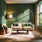
Cream and Ivory: My Go-To for Warmth

I’m slightly obsessed with cream carpet against taupe walls.
It’s the combination I ended up choosing for my own living room, and I haven’t looked back.
Cream brings this soft, cozy warmth that makes taupe feel less serious and more inviting.
If your taupe has warmer undertones—think hints of brown or tan—cream is going to feel like it was always meant to be there.
The contrast is subtle but so effective.
Your walls don’t disappear, but they also don’t compete with the floor.
Instead, everything feels layered and intentional.
I went with a textured cream carpet, not a flat solid, because the texture adds dimension without being loud.
It catches the light differently throughout the day, which keeps the room from feeling one-note.
One thing to consider: cream does show dirt more than darker colors, so if you have pets or kids, you might want to look for a stain-resistant option.
But the trade-off is worth it for me.
Walking into a room with cream carpet and taupe walls feels like stepping into a warm hug.
It’s soft, it’s sophisticated, and it’s never going to go out of style.
Soft Gray: The Elegant Balance

If you want something a little more modern, soft gray carpet is absolutely stunning with taupe walls.
I tested this combo in my guest bedroom, and it gave the space this calm, spa-like vibe that I love.
Gray adds a cooler tone that balances out any warmth in your taupe without making things feel cold.
The key word here is soft—you don’t want a harsh charcoal or slate gray.
Think light dove gray, or a greige that leans more gray than beige.
It creates this monochromatic look that feels really pulled together, like you hired a designer but you totally did it yourself.
The beauty of gray carpet is that it hides dirt and wear better than lighter colors, which is a huge win if you’re practical like me.
But it still feels elevated and intentional, not boring.
I’d recommend getting a plush or velvet-finish gray carpet if you go this route.
The softness underfoot makes the whole room feel more luxurious.
And honestly, gray carpet with taupe walls is one of those combinations that photographs beautifully, if you’re into that sort of thing.
It’s chic, it’s timeless, and it works in literally any room of the house.
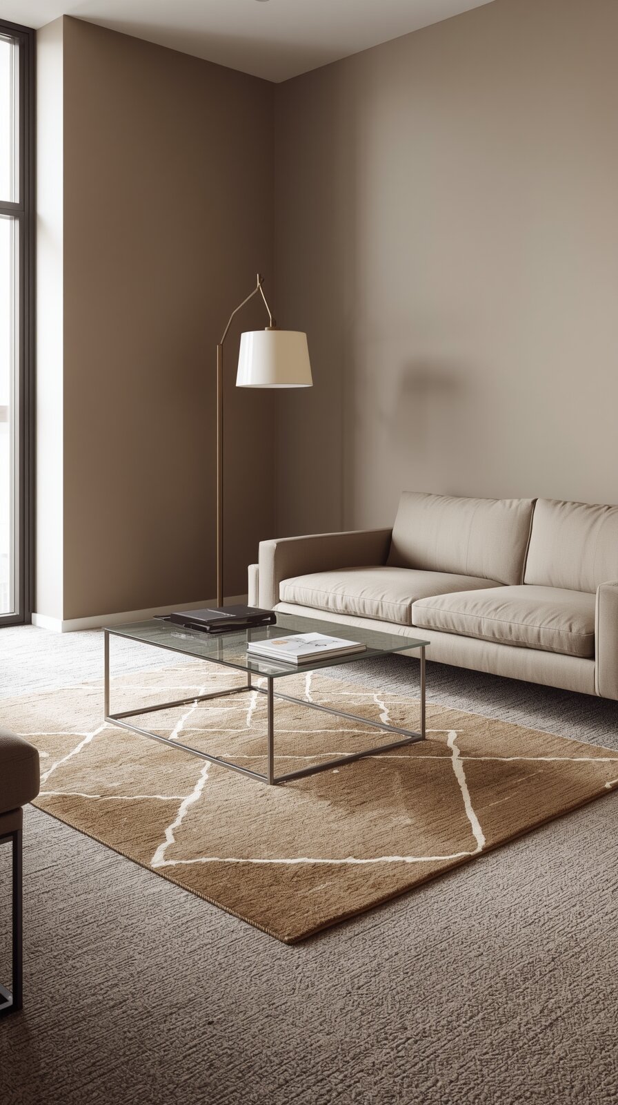
Warm Beige: The Safe (But Sophisticated) Choice

Beige gets a bad rap for being boring, but hear me out.
A warm beige carpet with taupe walls is anything but dull when you do it right.
I’m talking about a beige with golden or honey undertones, not that flat builder-beige from the ’90s.
This combination creates a tonal, cohesive look that feels really high-end.
Everything flows together without any jarring color breaks, which makes your space feel bigger and more open.
If your taupe walls lean warmer—toward brown or tan—warm beige carpet is going to feel like a natural extension of the wall color.
It’s safe in the best way possible.
You’re not going to walk in six months from now and hate it, which is something I think about every time I make a big decor decision.
The trick is to add contrast through your furniture and accessories.
With a beige-on-taupe scheme, you need texture and pattern to keep things interesting.
Think chunky knit throws, linen pillows, wood furniture, maybe a bold rug layered on top.
I did this in my dining room, and the warmth of the beige carpet made the whole space feel grounded and cozy.
It’s the kind of choice that lets you experiment with decor without worrying about clashing with your floors.

Find Your Room’s Color Palette
Tap a vibe — get a curated 5-color palette with hex codes you can copy ✨
💭 I Wrote a Book About My Biggest Decorating Mistakes!
When I decorated my first home, I thought I knew what I was doing. Spoiler: I didn’t. 😅
💸 I bought a sofa way too big for my living room. Paint colors that looked amazing in the store but terrible on my walls.
Charcoal or Deep Gray: For the Bold Ones

Okay, this one’s for you if you want drama.
Charcoal or deep gray carpet against taupe walls creates this incredible contrast that feels modern and a little moody in the best way.
I wouldn’t do this in every room, but in a bedroom or a den?
It’s magic.
The dark carpet grounds the space and makes your taupe walls look lighter and more luminous by comparison.
It’s the kind of choice that makes people walk into your room and say, “Wow, this is stunning.”
You do need good lighting to pull this off, though.
Dark carpet can make a room feel smaller if you don’t have enough natural light or well-placed lamps.

But if your space has big windows or you’re good about layering light, go for it.
I tried this in my home office, and it completely transformed the vibe from generic to intentional.
The deep gray carpet also hides absolutely everything—pet hair, dirt, crumbs—which is a huge practical bonus.
Just make sure your furniture has enough contrast so it doesn’t disappear into the floor.
Light-colored sofas, bright white trim, metallic accents—all of those help balance the darkness.
This combo feels grown-up and sophisticated, and I love it for that.
Soft Blue or Blue-Gray: My Unexpected Favorite

This is going to sound weird, but stay with me.
Soft blue or blue-gray carpet with taupe walls is one of the most beautiful, underrated combinations I’ve ever seen.
I stumbled on this by accident when I was helping a friend pick carpet for her bedroom, and now I recommend it all the time.
The blue brings in a cool, serene quality that makes taupe feel more dynamic.
It’s not matchy-matchy, but it’s still cohesive.
If your taupe has any gray undertones, blue-gray carpet is going to feel like they were made for each other.
The whole room takes on this calming, almost coastal vibe without being overly themed.
I’m obsessed with how it looks in bedrooms especially—it just makes you want to crawl in and never leave.
The key is to keep the blue soft and muted, not bright or saturated.
Think dusty blue, slate blue, or a gray with just a hint of blue peeking through.
You want it to complement the taupe, not steal the show.
And if you’re worried about it feeling too cool, just layer in warm wood tones and soft textiles.
This is one of those choices that feels a little risky but pays off in a big way.
It’s fresh, it’s different, and it makes your space feel uniquely yours.
Greige: When You Can’t Decide Between Gray and Beige

Greige carpet is literally the perfect middle ground, and I’m here for it.
If your taupe walls are also in that gray-beige hybrid zone, greige carpet is going to feel like the most natural fit.
It’s warm but not too warm, cool but not too cool—it’s just… balanced.
I used greige carpet in my hallway, and it ties together all the different rooms that open off of it without clashing with any of them.
The beauty of greige is that it’s incredibly versatile.
You can style it with warm wood furniture and gold accents, or go cooler with chrome and white.
It plays nice with everything.
If you’re someone who likes to change up your decor seasonally or you get bored easily, greige gives you that flexibility.
Your carpet won’t limit your design choices down the road.
I’d recommend a greige with a slight texture or pattern—something subtle like a fleck or a tone-on-tone stripe.
It keeps the floor from looking too flat while still being neutral enough to work anywhere.
Greige is also really forgiving when it comes to showing wear and tear.
It’s honestly one of the smartest, most practical choices you can make, and it still looks really elevated and intentional.
What’s Your Decor Personality?
5 questions · 30 seconds · Instant style match 🏡
Taupe-on-Taupe: The Monochromatic Magic

I know what you’re thinking—taupe carpet with taupe walls sounds like too much taupe.
But trust me, when you do it right, it’s stunning.
The trick is to choose a carpet that’s a different shade or tone than your walls.
If your walls are a lighter taupe, go darker with the carpet, or vice versa.
This creates a layered, monochromatic look that feels really sophisticated and cohesive.
I did this in my main bedroom, and it’s the most calming space in my entire house.
Everything flows together seamlessly, and there’s no visual interruption between the walls and the floor.
The key to making taupe-on-taupe work is texture.
You absolutely need texture to keep things from looking flat and boring.
A plush, shaggy carpet, or one with a subtle pattern, will add dimension and interest.
And then layer in different textures through your bedding, curtains, and furniture—linen, velvet, wood, metal.
The monochromatic palette lets you play with texture in a way that feels really intentional.
It’s sort of like wearing all black but with different fabrics and finishes—it looks pulled together and chic without trying too hard.
This is one of my favorite approaches for people who want a really serene, spa-like space.

Taupe With Warmer Undertones? Go Terracotta-Adjacent

Okay, this one’s a little more adventurous, but if your taupe has warm, earthy undertones, consider a carpet in the terracotta or rust family.
I’m talking about a soft, muted terracotta—not bright orange—that brings in warmth and a touch of personality.
I haven’t personally done this in my own home yet, but I’ve seen it in a friend’s space and I’m obsessed.
It gives taupe walls this unexpected richness and makes the whole room feel cozy and grounded.
The warmth of the terracotta plays off the neutral taupe in a way that feels really organic and natural.
It’s perfect if you’re into that modern desert or earthy boho vibe.
You’d want to balance it with plenty of neutral furniture and natural materials—think light wood, woven textures, cream linens.
The carpet becomes the statement piece, and everything else supports it.
This is definitely a bolder choice, and it might not work in every room.
But in a living room or a cozy reading nook?
It’s stunning.
If you’re nervous about committing to a terracotta carpet, you could always test the waters with a large area rug first.
See how you feel about the color combo before you go all-in.
I love this option for people who want something a little different but still sophisticated.
This or That?
Pick your fave — see what other readers chose! 👀
Light Taupe or Tan: The Barely-There Option

If you want your carpet to basically disappear and let your furniture and decor do the talking, go with a light taupe or tan that’s very close to your wall color.
This creates a super cohesive, almost monochromatic look where the walls and floor blend together.
It makes your space feel larger and more open because there’s no visual break between the two.
I used this approach in my small guest room, and it completely opened up the space.
The room feels way bigger than it actually is because everything flows.
The carpet doesn’t demand attention—it just quietly supports everything else.
This is a great choice if you have a lot of colorful or patterned furniture and decor that you want to stand out.
💭 I Wrote a Book About My Biggest Decorating Mistakes!
When I decorated my first home, I thought I knew what I was doing. Spoiler: I didn’t. 😅
💸 I bought a sofa way too big for my living room. Paint colors that looked amazing in the store but terrible on my walls.
The neutral floor and walls become a backdrop for your personality.
It’s also really forgiving if you’re not super confident in your decorating skills.
You can’t really go wrong with a barely-there carpet color.
The downside is that it can feel a little bland if you don’t add enough personality through your styling.
So make sure you’re layering in color, texture, and pattern in your furniture, art, and accessories.
But if you want a safe, easy, space-expanding option, light taupe or tan carpet is the way to go.
Navy or Deep Blue: The Unexpected Stunner

This is definitely a bold move, but navy or deep blue carpet with taupe walls is one of those combinations that just works.
It’s unexpected, it’s sophisticated, and it adds so much depth to a room.
The navy brings in richness and drama without feeling heavy or dark.
And it contrasts beautifully with the softness of taupe walls.
I’ve seen this done in a den with leather furniture and brass accents, and it was absolutely gorgeous.
The whole room felt like a classic library or a high-end hotel.
If you’re going to try this, I’d recommend doing it in a room where you want a cozier, more intimate vibe—not a bright, airy space.
Navy carpet naturally makes a room feel more enclosed, which can be a good thing if you’re creating a reading nook or a home theater.
You’ll want to make sure you have good lighting, though.
Navy can absorb light, so layer in floor lamps, table lamps, and maybe some recessed lighting.
And keep your walls and furniture lighter to balance out the darkness of the floor.
This is one of those choices that feels really confident and intentional.
It’s not for everyone, but if you’re drawn to it, go for it.
It’s the kind of design move that makes your space memorable.
Quick Design Dilemma
Cast your vote — see what other readers think! 🤔
Soft Green or Sage: For the Nature Lovers

If you want to bring a little bit of the outdoors in, soft green or sage carpet with taupe walls is absolutely beautiful.
I’m talking about a muted, earthy green—not bright lime or emerald.
The green adds a fresh, natural quality that makes taupe feel more alive and less neutral.
It’s perfect if you’re into that organic, nature-inspired aesthetic.
I tested a sage carpet sample in my sunroom, and it completely changed the vibe.
The room felt more connected to the garden outside, and the taupe walls took on this warm, earthy quality.
The key is to keep the green soft and muted so it doesn’t overwhelm the space.
You want it to feel like a natural extension of the taupe, not a jarring contrast.
Pair it with lots of natural wood, woven textures, and organic shapes in your furniture and decor.
The whole look should feel cohesive and grounded.
This is a really unique choice that I don’t see often, which is part of why I love it.
It’s fresh and different without being trendy or over-the-top.
If you’re someone who finds peace in nature and wants your home to reflect that, soft green or sage carpet might be your answer.
It’s calming, it’s beautiful, and it works surprisingly well with taupe.
My Personal Tips for Choosing the Right Carpet Color
Here’s what I’ve learned after way too many carpet shopping trips and sample testing sessions.
Always—and I mean always—get samples and put them in your actual space.
Carpet looks completely different in the store lighting versus your home at different times of day.
I tape samples to my floor and live with them for at least a week, looking at them in morning light, afternoon light, and evening with the lamps on.
It sounds excessive, but it’s saved me from so many regrets.
Light carpets are gorgeous, but if you have kids, pets, or heavy foot traffic, you might want to go a shade or two darker.
I learned this the hard way with my cream carpet—it’s beautiful, but I vacuum constantly.
Think about texture too, not just color.
A textured carpet in the “wrong” color can actually work better than a flat carpet in the “right” color because texture adds dimension and interest.
And finally, trust your gut.
If you’re torn between two options, go with the one that makes you feel something.
The technically perfect choice isn’t always the one that makes you happy.
Your home should reflect your personality, not just follow design rules.