y blue walls were perfect.
Absolutely perfect.
Until I realized my carpet was making them look… wrong.
You know that feeling when you finally nail the wall color, and then your eyes drift down and you’re like, wait, why does this suddenly feel off?
That was me last spring.
I’d spent weeks agonizing over the exact shade of coastal blue for my bedroom—not too bright, not too gray, just that soft, beachy vibe I was obsessed with.
But the second coat dried, I looked at my boring tan carpet and felt my heart sink a little.
The whole room felt disconnected, like the walls and floor were in two different houses.
So I did what any slightly obsessive person would do: I bought eight different carpet samples and lived with them for a month.
I moved them around, stared at them in different light, and basically became a carpet detective.
Here’s everything I figured out about pairing carpets with those dreamy blue walls.
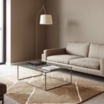
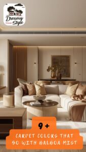
Soft Cream Carpets (My Failsafe Choice)

Cream is my absolute go-to when I’m pairing anything with blue walls.
It’s warm without being yellow, soft without being boring, and it just grounds the whole room in this really cozy way.
When I finally swapped out that beige disaster for a plush cream carpet, my living room suddenly felt like a boutique hotel by the sea.
The blue walls stayed breezy and light, but the cream added this warmth that made the space feel like you could actually live in it—not just look at it.
I love that cream doesn’t compete.
It sits there quietly, letting your walls do the talking, while adding just enough contrast so the room doesn’t feel washed out.
If your blue is on the cooler side (think sky or aqua), cream adds balance.
If your blue leans more gray or muted, cream keeps it from feeling too serious.
My tip: Go for a cream with a slight texture—like a low-pile or loop carpet.
Flat cream can look dingy over time, but texture hides everything and adds that extra layer of coziness.
I’m obsessed with how forgiving it is, especially if you have kids or pets.
It’s the kind of choice that just works, no matter what.
Tap to Explore These Beauties
See my ideas in action 👇 Tap any image to explore full details.
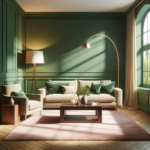
Warm Taupe (For When You Want Cozy, Not Coastal)

Taupe is criminally underrated.
I used to think it was boring—until I tried it with my blue walls and realized it’s actually the perfect grounding neutral.
It has this earthy, almost sandy quality that plays beautifully with coastal blues, but it doesn’t scream “beach house.”
Instead, it whispers “stylish home that happens to have gorgeous blue walls.”
I tested this combo in my bedroom, where the walls are a soft periwinkle-blue.
The taupe carpet made the whole space feel like a retreat—warm, inviting, and somehow more sophisticated than my usual beachy vibes.
It’s especially great if you want your home to feel pulled together without following a theme too literally.
💭 Ever wondered what your room would actually look like rearranged?
I built a free tool that lets you drag furniture around a 2D floor plan. No signup, no catch.
See the Room Planner →Taupe adds weight and maturity.
It anchors the room in a way that lighter neutrals can’t.
Why it works emotionally: Taupe feels safe and luxurious at the same time.
It’s like wrapping your coastal walls in a cashmere blanket.
My advice?
Look for a taupe with warm undertones—nothing too gray or cool, or it’ll clash with the softness of blue.
Sandy Beige (The Obvious One That Actually Delivers)

I know, I know—beige feels obvious.
But hear me out.
Not all beiges are created equal, and the right sandy beige can make your coastal-chic walls sing.
I’m talking about a beige with a hint of gold or peach—something that mimics actual sand, not office carpet from 2003.
When I redid my entryway (soft blue-gray walls), I went with a sandy beige runner, and it immediately made the space feel like a beach cottage.
It’s warm, it’s inviting, and it doesn’t try too hard.
The trick is finding a beige that has life to it—something with dimension, maybe a subtle pattern or a woven texture.
Flat, lifeless beige will make your blue walls look dull.
But a rich, textured beige?
Chef’s kiss.
My hack: Hold carpet samples next to your wall in natural light.
Beige can look completely different depending on the time of day, and you want one that stays warm and golden—not gray or pink.
This combo is perfect if you’re leaning full coastal and want that seamless sand-to-sea vibe.
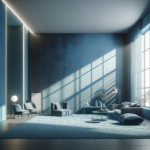
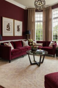
Charcoal Gray (For Drama and Depth)

This one surprised me.
I always thought gray carpets were cold and sterile—until I saw charcoal paired with a dusty blue wall in my friend’s den.
Holy wow.
The contrast was stunning.
It made the blue walls look richer, moodier, and so much more interesting.
Charcoal adds this unexpected edge to coastal walls.
Instead of soft and breezy, you get sophisticated and layered.
I tried this in my home office (walls are a muted slate-blue), and it completely changed the energy of the room.
It went from “cute beach vibe” to “I mean business, but make it chic.”
The key is balance.
If your walls are already dark or saturated, charcoal might be too much.
But if your blue is soft, faded, or gray-toned, charcoal creates this beautiful, grounding contrast.
Personal tip: Add lighter accents—white furniture, cream throws, natural wood—to keep the room from feeling too heavy.
Charcoal is bold, so you need brightness elsewhere to balance it out.
This combo is for you if you want coastal vibes with a grown-up, editorial twist.

Find Your Room’s Color Palette
Tap a vibe — get a curated 5-color palette with hex codes you can copy ✨
💭 I Wrote a Book About My Biggest Decorating Mistakes!
When I decorated my first home, I thought I knew what I was doing. Spoiler: I didn’t. 😅
💸 I bought a sofa way too big for my living room. Paint colors that looked amazing in the store but terrible on my walls.
Ivory (Clean, Crisp, and Classic)

Ivory is my secret weapon for making blue walls feel fresh and airy.
It’s brighter than cream, softer than white, and it has this clean, almost spa-like quality.
I used an ivory carpet in my guest room (walls are a soft powder blue), and every single guest comments on how peaceful it feels.
The ivory reflects light and makes the space feel bigger and brighter.
It’s especially great in smaller rooms where you don’t want the floor to visually shrink the space.
What I love about ivory is how it disappears in the best way.
It’s there, doing its job, but it’s not fighting for attention.
Your blue walls stay the star of the show.
Why it works: Ivory is timeless.
It doesn’t feel trendy or dated—it just feels right.
My only caution?
Ivory shows everything.
So if you have a busy household, maybe save this one for low-traffic areas or be prepared to vacuum like it’s your cardio.
I use mine in spaces where I can control the chaos (aka not the mudroom).
Ivory and blue is the ultimate clean-slate combo.
Soft Gray with Blue Undertones (Matchy Without Being Matchy)

This is such a designer move, and I feel fancy every time I recommend it.
A soft gray carpet with blue undertones creates this tonal, monochromatic look that feels intentional and polished.
I tried this in my hallway (walls are a chalky coastal blue), and it’s like the floor and walls are having a quiet conversation.
They’re related, but not identical twins.
It’s subtle and sophisticated.
The trick is finding a gray that has just a hint of blue—not so much that it’s obviously blue-gray, but enough that it ties into your walls.
This creates a seamless, calming flow.
My experience: I held about twelve gray samples next to my wall before finding the right one.
Most grays lean green or purple, which looked terrible.
But the one with a whisper of blue?
Perfect.
This combo works especially well in open-concept spaces where you want continuity without everything looking too matchy-matchy.
It’s understated elegance at its best.
And it’s incredibly forgiving—it hides dirt and doesn’t show wear as much as lighter carpets.
What’s Your Decor Personality?
5 questions · 30 seconds · Instant style match 🏡
Natural Jute or Sisal Look (Texture Over Color)

Okay, so I’m cheating a little here because jute isn’t technically a carpet in the plush sense.
But if you’re going for coastal-chic, a natural jute-look carpet or rug-as-carpet situation is everything.
I have a jute rug covering most of my sunroom floor (pale blue walls), and it’s the most relaxed, beachy-without-trying vibe ever.
The texture is the star here.
Jute adds this organic, laid-back quality that makes blue walls feel effortless and breezy.
It’s like bringing the outdoors in, but in a really chic way.
Why I love it: It’s neutral, it’s natural, and it doesn’t feel precious.
You can spill on it, drag sandy feet across it, and it still looks intentionally casual.
The downside?
It’s rougher underfoot, so not great for bedrooms where you want plush comfort.
But for living rooms, entryways, or sunrooms?
Absolute magic.
Jute also comes in different weaves and tones—some lean more golden, some more gray—so you can fine-tune it to your exact blue.
My advice?
Go for a tighter weave if you want it to feel more refined.
Greige (The Ultimate Chameleon Neutral)

Greige is gray + beige, and it’s become my most-recommended neutral for basically everything.
With coastal-chic blue walls, greige is like the diplomatic friend who gets along with everyone.
I used a greige carpet in my dining room (walls are a misty blue-gray), and it’s the perfect bridge between warm and cool.
Greige has this magical ability to adapt to its surroundings.
In morning light, it looks warmer and more beige.
In evening light, it leans cooler and more gray.
It’s never boring, never wrong.
Emotionally, here’s why it works: Greige feels modern and timeless at the same time.
It’s not trying too hard, but it’s definitely not lazy.
It’s the carpet equivalent of a white button-down—you can dress it up or down.
With blue walls, it adds just enough neutrality without going too warm (like beige) or too cool (like gray).
My tip?
Choose a greige that leans slightly warmer if your blue is cool-toned, and vice versa.
You want balance, not a temperature war between your walls and floor.

Soft White (Bold, But So Worth It)

I’ll be honest—soft white carpet scared me for years.
I thought it was impractical, high-maintenance, and only for people who don’t actually live in their homes.
Then I saw it paired with pale blue walls in a boutique Airbnb, and I was immediately converted.
The room felt like a cloud.
Soft white carpet makes blue walls feel airy, spacious, and ridiculously elegant.
It’s bright without being harsh, and it creates this seamless, dreamy look that’s hard to achieve with any other color.
I tested this in my own space by using a large white rug over hardwood (commitment issues), and even that made a huge difference.
The blue walls suddenly felt softer and more serene.
Real talk: White carpet is high maintenance.
You’ll need to clean it more often, and spills are a crisis.
But if you’re kid-free, pet-free, or just really careful, the payoff is stunning.
My hack?
Choose a white with a slight texture or pattern—it hides imperfections way better than a flat white.
This combo is for maximalists who want that wow-factor.
This or That?
Pick your fave — see what other readers chose! 👀
Pale Seafoam Green (Unexpected and Dreamy)

This one is for the bold souls who want to push the coastal-chic envelope.
Pale seafoam green carpet with blue walls sounds risky, I know.
But if you get the tones right, it’s like living inside a watercolor painting.
I tried this in my reading nook (walls are a soft slate-blue), and it’s my favorite corner of the house.
The seafoam adds this subtle pop of color without feeling loud or childish.
It’s soothing, unexpected, and so pretty.
The key is keeping the green super pale and muted—think almost-gray-green, not mint.
You want it to whisper, not shout.
💭 I Wrote a Book About My Biggest Decorating Mistakes!
When I decorated my first home, I thought I knew what I was doing. Spoiler: I didn’t. 😅
💸 I bought a sofa way too big for my living room. Paint colors that looked amazing in the store but terrible on my walls.
Why it works emotionally: Color-on-color can feel risky, but when it works, it feels like you really know what you’re doing.
It’s confident and creative.
My advice?
Test this with a large rug first before committing to wall-to-wall carpet.
Seafoam can look very different depending on your lighting and the specific shade of blue on your walls.
But when it clicks?
Magic.
Quick Design Dilemma
Cast your vote — see what other readers think! 🤔
Warm Terracotta or Rust (A Warm Contrast)

This is my wildcard pick, and I’m obsessed with it.
Terracotta or rust-toned carpet with coastal blue walls creates this stunning warm-cool contrast that feels both modern and vintage.
It’s like pairing a summer sky with desert sand.
I haven’t done this in my own home yet (but it’s on my vision board), but I’ve seen it in design blogs and real homes, and it’s chef’s kiss.
The warmth of terracotta grounds the coolness of blue in a way that feels intentional and layered.
It’s not your typical coastal palette, which is exactly why I love it.
It says, “I have a beachy vibe, but I’m not boring about it.”
Emotional appeal: This combo feels collected and worldly.
It’s cozy without being too soft, bold without being overwhelming.
My tip?
Keep your other decor fairly neutral if you go this route—white linens, natural wood, black accents—so the blue and terracotta can be the stars.
This is for anyone who wants coastal vibes with a spicy, unexpected twist.
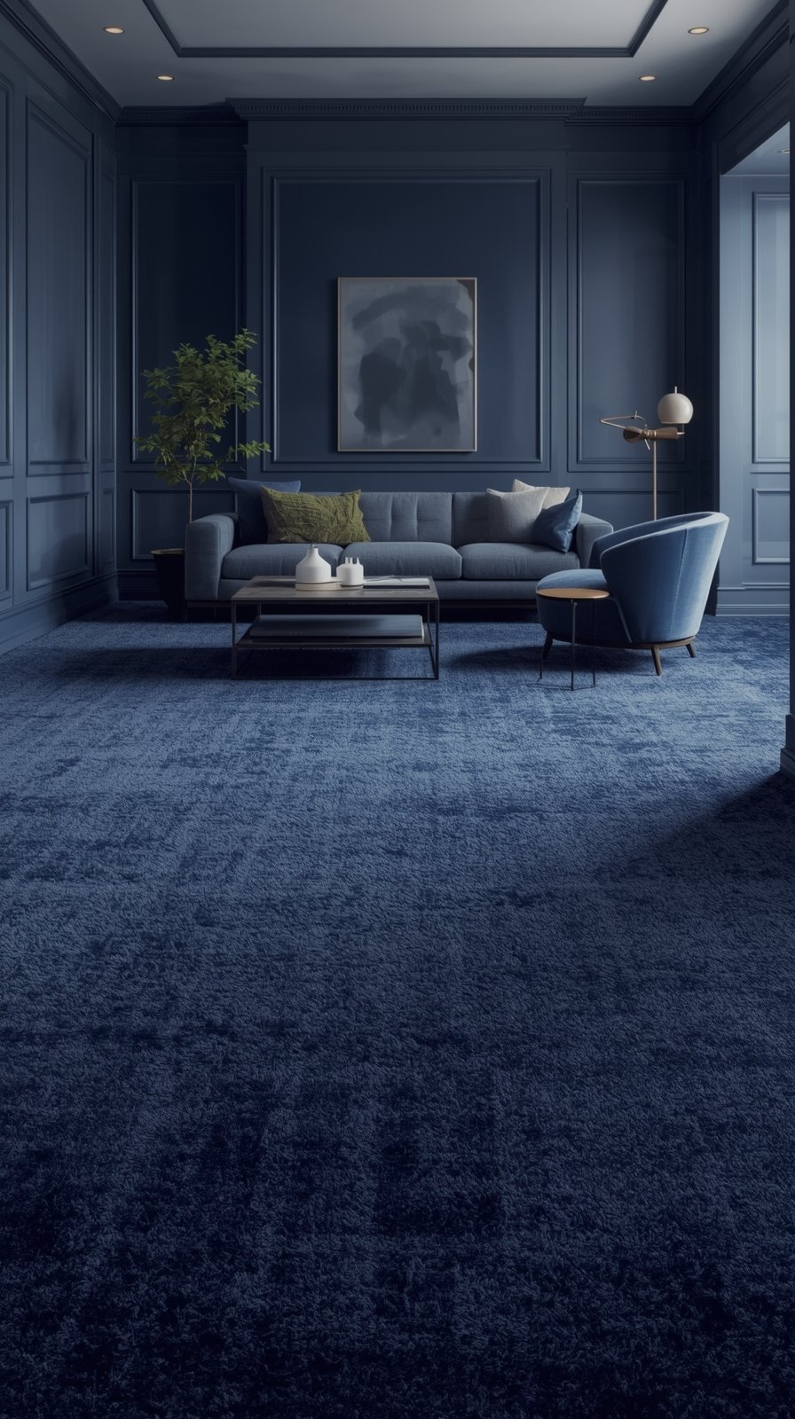
Navy Blue (Tonal and Moody)

Navy carpet with lighter blue walls is a bold, tonal move—and when it works, it’s stunning.
I tried a navy rug in my living room (walls are a pale sky blue), and it completely changed the vibe.
The room went from airy and casual to layered and intentional.
Navy adds depth and richness.
It makes your lighter blue walls look even more luminous by comparison.
It’s like giving your room a visual anchor.
The trick is making sure your walls are light enough to create contrast.
If your walls are already dark or saturated, navy carpet might make the space feel too heavy.
But with soft, pale blues?
It’s perfection.
Personal insight: Navy carpet is surprisingly forgiving.
It hides stains and wear like a champ, which is why I actually kept mine even with a toddler running around.
Add lighter furniture, white trim, and plenty of natural light to keep the room from feeling cave-like.
This combo is for you if you want coastal vibes with a sophisticated, grown-up edge.