had a row of sad, terracotta pots sitting on my back porch doing absolutely nothing for me.
They weren’t broken.
They weren’t ugly, exactly.
But they were just… there.
Blending into the concrete like they’d given up on life.
So one lazy Sunday, I grabbed some leftover craft paint, a couple of brushes, and sat cross-legged on my porch floor in my pajamas.
Three hours later, I had the most charming little collection of pots I’d ever seen — and I made them myself.
That feeling, you guys?
That little rush of “I actually did that”?
That’s what this post is all about.
Why Plain Pots Feel Like Wasted Potential

Okay, I’m just going to say it — a plain terracotta pot is one of the biggest missed opportunities in home decorating.
It’s literally a blank canvas sitting right there on your porch, your windowsill, your kitchen counter.
And we just… leave it orange-brown and call it a day.
I used to do the same thing.
I thought, “Oh, it’s just a pot.
The plant is the pretty part.”
But when I finally started painting my pots, I realized the pot is part of the whole vibe.
It sets the tone for the plant inside it.
A scraggly little herb in a beautifully painted pot suddenly feels intentional, styled, curated.
And a gorgeous bloom in a boring pot kind of just… sits there.
I know which one I want on my porch.
The good news is, transforming a plain pot is so much easier — and cheaper — than you’d think.
It’s one of those projects that feels way more impressive than the effort it actually takes.
Tap to Explore These Beauties
See my ideas in action 👇 Tap any image to explore full details.
What You Actually Need (Keep It Simple)

Let me save you the overwhelm of a 47-tab browser session, because I’ve been there.
You do not need a full craft supply haul for this.
Here’s what I actually use: basic acrylic craft paint (the little bottles from the dollar section are totally fine), a few brushes in different sizes, a sealer spray to protect the finish, and that’s pretty much it.
That’s the whole list.
If you’re painting terracotta specifically, I like to give the pot a base coat of white or cream first.
It makes every color on top look so much more vibrant and true-to-tone.
If you skip that step, darker terracotta can muddy your colors a little.
💭 Ever wondered what your room would actually look like rearranged?
I built a free tool that lets you drag furniture around a 2D floor plan. No signup, no catch.
See the Room Planner →You’ll also want to make sure your pot is clean and dry before you start.
Any moisture or dust and the paint just won’t adhere the way you want it to.
I wipe mine down with a damp cloth the night before and let them air dry overnight.
And honestly?
That’s the most “prep work” involved.
The rest is just fun.
My Favorite Painting Styles (And Which One Is Right for You)

This is where it gets really exciting, because there are so many different directions you can go.
I’ve tried a bunch of them at this point, and each one gives off a completely different energy.
Solid color with a white rim is my go-to for a clean, modern look.
Deep terracotta red, sage green, dusty blue — any of these look stunning with a simple white rim at the top.
Abstract brushstrokes are my favorite when I want something that feels artsy but requires zero actual artistic skill.
You literally just swoosh paint across the pot in big, confident strokes.
Geometric patterns — triangles, stripes, half-moons — look incredibly chic and are easier to do than they appear if you use painter’s tape.
Floral hand-painting is my love language, honestly.
Little daisies, trailing vines, tiny leaves — even if your lines aren’t perfect, they look charming.
Boho patterns with dots and wavy lines are also gorgeous and very forgiving for beginners.
My personal recommendation?
Start with solid color on your first pot.
Build your confidence.
Then go wild.

Find Your Room’s Color Palette
Tap a vibe — get a curated 5-color palette with hex codes you can copy ✨
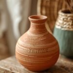
The Terracotta Pot — A Classic for a Reason

There is something so deeply cozy about terracotta.
It’s warm, it’s earthy, and it has this beautiful texture that paint clings to in the most satisfying way.
When I painted my first terracotta pot in a soft cream with tiny hand-painted flowers, I genuinely felt like I was holding a little piece of art.
Terracotta is also really forgiving.
If you mess up a brushstroke, let it dry and paint right over it.
No drama, no starting over.
One thing I’ll mention — terracotta is porous, which means it absorbs moisture.
If your pot is going to live outside or hold a watered plant, make sure you seal it really well.
I use a matte outdoor sealer spray and do two coats.
It protects the paint and also gives the pot that gorgeous matte, artisan finish that looks so expensive.
Also, if you want the inside of the pot sealed too (which helps the plant, honestly), you can line it or seal the inside separately.
Small detail, big difference for longevity.

💭 I Wrote a Book About My Biggest Decorating Mistakes!
When I decorated my first home, I thought I knew what I was doing. Spoiler: I didn’t. 😅
💸 I bought a sofa way too big for my living room. Paint colors that looked amazing in the store but terrible on my walls.
Plastic Pots Are Having a Moment (And I’m Here for It)

Okay, don’t sleep on plastic pots.
I know, I know — they feel cheap and kind of sad on their own.
But painted?
They look absolutely stunning, and they’re actually easier to work with in some ways.
They’re lighter, more durable outdoors, and they don’t absorb moisture the way terracotta does.
The trick with plastic is surface prep.
You need a primer first — specifically one that says “bonds to plastic” on the label.
Without it, the paint will peel off eventually, and that’s heartbreaking after you’ve put in the work.
I learned that the hard way on a beautiful blue pot I made last summer.
After it peeled, I re-primed and repainted it, and it’s been perfect ever since.
Once the primer is on, you can use the same acrylic paints and techniques as you would on terracotta.
My favorite look on plastic pots is an all-over pastel with a thin, hand-painted botanical border near the rim.
It transforms a $2 pot into something that looks like it came from a boutique garden shop.
And that is the whole goal, isn’t it?
Psst… Check This Out
chrome & metallic Accent Decor Ideas That feel sleek, Sharp And so on Take Me There →Patterns That Always Look Gorgeous (Even If You’re Not Artistic)

Let me be really honest with you — I am not a trained artist.
My hand is not steady.
My lines are not perfect.
And my painted pots are some of the most complimented things in my home.
Because there’s a magic in handmade imperfection that no machine can replicate.
That said, here are the patterns I return to again and again because they’re beginner-friendly and always beautiful:
Stripes — use painter’s tape and you literally cannot go wrong.
Polka dots — dip the back end of a paintbrush into paint and dot away.
So meditative.
Simple leaf shapes — dip an actual leaf in paint and press it onto the pot.
Nature does the work for you.
Half-dipped look — paint just the bottom half of a pot in a bold color, leave the top natural.
Incredibly chic.
Color blocking — two or three sections of different colors separated by thin lines.
If I had to pick just one for a beginner, I’d say the half-dipped look every time.
It looks like you spent hours.
It takes about twenty minutes.
What’s Your Decor Personality?
5 questions · 30 seconds · Instant style match 🏡
Color Palettes I’m Absolutely Obsessed With Right Now

Color is everything, you guys.
The right palette can make your pots look like a cohesive, intentional collection.
The wrong mix just looks like you grabbed whatever was in the junk drawer.
Here are the combinations I keep coming back to:
Sage green + cream + terracotta — earthy, warm, so incredibly cozy.
This is my porch’s whole personality right now.
Dusty blue + white + gold accents — feels coastal and elegant at the same time.
Blush pink + sage + soft black — feminine but modern.
I love this for indoor pots.
Deep forest green + burnt orange + cream — very autumnal and rich.
All white with black line-art details — this is the minimalist-chic move and it always, always looks stunning.
My personal tip?
Pick three colors max for your collection, and use them across all your pots in different ways.
One pot might be mostly sage with a cream rim.
Another might be cream with sage dots.
That repetition is what makes a collection feel curated rather than random.
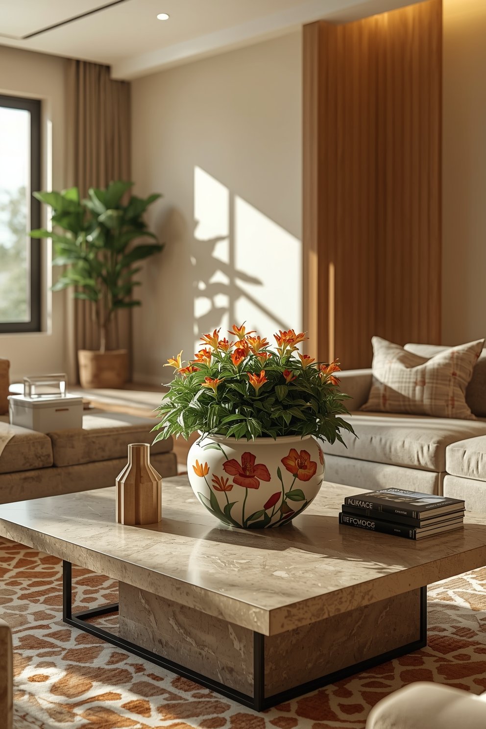
Where to Display Your Painted Pots (Think Beyond the Porch)

I think a lot of us default to “porch” when we think of flower pots.
And yes, the porch is amazing.
But painted flower pots are so versatile.
They can live anywhere.
I have a cluster of three small painted pots on my kitchen windowsill with herbs in them — basil, rosemary, mint.
It’s functional and it looks like something out of a dream kitchen.
I have a tall painted pot in the corner of my living room with a faux fiddle leaf fig.
It acts as a sculptural element, not just a plant holder.
I’ve also done a little painted pot on my bathroom shelf with a tiny succulent.
That bathroom shelf?
Now my favorite corner of the whole house.
If I had a small entryway, the first thing I’d do is put one beautiful, painted pot with a trailing plant on the entry table.
It makes the whole space feel intentional and alive the moment you walk in.
Think of your painted pots as decor pieces first, plant holders second.

This or That?
Pick your fave — see what other readers chose! 👀
How to Make Your Pots Look Like a Curated Collection

There is a difference between “a bunch of painted pots” and “a curated collection.”
And the difference is in the details.
The first trick is the one I mentioned — stick to a cohesive color palette across all your pots.
The second trick is to vary the sizes.
A cluster of three pots always looks better when they’re different heights.
Tall, medium, small.
It creates visual interest and depth.
Third trick — vary the patterns but keep the palette.
One solid color pot, one striped pot, one dotted pot, all in the same three colors.

Now you have something really beautiful.
Fourth trick — consider the surfaces.
Mixing matte pots with one slightly glossy one adds dimension to the whole grouping.
And the fifth trick, which is my favorite:
Add a small non-plant element into the grouping.
A little candle, a smooth stone, a small piece of driftwood.
It makes the whole thing feel styled, not just planted.
That’s the move that always gets “Oh my gosh, where did you get this?” from guests.
Sealing and Protecting Your Work (Don’t Skip This)

I cannot stress this enough — sealing your painted pots is not optional.
It’s the step that takes your project from “cute craft” to “lasting piece of home decor.”
Without a sealer, especially for outdoor pots, the paint will fade, chip, and peel.
And that’s just sad after all your effort.
For outdoor pots, I use a matte spray sealer that’s rated for outdoor use.
Two coats, letting each coat dry fully before the next.
For indoor pots that won’t get splashed with water much, one good coat is usually fine.
If you want a slightly more protective finish on a pot that’s going to get really wet (like one that doesn’t have drainage and you water it directly), you can brush on a waterproof mod podge or a decoupage sealer.
It dries clear and creates a really solid barrier.
The other thing I do for outdoor pots specifically is paint the inside bottom with a little waterproofing sealant before I add soil.
It just helps the whole pot last so much longer.
Ten extra minutes of effort, and your beautiful pot survives seasons instead of just weeks.
💭 I Wrote a Book About My Biggest Decorating Mistakes!
When I decorated my first home, I thought I knew what I was doing. Spoiler: I didn’t. 😅
💸 I bought a sofa way too big for my living room. Paint colors that looked amazing in the store but terrible on my walls.
Making It a Ritual, Not Just a Project

Here’s the thing I love most about painting flower pots.
It’s not really about the pots.
It’s about the experience of making something with your hands.
There’s something so grounding about sitting on your porch or at your kitchen table with some paint and a brush.
No screens.
No noise.
Just you and the pot and a cup of something warm nearby.
I’ve made it into a little ritual for myself.
When I need to reset — when the week has been a lot — I grab my paints.
I put on a podcast or a comfort show in the background.
And I just paint.
It’s kindda meditative, honestly.
And the best part is that at the end, you have something real and beautiful to show for it.
It sits on your shelf or your porch and every time you look at it, you feel that little quiet pride.
That, to me, is the whole point of doing things by hand.
My personal tip here?
Don’t save it for a “special project day.”
Just start with one pot.
One afternoon.
See how it feels.
Quick Design Dilemma
Cast your vote — see what other readers think! 🤔
A Few of My Favorite Pot-Painting Hacks

Okay, wrapping up with the actual hacks I’ve picked up along the way, because this is the stuff nobody tells you.
Hack one: Use a pencil to lightly sketch your design on the pot before you paint.
It wipes off easily and gives you a guide so you’re not freestyling with paint in a panic.
Hack two: Washi tape is amazing for creating crisp lines and geometric shapes.
Way easier to find than painter’s tape and sticks perfectly to terracotta.
Hack three: If you mess up, don’t panic and don’t try to fix it wet.
Let it dry fully, then paint over.
Wet fixes almost always make things worse.
Hack four: A fan brush creates the most beautiful, wispy botanical strokes.
If you want that loose, painterly floral look, that’s your brush.
Hack five: Metallic gold paint as an accent — just a rim, just a tiny detail — elevates everything instantly.
I’m obsessed with a sage pot with a gold-painted rim.
Hack six: Paint in batches.
Do your base coat on five pots at once.
While they dry, do something else.
Come back for layer two.
It’s so much more efficient and honestly more fun.