ast spring, I walked into my kitchen with fresh eyes after visiting a friend’s newly renovated space, and I felt it—that sinking feeling when you realize your cabinets are screaming a decade you’d rather forget.
It wasn’t that they were falling apart or even particularly ugly.
But something about them felt frozen in time, like they were wearing the wrong outfit to a party.
I started noticing the brassy hardware, the weird valance above the sink, the orange-toned wood that once felt so warm but now just felt… dated.
Here’s the thing: cabinets set the entire mood of your kitchen.
When they’re off, everything else suffers, no matter how nice your countertops or backsplash are.
So I dug into what was actually making my kitchen feel stuck, and I’m sharing every mistake I found—and what I’m doing about it.


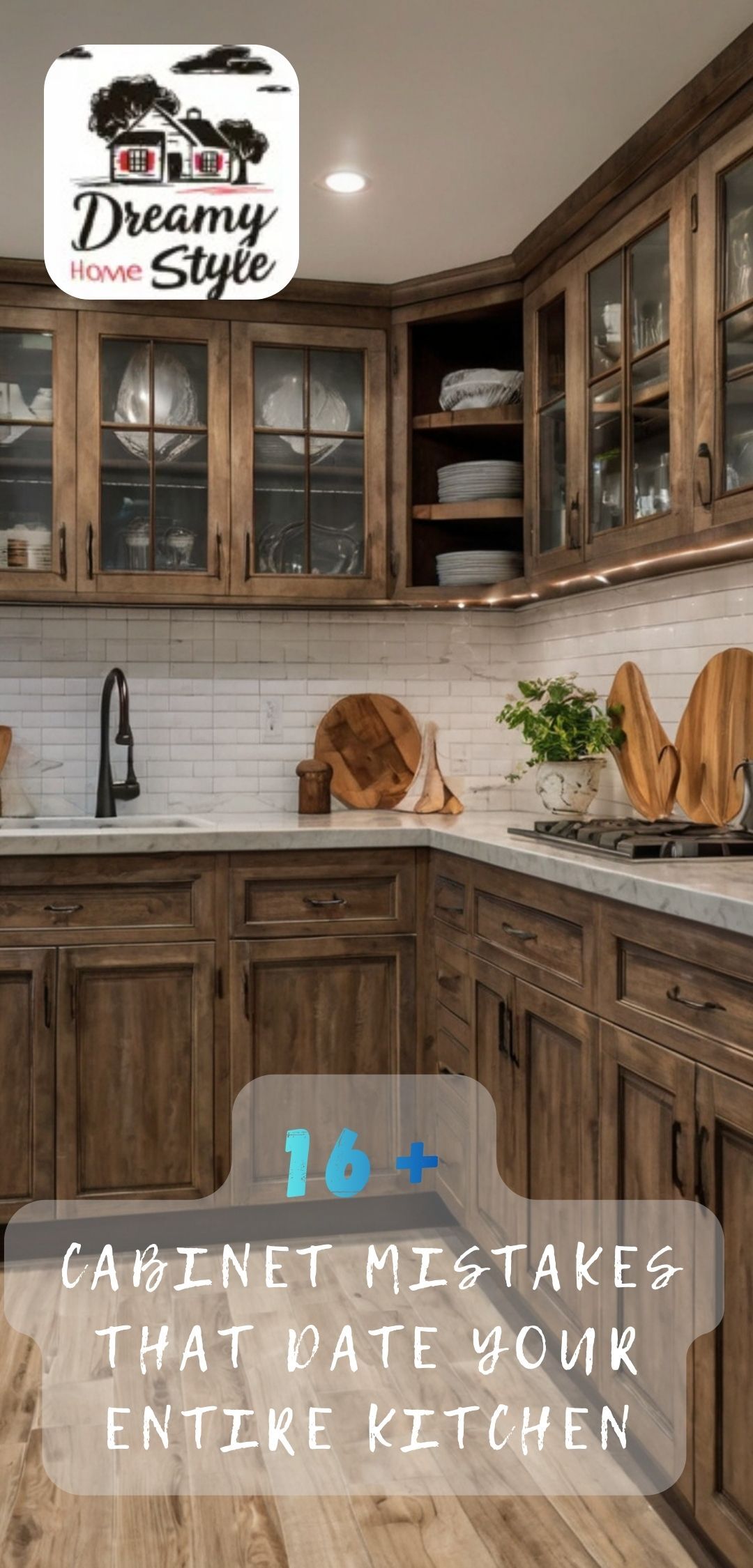
Orange-Toned Wood That Screams a Different Era

If your cabinets have that warm, honey-oak glow, I’m willing to bet they were installed sometime when everyone thought wood tones had to be orange.
I had them too.
And while they’re not inherently bad, they do tend to make a kitchen feel like it hasn’t been touched in twenty years.
The orange undertone clashes with almost every modern color palette, especially the cooler grays and whites we’re drawn to now.
When I started looking at cabinet refreshes, I realized how much that single tone was holding my whole kitchen back.
If you’re not ready to replace them entirely, there are ways to tone down the orange.
A glaze or stain in a cooler, more neutral brown can work wonders.
Or, if you’re feeling bold, paint is your best friend here.
I went with a soft greige on my lowers and kept the uppers a crisp white—it completely transformed the space without gutting everything.
The wood grain still shows through slightly, which I actually love because it keeps some texture and warmth.
But that orange?
Gone.
Tap to Explore These Beauties
See my ideas in action 👇 Tap any image to explore full details.
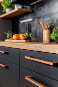
Brass or Gold Hardware from the Wrong Decade

I used to think hardware was just… there.
Like, it served a function, and that was it.
But then I swapped out my old brassy pulls, and wow—it was like the cabinets got a facelift.
Brass hardware from a certain era has this overly shiny, yellowish look that immediately ages a kitchen.
It’s not the warm, soft brass that’s trendy now.
It’s the kind that looks like it came in a builder-grade package deal.
I replaced mine with matte black handles, and the difference was instant.
Suddenly my cabinets looked intentional, modern, sleek.
If black feels too harsh for your space, brushed nickel or even unlacquered brass (the kind that develops a patina) can feel so much more current.
The key is avoiding that high-shine yellow-gold finish.
And here’s a little hack: you don’t have to replace every single pull if budget’s tight.
Start with the most visible ones—around the stove, the island, the spots your eye goes to first.
You can always finish the rest later, but you’ll feel the impact right away.
That Weird Decorative Valance Above the Sink

Okay, can we talk about the cabinet valance?
You know, that little decorative piece of wood that hangs down above the sink, usually with some scalloped edge or carved detail?
I had one, and I never really thought about it until I saw a kitchen without it.
The ceiling line looked so much cleaner, so much taller.
Valances were everywhere for a while, meant to add “character” or “charm.”
But now they just chop up the visual flow and make the whole kitchen feel fussier than it needs to be.
Removing mine was honestly one of the easiest updates I made.
A little patchwork where it was attached, a quick paint touch-up, and boom—gone.
The space above my sink suddenly felt open and airy, like the cabinets could breathe.
If you have one and you’ve been on the fence, I say go for it.
It’s a small change that makes a surprisingly big impact.
And if there’s a weird gap left behind, you can always add open shelving or leave it bare for a more minimalist vibe.
Find Your Room’s Color Palette
Tap a vibe — get a curated 5-color palette with hex codes you can copy ✨
Builder-Grade Cabinet Doors with Zero Personality

Flat, plain slab doors in that cheap laminate finish?
They scream “rental” or “quick flip,” even if you own your place.
I’m all for simplicity, but there’s a difference between sleek minimalism and just… boring.
Builder-grade doors usually lack any detail—no shaker style, no beading, no texture.
They’re just flat rectangles that do the job and nothing more.
When I upgraded to shaker-style doors, my kitchen instantly felt more custom, more expensive.
Shaker doors have that classic recessed panel that adds just enough detail without going overboard.
They work in modern spaces, traditional spaces, everything in between.
If you’re not replacing the whole cabinet box, you can often just swap out the door fronts.
It’s way more affordable than a full remodel, and the transformation is wild.
I paired mine with new hinges (the old ones were weirdly visible and clunky), and the whole look elevated.
Another option?
Adding trim or molding to your existing flat doors to fake that shaker look.
I’ve seen it done beautifully with some wood glue, a miter saw, and a weekend.

💭 I Wrote a Book About My Biggest Decorating Mistakes!
When I decorated my first home, I thought I knew what I was doing. Spoiler: I didn’t. 😅
💸 I bought a sofa way too big for my living room. Paint colors that looked amazing in the store but terrible on my walls.
Cabinets That Stop Short of the Ceiling

The gap between the top of your cabinets and the ceiling is prime real estate for dust, random clutter, and a dated look.
I used to store things up there—you know, the serving platters I never used, old cookbooks, a weird basket I didn’t know what to do with.
But that gap made my kitchen feel shorter, choppier, less polished.
Extending cabinets to the ceiling is one of those changes that makes everything feel more expensive and intentional.
It draws the eye up, makes the room feel taller, and eliminates that awkward dust-collecting void.
When I renovated, I added a simple box extension on top of my existing cabinets.
My contractor built it out with plywood, and we painted it all the same color so it looked seamless.
If you’re handy, this is totally a DIY project.
Or you can add crown molding to bridge the gap, which gives a similar effect without the full build-out.
Either way, you’re creating this clean, continuous line that feels so much more current.
And as a bonus, you gain a ton of extra storage for things you don’t need to access every day.
What’s Your Decor Personality?
5 questions · 30 seconds · Instant style match 🏡
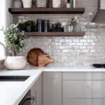
Glass-Front Cabinets with Weird Mullions or Grids

I love a good glass-front cabinet.
They can make a kitchen feel open, showcase pretty dishes, break up a wall of solid doors.
But the ones with those little grids or mullions—the wooden or metal dividers inside the glass—can feel really specific to a certain time period.
Especially if they’re overly ornate or paired with that orange oak we talked about earlier.
I had two glass cabinets flanking my range, and they had these chunky mullions that felt more country cottage than the clean, modern vibe I wanted.
I replaced the doors with simple clear glass panels—no grids, no fuss.
It opened everything up and let my dishware be the star instead of the door design.
If you like the look of mullions, go for it—but opt for sleeker, thinner ones in black or brass.
The thick, chunky wood versions tend to skew older.
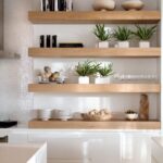
Another option is to remove the glass altogether and go open shelving.
It’s a bigger commitment (you have to keep things tidy), but it’s such a fresh, airy look.
I did that on one side of my kitchen, and I’m obsessed.
Matchy-Matchy Everything (All Uppers, All Lowers, Same Finish)

For the longest time, kitchens were designed with total uniformity—same cabinet color, same style, top to bottom.
And while there’s nothing wrong with cohesion, it can feel a little flat, a little predictable.
I wanted more depth, more visual interest.
So I painted my upper cabinets white and kept my lowers a deep, moody blue-gray.
The contrast is stunning.
It makes the ceiling feel higher, adds dimension, and just feels more modern and intentional.
Two-toned cabinets are everywhere now, and for good reason—they break up the monotony without feeling chaotic.
You can also mix finishes, like pairing painted cabinets with a natural wood island.
Or do open shelving on top with closed cabinets below.
The key is balance.
You don’t want it to feel random or like you ran out of paint halfway through.
But a thoughtful mix?
That’s chef’s kiss.
If you’re nervous about committing, start with just the island or a small section.
You can always expand if you love it.
This or That?
Pick your fave — see what other readers chose! 👀
Bulky Crown Molding That Feels Too Heavy

Crown molding can be beautiful—it adds a finished, custom look to cabinets.
But there’s a fine line between elegant and overwhelming.
I had this super thick, ornate crown molding that felt like it belonged in a different kind of house.
It was heavy, dark, and made my cabinets feel squatter than they actually were.
When I scaled down to a simpler, thinner profile, everything felt lighter and more balanced.
The cabinets didn’t look unfinished, but they also didn’t look like they were trying too hard.
💭 Ever wondered what your room would actually look like rearranged?
I built a free tool that lets you drag furniture around a 2D floor plan. No signup, no catch.
See the Room Planner →If your crown molding is chunky and carved with lots of detail, it might be aging your space.
Consider swapping it for something sleeker, or even skipping it altogether for a more modern, minimal look.
I’ve seen kitchens with just a simple cap on top of the cabinets, no molding at all, and they look so clean and current.
It really depends on your overall style.
But if your molding feels like it’s wearing a ballgown to a casual dinner, it might be time to simplify.
Open Shelving Done Wrong (Cluttered or Awkwardly Placed)

I’m a huge fan of open shelving when it’s done right.
But I’ve also seen it done very, very wrong.
Like, shelves crammed with mismatched mugs, plastic kid cups, and random kitchen gadgets.
Or shelves placed in spots that make no sense, like way up high where you can’t reach anything or blocking a window.
Open shelving should feel curated, intentional, and functional.
When I added open shelves to my kitchen, I made sure they were at a height I could actually use.
I styled them with dishes I love and use often—white plates, a few pretty bowls, some glasses.
Everything else stayed behind closed doors.
The result feels airy and personal without looking like a cluttered mess.
If your open shelves are making your kitchen feel dated, it might be the styling, not the shelves themselves.
Pare down to a few cohesive pieces.
Use matching or complementary colors.
Add a plant or a small cutting board for warmth.
And if the shelves are in a weird spot or just not working, don’t be afraid to take them down and patch the wall.
Not every trend works in every kitchen, and that’s okay.
Quick Design Dilemma
Cast your vote — see what other readers think! 🤔
Visible Hinges That Scream DIY Upgrade Gone Wrong

I never thought about cabinet hinges until I noticed how obvious mine were.
Those big, exposed hinges on the outside of the door?
They’re functional, sure, but they’re also a dead giveaway of a certain era or a budget build.
European hidden hinges (the kind that tuck inside the cabinet) give such a cleaner, more seamless look.
When I upgraded to hidden hinges, my cabinet doors closed smoother, looked sleeker, and just felt more high-end.
It’s one of those details most people won’t consciously notice, but it all adds up to the overall impression.
If you’re replacing doors or doing any kind of cabinet refresh, I’d 100% recommend making the switch.
The installation is a little more involved than surface-mount hinges, but there are tons of tutorials online, and it’s not as scary as it seems.
I did mine over a weekend with a drill and a template.
And if you’re not ready to DIY it, a handyman can knock it out pretty quickly.
The cost is low, and the impact on the overall look is surprisingly big.
💭 I Wrote a Book About My Biggest Decorating Mistakes!
When I decorated my first home, I thought I knew what I was doing. Spoiler: I didn’t. 😅
💸 I bought a sofa way too big for my living room. Paint colors that looked amazing in the store but terrible on my walls.