
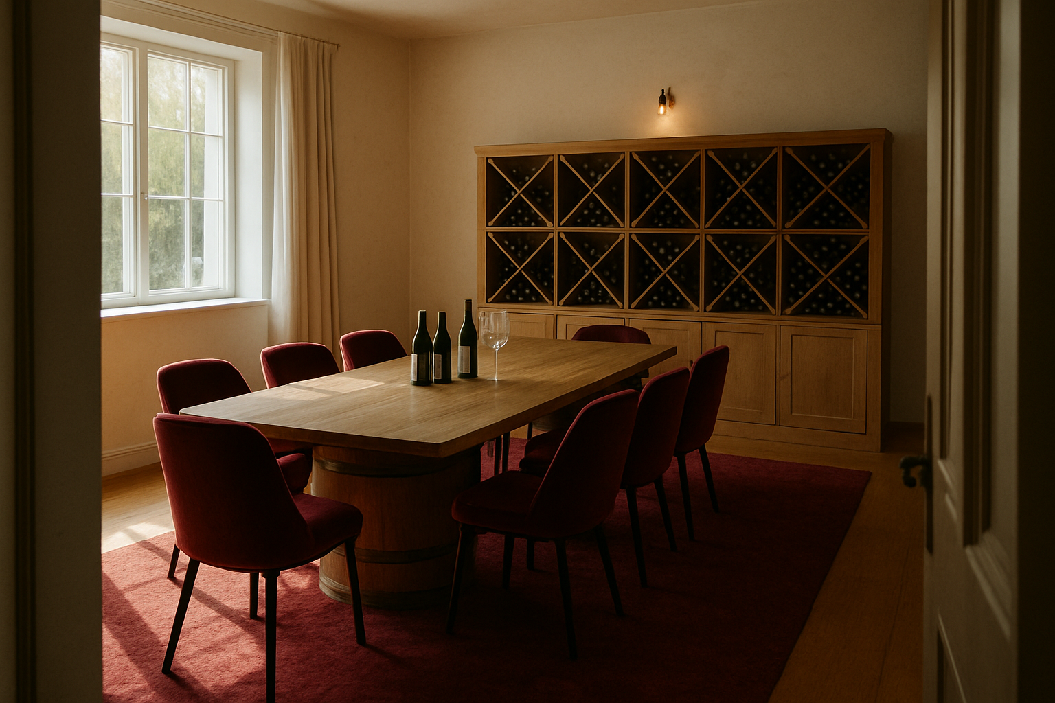

If you’re trying to fit both a wine collection and an actual dinner party into one room, this is for you.
I’ll walk through how to split the space into a cool storage zone and a warm seating zone, keep the pouring path clear, and light each part the way it actually needs to be lit.
By the end you’ll have a free floor plan you can adjust to your own room.
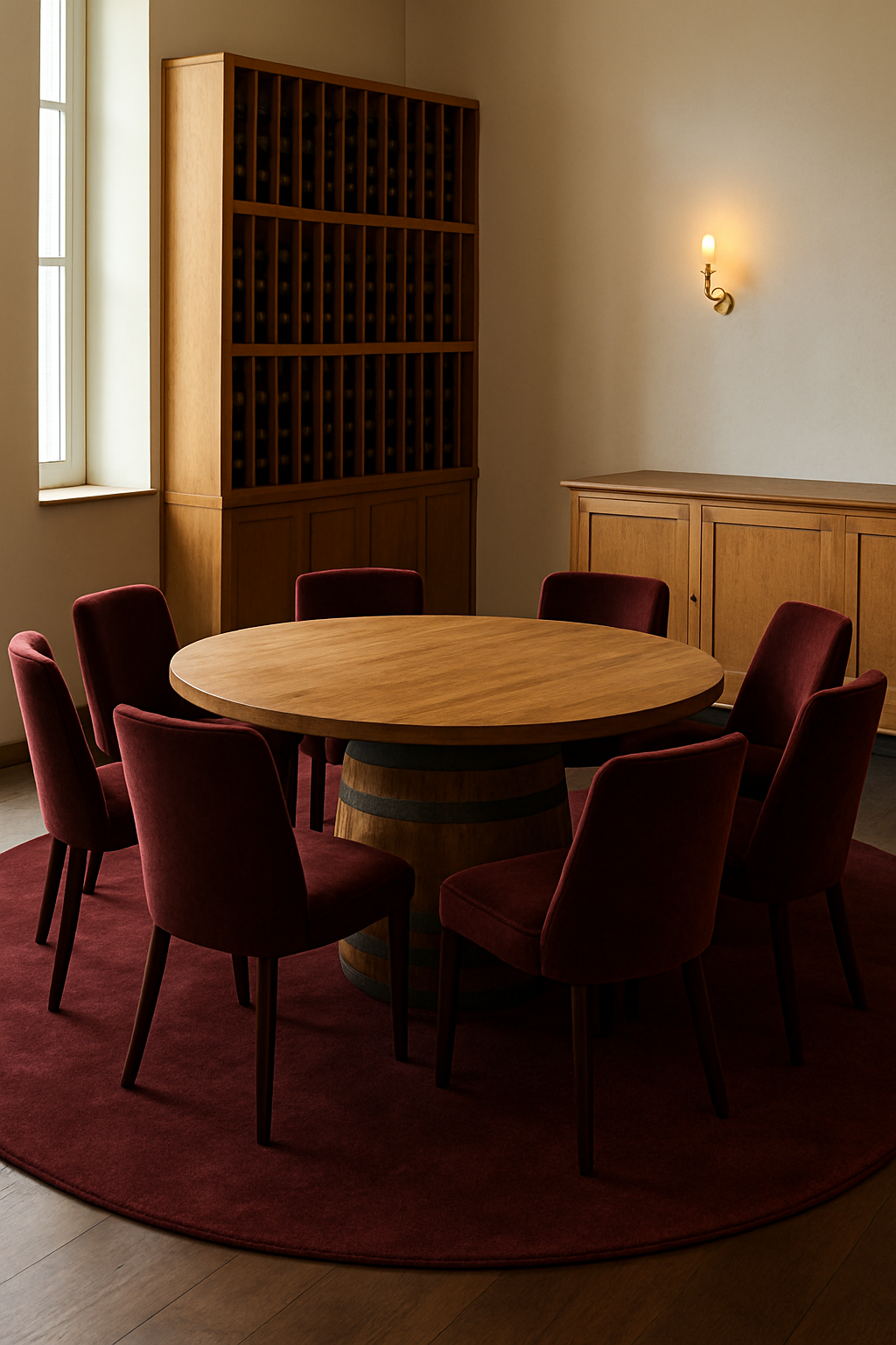
Free floor plan: Open this wine tasting room layout in the free room planner — furnished, to scale, and yours to move around →
Two Climates, One Floor Plan
Bottles want it cold and dark, kept dead still.
People want it warm and bright, buzzing loud.
You can’t compromise your way out of that.
You have to zone it.
Here’s where most tasting rooms go sideways.
Somebody draws one rectangle, calls it “the wine room,” and then tries to make a single lighting plan, a single temperature and a single traffic pattern serve both the bottles and the guests standing around them.
It doesn’t work.
I’ve never once seen it work.
A rack needs a storage target of about 55°F (13°C), steady, boring, unchanging.
Your guests, meanwhile, want a room that feels alive when eight people are laughing around a table with glasses clinking.
So stop designing “a wine room.” Start designing two rooms that happen to share a floor.
One is a little vault.
The other is a dining room that happens to have a really good view of the vault.
They don’t want the same temperature, the same light, or the same foot traffic.
Pretending they do is the root mistake underneath almost every awkward tasting room I’ve seen photos of.
Cool and Dark, Kept Still
The rack doesn’t go where it looks good.
It goes on whichever wall never gets direct sun, full stop.
Even if that’s the wall you’d rather put the window on.
Even if it means your prettiest sightline now belongs to a blank stretch of drywall instead of the racking.
I know that’s annoying to accept, but it’s worth it.
Do it anyway.
Bottles store best around 55°F (13°C) with roughly 50–70% relative humidity, kept away from sunlight and vibration.
That’s not a decorating preference, it’s chemistry: heat and light break down wine over time, and vibration disturbs sediment in anything you’re aging.
So the very first decision in laying out this room isn’t “where’s the table.” It’s “which wall stays dark and cool all day, every season, no exceptions.” Walk the room at 3pm in July if you can.
Whatever wall is still shaded then, that’s your rack wall.
Not the wall with the nice sightline from the hallway.
Not the wall that would make the room symmetrical.
The dark one.
Sun and Vibration Break the Rules First
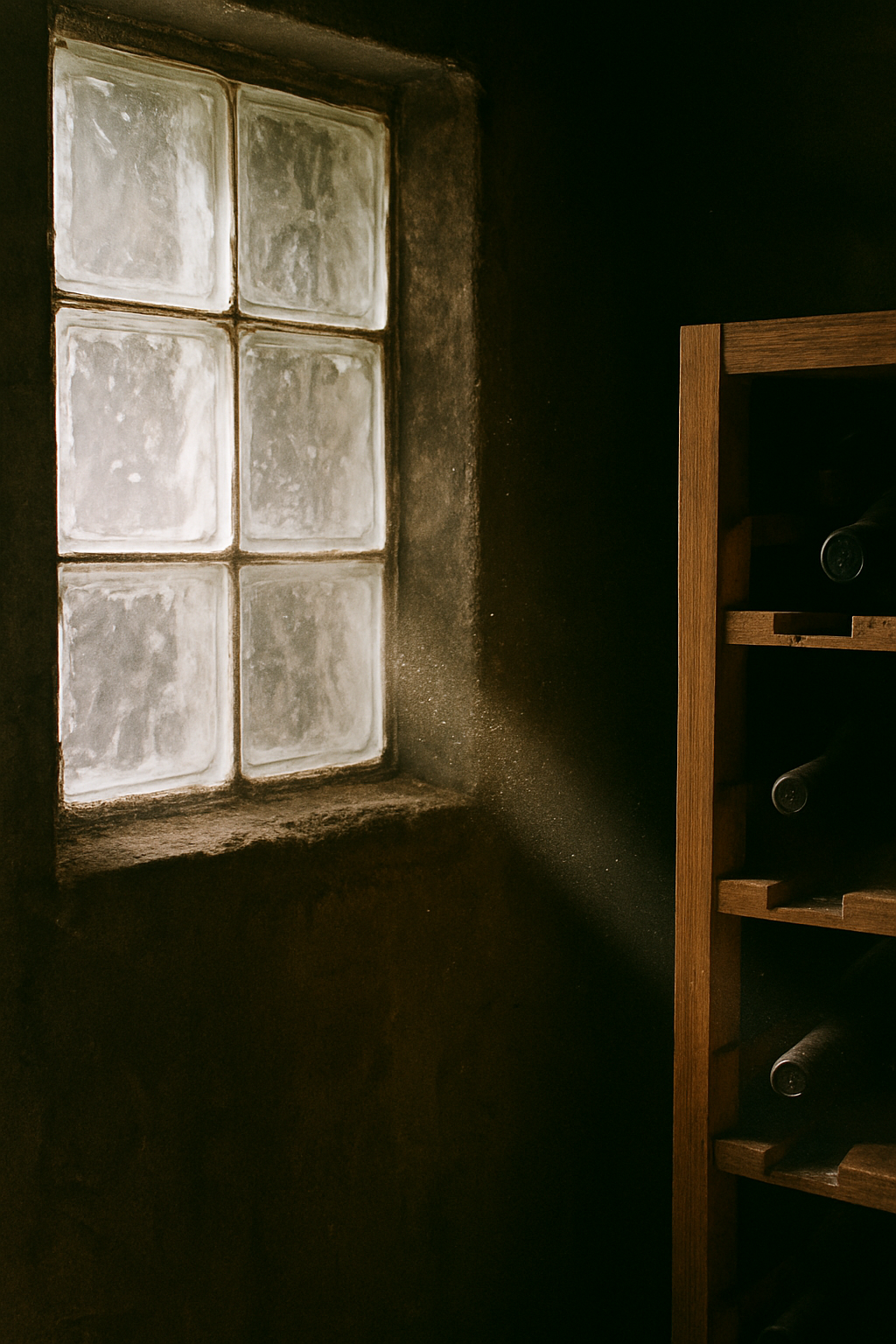
A cellar window is a genuinely nice detail — glass block, iron mullions, whatever your style is, I get the appeal.
But if it lands on the same wall as the rack, or lets afternoon light rake sideways across the bottles for even an hour a day, it’s not a design feature anymore.
It’s the thing quietly cooking your wine while you’re proud of how charming it looks.
Same goes for the cellar door.
Every time it swings, it’s a little gust of room-temperature (or worse, sun-warmed) air hitting a space that’s supposed to stay steady.
Put both the window and the door on walls that don’t face the rack directly.
And think about what’s on the other side of that rack wall too — a laundry room with a washer thumping away, a hallway with heavy foot traffic, a mechanical closet.
All of that is vibration you don’t want traveling into stored sediment.
I’ve seen people add a window purely for charm without ever checking which direction it faces relative to the rack, and that’s backwards.
Charm is the reward for getting the physics right first, not a substitute for it.
Read next: Chandelier size and hanging height
Rack, Credenza, Table: The Pouring Path
If pouring wine means walking behind someone’s chair every single time, your layout failed before you bought a single bottle.
Honestly, this is the part almost nobody thinks about until they’re standing there with an open bottle and nowhere to go.
The path a bottle travels should be fixed and boring: rack to credenza, credenza to table, table to glass.
Straight line.
Uncrossed.
That means the credenza — your working surface for opening and staging — can’t sit on the same wall as the dining table.
Anyone serving would have to squeeze past seated chairs just to reach it.
And once someone must edge past behind a seated diner, that gap needs to be at least 36 in; for someone actually walking past with a tray, 44 in.
That’s serving clearance, not the tight squeeze you’d tolerate walking past your own couch.
If your floor plan only works when people turn sideways, it’s not a pouring path.
It’s an obstacle course with good lighting.
Eight Chairs Change the Clearance Math
A table for eight isn’t a style choice, it’s a math problem.
I say this because I’ve watched people size a table purely to “fill the room” and then wonder why nobody can push their chair back without hitting the credenza.
Start with about 24 in of table edge per place setting.
That’s the standard for actually being able to eat without elbowing your neighbor.
Eight people, 24 inches each, and you’re looking at a table somewhere between 6 and 8 feet long, depending on whether anyone sits at the ends.
Then comes the part people skip: the clearance behind every seated chair.
You need 32 in minimum for a diner to just push back and stand.
Bump that to 36 in if anyone needs to edge past a seated guest occasionally.
Go up to 44 in if that’s a regular serving path, like the one running from your credenza.
That’s real wall-to-chair distance, measured from the table edge outward, not just open floor space floating somewhere in front of the hutch.
Size the table to the room’s square footage and you’ll get a room that looks fine on paper.
It’ll feel cramped the first time all eight chairs are actually pulled out and occupied.
And budget for the possibility that the table that fits this math has to be built to size.
Serving Lives at the Credenza, Not the Table
The table is for sitting and tasting, period.
The moment you start opening bottles or decanting on it — glasses lined up in a row — you’ve quietly turned your dining surface into a bar.
And meanwhile the credenza you designed specifically for that job just sits there empty, doing nothing, for no reason.
This isn’t just a tidiness thing.
Bottles that just came off the rack at 55°F (13°C) and 50–70% relative humidity shouldn’t linger on a table surrounded by body heat, ambient light and conversation.
Give them only as long as it takes to pour.
Stage everything at the credenza: open it there, let it breathe there if it needs to, decant there.
Only bring the glass itself to the table.
It also just plain works better logistically.
A crowded table with wine bottles, an ice bucket and eight place settings fighting for space is nobody’s idea of a relaxed tasting.
Keep the working mess at the credenza and let the table stay a place people actually want to sit.
Light That Doesn’t Cook the Racks
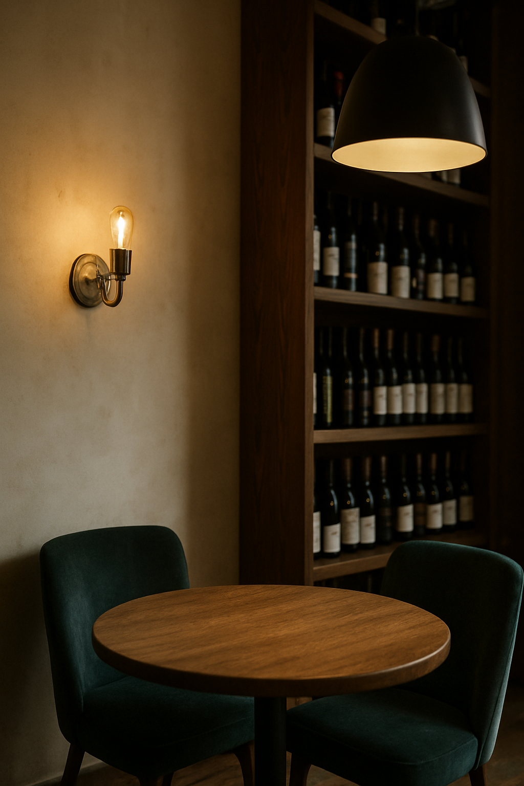
Overhead light belongs over the table, not over the rack.
This is where I get a little opinionated — I think overhead lighting is basically a crime, and a wine cellar isn’t about to change my mind.
I know a brass sconce mounted near the bottles looks gorgeous in photos.
Moody, warm, very “wine cellar” in the Pinterest sense.
But a sconce a foot or two from the bottles puts light, and a little warmth, right where you’re trying to keep things dark and cool.
Even dimmed, it’s working against the rack.
Keep every heat-producing fixture over the seating zone, full stop.
Let the storage wall stay lit by something passive: reflected ambient light from the room, or nothing at all beyond what you need to read a label.
Over the table itself, a chandelier is the classic move and it works, but size it right.
The bottom of the fixture should hang about 30–36 in above the tabletop.
And the chandelier’s overall diameter should run roughly 12 in less than the table’s width, so it doesn’t loom over the edges or clip anyone’s sightline across the table.
Get that sizing wrong and you either bonk someone’s head standing up, or end up with a fixture that looks like it’s floating off in its own corner of the ceiling.
Free floor plan: Try it on your own measurements: open the wine tasting room plan and drag the walls to your room →
Open the Free Plan and Move Things Around
This is a sit-down room, not a display case.
That’s the whole philosophy behind Dreamy’s free room planner template.
It’s built on this exact split-zone logic — rack wall on one side, seating zone on the other, fixed pouring path connecting them.
The plan holds eight velvet chairs around a barrel-wood table on a burgundy velvet rug, an oak wine rack, a bar credenza, a brass chandelier and a brass sconce, with a cellar window and a cellar door.
A tasting room nobody actually sits in is just an expensive hallway with good storage.
So when you fit it to your room: the rack goes on your cool wall, clear of the window and the door; the credenza stays off the table’s wall; the chandelier hangs over the table at the proportions I just walked through; and the sconce lives in the seating zone, nowhere near the rack.
None of it is locked in.
Swap the barrel-wood table for something narrower if your room’s tighter.
Resize the rug, delete a couple chairs if six is your real number, move the credenza to whichever wall actually clears your specific doorway.
Treat this as a starting layout, not a finished one.
The value isn’t in the exact pieces.
It’s in the zoning logic underneath them, which doesn’t change no matter what your room’s actual dimensions turn out to be.

