So you walk into your kitchen every morning, and instead of feeling blah about your space, you get that warm, cozy feeling that makes you want to linger over your coffee a little longer.
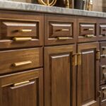
Your espresso cabinets are gorgeous, but something feels off.
Maybe it’s that kitchen table sitting in the middle of everything, not quite fitting in with the rest of your beautiful dark cabinetry.
Too light, and your table might look out of place.
Too dark, and your whole kitchen could feel like a cave.
These rich, dark brown cabinets can work with everything from bright whites to warm woods to bold statement colors.
Ready to discover?
Let’s go:
Classic White: The Timeless Choice That Never Fails


White kitchen tables create the perfect contrast against espresso cabinets, making your space feel bright and welcoming.
This classic combination works because white reflects light, which helps balance out the darkness of your cabinets.
When you choose a white table, you’re creating a focal point that draws the eye and makes your kitchen feel more spacious.
The beauty of white lies in its ability to work with any style – whether your kitchen is modern, farmhouse, or traditional.
A crisp white farmhouse table adds rustic charm to your espresso cabinet kitchen.
Meanwhile, a sleek white modern table creates a contemporary look that feels fresh and clean.
White also gives you incredible flexibility when it comes to decorating.
You can change your placemats, centerpieces, and chair cushions with the seasons without worrying about clashing colors.
The neutral backdrop of white lets you experiment with pops of color through accessories.
Consider different white finishes to add interest to your space.
A glossy white table reflects more light and feels more formal, while a matte white finish creates a softer, more casual vibe.
Distressed white adds character and works especially well if you want that lived-in, farmhouse feel.
Remember that white tables do require more maintenance since they show dirt and stains more easily.
But the stunning visual impact they create with espresso cabinets makes the extra cleaning worth it.
Tap to Explore These Beauties
See my ideas in action 👇 Tap any image to explore full details.
Natural Wood: Bringing Warmth and Character to Your Space
Natural wood tables create a beautiful, layered look when paired with espresso cabinets.
The key is choosing the right wood tone that complements rather than competes with your dark cabinetry.
Light woods like maple, birch, or pine create a lovely contrast that feels warm and inviting.
These lighter wood tones help brighten your kitchen while still maintaining that cozy, natural feeling.
Medium-toned woods like cherry or walnut add richness without making your space feel too dark.
The natural grain patterns in wood bring texture and visual interest to your kitchen design.
Wood tables also age beautifully, developing character over time that adds to their charm.
When choosing a natural wood table, consider the undertones in both your cabinets and the wood.
Espresso cabinets often have subtle red or chocolate undertones that can guide your wood selection.
A honey-colored oak table might bring out warm undertones in your cabinets.
Meanwhile, a cooler-toned ash table can create a more modern, sophisticated look.
The finish on your wood table matters too.
A matte finish feels more casual and contemporary, while a glossy finish adds formality and reflects more light.
Natural wood tables are practical choices because they hide scratches and wear better than painted surfaces.
They’re perfect for busy families who need a table that can handle daily use while still looking beautiful with those stunning espresso cabinets.

Creamy Beige: The Perfect Neutral Bridge
Creamy beige tables offer the perfect middle ground between the boldness of white and the richness of natural wood.
This warm neutral creates a sophisticated look that feels both elegant and approachable.
Beige works beautifully with espresso cabinets because it contains subtle brown undertones that echo the warmth in your cabinetry.
The result is a harmonious color scheme that feels intentional and well-designed.
Different shades of beige can create completely different moods in your kitchen.
A light, almost off-white beige feels fresh and airy, similar to white but with more warmth.
Deeper beige tones create a cozy, enveloping feeling that’s perfect for kitchens where you love to gather and linger.
Beige tables are incredibly versatile when it comes to styling and decorating.
They work with both warm and cool accent colors, giving you flexibility in your décor choices.
Soft blues, sage greens, and lavenders all look beautiful against beige and espresso combinations.
Warmer accent colors like coral, yellow, and burgundy also complement this neutral pairing perfectly.
Consider textured beige finishes to add visual interest to your table.
A weathered beige finish adds character and works well in farmhouse or cottage-style kitchens.
Smooth, painted beige feels more contemporary and sophisticated.
The forgiving nature of beige makes it an excellent choice for families since it doesn’t show every little mark or stain like pure white does.
Light Gray: Modern Sophistication at Its Best
Light gray kitchen tables bring contemporary elegance to kitchens with espresso cabinets.
This sophisticated color choice creates a modern look that feels both timeless and on-trend.
Gray works exceptionally well with espresso because it’s neutral enough not to compete, yet distinctive enough to create visual interest.
The cool undertones in gray provide a beautiful contrast to the warm undertones typically found in espresso cabinetry.
Light gray tables come in many different shades, from soft dove gray to warmer greige tones.
Cooler grays create a crisp, clean look that feels very contemporary and minimalist.
Warmer grays with beige undertones (often called greige) feel softer and more approachable.
The beauty of gray lies in its ability to work with virtually any accent color.
Bright colors like yellow, teal, or coral pop beautifully against gray and espresso combinations.

💭 I Wrote a Book About My Biggest Decorating Mistakes!
When I decorated my first home, I thought I knew what I was doing. Spoiler: I didn't. 😅
💸 I bought a sofa way too big for my living room. Paint colors that looked amazing in the store but terrible on my walls.
Softer colors like blush pink, sage green, or cream create a more subtle, sophisticated palette.
Gray tables also photograph beautifully, which is perfect if you love sharing your kitchen on social media.
Consider different gray finishes to match your kitchen’s style.
A matte gray finish feels modern and casual, perfect for everyday family dining.
A glossy gray finish adds formality and reflects light, helping to brighten your kitchen space.
Distressed gray finishes work well in farmhouse or shabby chic kitchens, adding character and charm to your espresso cabinet space.
Find Your Room's Color Palette
Tap a vibe — get a curated 5-color palette with hex codes you can copy ✨
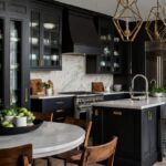
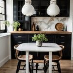
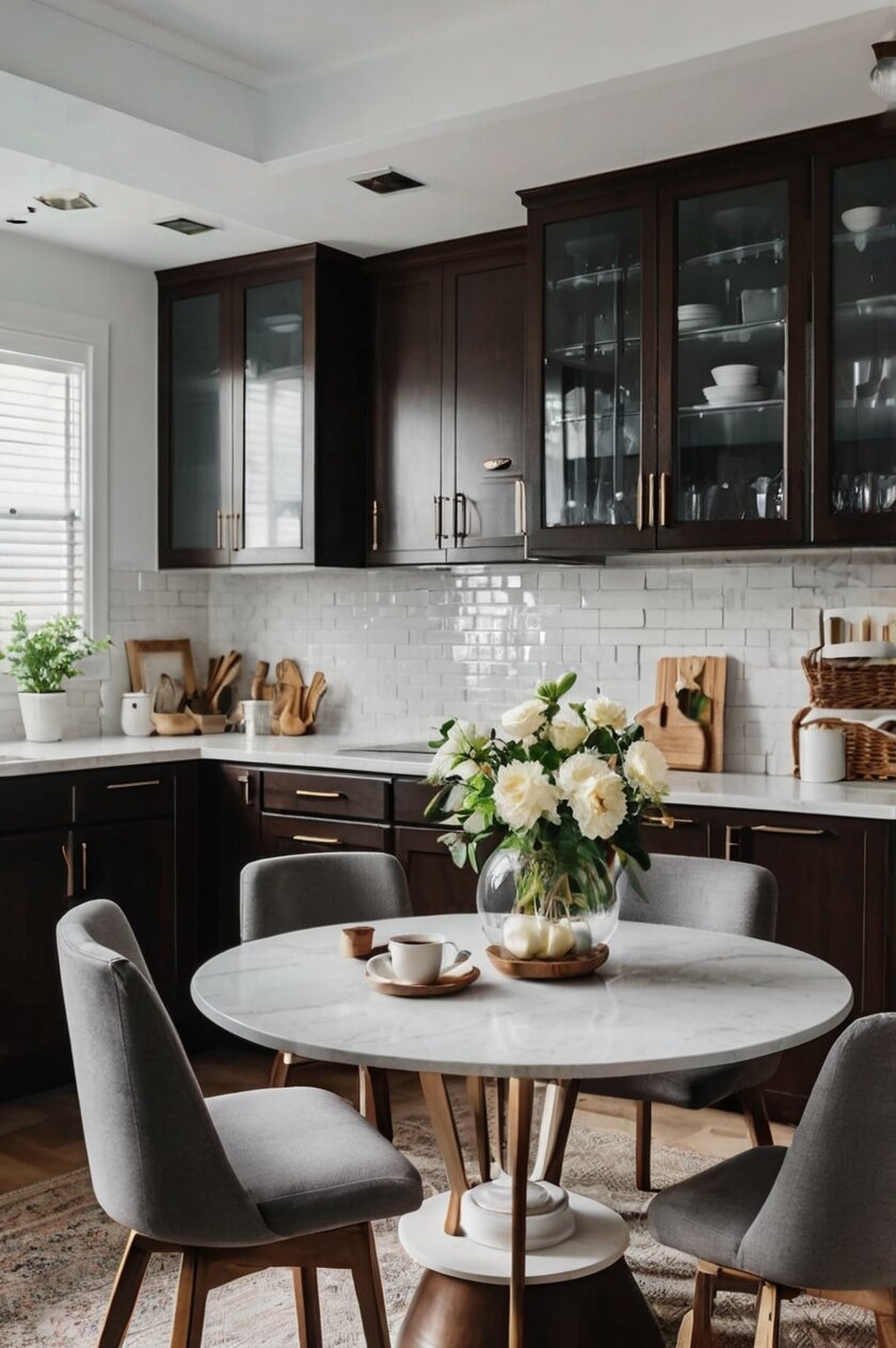
Rich Black: Bold Drama That Commands Attention
Black kitchen tables create stunning, dramatic contrast against espresso cabinets while maintaining a cohesive dark color scheme.
This bold choice works particularly well in larger kitchens where the dark tones won’t overwhelm the space.
Black tables make a strong design statement that says you’re confident in your decorating choices.
The key to making black work with espresso is ensuring there’s enough light in your kitchen through windows, lighting, or lighter wall colors.
Different black finishes create completely different looks in your space.
A glossy black table reflects light and feels more formal and sophisticated.
Matte black feels more contemporary and casual, perfect for modern kitchen designs.
Distressed black adds rustic charm and works beautifully in farmhouse or industrial-style kitchens.
Black tables are incredibly practical because they hide stains, scratches, and everyday wear better than lighter colors.
This makes them perfect for busy families who need a table that looks good with minimal maintenance.
When styling a black table with espresso cabinets, focus on adding lighter elements through accessories.
Bright white dishes, colorful placemats, or fresh flowers help prevent the space from feeling too dark.
Metallic accents like gold, silver, or copper add glamour and reflect light around your kitchen.
Consider the shape of your black table carefully – round tables feel softer and more inviting, while rectangular tables create clean, modern lines that complement contemporary espresso cabinet designs.
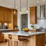
Warm Honey Oak: Embracing Natural Beauty
Honey oak tables bring golden warmth to kitchens with espresso cabinets, creating a cozy, inviting atmosphere.
This classic wood tone has made a major comeback in recent years as people embrace natural materials and warm color palettes.
The golden undertones in honey oak create a beautiful contrast against the deep brown of espresso cabinets.
This combination feels both traditional and fresh, perfect for kitchens that blend classic and contemporary elements.
Honey oak works particularly well in kitchens with good natural light, where the golden tones can really shine.
The warm color helps make your kitchen feel sunny and welcoming, even on cloudy days.
When choosing a honey oak table, pay attention to the grain pattern and finish.
Tables with prominent grain patterns add visual texture and character to your space.
Smoother grain patterns feel more refined and work well in formal dining areas.
The finish on your honey oak table affects both its appearance and durability.
A natural finish lets the wood’s beauty shine through and ages gracefully over time.
Stained finishes can enhance the golden tones or add slightly different undertones to complement your espresso cabinets.
Honey oak tables pair beautifully with warm accent colors like deep reds, burnt oranges, and golden yellows.
They also work well with cooler colors like sage green or soft blue for a more balanced color palette.
What's Your Decor Personality?
5 questions · 30 seconds · Instant style match 🏡
Soft Sage Green: Bringing Nature Indoors
Sage green kitchen tables add a fresh, natural element to kitchens with espresso cabinets.
This soft, muted green creates a calming atmosphere that feels both sophisticated and welcoming.
Green works beautifully with brown tones because it’s a complementary color that occurs naturally in nature.
Think of sage green as the color of eucalyptus leaves or weathered garden furniture – it has that perfect balance of color and neutrality.
Sage green tables help bring the outdoors in, creating a connection to nature that makes your kitchen feel fresh and alive.
This color choice works particularly well if you have plants in your kitchen or views of greenery outside your windows.
The muted tone of sage green means it won’t overwhelm your space or compete with your beautiful espresso cabinets.
Instead, it provides a gentle pop of color that adds interest without being too bold.
Different shades of sage green can create different moods in your kitchen.
Lighter sage feels airy and fresh, perfect for smaller kitchens or spaces with limited natural light.
Deeper sage tones feel more sophisticated and work well in larger, more formal kitchen spaces.
Sage green pairs beautifully with other natural colors like cream, warm white, and natural wood tones.
It also works well with metallic accents, particularly brass and copper, which add warmth to the cool green tones.
Consider how much green you want in your space – a sage green table might be perfect on its own, or you might want to echo the color in other accessories throughout your kitchen.
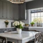
Charcoal Gray: Sophisticated Depth and Dimension
Charcoal gray tables create sophisticated, layered look when paired with espresso cabinets.
This deeper gray tone adds depth to your kitchen design while maintaining the elegant, monochromatic feel that many homeowners love.
Charcoal works particularly well with espresso because both colors share similar depth and richness.
The result is a kitchen that feels intentionally designed and pulled together.
The beauty of charcoal gray lies in its versatility – it’s dark enough to feel dramatic but not as stark as black.
This makes it perfect for homeowners who want something bold but not overwhelming.
Charcoal gray tables work beautifully in both modern and traditional kitchen designs.
In modern kitchens, charcoal creates clean, sophisticated lines that feel very contemporary.
In traditional kitchens, charcoal adds depth and richness that feels both classic and current.
Different finishes can completely change the look of your charcoal table.
A matte finish feels modern and understated, perfect for minimalist kitchen designs.
A slightly weathered finish adds character and works well in transitional or farmhouse-style kitchens.
When styling a charcoal table with espresso cabinets, focus on adding lighter elements to prevent the space from feeling too dark.
Cream-colored dishes, bright white serving pieces, or colorful fresh flowers help balance the darker tones.
Metallic accents in gold, brass, or copper add warmth and prevent the color scheme from feeling too cool.
Antique White: Vintage Charm with Modern Appeal
Antique white tables bring vintage charm to kitchens with espresso cabinets while still feeling fresh and current.
This slightly aged white has more character than pure white, with subtle undertones that add warmth and depth.
Antique white works beautifully with espresso cabinets because it provides contrast without being too stark or bright.
The slightly aged quality of antique white creates a perfect bridge between old and new, making it ideal for kitchens that blend vintage and contemporary elements.
Different antique white finishes can create completely different looks in your space.
A slightly yellowed antique white feels warm and cozy, perfect for farmhouse or cottage-style kitchens.
Antique white with gray undertones feels more sophisticated and works well in transitional kitchen designs.
The beauty of antique white is that it looks intentionally aged rather than simply dirty or worn.
This makes it perfect for busy families who want a table that can handle daily use while still looking beautiful.
Antique white tables pair wonderfully with vintage-inspired accessories like mason jar centerpieces, vintage linens, or antique serving pieces.
They also work well with more modern accessories, creating an eclectic mix that feels collected over time.
Consider distressing techniques if you’re painting a table antique white yourself.
Light sanding on edges and corners can create authentic-looking wear that adds to the vintage charm.
The key is to make the distressing look natural rather than forced or overdone.
This or That?
Pick your fave — see what other readers chose! 👀
Deep Navy Blue: Unexpected Elegance
Navy blue kitchen tables create an unexpectedly elegant pairing with espresso cabinets.
This rich, deep blue adds sophisticated color to your kitchen without being too bright or overwhelming.
Navy works beautifully with brown tones because blue and brown are natural companions – think of ocean and sand, or sky and earth.
The deep tone of navy ensures it doesn’t compete with your espresso cabinets but rather complements them.
Navy blue tables work particularly well in kitchens with white walls or backsplashes, where the blue can really pop against the neutral backdrop.
This color choice is perfect for homeowners who want to add color to their kitchen but prefer sophisticated, muted tones over bright, bold colors.
Different shades of navy can create different moods in your space.
💭 I Wrote a Book About My Biggest Decorating Mistakes!
When I decorated my first home, I thought I knew what I was doing. Spoiler: I didn't. 😅
💸 I bought a sofa way too big for my living room. Paint colors that looked amazing in the store but terrible on my walls.
A true navy feels classic and timeless, perfect for traditional or nautical-inspired kitchen designs.
Navy with slight gray undertones feels more contemporary and works well in modern kitchen spaces.
Navy tables pair beautifully with white dishes and serving pieces, creating a classic color combination that never goes out of style.
They also work well with brass or gold accents, which add warmth to the cool blue tones.
Consider how much blue you want in your kitchen space – a navy table might be perfect as a single statement piece, or you might want to echo the color in window treatments, dish towels, or other accessories.
The key is finding the right balance so the navy feels intentional rather than random.
Warm Taupe: Sophisticated Neutral Elegance
Taupe kitchen tables offer sophisticated neutral elegance that pairs beautifully with espresso cabinets.
This complex neutral combines elements of brown, gray, and beige to create a color that’s both warm and cool.
Taupe works exceptionally well with espresso because it shares some of the same brown undertones while being significantly lighter.
The result is a harmonious color scheme that feels both sophisticated and approachable.
Different taupe tones can create completely different looks in your kitchen space.
Warmer taupes with more brown undertones feel cozy and traditional, perfect for kitchens with classic styling.
Cooler taupes with gray undertones feel more contemporary and work well in modern kitchen designs.
The beauty of taupe lies in its incredible versatility when it comes to decorating and styling.
This neutral works with virtually any accent color, from bright jewel tones to soft pastels.
Taupe tables are perfect for homeowners who like to change their décor seasonally because the neutral base works with any color palette.
Consider different taupe finishes to match your kitchen’s style and your lifestyle needs.
A smooth, painted taupe finish feels refined and works well in formal dining areas.
A slightly textured taupe finish adds visual interest and works well in casual, family-friendly kitchens.
Taupe tables photograph beautifully and always look pulled together, making them perfect for homeowners who love entertaining or sharing their kitchen spaces on social media.
Quick Design Dilemma
Cast your vote — see what other readers think! 🤔
Soft Cream: Warm Neutrality at Its Finest
Cream-colored kitchen tables bring warm neutrality to kitchens with espresso cabinets, creating a soft, inviting atmosphere.
This warm white has yellow or beige undertones that make it feel cozier and more welcoming than stark white.
Cream works beautifully with espresso cabinets because it provides light contrast while maintaining warmth in the color palette.
The result is a kitchen that feels both bright and cozy – perfect for families who spend lots of time cooking and eating together.
Different cream tones can create different moods in your kitchen space.
Lighter creams feel fresh and airy, perfect for smaller kitchens or spaces with limited natural light.
Deeper, richer creams feel more substantial and work well in larger, more formal kitchen spaces.
Cream tables are incredibly forgiving when it comes to everyday wear and tear.
They don’t show every little mark like pure white does, but they’re still light enough to brighten your space.
This makes cream perfect for busy families who need a table that looks good with minimal maintenance.
Cream pairs beautifully with other warm neutrals like beige, taupe, and soft gray.
It also works well with warm accent colors like soft coral, sage green, or dusty blue.
The key is choosing colors that complement the warm undertones in both the cream and the espresso.
Consider textured cream finishes to add visual interest to your table – a slightly weathered cream finish adds character and works well in farmhouse or cottage-style kitchens.
Weathered Gray: Casual Elegance with Character
Weathered gray kitchen tables bring casual elegance and character to kitchens with espresso cabinets.
This finish combines the sophistication of gray with the charm of aged, weathered wood.
Weathered gray works beautifully with espresso cabinets because it adds texture and visual interest without competing for attention.
The slightly aged appearance of weathered gray creates a perfect balance between polished and relaxed, making it ideal for kitchens that need to be both beautiful and family-friendly.
Different weathered gray techniques can create completely different looks in your space.
Light weathering that just touches the surface feels subtle and sophisticated, perfect for transitional kitchen designs.
Heavier weathering with more visible wear marks feels more rustic and works well in farmhouse or cottage-style kitchens.
The beauty of weathered gray is that it looks authentically aged rather than artificially distressed.
This makes it perfect for homeowners who want character in their furniture without the maintenance that comes with antique pieces.
Weathered gray tables pair wonderfully with other weathered or vintage-inspired accessories.
Think galvanized metal centerpieces, vintage mason jars, or aged wooden serving pieces.
They also work well with more modern accessories, creating an eclectic mix that feels collected over time rather than bought all at once.
Consider the scale of weathering you want in your space – subtle weathering might be perfect for a sophisticated kitchen, while more dramatic weathering works well in casual, family-centered spaces.