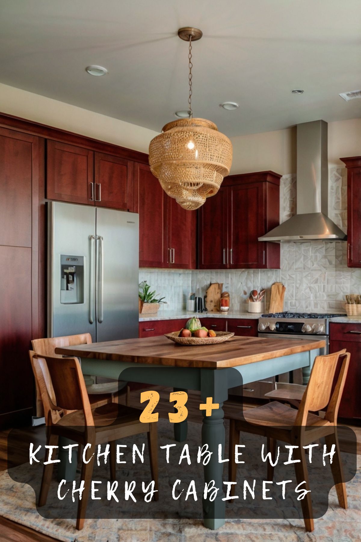
I remember the first time I walked into my kitchen after we installed cherry cabinets.
It was like stepping into a whole new world—warm, rich, and inviting.
But then I looked at my old, beat-up kitchen table, and it just didn’t fit anymore.
The cabinets were stunning, but the table seemed totally out of place.
I knew I had to figure out the perfect color for it, and honestly, I spent way too many hours obsessing over paint swatches and Pinterest boards.
Now that I’ve been through this little kitchen design journey, I want to save you the hassle and share some ideas for kitchen table colors that work beautifully with cherry cabinets:

Classic White

If you’re looking to brighten up the space and let your cherry cabinets remain the star of the show, white is a timeless choice.
A white kitchen table offers a clean, fresh look that balances the deep, rich tones of cherry wood.
It creates a stunning contrast, making both the table and the cabinets stand out in their own way.
Plus, white is incredibly versatile and works with just about any decor style, whether you’re into modern minimalism or farmhouse chic.

To pull this off, you’ll want to choose a shade of white that complements the undertones of your cherry cabinets.
If your cabinets lean more toward a reddish hue, go for a crisp, cool white to balance the warmth.
But if they have a darker, more brownish tone, a creamy or off-white shade might feel more harmonious.
Another bonus of a white table is how easy it is to accessorize.

Add a colorful centerpiece or some patterned placemats, and you’ve got a table that can change with the seasons or your mood.
And don’t forget about durability—if you’ve got kids or you’re prone to spills, consider a semi-gloss or satin finish for easy cleaning.
White tables can sometimes show wear and tear over time, but a quick touch-up with paint will keep it looking brand new.
This choice is perfect if you want a table that feels fresh and inviting without stealing attention from your gorgeous cabinets.
Slate Gray

Gray is one of those colors that feels effortlessly modern yet cozy, and slate gray in particular pairs beautifully with cherry cabinets.
It’s a sophisticated choice that adds depth without overpowering the natural warmth of the wood.
What makes slate gray so appealing is its versatility.

It works equally well in sleek, contemporary kitchens as it does in more traditional or rustic settings.
When picking the right shade, go for a medium to dark tone of gray.
A lighter gray might not have enough contrast to really pop against the cabinets, while a darker slate gives just the right amount of drama.
The cool undertones of slate gray create a pleasant contrast to the warm reds and browns in cherry wood, giving your kitchen a balanced, harmonious feel.
To make your slate gray table stand out, pair it with some metallic accents.

Think brushed nickel or matte black hardware, or even a simple vase with silver detailing.
These touches will amplify the modern vibe and tie the whole look together.
Another thing to love about a slate gray table is its practicality.
It’s fantastic at hiding minor scratches or imperfections, which is a big win if your table sees a lot of daily use.
If you’re using fabric chairs, consider upholstery in a complementary gray tone or a lighter neutral like beige to soften the overall look.
This color choice is ideal if you want a table that feels chic and sophisticated while still blending smoothly with your cherry cabinets.
Warm Beige

If you’re aiming for a cozy, inviting vibe in your kitchen, beige is a fantastic option for your table.
It’s warm and neutral, which makes it an excellent match for the rich tones of cherry cabinets.
Beige has that unique ability to make a space feel grounded and homey without being boring.
To make sure the beige doesn’t look too flat, consider choosing a shade with subtle undertones.

For example, a beige with a hint of caramel or taupe can add depth and dimension to the table.
These tones will pick up on the natural warmth of the cherry cabinets, creating a cohesive, welcoming space.
A matte or satin finish works best for this look, as it keeps the table feeling soft and approachable.
Decorating a beige table is a breeze.
You can add pops of color with a vibrant table runner or keep it simple with earthy, natural elements like a wooden bowl or ceramic vase.
If your kitchen leans toward a farmhouse or rustic style, beige is especially fitting.

Pair it with some wooden chairs or a bench for seating to complete the look.
Beige is also a forgiving color when it comes to wear and tear.
It doesn’t show scratches or stains as much as lighter shades like white, making it a practical choice for busy kitchens.
This is the perfect color if you want a table that blends seamlessly with your cabinets while still adding its own warm charm to the room.
Deep Navy Blue

For a bold and dramatic look, Deep Navy Blue is a stunning choice for your kitchen table.
It’s a color that exudes sophistication and brings a modern touch to a space dominated by cherry cabinets.
Navy blue creates a striking contrast with the warm, reddish tones of the wood, instantly elevating the overall aesthetic.
This color works especially well if your kitchen has plenty of natural light.

The natural light helps keep the navy from feeling too heavy or overpowering, allowing it to shine as a statement piece.
To make the navy blue pop even more, pair it with gold or brass accents.
Think gold-trimmed placemats or a brass vase as a centerpiece.
These metallic touches will enhance the luxe vibe and give your kitchen a high-end feel.

If you’re worried about the navy blue feeling too intense, consider using it as an accent rather than the main color.
For example, you could paint just the table legs navy blue while keeping the tabletop a lighter, more neutral shade.
This creates a two-tone effect that’s both stylish and unique.
Navy blue is also a surprisingly practical choice.
It hides stains and scratches well, making it a great option if your table sees a lot of action.
This color is perfect if you want your table to make a bold statement while complementing the richness of your cherry cabinets.
Olive Green

Olive green is a fantastic option if you’re looking to add a touch of nature-inspired charm to your kitchen.
This earthy tone pairs beautifully with cherry cabinets, creating a warm, organic vibe that instantly feels cozy and inviting.
The muted quality of olive green keeps it from competing with the richness of the cherry wood, while still adding a bit of personality to the space.
What makes olive green such a unique choice is that it bridges the gap between bold and neutral.

It’s not as dramatic as navy blue or as subtle as beige—it hits that perfect middle ground.
When choosing the right shade, aim for a soft, muted olive rather than anything too bright or vibrant.
The muted tone will harmonize better with the deep reds and browns in your cherry cabinets.
If you’re worried about it feeling too dark, pair the table with lighter chairs or cushions in a neutral fabric like cream or light gray.
Olive green also works well with natural textures.
Consider adding a woven placemat, a rustic wooden bowl, or even potted herbs as a centerpiece to emphasize the earthy theme.

For a modern twist, you could incorporate black or matte gold hardware on the table or surrounding kitchen decor.
Another great thing about olive green is how versatile it is with seasonal decorations.
In the fall, it pairs beautifully with pumpkins and warm-toned table runners.
In the spring, you can freshen it up with white flowers or pastel accessories.
If your kitchen has plants or greenery, an olive green table ties everything together effortlessly.
This is the perfect color if you want to bring a little bit of the outdoors inside, while still keeping things elegant and timeless.
Rich Espresso

If you want a kitchen table that feels luxurious and sophisticated, you can’t go wrong with a rich espresso color.
This deep, dark brown creates a seamless look when paired with cherry cabinets, giving your kitchen a cohesive and polished feel.
The beauty of espresso lies in its ability to complement the warmth of cherry wood without being too matchy-matchy.
It’s a tone that enhances the natural richness of the cabinets while adding its own depth to the space.
When choosing an espresso shade, go for one that leans toward a true dark brown rather than anything with reddish undertones.
This will create enough contrast to make the table stand out while still blending harmoniously with the cabinets.
For added visual interest, consider a table with a glossy or semi-gloss finish.

The slight shine will reflect light and give the table a high-end look.
To keep your kitchen from feeling too dark, balance the espresso table with lighter-colored chairs or cushions.
Neutral tones like beige, cream, or even a soft gray work beautifully here.
You can also add metallic touches—think a gold or silver centerpiece—to brighten up the overall look.
Espresso is a particularly great choice if you’re aiming for a more formal or traditional kitchen aesthetic.
Pair it with elegant decor, like a vase of fresh flowers or a sleek runner, to elevate the space even further.
One of the best things about espresso is how easy it is to maintain.
It hides scratches, stains, and everyday wear and tear like a pro, making it ideal for busy households.
This color is perfect if you want a table that feels rich, elegant, and timeless, while still being practical for daily life.
Soft Pastel Blue

For a light and airy feel, soft pastel blue is a stunning option for your kitchen table.
This delicate color brings a sense of calm and freshness to the room, offering a lovely contrast to the bold, warm tones of cherry cabinets.
Pastel blue is perfect if you want to create a kitchen space that feels relaxed and inviting.
The beauty of pastel blue lies in its subtlety.
It’s not overpowering, but it still adds a pop of color that can brighten up the entire room.
When choosing the shade, look for something with cool undertones.
This will help balance out the natural warmth of the cherry cabinets, creating a harmonious blend of colors.
A matte or eggshell finish works best for a pastel blue table, as it keeps the look soft and understated.
To tie the table into the rest of your kitchen decor, consider adding blue accents throughout the space.

For example, you could hang light blue curtains, use blue dishware, or even add a few blue throw pillows to nearby seating.
If you want to keep things more neutral, pair the table with white or beige chairs for a classic look.
Decorating a pastel blue table is a lot of fun because the color works well with so many styles.
You can go coastal with nautical-themed accessories or keep it minimal with simple, clean lines.
To keep the table practical, make sure to use a finish that’s easy to clean, especially if you have kids or entertain often.
This color is perfect if you want to add a touch of whimsy and lightness to your kitchen without overwhelming the space.
Bright Yellow


If you’re looking to inject some energy and cheer into your kitchen, a bright yellow table is a bold and playful choice.
Yellow is a color that instantly lifts the mood of any space, and when paired with cherry cabinets, it creates a sunny, inviting atmosphere.
The warm tones of yellow complement the reddish hues of cherry wood beautifully, making the two feel like they were made for each other.
When choosing the right shade, go for a true, vibrant yellow rather than anything too muted or pastel.
The boldness of the color will make the table a standout piece in your kitchen.

To balance out the brightness, pair the table with neutral-colored chairs or cushions in shades like white, beige, or light gray.
This will keep the overall look from feeling too overwhelming.
Another great way to tone down a yellow table is by incorporating natural elements.
For example, add a simple wooden bowl, a vase of fresh flowers, or even a woven placemat to ground the space.
Bright yellow is particularly fun if you love a retro or eclectic style.
Pair it with colorful dishware, funky patterns, or even a vintage light fixture to complete the look.
One thing to keep in mind is that bright yellow can show wear and tear more easily than darker colors.
Make sure to use a gloss or semi-gloss finish for durability and easy cleaning.
This color is perfect if you want to create a kitchen that feels lively, cheerful, and full of personality.
Soft Mint Green

If you’re craving something fresh, light, and invigorating, soft mint green is a fabulous choice for your kitchen table.
This delicate color brings a subtle pop of personality to your space while perfectly complementing the warm, rich tones of cherry cabinets.
Mint green feels clean and modern but still has a timeless quality that works well in both traditional and contemporary kitchens.
The beauty of mint green lies in its versatility.
It works wonderfully if you’re aiming for a vintage vibe, but it can also feel crisp and chic in a more modern setting.

When choosing the right shade, go for a soft, pastel mint instead of anything too bold or bright.
The gentler tone will blend beautifully with your cherry cabinets without overpowering the space.
Pairing your mint green table with white or beige chairs creates a fresh, airy look that feels cohesive.
If you want to add a little more flair, consider incorporating patterned cushions or chair covers in complementary tones.
For decor, mint green pairs wonderfully with natural elements.
Think small potted plants, a vase filled with white flowers, or even wooden serving trays to tie everything together.
To add a bit of fun, you can also mix in metallic accents like a silver or rose gold centerpiece.
Mint green is incredibly versatile when it comes to seasonal decor as well.

In the spring and summer, it feels light and breezy, while in the winter, you can warm it up with cozy table runners or candles.
One practical tip: consider using a semi-gloss finish to make the table easier to clean while keeping the soft, understated quality of the color.
If you’re looking for a table color that feels fresh, inviting, and effortlessly stylish, soft mint green might just be the perfect choice for your kitchen.
Charcoal Black

For a bold, dramatic look that exudes elegance, a charcoal black table is a stunning choice to pair with cherry cabinets.
This deep, moody color creates a striking contrast with the warm tones of cherry wood, instantly elevating the sophistication of your kitchen.
Charcoal black is a fantastic option if you want your table to make a statement without overwhelming the space.
The key to pulling off this look is balance.

A matte or satin finish works best for a charcoal black table, giving it a modern, sleek appearance while preventing it from feeling too harsh.
If you’re worried about the table making the room feel too dark, pair it with lighter chairs or cushions in shades like cream, beige, or light gray.
You can also bring in metallic elements, such as gold or brushed nickel candlesticks, to brighten up the overall look.
One of the best things about a charcoal black table is its versatility.
It works beautifully in both modern and traditional kitchens, depending on how you style it.
In a contemporary setting, pair it with minimalist decor and clean lines for a sleek, edgy vibe.

In a more traditional kitchen, add soft textures like a woven table runner or upholstered chairs to soften the look.
Charcoal black also excels in practicality.
It hides stains, scratches, and everyday wear exceptionally well, making it a great choice for families or anyone who uses their table frequently.
If you’re aiming for a kitchen that feels bold, polished, and undeniably chic, a charcoal black table will fit the bill perfectly.
Blush Pink

For a soft, unexpected twist, consider a blush pink table to pair with your cherry cabinets.
This delicate, feminine hue adds a touch of whimsy and elegance, creating a kitchen space that feels unique and inviting.
While blush pink might not be the most obvious choice, it works beautifully as a subtle contrast to the deep, rich tones of cherry wood.
The trick to making blush pink work is choosing the right shade.
Opt for a muted, dusty pink rather than anything too bright or bubblegum-like.
This will help the table maintain an understated, sophisticated look that complements the warmth of the cabinets.
Pair the blush pink table with neutral chairs in shades like white, beige, or light gray to keep the overall palette balanced.
If you want to add a bit more flair, consider incorporating floral-patterned chair cushions or a soft, pastel-colored table runner.

Blush pink is also a great choice if you love accessorizing.
Gold accents, such as a gilded vase or candlesticks, pair beautifully with this color and enhance its elegance.
You can also mix in other soft pastels, like mint green or lavender, for a playful, cohesive look.
One of the great things about blush pink is how versatile it is with different kitchen styles.
It can feel romantic and vintage in a traditional setting, or fresh and trendy in a modern one.
For practicality, make sure to use a finish that’s easy to clean, especially if your table gets a lot of use.
If you’re looking for a color that feels fresh, unique, and full of charm, blush pink might be the perfect fit for your kitchen table.
Rustic Barn Red

If you want to embrace the warm, cozy vibe of your cherry cabinets, rustic barn red is an excellent choice for your kitchen table.
This rich, earthy color ties in beautifully with the reddish tones of cherry wood, creating a harmonious, inviting look.
Barn red brings a touch of rustic charm to your kitchen, making it perfect for farmhouse or country-inspired spaces.
When choosing the right shade, go for a deep, muted red rather than anything too bright or primary-colored.
The muted tone will complement the natural warmth of the cabinets without feeling overpowering.
A matte or distressed finish works particularly well for this look, adding an extra layer of texture and character to the table.
Pair your barn red table with natural wood or neutral-colored chairs to keep the overall look grounded and cohesive.
For decor, consider incorporating elements like burlap table runners, mason jar centerpieces, or even a small arrangement of dried flowers.
These rustic touches will enhance the table’s charm and tie the whole space together.
Barn red also pairs wonderfully with seasonal decor.
In the fall, add pumpkins and warm-toned accents for a cozy vibe.
In the winter, bring in evergreen garlands or plaid patterns to make the space feel festive.
This color is perfect if you want your kitchen table to feel warm, welcoming, and full of character while staying true to the richness of your cherry cabinets.
Light Cream

For a timeless, elegant look that never goes out of style, light cream is a fantastic color for your kitchen table.
This soft, neutral shade creates a bright, airy feel that beautifully balances the rich tones of cherry cabinets.
Light cream is a classic choice that works well in any kitchen style, from traditional to modern.

The key to making light cream work is choosing a shade with just the right amount of warmth.
A slightly off-white or creamy tone will complement the warmth of the cherry wood without feeling too stark or cold.
A satin or semi-gloss finish works best for this look, giving the table a subtle sheen that feels polished and refined.
Pair your light cream table with chairs in coordinating neutral tones, or go for a bolder contrast with dark wood or black seating.
For decor, light cream provides the perfect blank canvas.
You can easily switch up your table accessories to match the seasons or your mood.

For example, add colorful placemats for a playful touch in the summer, or opt for metallic accents for a more sophisticated look year-round.
Light cream is also incredibly practical.
It’s easy to clean and maintain, especially if you choose a durable finish, making it a great option for busy households.
If you’re looking for a table color that feels bright, elegant, and effortlessly timeless, light cream is a choice you can’t go wrong with.


