he kitchen table you choose acts as a focal point that can either complement or contrast with these striking black cabinets.
Your choice of table color affects not just the look but also the feel of your entire kitchen.
The right table can warm up the space, brighten dark corners, or add that perfect finishing touch to your kitchen design.
Some of my favorite colors will create a harmonious, cohesive look while others will provide eye-catching contrast:

Classic White Tables


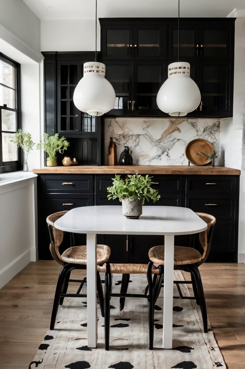
White kitchen tables create a timeless contrast against black cabinets that never goes out of style.
This high-contrast combination instantly brightens your kitchen space, making it feel more open and airy.
White tables reflect light throughout the room, which is especially helpful if your black cabinets make the space feel darker.
You can choose from many different white finishes depending on your style preferences.
A glossy white table brings a modern, clean aesthetic that feels fresh and contemporary.
Matte white offers a softer look that still provides contrast without being too stark or harsh.
Distressed or chalk-painted white tables add farmhouse charm for a more casual, lived-in feeling.
The beauty of white is its versatility with other elements in your kitchen.
White tables work perfectly with any accent colors you might have in your kitchen decor.
They allow colorful dishes, placemats, or centerpieces to really stand out against the neutral background.
If you’re worried about keeping a white table clean, consider materials like quartz, laminate, or certain hardwoods with protective finishes.
Modern white tables often come with stain-resistant treatments that make maintenance much easier than in the past.
For families with young children, look for white tables with textured surfaces that help hide fingerprints and small marks.
The shape of your white table can also impact the overall feel of your kitchen with black cabinets.
Round white tables soften the angular lines often found in kitchens with black cabinetry.
Rectangular white tables maximize seating space and reinforce the clean lines of modern black cabinets.
A white pedestal table creates an elegant focal point that complements more traditional black cabinet styles.
To add visual interest, consider white tables with black accents or details that tie into your cabinetry.
White tables with black legs create a coordinated look that connects the table to your black cabinets.
The white and black combination is also extremely flexible if you decide to update other elements of your kitchen in the future.
Tap to Explore These Beauties
See my ideas in action 👇 Tap any image to explore full details.
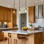
Natural Wood Tones
Natural wood tones bring warmth and organic texture to kitchens with black cabinets.
This combination balances the coolness of black with the inviting quality of natural materials.
Wood tables create a timeless look that works with nearly any kitchen style, from modern to traditional.
You can choose from a wide spectrum of wood tones depending on the effect you want to create.
Light maple or ash woods brighten the space and create a striking contrast against dark cabinets.
Medium woods like oak or cherry provide a balanced middle ground that feels grounded yet warm.
Dark walnut or mahogany creates a sophisticated, coordinated look when paired with black cabinetry.
The grain pattern in natural wood adds visual interest that breaks up the solid blocks of color from black cabinets.
Live-edge wood tables introduce an element of rustic charm that softens the sleek appearance of black cabinets.
Reclaimed wood tables tell a story and add character to modern kitchens with their unique marks and patina.
The beauty of wood is that it ages gracefully, developing more character over time unlike many manufactured materials.
Wood tables are also highly practical, standing up well to daily use in busy kitchen environments.
💭 Ever wondered what your room would actually look like rearranged?
I built a free tool that lets you drag furniture around a 2D floor plan. No signup, no catch.
See the Room Planner →If your black cabinets have a matte finish, consider a wood table with some gloss to add dimension to the space.
For high-gloss black cabinets, a matte-finished wood table provides pleasant textural contrast.
Wood tables pair beautifully with black metal accents often found in kitchens with black cabinetry.
You can easily refresh a wood table with different chairs or bench seating as your style preferences change.
Natural wood tones also help make black kitchens feel more approachable and less formal.
If your kitchen has black cabinets with white countertops, a wood table bridges these contrasting elements perfectly.
Wood tones complement almost any accent color you might have in your kitchen décor or accessories.
Consider wood tables with black inlays or details for a custom look that ties directly to your cabinetry.
Tables made from multiple wood tones can add interesting dimension to your black kitchen design.
The timeless appeal of wood means your investment will remain stylish even as other kitchen trends come and go.
Clear Glass Tables
Clear glass tables create a light, airy feeling in kitchens with heavy black cabinets.
This transparent option helps your kitchen feel more spacious by reducing visual weight in the room.
Glass tables reflect light throughout the space, brightening dark corners and illuminating the entire kitchen.
The sleek surface of glass complements the modern aesthetic often associated with black cabinetry.
Unlike solid tables, glass doesn’t visually compete with your dramatic black cabinets for attention.
Glass tables allow you to showcase beautiful flooring underneath, adding another dimension to your design.
You can choose from various glass thicknesses depending on your preference for sturdiness and style.
Thicker glass tables (½ inch or more) provide substantial durability while maintaining a floating appearance.
Tempered glass options offer essential safety features for busy household kitchens.
Frosted or etched glass tables add subtle texture while still maintaining the light-enhancing properties.
The edges of glass tables can be customized with different finishes from smooth to beveled for added interest.
Round glass tables soften the angular lines typically found in kitchens with black cabinetry.
Rectangular glass tables maximize seating while maintaining an unobtrusive profile in the space.
Glass tables with black metal frames create a cohesive connection to your black cabinets.
Chrome or stainless steel frames offer pleasing contrast while tying into kitchen appliances and hardware.
Glass is exceptionally easy to clean with standard glass cleaners, making maintenance simple.
These tables show fewer water spots and fingerprints than you might expect, especially with regular cleaning.
For families concerned about durability, look for tables with tempered glass that resists scratching and breaking.
Glass dining tables make an excellent choice for smaller kitchens where visual space is at a premium.
The reflective quality of glass adds dimension and depth to your kitchen’s overall appearance.
Glass tables work well with virtually any chair style, from modern acrylic to traditional wood.
For a dramatic look, pair a glass table with black chairs to echo your cabinet color.
Glass tables also age well stylistically, looking current even as other elements of your kitchen evolve.
With proper care, glass tables maintain their pristine appearance for many years without fading or discoloring.
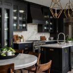
Bold Black Tables
Black-on-black kitchen designs create a striking, monochromatic statement that exudes sophistication.
Pairing black tables with black cabinets creates a cohesive, designer-inspired look that feels intentional.
This approach works especially well in spaces with good natural light or ample artificial lighting.
Black tables come in various materials that each bring different qualities to your kitchen design.
Black wood tables add warmth and natural texture while maintaining the coordinated color scheme.
Black marble or stone tables introduce subtle pattern and luxurious appeal to your kitchen.
Matte black metal tables create an industrial-chic vibe that complements modern black cabinetry.
High-gloss black tables reflect light and add dimension to your monochromatic kitchen design.
The key to making this look work is creating subtle contrast through different finishes and textures.
If your cabinets have a glossy finish, consider a matte black table to provide textural interest.
For matte black cabinets, a table with some sheen helps break up the sameness of the color palette.
Black tables with interesting details like carved legs or unique bases become focal points in the space.
You can add dimension to an all-black kitchen through carefully selected tableware and accessories.

Find Your Room’s Color Palette
Tap a vibe — get a curated 5-color palette with hex codes you can copy ✨
💭 I Wrote a Book About My Biggest Decorating Mistakes!
When I decorated my first home, I thought I knew what I was doing. Spoiler: I didn’t. 😅
💸 I bought a sofa way too big for my living room. Paint colors that looked amazing in the store but terrible on my walls.
White place settings pop dramatically against a black table, creating striking contrast for meals.
Colorful centerpieces or table runners stand out beautifully against the neutral black background.
Black tables hide marks and stains better than lighter colors, making them practical for busy families.
The sleek appearance of black tables creates a sophisticated, upscale feeling in any kitchen space.
This color choice works particularly well in contemporary, modern, and minimalist kitchen designs.
The black-on-black approach allows architectural details and cabinetry design to take center stage.
In open concept homes, a black table creates visual continuity between the kitchen and adjacent spaces.
For maximum impact, consider black tables with interesting shapes or unexpected proportions.
Round black tables soften the typically angular lines found in kitchens with black cabinetry.
This bold choice communicates confidence in your design decisions and creates a memorable space.
Black tables with glass inserts or elements provide visual relief within the monochromatic scheme.
This dramatic choice is particularly striking in kitchens with contrasting white walls or countertops.
Metallic Silver or Chrome
Metallic silver tables bring a contemporary edge to kitchens featuring black cabinets.
This sleek combination creates a modern, urban look that feels both sophisticated and current.
Silver or chrome surfaces reflect light throughout your kitchen, brightening the space significantly.
The cool tones of metallic tables complement the crispness of black cabinetry perfectly.
These tables often feature clean lines and minimal ornamentation, enhancing a streamlined aesthetic.
Stainless steel tables offer exceptional durability while coordinating with modern appliances.
Brushed nickel or aluminum provides a softer metallic finish that’s less prone to showing fingerprints.
Chrome tables with high-polish finishes make a bold statement and create dramatic reflections.
Silver tables with black accents create a cohesive connection to your black cabinets.
Glass-topped tables with silver frames offer a lighter appearance while maintaining the metallic element.
Metallic tables work especially well in contemporary, industrial, or minimalist kitchen designs.
The contrast between black cabinets and silver tables creates visual interest without requiring additional colors.
This pairing feels inherently upscale, lending a luxury apartment or high-end restaurant atmosphere.
For smaller kitchens, reflective metallic surfaces help the space feel larger and more open.
Silver tables coordinate beautifully with stainless steel appliances often found in modern kitchens.
The cool tones of silver balance the depth and richness of black cabinetry.
Metallic tables maintain their appearance over time without fading or discoloring.
Most metal tables are exceptionally easy to clean, requiring just a simple wipe-down with appropriate cleaners.
For added visual interest, look for metallic tables with textured surfaces or geometric patterns.
Silver tables with unique leg designs become sculptural elements that enhance your kitchen’s style.
This combination works particularly well with concrete or stone countertops for an industrial-chic vibe.
Metal tables provide stability and durability that’s ideal for households with heavy daily use.
The sleek surfaces of metallic tables create an appealingly smooth contrast to textured black cabinets.
Silver tables with adjustable heights offer flexibility for different uses throughout the day.
This modern pairing creates a perfect backdrop for colorful dishes or vibrant food presentations.
Marble or Stone Tables
Marble or stone tables add natural elegance to kitchens with black cabinets.
This luxurious pairing elevates your kitchen with timeless materials that exude quality.
The natural patterns and veining in marble create visual interest against solid black cabinetry.
White marble tables offer dramatic contrast that brightens your kitchen dramatically.
Cream or beige stone tables provide a softer contrast while still lightening the space.
Gray marble creates a sophisticated, monochromatic scheme that feels cohesive and intentional.
Black marble with white veining connects beautifully to your cabinets while adding texture.
Green marble (like Verde Alpi) introduces a subtle color that pairs surprisingly well with black.
Each stone table is unique, with natural variations that make your kitchen one-of-a-kind.
Modern technology has made stone tables more affordable through engineered stone options.
Quartz composite tables offer the look of natural stone with improved durability and stain resistance.
Concrete tables provide a contemporary stone-like option with industrial appeal.
Stone tables anchor the kitchen with substantial weight both visually and physically.
The cool touch of stone creates an interesting sensory experience in your kitchen space.
Round stone tables soften the angular lines typically found in kitchens with black cabinetry.
Stone tables with black bases create a cohesive connection to your cabinet color scheme.
These tables maintain their beauty for decades, often becoming family heirlooms.
Most stone tables are heat-resistant, making them practical for serving hot dishes directly from the oven.
With proper sealing, marble and stone tables resist staining and damage from everyday use.
The natural imperfections in stone add character that manufactured materials cannot replicate.
Stone tables work well in virtually any design style from traditional to ultra-modern.
For smaller spaces, consider stone-topped tables with visually lighter bases to reduce visual weight.
The texture of honed (matte) stone provides pleasing contrast to smooth, glossy black cabinets.
Polished stone reflects light and adds brightness to kitchens with dark cabinetry.
Since both stone and black are neutrals, this combination pairs easily with any accent colors you choose.
What’s Your Decor Personality?
5 questions · 30 seconds · Instant style match 🏡
Colorful Accent Tables
Bold colored tables create exciting focal points in kitchens with black cabinets.
This approach injects personality and energy into spaces that might otherwise feel too serious.
Red tables make a dramatic statement that instantly draws attention in black kitchens.
Blue tables in various shades create a range of moods from calming navy to energetic cobalt.
Green tables introduce a natural element that feels fresh and vibrant against black cabinetry.
Yellow tables brighten the entire space, creating a cheerful contrast to serious black cabinets.
Orange or coral tables add warmth and unexpected whimsy to contemporary black kitchens.
Purple tables in eggplant or lavender tones add sophisticated color that complements black beautifully.
Turquoise or teal tables create a jewel-toned focal point that enlivens the entire kitchen.
Colorful tables allow you to express your personality in an otherwise neutral kitchen scheme.
This approach works especially well if your black cabinets have simple, clean lines.
Painted wood tables offer affordability and flexibility, as you can repaint them if your preferences change.
Enameled metal tables provide durability with vibrant color that resists chipping and fading.
Colored glass tables combine brightness with a light visual footprint that works well in smaller spaces.
For a more subtle approach, consider tables with colored bases and neutral tops.
Alternatively, neutral tables with colored chairs create a similar effect with more flexibility.
The psychological impact of color can transform how you feel in your kitchen space.
Warm colors like red, orange, and yellow create an energetic, sociable atmosphere.
Cool colors like blue, green, and purple promote relaxation and calm during meals.
The finish of your colored table affects how bold the statement will be in your kitchen.
High-gloss colored tables make a more dramatic impact with their reflective qualities.
Matte finishes create a more subtle color statement that’s easier to live with long-term.
Distressed or hand-painted finishes add character and reduce the intensity of bright colors.
Colorful tables work particularly well in eclectic, bohemian, or contemporary kitchen designs.
For maximum impact, choose a color that contrasts with black rather than one that blends with it.
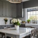
Gray Tables – From Light to Charcoal
Gray tables create a sophisticated bridge between black cabinets and lighter elements in your kitchen.
This versatile neutral comes in countless shades, from pale dove gray to deep charcoal.
Light gray tables create subtle contrast with black cabinets while maintaining a cohesive neutral palette.
Medium gray tables blend harmoniously with black without the stark contrast of white or light colors.
Charcoal gray tables coordinate closely with black cabinets for a subtle, tonal variation.
Gray tables with black legs or accents create a thoughtful connection to your cabinetry.
The understated elegance of gray works in virtually any design style from traditional to modern.
Wood tables with gray washes or stains combine warmth and contemporary color in one piece.
Concrete or slate tables offer natural gray tones with interesting texture and durability.
Gray tables with varied textures add depth to your kitchen without introducing competing colors.
Weathered or driftwood gray finishes add casual, coastal charm to kitchens with black cabinets.
Gray marble or quartz tables introduce subtle patterns that enhance visual interest.
Tables incorporating gray and black together create a seamless connection to your cabinetry.
Gray tables with metallic flecks or accents add subtle sparkle and dimension.
The versatility of gray means it pairs beautifully with any accent colors you might introduce.
Gray tables hide everyday marks and spills better than white while still brightening the space.
For small kitchens, light gray tables help the space feel more open than darker alternatives.
Gray tables with interesting grain patterns or textures become subtle focal points.
This neutral choice allows your black cabinets and other kitchen elements to shine.
Gray tables feel current and contemporary without being too trendy or likely to date quickly.
If your kitchen features black cabinets with gray countertops, a matching gray table creates cohesion.
Two-tone tables featuring gray and black create a custom look that perfectly suits your cabinetry.
The subtle sophistication of gray creates a restful backdrop for colorful meals and table settings.
Gray tables with unique shapes or design details add interest without overwhelming the space.
This versatile choice adapts well if you change other elements of your kitchen in the future.
Two-Tone Tables
Two-tone tables create visual interest and connection between different elements in your black cabinet kitchen.
This clever design approach allows you to incorporate multiple colors in one cohesive piece.
Black and white two-tone tables create dramatic contrast while coordinating perfectly with your cabinets.
Tables with black bases and white tops lighten the dining area while tying into the cabinetry.
Reverse designs with white bases and black tops make an unexpected statement that still coordinates.
Wood and black combinations add warmth while maintaining connection to your black cabinets.
Natural wood tops with black legs offer the perfect balance of warmth and coordination.
Two-tone tables effectively bridge different finishes and materials throughout your kitchen.
If your kitchen has black cabinets and stainless appliances, a table combining black and metal elements ties everything together.
Black and marble combinations create a luxurious look that balances weight and lightness.
Two-tone tables often feature interesting construction details that become design features.
Color blocking on table surfaces creates visual interest that plain tables cannot achieve.
Tables with inlaid patterns or materials add custom-look details to your kitchen.
Two-tone designs allow you to incorporate multiple textures as well as colors.
For example, glossy black paired with matte wood creates pleasing textural variation.
These versatile tables often work better with existing décor than single-color options.
Two-tone tables with black components create a natural connection to your black cabinetry.
You can choose proportions that emphasize either the black elements or contrasting materials.
Tables that are predominantly black with subtle contrasting details create a more cohesive look.
Designs featuring minimal black with mostly contrasting materials create more visual separation.
Two-tone tables often appear more custom and high-end than single-color alternatives.
These versatile pieces frequently feature interesting design details like unique joinery or hardware.
The dual-material approach works well in transitional kitchens that blend different design styles.
Two-tone tables allow you to test color combinations without committing to a fully colored table.
This approach gives you flexibility to coordinate with multiple elements in your kitchen design.
This or That?
Pick your fave — see what other readers chose! 👀
Rustic Farmhouse Tables
Rustic farmhouse tables create warming contrast against sleek black cabinets.
This unexpected pairing balances modern and traditional elements for an inviting atmosphere.
The natural wood tones of farmhouse tables soften the bold statement of black cabinetry.
Distressed finishes and visible woodgrain add character that complements smooth cabinet surfaces.
Large farmhouse tables create a welcoming gathering spot in kitchens with dramatic black backdrops.
The substantial presence of these tables balances the visual weight of black cabinets.
Reclaimed wood farmhouse tables tell a story through their unique marks and patina.
Light-colored pine or oak farmhouse tables brighten spaces that might otherwise feel dark.
Tables with whitewashed or limed finishes create subtle contrast while maintaining rustic appeal.
Traditional trestle bases add architectural interest that complements structured black cabinetry.
X-brace details on table bases introduce geometric elements that echo cabinet lines.
Wide plank tops showcase beautiful wood grain that stands out against black surroundings.
The imperfections in rustic tables create charming contrast to the precision of modern cabinetry.
💭 I Wrote a Book About My Biggest Decorating Mistakes!
When I decorated my first home, I thought I knew what I was doing. Spoiler: I didn’t. 😅
💸 I bought a sofa way too big for my living room. Paint colors that looked amazing in the store but terrible on my walls.
Live-edge farmhouse tables add organic, flowing lines to kitchens with geometric black cabinets.
Hand-scraped surfaces add tactile interest that contrasts with smooth cabinet fronts.
Expandable farmhouse tables offer practicality for entertaining in your striking black kitchen.
Traditional turned legs add historic character that balances contemporary black cabinetry.
Breadboard ends on table tops showcase craftsmanship that complements quality cabinetry.
The warmth of honey-toned wood creates welcoming contrast to cool black cabinets.
Darker stained farmhouse tables coordinate with black cabinets while maintaining rustic character.
Painted bases with wood tops offer another way to connect with your black kitchen scheme.
Black or dark gray painted bases with natural wood tops create a transitional farmhouse look.
Custom-built farmhouse tables can be sized perfectly for your specific kitchen dimensions.
The durability of these substantial tables stands up well to busy family life.
Farmhouse tables age beautifully, developing more character and patina over years of use.
Blue Tables
Blue tables create a fresh, unexpected pairing with black cabinets that feels both current and timeless.
This color combination offers sophisticated contrast that works in various kitchen styles.
Navy blue tables create a rich, cohesive look that coordinates beautifully with black cabinetry.
The deep tones of navy feel substantial and grounding, complementing the weight of black cabinets.
Cobalt or royal blue tables make energetic statements that enliven black kitchen spaces.
These vibrant blues create focal points that draw guests into your kitchen dining area.
Dusty or slate blue tables offer subtle color that feels both current and calming.
These muted blues provide gentle contrast without competing with your dramatic black cabinets.
Teal or turquoise tables introduce jewel tones that pop dramatically against black backgrounds.
These blues with green undertones create refreshing energy in kitchens with dark cabinetry.
Pale or powder blue tables lighten kitchen spaces while adding delicate color interest.
These softer blues create airy contrast that brightens kitchens with substantial black elements.
Distressed blue tables add casual charm and vintage character to modern black kitchens.
Psst… Check This Out
Urban Loft Kitchen Ideas That Make Your Space Look Modern And Stylish Take Me There →The weathered appearance softens the sleek precision often found in black cabinetry.
High-gloss blue tables create dramatic reflective surfaces that bounce light throughout the space.
Matte blue finishes provide depth and richness that complements both glossy and matte black cabinets.
Blue glass tables combine color with transparency for an airy feel in black kitchens.
Blue marble or stone tables introduce natural patterning with sophisticated blue tones.
Blue tables with black accents or bases create thoughtful connections to your cabinetry.
Two-tone tables featuring blue and black offer customized coordination with your kitchen.
Blue painted wood tables provide affordable color that can be refreshed if your taste changes.
Blue metal tables combine industrial appeal with colorful personality.
The psychological effects of blue—calmness and tranquility—balance the drama of black cabinets.
Blue and black together create a color scheme that feels both masculine and feminine.
This versatile combination works well with various metal finishes from silver to brass accents.
Quick Design Dilemma
Cast your vote — see what other readers think! 🤔
Mixed-Material Tables
Mixed-material tables combine different elements for unique style that complements black cabinets.
These distinctive tables add visual depth through contrasting textures and materials.
Wood and metal combinations create industrial-chic appeal that balances warmth and structure.
Tables with wood tops and black metal bases directly connect to black cabinetry while adding warmth.
Stone tops with wood bases combine natural elements in a sophisticated, designer-inspired way.
Glass-topped tables with wood or metal bases reduce visual weight while adding interesting contrast.
Concrete tops with metal frames create urban appeal that complements modern black kitchens.
Tables combining black components with contrasting materials create cohesion with your cabinetry.
Mixed materials allow you to incorporate multiple design elements from throughout your kitchen.
If your kitchen features black cabinets with wood accents, a table combining these materials creates continuity.
Kitchens with black cabinets and stone countertops benefit from tables that incorporate similar elements.
The textural variation in mixed-material tables adds dimensionality to your kitchen design.
These tables often feature thoughtful design details that showcase craftsmanship.
Interesting joinery between different materials creates visual focal points.
Contrasting materials emphasize the unique properties of each component.
For example, smooth glass highlights the texture of rough wood or industrial metal.
Mixed-material tables often appear more custom and high-end than single-material options.
These tables frequently incorporate current design trends while maintaining timeless appeal.
Tables combining black with other materials create natural connection to your cabinetry.
The versatility of mixed materials allows coordination with multiple elements in your kitchen.
These tables adapt well to various design styles from industrial to contemporary to rustic modern.
Mixed materials allow you to incorporate trending finishes without committing entirely to one look.
The unique combinations create conversation pieces that enhance your kitchen’s character.
Tables combining different materials often feature interesting structural elements.
These distinctive pieces add personality that basic tables cannot provide.
Acrylic or Lucite Tables
Acrylic or lucite tables create a modern, almost magical floating appearance in black kitchens.
These transparent tables add function without additional visual weight in your space.
The clear material allows your eye to travel uninterrupted, making kitchens feel more spacious.
Acrylic tables reflect and refract light, adding sparkle and brightness to kitchens with dark cabinets.
Their contemporary aesthetic complements the modern feel often associated with black cabinetry.
These tables create interesting shadow patterns that add dimension to your kitchen space.
Completely clear acrylic tables virtually disappear, allowing your black cabinets to remain the focal point.
Tinted acrylic in smoke or gray tones creates subtle color that coordinates with black beautifully.
Colored acrylic tables in bold hues make dramatic statements against black backgrounds.
The sleek, clean lines of acrylic furniture enhance contemporary kitchen designs.
These tables resist water damage and staining, making them practical for busy kitchens.
Modern manufacturing techniques have improved durability, making today’s acrylic furniture surprisingly sturdy.
Acrylic tables with interesting sculptural bases become artistic elements in your kitchen.
Ghost chairs paired with acrylic tables create a cohesive transparent seating arrangement.
For maximum impact, look for thick acrylic (¾” or greater) that has substantial presence.
The seamless construction creates ultra-clean lines that complement modern cabinetry.
Acrylic tables with black accents or details create thoughtful connections to your black cabinets.
These tables work particularly well in smaller kitchens where visual space is at a premium.
In open-concept homes, acrylic tables create visual flow between kitchen and living spaces.
For families concerned about durability, look for commercial-grade acrylic with scratch-resistant coatings.
These tables are surprisingly easy to maintain with special acrylic cleaners that prevent clouding.
Round acrylic tables soften the angular lines typically found in kitchens with black cabinetry.
Waterfall-edge acrylic tables create dramatic sculptural elements in your kitchen space.
The contemporary feel of acrylic perfectly complements the modern aesthetic of black cabinets.
Unlike glass, acrylic tables feel warmer to the touch, creating a more comfortable dining experience.