ark brown tables are special because they can handle both light and dark chair colors.
This means you have lots of fun choices to pick from.
You can go safe with classic colors, or you can be brave and try something totally different.
The most important thing is that you love how your dining room looks when you’re done.
Crisp White Chairs


White chairs with your dark brown table create a look that never goes out of style.
Think of it like wearing a white shirt with dark jeans – it just works perfectly every time.
White chairs make your dark brown table pop and stand out like the star of the show.
The contrast between the dark table and bright white chairs creates a clean, fresh feeling in your room.
White chairs also make your dining room feel bigger and brighter, especially if you don’t have a lot of windows.
This color combo works great if you love the farmhouse style or want your room to feel clean and simple.
You can choose white chairs in any style – from fancy ones with curved backs to simple ones that look modern.
White leather chairs give you a fancy restaurant feeling, while white wooden chairs feel more casual and relaxed.
The best part about white chairs is that they match any other colors you want to add to your room later.
You can change your curtains, add colorful pillows, or hang new artwork without worrying if it will match your chairs.
White chairs are also great if you have kids because you can easily see when they need cleaning.
Plus, white goes with every season – it feels fresh in summer and cozy in winter.
If you’re worried about white chairs getting dirty, look for ones with washable covers or easy-to-clean materials.
Many people think white furniture is hard to keep clean, but modern white chairs are made to be practical and beautiful.
Tap to Explore These Beauties
See my ideas in action 👇 Tap any image to explore full details.
Warm Cream Chairs
Cream colored chairs give you all the good things about white chairs but with a softer, warmer feeling.
Cream is like white’s cozy cousin – it’s still light and bright but feels more comfortable and welcoming.
With your dark brown table, cream chairs create a color combination that feels like drinking hot chocolate on a cold day.
The warm tones in cream chairs bring out the rich, chocolatey colors in your dark brown table.
This makes both the table and chairs look more expensive and fancy than they might actually be.
Cream chairs work especially well if your room has warm lighting or if you want a romantic, elegant feeling.
You can find cream chairs in lots of different materials like fabric, leather, or even painted wood.
Cream fabric chairs with soft cushions make your dining room feel like a comfortable living room where people want to stay and talk.
Cream leather chairs give you a more formal, grown-up look that’s perfect for dinner parties.
The great thing about cream is that it hides small stains and wear better than pure white does.
This makes cream chairs a smart choice for busy families or people who use their dining room every day.
Cream also looks beautiful with gold or brass decorations, so you can add fancy touches like gold picture frames or brass candlesticks.
If you love decorating for different seasons, cream chairs work with both warm fall colors and cool spring colors.
You can easily change your table decorations throughout the year while your cream chairs look perfect every time.
💭 Ever wondered what your room would actually look like rearranged?
I built a free tool that lets you drag furniture around a 2D floor plan. No signup, no catch.
See the Room Planner →Bold Navy Blue Chairs
Navy blue chairs with your dark brown table create a combination that looks both classic and exciting.
Navy blue is like the dark brown table’s best friend – they’re both rich, deep colors that make each other look amazing.
This color pairing reminds people of fancy libraries with leather books and cozy fireplaces.
Navy blue chairs add a pop of color without being too bright or overwhelming for your room.
The deep blue color makes your dark brown table look warmer and more inviting.
Navy blue works great if you want your dining room to feel sophisticated and grown-up.
You can choose navy blue chairs in different styles to match your personality and room.
Navy blue leather chairs give you a fancy, expensive look that impresses guests.
Navy blue fabric chairs with patterns or textures add interest and make your room feel more personal.
The best part about navy blue is that it goes with lots of other colors you might want to add later.
You can add white decorations for a nautical sailing theme, or add gold touches for a royal, elegant feeling.
Navy blue chairs also hide stains and everyday wear really well, making them practical for families.
This color combination works in both traditional rooms with classic furniture and modern rooms with simple, clean lines.
If you love the look but worry navy might be too dark, try navy chairs with lighter colored cushions or trim.
Fresh Green Chairs
Green chairs bring the feeling of nature and fresh air to your dining room.
With your dark brown table, green chairs create a combination that feels like eating dinner in a beautiful garden.
Green is a color that makes people feel calm and happy, perfect for family meals and dinner with friends.
There are many different shades of green that work beautifully with dark brown tables.
Light green chairs like mint or sage create a soft, peaceful feeling that’s perfect for breakfast nooks.
Darker green chairs like forest green or emerald make your dining room feel rich and elegant.
Green chairs work especially well if you have plants in your dining room or windows that look out at trees.
The natural connection between green and brown makes your whole room feel more connected to the outdoors.

Find Your Room’s Color Palette
Tap a vibe — get a curated 5-color palette with hex codes you can copy ✨
💭 I Wrote a Book About My Biggest Decorating Mistakes!
When I decorated my first home, I thought I knew what I was doing. Spoiler: I didn’t. 😅
💸 I bought a sofa way too big for my living room. Paint colors that looked amazing in the store but terrible on my walls.
Green fabric chairs with interesting textures add warmth and coziness to your space.
Green leather chairs give you a more formal look that still feels fresh and natural.
One of the best things about green chairs is that they work in every season.
In spring and summer, they feel fresh and bright like new leaves on trees.
In fall and winter, they feel cozy and warm like pine trees covered in snow.
Green chairs also work well with lots of different decorating styles, from country farmhouse to modern city apartment.
If you love changing your decorations, green chairs work with almost any color you want to add.
Elegant Gray Chairs
Gray chairs with your dark brown table create a sophisticated look that feels both modern and timeless.
Gray is like the perfect neutral color – it’s not too light and not too dark, so it works with everything.
With your dark brown table, gray chairs create a color combination that looks expensive and well-planned.
Gray chairs make your dark brown table look warmer and more inviting without competing for attention.
This color pairing works great if you want your dining room to feel calm and peaceful.
Gray comes in many different shades, from light silver gray to deep charcoal gray.
Light gray chairs make your room feel bigger and brighter, especially if you don’t have a lot of natural light.
Dark gray chairs create a more dramatic, formal feeling that’s perfect for fancy dinner parties.
Gray chairs work with both warm and cool colors, so you can decorate your room however you like.
You can add warm touches like gold picture frames and orange flowers, or cool touches like silver candlesticks and blue artwork.
Gray fabric chairs with soft textures make your dining room feel cozy and comfortable.
Gray leather chairs give you a sleek, modern look that impresses guests.
The practical side of gray chairs is that they hide everyday wear and small stains really well.
This makes them a smart choice for busy families or people who entertain a lot.
Psst… Check This Out
Gray Table Dilemma? Here Are 7+ Chair Colors That Work Every Time Take Me There →Sunny Yellow Chairs
Yellow chairs bring sunshine and happiness to your dining room every single day.
With your dark brown table, yellow chairs create a combination that feels warm and cheerful.
Yellow is the color of sunshine, flowers, and happy memories, making it perfect for family meal times.
The bright, cheerful feeling of yellow chairs makes your dark brown table feel more friendly and welcoming.
This color combination works especially well in rooms that don’t get a lot of natural sunlight.
Yellow chairs can instantly make a dark room feel brighter and more cheerful.
There are many different shades of yellow that work beautifully with dark brown tables.
Pale yellow chairs like butter or cream create a soft, gentle feeling that’s perfect for morning breakfast.

Bright yellow chairs like sunflower or lemon create an energetic, fun feeling that makes people smile.
Golden yellow chairs add warmth and richness that brings out the beautiful tones in your dark brown table.
Yellow fabric chairs with patterns or textures add personality and make your room feel more interesting.
Yellow wooden chairs painted in a matte finish give you a casual, country feeling.
The best part about yellow chairs is that they make people feel happy and excited about eating together.
Yellow is also a color that works well with many other colors if you want to add more decorations later.
What’s Your Decor Personality?
5 questions · 30 seconds · Instant style match 🏡
Rich Burgundy Chairs
Burgundy chairs create a combination with your dark brown table that feels elegant and expensive.
Burgundy is a deep, rich red color that looks like fine wine and fancy velvet curtains.
With your dark brown table, burgundy chairs create a color combination that reminds people of elegant restaurants and cozy libraries.
The deep red tones in burgundy chairs bring out the warm, chocolatey colors in your dark brown table.
This makes both pieces of furniture look more expensive and sophisticated than they might actually be.
Burgundy chairs work perfectly if you want your dining room to feel formal and grown-up.
This color combination is ideal for people who love to host dinner parties and entertain guests.
Burgundy leather chairs give you a classic, traditional look that never goes out of style.
Burgundy fabric chairs with rich textures like velvet or brocade add luxury and warmth to your room.
The practical side of burgundy chairs is that they hide stains and everyday wear very well.
This makes them a great choice for families who use their dining room every day.
Burgundy also works beautifully with gold or brass decorations, so you can add fancy touches like gold-framed mirrors or brass candlesticks.
This color combination works well in both traditional rooms with antique furniture and modern rooms with clean, simple lines.
If you love the elegance but worry burgundy might be too dark, try burgundy chairs with lighter colored cushions or wooden trim.
Soft Beige Chairs
Beige chairs with your dark brown table create a warm, comfortable feeling that makes everyone want to sit down and stay awhile.
Beige is like a warm hug in color form – it’s cozy, welcoming, and makes people feel at home.
With your dark brown table, beige chairs create a combination that feels natural and easy on the eyes.
The warm, neutral tones in beige chairs complement the rich brown of your table without competing for attention.
This color pairing works great if you want your dining room to feel relaxed and casual.
Beige chairs are perfect for families because they create a comfortable space where everyone feels welcome.
Beige comes in many different shades, from light cream beige to rich tan beige.
Light beige chairs make your room feel bigger and more open, especially in smaller spaces.
Darker beige chairs add warmth and coziness without making your room feel too heavy or dark.
Beige fabric chairs with soft textures make your dining room feel like a comfortable living room.
Beige leather chairs give you a more polished look while still feeling warm and inviting.
The practical benefits of beige chairs are that they hide everyday wear and small stains really well.
This makes them an excellent choice for busy households or people who entertain frequently.
Beige also works as a perfect background color that lets you change your decorations with the seasons or your mood.
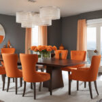
Vibrant Orange Chairs
Orange chairs bring energy and excitement to your dining room in a way that few other colors can.
With your dark brown table, orange chairs create a combination that feels warm, friendly, and full of life.
Orange is the color of autumn leaves, cozy fires, and beautiful sunsets, making it perfect for creating a welcoming atmosphere.
The bright, energetic feeling of orange chairs makes your dark brown table feel more approachable and fun.
This color combination works especially well if you want your dining room to feel lively and social.
Orange chairs can turn an ordinary meal into a special occasion just by adding their cheerful presence.
There are many different shades of orange that work wonderfully with dark brown tables.
Soft orange chairs like peach or coral create a gentle, warm feeling that’s perfect for family dinners.
Bright orange chairs like tangerine or pumpkin create a bold, dramatic statement that guests will remember.
Burnt orange chairs add depth and richness that brings out the beautiful grain in your dark brown table.
Orange fabric chairs with interesting patterns add personality and make your room feel more unique.
Orange leather chairs give you a modern, contemporary look that feels both stylish and comfortable.
The best thing about orange chairs is that they create a happy, positive atmosphere that makes people want to gather together.
Orange also works well with many other warm colors if you want to add more decorative elements to your room.
This or That?
Pick your fave — see what other readers chose! 👀
Classic Black Chairs
Black chairs with your dark brown table create a sophisticated, elegant combination that looks professionally designed.
Black is like the little black dress of furniture colors – it’s always appropriate and always looks good.
With your dark brown table, black chairs create a rich, dramatic look that feels both modern and timeless.
The deep, solid color of black chairs makes your dark brown table stand out as the beautiful centerpiece it is.
This color combination works perfectly if you want your dining room to feel formal and sophisticated.
Black chairs are ideal for people who love clean, simple lines and modern design.
Black leather chairs give you a sleek, contemporary look that impresses everyone who sees it.
Black wooden chairs with interesting shapes add visual interest while keeping the color scheme simple and elegant.
💭 I Wrote a Book About My Biggest Decorating Mistakes!
When I decorated my first home, I thought I knew what I was doing. Spoiler: I didn’t. 😅
💸 I bought a sofa way too big for my living room. Paint colors that looked amazing in the store but terrible on my walls.
Black fabric chairs with different textures can add warmth and comfort while maintaining the sophisticated color palette.
The practical advantages of black chairs are that they hide stains and everyday wear exceptionally well.
This makes them perfect for busy families or people who entertain guests regularly.
Black chairs also work as a neutral base that lets you add any other colors you want through decorations.
You can change your table settings, artwork, and accessories with the seasons while your black chairs always look perfect.
This color combination works well in both traditional dining rooms and ultra-modern spaces.
Warm Tan Chairs
Tan chairs create a natural, earthy combination with your dark brown table that feels comfortable and welcoming.
Tan is like beige’s more adventurous cousin – it has more personality while still being warm and neutral.
With your dark brown table, tan chairs create a color combination that reminds people of cozy cabins and natural materials.
The warm, earthy tones in tan chairs bring out the rich, natural beauty of your dark brown table’s wood grain.
This makes both pieces look more expensive and well-crafted than they might actually be.
Tan chairs work especially well if you love natural, organic decorating styles.
This color combination is perfect for people who want their dining room to feel connected to nature.
Tan leather chairs give you a casual, comfortable look that feels like expensive ranch furniture.
Tan fabric chairs with natural textures like linen or canvas add warmth and coziness to your space.
The practical benefits of tan chairs are that they hide everyday wear and small stains very well.
This makes them an excellent choice for families with children or people who love to entertain.
Tan also works beautifully with natural materials like wood, stone, and plants.
You can easily add woven baskets, wooden bowls, and green plants to create a complete natural look.
This color combination works well in both rustic country homes and modern apartments that want a natural feeling.
Quick Design Dilemma
Cast your vote — see what other readers think! 🤔
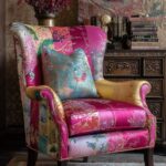
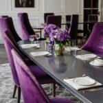
Deep Purple Chairs
Purple chairs with your dark brown table create a combination that feels royal, elegant, and totally unique.
Purple is the color of royalty, luxury, and creativity, making it perfect for people who want their dining room to stand out.
With your dark brown table, purple chairs create a rich, dramatic look that guests will never forget.
The deep, jewel-like tones in purple chairs make your dark brown table look more luxurious and expensive.
This color combination works perfectly if you want your dining room to feel special and sophisticated.
Purple chairs are ideal for people who love bold colors and aren’t afraid to make a statement.
Deep purple chairs like eggplant or plum create a dramatic, formal feeling that’s perfect for dinner parties.
Lighter purple chairs like lavender or lilac create a softer, more romantic feeling while still being unique.
Purple velvet chairs add luxury and texture that makes your dining room feel like a high-end restaurant.
Purple leather chairs give you a modern, contemporary look that feels both bold and sophisticated.
The interesting thing about purple chairs is that they work with both warm and cool decorating schemes.
You can add gold and warm colors for a royal, traditional feeling, or add silver and cool colors for a modern, dramatic look.
Purple also works well with natural elements like wood and plants, creating an interesting contrast between bold color and natural materials.
This color combination is perfect for creative people who want their dining room to reflect their artistic personality.
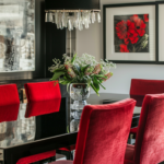
Bright Red Chairs
Red chairs bring passion, energy, and excitement to your dining room like no other color can.
With your dark brown table, red chairs create a combination that feels bold, confident, and full of personality.
Red is the color of love, energy, and celebration, making it perfect for creating memorable dining experiences.
The vibrant, energetic feeling of red chairs makes your dark brown table feel more important and special.
This color combination works especially well if you want your dining room to be the heart of your home.
Red chairs can turn every meal into a special occasion just by adding their dramatic presence.
There are many different shades of red that work beautifully with dark brown tables.
Bright red chairs like cherry or fire engine red create a bold, energetic statement that demands attention.
Deeper red chairs like crimson or brick red create a more sophisticated, elegant feeling while still being dramatic.
Dark red chairs like wine or mahogany red add richness and depth that complements your brown table perfectly.
Red fabric chairs with interesting textures add warmth and comfort while maintaining the bold color impact.
Red leather chairs give you a sleek, modern look that feels both luxurious and exciting.
The best thing about red chairs is that they create a warm, welcoming atmosphere that encourages conversation and connection.
Red also works well with many other colors if you want to add more decorative elements to create a complete look.