ave you ever stared at your brown table and wondered how to bring it to life without a complete dining room overhaul?
The answer might be simpler than you think – placemats!
These small but mighty dining accessories can completely transform your eating space with minimal effort and cost.
Brown tables provide a warm, classic foundation for your dining area, but sometimes they need a little help to truly shine.
The right placemat color can complement your table’s rich tones while adding personality and style to your dining experience.
Ready to transform your dining experience with a splash of color?
Crisp White: The Timeless Classic


Nothing creates a more striking contrast against a brown table than crisp, clean white placemats.
White brings an immediate sense of freshness to your dining space, making your brown table appear richer and more defined.
This color choice works with any style of décor, from farmhouse to modern minimalist.
When you choose white placemats, you’re creating a blank canvas that makes your food and table settings pop with visual appeal.
The beauty of white placemats is their versatility – they can be dressed up with fancy dinnerware for special occasions or kept casual for everyday meals.
For a textured look, consider white placemats made from linen, which add subtle visual interest while maintaining that clean aesthetic.
White is particularly effective with darker brown tables, as the contrast creates a sophisticated, high-end restaurant feel in your own home.
If you’re worried about stains, look for white placemats made from easy-to-clean materials like vinyl or treated fabric.
You can also find white placemats with subtle patterns or embossed designs that add interest while maintaining the clean look.
White placemats work wonderfully in spaces with neutral color schemes, allowing other elements of your table setting to stand out.
They also photograph beautifully, making your dinner parties Instagram-ready without much effort.
During holiday seasons, white placemats provide the perfect backdrop for themed centerpieces and decorative elements.
If your dining room gets limited natural light, white placemats can help brighten the space and make it feel more open and airy.
Tap to Explore These Beauties
See my ideas in action 👇 Tap any image to explore full details.
Navy Blue: Sophisticated Elegance


Navy blue placemats bring an immediate sense of sophistication and elegance to your brown table.
This deep, rich color creates a beautiful partnership with brown wood tones, particularly medium to lighter brown tables.
When you choose navy blue, you’re adding a timeless color that never goes out of style, much like a well-tailored blue suit.
Navy creates a grounding effect on your table setting, making everything placed on top appear more refined and intentional.
The combination of navy and brown creates a classic, almost nautical feel that works beautifully in traditional and coastal-inspired homes.
For added interest, look for navy placemats with subtle texture or a small pattern that adds dimension without overwhelming.
Navy placemats hide minor stains better than lighter colors, making them practical for families and frequent entertainers.
This dark blue shade pairs wonderfully with brass or gold accents in your table settings, creating a luxurious dining experience.
Navy blue works equally well in both casual and formal dining settings, simply by changing what you place on top.
During summer months, navy placemats create a cool, refreshing backdrop for seasonal table décor and bright dishware.
In winter, this same color feels cozy and appropriate for holiday gatherings and formal dinner parties.
Navy placemats can help tie together other blue elements in your dining room or adjacent spaces for a cohesive look.
The contrast between navy and brown creates visual interest that makes your dining space look thoughtfully designed rather than randomly assembled.
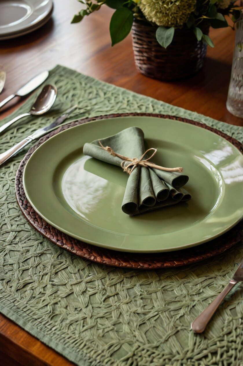
Sage Green: Natural Harmony


Sage green placemats create a sense of natural harmony with brown tables that’s hard to beat.
This muted, soft green tone complements the organic quality of wood, creating a peaceful, nature-inspired dining experience.
When you choose sage green, you’re bringing the calming elements of the outdoors into your eating space.
This color works particularly well with medium-toned brown tables, enhancing their warmth without competing for attention.
Sage green has risen in popularity in home décor because it functions almost as a neutral while still adding a subtle hint of color.
The earthy combination of sage and brown creates a foundation that works beautifully with both rustic and modern table settings.
For maximum impact, look for sage placemats with interesting textures like linen, which adds dimension and visual interest.
This color choice creates a serene backdrop for meals, potentially encouraging more mindful, relaxed dining experiences.
Sage green placemats transition seamlessly between seasons, looking fresh in spring and summer while remaining cozy for fall and winter gatherings.
They pair beautifully with natural elements like wooden serving pieces, stone centerpieces, or fresh greenery on your table.
This color option works especially well in spaces that embrace biophilic design, which incorporates natural elements for improved wellbeing.
Sage placemats can help bring cohesion to dining spaces that incorporate plants or that have views of outdoor greenery.
The subtle color makes food look appetizing while creating a sophisticated backdrop for your dinnerware collection.
Burnt Orange: Bold and Seasonal
Burnt orange placemats make a confident statement while beautifully complementing the natural tones of your brown table.
This warm, rich color creates a stunning color harmony with brown wood, particularly darker brown tables that need brightening.
When you choose burnt orange, you’re embracing a color that feels perpetually autumn-inspired, yet works year-round.
The combination creates a cozy, inviting atmosphere that naturally draws people to gather around your table.
Burnt orange adds warmth to your dining space, making even the simplest meals feel like special occasions.
This bold color choice works especially well in dining rooms with neutral walls and furniture, adding a controlled pop of color exactly where you want it.
For maximum impact, pair burnt orange placemats with white dinnerware to create a striking contrast that highlights both elements.

Find Your Room’s Color Palette
Tap a vibe — get a curated 5-color palette with hex codes you can copy ✨
💭 I Wrote a Book About My Biggest Decorating Mistakes!
When I decorated my first home, I thought I knew what I was doing. Spoiler: I didn’t. 😅
💸 I bought a sofa way too big for my living room. Paint colors that looked amazing in the store but terrible on my walls.
Textured burnt orange placemats, like those made from burlap or woven materials, add dimension that enhances the rustic quality of brown tables.
This color choice evokes feelings of warmth and comfort, potentially making your dining experience more enjoyable on a psychological level.
Burnt orange placemats can help tie together other orange or warm-toned décor elements in your space for a cohesive look.
They photograph beautifully, making your table settings pop on social media or in family photos.
During autumn and Thanksgiving, burnt orange placemats create the perfect seasonal foundation for holiday-themed table décor.
The energetic yet sophisticated quality of burnt orange can make everyday meals feel more special and intentional.
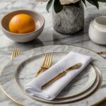
Soft Gray: Modern Minimalism
Soft gray placemats bring contemporary sophistication to brown tables without overwhelming the natural beauty of the wood.
This neutral color creates a subtle contrast that allows both the placemats and the table to shine in their own right.
When you choose soft gray, you’re embracing a modern aesthetic that feels clean and intentional.
Gray works particularly well with brown tables that have cooler undertones, creating a harmonious color relationship.
The combination of gray and brown bridges the gap between warm and cool color schemes, making it versatile for various dining room styles.
Soft gray placemats provide a perfect backdrop for colorful dishes or centerpieces when you want those elements to be the stars of your table.
For added interest, look for gray placemats with subtle patterns or textural elements that add dimension to your table setting.
This color choice fits perfectly in contemporary, Scandinavian, or minimalist design schemes while still honoring the warmth of your wooden table.
Gray placemats hide minor stains and wear better than white options, making them practical for daily use.
They create a soothing, uncluttered look that can make mealtime feel more peaceful and less visually chaotic.
Soft gray works beautifully year-round and can be easily accessorized with seasonal décor for holidays and special occasions.
This color provides a sophisticated foundation that makes even casual meals feel more elegant and thoughtfully presented.
The neutral quality of gray allows your food and table décor to visually stand out, potentially making your culinary creations more appealing.
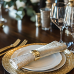
Burgundy: Rich and Regal
Burgundy placemats bring a sense of richness and elegance that transforms an ordinary brown table into a sophisticated dining experience.
This deep red-purple hue creates a luxurious partnership with brown wood tones, particularly with medium to dark brown tables.
When you choose burgundy, you’re adding a color associated with fine wine, royalty, and opulent dining traditions.
The combination of burgundy and brown creates a warm, inviting atmosphere that feels perfect for special occasions and holiday gatherings.
Burgundy placemats add dramatic depth to your table setting without appearing too bold or overwhelming.
This color choice works year-round but feels especially appropriate during winter months and holiday seasons.
For maximum impact, look for burgundy placemats in luxurious materials like velvet or with subtle sheen for added visual interest.
Burgundy creates an excellent backdrop for gold or brass flatware and accents, enhancing the regal feeling of your table.
This color choice can help create a more formal, elegant dining atmosphere even with casual dinnerware.
Burgundy placemats hide stains better than lighter colors, making them practical despite their elegant appearance.
The rich tone creates a beautiful contrast with white plates or serving dishes, making your food presentation pop.
This color option can help tie together other red or burgundy elements in your dining room for a cohesive, designed look.
The combination of burgundy and brown creates a classic, timeless feel that won’t quickly go out of style, making it a good investment.

What’s Your Decor Personality?
5 questions · 30 seconds · Instant style match 🏡
Mustard Yellow: Cheerful Contrast
Mustard yellow placemats add an unexpected pop of cheerful color that beautifully contrasts with the rich tones of brown tables.
This golden-yellow hue creates an immediate focal point on your table while still complementing the natural warmth of wood.
When you choose mustard yellow, you’re bringing sunshine and positive energy directly to your dining experience.
The combination works particularly well with darker brown tables, where the contrast is most striking and effective.
Mustard yellow adds a contemporary touch to traditional brown furniture, updating your dining space without requiring major changes.
This color choice creates a welcoming, cheerful atmosphere that can make everyday meals feel more special and joyful.
For a coordinated look, echo small touches of mustard yellow in other dining room elements like artwork, curtains, or decorative pieces.
Mustard placemats work beautifully in fall and winter but can transition to spring and summer when paired with the right table accessories.
This color option photographs exceptionally well, making your table settings look magazine-worthy with minimal effort.
The energetic quality of mustard yellow can spark conversation and create a lively atmosphere for dinner parties and gatherings.
Textured mustard placemats add additional visual interest that enhances both the color and your brown table.
This bold choice shows design confidence while still honoring color theory principles that make brown and yellow natural companions.
Mustard yellow placemats can help brighten darker dining spaces, adding a sense of warmth and light to rooms with limited natural illumination.
Teal: Jewel-Toned Drama
Teal placemats create stunning jewel-toned drama that transforms your brown table into a designer-worthy dining space.
This blue-green color creates a rich, vibrant contrast with brown wood that immediately draws the eye and creates visual interest.
When you choose teal, you’re embracing a color that feels both timeless and trendy, working in traditional and contemporary spaces alike.
The combination of teal and brown creates a nature-inspired color scheme reminiscent of forests and natural landscapes.
Teal placemats add a refreshing pop of color that energizes your dining space without overwhelming it.
This color choice works particularly well with medium to dark brown tables, where the contrast creates maximum impact.
For added dimension, look for teal placemats with subtle patterns or varying shades that create depth and visual intrigue.
Teal creates a perfect backdrop for gold or brass accents, creating a luxurious, curated look for special occasions.
This color option can help tie together blue, green, or teal elements from adjacent spaces, creating flow throughout your home.
Teal placemats hide minor stains and wear better than lighter colors, making them practical for family dining.
The psychological effect of this blue-green shade can make dining feel more relaxed and peaceful, potentially enhancing your mealtime experience.
This color choice works year-round but feels especially fresh during spring and summer months.
Teal placemats make white dinnerware pop while also complementing earth-toned dishes for a cohesive, designer-inspired table setting.
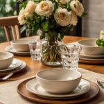
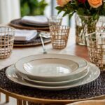
Cream: Subtle Sophistication
Cream placemats offer subtle sophistication that enhances your brown table without competing with its natural beauty.
This warm off-white shade creates a soft contrast that highlights the rich tones of wood while adding an element of refinement.
When you choose cream, you’re selecting a timeless color that works with any style from traditional to farmhouse to modern.
The combination creates a warm, inviting atmosphere that feels simultaneously casual and elegant.
Cream placemats brighten your table setting without the stark contrast that pure white sometimes creates with darker woods.
This color choice works beautifully with any brown table, from the lightest oak to the darkest walnut or mahogany.
For added interest, look for cream placemats with subtle texture or a simple pattern that adds dimension without overwhelming.
Cream creates the perfect neutral foundation that allows other elements of your table setting to stand out and shine.
This versatile color option transitions seamlessly between casual family dinners and more formal entertaining occasions.
Cream placemats photograph beautifully, creating a bright, clean background for food photos and table setting images.
The subtle warmth of cream compared to stark white creates a more inviting, comfortable feeling for everyday dining.
This color choice pairs beautifully with natural table elements like wooden serving pieces, fresh flowers, or greenery.
Cream placemats help brighten darker dining spaces while maintaining a softer, more forgiving look than bright white options.
This or That?
Pick your fave — see what other readers chose! 👀
Olive Green: Earthy Elegance
Olive green placemats bring earthy elegance to brown tables, creating a sophisticated, nature-inspired dining experience.
This muted green shade harmonizes beautifully with brown wood tones, enhancing rather than competing with your table’s natural beauty.
When you choose olive green, you’re embracing a color associated with nature, peace, and timeless style.
The combination creates a grounded, organic feeling that works particularly well in spaces with a natural or Mediterranean aesthetic.
Olive green placemats add depth and richness to your table setting without overwhelming it with bright color.
This color choice works year-round but feels especially appropriate during fall and winter months.
For maximum impact, look for olive placemats with interesting textures that add dimension and tactile appeal to your table.
💭 I Wrote a Book About My Biggest Decorating Mistakes!
When I decorated my first home, I thought I knew what I was doing. Spoiler: I didn’t. 😅
💸 I bought a sofa way too big for my living room. Paint colors that looked amazing in the store but terrible on my walls.
Olive green creates a beautiful backdrop for both white dinnerware and earthy ceramic pieces, making either option look intentional and designed.
This color option pairs wonderfully with brass, gold, or wooden serving pieces for a cohesive, organic table setting.
Olive placemats hide minor stains and wear exceptionally well, making them practical for everyday family use.
The muted quality of olive green creates a calming dining atmosphere that can make meals feel more relaxed and enjoyable.
This color choice works well in spaces that incorporate other natural elements like wood, stone, or plants.
Olive green placemats help create a sophisticated foundation that elevates even the simplest meals to feeling special and intentional.
Coral: Unexpected Brightness
Coral placemats bring unexpected brightness that transforms your brown table into a cheerful, energetic dining space.
This warm pinkish-orange hue creates a surprising contrast with brown wood that feels fresh, contemporary, and design-forward.
When you choose coral, you’re embracing a color that brings immediate warmth and positive energy to your dining experience.
The combination works particularly well with medium to dark brown tables, where the contrast creates maximum visual impact.
Coral placemats add a tropical, vacation-inspired feeling that can make everyday meals feel more special and joyful.
This color choice creates a perfect spring and summer table setting but can bring welcome warmth during colder months too.
For a coordinated look, echo small touches of coral in fresh flowers, napkins, or a simple centerpiece on your table.
Coral creates a beautiful backdrop for both white dinnerware and blue accents, offering multiple styling possibilities.
This vibrant color choice photographs beautifully, making your table settings look magazine-worthy with minimal effort.
The energetic quality of coral can spark conversation and create a lively atmosphere for breakfast gatherings or dinner parties.
Coral placemats can help brighten dark dining spaces, adding a sense of warmth and light to rooms with limited natural illumination.
This color option shows design confidence while still creating a harmonious partnership with the natural warmth of your brown table.
The psychological effect of this warm, happy color can potentially make dining experiences more enjoyable and uplifting.
Quick Design Dilemma
Cast your vote — see what other readers think! 🤔
Black: Bold Sophistication
Black placemats bring bold sophistication that instantly elevates your brown table to new levels of elegance.
This dramatic color choice creates a striking foundation that makes everything placed on top look more intentional and refined.
When you choose black, you’re embracing a timeless color that never goes out of style and works with any décor aesthetic.
The combination of black and brown creates a rich, layered look that feels particularly luxurious with darker brown tables.
Black placemats add immediate drama to your dining space without requiring any other changes to your décor.
This color choice creates a high-end, restaurant-quality feeling that makes even simple meals feel more special.
For added interest, look for black placemats with texture or subtle patterns that add dimension without losing the dramatic effect.
Black creates the perfect backdrop for colorful dishes or serving pieces that you want to highlight and showcase.
This versatile option transitions seamlessly between casual family dinners and formal entertaining occasions.
Black placemats hide stains exceptionally well, making them one of the most practical choices for everyday use.
The sleek, contemporary feeling of black can help modernize traditional brown furniture without losing its warmth.
This color choice pairs beautifully with any metallic accents – gold, silver, or copper – allowing flexibility in your table accessories.
Black placemats create a sophisticated foundation that elevates your entire dining experience to feel more intentional and designed.
Lavender: Soft and Unexpected
Lavender placemats bring a soft and unexpected color choice that pairs surprisingly well with brown tables.
This gentle purple hue creates a unique color combination that feels fresh, creative, and design-forward.
When you choose lavender, you’re embracing a color associated with relaxation, creativity, and subtle elegance.
The combination works beautifully with lighter to medium brown tables, creating a springlike, refreshing aesthetic.
Lavender placemats add a touch of whimsy and personality that shows creative confidence in your decorating choices.
This color option creates a perfect foundation for spring and summer dining, bringing a garden-inspired feeling to your table.
For maximum impact, pair lavender placemats with simple white dinnerware to let the color truly shine.
Lavender creates a beautiful backdrop for silver or chrome accents, enhancing the cool, sophisticated feeling of your table setting.
This unexpected color choice can become a conversation starter, showing guests your willingness to experiment with unique combinations.
The soft, soothing quality of lavender can create a calming dining atmosphere that encourages relaxed, enjoyable meals.
Lavender placemats work particularly well in dining spaces that incorporate other purple, blue, or pink elements for a cohesive look.
This color option can help brighten and enliven brown tables that might otherwise feel too heavy or traditional.
The subtle yet distinct color brings a sophisticated touch that elevates everyday dining while still feeling approachable and inviting.