
Light blue carpet creates a serene foundation for any room, but choosing the right complementary colors can transform your space from merely pleasant to absolutely breathtaking.
Your light blue carpet serves as a cool, calming base that can either fade into the background or become a standout feature depending on how you style the rest of your room.
Think of your carpet as a sky-like canvas that opens up countless possibilities for walls, furniture, and accents.
The right color combinations can make your space feel larger, cozier, more elegant, or more playful—depending on what atmosphere you want to create.
✨Click to Get My 101 FREE Designer Room Ideas
1. Crisp White Walls for a Fresh, Airy Feel
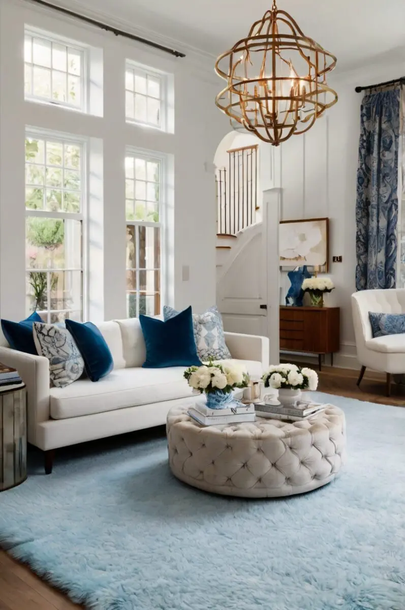
White walls create the perfect backdrop for your light blue carpet, offering a clean, timeless combination that never goes out of style.
This pairing evokes the feeling of clouds against a blue sky, bringing a sense of openness and tranquility to any room.
When you choose white for your walls, you’re creating a versatile foundation that allows your light blue carpet to appear more vibrant.
The contrast between the two colors isn’t harsh, but rather creates a soft, pleasing visual effect that makes your space feel larger and more cohesive.
For the best results, consider warm whites like alabaster or creamy white rather than stark, bluish whites which might make the room feel too cool or clinical.
You can enhance this color scheme with natural wood tones in your furniture to add warmth and depth to the space.
White walls also provide the perfect backdrop for artwork and decorative elements, allowing you to introduce additional accent colors as desired.
In rooms with limited natural light, this combination helps bounce light around, creating a brighter, more welcoming atmosphere.
This pairing works exceptionally well in bedrooms and living rooms where a calming environment is desirable.
For added interest, consider incorporating textural elements in your white walls, such as shiplap, wainscoting, or textured wallpaper.
White ceiling treatments like crown molding can further enhance the sophisticated yet relaxed aesthetic of this color combination.
You’ll find that this classic pairing provides flexibility for seasonal decor changes without clashing with your permanent elements.
The white and light blue combination allows you to experiment with different accent colors through pillows, throws, and other accessories as your tastes evolve.
2. Soft Gray for Sophisticated Elegance
Soft gray walls create a sophisticated backdrop that complements your light blue carpet without competing for attention.
This elegant combination evokes a sense of calm while maintaining visual interest through subtle contrast.
When you select the right shade of gray, you’re creating a refined color story that feels intentional and cohesive.
Light to medium gray tones work best, as they provide enough contrast without overwhelming the delicate blue of your carpet.
Consider warm-leaning grays (greige) if your light blue carpet has warmer undertones, or cool grays if your carpet has more of an icy blue appearance.
This pairing works particularly well in formal living rooms, home offices, and master bedrooms where an air of sophistication is desired.
The gray-blue combination can be enhanced with metallic accents in silver, chrome, or brushed nickel for an upscale, contemporary look.
You’ll find that this color scheme creates a perfect neutral foundation that allows your furnishings and artwork to stand out beautifully.
For additional visual interest, consider incorporating different textures in your gray elements, such as velvet furniture or linen drapery.
This combination adapts well to various design styles, from traditional to modern, making it versatile for homes of any architectural style.
In larger rooms, you might consider using a slightly darker gray on an accent wall to create depth while maintaining the sophisticated aesthetic.
Your accessories can include darker blues, blacks, or whites to complete the sophisticated palette without disrupting the harmony.
The gray-blue pairing also provides excellent flexibility for lighting choices, looking equally beautiful in natural daylight or warm evening lighting.
3. Navy Blue for a Bold Monochromatic Look
Creating a monochromatic scheme with navy blue walls and your light blue carpet establishes a dramatic yet harmonious look that exudes confidence.
This color combination creates visual depth through varying intensities of the same color family.
When you embrace this bold approach, you’re creating a cocooning effect that feels both sophisticated and comforting.
Navy blue serves as a perfect dramatic counterpoint to the softness of your light blue carpet, creating a layered, designer-approved aesthetic.
This pairing works particularly well in dining rooms, libraries, or bedrooms where a sense of intimacy and elegance is desired.
You’ll find that this monochromatic scheme appears intentional and pulled-together, avoiding the disconnected feeling that can happen with mismatched blues.
To prevent the space from feeling too dark or heavy, incorporate plenty of white trim and light-colored furniture to create necessary contrast.
Consider adding metallic elements like brass or gold accents to add warmth and luminosity to this cool-toned palette.
The combination of navy and light blue creates a perfect backdrop for artwork, especially pieces with complementary colors like coral or ochre that will pop against the blue backdrop.
For additional interest, explore navy walls with texture such as grasscloth wallpaper or a subtle pattern that adds dimension.
This color scheme transitions beautifully from day to night, appearing bright and energetic in daylight and cozy and sophisticated in evening light.
You might consider using navy on just one accent wall if you’re concerned about making the room feel too dark or small.
White ceiling paint is particularly important with this combination to prevent the room from feeling closed in or top-heavy.
4. Sunny Yellow for Cheerful Contrast
Introducing sunny yellow as an accent color creates a vibrant, cheerful contrast that brings energy and optimism to rooms with light blue carpet.
This combination recalls blue skies and sunshine, creating a naturally uplifting atmosphere that instantly brightens your mood.
When you pair these complementary colors, you’re creating a dynamic visual interest that makes both colors appear more vibrant and intentional.
Instead of painting entire walls yellow (which might be overwhelming), consider using this cheerful hue for accent furniture, throw pillows, artwork, or a single accent wall.
The key to success with this pairing is selecting the right shade of yellow—butter yellows and mustard tones tend to work best with light blue, rather than acidic lemon yellows.
This color combination works particularly well in kitchens, breakfast nooks, children’s rooms, and spaces where you want to foster creativity and conversation.
You’ll find that adding yellow brings warmth to the cool undertones of your light blue carpet, creating a balanced, harmonious environment.
White or light neutral walls often work best as a backdrop for this color scheme, allowing both the blue carpet and yellow accents to shine.
Consider incorporating patterns that combine both colors, such as a throw pillow or area rug that ties the colors together cohesively.
Natural materials like rattan, jute, or light woods enhance this sunny scheme and prevent it from feeling too artificial or stimulating.
For a more sophisticated take on this combination, consider muted gold or amber tones rather than bright sunshine yellow.
This pairing is particularly effective in rooms that receive less natural light, as the yellow elements help create a sense of warmth and brightness.
You can adjust the energy level of the room by increasing or decreasing the amount of yellow—more for energetic spaces, less for more relaxed areas.
✨Click to Get My 101 FREE Designer Room Ideas
5. Soft Blush Pink for Romantic Elegance
Pairing soft blush pink with your light blue carpet creates a delicate, romantic atmosphere that feels both contemporary and timeless.
This combination evokes the peaceful beauty of sunset skies, bringing a sense of gentle warmth and sophistication to your space.
When you introduce blush pink alongside light blue, you’re creating a subtle tension between warm and cool tones that’s visually interesting without being overwhelming.
This color pairing works exceptionally well in bedrooms, dressing rooms, and formal living areas where a sense of refined elegance is desired.
Consider blush pink for wall color, upholstered furniture, or significant decorative elements to make a more substantial statement with this lovely hue.
You’ll find that this combination creates a soothing, peaceful environment that feels both current and enduring.
For a more contemporary take, incorporate metallic accents in rose gold or copper that complement the warmth of the blush tones.
The key to success with this pairing is selecting the right shade of blush—look for sophisticated, muted pinks with slight gray or beige undertones rather than saccharine, candy-like pinks.
This color scheme transitions beautifully through different lighting conditions, appearing fresh during daylight hours and warm and cozy in the evening.
Consider incorporating textural elements in your blush pieces, such as velvet pillows or silk drapery, to add depth and luxury to the pairing.
White trim and accents help provide definition and crispness to this soft color palette, preventing it from appearing too diffuse or undefined.
For a pulled-together look, incorporate small elements that contain both colors, such as artwork or decorative objects that feature both blush and light blue.
You might consider adding deeper blue accents as well to create a dimensional color story that has both light and depth.
6. Green Sage for Natural Harmony
Sage green creates a harmonious, nature-inspired palette when paired with your light blue carpet, evoking the serene colors of a coastal landscape.
This combination feels organic and tranquil, perfect for creating a peaceful retreat within your home.
When you bring these colors together, you’re recreating the natural world’s own color scheme—think of ocean waters meeting coastal vegetation.
Sage walls provide a soft, muted backdrop that complements rather than competes with your light blue carpeting.
This color pairing works beautifully in living rooms, bedrooms, home offices, and any space where you want to foster a sense of calm and connection to nature.
You’ll find that natural light enhances this combination wonderfully, bringing out the subtle undertones in both colors.
Consider incorporating natural materials like wood, rattan, stone, and linen to enhance the organic quality of this color scheme.
For a more dramatic version of this pairing, you might explore deeper forest greens as accents against the light blue and sage foundation.
White trim creates nice definition for this soft color palette, helping to keep the space feeling clean and intentional rather than too washed out.
The sage and light blue combination works with many decorating styles, from coastal casual to modern organic to traditional.
To add visual interest, incorporate patterns that combine these hues, such as botanical prints or abstract designs featuring both colors.
This color scheme transitions beautifully through seasons, feeling cool and refreshing in summer and warm and cozy when paired with deeper accents in fall and winter.
You might consider bringing actual plants into the space to enhance the natural quality of this color combination, creating a truly biophilic design approach.
7. Warm Beige for Cozy Comfort
Warm beige creates a cozy, inviting atmosphere when paired with your light blue carpet, balancing cool and warm tones beautifully.
This combination feels grounded yet refreshing, offering the perfect neutral foundation that never feels bland or uninspired.
When you pair these colors, you’re creating a versatile backdrop that works with virtually any accent color or decorating style.
The warmth of beige walls or furniture helps counterbalance the coolness of light blue, resulting in a space that feels welcoming rather than cold.
This color combination works particularly well in living rooms, family rooms, and bedrooms where comfort and versatility are priorities.
You’ll find that this pairing creates a peaceful, timeless quality that won’t quickly feel dated or trendy.
Consider exploring different textures in your beige elements—nubby woven fabrics, smooth leather, or plush velvet—to add depth and interest.
Natural wood tones in medium to light finishes enhance this color scheme, adding additional warmth and organic character.
This combination provides an excellent foundation for seasonal decorating changes, as it complements both cooler summer palettes and warmer fall color schemes.
For a more contemporary take on this pairing, consider greige (gray-beige) tones that have slightly cooler undertones while still providing warmth.
Pattern mixing works well within this color scheme—consider incorporating patterns that feature both colors for a cohesive, intentional look.
This pairing adapts beautifully to different lighting situations, maintaining its appeal from bright daylight to warm evening illumination.
You might consider incorporating textural wall treatments in your beige walls, such as venetian plaster or subtle textured wallpaper, to add architectural interest.
8. Charcoal Gray for Modern Contrast
Charcoal gray creates a bold, sophisticated contrast with light blue carpet, establishing a modern, dramatic aesthetic with depth and character.
This combination makes a confident design statement while remaining versatile enough to work with various decorating styles.
When you pair these colors, you’re creating an intriguing visual tension between light and dark, cool and neutral.
Charcoal works particularly well as an accent wall color, allowing you to incorporate this dramatic hue without overwhelming the space.
This color combination creates a perfect backdrop for modern art and contemporary furniture, highlighting their forms and finishes effectively.
You’ll find that this pairing brings a certain urban sophistication to your space while the light blue carpet keeps it from feeling too severe or harsh.
Consider incorporating metallic accents in silver, chrome, or brushed nickel to enhance the contemporary quality of this color scheme.
For balance, include plenty of white or light neutral elements to prevent the space from feeling too dark or heavy.
This pairing works especially well in home offices, media rooms, and living spaces where a sense of drama and sophistication is desired.
The contrast between light blue and charcoal creates a perfect foundation for introducing one or two vibrant accent colors, such as mustard yellow or emerald green.
Consider incorporating textural elements in your charcoal features, such as tweed upholstery or matte and glossy finishes side by side.
This color scheme creates an excellent backdrop for architectural features and statement lighting, allowing them to stand out dramatically.
You might consider using charcoal for larger furniture pieces against light walls if full charcoal walls feel too committed or dramatic for your space.
✨Click to Get My 101 FREE Designer Room Ideas
9. Lavender for Subtle Sophistication
Lavender creates an unexpected yet harmonious companion to light blue carpet, resulting in a soft, sophisticated color story with a touch of whimsy.
This combination creates a soothing, dream-like quality that feels both elegant and quietly unique.
When you pair these colors, you’re working with different aspects of the cool color spectrum that complement rather than compete with each other.
The key to success is choosing a muted, sophisticated lavender with gray undertones rather than a vibrant purple, which might clash with your light blue carpet.
This color combination works beautifully in bedrooms, reading nooks, and spaces where a sense of tranquility and thoughtfulness is desired.
You’ll find that this pairing creates a refined atmosphere that feels both current and timeless.
Consider incorporating silver or pearl accents to enhance the elegant quality of this color scheme.
For balance and definition, include white trim and some darker elements to provide contrast and prevent the space from feeling too ethereal.
This combination provides a perfect backdrop for vintage or antique furniture pieces, allowing their character and patina to shine.
The lavender-blue pairing adapts well to different lighting conditions, appearing more distinct in natural light and blending more subtly in evening illumination.
Consider incorporating patterns that combine these colors, such as watercolor prints or abstract designs featuring both lavender and light blue.
This color scheme works particularly well in spaces where you want to foster creativity, reflection, and gentle conversation.
You might consider using lavender in unexpected ways, such as on a ceiling or as the inside color of built-in bookshelves, for a subtle but impactful design element.
10. Coral for Energetic Vibrancy
Coral introduces a lively, energetic counterpoint to your light blue carpet, creating a dynamic, contemporary color combination that feels fresh and inviting.
This pairing recalls the vivid colors of tropical settings—ocean waters and vibrant sunsets—bringing a sense of warmth and optimism to your space.
When you combine these colors, you’re creating an intriguing balance between cool and warm, soft and vibrant.
Rather than painting entire walls coral (which might be overwhelming), consider using this vibrant hue for accent furniture, artwork, or decorative accessories.
This color combination works particularly well in social spaces like living rooms, dining rooms, and kitchens where energy and conversation are welcome.
You’ll find that the coral elements bring warmth and life to the cool foundation of your light blue carpet.
Consider varying the intensity of your coral elements, incorporating both vibrant and more muted versions for a sophisticated, layered approach.
Neutral walls in white or light beige often work best with this combination, allowing both the blue carpet and coral accents to shine.
For a cohesive look, incorporate patterns or artwork that feature both colors together, helping to validate and reinforce your color choices.
This pairing adapts beautifully to both contemporary and traditional decorating styles, depending on how you implement the coral elements.
Natural materials like rattan, jute, and light woods enhance the fresh, organic quality of this color scheme.
Consider using coral in unexpected places—the inside of a bookshelf, a painted piece of furniture, or even a ceiling—for maximum impact.
You can adjust the energy level of this combination by increasing or decreasing the amount of coral—more for energetic spaces, less for a more subtle approach.
11. Chocolate Brown for Rich Warmth
Chocolate brown introduces a rich, grounding element when paired with light blue carpet, creating a sophisticated contrast that feels both luxurious and welcoming.
This combination balances cool and warm tones beautifully, with the earthy brown warming up the ethereal quality of light blue.
When you combine these colors, you’re creating a palette reminiscent of earth and sky, bringing a sense of natural harmony to your interiors.
The rich depth of chocolate brown provides striking contrast to the lightness of your blue carpet, adding visual interest and dimension to your space.
This pairing works particularly well in living rooms, studies, and spaces where you want to create a sense of established elegance and comfort.
You’ll find that brown leather furniture looks especially striking against light blue carpeting, creating a timeless, library-like quality.
Consider incorporating varying shades of brown through wood furniture, textiles, and decorative elements for a layered, intentional approach.
For balance, include some lighter neutral elements in cream or beige to prevent the space from feeling too heavy or dark.
This color combination adapts well to various decorating styles, from traditional to rustic modern to contemporary casual.
Consider adding metallic accents in bronze or antiqued gold to enhance the rich, warm qualities of this color scheme.
Textural elements are particularly important with this pairing—consider incorporating velvet, leather, wool, and other tactile materials.
This combination creates an excellent foundation for displaying collections, books, and meaningful objects, which stand out beautifully against this backdrop.
You might consider using chocolate brown for larger furniture pieces or an accent wall rather than throughout the entire space for the most balanced effect.
12. Mint Green for Fresh Playfulness
Mint green introduces a fresh, playful element when paired with light blue carpet, creating a cool color palette that feels both invigorating and calming.
This combination evokes the refreshing qualities of a spa or seaside retreat, bringing a sense of cleanliness and rejuvenation to your space.
When you pair these colors, you’re working with closely related hues that create a harmonious, analogous color scheme with subtle variety.
The slight distinction between cool blue and cool green creates just enough visual interest without high contrast or tension.
This color combination works beautifully in bathrooms, bedrooms, children’s rooms, and spaces where a fresh, clean aesthetic is desired.
You’ll find that this pairing creates a youthful energy without appearing childish, especially when executed with sophisticated furnishings and accessories.
Consider incorporating plenty of white elements to provide crisp definition and prevent the space from feeling too soft or undefined.
Natural materials like light woods, rattan, and stone enhance the fresh, organic quality of this color scheme.
For a more contemporary approach, incorporate geometric patterns that feature both mint and light blue together in modern designs.
This color combination provides an excellent backdrop for plants, which look vibrant and enhance the natural qualities of this palette.
Consider varying the intensity of your mint elements, from very pale mint to slightly deeper versions, creating subtle layers of interest.
This pairing adapts beautifully to different lighting situations, maintaining its fresh appeal from bright morning light to evening illumination.
You might consider using mint for unexpected accents like painted furniture, door frames, or even ceiling color for a surprising but harmonious design element.
✨Click to Get My 101 FREE Designer Room Ideas
13. Deep Teal for Dramatic Depth
Deep teal creates a bold, sophisticated extension of your light blue carpet, establishing a dramatic color story that feels cohesive yet dynamic.
This combination creates a beautiful color gradient effect, as if your room is capturing different depths of ocean waters.
When you pair these colors, you’re creating an intriguing monochromatic scheme with significant variation in intensity and depth.
The deep teal provides a striking anchor that makes your light blue carpet appear even more delicate and intentional by contrast.
This color combination works particularly well in dining rooms, libraries, and spaces where you want to create a memorable, distinctive atmosphere.
You’ll find that this pairing creates a cocooning effect that feels both dramatic and surprisingly comforting.
Consider introducing deep teal through an accent wall, substantial furniture pieces, or dramatic drapery for maximum impact.
For balance, incorporate lighter neutral elements in white or cream to prevent the space from feeling too intense or overwhelming.
This color scheme provides a stunning backdrop for metallic accents in gold or brass, which pop dramatically against the deep teal while harmonizing with the light blue.
Consider incorporating patterns that feature both colors, such as ikat designs or watercolor prints that blend these blue-green hues.
This combination creates excellent conditions for layered lighting, as the deep teal looks dramatically different under various lighting conditions.
For a sophisticated approach, explore textural elements in your teal features—velvet, grasscloth wallpaper, or glazed ceramics—adding depth and interest.
You might consider using teal for architectural features like built-in bookshelves or millwork to create a stunning frame for your space while maintaining your light blue carpet as the foundation.
