ague Blue has become one of the most sought-after wall colors in recent years, and for good reason.
This rich, deep navy with green undertones from Farrow & Ball creates an elegant and sophisticated atmosphere in any room.
But once you’ve painted your walls this gorgeous shade, you might find yourself wondering: what carpet color will complement it perfectly?
The right carpet can either balance Hague Blue’s boldness or enhance its dramatic effect, completely transforming how your space feels.
💭 Ever wondered what your room would actually look like rearranged?
I built a free tool that lets you drag furniture around a 2D floor plan. No signup, no catch.
See the Room Planner →Cream or Off-White Carpet


A cream or off-white carpet creates a stunning contrast against Hague Blue walls, instantly brightening your space and making it feel more open.
This classic pairing works because it balances the depth and richness of Hague Blue with lightness and airiness.
When you choose a cream carpet, you’re creating a timeless look that won’t go out of style.
The contrast between dark walls and light flooring helps define the architecture of your room while creating visual interest.
This combination works particularly well in smaller spaces where you want to prevent the dark blue walls from making the room feel cramped.
Designers often recommend cream carpets with subtle texture or a low pile for added dimension without competing with your statement walls.
For families with children or pets, consider an off-white option with flecks or a slight pattern that can help hide minor stains while maintaining the light appearance.
You can enhance this pairing by adding gold or brass accents throughout your room to bring warmth to the cool-toned walls.
Think about adding cream throw pillows or curtains to tie the floor and walls together for a cohesive look.
This color combination works in any room but is especially effective in bedrooms where the contrast creates a peaceful yet sophisticated atmosphere.
Remember that cream carpets require more maintenance than darker options, so consider your lifestyle before committing to this dramatic pairing.
With proper care, this classic combination will create a sophisticated foundation for any decorating style from traditional to contemporary.
Tap to Explore These Beauties
See my ideas in action 👇 Tap any image to explore full details.
Light Gray Carpet
Light gray carpet offers a sophisticated and versatile pairing with Hague Blue walls, creating a balanced, contemporary look.
This combination works beautifully because light gray provides contrast without the starkness of white, softening the overall effect.
When you choose a light gray carpet, you’re selecting a neutral that complements rather than competes with your bold blue walls.
The gray tones pick up on the cooler undertones in Hague Blue, creating a harmonious color story throughout your space.
Many interior designers recommend this pairing for living rooms and home offices where you want a professional, put-together appearance.
Light gray carpets with subtle texture add dimension and interest while still letting your Hague Blue walls be the star of the show.
This pairing works with almost any accent color, allowing you to introduce pops of yellow, rust, or emerald green through accessories.
If your space receives limited natural light, a light gray carpet helps reflect what light there is, preventing the room from feeling too dark or closed in.
Consider a gray carpet with a slight silver thread or sheen to add a touch of luxury that complements the richness of Hague Blue.
This combination creates a perfect backdrop for both modern furnishings with clean lines or more traditional pieces with classic silhouettes.
For added interest, look for light gray carpets with subtle patterns that add texture without overwhelming the eye.
The beauty of this pairing is its versatility – it can lean formal or casual depending on your furniture and accessories.
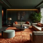
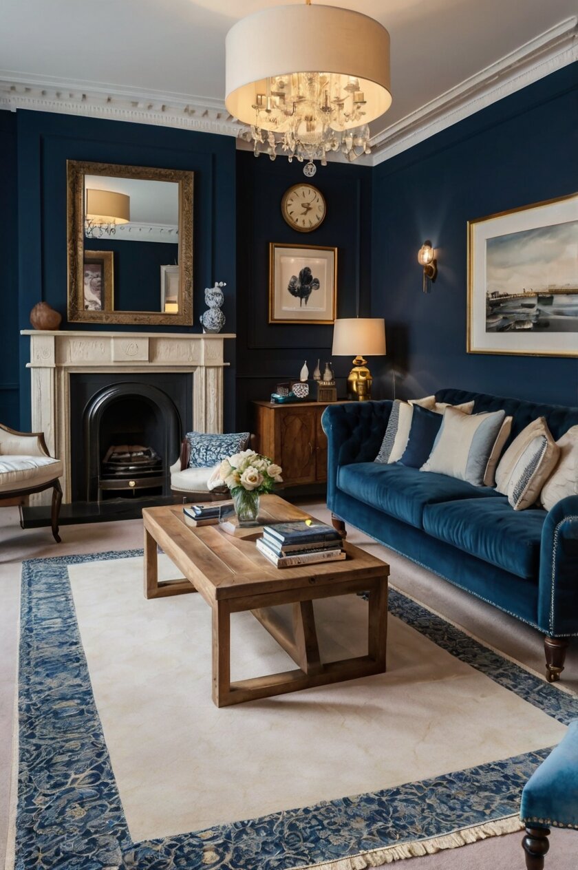
Navy Blue Carpet
Choosing a navy blue carpet to match your Hague Blue walls creates a bold, monochromatic look that feels incredibly luxurious and enveloping.
This tone-on-tone approach makes a powerful statement while creating a sense of depth in your space.
When you pair similar blues together, you’re creating a cocoon-like atmosphere that feels sophisticated and intentional.
Interior designers often recommend this approach for media rooms, libraries, or bedrooms where you want to create a cozy, intimate environment.
The key to making this work is selecting a navy carpet that’s either slightly lighter or slightly darker than your Hague Blue walls to create subtle contrast.
This monochromatic look becomes even more striking when you add different textures throughout the space to prevent it from feeling flat.
Consider incorporating metallic accents like brass or gold to add warmth and brightness to this cool-toned palette.
White trim and ceiling will provide necessary contrast, preventing the room from feeling too dark or one-dimensional.
This combination works particularly well in larger rooms that can handle the visual weight of dark colors on both walls and floors.
For added interest, look for navy carpets with subtle patterns or varying pile heights to create texture and dimension.
The monochromatic approach allows your furniture and art to stand out dramatically against the unified background.
This pairing creates a perfect foundation for showcasing statement lighting fixtures that become even more impactful against the deep blue backdrop.
Beige or Taupe Carpet
Beige or taupe carpet creates a warm, grounding effect when paired with Hague Blue walls, offering a perfect balance between contrast and harmony.
This combination works because the warm undertones in beige and taupe soften the coolness of Hague Blue, creating a welcoming atmosphere.
When you choose beige carpet, you’re selecting a versatile neutral that will allow you to easily change accessories and furnishings over time.
The natural quality of these earth tones complements the sophisticated depth of Hague Blue, creating a pairing that feels both elegant and approachable.
Designers often recommend this combination for living rooms and bedrooms where you want to create a serene, comfortable environment.
Beige carpets with varied textures like berber or frieze add visual interest while maintaining the neutral palette.
This pairing works exceptionally well with natural wood furniture, creating a color story that feels connected to nature.
If you’re concerned about maintenance, choose a medium-toned taupe that will hide minor dirt and stains while still providing contrast to your blue walls.
Consider a carpet with subtle flecks or a slight pattern to add dimension and hide wear in high-traffic areas.
The warmth of beige or taupe creates a beautiful foundation for layering textiles like throws and pillows in complementary colors.
This combination allows for versatility in decorating styles, working equally well with traditional furnishings or more contemporary pieces.
For a cohesive look, incorporate elements in similar beige tones in your window treatments or upholstery to connect your floor and other design elements.

Find Your Room’s Color Palette
Tap a vibe — get a curated 5-color palette with hex codes you can copy ✨
💭 I Wrote a Book About My Biggest Decorating Mistakes!
When I decorated my first home, I thought I knew what I was doing. Spoiler: I didn’t. 😅
💸 I bought a sofa way too big for my living room. Paint colors that looked amazing in the store but terrible on my walls.
Emerald Green Carpet
An emerald green carpet paired with Hague Blue walls creates a bold, nature-inspired color story that feels both luxurious and unexpected.
This combination draws from the color wheel theory where analogous colors (those next to each other) create harmony while maintaining visual interest.
When you choose emerald green carpeting, you’re embracing a rich jewel tone that complements the depth and sophistication of Hague Blue.
Interior designers love this pairing for statement rooms like dining rooms, home libraries, or creative spaces where you want to make a distinctive impression.
The green and blue combination echoes colors found in nature, creating a biophilic connection that feels inherently pleasing to the eye.
This bold pairing works because both colors share cool undertones while providing enough contrast to define the space.
Consider a plush, high-pile emerald carpet to add texture and comfort that balances the cool sophistication of your Hague Blue walls.
This color combination pairs beautifully with brass or gold accents that enhance the jewel-tone quality of both the walls and carpet.
For a cohesive look, incorporate small touches of emerald in artwork or accessories on your blue walls to tie the space together.
This pairing works especially well in rooms with plenty of natural light that can showcase the true depth of both colors.
If full emerald carpeting feels too bold, consider a patterned carpet that incorporates both blue and green tones for a more subtle approach.
The richness of this color combination creates a perfect backdrop for both antique furnishings and sleek, contemporary pieces.
Charcoal Gray Carpet
Charcoal gray carpet paired with Hague Blue walls creates a sophisticated, contemporary look with dramatic depth and understated elegance.
This combination works because both colors are rich and deep but distinct enough to create definition between your walls and floor.
When you choose charcoal carpet, you’re creating a strong foundation that anchors the room while allowing the Hague Blue to be the star.
This pairing is particularly effective in formal spaces like dining rooms or home offices where you want to create a serious, professional atmosphere.
Designers love this combination because it creates a perfect neutral backdrop for either colorful accessories or a minimalist aesthetic.
The dark gray flooring helps hide stains and wear, making it practical for high-traffic areas or homes with children and pets.
Consider a charcoal carpet with subtle texture or a low pattern to add visual interest without competing with your statement walls.
This color combination works beautifully with white trim and ceiling to prevent the space from feeling too dark or heavy.
The richness of these two deep tones makes metallic accents in silver, chrome, or brushed nickel stand out dramatically.
For added dimension, look for charcoal carpets with slight variations in tone or subtle flecks that add depth without creating a busy look.
This pairing creates a perfect backdrop for statement furniture pieces in lighter colors that will pop against the dark background.
The timeless quality of this combination means your investment in quality carpeting will remain stylish for years to come.

What’s Your Decor Personality?
5 questions · 30 seconds · Instant style match 🏡
Soft Sage Green Carpet
Soft sage green carpet creates a soothing, natural complement to Hague Blue walls, offering a subtle contrast that feels fresh and harmonious.
This combination works because sage green shares the same muted quality as Hague Blue, creating a sophisticated palette inspired by nature.
When you choose sage carpet, you’re bringing in an element that softens the intensity of blue walls while maintaining a coherent color story.
Interior designers recommend this pairing for bedrooms and meditation spaces where a calm, restorative atmosphere is the goal.
The combination of these two colors creates a palette reminiscent of natural landscapes, bringing an outdoor-inspired tranquility to your interior.
Consider a sage carpet with varying pile heights or subtle texture to add dimension without disrupting the peaceful feeling of the space.
This color pairing works exceptionally well with natural wood furniture and accents, enhancing the nature-inspired aesthetic.
Light fixtures in warm metals like brass or gold add necessary warmth to this cool-toned palette, creating balance in your space.
For a cohesive look, incorporate elements of both colors in your accessories, such as artwork or textiles that feature both blue and green tones.
This combination provides a perfect backdrop for plants, allowing their natural greenery to enhance and connect with your color scheme.
Sage green carpeting is versatile enough to transition between seasons, feeling cool and refreshing in summer and cozy in winter months.
The subtle contrast between these colors creates a sophisticated foundation that works with both traditional and contemporary decorating styles.
Warm Taupe Carpet
Warm taupe carpet creates a cozy, inviting atmosphere when paired with Hague Blue walls, balancing the cool tones with earthy warmth.
This combination works because the warm undertones in taupe soften and complement the depth of Hague Blue, creating a balanced environment.
When you choose warm taupe carpeting, you’re selecting a versatile neutral that bridges the gap between beige and gray, offering the best of both.
Designers often recommend this pairing for family rooms and bedrooms where comfort and relaxation are priorities.
The warmth of taupe prevents Hague Blue from feeling too cool or formal, making the space more welcoming and livable.
Consider a plush, soft taupe carpet to add textural contrast to the smooth painted walls, creating a multi-dimensional effect.
This color combination works beautifully with natural elements like wood furniture, leather accents, and organic textiles.
Warm taupe carpeting provides practical benefits too, as its medium tone helps disguise everyday dirt and minor stains.
For added interest, look for taupe carpets with subtle variations in tone or texture that add depth without creating visual busyness.
This pairing creates a perfect foundation for adding accent colors like rust, terracotta, or mustard through accessories and art.
The neutrality of taupe allows for flexibility in decorating, making it easy to update your look seasonally without changing your major elements.
This combination transitions well between different lighting conditions, maintaining its sophisticated appeal from bright daylight to cozy evening ambiance.
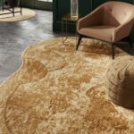
Soft Gold or Champagne Carpet
Soft gold or champagne carpet creates an elegant, luxurious pairing with Hague Blue walls, adding warmth and light to the rich, deep background.
This combination works because the subtle metallic quality of champagne carpeting reflects light while complementing the sophistication of Hague Blue.
When you choose a soft gold carpet, you’re creating a timeless look that feels both classic and contemporary.
Interior designers recommend this pairing for formal living rooms, master bedrooms, or dining areas where you want to create a sense of luxury.
The warmth of gold tones balances the coolness of Hague Blue, creating a harmonious environment that feels welcoming and refined.
Consider a champagne carpet with a slight sheen or subtle pattern to enhance the luxurious quality without overwhelming the space.
This color combination creates a perfect backdrop for both modern furniture with clean lines or antique pieces with ornate details.
Gold or champagne carpeting reflects available light, helping to brighten spaces where Hague Blue might otherwise make the room feel darker.
For a cohesive look, incorporate brass or gold accessories throughout the room to connect with the warm tones in your carpet.
This pairing works exceptionally well in rooms with traditional architectural details like crown molding or wainscoting painted in crisp white.
The contrast between dark walls and light flooring helps define the architecture of your space while creating visual interest.
This combination creates a sense of luxury that transforms even simple rooms into spaces that feel considered and intentionally designed.
This or That?
Pick your fave — see what other readers chose! 👀
Rich Burgundy Carpet
Rich burgundy carpet paired with Hague Blue walls creates a bold, regal combination that exudes sophistication and dramatic flair.
This pairing works because these two jewel tones complement each other while providing enough contrast to create visual interest.
When you choose burgundy carpet, you’re embracing a classic color that adds warmth and depth to counter the coolness of Hague Blue.
Interior designers recommend this combination for dining rooms, libraries, or home theaters where you want to create an immersive, luxurious environment.
The richness of both colors creates a cocooning effect that feels particularly appropriate for spaces used mainly in the evening.
Consider a plush, velvety burgundy carpet to enhance the luxurious feeling and add textural contrast to your painted walls.
This color combination pairs beautifully with dark wood furniture, creating a traditional, timeless aesthetic with depth and character.
For a more contemporary look, incorporate metallic accents in brass or gold to brighten and elevate this rich color palette.
The warmth of burgundy balances the coolness of Hague Blue, creating a space that feels both dramatic and welcoming.
This bold pairing makes a confident design statement that showcases your willingness to embrace color and create memorable spaces.
For a cohesive look, incorporate small touches of burgundy in artwork or accessories on your blue walls to connect the floor and wall colors.
While this combination is dramatic, it creates a timeless look that won’t quickly feel dated or trendy.
💭 I Wrote a Book About My Biggest Decorating Mistakes!
When I decorated my first home, I thought I knew what I was doing. Spoiler: I didn’t. 😅
💸 I bought a sofa way too big for my living room. Paint colors that looked amazing in the store but terrible on my walls.
Oatmeal or Natural Sisal Carpet
Oatmeal carpet or natural sisal flooring creates an organic, textural contrast to Hague Blue walls, bringing warmth and casual elegance to your space.
This combination works beautifully because the natural, neutral quality of oatmeal or sisal softens the formality of Hague Blue.
When you choose these natural tones, you’re creating a backdrop that feels connected to nature while maintaining sophistication.
Interior designers often recommend this pairing for coastal homes, transitional spaces, or rooms where you want to balance traditional and casual elements.
The textural quality of natural fiber carpets adds visual interest and depth that complements the rich, smooth appearance of Hague Blue paint.
Consider carpets with visible weaves or subtle patterns that add dimension without competing with your statement walls.
This combination works particularly well with light wood furniture, rattan accents, and natural textiles throughout the space.
The neutral foundation allows you to easily change accent colors seasonally or as design trends evolve over time.
For a cohesive look, incorporate natural materials like wood, stone, or linen in other elements of your room to connect with the natural carpet.
This pairing creates a perfect balance between formal and casual, making spaces feel both sophisticated and lived-in.
The light flooring helps brighten rooms with dark walls, preventing spaces from feeling too heavy or closed-in.
This combination works in virtually any room of your home but is particularly effective in living rooms or bedrooms where comfort is a priority.
Quick Design Dilemma
Cast your vote — see what other readers think! 🤔
Soft Coral or Peach Carpet
Soft coral or peach carpet creates an unexpected yet harmonious pairing with Hague Blue walls, offering a fresh, contemporary look with vintage charm.
This combination works because coral and peach tones sit opposite blue on the color wheel, creating a complementary relationship that’s visually striking yet balanced.
When you choose soft coral carpeting, you’re embracing a color palette that feels both current and timeless.
Interior designers recommend this pairing for bedrooms, creative spaces, or dining rooms where you want to create a cheerful, sophisticated atmosphere.
The warmth of coral or peach brightens spaces with Hague Blue walls, preventing rooms from feeling too dark or serious.
Consider a plush, high-pile coral carpet to add textural interest and comfort that balances the cool sophistication of your blue walls.
This color combination works beautifully with brass or gold accents that enhance the warmth of the coral while adding luxury to the overall scheme.
For a cohesive look, incorporate small touches of coral in artwork or accessories on your blue walls to connect the color story.
This pairing creates a perfect foundation for both modern furnishings and vintage-inspired pieces that echo the nostalgic quality of this color combination.
The contrast between cool walls and warm flooring creates a balanced environment that feels both energizing and comfortable.
This unexpected combination makes a confident design statement that showcases your willingness to embrace color in sophisticated ways.
While bold, this pairing has surprising longevity when the coral or peach is chosen in a soft, dusty tone rather than a bright, saturated hue.

Patterned Carpet with Blue and Neutral Tones
Patterned carpet featuring blue and neutral tones creates a cohesive, designer-worthy foundation when paired with Hague Blue walls.
This combination works because the pattern incorporates your wall color, creating immediate harmony while adding visual interest to your space.
When you choose a carpet with blue elements, you’re creating continuity between your walls and floor without committing to a single-color carpet.
Interior designers recommend this approach for living rooms, home offices, or hallways where you want to add personality while maintaining sophistication.
The pattern helps disguise wear and stains, making it practical for high-traffic areas while still complementing your beautiful Hague Blue walls.
Consider geometric patterns for contemporary spaces or traditional motifs like damask for more classic interiors.
This approach allows you to incorporate multiple colors that can inspire other design elements throughout your room.
Patterned carpets with a mix of blue, cream, gray, or taupe create a built-in color palette that makes decorating the rest of your space easier.
For a cohesive look, pull colors from your carpet pattern into accessories like pillows, throws, and artwork.
This combination works particularly well in open floor plans where the patterned carpet helps define specific areas while maintaining a cohesive look.
The visual texture of a pattern adds depth and dimension to your space without requiring additional decorative elements.
This approach offers the perfect solution when you can’t decide between solid carpet options, giving you the benefits of multiple colors in one sophisticated choice.