I recently painted my living room walls cloud white, and now I’m struggling to pick the right carpet color.
After wasting money on samples that totally clashed, I did my homework to find colors that complement cloud white walls.
Greige and light Gray look gorgeous with cloud white.
Stay away from beige – it makes the walls seem dingy.
Interestingly, cloud white walls work with both warm and cool carpet tones if I pick the right shades.
✨Click to Get My 101 FREE Designer Room Ideas
Greige

Greige (a mix of Gray and beige) is a versatile neutral that pairs beautifully with cloud white walls.
It creates a soothing, cozy vibe in my living room.
I’d go for a pale greige that won’t look too muddy.
Specifically, I’m considering a soft heathered greige carpet in a plush saxony weave, which will hide footprints well since I have kids and pets.
The greige will contrast nicely with my bright white walls without clashing.
I’d pair it with creamy white trim and accents of warm wood tones to keep things cohesive.
Greige is a flexible enough background to work with any style of furniture too – from modern to farmhouse.
I can easily incorporate vibrant pops of color like emerald green and sapphire blue without the greige carpet looking out of place.
The only downside is greige can show stains if you have messy kids like mine.
But a good professional carpet cleaning once a year should keep it looking fresh.
I’d specifically avoid a flat weave greige carpet because it would show every footprint and vacuum mark.
And I’d steer clear of a berber greige since it doesn’t have enough texture to complement my smooth drywall.
But an affordable, durable saxony or frieze greige carpet would beautifully enhance my cloud white walls.
Pale Blue

A pale blue carpet adds a subtle pop of color and feels breezy with cloud white walls.
I’d steer clear of navy or bright blues, which are jarring against such a pristine white background.
But a soft powder blue, with just a hint of color, would be beautiful.
It would give just enough visual interest without overwhelming my small living room.
I love how powder blue and white feel soothing and beachy.
The pale blue would bring out the cool undertones in the cloud white paint.
And it would contrast nicely without clashing like deeper shades of blue might.
I’d probably choose a plush, stain-resistant saxony powder blue carpet.
The soft, thick pile would feel great underfoot and hold up to kids and pets.
To decorate, I’d choose neutral furnishings like a creamy linen sofa and plenty of light wood accents.
Nautical elements like jute rugs, driftwood and rope details would accentuate the beach vibe.
Palm leaf prints and rattan textures would further enhance the laidback charm.
I’d probably avoid darker woods, which might feel too heavy against the airy blue and white palette.
But warm metallics like brass lamps or gold picture frames would give a subtle luxe feel.
Blush Pink
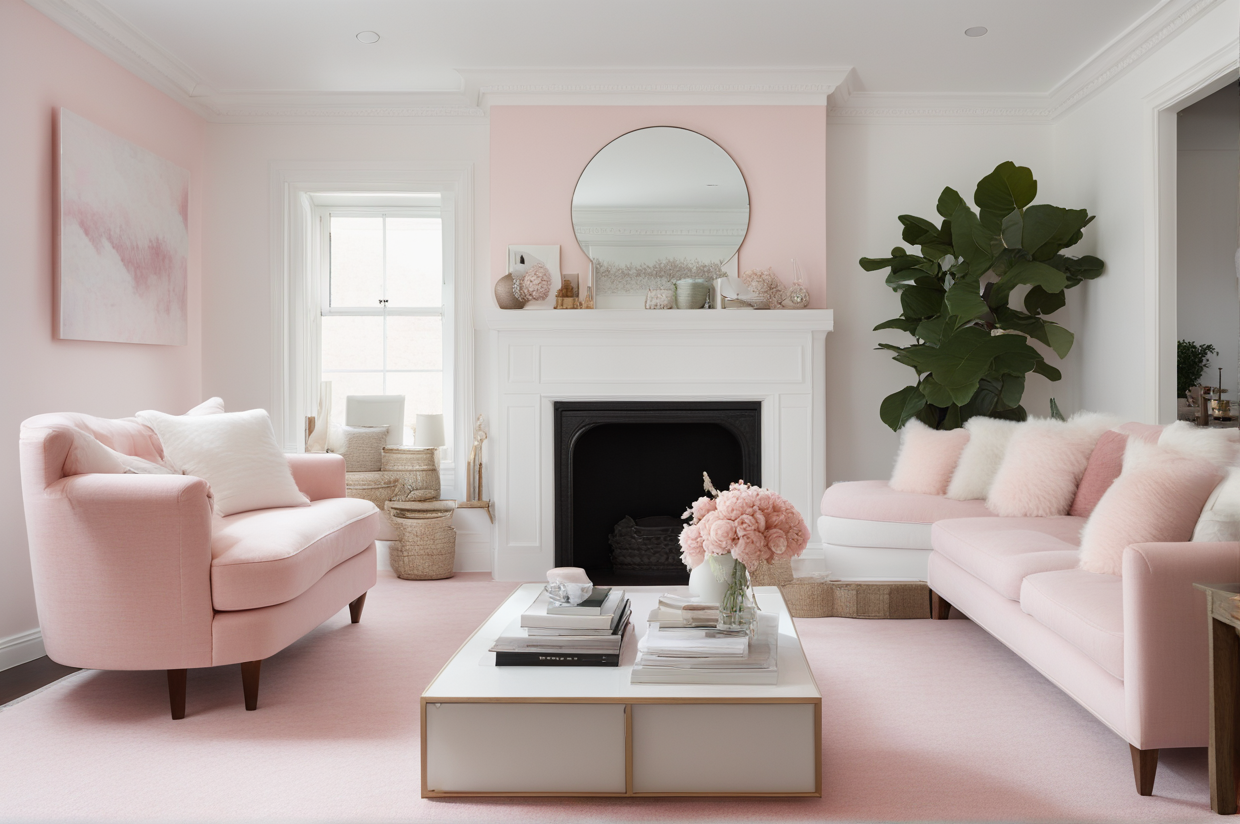
Blush pink carpet looks girly yet sophisticated with cloud white.
I’d pick a muted pink rather than a bright pink, or it may be overwhelming against my plain white walls.
A soft, rosy pink would add just the right pop of femininity without going overboard.
And it would tie in nicely to the warm, peachy undertones in my cloud white paint.
I’d probably do a plush saxony blush pink carpet to feel rich and cushy underfoot.
It would need to be dense enough not to show every footprint and vacuum mark.
For furniture, I’d choose painted antiques and vintage-style pieces for a romantic look.
Light woods like birch would help tone down the pink so it doesn’t veer childlike.
Mirrored accents and crystal chandeliers would give it a glam vibe.
Sheer linen drapes would soften the windows for an airy, graceful ambiance.
To avoid looking too sugary, I’d use sophisticated greenery like olive tree branches instead of flowers.
And I’d incorporate neutral textures like velvet toss pillows and wool handknit blankets.
Just the right dose of color paired with elegant accents strikes the perfect girly-chic balance.
Olive Green

An olive green carpet with cloud white walls gives off a natural, peaceful vibe.
I’d avoid going too dark with the green or it can feel swampy against my bright white backdrop.
But a soft sagey olive green would be beautiful – almost like a subtle nod to nature indoors.
The earthy olive would play up the subtle yellow undertones in my cloud white paint.
And it would add organic contrast without being too bold or intense.
I’d probably do a durable, textured loop pile olive carpet to hide dirt and footprints.
For furniture, I’d use lots of light wood like oak and woven textures to enhance the nature theme.
An olive velvet sofa would tie everything together in a cozy way.
Lush potted plants like ferns or orchids would accentuate the tranquil vibe.
I’d avoid any stark whites or metallics so as not to distract from the organic palette.
But natural elements like stone, wood and linen would fit right in.
It’s a sophisticated dose of color that plays up the subtle warmth of the walls.
✨Click to Get My 101 FREE Designer Room Ideas
Cream

Cream carpet and cloud white walls are a fail-safe neutral pairing.
I’d go for a rich cream with warm undertones rather than plain beige, which could risk looking dull.
The creamy ivory would provide enough contrast from my bright white walls without clashing.
And it would pick up the subtle warm peach undertones in the cloud white paint.
I’d probably do a thick, plush saxony cream carpet to feel indulgent underfoot.
The soft, dense pile would hold up well to daily life with kids and pets.
For furniture, I’d mix metals like antique brass and chrome for an eclectic vibe.
Creamy linen and velvet upholstery would enhance the luxe feel.
I’d bring in shades of blue throughout the space as an accent color.
Navy throw pillows, a pale blue chair, and cerulean artwork would really pop.
I’d avoid any strong reds, which could clash with the understated ivory and white palette.
But rich wood accents would add warmth and keep things from feeling too sterile.
Tan

Tan carpeting has an earthy feel that works nicely with cloud white walls.
I’d make sure to avoid orange or brown undertones in the tan, so it doesn’t feel drab or dingy.
But a light camel tan would add a subtle touch of coziness to balance the crisp white walls.
I’d likely opt for a durable, loop pile tan carpet to stand up to high traffic areas.
And I’d choose a Subtle organic pattern to hide stains and footprints.
For furniture, I’d use lots of cane, rattan and woven woods for an organic look.
Neutral linen upholstery would keep things simple and airy.
Touches of terracotta in vases, pillows and artwork would bring out the earthiness.
I’d avoid any bright, bold colors that might overwhelm the neutral palette.
But metallic accents in brass and copper wouldwarm things up in an understated way.
Light Wood Tones
Light wood flooring like maple or birch beautifully complements cloud white walls.
Dark woods like walnut can feel too heavy against my bright, airy white walls.
But a bleached oak or light ash wood floor would be perfect.
It would provide warmth and texture without weighing down the space.
And it would subtly pick up on the faint yellow cast in my cloud white paint.
I’d finish it with a matte coating to minimize upkeep and hide scuffs.
For furnishings, I’d use crisp white upholstery mixed with natural linen.
Brass legs on the furniture would tie in nicely with the soft wood tones.
I’d bring in shades of green through an emerald velvet chair, plants and artwork.
The green would complement both the white walls and wood flooring.
I’d avoid any big bold patterns that compete with the simple palette.
But subtle stripes and organic motifs would accent things nicely.
Off-White
Slightly off-white carpeting gives just enough contrast with pure cloud white walls.
I’d stay away from stark white carpet, which washes out the room and competes with my walls.
But a warm, creamy off-white carpet would be perfect.
It would provide subtle contrast while still remaining in the same tonal family.
I’d likely do plush saxony carpet in an organic pattern to hide dirt.
For furniture, I’d mix woods like oak and walnut to add richness.
Accents of black and navy blue would ground the airy neutral palette.
Brass fixtures would add a hint of glam to the relaxed vibe.
I’d avoid any strong jewel tones that would overwhelm the understated neutrals.
But textured ivory linens and cozy knit blankets would enhance the quiet elegance.
✨Click to Get My 101 FREE Designer Room Ideas
Dusty Rose
Dusty rose carpet with cloud white walls is romantic and airy.
I’d pick a subdued rose hue rather than a bright pink, to complement the walls.
A soft muted dusty rose would add just a whisper of color while keeping things calm.
I’d likely do a wool loop pile rose carpet for durability and a touchable texture.
For furniture, I’d choose painted antiques in whites and creams for an ethereal feel.
Aged wood tones would enhance the vintage charm while grounding the space.
Accents of emerald green and burnt orange would provide an earthy contrast.
I’d avoid any stark patterns or bright colors that would overwhelm the muted palette.
But a subtle rose trellis motif would accent things nicely.
Just a touch of color paired with vintage elements strikes the perfect dreamy balance.
Pale Yellow
Pale yellow carpeting cheers up cloud white walls.
I’d avoid going too vibrant with the yellow, or it will overwhelm the crisp white backdrop.
But a buttery ivory yellow would feel bright and uplifting with the cloud white.
It would contrast nicely while picking up on the faint yellow tones in the wall paint.
For durability, I’d likely choose a textured loop pile yellow carpet.
To decorate, I’d use light oak furnishings and accents of chartreuse.
Crisp white upholstery mixed with natural linen would keep things fresh.
Rattan, woven woods and driftwood accents would enhance the airy charm.
I’d avoid any bold patterns or dark colors that could overwhelm the light palette.
But metallic brass accents would warm things up in a subtle way.
Lavender
Lavender carpeting looks dreamy and peaceful with cloud white walls.
I’d just don’t pick a bright purple, or it can be jarring against the stark white backdrop.
But a muted heathered lavender would beautifully complement the walls’ peachy undertones.
It would provide a subtle pop of color while remaining soft and inviting.
For durability and stain resistance, I’d likely do a nylon saxony lavender carpet.
To decorate, I’d choose a weathered oak dining table and muted floral upholstery.
Accents of blush pinks and sage greens would enhance the ethereal vibe.
Mirrored furniture and crystal chandeliers would add a touch of whimsy.
I’d avoid
I’d avoid any loud patterns or neon colors that could clash with the peaceful palette.
But metallics like bronze and rose gold would warm things up stylishly.
And sheer linen drapes would filter the light beautifully.
Light Gray
Light Gray carpeting has a clean, modern look with cloud white walls.
I’d stay away from medium or charcoal Grays, which can seem too dark and dramatic with my bright white walls.
But a super pale silver Gray would look amazing.
It would add some contrast without making my living room feel cold or sterile.
I love how light Gray and white feel crisp and contemporary.
And since my walls are pure bright white, I can get away with a bolder, contrasting light Gray carpet instead of playing it safe with greige.
The only tricky part is keeping light Gray carpet clean – it loves to show every speck of dirt.
So I’d probably opt for a textured loop pile light Gray to help disguise footprints and vacuum marks.
And I’d have to be diligent about removing spills and stains immediately before they set.
But it would be worth the maintenance for that chic, modern look.
I’d pair the light Gray carpet with sleek midcentury-style furniture in warm woods and plenty of texture from throws and pillows.
Large leafy plants would also help soften the crisp white and Gray palette.
I’d avoid any beige or brown tones – they’d drag down the fresh color scheme.
Vibrant teal, chartreuse or fuchsia accents would really pop against the neutral backdrop.
✨Click to Get My 101 FREE Designer Room Ideas
Sage Green
Sage green carpeting has a calming spa-like feel with cloud white walls.
I’d make sure to avoid dark or olive greens that could overwhelm the bright white backdrop.
But a soft seafoam green would be perfect to complement the walls’ subtle peach undertones.
It would provide just enough color while maintaining a serene vibe.
I’d likely choose a durable, frieze constructed seafoam carpet to stand up to wear.
For decor, I’d use lots of light oak wood tones mixed with crisp white linens.
Touches of greenery like fiddle leaf fig trees and eucalyptus would enhance the nature theme.
I’d avoid any loud colors or busy patterns that could compete with the soothing palette.
But metallic accents in brass and copper would add subtle richness.
Platinum Gray
Platinum Gray carpeting has an elegant look with cloud white walls.
I’d steer clear of dark charcoal Grays, which are too harsh against my bright white backdrop.
But a pale silver-toned platinum Gray would add just the right contrast while feeling glamorous.
The cool undertones would complement the crisp white walls beautifully.
And it would provide enough visual interest without overwhelming the space.
For durability, I’d likely choose a frieze or loop pile platinum Gray carpet.
To decorate, I’d use mirrored furniture, glass accents, and crystal lighting fixtures.
Crisp white upholstery mixed with silvery velvets would continue the elegant vibe.
I’d avoid any warm wood tones or bold colors that could clash.
But icy blue and purple accents would complement the cool palette nicely.
Taupe
Taupe carpeting is a flexible neutral that pairs nicely with cloud white walls.
I’d stay away from reddish or brown toned tawpes that could risk looking muddy.
But a warm, sandy taupe would add cozy contrast to the crisp white walls.
It would provide subtle visual interest without overwhelming the space.
I’d likely do a durable, loop pile taupe carpet to stand up to pets and kids.
For decor, I’d choose a mix of wood tones from oak to walnut.
Creamy linen upholstery would keep things fresh and light.
Earth tone ceramics, maps and woven accents would enhance the warmth.
I’d avoid any bright colors that could compete with the understated palette.
But black iron accents would add bold contrast in a natural way.
Silver Gray
Silver Gray carpeting has a sleek, modern vibe with cloud white walls.
I’d just don’t pick a blue-ish Gray, which can feel icy against the warm white walls.
But a true, pale silver Gray would add stylish contrast while feeling crisp and contemporary.
I’d likely opt for a durable, low-pile Gray carpet to show off sleek furniture legs.
To decorate, I’d choose mid-century style furnishings with an airy, minimalist look.
Accents of black, yellow and chartreuse would pop against the neutral backdrop.
I’d avoid any ornate traditional styles that could clash with the modern palette.
But geometric prints and abstract art would complement the sleek lines.
✨Click to Get My 101 FREE Designer Room Ideas
Top 11+ Carpet Colors for Cloud White Walls
| Rank | Why It Works | |
|---|---|---|
| Greige | 9.5 | Soothing, cozy vibe. Versatile neutral. |
| Light Gray | 9.0 | Clean, modern look. Provides enough contrast. |
| Pale Blue | 8.5 | Breezy, beachy feel. Subtle pop of color. |
| Blush Pink | 8.0 | Girly yet sophisticated. Muted pink is charming. |
| Olive Green | 8.0 | Natural, peaceful vibe. Earthy contrast. |
| Cream | 8.0 | Fail-safe neutral. Warms up the white. |
| Tan | 7.5 | Subtle coziness. Down-to-earth sophistication. |
| Light Wood | 7.5 | Warmth without weighing down the space. |
| Off-White | 7.0 | Subtle contrast. Stays in same tonal family. |
| Dusty Rose | 7.5 | Romantic, airy charm. Just a whisper of color. |
| Pale Yellow | 7.0 | Cheery brightness. Uplifting contrast. |
| Lavender | 7.5 | Dreamy, peaceful ambiance. Muted purple is charming. |
| Sage Green | 8.0 | Relaxing, spa-like feel. Soothing subtle green. |
| Platinum Gray | 8.5 | Elegant and glamorous. Cool contrast. |
| Taupe | 7.0 | Flexible neutral. Subtle cozy contrast. |
| Silver Gray | 8.0 | Sleek, modern look. Stylish crisp contrast. |
| Beige | 4.0 | Dingy and dull. Makes walls look yellow. |
| Black | 3.0 | Harsh and overwhelming contrast. |
| Burgundy | 4.0 | Clashes with bright white. Too bold. |
