
See your kitchen cabinets in any color, two-tone included: the upper cabinets, the lower cabinets and the island each in their own color, with the light each one reflects. Start from Benjamin Moore's own two-tone pairs, or any color you like, on a sample kitchen or a photo of yours. Your photo never leaves your device.
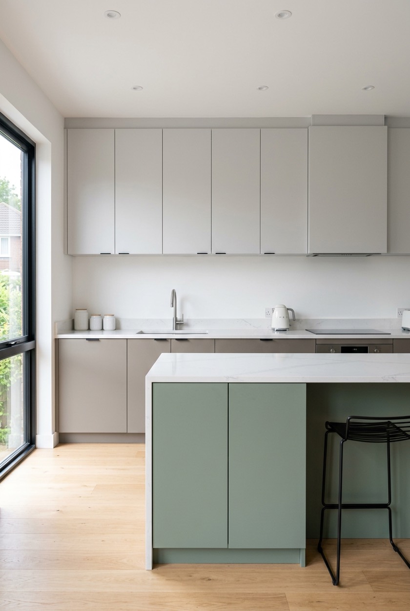
Pick the cabinets, then a color
1Your kitchen
2Which cabinets?
- Upper cabinets: Stonington Gray#CACBC5 · LRV 59Find the paint
- Lower cabinets: Hale Navy#434B56 · LRV 7Find the paint
- Island: Hale Navy#434B56 · LRV 7Find the paint
LRV gap between uppers and lowers: 52, stands apart in any light.
Darker below: Sherwin-Williams’ Sue Wadden says dark lower cabinets make the ceiling look higher.
3Pick a color
4Two-tone pairs from Benjamin Moore
The pairs Benjamin Moore's own pages name for two-tone cabinets. One tap paints the lighter color above and the darker one below and on the island.
5Your own photo
On a sample kitchen every cabinet is painted for you. On your own photo, pick Uppers, then tap each upper door; do the same for the lowers and the island. Missed a strip? Tap it too, or use the brush.
Quick answer: to try kitchen cabinet colors, paint them on a photo first. Pick Uppers, Lowers or Island above, then a color, and that part of the kitchen changes. For two-tone cabinets, the usual layout is a darker color below and a lighter one above: Sherwin-Williams’ color marketing director says dark lower cabinets make the ceiling look higher. The tool shows the light each color reflects (LRV) and the gap between them. It is free, and your photo never leaves your device.
How to use the kitchen cabinet color visualizer
- Pick a kitchen. Start with the modern or the warm sample kitchen, or tap Upload or take a photo to use yours. A photo taken straight on, in daylight, works best.
- Pick the cabinets. Uppers are the wall cabinets, Lowers the base cabinets under the counter, Island the island. The next color you pick paints that part.
- Pick a color. Browse the six color families, type any color code, or tap one of Benjamin Moore’s two-tone pairs: it paints the lighter color above and the darker one below and on the island in one go.
- Read the scheme. Each part shows its color code and LRV, and the line under them gives the LRV gap between uppers and lowers and what it does to the room. Swap uppers and lowers turns the scheme over.
- On your own photo, tap each door. Choose a part, then tap each of its doors and panels; cabinet doors are separate areas, so a door you skip keeps its old color. Compare shows the before and after, and Find the paint opens the closest Sherwin-Williams, Benjamin Moore and Behr colors to any part.
Two-tone cabinets: which color goes where
The question every two-tone kitchen starts with is which color goes on top. Sue Wadden, Director of Color Marketing at Sherwin-Williams, put it like this in the company’s STIR magazine: two-tone cabinets can create the illusion of a higher ceiling (dark cabinets below) or lower ceiling (dark cabinets above)
. Most kitchens want the first, so a pair here is painted darker below. In a tall kitchen that feels cold, the swap is the cozier choice.
Not ready for two colors on the walls of cabinets? Her advice is to start by adding color to an island: an instant focal point
. Paint the uppers and lowers one color and give the island the second one.
How much contrast is enough is a matter of light. The visualizer measures it as the gap in LRV (light reflectance value, 0 for black to 100 for white) and reads it with the yardstick England’s building regulations use for surfaces that must stand apart (Approved Document M, Volume 2, paragraph 0.26): a gap of more than 30 points contrasts in any light, 20 to 30 where the light is good, and under 20 reads as a soft, tonal two-tone, where the difference is mostly in the hue.
Benjamin Moore’s two-tone cabinet pairs
Benjamin Moore’s own pages name these pairs for two-tone cabinets: three in its Two-tone cabinet paint color pairings we love
, four black and brown pairs for a cozy cafe-meets-industrial look
, and the Stonington Gray uppers and Hale Navy lowers a painting contractor, Paper Moon Painting, used in an Austin kitchen it profiled. The colors and their LRV come from Benjamin Moore’s own designer palette files.
| Above (uppers) | Below (lowers, island) | LRV above / below | LRV gap | Reads as |
|---|---|---|---|---|
| Stonington Gray HC-170 | Hale Navy HC-154 | 59 / 7 | 52 | stands apart in any light |
| Harbor Haze 2136-60 | Caliente AF-290 | 64 / 7 | 57 | stands apart in any light |
| Swiss Coffee OC-45 | Yarmouth Blue HC-150 | 84 / 55 | 29 | stands apart in good light |
| Etiquette AF-50 | Weimaraner AF-155 | 76 / 30 | 46 | stands apart in any light |
| Southern Vine 2138-10 | Blacktop 2135-10 | 7 / 5 | 2 | a soft, tonal two-tone |
| Espresso Bean CSP-30 | Black HC-190 | 4 / 3 | 1 | a soft, tonal two-tone |
| Brown Sugar 2112-20 | Black Bean Soup 2130-10 | 7 / 5 | 2 | a soft, tonal two-tone |
| Flint AF-560 | Barista AF-175 | 11 / 6 | 5 | a soft, tonal two-tone |
The black and brown pairs are the interesting ones: their LRVs are almost the same, so they do not contrast in lightness at all. What separates them is the hue, warm brown against a cooler black or charcoal, which is why they read as rich rather than striped.
The finish for painted cabinets
Cabinets are handled every day, so they take a tougher sheen than the walls. Benjamin Moore’s own cabinet ideas page pairs Eggshell on walls and Satin on cabinets for subtle contrast
, or Satin finish on walls and Semi-Gloss finish on cabinets for a slightly higher sheen combination
, and warns that a matte finish is less durable/washable than finishes that are eggshell and higher
. The free paint sheen finder compares the sheens the paint makers name for each surface.
Three worked examples
Classic navy and gray. Tap Benjamin Moore’s Stonington Gray and Hale Navy pair: the uppers turn a light warm gray (LRV 59) and the lowers and island a deep navy (LRV 7). The gap is 52 points, so the two stand apart in any light, and the dark color sits below, the way that makes a ceiling look higher.
Soft and light. Swiss Coffee above and Yarmouth Blue below are both light colors, LRV 84 and 55: a gap of 29, which shows in a well-lit kitchen and fades on a dull evening. It is the gentle way to try two-tone without a dark color.
Only the island. Paint the uppers and lowers one color, then pick Island and give it the second: the line under the scheme says the island is now the focal point, Sue Wadden’s way to start with color.
Common mistakes with cabinet colors
- Judging a color from a chip alone. A run of cabinet doors shows far more color than a chip. Try it on a photo of the room, then paint a sample board and stand it against the cabinets.
- Two colors of the same lightness. Unless you want a tonal look on purpose, a gap under 20 points can read as a mismatch rather than a choice.
- A dark color above in a low kitchen. Dark uppers bring the ceiling down. Keep the darker color low unless the room is tall.
- Forgetting the countertop and the floor. They stay. Pick the cabinet colors with them in the photo, in daylight.
- Matte on the doors. It marks. Benjamin Moore puts cabinets in satin or semi-gloss.
Changing more than the color? Check the sizes with the free kitchen cabinet size calculator and the cabinet height calculator, place the knobs and pulls with the cabinet hardware placement calculator, and lay out the whole kitchen in the free 2D planner.
Plan the kitchen freeRead next
- Two-tone kitchen cabinet color combinations
- Kitchen cabinet color ideas
- Cabinet colors that make a kitchen look bigger
- Navy blue kitchen cabinets
- Sage green kitchen cabinets
Kitchen cabinet color questions
How can I see what color my kitchen cabinets would look like?
Upload a photo of your kitchen to the visualizer above, pick Uppers, Lowers or Island, choose a color and tap each door of that part. The color keeps the light and shadow of your photo. It runs in your browser, so the photo is never uploaded.
Which color goes on top in Two-Tone Kitchen Cabinets?
Usually the lighter one. Sherwin-Williams’ Sue Wadden says dark cabinets below create the illusion of a higher ceiling, and dark cabinets above a lower one. Use Swap uppers and lowers to see both on your kitchen.
What are good two-tone kitchen cabinet combinations?
Benjamin Moore names Swiss Coffee with Yarmouth Blue, Weimaraner with Etiquette, Caliente with Harbor Haze, and Stonington Gray over Hale Navy, plus black and brown pairs like Espresso Bean with Black. Each is one tap in the visualizer, with its LRV gap.
What is the best kitchen cabinet color?
The one that works with what stays: your countertop, floor and the light the kitchen gets. Light colors (LRV 55 and up) keep a small or dark kitchen bright; deep colors work best below, or on an island, with lighter uppers. Try a few on a photo of your own kitchen before you choose.
Should the island be a different color from the cabinets?
It is the easiest place for a second color. Sue Wadden of Sherwin-Williams suggests starting with the island when two-tone cabinets feel like too much: it becomes an instant focal point while the rest of the kitchen stays one color.
What sheen should painted kitchen cabinets be?
Satin or semi-gloss. Benjamin Moore pairs eggshell walls with satin cabinets, or satin walls with semi-gloss cabinets, and says matte is less durable and washable than eggshell and higher sheens.
Is there a free cabinet paint visualizer?
Yes, this one: no app, no sign-up and no limit. It works on the sample kitchens or your own photo, on a phone or a computer, and the photo stays on your device.