
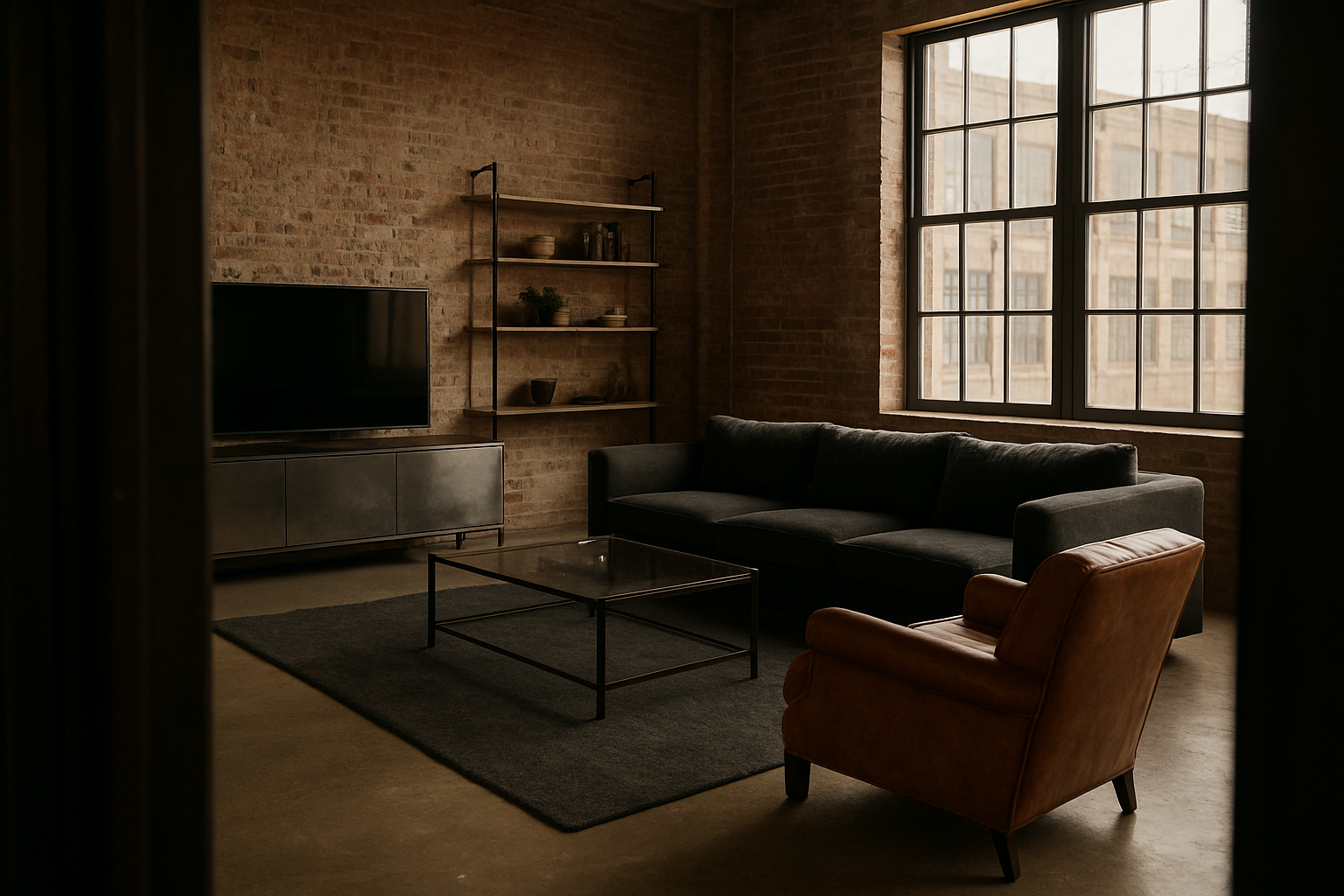

This post walks through how to actually furnish an open loft — where to float the sectional, how to size and place the rug, where the power and light need to go, and how to test the whole layout against your own space using the free plan.
It’s less about copying a photo and more about understanding why furniture pushed to the walls never quite works when the room doesn’t have walls to lean on.
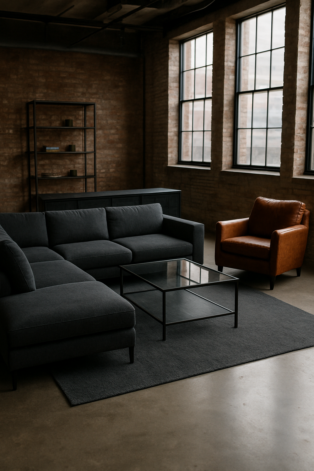
Free floor plan: Open this industrial loft layout in the free room planner — furnished, to scale, and yours to move around →
Floating the Sectional Is the Whole Argument
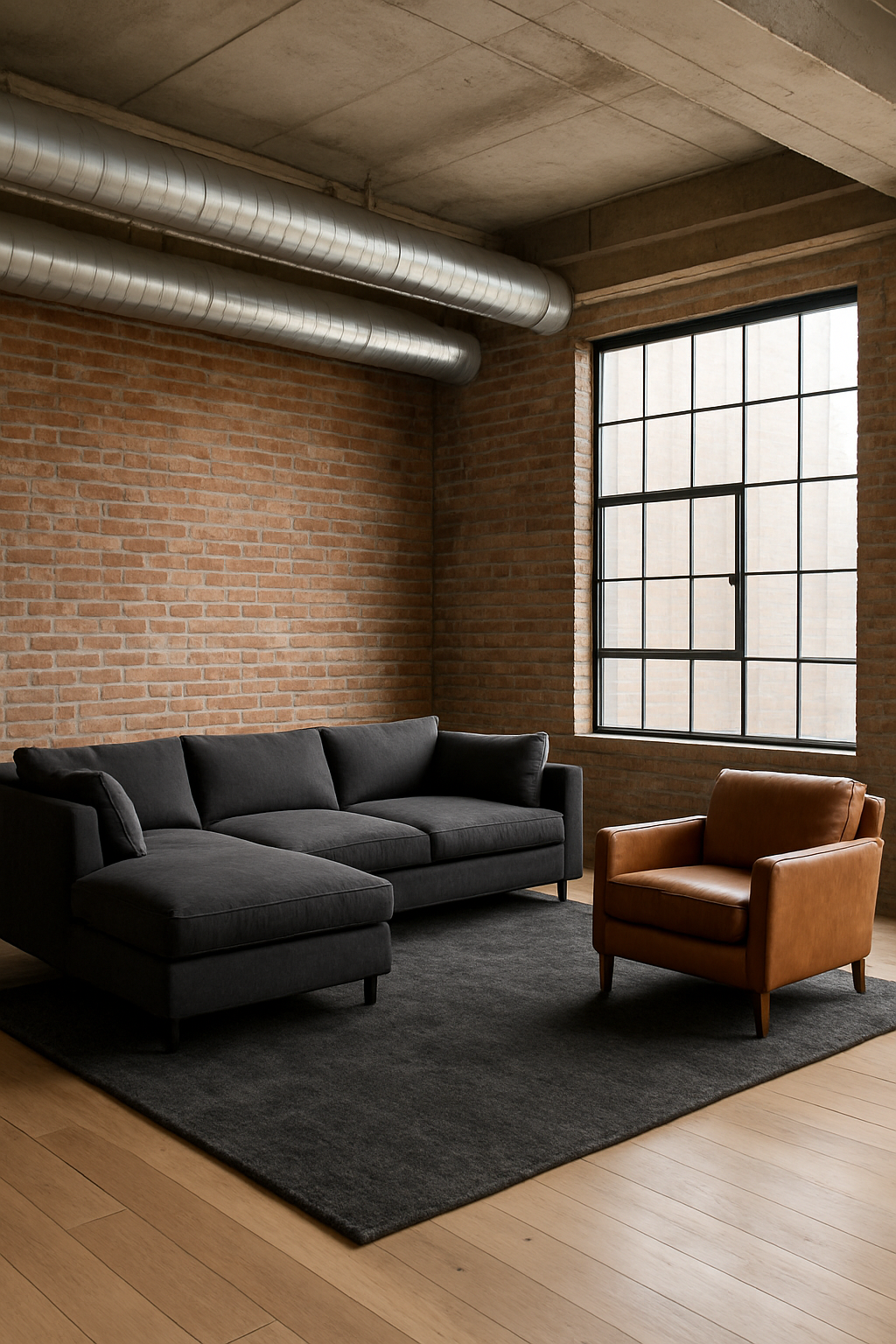
A loft with the furniture shoved against the brick isn’t minimalist — it’s a waiting room, and everyone sitting in it is waiting for someone to tell them where the living room actually is.
It’s easy to convince yourself the emptiness in the middle of a big loft room is just… the room being big.
It isn’t.
It’s a floor plan nobody has made yet.
Pushing every piece to the perimeter feels responsible.
Safe.
Like you’re respecting the architecture instead of cluttering it up.
But a sectional pressed flat against brick isn’t reading as intentional, it’s reading as furniture nobody committed to placing.
In a loft, walls aren’t going to do the work of telling you where the living room ends and the kitchen begins — nobody built those walls, that’s the whole point of the loft.
So the furniture has to do it instead.
Floating the sectional out into the room isn’t a styling trick, it’s you acting as your own contractor, framing a room the architect refused to.
The math matters here too.
Once you pull the sectional off the wall, you need about 36 inches of clear walkway on the path that actually gets used (the one from your door to the kitchen, say), or the room reads like an obstacle course instead of a house.
A tape measure and a couple of minutes are all it takes to check this before you commit to a layout.
Walkways Go Around the Zone, Never Through It
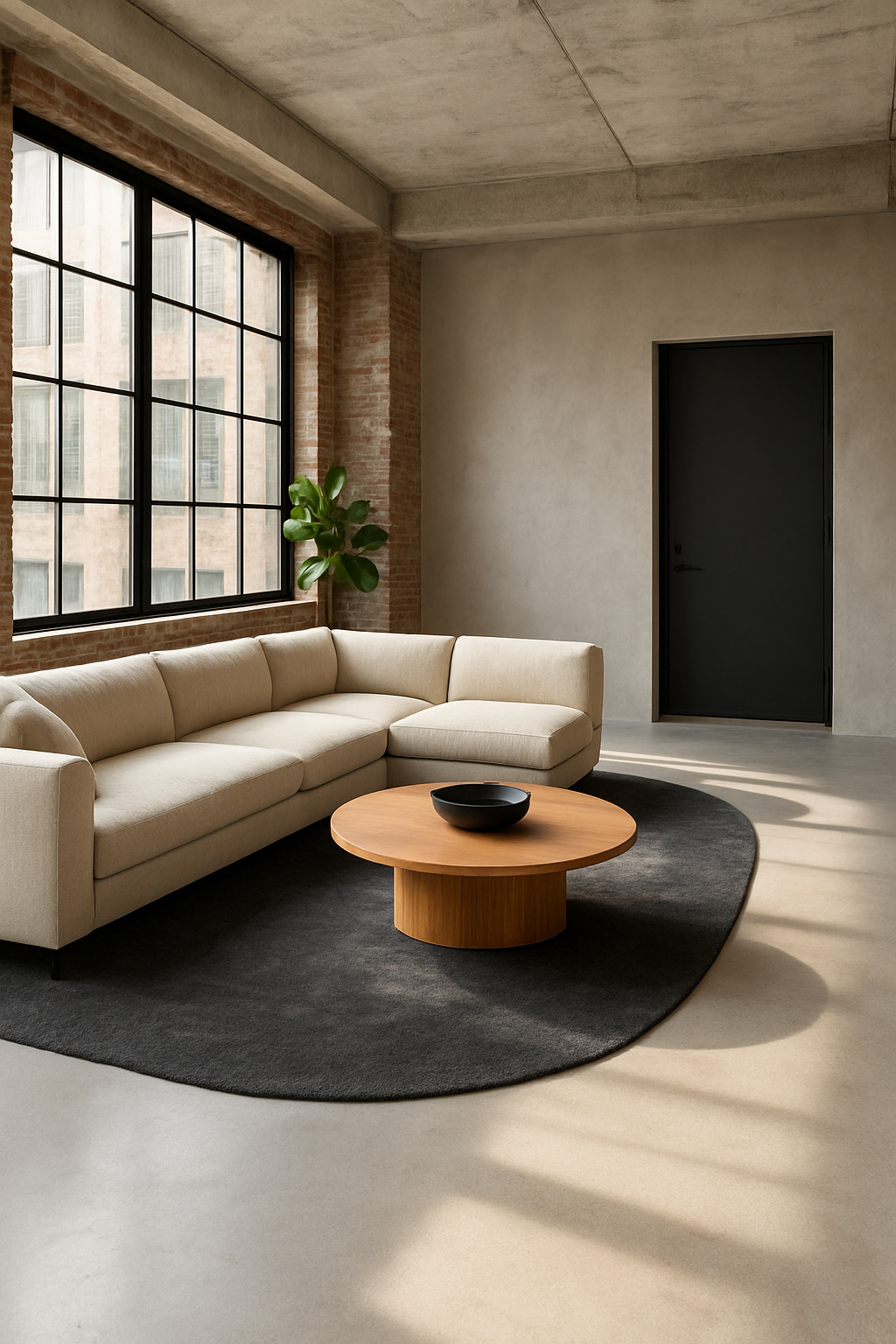
Once the sectional’s floating, you’ve got a new problem, and it’s the one every “open concept” article skips: where does foot traffic actually go?
The instinct is to let people cut straight across the space, diagonal from the front door to the fridge, right through where the coffee table lives.
Don’t.
A walkway needs to run around the seating zone, not through it.
Give yourself 24 to 30 inches along the edge of the rug for that secondary path, the one people use to get to the kitchen without stepping over anyone’s shins.
And inside the zone, the coffee table sits about 14 to 18 inches off the sofa’s front edge — that gap is for knees and coffee mugs, not for a shortcut to the bathroom.
If your main walkway cuts straight through the seating group, you don’t actually have a living room.
You have a hallway that happens to have a couch parked in it, and everyone in that room will feel it even if they can’t say why.
Route the path from the door to the kitchen between the sofa and the coffee table because it’s the shortest line on paper, and it’s efficient.
It’s also miserable to sit in, because every trip to the fridge means someone stepping over your feet with a plate.
Free calculator: Size the coffee table to your sofa →
Let the Rug Be the Only Wall You Get
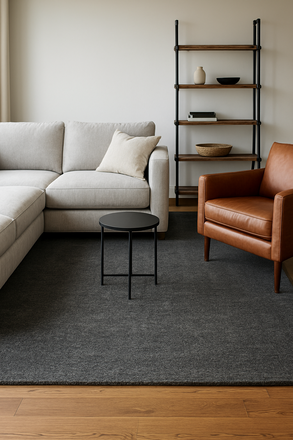
Rugs get treated like an afterthought accessory, something you toss under the coffee table because the floor looked bare, and in a loft that’s a mistake that shows within a week.
A rug that only sits under the coffee table isn’t decor, it’s a doormat with delusions of grandeur.
It’s not doing the one job a rug has to do in an open floor plan, which is arguing, visually, that this patch of concrete or hardwood is a room and not just a wide spot in the hallway.
The rug is the only wall you’re getting.
Since there’s no drywall marking the edge of the living room, the rug has to mark it instead, which means it needs to be big enough that the front feet of your sectional, at minimum, actually land on it, not just the back feet near the brick.
A rug that only catches the back edge of the sofa looks like it’s sliding out from under the furniture, like it lost an argument.
Extend it past the front edge of the sectional far enough that those front feet plant firmly on it (figure at least 8 inches of overhang past where the feet sit) and suddenly the whole zone reads as one deliberate room instead of a couch someone parked near a rug.
Sizing a rug to match a photo you like, rather than your own walkway, is a common mistake — it might fit the coffee table fine and nothing else.
Useless.
Size the rug to the walkway you’ve already planned, not the other way around.
Sizing it wrong the first time is an expensive way to learn that lesson.
Read next: An industrial living room
Free calculator: Find the right rug size for this room →
Power Has to Float With the Furniture
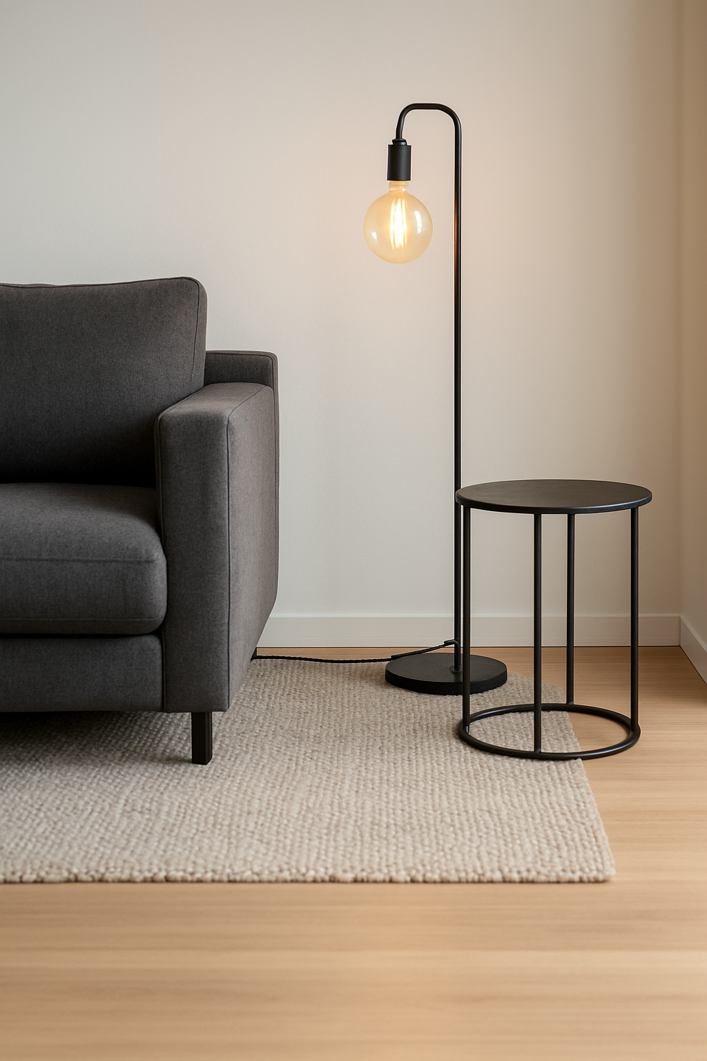
Nobody talks about the cord until it’s already duct-taped to the floor, and by then it’s too late to pretend it’s not an eyesore.
A floating sectional sitting in the middle of an open floor doesn’t have a wall behind it to hide an outlet in, which means the floor lamp, the side table lamp, whatever’s charging, all of it needs somewhere to go that isn’t across the walkway.
A lamp cord snaking over the path from your door to the kitchen isn’t an industrial detail, it’s a trip hazard wearing a costume.
Route cords under the edge of the rug, or through one of those flat cord channels made for exactly this, or run them behind the media console if it’s close enough to a floor outlet.
If your loft’s got floor outlets already, use them, don’t fight it.
If it doesn’t, that’s a conversation to have before the furniture goes down, not after.
Treat the extension cord situation as something that will “work itself out” and it won’t.
It becomes a permanent orange cord across the exact spot where the dog does his evening zoomies.
Buy the channel first.
Glare Off the Factory Windows Will Win Every Argument With Your TV
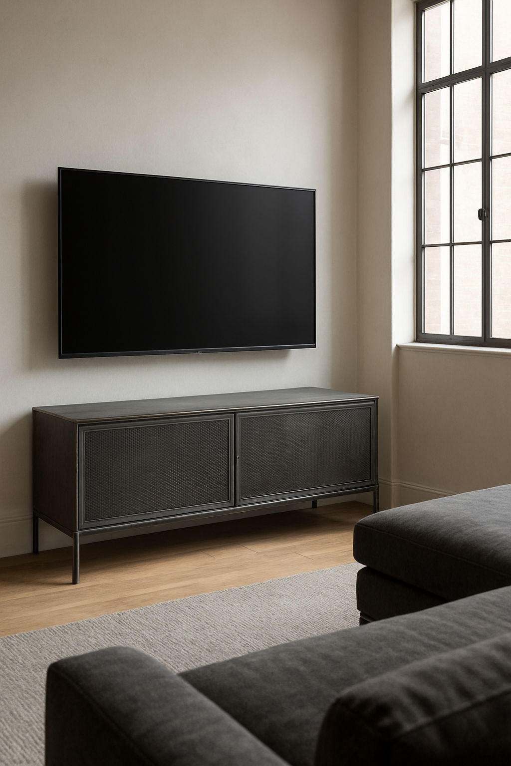
The real fight with a TV in a loft isn’t the size or the mount height, it’s the windows.
Factory windows are gorgeous, all that grid-paned afternoon light, and they will absolutely wreck a screen if you don’t account for them before the console goes up.
You can’t out-decorate two factory windows dumping light straight into a TV.
Doesn’t matter how nice the console is or how perfectly it matches the coffee table, if the screen faces the window wall (or backs up against it, which is nearly as bad), you’re watching a mirror by 3pm, not a movie.
The fix is placing the screen perpendicular to the window wall instead of facing it head-on, so the light rakes across the glass instead of firing straight into it.
Centering a media console on the “best wall” because it looks balanced, without ever standing in the room at 3pm to check where the light lands, is an easy mistake to make, and an annoying one to sit through once the glare shows up.
Free calculator: Work out the screen size and viewing distance →
A Tall Ceiling Needs Light at Two Different Heights, Not One Fixture Doing Everything
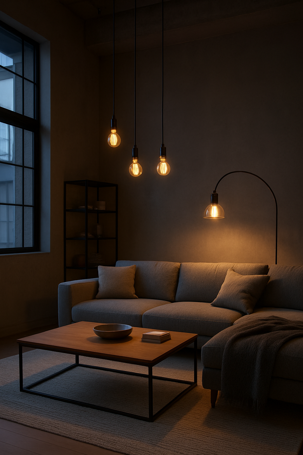
Fourteen-foot ceilings sound like a bragging right until you realize one pendant up near the rafters is doing absolutely nothing for the room you’re actually sitting in.
One bright fixture in a tall room doesn’t light the room, it lights the ceiling, and leaves you sitting in a kind of spotlight underneath it once the sun goes down.
This is, incidentally, why I will die on the hill that overhead-only lighting is the worst decision anyone makes in a tall room.
Not a personality quirk.
Just true.
The fix is light at two different heights, not one fixture stretching to cover both.
Pendants handle the high volume of the room — they establish a lower plane of light that visually pulls the ceiling down to a human scale, ideally hanging so the bottom sits around 7 feet off the floor.
Floor lamps handle the seating zone itself, lighting at actual seated eye level next to the sectional and the armchair, where people are reading or talking or falling asleep with a mug going cold on the side table.
It’s tempting to assume a bigger, brighter pendant will solve the height problem on its own, throw enough lumens up there and it’ll bounce down eventually.
It doesn’t bounce down evenly, it just makes a brighter patch of ceiling and a dimmer, weirdly shadowed seating area underneath.
A second, lower layer of light is what fixes it, not a bigger fixture.
Drag This Exact Plan Into the Room Planner and Test It Against Your Own Brick
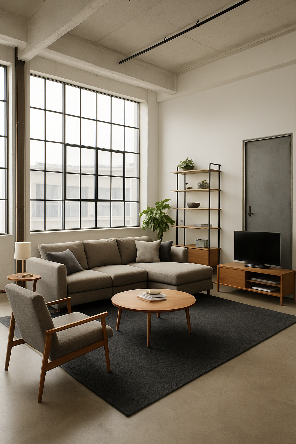
There’s a free furnished layout built for exactly this problem, and it’s meant to be dragged around, not admired from a distance.
The plan includes a charcoal area rug, a charcoal sectional, a leather armchair, a steel and glass coffee table, a steel media console, an iron pipe shelf, an Edison arc lamp, an Edison floor lamp, a monstera, a steel side table, 2 factory windows, a steel door, and 2 Edison pendants.
Set it up the way this whole post has been arguing for: the sectional floated off the brick, the rug catching its front feet, the walkways routed around the zone instead of through it.
A layout like this is useless if you just look at it and nod.
The entire point is dragging it against your own window wall, seeing whether that 36-inch walkway actually survives once you account for where your real door is, whether your factory windows sit on the same wall as the plan’s or the opposite one, whether your ceiling’s tall enough at 14 feet to need that second pendant or just fine at 9 feet with one.
Your brick isn’t the plan’s brick.
Your door might swing the wrong way.
That’s fine, that’s the whole exercise.
Treat the furnished plan as a starting position you argue with, not a finished picture you copy square for square.
Move the armchair.
Fight with the media console placement relative to your actual windows.
Slide the rug until the front feet of the sectional land where they need to.
It’s not going to look exactly like the plan when you’re done with it, and it shouldn’t.

