
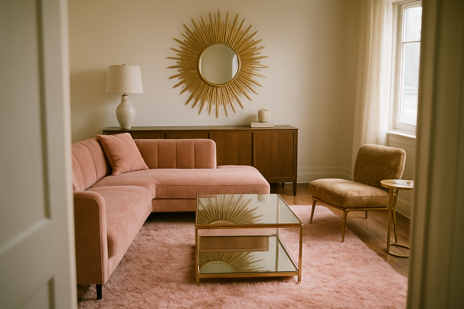

A mirror that reflects the front door and nothing else is decorating a hallway, not a room.
I see this constantly in Hollywood Regency spaces.
Someone hangs a gorgeous mirror, steps back, admires how it “doubles the entrance,” and calls it done.
Except nobody lives in an entrance.
They live in the room past it, and that room still has to hold a body, a drink, a Tuesday night.
Glamour that only survives the photo isn’t glamour.
It’s a set that collapses the second someone sits down in it.
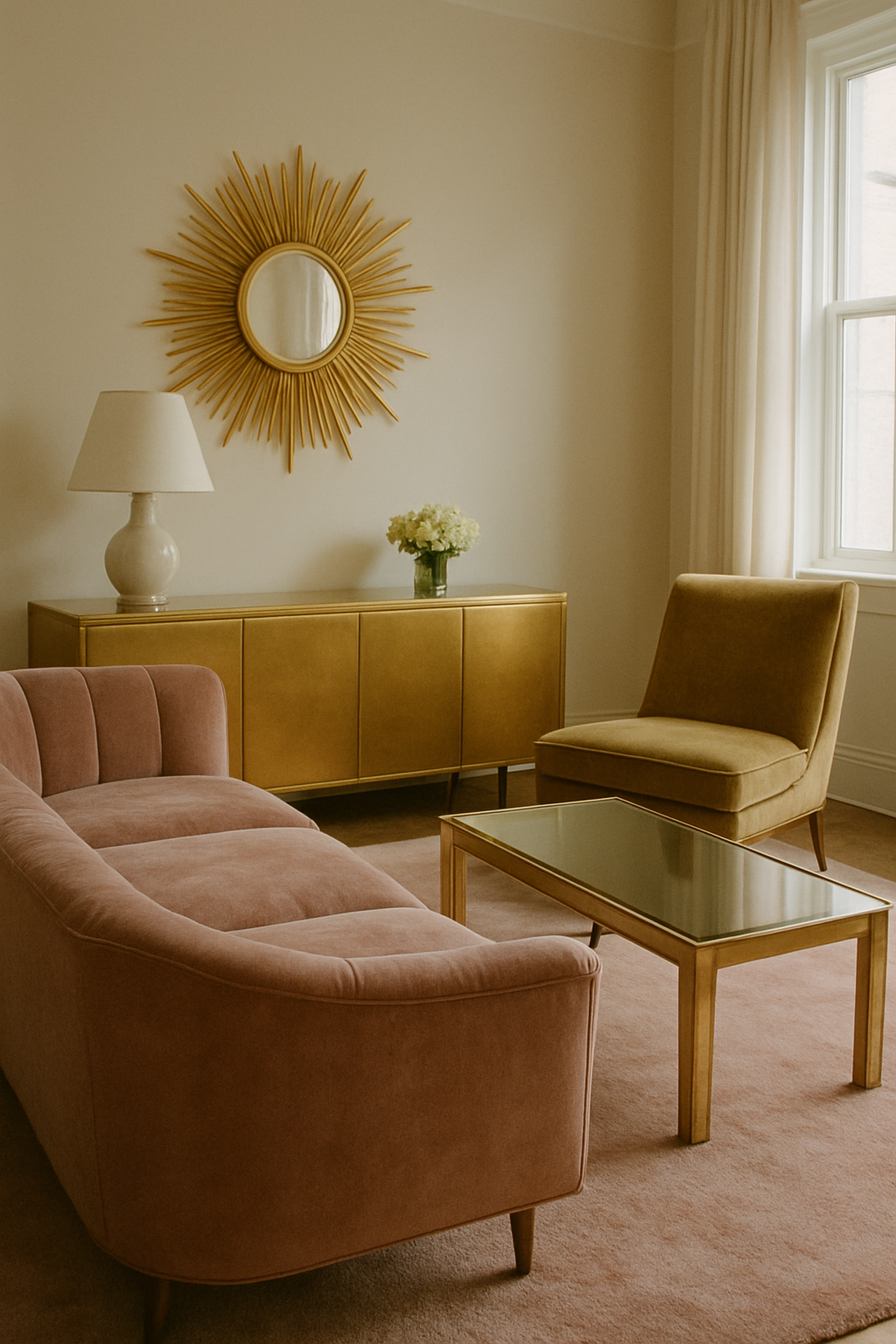
Free floor plan: Open this Hollywood Regency room layout in the free room planner — furnished, to scale, and yours to move around →
Design the View From the Doorway
The first six feet you see walking into a room decide everything.
Not the whole room, just that first slice, the one your eye lands on before you’ve even taken your shoes off.
If that view is a gold sunburst mirror catching the afternoon light, or the back cushion of a plush sofa sitting there like it’s expecting company, the room reads as staged on purpose.
Confident.
Considered.
If instead the first thing you clock is the back of an armchair, or the flat edge of a console table, something’s off.
You’ll feel it before you can name it.
Here’s my take, and I’ll die on it: if the first thing you see walking in is the back of a chair or a table edge, the room was arranged for a camera standing where you’re not.
Nobody’s photographing your living room from the corner by the window at 5pm every single day.
You’re walking in with groceries, or Biscuit’s leash tangled around your wrist, and what greets you should feel like it was built for that entrance, not a listing photo.
A sofa back facing the door reads as intentional.
A mirrored surface catching your reflection as you walk in reads as intentional.
A chair angled away from you like it’s snubbing you?
That’s a photo composition wearing a room’s clothes.
Mirrors Are Doing a Job, Not Just Hanging There
People treat mirrors in this style like automatic wins: hang one anywhere and boom, more light, more drama.
That’s not how it works, and honestly this is the mistake I see most often.
A mirror only earns its wall space if it’s reflecting something worth seeing twice.
A draped window, all that soft fabric catching whatever light comes through, that’s gorgeous, doubled, worth it.
A crystal chandelier hanging low over a console, its facets throwing little prisms around: reflect that and you’ve got two chandeliers’ worth of sparkle for the price of one.
That’s the job.
What a mirror should almost never center on is the front door.
I know, I know, it feels efficient, symmetrical, like you’re bouncing light straight back into the entry.
But a mirror that only doubles the door is decorating the exit, and that’s the opposite of the point.
I don’t think a mirror should be hung just so guests can watch themselves leave.
Assuming any mirror placement “doubles the light” is the trap.
It only works if there’s actual light or something genuinely worth seeing on the other side of the glass.
A blank wall reflected back is still a blank wall.
Foot traffic reflected back is just more foot traffic, now with a frame around it.
Every Seat Needs a Surface It Can Actually Reach
Walk your room and do this one test: sit in every single seat and try to set a drink down without standing up.
Not reaching across your body, not leaning, not balancing a mug on the armrest and praying.
Just reach, set it down, done.
If you can’t, that seat has a problem no amount of velvet fixes.
The coffee table is the anchor case here, and there’s an actual number worth knowing: about 14 to 18 inches from the sofa’s front edge, per the rule of thumb.
Any closer and you’re kicking it with your shins every time you stand up (ask me how I know.
Actually, don’t.
It’s a whole bruise story).
Any farther and it stops functioning as a coffee table and starts functioning as a piece of furniture you look at from across the room.
The failure case that shows up over and over is the slipper chair sitting pretty in a corner with zero side table anywhere near it.
It looks incredible in a photo.
Someone sits in it at a party, realizes there’s nowhere for their glass of wine, and either holds it the entire time or sets it on the floor next to their foot like an animal.
A gorgeous chair with nothing within reach isn’t seating, it’s a prop, and props don’t get sat in twice.
Read next: Hollywood glam powder room ideas
Read next: Not sure this is your style?
Take the decor style quiz
Slipper Chairs Are Not Scaled for Real Bodies
I love a slipper chair.
Low back, no arms, this clean little silhouette that photographs like a dream.
A gold slipper chair especially, catching light along that low frame, looks like it wandered in from an old movie set.
And that’s exactly what it is: a supporting character.
The low arms mean nowhere to actually rest your elbows.
The low back means no real support if you’re sitting for more than the length of one drink, maybe 20 minutes tops.
It’s built for a quick perch, a conversation from the edge of a room, not for the person who wants to sink in and watch a movie for two hours.
Where people go wrong is treating slipper chairs as the primary seating in a room: two or three of them doing the job a sofa should be doing.
Put two slipper chairs doing the real work of a room and you’ve built a stage set, not a living room.
They’re accents.
They flank.
They don’t anchor.
Give them a sofa to be a supporting act to, and they’re perfect.
Ask them to carry the whole scene and everyone’s uncomfortable by the second half of the evening.
Lamps Come in Pairs, Full Stop
Most of the instincts in this style need a functional gut-check.
Lighting is the one place where the instinct is just correct, no argument from me.
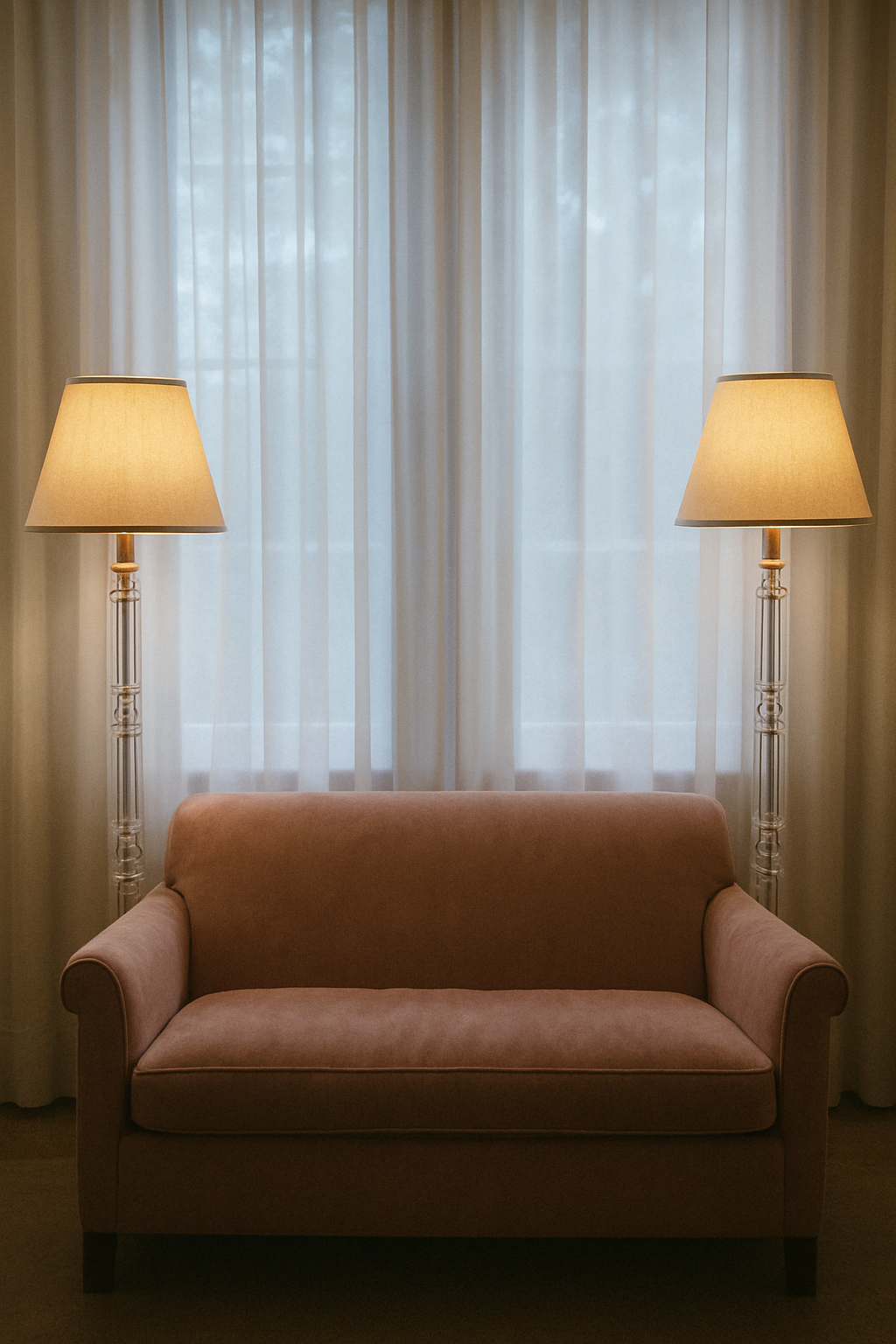
Two crystal floor lamps flanking a sofa, or a console, or the foot of a bed: that’s not just symmetrical for symmetry’s sake.
It’s actually solving a lighting problem, because a single overhead fixture doing all the work in a room like this is flat, harsh, and honestly kind of depressing (overhead lighting is, and I will say this until I’m blue in the face, one of the worst things that ever happened to residential design).
One lamp in a Hollywood Regency room looks like a mistake, not a choice.
It reads as if the other one broke two weeks ago and you still haven’t replaced it.
A pair reads as considered, layered, warm at two points instead of one flat wash from the ceiling.
Pairs are the one rule here worth following without arguing about it.
Placement matters too.
Not just buying two of the same lamp and calling it a day.
Flank something.
A sofa’s two ends, a console’s two sides.
The symmetry only works when it’s framing a piece, not just scattered across a room because you had two lamps and two corners.
Keep the Route to the Door Empty
This is the one people forget entirely because they’re so focused on filling the room with drama.
Somebody needs to leave this room eventually.
Coat on, hands full, maybe walking backward because they’re still finishing a conversation.
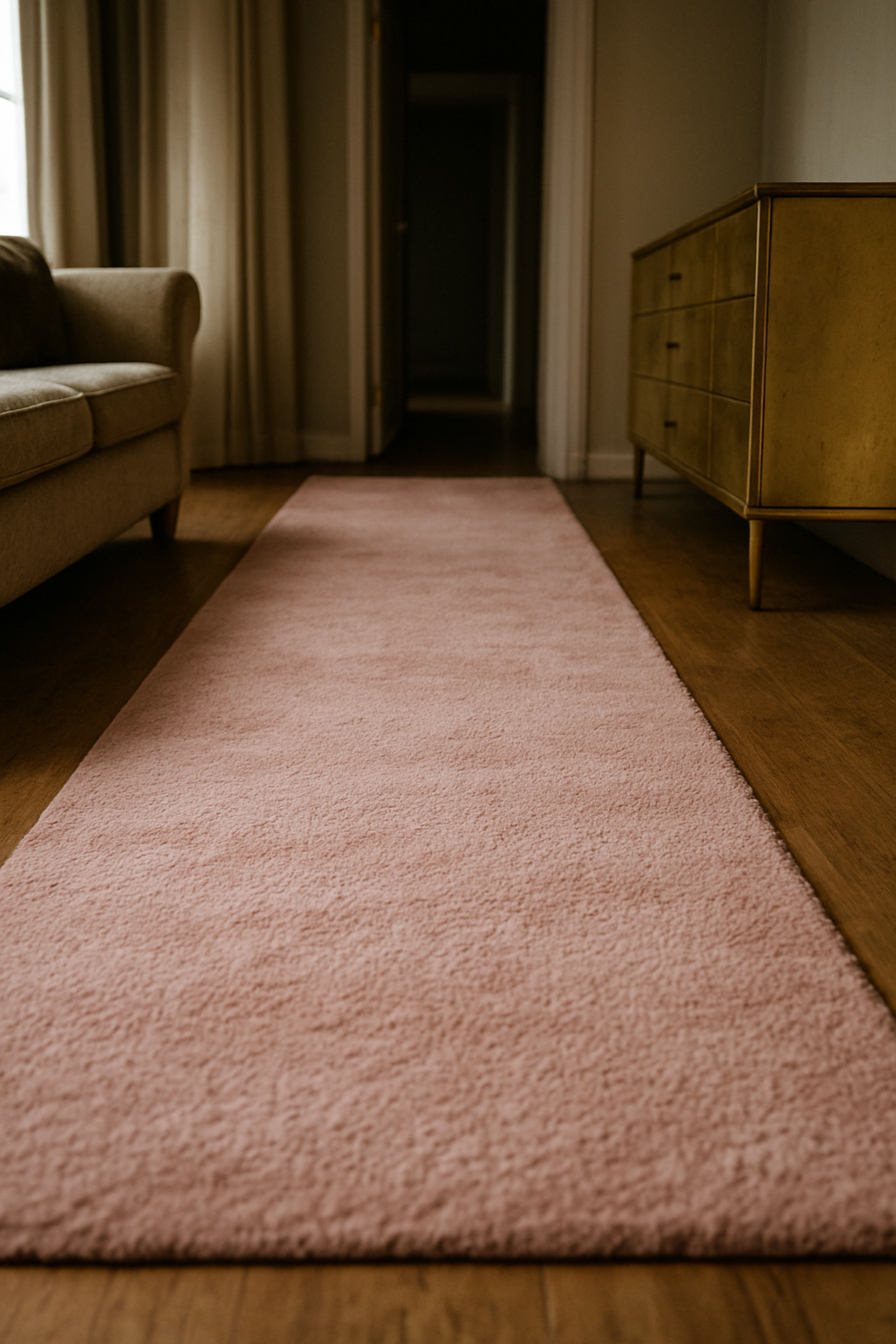
That path from the seating area back to the door has to stay clear no matter what else is going on, around 36 inches for a main walkway, per the rule of thumb, and 24 to 30 inches for a secondary path.
Those aren’t huge numbers, but they add up fast once you’ve got a coffee table, a credenza, and a rug with fringe that likes to bunch up under furniture legs.
Glamour can crowd a room.
It can pile on pattern and shine and gold everywhere you look.
But it can’t be allowed to crowd the one path someone needs when they’re leaving with their coat on.
The mistake I see constantly is people pushing every piece of furniture toward the walls to create “openness” in the middle, feeling proud of all that floor space.
Then a coffee table corner or a credenza edge is sitting right in the one line anyone actually walks.
Open floor in the middle of the room doesn’t help if the actual route from the sofa to the door has a pinch point.
Walk it.
Physically walk it with your arms full of something, the way you would leaving for work.
If you clip a table corner, move the table.
Free floor plan: Try it on your own measurements: open the Hollywood Regency room plan and drag the walls to your room →
The Free Plan You Can Rearrange Right Now
Dreamy’s free furnished plan for this style holds a blush velvet sofa, a gold slipper chair, a gold mirrored coffee table, a gold lacquer credenza, a gold sunburst mirror, two crystal floor lamps, a fan palm, a gold display cabinet, a blush plush rug, a draped window, a lacquered door and a crystal chandelier.
Run it through the checks above as you fit it to your room: the sofa facing the door, not away from it; the sunburst mirror catching the draped window and the chandelier, not the door; the coffee table 14 to 18 inches from the sofa; and a surface within reach of the slipper chair.
Put the two crystal floor lamps where they flank something, instead of leaning on a single overhead fixture.
Keep the credenza and the display cabinet against the walls, out of the walking path, and let the fan palm and the rug bring the warmth without eating into that clearance.
And keep the lacquered door’s swing clear of every piece.
But none of that means you should copy it exactly.
A plan is only useful if you’re allowed to argue with it.
This one’s built to be dragged around, not copied exactly.
Maybe your entrance is on the opposite wall and the whole layout needs to flip.
Maybe you don’t have room for a credenza and want to swap it for something narrower.
Drag the sofa, resize the rug, delete the display cabinet if it’s not your thing.
The point was never to hand you a fixed picture to recreate in your own house.
It was to hand you a starting point you can run through the four checks — doorway view, mirror job, reach, and clearance — so whatever you rearrange from here, you’re rearranging on purpose instead of for a photo.

