I used to think white kitchens were the only “safe” choice.
Clean, bright, timeless — all the things every design blog told me to want.
But safe stopped feeling inspiring a long time ago.
When I started seriously looking into gray-blue, I realized it wasn’t just a trend I was chasing.
It was a mood I was craving.
Gray-blue sits in this gorgeous in-between space — not as cold as a straight gray, not as bold as a true navy.
It’s sort of the Goldilocks of kitchen colors.
Warm enough to feel inviting, cool enough to feel elevated.
It works in small kitchens and sprawling open-plan ones.
It plays beautifully with natural wood, marble, brass, matte black — basically every finish I already love.
If you’ve been on the fence about committing to color in your kitchen, gray-blue is genuinely one of the most forgiving, most gorgeous places to start.
And I mean that sincerely, not just as a person who loves pretty rooms — but as someone who lived through the decision and would absolutely make it again.

The Mood a Gray-Blue Kitchen Actually Creates


There’s something I didn’t fully expect when I finally had gray-blue walls and cabinets surrounding me.
The kitchen felt quieter.
Not in a boring way.
In a deeply cozy, almost spa-like way.
Gray-blue has this natural ability to slow things down visually.
When you walk into a room painted in this color, your eyes just… settle.
There’s no visual noise.
It’s like the room takes a breath with you.
I noticed I actually started lingering in my kitchen more.
Morning coffee stopped being something I rushed through.
It became this small ritual I looked forward to.
That’s the emotional power of color that nobody really talks about enough.
Gray-blue specifically creates a feeling of calm sophistication without feeling cold or uninviting.
It’s elegant without trying too hard.
Moody without being dramatic.
And honestly?
It photographs beautifully in natural light — which, if you’re someone who loves sharing your home on social, is a very real bonus worth mentioning.
How to Find Your Perfect Shade of Gray-Blue


This is where I want to be really honest with you, because finding your gray-blue is not as simple as it sounds.
I went through seven swatches before I landed on the right one.
Seven.
Some reads too purple in my north-facing kitchen light.
Some felt more green than blue by afternoon.
One I was convinced was perfect until I put it next to my countertops and it looked almost lavender.
The light in your kitchen is everything.
North-facing kitchens tend to make gray-blues feel cooler and more muted — which can be gorgeous, but you want to know that going in.
South-facing kitchens warm the color up beautifully, giving it that soft, dreamy quality that makes everything look effortless.
My biggest tip?
Always test your swatches in large patches — at least 12 inches square — and look at them at three different times of day.
Morning, midday, and evening with your artificial lights on.
The color will look different in every single one.
And that’s not a bad thing — it just means you need to love how it looks in all of them before you commit.
Cabinets First — My Favorite Way to Start


If you’re not ready to commit to full gray-blue walls, start with the cabinets.
Honestly, I think this is where the color does its most magical work anyway.
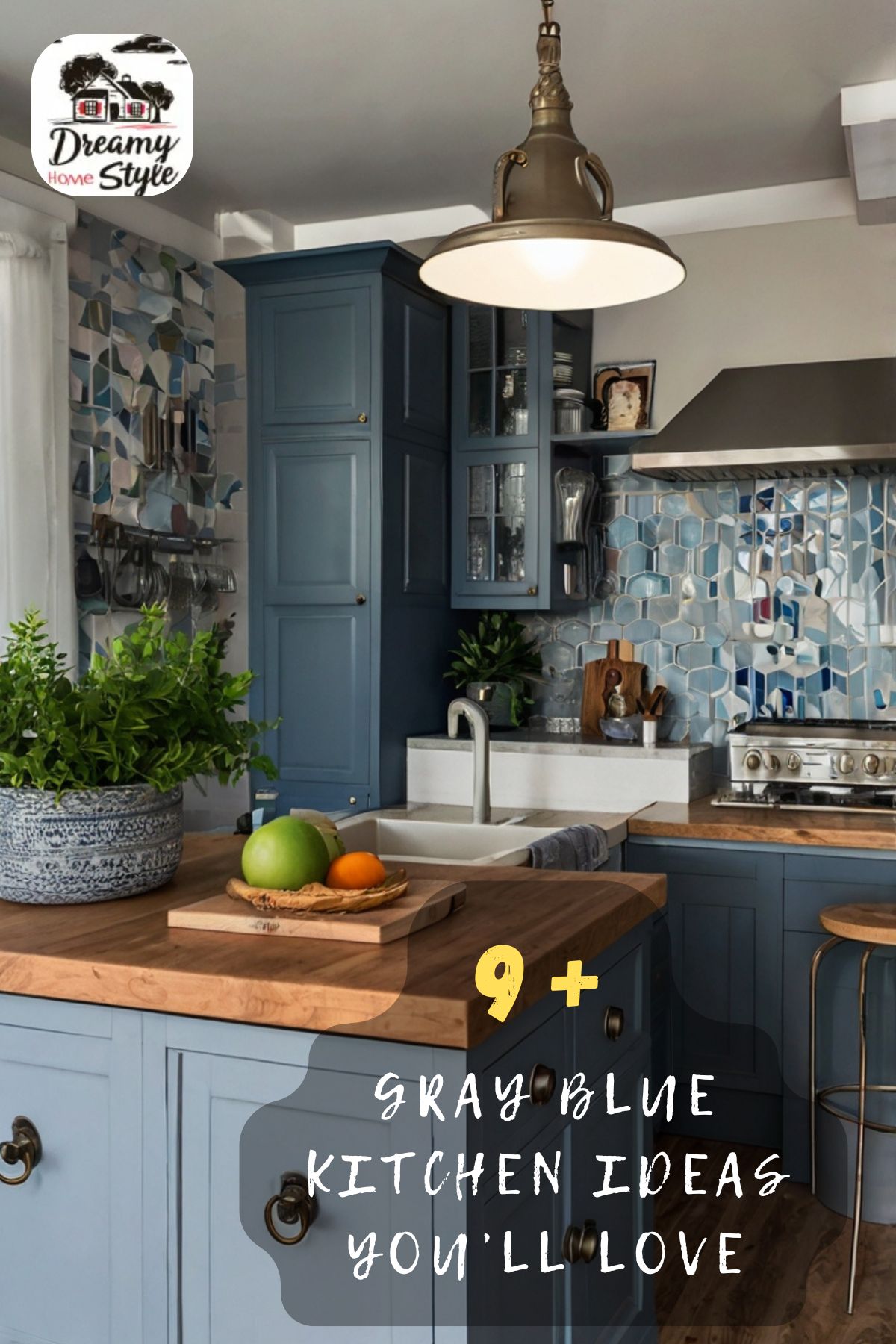
Gray-blue cabinets create structure in a kitchen.
They give the room a grounded, intentional feeling that white or cream cabinets can sometimes lack.
When I tackled my own kitchen, I went full gray-blue on every single cabinet — uppers and lowers — and I do not regret it for even one second.
But I know that’s not for everyone.
If you’re more cautious with color, painting just your lower cabinets is an incredible starting point.
It gives you that depth and drama without overwhelming the space.
And you can always come back for the uppers later once you’ve fallen completely in love with it — which, spoiler, you will.
The thing about gray-blue cabinets specifically is that they feel high-end without requiring a high-end budget.
A quality paint, good prep work, and the right sheen?
Your kitchen will look like it belongs in a design magazine.
No expensive remodel required.
The Magic of Gray-Blue on Lower Cabinets Only

This is actually my personal favorite kitchen design trick, full stop.
Painting only the lower cabinets in gray-blue while keeping the uppers white or cream is chef’s kiss.
It creates this beautiful two-tone effect that feels intentional and curated.
The lowers ground the space with color and depth.
The uppers keep it feeling light and airy.
Together they just work in a way that’s hard to fully explain until you see it.
When I tested this look in my sister’s kitchen last spring, she cried a little.
Genuinely.
Because it transformed the room so completely, with so little effort, that it felt almost too good to be true.
The visual weight of the dark lower cabinets also makes the kitchen feel more balanced — especially in spaces where the ceiling is high or the room feels a little top-heavy.
It tricks the eye in the best possible way.
And practically speaking?
Lower cabinets take more of a beating day-to-day, so having them in a deeper color that hides scuffs and smudges a little more forgivingly?
That’s just smart design, honestly.
The Best Paint Finish for Gray-Blue Kitchen Cabinets

I cannot stress this enough: the finish matters just as much as the color.
I learned this the hard way when I used a flat finish on my first attempt and ended up with cabinets that showed every single fingerprint.
In a kitchen.
Where hands are constantly touching things.
It was not my finest moment.
For gray-blue kitchen cabinets, I always recommend a satin or semi-gloss finish.
Satin gives you a soft, subtle sheen that looks incredibly elegant — it’s my personal preference.
It’s easy to wipe down, it reflects just enough light to make the color pop, and it doesn’t look shiny in an obvious or cheap way.
Semi-gloss is great if your kitchen gets a lot of moisture or heavy use, because it’s even more durable and wipeable.
If you’re painting walls in the same gray-blue shade, you can go eggshell there — it’s a little less reflective and feels softer on a large flat surface.
The combination of eggshell walls and satin cabinets in the same color family is genuinely one of my favorite looks.
It creates this tonal, layered effect that feels very intentional and very, very beautiful.
Countertops That Look Incredible with Gray-Blue

This is the part where I get really excited, because the countertop pairings for gray-blue are so good.
White marble — or a marble-look quartz — is the most classic choice, and honestly, it earns that status.
The cool white veining against gray-blue cabinets is just stunning.
Clean, bright, timeless in all the best ways.
But my absolute personal favorite pairing?
Warm butcher block or light oak wood countertops with gray-blue cabinets.
That combination of cool color and warm natural wood creates this gorgeous tension that feels collected and lived-in rather than overly designed.
It’s the kind of kitchen that feels like a real home.
Creamy white quartz with subtle warm undertones also works beautifully, especially if your gray-blue leans slightly toward the warmer side.
What I’d avoid is anything too dark — like a dark gray or near-black countertop — because it can make the kitchen feel heavy and a little cave-like, which is the opposite of what we’re going for.
Keep the countertops light and the contrast will do all the beautiful work for you.
Hardware That Makes Gray-Blue Cabinets Absolutely Sing

Hardware is the jewelry of your kitchen, and with gray-blue cabinets?
You have so many gorgeous options.
Brass is my ride-or-die recommendation.
Warm, antique brass specifically — not shiny polished gold — against gray-blue cabinets creates this rich, layered look that feels incredibly sophisticated.
The warm metal tones pull out any hint of warmth in the gray-blue and make the whole kitchen feel intentional and curated.
I’m obsessed with it.
Matte black is another stunning option if you want something more modern and graphic.
The contrast between soft gray-blue and crisp matte black is very clean and very chic.
Brushed nickel or satin chrome works well if you want something more understated — it complements the cool tones in the gray-blue without competing with them.
My personal tip: mix your metals slightly if you’re confident enough to do it.
Brass cabinet pulls with a matte black faucet, for example.
It sounds risky but it looks incredibly intentional when done right.
Just keep one metal as the dominant choice and use the second as an accent.
That’s the trick that makes it look designed rather than accidental.
Backsplash Ideas That Feel Perfect with Gray-Blue

The backsplash is where you get to have a little fun, and gray-blue is one of the most versatile backdrops for it.
Subway tile in white or cream is the most classic choice — and it works effortlessly.
Simple, timeless, and lets the cabinet color do all the talking.
But if you want something with a little more personality, soft green or sage zellige tiles are incredibly beautiful against gray-blue cabinets.
The two colors have just enough tonal similarity to feel cohesive, but enough difference to create visual interest.
It’s one of those combinations that looks much more intentional than it is.
Warm terracotta or clay-toned tiles are another option I love, because they add that warmth contrast that keeps the kitchen from feeling too cool.
A light natural stone slab backsplash — especially one with soft warm veining — is genuinely my dream pairing.
It feels elevated and seamless and very, very beautiful.
For grout color: always choose a grout that’s close in tone to your tiles.
A contrasting grout can look beautiful, but a tonal grout gives you that seamless, high-end look that photographs like an absolute dream.
Flooring That Works Beautifully in a Gray-Blue Kitchen

Flooring is one of those decisions that can either make a gray-blue kitchen sing or feel a little off, so I want to be really helpful here.
Light to medium natural wood floors are my top recommendation, always.
Warm oak, honey-toned hardwood, or even a good-quality wood-look LVP in a warm tone will complement gray-blue cabinets in the most gorgeous way.
The warmth of the wood floor balances the cool sophistication of the gray-blue and keeps the whole space feeling grounded and inviting.
White or light gray tile floors also work beautifully if you want a more clean, European-style kitchen feel.
Large-format tiles — think big, simple squares or rectangles — feel especially elegant in a gray-blue kitchen because they don’t compete visually.
What I’d personally avoid is a very dark floor.
Dark floors with gray-blue cabinets can sometimes make a kitchen feel a little heavy, especially in a smaller space.
If you love a dark floor, pair it with lighter upper cabinets and lots of light from windows to keep the room feeling open.
And if you’re working with what you already have?
A beautiful area rug in warm tones can do wonders for tying everything together.
Lighting That Makes Gray-Blue Look Its Best

I have to talk about lighting because it genuinely changes everything with gray-blue.
This color is one of the most light-sensitive colors I’ve ever worked with.
Warm-toned bulbs (around 2700K on the Kelvin scale) will bring out the warmer, softer side of gray-blue.
Cool-toned bulbs (around 4000K) will make it feel crisper, more modern, and slightly more gray.
Neither is wrong — it just depends on the mood you’re going for.
Personally?
I love warm lighting in kitchens because it makes everything feel more inviting and a little bit golden, which is exactly the feeling I want when I’m cooking or gathering with people I love.
For fixtures, brass or antique gold pendants over an island look absolutely stunning against gray-blue.
The warm metal tones echo the warmth of the lighting itself and create this cohesive, layered glow.
Under-cabinet lighting is something I feel strongly about, and not just for practical reasons.
When those soft lights illuminate your countertops against gray-blue cabinets in the evening?
It’s one of the coziest, most beautiful things a kitchen can do.
Add it if you can.
You’ll thank yourself every single time you walk in after dark.
How to Add Warmth So It Never Feels Cold

This is the question I get asked most often about gray-blue kitchens, and I completely understand why.
It’s a cool color at its core, and without the right layering, it can veer into feeling a little sterile.
But here’s what I’ve learned: warmth in a gray-blue kitchen is all about texture and contrast.
Bring in natural wood wherever you can — open shelving in oak, a wooden bowl on the counter, a simple cutting board propped up on the backsplash.
Those small natural elements warm up the whole room instantly.
Woven or rattan accents — a pendant light shade, a small basket, a place mat — add organic texture that softens the cool tones beautifully.
Live plants are another thing I’m completely obsessed with in a gray-blue kitchen.
A trailing pothos on a shelf, a small herb garden on the windowsill, a single stem in a simple vase on the counter.
Green and gray-blue are genuinely one of the most beautiful color combinations in nature.
Soft linen dish towels in warm neutral tones, a vintage rug underfoot, a bowl of citrus fruit on the island — these small, warm details are what make a gray-blue kitchen feel like a home rather than a showroom.
It’s all in the layering.


