

Free floor plan: Open this art deco lounge layout in the free room planner — furnished, to scale, and yours to move around →
Axis Before Anything Else
Every “art deco living room” board on Pinterest is a color palette wearing a floor plan costume.
Emerald velvet, brass everything, some geometric wallpaper, and somewhere in the caption, “symmetrical layout,” like that’s a mood and not an actual measurement.
It’s not a mood.
It’s a line you draw through your room with a tape measure, and everything else has to answer to it.
Here’s where people mess it up before they even start: they default to the TV wall.
Sofa goes across from the TV, done, “symmetrical enough.” Except the TV isn’t an object worth looking at, it’s a black rectangle you stare at with the lights off.
It can’t anchor anything.
If the wall you pick doesn’t have a real object on it (a cabinet, a bar, a credenza, something with weight and shine and presence), it’s not a focal point, it’s just the wall the TV happened to be near.
So pick a different wall.
In a true deco layout, your anchor is a brass display cabinet, the kind with the fluted legs and the glass front you’d stack barware or grandma’s crystal behind.
That’s your wall.
No cabinet?
A lacquer credenza works just as well, honestly maybe better in a room under 250 square feet since it’s lower profile.
Once you’ve got your anchor piece against its wall, draw an imaginary line straight out from the center of it, across the rug, through the coffee table, all the way to the opposite wall.
That’s your axis.
Everything in the room either sits on it or balances against it.
Nothing gets placed until that line exists.
Pairs Do the Heavy Lifting
I’ll say the unpopular thing: a single dramatic chair is not “eclectic.” In a lot of rooms, sure, one weird thrifted chair adds character.
In a deco room built on an axis, one chair just reads unfinished, like you ran out of budget halfway through and called it a design choice.
And look, I get it, I’ve done this.
One gorgeous velvet chair, bought on its own and expected to anchor a corner, just sits there looking lonely.
Lopsided rooms don’t feel put-together, they feel like you’re still shopping.
Deco layouts move in twos.
A pair of brass torchères flanking that cabinet, one on each side, same height, same finish.
Matching lamps on either end of the credenza if that’s your anchor instead.
A pair of chairs facing the sofa across the axis, mirrored, not matched-but-different, actually the same chair twice.
It feels almost boring to shop this way at first.
You find one chair you love and then you have to go find its twin, which, depending on the store, is its own headache.
But that’s the whole mechanism.
The pairs are what make the eye read the room as intentional instead of assembled.
Buy the pair or don’t start the room.
That’s blunt, but it’s true — one showstopping chair sitting across from a normal one just looks like a layout that gave up.
Centering the Rug and the Chandelier
This is the part that’s easiest to get wrong on the first try.
You center the rug to the room, to the four walls, because that’s what feels natural when you’re standing in the doorway.
Wrong move.
The rug centers on the furniture group, on the axis, not on the room’s architecture.
If your seating cluster is slightly off from the room’s true center (and it usually is, thanks to doorways and windows and whatever), your rug follows the furniture, not the drywall.
Centering it to the room instead of the seating group is a common reason a symmetrical layout still reads as accidental, even when every chair is paired correctly.
Same discipline applies overhead.
The chandelier hangs centered on that same axis line, directly over whatever table sits on it, usually your coffee table or a round table if you’ve got one in the mix.
And this is where eyeballing gets you in trouble.
You cannot just hang the fixture wherever looks “about right” from the couch.
There’s actual math, and it depends on the table.
Over a dining table, where everyone stays seated, the bottom of the chandelier lands around 30 to 36 inches above the tabletop, and the fixture’s diameter runs about 12 inches less than the table’s width.
Over a coffee table, people stand up and walk right under it, so the rule of thumb moves to the floor: keep the bottom about 7 feet up.
Too big and it swallows the seating group visually.
Hung too high over a dining table, it floats up there doing nothing, disconnected from the piece it’s supposed to be anchoring.
Measure every time.
Don’t guess.
Read next: Find the right rug size for the room
Read next: Not sure this is your style?
Take the decor style quiz
Break the Symmetry Exactly Once
Nobody warns you about this part: perfect mirror-image symmetry, executed flawlessly, doesn’t feel glamorous.
It feels like a hotel conference room.
Sterile.
Like it’s waiting for a name-tag table to show up.
Match everything (same lamps, same pillows, same everything, down to the coasters), stand back, and you’ll just feel cold looking at it.
It needs one thing out of line.
So you break your own rule, on purpose, exactly once.
A single fan palm shoved into a corner, off the axis entirely, left alone and a little wild-looking against all that precision.
Or swap one of your matched lamps for a twin that’s 4 inches taller or shorter than its pair, same lamp, different scale, so your eye catches the mismatch and lingers there for a second.
Or angle one chair a few degrees instead of squaring it dead-on to its mirror partner, like someone just got up from it to answer the door.
The point of the one break isn’t decoration.
It’s proof.
It tells the room, and everyone standing in it, that the symmetry was a choice you made, not a limitation you were stuck with because you couldn’t think of anything else to do with the space.
Mirrors Aren’t Decoration, They’re Geometry
People hang mirrors across from windows because “it bounces light,” and sure, that’s true, mirrors do bounce light.
But in a symmetrical room that’s a lazy default.
It’s decorating for daylight instead of decorating for the axis you spent this whole time building, and the result is a mirror that reflects… a window.
Cool.
Great.
You’ve doubled a window.
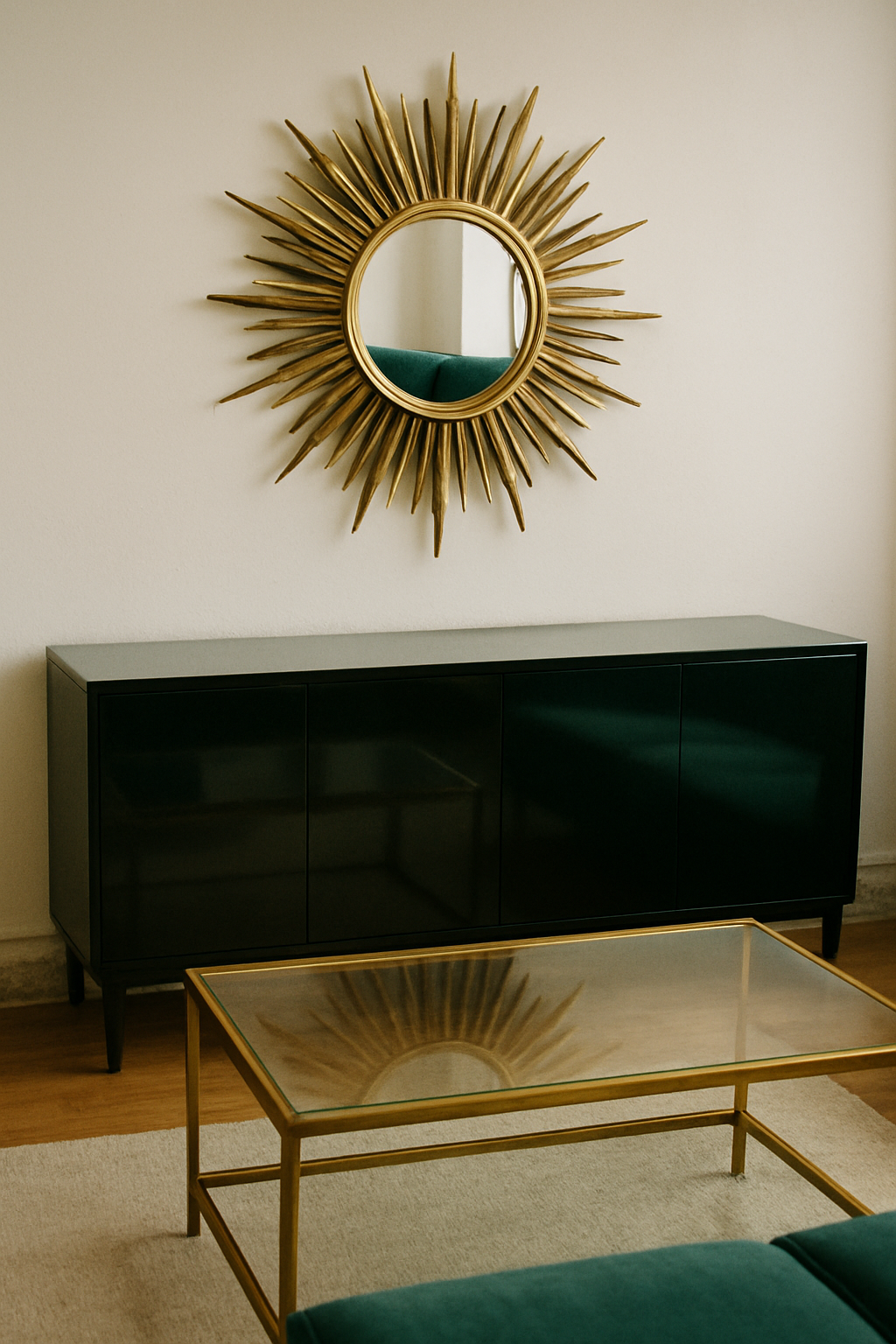
In this layout the mirror goes on the axis wall, directly opposite your brass cabinet.
A sunburst mirror is the classic move here, all those brass rays fanning out, and it’s not just because it looks period-appropriate.
Hung on that wall, it reflects the chandelier and the cabinet back into the room, doubling the exact focal point you centered everything around in the first place.
That’s its job.
Not brightening a corner, not filling blank wall space.
Doubling the thing that matters.
If your mirror’s hung and it’s showing you a blank wall or a hallway or nothing in particular, it’s in the wrong spot.
Move it.
I know that’s annoying once it’s already got a nail hole behind it, but a mirror reflecting nothing is just an expensive pane of glass at that point.
Clearance to the Cabinet Isn’t Optional
A gorgeous symmetrical layout that makes you sidestep a torchère every single time you want a drink isn’t a layout.
It’s an obstacle course with good lighting.
I say this with love, because it’s so tempting to push furniture in tighter than it should be for the sake of a photo, and then live with clipping your hip on an end table every single day.
Keep about 36 inches of clear walkway running straight down your axis to the cabinet, straight, not around the furniture pairs, right down the center line you already drew.
That’s your main path.
Around a chair pair, where people are just skirting past rather than walking a straight shot, 24 to 30 inches is enough breathing room without eating up the whole floor.
Those aren’t arbitrary numbers pulled out of thin air over a morning coffee.
They’re the usual rule-of-thumb walkway widths, and deco symmetry doesn’t get to override them just because the room looks better on paper with the chairs pulled in tighter.
If achieving perfect mirror spacing means nobody can actually get to the bar cabinet without turning sideways, the symmetry loses.
Every time.
Free floor plan: Try it on your own measurements: open the art deco lounge plan and drag the walls to your room →
Inside the Free Plan
The free plan is built around this exact axis logic, because honestly it’s easier to see it than to keep reading about it in paragraph form.
It’s not a finished room and it’s not supposed to be.
It’s a starting axis you’re meant to mess with.
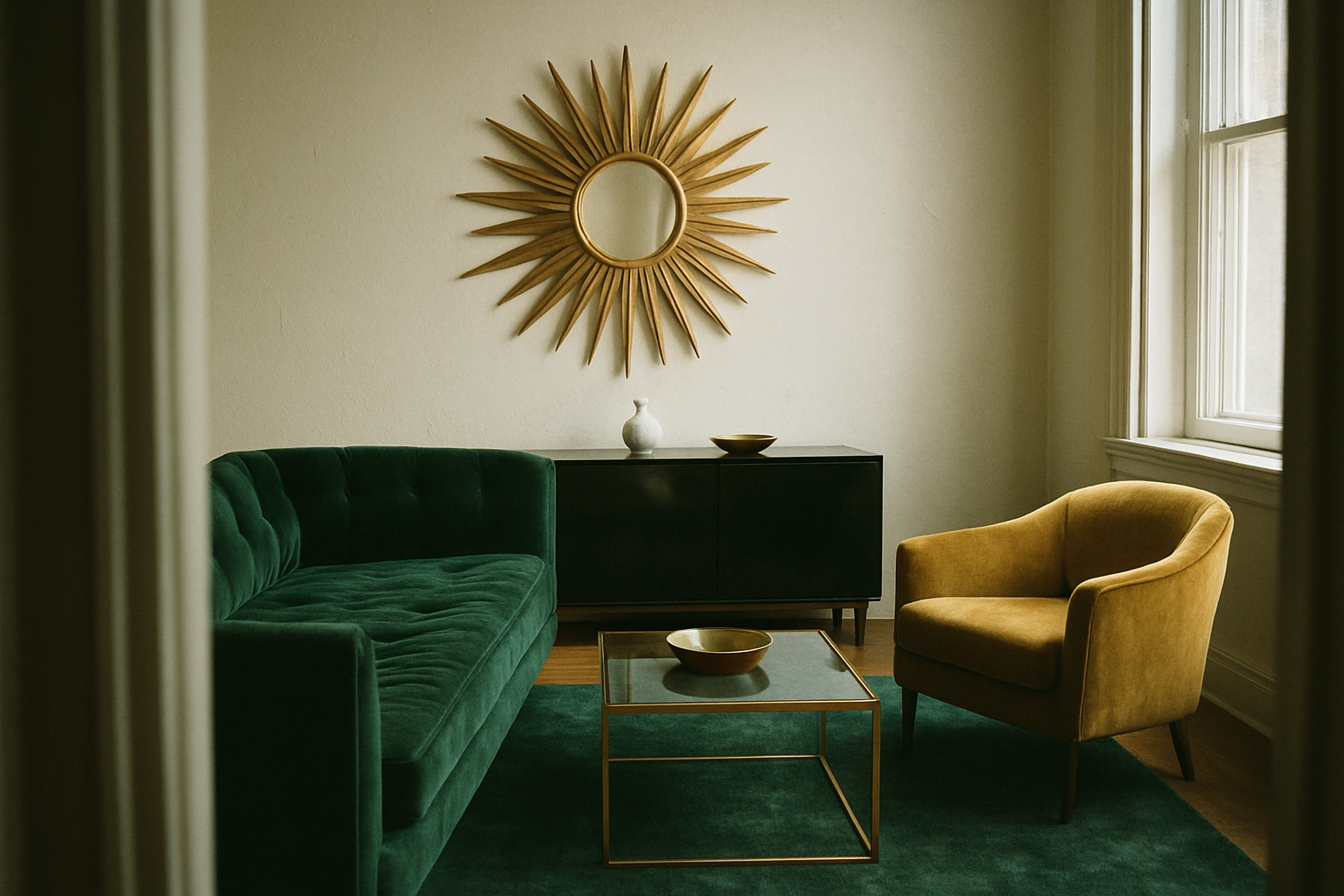
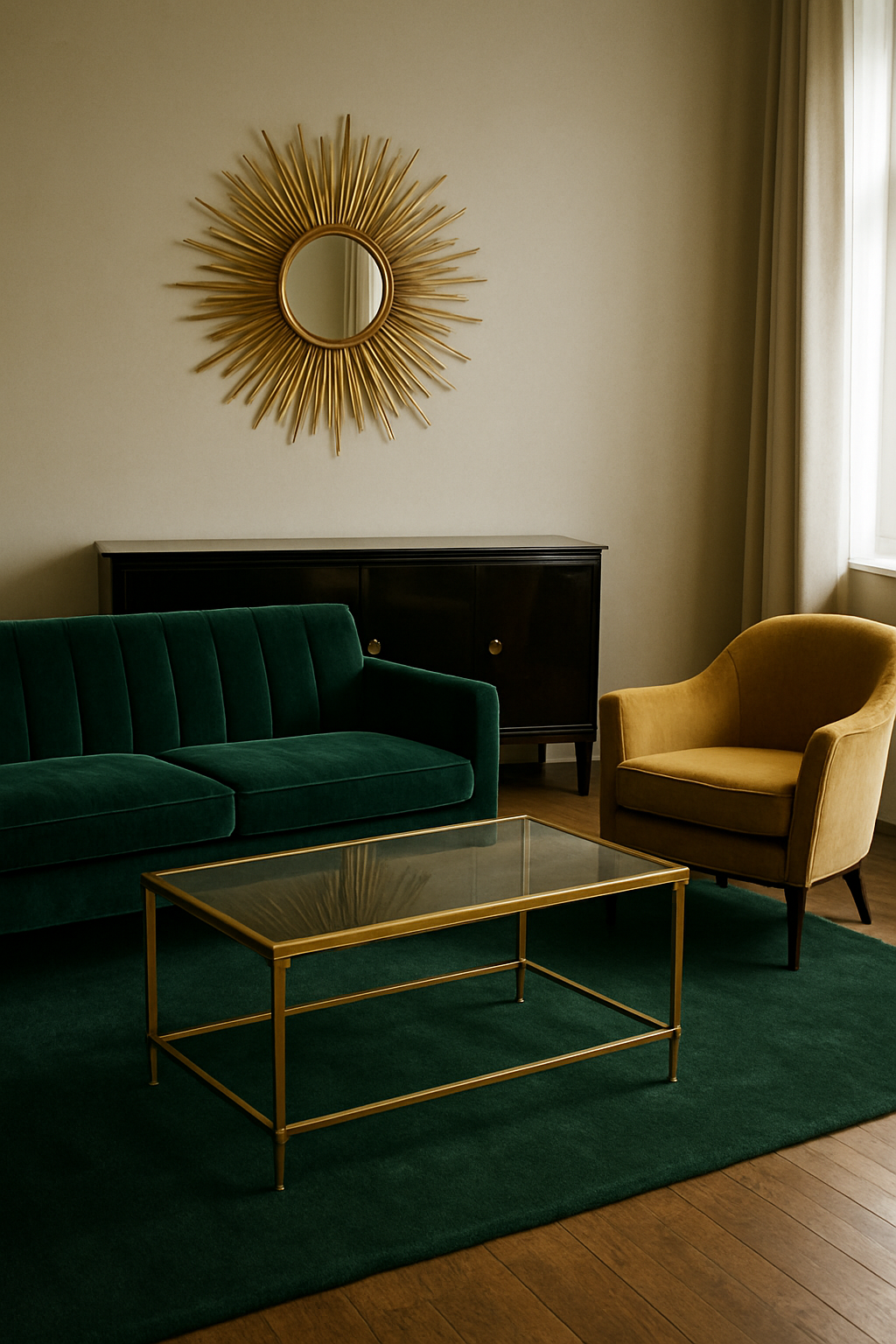
The emerald rug and the emerald velvet sofa sit right on the axis, centered on the seating group like we talked about.
Facing the sofa, across that same line, is the gold velvet chair, and it’s there on its own, so the first thing to do in the planner is give it its twin.
The brass display cabinet anchors the far wall with a pair of brass torchères flanking it on either side, matched height, matched finish.
The coffee table sits about 14 to 18 inches off the sofa’s front edge, which gives you room to actually use it without banging your shins getting up (ask me how I know).
Overhead, the deco chandelier is centered directly over the rug, on axis with everything below it.
On the opposite wall, the sunburst mirror doubles the cabinet and the chandelier straight back into the room.
There’s a lacquer credenza and a lacquer door worked into the layout too, plus a geometric window that plays off the same angular lines as everything else, and tucked into a corner, off-axis on purpose, the fan palm doing its one job of looking a little unruly next to all that precision.
That’s the whole list.
Nothing else gets added just because it’d look nice, if a piece isn’t on that axis or isn’t the one intentional break, it’s not part of this room.
Pull it into your own space and change what needs changing: swap the emerald for a color you actually live with, move the cabinet to whichever wall in your place has real presence, resize the clearances for your own floor plan.
The template’s job was never to be copied exactly.
It’s there to get wrecked a little, and rebuilt around your wall, your axis, your one deliberate break.
Related read: Things I Wish I Knew Before I Decorated My First Home — Instant PDF + Kindle download. Secure checkout by Stripe

