The right paint color can enhance your greige carpet and create a harmonious look throughout your home.
Your greige carpet actually offers more flexibility than you might think.
It serves as an excellent foundation for many different design styles and color schemes.
Now let’s discover a few fantastic paint colors that pair beautifully with greige carpet.
My carefully selected colors will help you create a cohesive look that feels intentional and designer-inspired:
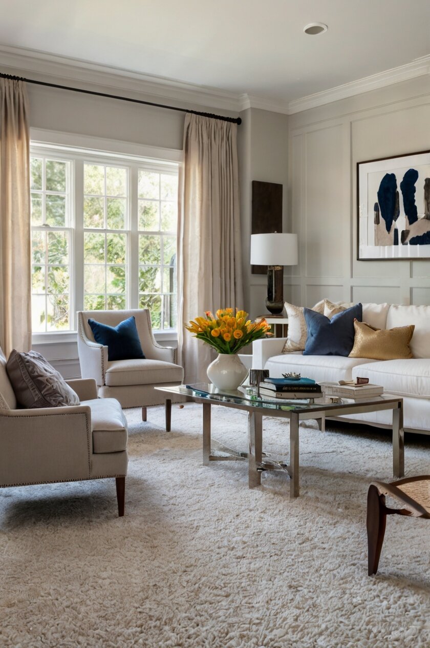
1. Crisp White (Benjamin Moore’s “White Dove” or Sherwin Williams’ “Pure White”)


Nothing complements greige carpet quite like a perfect crisp white wall.
White creates a clean, fresh backdrop that allows your greige carpet to become a subtle feature rather than competing with it.
The contrast between the soft greige floor and bright white walls creates a modern, airy feeling in any room.
This combination works particularly well in spaces where you want to maximize light and create an open feeling.
Living rooms, hallways, and bedrooms all benefit from this simple yet effective pairing.
The beauty of white walls with greige carpet lies in their versatility.
You can easily change your accent colors through furniture and accessories without needing to repaint.
When choosing your white, look for options with slight warm undertones like Benjamin Moore’s “White Dove” or Sherwin Williams’ “Pure White.”
These whites have just enough warmth to complement the beige tones in your greige carpet.
Pure bright whites with no undertones might feel too stark or clinical against the softness of greige.
Consider the lighting in your room when selecting your white paint.
Natural light will make whites appear brighter, while rooms with limited windows might benefit from slightly warmer whites.
Texture plays an important role when using white walls with greige carpet.
Adding textured elements like woven baskets, natural wood furniture, or plush throw pillows prevents the space from feeling flat.
For a cohesive look throughout your home, use the same white in connecting spaces.
This creates flow while allowing you to use different accent colors in each room.
In kitchens and bathrooms, white cabinetry alongside white walls creates a seamless look that pairs beautifully with greige flooring.
Remember that not all whites are created equal—some have yellow, pink, blue or gray undertones.
Hold paint samples against your greige carpet in different lighting conditions before making your final decision.
White walls create the perfect blank canvas for your personal style to shine.
This timeless combination will never go out of style and appeals to future homebuyers if you ever decide to sell.
2. Soft Gray (Behr’s “Silver Drop” or Sherwin Williams’ “Agreeable Gray”)


Pairing your greige carpet with soft gray walls creates a sophisticated, layered neutral palette.
This tone-on-tone approach feels elegant and calming in any space.
The key to success with this combination is choosing a gray that complements rather than matches your carpet exactly.
Look for light to medium grays with warm undertones like Behr’s “Silver Drop” or Sherwin Williams’ “Agreeable Gray.”
These shades have just enough warmth to prevent the space from feeling cold or institutional.
In living areas, this pairing creates a relaxed atmosphere that serves as the perfect backdrop for colorful furniture and artwork.
Gray walls with greige carpet work especially well in bedrooms where you want to create a peaceful retreat.
The subtle contrast between the carpet and walls adds visual interest without being overwhelming.
This combination allows your decorative elements and furniture to stand out beautifully.
Consider the undertones in your specific greige carpet when selecting your gray paint.
If your carpet leans more toward the beige side, choose a gray with similar warm undertones.
For carpets with stronger gray tones, you can use a cooler gray on the walls for a harmonious effect.
Gray comes in countless variations, so don’t rush this decision.
Test several samples on your walls and observe how they look throughout the day as lighting changes.
This color combination works well with both modern and traditional furniture styles.
In home offices, the soft gray walls with greige carpet create a focused environment without feeling too serious.
Add metallic accents in silver, gold or bronze to elevate this neutral palette.
Wood tones also pair beautifully with this combination, adding warmth and natural texture.
For a more dramatic look, consider using a darker gray as an accent wall while keeping the remaining walls in a lighter shade.
This subtle neutral pairing will never go out of style and provides excellent versatility for changing your decor over time.
3. Sage Green (Benjamin Moore’s “October Mist” or Sherwin Williams’ “Clary Sage”)
Sage green walls create a refreshing natural vibe when paired with greige carpet.
This combination brings the calming elements of nature indoors.
Sage green has emerged as one of the most popular paint colors in recent years, and for good reason.
It offers subtle color without overwhelming a space, making it perfect for pairing with greige carpet.
Look for mid-tone sage greens like Benjamin Moore’s “October Mist” or Sherwin Williams’ “Clary Sage.”
These shades have gray undertones that connect beautifully with the gray elements in your greige carpet.
In living rooms, sage green walls create a welcoming atmosphere that feels both current and timeless.
Bedrooms benefit from the restful quality of sage green, promoting relaxation and sleep.
Home offices painted in sage green can boost focus while reducing eye strain and stress.
This color combination works exceptionally well in spaces that overlook gardens or natural settings.
The sage green walls can visually connect your interior spaces with the outdoors.
For a cohesive look, choose accent pieces that include both the sage green of your walls and the tones of your greige carpet.
Natural materials like wood, rattan, and linen complement this palette beautifully.
Consider using a slightly darker shade of sage green on one accent wall for subtle dimension.
This color pairing works with many design styles, from farmhouse to modern to traditional.
In kitchens, sage green cabinetry looks stunning against greige flooring, creating a fresh yet sophisticated look.
Bathrooms also benefit from this combination, creating a spa-like retreat feeling.
When accessorizing a sage green and greige space, consider adding touches of cream, terracotta, or brass for warmth.
Botanical prints and houseplants are natural additions that enhance this nature-inspired palette.
This combination feels especially appropriate in spring and summer but remains appealing year-round.
4. Warm Beige (Sherwin Williams’ “Accessible Beige” or Benjamin Moore’s “Manchester Tan”)
Embracing the beige tones in your greige carpet with warm beige walls creates a seamlessly elegant look.
This monochromatic approach feels sophisticated and timeless.
When selecting your beige paint, look for options like Sherwin Williams’ “Accessible Beige” or Benjamin Moore’s “Manchester Tan.”
These shades have enough depth to create subtle contrast with your carpet without clashing.
The beauty of this combination lies in its versatility across different design styles.
From traditional to contemporary, warm beige walls with greige carpet work in virtually any aesthetic.
This pairing creates an excellent backdrop for colorful art and accessories to shine.
In living areas, this combination establishes a welcoming atmosphere that feels both refined and comfortable.
Dining rooms painted in warm beige feel intimate and inviting, perfect for gathering with family and friends.
This color scheme works particularly well in open floor plans, creating visual continuity throughout connected spaces.
Natural light enhances this palette, bringing out the subtle variations between your walls and carpet.
To prevent the space from feeling flat, incorporate plenty of texture through fabrics, wood tones, and decorative elements.
Consider adding deeper browns and tans as accent colors to create depth within this neutral scheme.
Metallic finishes like brushed gold or bronze add warmth and sophistication to beige and greige spaces.
Black accents create striking contrast that keeps this neutral palette from feeling too safe or boring.
This combination provides excellent flexibility for seasonal decor changes throughout the year.
In bedrooms, warm beige walls with greige carpet establish a serene retreat that promotes relaxation.
This color pairing has excellent longevity, unlikely to feel dated even as design trends change.
For visual interest, consider using a textured paint technique or wallpaper in a complementary beige tone.
When selling your home, this neutral combination appeals to the widest range of potential buyers.
5. Soft Blue (Benjamin Moore’s “Breath of Fresh Air” or Sherwin Williams’ “North Star”)
Soft blue walls create a refreshing contrast with greige carpet that feels both calming and uplifting.
This combination brings to mind clear skies and coastal vibes.
The cool tones of blue balance beautifully with the warmth typically found in greige carpeting.
Look for light blues with gray undertones like Benjamin Moore’s “Breath of Fresh Air” or Sherwin Williams’ “North Star.”
These sophisticated blue shades have enough gray in them to connect with the gray tones in your greige carpet.
In bedrooms, this pairing creates a tranquil retreat that promotes restful sleep.
Living rooms benefit from the welcoming yet refreshing quality this combination provides.
Home offices painted in soft blue can boost focus and productivity while feeling serene.
This color combination works particularly well in spaces that need to feel larger and more open.
The light-reflecting qualities of soft blue visually expand your space.
For a cohesive look, incorporate throw pillows or artwork that contain both the blue of your walls and tones from your greige carpet.
Natural light enhances this palette, making it perfect for rooms with good window exposure.
In rooms with limited natural light, this combination prevents the space from feeling dark or cramped.
Coastal and nautical decor styles work exceptionally well with this color pairing.
However, it’s versatile enough to complement many other design aesthetics too.
White trim and moldings create crisp definition against soft blue walls.
Wood tones add necessary warmth to balance the coolness of blue in this scheme.
For a more dramatic look, consider using a slightly darker blue on one feature wall.
Bathrooms painted in soft blue create a spa-like atmosphere when paired with greige flooring.
This combination has staying power—it feels fresh and current without being too trendy.
6. Pale Yellow (Benjamin Moore’s “Hawthorne Yellow” or Sherwin Williams’ “Memorable Rose”)
Pale yellow walls paired with greige carpet create a cheerful, sunny atmosphere in any room.
This combination brings warmth and optimism to your space.
The subtle yellow adds enough color to be interesting while still functioning as a near-neutral.
Look for buttery yellows with slight beige undertones like Benjamin Moore’s “Hawthorne Yellow” or Sherwin Williams’ “Memorable Rose.”
These shades have enough softness to complement rather than compete with your greige carpet.
In kitchens and breakfast nooks, this pairing creates an inviting morning space that energizes.
Living areas benefit from the welcoming, cheerful quality yellow brings to the room.
Home offices painted in pale yellow can boost creativity and positivity throughout the workday.
This color combination works particularly well in spaces that don’t receive much natural light.
The warm yellow tones can help compensate for limited sunshine.
For a cohesive look, incorporate accessories that blend the yellow from your walls with tones from your greige carpet.
White trim pops beautifully against pale yellow walls, creating architectural definition.
This combination works well with many wood tones, particularly medium and light finishes.
Farmhouse and cottage design styles are natural fits for this cheerful color pairing.
However, with the right accessories, it can work with modern aesthetics too.
In nurseries and children’s rooms, pale yellow with greige carpet creates a gender-neutral space that feels happy and bright.
For visual interest, consider using a slightly different shade of yellow on the ceiling for an unexpected touch.
Floral patterns and botanical prints complement this nature-inspired color scheme.
During darker winter months, this combination helps maintain a sense of warmth and brightness in your home.
This pairing creates excellent versatility for seasonal decor changes throughout the year.
7. Warm Terracotta (Sherwin Williams’ “Cavern Clay” or Benjamin Moore’s “Sienna Clay”)
Terracotta walls create a rich, earthy statement when paired with greige carpet.
This combination brings southwestern warmth and organic appeal to your space.
The terracotta acts as a warm counterpoint to the cooler gray tones in your greige carpet.
Look for muted terracotta shades with some gray undertones like Sherwin Williams’ “Cavern Clay” or Benjamin Moore’s “Sienna Clay.”
These sophisticated earth tones have enough depth to create impact without overwhelming the space.
In living rooms, this pairing creates a cozy, inviting atmosphere that encourages conversation.
Dining rooms benefit from the appetite-stimulating quality of terracotta walls.
This color combination works particularly well in spaces where you want to create a sense of warmth and intimacy.
The rich terracotta prevents greige carpet from feeling too cool or impersonal.
For a cohesive look, incorporate accessories that blend both the terracotta from your walls and tones from your greige carpet.
Natural materials like wood, leather, and clay complement this earthy palette beautifully.
Consider using a slightly lighter shade of terracotta on the ceiling to prevent the space from feeling closed in.
This combination pairs exceptionally well with southwestern, rustic, and Mediterranean design styles.
However, it can also work with more contemporary aesthetics when balanced with modern furnishings.
Plants and botanical elements thrive visually against terracotta walls with greige flooring.
Metallic accents in copper and bronze enhance the warm undertones of this color scheme.
For visual interest, consider using a textured painting technique on your terracotta walls.
This combination creates a perfect backdrop for displaying global artifacts and handcrafted items.
While bold, this color pairing has surprising longevity as earth tones continue to remain relevant in interior design.
The rich contrast between walls and flooring creates a designer-worthy look that feels intentional and confident.
8. Navy Blue (Benjamin Moore’s “Hale Navy” or Sherwin Williams’ “Naval”)
Navy blue walls create dramatic sophistication when paired with greige carpet.
This bold combination feels both classic and contemporary.
The depth of navy creates striking contrast against the lighter tones of greige flooring.
Look for rich navy blues with gray undertones like Benjamin Moore’s “Hale Navy” or Sherwin Williams’ “Naval.”
These sophisticated blues have enough complexity to look interesting in changing light conditions.
In home offices and libraries, this pairing creates a focused, intellectual atmosphere.
Dining rooms benefit from the formal, elegant quality navy brings to special occasions.
This color combination works particularly well in spaces where you want to create a sense of drama and intimacy.
The navy walls make greige carpet appear lighter by contrast, highlighting its subtle variations.
For a less overwhelming approach, consider using navy on just one accent wall while keeping other walls light.
This combination pairs beautifully with brass and gold accents that pop against the deep blue.
White trim creates striking definition against navy walls, highlighting architectural details.
This pairing works well with many design styles, from traditional to modern to coastal.
In bedrooms, navy walls with greige carpet create a cocooning effect that promotes restful sleep.
Consider carrying the navy into textiles and accessories throughout the space for cohesion.
Natural wood tones add necessary warmth to balance the coolness of navy in this scheme.
For added interest, consider using navy wallpaper with a subtle pattern rather than solid paint.
This combination creates an excellent backdrop for displaying artwork and collections.
While dramatic, this color pairing has remarkable staying power in interior design.
The sophisticated contrast between walls and flooring creates a designer-worthy look that feels intentional and confident.
9. Soft Lavender (Benjamin Moore’s “Organdy” or Sherwin Williams’ “Sensitive Tint”)
Soft lavender walls create an unexpected yet harmonious pairing with greige carpet.
This combination brings subtle color while maintaining a sophisticated, serene feeling.
The purple undertones in lavender complement the complex neutrality of greige beautifully.
Look for muted lavenders with gray undertones like Benjamin Moore’s “Organdy” or Sherwin Williams’ “Sensitive Tint.”
These sophisticated lavenders have enough gray in them to connect with your greige carpet without feeling too purple.
In bedrooms, this pairing creates a tranquil retreat that promotes restful sleep.
Home offices benefit from the creative yet calming influence of soft lavender walls.
This color combination works particularly well in spaces used for relaxation and contemplation.
The subtle lavender prevents greige carpet from feeling too predictable or safe.
For a cohesive look, incorporate accessories that blend both the lavender from your walls and tones from your greige carpet.
Silver and chrome accents enhance the cool tones in this color scheme.
White furniture and trim create beautiful contrast against soft lavender walls.
This combination pairs well with both traditional and contemporary design styles.
In bathrooms, soft lavender walls create a spa-like atmosphere when paired with greige flooring.
Consider using a slightly darker shade of lavender on one feature wall for added dimension.
Floral patterns and botanical elements complement this gentle color scheme beautifully.
For visual interest, consider using a lavender wallpaper with a subtle pattern rather than solid paint.
This combination creates an excellent backdrop for displaying artwork with cooler color palettes.
While unique, this color pairing has surprising versatility and staying power.
The sophisticated yet slightly unexpected contrast between walls and flooring creates a designer-worthy look that feels intentional and confident.
10. Light Greige (Benjamin Moore’s “Balboa Mist” or Sherwin Williams’ “Repose Gray”)
Using light greige walls with greige carpet creates a seamless, sophisticated monochromatic look.
This tone-on-tone approach feels elegant and intentional.
The key is choosing a wall color that’s a shade or two lighter than your carpet for subtle definition.
Look for light greiges like Benjamin Moore’s “Balboa Mist” or Sherwin Williams’ “Repose Gray.”
These versatile neutral shades have the perfect balance of gray and beige to complement your carpet.
In open-concept spaces, this pairing creates visual continuity and flow between areas.
Living rooms benefit from the calm, uncluttered feeling this monochromatic approach provides.
This color combination works particularly well in spaces where you want other elements—like art or furniture—to be the focus.
The subtle contrast between walls and floor creates depth without obvious boundaries.
For visual interest, incorporate plenty of texture through fabrics, furnishings and decorative elements.
This combination pairs beautifully with virtually any accent color you might want to incorporate.
White trim creates definition against light greige walls, highlighting architectural details.
This pairing works with any design style from traditional to minimalist to transitional.
In bedrooms, this combination creates a serene retreat that feels both current and timeless.
Wood tones of all varieties work well with this neutral foundation.
For added interest, consider using a textured painting technique or wallpaper in a complementary greige tone.
This combination creates an excellent backdrop for displaying colorful artwork and collections.
Metallic accents in silver, gold, or bronze all complement this versatile neutral palette.
When selling your home, this cohesive neutral combination appeals strongly to potential buyers.
The sophisticated yet subtle contrast between walls and flooring creates a designer-worthy look that feels intentional and confident.
11. Blush Pink (Benjamin Moore’s “First Light” or Sherwin Williams’ “Romance”)
Blush pink walls create a soft, flattering pairing with greige carpet.
This combination brings subtle color while maintaining an elegant, sophisticated feeling.
The warm pink acts as a beautiful counterpoint to the cooler gray tones in your greige carpet.
Look for muted blush pinks with gray undertones like Benjamin Moore’s “First Light” or Sherwin Williams’ “Romance.”
These sophisticated pinks have enough neutrality to function almost as a neutral themselves.
In bedrooms, this pairing creates a tranquil yet subtly feminine retreat.
Living spaces benefit from the warm, flattering glow blush pink walls cast on everything in the room.
This color combination works particularly well in spaces where you want to create a sense of softness and comfort.
The blush pink prevents greige carpet from feeling too cool or impersonal.
For a cohesive look, incorporate accessories that blend both the pink from your walls and tones from your greige carpet.
Gold and brass accents enhance the warm undertones of this color scheme beautifully.
White furniture and trim create crisp definition against blush pink walls.
This combination pairs well with both traditional and contemporary design styles.
In home offices, blush pink walls create an energizing yet soothing atmosphere for productivity.
Consider using a slightly deeper shade of pink on one feature wall for added dimension.
Floral patterns and botanical elements complement this gentle color scheme perfectly.
For visual interest, consider using a pink wallpaper with a subtle pattern rather than solid paint.
This combination creates an excellent backdrop for displaying artwork with warmer color palettes.
While traditionally considered feminine, this color pairing has evolved to feel sophisticated and gender-neutral when styled appropriately.
The subtle yet interesting contrast between walls and flooring creates a designer-worthy look that feels intentional and confident.
12. Warm Taupe (Benjamin Moore’s “Pashmina” or Sherwin Williams’ “Mega Greige”)
Warm taupe walls create rich, earthy sophistication when paired with greige carpet.
This combination brings depth and nuance to your space without using bold colors.
The taupe acts as a deeper extension of the tones already present in your greige carpet.
Look for warm taupes with balanced undertones like Benjamin Moore’s “Pashmina” or Sherwin Williams’ “Mega Greige.”
These sophisticated neutrals have more depth than your carpet while maintaining a harmonious connection.
In living rooms, this pairing creates a cozy, enveloping atmosphere that feels grounded and secure.
Dining rooms benefit from the intimate, elegant quality taupe brings to gatherings.
This color combination works particularly well in spaces where you want to create a sense of warmth and sophistication.
The deeper taupe walls make greige carpet appear lighter by contrast, highlighting its subtle variations.
For a cohesive look, incorporate accessories that blend both the taupe from your walls and tones from your greige carpet.
Natural materials like wood, leather, and stone complement this earthy palette beautifully.
White trim creates striking definition against taupe walls, highlighting architectural details.
This pairing works well with many design styles, from traditional to transitional to contemporary.
In home offices and libraries, taupe walls with greige carpet create a focused, grounded workspace.
Consider using a slightly lighter shade of taupe on the ceiling to prevent the space from feeling closed in.
For added interest, consider using a textured painting technique on your taupe walls.
This combination creates an excellent backdrop for displaying artwork and collections of all types.
Metallic accents in bronze and antique gold enhance the warm undertones of this color scheme.
While subtly dramatic, this color pairing has remarkable longevity in interior design.
The sophisticated depth between walls and flooring creates a designer-worthy look that feels intentional and confident.
13. Cool Mint (Benjamin Moore’s “Fresh Mint” or Sherwin Williams’ “Mint Condition”)
Cool mint walls create a refreshing, unexpected pairing with greige carpet.
This combination brings a crisp, clean feeling to any space.
The cool mint acts as an invigorating counterpoint to the warmer beige tones in your greige carpet.
Look for soft mint greens with gray undertones like Benjamin Moore’s “Fresh Mint” or Sherwin Williams’ “Mint Condition.”
These sophisticated mints have enough gray in them to connect with your greige carpet without feeling too bright.
In bathrooms, this pairing creates a spa-like retreat that feels both clean and calming.
Bedrooms benefit from the serene yet slightly energizing quality mint brings to the space.
This color combination works particularly well in spaces that need to feel light and airy.
The mint walls prevent greige carpet from feeling too warm or heavy.
For a cohesive look, incorporate accessories that blend both the mint from your walls and tones from your greige carpet.
Silver and chrome accents enhance the cool tones in this color scheme beautifully.
White furniture and trim create crisp definition against mint walls.
This combination pairs especially well with mid-century modern and contemporary design styles.
In home offices, mint walls create an energizing yet soothing atmosphere for productivity.
Consider using a slightly deeper shade of mint on one feature wall for added dimension.
For visual interest, consider using a mint wallpaper with a subtle pattern rather than solid paint.
This combination creates an excellent backdrop for displaying artwork with cooler color palettes.
Plants and botanical elements thrive visually against mint walls with greige flooring.
While somewhat unique, this color pairing offers a fresh alternative to more common neutrals.
The crisp contrast between walls and flooring creates a designer-worthy look that feels intentional and confident.


