ream walls are friendly to almost any color scheme, but that doesn’t mean all choices are equal.
The right sofa color can turn your living room from “just okay” to “absolutely amazing ++” in an instant.
Your sofa is usually the biggest piece of furniture in your living room, so choosing the right color is super important.
With cream walls, you have tons of options that can match different moods and styles.
Maybe you want something calm and peaceful, or perhaps something bold and exciting!
Let’s explore together all the above options here:
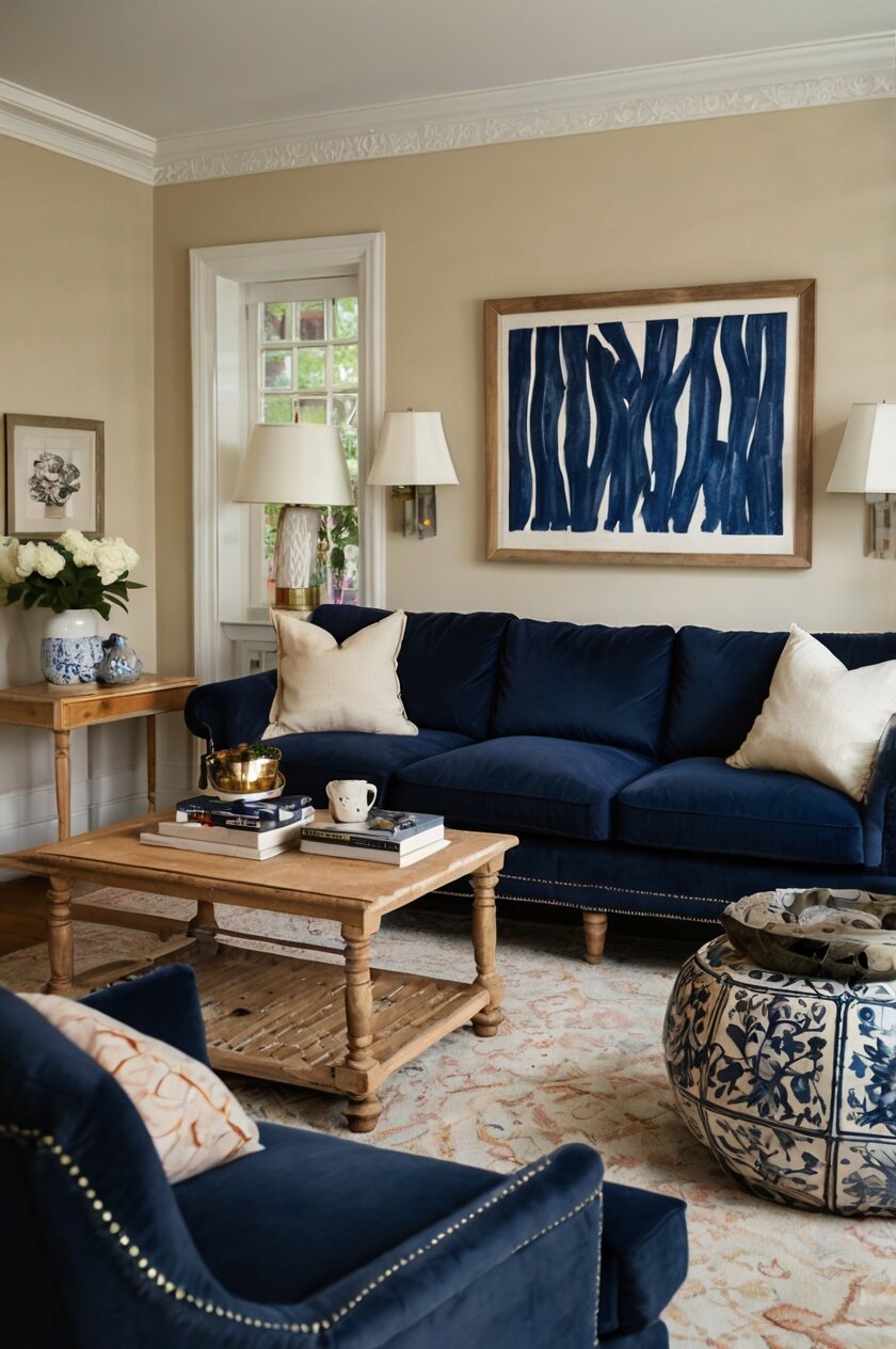
Classic Navy Blue: A Timeless Match for Cream Walls


Navy blue sofas are like the perfect pair of jeans – they go with everything, especially cream walls!
This color combination creates a look that’s both fancy and comfortable at the same time.
When you choose a navy blue sofa for your cream walls, you’re picking a color team that will never go out of style.
Navy blue brings a sense of calm to your room, like looking at the deep ocean on a sunny day.
The contrast between your dark blue sofa and light cream walls creates what designers call “visual interest” – it makes your eyes happy!
This color combo works in any season and can match almost any decorating style you love.
If you like traditional rooms, a navy blue sofa with rolled arms and wooden legs looks amazing against cream walls.
For a more modern look, try a sleek navy blue sofa with clean lines and metal legs instead.
The best part about navy blue is that it hides small stains and daily wear better than lighter colors.
This makes it perfect if you have kids, pets, or just enjoy snacking while watching your favorite shows.
To make this combo even better, add some gold or brass accents like picture frames or table lamps.
These metallic touches really pop against both the navy blue and cream background.
For throw pillows, you have so many options that work well with navy and cream.
Try patterns with light blue, coral, yellow, or even patterns that include cream to tie everything together.
During winter months, add a chunky cream-colored throw blanket to your navy sofa for a cozy feel.
In summer, swap it for something lighter in a complementary color like soft yellow or coral.
The great thing about navy blue is that it can feel different depending on what you pair it with.
Add red accessories for an American or nautical theme, or green plants for a natural, peaceful vibe.
You can even change up the look completely with different throw pillows when you want a new style without buying a new sofa.
Navy blue sofas come in many materials too – velvet navy looks super fancy, while navy leather gives a more sophisticated, timeless appeal.
For a casual family room, navy blue in a durable fabric like microfiber or treated cotton works perfectly with your cream walls.
Tap to Explore These Beauties
See my ideas in action 👇 Tap any image to explore full details.
Sophisticated Gray: The Perfect Neutral for Your Cream Walls
Gray sofas are super popular right now, and for good reason – they look amazing with cream walls!
This combination creates a sophisticated, modern look that’s easy to build around.
When you choose a gray sofa to go with your cream walls, you’re creating a soft, layered neutral palette.
The slight contrast between the cool gray and warm cream creates a balanced, harmonious feeling in your room.
There are so many shades of gray to choose from, each creating a slightly different feel with your cream walls.
Light gray creates a soft, airy feeling and makes your space feel bigger and brighter.
Medium gray offers more contrast while still maintaining a calm, balanced atmosphere in your living room.
Dark charcoal gray creates a bold statement against cream walls, perfect if you want your sofa to be a focal point.
The great thing about a gray sofa is how versatile it is with other accent colors.
You can add pillows in almost any color – blush pink, mustard yellow, teal, or purple – and they’ll all look amazing with your gray sofa and cream walls.
Gray sofas also work with any style of decorating, from super modern to traditional and everything in between.
For a contemporary look, choose a gray sofa with clean lines and metal legs to contrast with your soft cream walls.
If you prefer a cozier, more traditional style, a plush gray sofa with rounded arms works beautifully with cream backgrounds.
Gray velvet sofas are especially popular right now and add wonderful texture against smooth cream walls.
The soft sheen of velvet catches the light differently throughout the day, creating visual interest.
If you have pets or kids, consider a darker gray in a performance fabric that resists stains and wear.
Even with daily use, a quality gray sofa can maintain its good looks for many years.
During different seasons, you can easily change the feel of your gray and cream combo.
In winter, add warm throws in burgundy or forest green for a cozy feeling against your gray sofa.
For spring and summer, lighten things up with accessories in mint green, light blue, or sunny yellow.
Gray sofas also work wonderfully with wooden elements, whether you prefer dark woods or light natural finishes.
The combination of wood tones, gray fabric, and cream walls creates a balanced, designer look that’s very current.
If you’re worried about your room feeling too cool with a gray sofa, add warm elements like brass lamps, gold picture frames, or warm wood side tables.
These touches will warm up the gray while still complementing your cream walls perfectly.

Bold Red: A Striking Contrast for Cream Backgrounds
Red sofas make a big statement when paired with cream walls, creating a look that’s both classic and exciting!
This powerful color combination has been used by designers for centuries because it simply works so well.
When you choose a red sofa for your cream-walled room, you’re creating an instant focal point that grabs attention.
The warm cream background helps soften the boldness of the red, creating a balanced look that’s eye-catching but not overwhelming.
There are many shades of red to consider, each creating a slightly different feel against your cream walls.
A bright cherry red creates a modern, energetic vibe that can wake up any living space.
Deeper burgundy or cranberry reds offer a more sophisticated, rich look that works well in formal living rooms.
Brick or terracotta reds bring a warm, earthy feeling that’s perfect if you love rustic or Southwestern style.
Red is considered a “power color” that can actually increase energy levels in a room – perfect for spaces where you entertain guests!
Studies show that red can stimulate conversation and make time seem to pass more quickly – great for lively gatherings.
When decorating around a red sofa and cream walls, it’s best to keep other large pieces relatively neutral.
This allows your red sofa to be the star of the show without creating competition for attention.
For throw pillows on your red sofa, consider patterns that include cream to tie back to your walls.
Stripes, florals, or geometric patterns in cream and red look cohesive and intentionally designed.
You can also add black accents throughout the room for a classic red, black, and cream color scheme.
This timeless combination works in any style home, from ultra-modern to traditional.
If you’re worried about a red sofa being too bold, start with a smaller piece like a loveseat or accent chair.
You can always add more red elements if you find you love the look!
For coffee tables and side tables, both wood tones and glass work beautifully with the red sofa/cream wall combination.
Darker woods like walnut or mahogany complement the richness of red, while lighter woods create a nice contrast.
Red sofas come in many materials, but red leather is especially popular and durable.
A red leather sofa becomes even more beautiful with age and use, developing a rich patina over time.
For a more budget-friendly option, red microfiber or polyester blends offer the color impact without the higher price of leather.
During holidays, a red sofa makes decorating super easy – it already matches Christmas decor perfectly!
For year-round appeal, consider the undertones in your particular shade of red when choosing other accents.
Reds with orange undertones work well with gold and brass, while blue-toned reds pair beautifully with silver or chrome.

Elegant White: Clean and Bright Against Cream Walls
White sofas create a beautiful layered look when paired with cream walls, making your space feel bright and open!
This color combination gives your room a soft, airy quality that many designers absolutely love.
When you choose a white sofa to go with your cream walls, you’re creating what designers call a “tone-on-tone” effect.
This subtle layering of similar but slightly different shades adds depth and sophistication to your space.
The slight difference between bright white furniture and warmer cream walls creates a gentle contrast that’s easy on the eyes.
This combo makes rooms feel larger, brighter, and more welcoming without being boring.
White sofas come in many different “whites” – from stark bright white to softer off-whites with subtle undertones.
For cream walls, consider a crisp white sofa for more contrast, or an off-white with just a slightly different tone for a more subtle effect.
The white sofa and cream wall combination works with virtually any accent colors you might want to include.
This flexibility means you can easily change your room’s look with different pillows, throws, and accessories whenever you want a refresh.
White sofas create a perfect backdrop for colorful art or vibrant accent pieces that you want to showcase.
Against your cream walls, the white sofa helps these colorful elements truly stand out and get noticed.
If you’re worried about keeping a white sofa clean, look for performance fabrics specifically designed to resist stains.
Many white sofas now come with removable, washable covers that make maintenance much easier than in the past.
For homes with pets or small children, consider a white leather or faux leather sofa that can be wiped clean.
These options give you the white sofa look with much less worry about permanent stains.
To add visual interest to the white sofa/cream wall combo, focus on incorporating different textures.
A nubby white bouclé sofa looks amazing against smooth cream walls, adding tactile contrast even within a similar color palette.
White slipcover sofas offer a casual, comfortable vibe that works beautifully with cream walls in coastal or farmhouse-style homes.
For a more glamorous look, a white velvet sofa creates subtle sheen and luxury against matte cream walls.
When accessorizing a white sofa, natural elements like wood, rattan, and plants create wonderful contrast and warmth.
These organic elements prevent the white and cream combination from feeling too sterile or formal.
White sofas photograph beautifully too, making your cream-walled living room look magazine-worthy in pictures!
This is great if you love sharing your home on social media or just enjoy having a photogenic space.

Find Your Room’s Color Palette
Tap a vibe — get a curated 5-color palette with hex codes you can copy ✨
💭 I Wrote a Book About My Biggest Decorating Mistakes!
When I decorated my first home, I thought I knew what I was doing. Spoiler: I didn’t. 😅
💸 I bought a sofa way too big for my living room. Paint colors that looked amazing in the store but terrible on my walls.
Rich Brown Leather: Warm and Inviting With Cream Walls
Brown leather sofas create a wonderfully warm and inviting look when paired with cream walls!
This classic combination brings together the best of both worlds – cool, fresh backgrounds with warm, rich furniture.
When you choose a brown leather sofa for your cream-walled room, you’re creating a timeless look that never goes out of style.
The natural warmth of brown leather softens the space and makes it feel instantly more welcoming and lived-in.
Brown leather comes in many different shades, from light tan to deep chocolate, each creating a different effect with cream walls.
Lighter tan or camel leather creates a subtle, sophisticated contrast that works beautifully in modern or minimalist spaces.
Medium brown leather provides perfect balance – enough contrast to stand out against cream walls but not overwhelming.
Dark chocolate brown leather creates dramatic contrast and a more formal, traditional feeling against lighter cream backgrounds.
The great thing about leather sofas is that they actually look better as they age and develop what’s called a “patina.”
This natural aging process gives leather character and makes each sofa unique to your family over time.
Brown leather sofas are also incredibly practical for busy households with kids, pets, or frequent entertaining.
Unlike fabric sofas, most spills can be quickly wiped off leather before they become permanent stains.
Leather is extremely durable too, often lasting 15-20 years with proper care – much longer than most fabric sofas.
This makes a quality leather sofa a great investment piece for your cream-walled living room.
The combination of cream walls and brown leather works with many decorating styles, from rustic to modern.
For a contemporary look, choose a sleek leather sofa with clean lines and pair it with metal and glass accents.
For a more traditional or rustic style, opt for a rolled-arm leather sofa with nailhead trim against your cream walls.
This classic style creates a warm, library-like feeling that’s perfect for cozy nights at home.
When accessorizing a brown leather sofa, blue accents work especially well – navy, teal, or sky blue pillows create a beautiful color story.
Green is another great accent color, with sage, emerald, or olive all complementing both the leather and your cream walls.
For a global, well-traveled look, add textiles with patterns from around the world – kilim pillows or mudcloth throws look amazing with brown leather.
These global textiles bring color and pattern while enhancing the natural, worldly appeal of leather.
Adding plants to a room with a brown leather sofa and cream walls creates a perfect color balance of neutrals and greens.
The organic shapes of plants soften the strong lines of leather furniture and add life to the space.
For coffee tables and side tables, both light and dark woods work well with this combination.
Light woods create an airier feel, while darker woods create a more coordinated, cohesive look with the leather.
Cheerful Yellow: Sunshine Vibes with Cream Backgrounds
Yellow sofas create a happy, sunshine-filled space when paired with cream walls!
This cheerful combination feels warm and inviting all year round, like bringing a bit of summer inside your home.
When you choose a yellow sofa for your cream-walled room, you’re making a bold but beautiful choice that radiates positive energy.
Yellow is known as the color of optimism and joy – perfect for creating a living space that lifts your mood every time you enter!
There are many shades of yellow to consider, each creating a slightly different feel against your cream walls.
Bright, sunny yellows make a bold statement and create a fun, energetic atmosphere in your living room.
Softer buttery yellows offer a more subtle approach that’s still cheerful but not overwhelming against cream backgrounds.
Mustard or gold yellows bring sophistication and depth, creating a rich look that works well in both modern and traditional spaces.
The great thing about pairing yellow with cream walls is that they share warm undertones, creating a harmonious feel.
This color combination feels natural and balanced, like sunshine filling a light, airy room.
Yellow sofas work especially well in rooms that don’t get much natural light, as they can brighten up dark corners.
If your living room faces north or east, a yellow sofa can help bring warmth and light to an otherwise cool-feeling space.
For decorating around your yellow sofa, blue makes a perfect complementary color that balances the warmth of yellow.
Navy blue, teal, or cobalt accessories create a classic color combination against your cream walls that always looks fresh.
Gray is another excellent partner for yellow, creating a trendy, contemporary look that feels both current and timeless.
Add charcoal gray pillows or a gray area rug to ground your yellow sofa against cream walls.
For a nature-inspired palette, incorporate green plants or accessories around your yellow sofa.
This green-yellow-cream combination mimics natural outdoor colors and creates a fresh, organic feeling indoors.
If you’re hesitant about choosing such a bold color, start with a smaller yellow loveseat or even just yellow accent chairs.
You can still get the cheerful effect without committing to a full-sized yellow sofa.
Yellow velvet sofas are especially popular right now, adding both color and luxurious texture to rooms with cream walls.
The slight sheen of velvet adds dimension and catches the light beautifully throughout the day.
For a more casual look, yellow linen or cotton sofas offer the same cheerful color with a more relaxed, lived-in feel.
These natural fabrics work perfectly with cream walls in coastal, farmhouse, or casual contemporary homes.
When choosing art for walls around your yellow sofa, look for pieces that include both yellow and cream.
This creates a cohesive, intentional look that pulls your whole color scheme together.
Yellow sofas make great focal points, drawing the eye immediately when someone enters your cream-walled room.
This makes furniture arrangement easier, as you can build the rest of your room layout around this sunny centerpiece.
What’s Your Decor Personality?
5 questions · 30 seconds · Instant style match 🏡
Calming Green: Nature-Inspired Elegance for Cream Walls
Green sofas create a refreshing, nature-inspired look when paired with cream walls!
This combination brings the peaceful feeling of the outdoors inside your home in a sophisticated way.
When you choose a green sofa for your cream-walled room, you’re creating a space that feels both grounding and uplifting.
Green is known for its calming properties, making it perfect for creating a relaxing living space where you can unwind.
There are so many beautiful shades of green to consider, each creating a different mood against cream backgrounds.
Sage green creates a soft, subtle look that’s trendy right now but has staying power for years to come.
Emerald or jade green makes a bolder statement, bringing richness and luxury to your cream-walled living room.
Olive or forest greens offer a deeper, more grounded feeling that works beautifully in traditional or rustic spaces.
The combination of green and cream feels naturally harmonious, like plants growing against a sandy background.
This color pairing has roots in nature, which is why it feels so right to our eyes and creates such comfortable spaces.
Green sofas work exceptionally well in rooms that receive lots of natural light, as sunlight enhances their verdant hues.
In the morning and evening, changing light brings out different tones in your green sofa, adding natural variety to your space.
When decorating around a green sofa and cream walls, natural materials make perfect complements.
Wood, rattan, jute, and other organic elements enhance the nature-inspired theme without competing for attention.
For accent colors, both warm and cool tones can work well with green, giving you lots of decorating flexibility.
Coral, peach, or rust accents add warmth and create an interesting contrast with cooler green tones.
Blue or purple accessories create a cool color story that feels sophisticated and peaceful against your cream walls.
Gold or brass metal accents look particularly stunning with green sofas, adding warmth and gleam to the natural palette.
Pattern mixing works wonderfully with green sofas – floral, botanical, or geometric prints in complementary colors add interest.
Look for patterns that include both green and cream to tie your main color elements together cohesively.
If you want to embrace the biophilic (nature-loving) design trend, a green sofa is the perfect starting point.
Add plenty of houseplants to enhance the connection with nature and create a fresh, oxygen-rich environment.
Green velvet sofas are especially popular now, adding luxurious texture and depth to rooms with cream walls.
The dimensional quality of velvet makes the green color look even richer and more interesting throughout the day.
For a more casual look, green linen or cotton sofas offer a relaxed vibe that works beautifully with cream walls.
These breathable fabrics are practical for everyday family use while still providing that gorgeous green color.
Green leather sofas offer an unexpected twist on traditional leather furniture, perfect for those wanting something unique.
A green leather sofa makes a statement while still being neutral enough to work with many decorating styles.
Trendy Blush Pink: Soft and Stylish Against Cream
Blush pink sofas create a soft, stylish statement when paired with cream walls!
This trendy combination feels fresh and modern while still being wonderfully livable.
When you choose a blush pink sofa for your cream-walled room, you’re creating a space that feels both current and timeless.
The subtle warmth of blush pink adds just enough color without overwhelming your neutral cream background.
Blush pink has been popular in home design for several years now, proving it has staying power beyond just being a passing trend.
Designers often refer to blush pink as a “new neutral” because it works so well with other colors while adding a touch of personality.
The combination of blush pink and cream creates a soft, layered look that feels sophisticated and intentional.
This color pairing works especially well in living rooms, creating a welcoming space that feels both fresh and comfortable.
Blush pink comes in various shades from barely-there pale pink to deeper rose tones, each creating a different effect.
Lighter blush tones create a subtle, airy feel that’s perfect for minimalist or Scandinavian-inspired spaces.
Slightly deeper rose tones offer more contrast against cream walls, making more of a color statement in your living room.
The great thing about blush pink is that it flatters almost everyone, casting a warm glow that makes people look their best.
This makes your living room not just beautiful, but a space where family and friends will look and feel good in photos and gatherings.
When accessorizing a blush pink sofa against cream walls, consider adding touches of gray for a contemporary edge.
Gray pillows or a gray area rug grounds the softness of the pink and cream combination beautifully.
For a more glamorous look, gold or brass accents add warmth and luxury to the blush and cream palette.
These metallic touches catch the light and add dimension to what could otherwise be a very soft-looking space.
Green plants create a perfect natural contrast to blush pink sofas, adding life and visual interest to your cream-walled room.
The combination of pink, green, and cream mimics colors found in nature, creating a fresh, organic feeling indoors.
Blush pink velvet sofas are especially popular, adding rich texture that catches the light beautifully throughout the day.
This luxurious fabric makes the color look even more interesting and dimensional against flat cream walls.
For patterns around your blush sofa, look for designs that incorporate both pink and cream to tie everything together.
Floral patterns work especially well with this color combination, enhancing the fresh, pretty feeling of the space.
If you’re concerned about a pink sofa feeling too feminine, balance it with more structured furniture pieces in wood or metal.
Clean lines and natural materials help create a gender-neutral space that everyone can enjoy.
Blush pink works surprisingly well with many different decorating styles, from mid-century modern to contemporary glam.
This versatility makes it a smart choice that can evolve with your changing tastes over time.
During different seasons, you can easily change the feel of your blush and cream combo with different accessories.
Add deeper burgundy or navy in winter months for a cozier feel, or lighten things up with white and mint green in summer.
Elegant Teal: A Rich Jewel Tone for Cream Walls
Teal sofas create a rich, jewel-toned look that pairs beautifully with cream walls!
This color combination feels both bold and sophisticated, making a statement without being overwhelming.
When you choose a teal sofa for your cream-walled room, you’re creating a designer-worthy space that balances color and neutrality.
Teal is a versatile blue-green shade that works year-round and complements many different decorating styles.
The contrast between a deep teal sofa and light cream walls creates visual interest that immediately catches the eye.
This combination feels intentional and well-designed, showing your confidence in working with color.
Teal comes in various shades from lighter aqua-leaning teals to deeper peacock blues, each creating a different effect.
Brighter teals create an energetic, playful vibe against cream walls, perfect for lively family rooms.
Deeper, more saturated teals offer a more formal, sophisticated look that works beautifully in living rooms where you entertain guests.
Teal is considered a restful color that promotes feelings of calm and relaxation despite its rich intensity.
This makes a teal sofa perfect for creating a living space where you can truly unwind at the end of a long day.
When accessorizing a teal sofa against cream walls, gold or brass accents add warmth and elegance to the color scheme.
These metallic touches bring out the richness of teal while adding a luxurious element to your living room.
For throw pillows, consider patterns that include both teal and cream to tie your main color elements together.
Geometric patterns or botanical prints work especially well with this sophisticated color combination.
Teal pairs beautifully with many accent colors, giving you flexibility in your decorating scheme.
Coral or salmon accents create a trendy complementary color scheme that feels fresh and current against your cream walls.
For a more classic look, add accents in navy blue and white for a layered blue color story that never goes out of style.
Wood tones of all kinds work well with teal sofas, from light natural oak to rich walnut or mahogany.
This versatility with wood makes teal an easy color to work with in most existing living rooms.
Teal velvet sofas are especially popular right now, adding luxurious texture that enhances the rich color.
The dimensional quality of velvet makes teal look even more interesting as it catches the light differently throughout the day.
If velvet isn’t your style, teal in performance fabrics like microfiber or treated polyester offers the same beautiful color with more practicality.
These durable options are perfect for busy households with kids, pets, or frequent entertaining.
Teal leather sofas offer an unexpected twist on traditional leather furniture, perfect for creating a unique living space.
This bold choice makes a statement while still being versatile enough to work with changing accessory colors over time.
During different seasons, you can easily change the feel of your teal and cream combination.
Add warm orange and rust accents in fall, or lighten things up with white and yellow in spring and summer.

This or That?
Pick your fave — see what other readers chose! 👀
Modern Black: Bold Contrast Against Cream Backgrounds
Black sofas create a bold, dramatic statement against cream walls that feels both modern and timeless!
This high-contrast combination creates a sophisticated look that works in nearly any style of home.
When you choose a black sofa for your cream-walled living room, you’re creating a strong foundation for your entire design scheme.
The stark contrast between black and cream creates what designers call “visual tension” – a pleasing balance that keeps your eye moving.
Black sofas work with every decorating style, from ultra-modern to traditional, industrial to farmhouse.
This versatility makes a black sofa a smart investment that can evolve with your changing tastes over the years.
In smaller rooms, black sofas can actually help define the space and create a focal point against cream walls.
Despite what many people think, dark furniture doesn’t always make a room feel smaller – it can actually add depth when used correctly.
Black leather sofas are classic choices that offer both style and durability in busy households.
The sleek surface of leather adds a luxurious element while being practical for families with kids or pets.
For a softer look, black fabric sofas in materials like velvet, linen, or performance fabrics offer the same dramatic contrast with added texture.
Black velvet is especially popular right now, adding dimensional richness that looks stunning against cream backgrounds.
When decorating around a black sofa and cream walls, you have endless options for accent colors.
Almost any color you can imagine works with this neutral base – from bright primary colors to soft pastels or additional neutrals.
For a minimalist, modern look, stick with a strictly black, white, and cream palette with clean lines and minimal accessories.
This creates a timeless, gallery-like feeling that lets architectural features and carefully chosen art take center stage.
💭 I Wrote a Book About My Biggest Decorating Mistakes!
When I decorated my first home, I thought I knew what I was doing. Spoiler: I didn’t. 😅
💸 I bought a sofa way too big for my living room. Paint colors that looked amazing in the store but terrible on my walls.
For a more colorful approach, use your black sofa and cream walls as a neutral background for vibrant accent colors.
Bold yellows, emerald greens, or cobalt blues pop dramatically against the black and cream foundation.
Metallic accents work beautifully with this color combination – both warm metals like gold and brass or cool metals like silver and chrome.
These shiny elements add dimension and catch the light, bringing movement to the high-contrast space.
Patterns that include black and cream create cohesion in your design, tying the main color elements together.
Look for geometric prints, stripes, or abstract patterns that incorporate both of these core colors.
To soften the starkness of a black sofa, add plenty of texture through pillows, throws, and other textiles.
Different textures catch the light differently, adding visual interest even within a limited color palette.
Plants add the perfect organic element to rooms with black sofas and cream walls, bringing life and color.
The green of plants pops beautifully against both black and cream, creating a fresh, natural accent.
Black sofas photographically beautifully too, making your living room look like a designer space in pictures.
This is perfect if you enjoy sharing your home on social media or just appreciate a photogenic living area.
For coffee tables and side tables, both light and dark options work well with black sofas against cream walls.
Light woods or glass tables create more contrast, while black or dark wood tables create a more cohesive, grounded look.
Quick Design Dilemma
Cast your vote — see what other readers think! 🤔
Cheerful Orange: Energetic Pop Against Cream
Orange sofas create an energetic, happy vibe when paired with cream walls!
This bold combination feels sunny and welcoming, making your living room stand out from the crowd.
When you choose an orange sofa for your cream-walled room, you’re making a confident design choice that shows personality.
Orange is known as a sociable, friendly color – perfect for creating living spaces where people love to gather.
There are many shades of orange to consider, each creating a different effect against your cream walls.
Bright, true oranges make a bold, playful statement that adds instant energy to any living space.
Burnt orange or terracotta tones offer a more sophisticated, earthy take that works beautifully in modern or southwestern-inspired homes.
Coral or peachy oranges create a softer look that’s still colorful but less intense against cream backgrounds.
The combination of orange and cream feels naturally harmonious, like a creamsicle or a sunset against light clouds.
These colors share warm undertones, creating a cohesive feel despite their contrast in intensity.
Orange sofas work especially well in rooms that don’t get much natural light or face north, as they bring warmth and energy.
The vibrant color can help brighten up otherwise dark or cool-feeling spaces.
When decorating around an orange sofa and cream walls, blue makes a perfect complementary color.
Navy, teal, or cobalt blue accessories create classic color theory magic – opposites on the color wheel that make each other pop.
For a more subtle approach, add natural elements like wood, jute, and plants to ground the brightness of orange.
These earthy elements help balance the boldness of your orange sofa, creating a more layered, sophisticated look.
Patterns that include both orange and cream help tie your main color elements together cohesively.
Look for geometric prints, ikat patterns, or abstract designs that incorporate both these colors for pillows or throws.
Orange velvet sofas add luxurious texture that makes the color even more interesting against flat cream walls.
The dimensional quality of velvet shows different tones of orange as it catches the light throughout the day.
For a more casual, family-friendly option, orange in performance fabrics offers the same cheerful color with added durability.
These practical fabrics resist stains and wear, making colorful furniture more livable for everyday use.
During different seasons, you can easily shift the feel of your orange and cream combination.
Add deeper browns and rusts in fall for a seasonal look, or brighten things up with turquoise and white in summer months.
Orange works surprisingly well with many different decorating styles, from mid-century modern to contemporary.
This versatility makes it more usable than you might initially think when considering colorful sofas.
If you’re hesitant about choosing such a bold color, start with a smaller orange loveseat or accent chairs.
You can still get the energetic effect without committing to a full-sized orange sofa in your cream-walled room.
For art and accessories, look for pieces that echo your orange and cream palette to create a cohesive design story.
This intentional color repetition makes your space feel professionally designed rather than randomly assembled.
Luxurious Purple: Regal Elegance with Cream Walls
Purple sofas create a sense of luxury and uniqueness when paired with cream walls!
This rich combination feels both regal and comfortable, perfect for creating a distinctive living space.
When you choose a purple sofa for your cream-walled room, you’re making a statement that shows confidence and creativity.
Purple has historically been associated with royalty and luxury, bringing these qualities into your everyday living space.
✦ You Might Love This
Gray Wall Solutions: 8+ Stunning Sofa Colors to Complete Your Room Keep Reading →There are many beautiful shades of purple to consider, each creating a different mood against cream backgrounds.
Deep eggplant or plum purples create a sophisticated, formal look that’s dramatic without being overwhelming.