
White walls and gray sofas create a modern, clean foundation that’s super popular these days.
But the curtains you choose can completely change how your room feels.
They’re like the final puzzle piece that brings everything together.
The right curtains don’t just look pretty – they can make your room seem bigger, brighter, or even more comfortable.
With so many color options available, let’s have a look at my favorites here:
✨Click to Get My 101 FREE Designer Room Ideas
1. Elegant Navy Blue
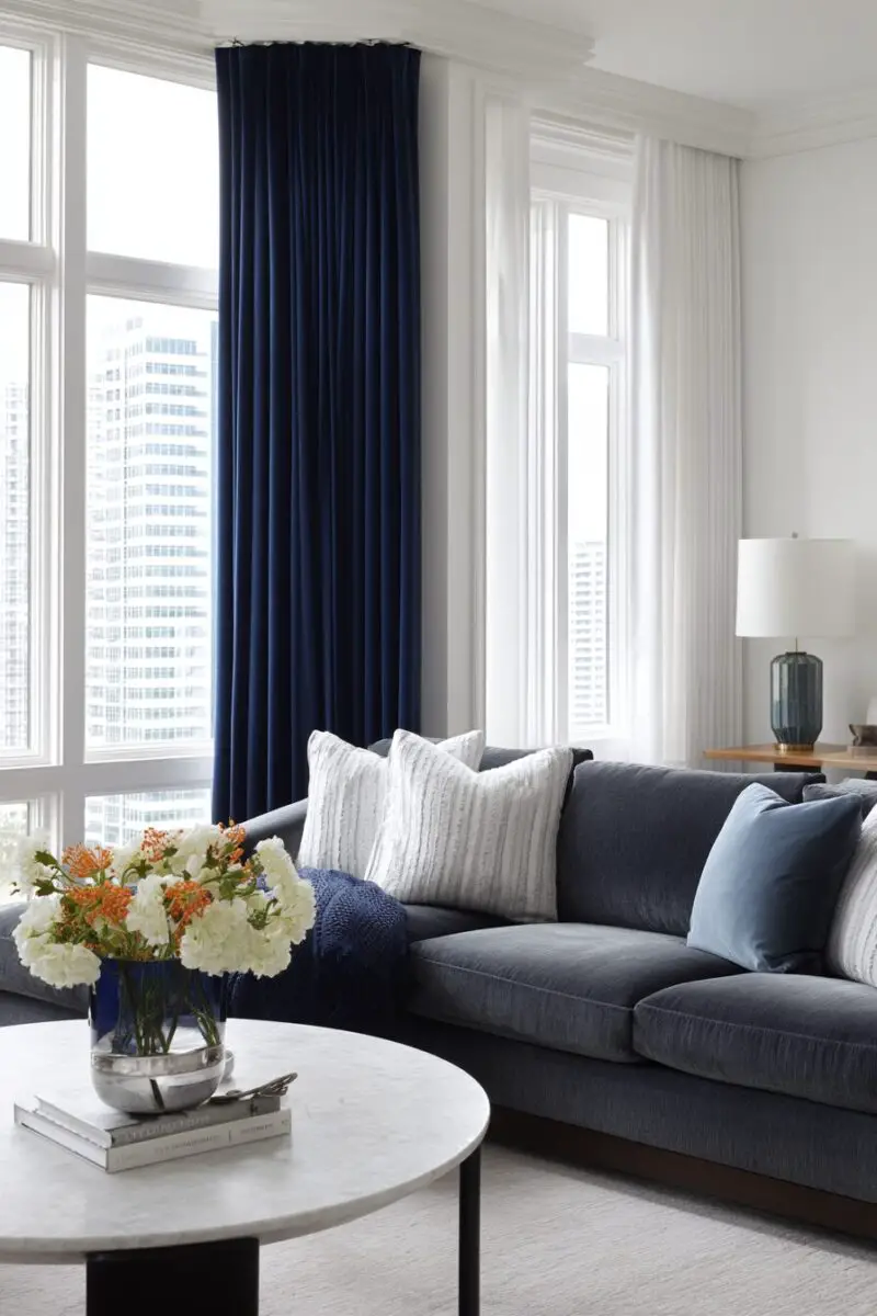
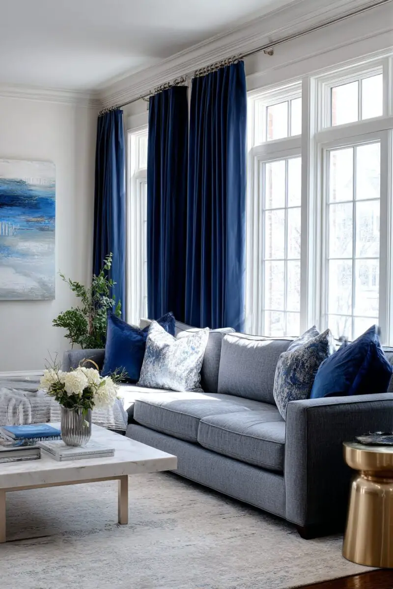
Navy blue curtains create a sophisticated anchor in a room with white walls and a gray sofa.
This deep, rich color adds a touch of elegance that instantly elevates your space.
Navy is considered a neutral in the design world, so it plays well with almost any accent colors you might already have.
When sunlight filters through navy curtains, it creates a soothing, gentle glow in your room.
This color works particularly well if your gray sofa has cool undertones.
The contrast between the deep navy and crisp white walls creates visual interest without being overwhelming.
Navy blue curtains can make your ceiling appear higher if you hang them close to the ceiling and let them fall to the floor.
This color choice works in both traditional and modern spaces, making it incredibly versatile.
For a cohesive look, consider adding small navy accents throughout your room, like throw pillows or decorative items.
In the winter months, navy curtains feel cozy and warm, while in summer they still feel appropriate and not too heavy.
Navy blue is also practical – it hides dust and small stains better than lighter colors.
If your room doesn’t get a lot of natural light, consider a lighter shade of navy or a thinner fabric to prevent the space from feeling too dark.
For added interest, you might choose navy curtains with a subtle pattern or texture.
The formality of navy brings a pulled-together look to casual spaces.
Navy curtains can serve as a beautiful backdrop for brass or gold hardware and accessories, which really pop against the deep blue.
When paired with light wood tones, navy curtains create a beautiful coastal-inspired look.
If you have children or pets, navy is forgiving of fingerprints and fur while still looking polished.
Many designers consider navy blue to be a “forever color” that won’t go out of style, making it a smart long-term investment.
For the most dramatic effect, choose a navy fabric with a slight sheen that catches the light.
This color choice tells visitors that you appreciate classic style with a modern edge.
2. Soft Blush Pink
Blush pink curtains add a gentle warmth to rooms with white walls and gray sofas.
This soft, pale pink brings a touch of color without overwhelming the neutral foundation of your space.
Blush is often described as a “new neutral” because it pairs beautifully with so many other colors.
When morning light filters through blush curtains, it casts a flattering, rosy glow throughout your room.
This color works especially well if your gray sofa has warm undertones.
The combination of blush, white, and gray creates a sophisticated, calming atmosphere that feels both fresh and timeless.
Blush pink curtains can make your space feel more inviting and lived-in compared to stark, cooler tones.
This color choice works beautifully in both modern and traditional spaces.
For a cohesive look, consider adding small blush accents like throw pillows, vases, or artwork.
Blush curtains bring a subtle feminine touch without being overly girly.
The softness of blush pink can help balance the coolness of gray and white, creating a more harmonious space.
If your room gets harsh afternoon sun, blush curtains can help filter the light into a softer, more flattering glow.
For added interest, consider blush curtains with subtle patterns or textures like small dots or a gentle sheen.
Blush pairs beautifully with metallic accents like gold, copper, or chrome.
This color is versatile enough to work in any room of your house, from living rooms to bedrooms.
Many find that blush pink creates a sense of tranquility, making it perfect for spaces where you want to relax.
If you’re worried about the room feeling too pink, choose a very pale blush that reads almost as a neutral from a distance.
Blush curtains can make a small room feel larger and more airy compared to darker curtain choices.
For a modern look, pair blush curtains with black accents or matte black hardware.
This color choice shows that you appreciate subtle sophistication and aren’t afraid of gentle color.
3. Classic Charcoal Gray
Charcoal gray curtains create a sophisticated monochromatic look with your white walls and gray sofa.
This deeper shade of gray adds depth and dimension to your space without introducing a new color.
Charcoal curtains create a sense of cohesion that feels intentional and designer-approved.
When choosing charcoal curtains, select a shade slightly darker than your sofa for the most pleasing contrast.
This color choice creates a modern, minimalist aesthetic that’s currently very popular in home design.
Charcoal gray serves as an excellent backdrop for colorful accessories if you want to add pops of color elsewhere.
The neutral nature of charcoal means you can easily change accent colors seasonally without having to replace your curtains.
This color option works particularly well in rooms with architectural details you want to highlight.
For added interest, consider charcoal curtains with texture like linen, velvet, or subtle patterns.
Charcoal gray curtains provide excellent light blocking if you need a darker room for sleeping or watching movies.
This color choice creates a sophisticated foundation that works with virtually any design style.
If your room feels too stark with white walls and a gray sofa, charcoal curtains add necessary visual weight.
Charcoal gray pairs beautifully with natural elements like wood, leather, and plants.
This color choice is practical for high-traffic areas as it hides dust and small stains better than lighter options.
For small spaces, charcoal curtains hung from ceiling to floor can create the illusion of height.
This color option shows that you understand the power of subtlety in design.
Charcoal curtains make a perfect backdrop for showcasing artwork or statement lighting fixtures.
This versatile neutral will never go out of style, making it a wise investment.
If your room lacks natural light, consider a charcoal with a slight sheen to reflect available light.
This color choice tells visitors you appreciate refined, sophisticated design choices.
4. Vibrant Emerald Green
Emerald green curtains add a bold, luxurious touch to rooms with white walls and gray sofas.
This rich jewel tone brings nature-inspired energy into your space.
Emerald green creates a striking contrast against white walls that immediately draws the eye.
When light filters through emerald curtains, it casts a magical, forest-like glow in your room.
This color choice works exceptionally well if you want to make a statement without repainting.
Emerald green has been considered a symbol of renewal and abundance in many cultures.
The combination of emerald, white, and gray creates a sophisticated palette that feels both fresh and timeless.
This color choice pairs beautifully with brass or gold accents for an extra touch of luxury.
Emerald green curtains can make your space feel more grounded and connected to nature.
This bold color works in both traditional and contemporary spaces, making it incredibly versatile.
For a cohesive look, consider adding small emerald accents throughout your room.
Emerald green is known to promote feelings of balance and harmony, making it perfect for living spaces.
If you’re worried about too much green, consider curtains with an emerald pattern on a neutral background.
This color choice shows that you’re confident in your design decisions and aren’t afraid of color.
Emerald green curtains create a beautiful backdrop for houseplants, amplifying their natural beauty.
The richness of emerald adds depth to rooms that might otherwise feel flat with just white and gray.
This color has staying power – it’s been popular in design for centuries and isn’t just a passing trend.
For a dramatic effect, choose emerald velvet curtains that add both color and luxurious texture.
This bold choice can make other neutral elements in your room look more intentional and sophisticated.
Emerald green is associated with growth and vitality, bringing positive energy into your living space.
✨Click to Get My 101 FREE Designer Room Ideas
5. Crisp Pure White
Pure white curtains create a clean, seamless look with your white walls while letting your gray sofa stand out.
This monochromatic choice amplifies natural light, making your space feel larger and airier.
White curtains allow for maximum light diffusion, creating a bright, cheerful atmosphere throughout the day.
This color choice creates a perfect blank canvas for you to add colorful accessories that can be easily changed.
White curtains contribute to a minimalist aesthetic that’s calming and uncluttered.
For added interest, consider white curtains with subtle texture or pattern that’s visible up close.
This versatile option works with any design style from farmhouse to ultra-modern.
White curtains create a sense of visual continuity that makes smaller spaces appear larger.
This color choice allows architectural details in your room to take center stage.
White curtains make your gray sofa appear more vibrant and defined as a focal point.
For a sophisticated look, choose white curtains in luxurious fabrics like silk or velvet.
This classic color choice will never go out of style, making it a practical long-term investment.
White curtains allow you to be more adventurous with other decorative elements in your room.
This color choice creates a fresh, clean look that’s especially appealing in warmer months.
White curtains reflect light back into the room, brightening dark corners naturally.
For a layered look, white sheer curtains can be paired with more substantial white drapes.
This versatile option works well in any room from living spaces to bedrooms.
White curtains create a sense of harmony and balance in spaces with many design elements.
This color choice is perfect if you enjoy changing your décor seasonally or frequently.
White curtains tell visitors you appreciate timeless design and attention to subtle details.
6. Bold Mustard Yellow
Mustard yellow curtains add a surprising pop of color that works beautifully with white walls and gray sofas.
This warm, golden-yellow brings sunshine and cheerfulness to your space year-round.
Mustard yellow is considered a modern neutral by many designers because it pairs well with so many colors.
When sunlight filters through mustard curtains, it creates a warm, golden glow throughout your room.
This color works particularly well with both light and dark gray sofas.
The combination of mustard, white, and gray creates a contemporary look that feels fresh and inviting.
Mustard yellow curtains can make your space feel cozier and more welcoming.
This color choice works in both modern and vintage-inspired spaces.
For a cohesive look, consider adding small mustard accents like throw pillows or decorative items.
Mustard yellow brings warmth to rooms with cooler gray tones, creating better balance.
The richness of mustard can help make a large room feel more intimate and defined.
If your room doesn’t get much natural light, mustard curtains can help create a sense of sunshine.
For added interest, you might choose mustard curtains with a subtle pattern or texture.
Mustard pairs beautifully with natural wood tones, plants, and earthy accents.
This color is known to stimulate conversation, making it perfect for living and dining areas.
Many find that mustard yellow creates a sense of optimism and creativity in a space.
If you’re worried about too much yellow, choose a deeper mustard that reads almost as a neutral.
Mustard curtains can bring much-needed warmth to rooms with lots of gray, white, and cool tones.
For a dramatic look, pair mustard curtains with black hardware or accents.
This color choice shows that you’re design-savvy and understand how to use color effectively.
7. Tranquil Sage Green
Sage green curtains add a soothing, nature-inspired element to rooms with white walls and gray sofas.
This soft, muted green brings a sense of tranquility and connection to the outdoors.
Sage is often described as a “new neutral” because it pairs so effortlessly with other colors.
When light filters through sage curtains, it creates a gentle, calming glow throughout your room.
This color works especially well if your gray sofa has warm undertones.
The combination of sage, white, and gray creates a sophisticated palette that feels both fresh and timeless.
Sage green curtains can make your space feel more grounded and peaceful.
This versatile color choice works in both country-inspired and modern minimalist spaces.
For a cohesive look, consider adding small sage accents like throw pillows, plants, or artwork.
Sage green brings a subtle color to your space without overwhelming the neutral foundation.
The softness of sage can help balance the coolness of gray and white, creating a more harmonious space.
If your room gets harsh afternoon sun, sage curtains can help filter the light into a softer, more flattering glow.
For added interest, consider sage curtains with subtle patterns or textures.
Sage pairs beautifully with natural materials like wood, rattan, and stone.
This color is associated with health and renewal, making it perfect for creating a wellness-focused space.
Many find that sage green promotes relaxation, making it ideal for bedrooms and living areas.
If you’re worried about too much green, choose a very pale sage that reads almost as a neutral from a distance.
Sage curtains can help bring the healing qualities of nature into your indoor environment.
For a modern farmhouse look, pair sage curtains with black hardware and natural textures.
This color choice tells visitors that you value creating a calm, balanced environment in your home.
8. Rich Burgundy Red
Burgundy red curtains add dramatic richness to rooms with white walls and gray sofas.
This deep, sophisticated color brings warmth and energy to your neutral foundation.
Burgundy creates a striking contrast against white walls that immediately draws the eye.
When light filters through burgundy curtains, it casts a warm, rosy glow throughout your space.
This color works beautifully with both light and dark gray sofas, creating a balanced look.
The combination of burgundy, white, and gray creates a timeless color scheme with historical roots.
Burgundy red curtains can make your space feel more intimate and cozy, especially in larger rooms.
This classic color choice works well in both traditional and contemporary spaces.
For a cohesive look, consider adding small burgundy accents throughout your room.
Burgundy brings a sense of luxury and refinement to even the simplest spaces.
The richness of burgundy can help make a space feel more established and intentional.
If your room feels too cool with white walls and a gray sofa, burgundy curtains add necessary warmth.
For added elegance, consider burgundy curtains in luxurious fabrics like velvet or silk.
Burgundy pairs beautifully with gold, brass, or bronze hardware and accents.
This color is associated with abundance and celebration, making it perfect for dining rooms or entertaining spaces.
Many find that burgundy creates a sense of comfort and security in a home.
If you’re worried about too much red, choose a deeper burgundy that reads almost as a neutral from a distance.
Burgundy curtains are practical for high-traffic areas as they hide dust and small stains better than lighter options.
For a dramatic effect, pair burgundy curtains with black accents or matte black hardware.
This color choice shows that you appreciate timeless elegance and aren’t afraid of rich color.
✨Click to Get My 101 FREE Designer Room Ideas
9. Light Aqua Blue
Light aqua blue curtains bring a refreshing, spa-like quality to rooms with white walls and gray sofas.
This soft, watery blue adds a subtle color that feels both clean and calming.
Aqua creates a gentle contrast against white walls that feels natural and organic.
When sunlight filters through aqua curtains, it creates a magical, ocean-inspired glow in your room.
This color works particularly well if your gray sofa has cool undertones.
The combination of aqua, white, and gray creates a sophisticated palette reminiscent of coastal design.
Aqua blue curtains can make your space feel more open and airy.
This versatile color choice works in both modern and traditional spaces.
For a cohesive look, consider adding small aqua accents like throw pillows or decorative items.
Aqua brings a sense of serenity and relaxation to your living space.
The freshness of aqua can help brighten rooms that feel too stark with just white and gray.
If your room gets harsh afternoon sun, aqua curtains can help filter the light into a softer, more flattering glow.
For added interest, consider aqua curtains with subtle patterns or textures like watercolor effects.
Aqua pairs beautifully with natural materials like light wood, jute, and rattan.
This color is associated with tranquility and clarity, making it perfect for creating a peaceful environment.
Many find that aqua blue promotes relaxation, making it ideal for bedrooms and living areas.
If you’re worried about too much blue, choose a very pale aqua that reads almost as a neutral from a distance.
Aqua curtains can help bring the calming qualities of water elements into your home.
For a fresh, contemporary look, pair aqua curtains with silver or chrome hardware.
This color choice tells visitors that you value creating a serene, rejuvenating atmosphere in your home.
10. Sunny Coral Orange
Coral orange curtains bring unexpected warmth and energy to rooms with white walls and gray sofas.
This vibrant yet approachable color adds instant cheer to your neutral foundation.
Coral creates a beautiful contrast against white walls that immediately brightens the space.
When sunlight filters through coral curtains, it casts a warm, golden-pink glow throughout your room.
This color works particularly well if your gray sofa has warm undertones.
The combination of coral, white, and gray creates a contemporary palette that feels fresh and inviting.
Coral orange curtains can make your space feel more lively and welcoming.
This bold color choice works especially well in modern and eclectic spaces.
For a cohesive look, consider adding small coral accents like throw pillows or artwork.
Coral brings a sense of playfulness and optimism to your living space.
The warmth of coral can help balance rooms that feel too cool with just white and gray.
If your room lacks natural light, coral curtains can help create a sense of sunshine and brightness.
For a more subtle approach, consider coral curtains with a pattern that incorporates white or neutral elements.
Coral pairs beautifully with turquoise, navy, or green accents for a color-lovers approach.
This color is associated with energy and enthusiasm, making it perfect for social spaces.
Many find that coral creates a sense of hospitality and warmth in a home.
If you’re worried about too much orange, choose a softer coral that leans more toward pink.
Coral curtains can bring much-needed warmth to rooms with lots of gray, white, and cool tones.
For a dramatic effect, pair coral curtains with dark navy or emerald green accents.
This color choice shows that you’re confident in your design decisions and appreciate the mood-lifting power of color.
11. Sophisticated Lavender Gray
Lavender gray curtains add a subtle, sophisticated color to rooms with white walls and gray sofas.
This soft, muted purple with gray undertones brings unexpected elegance to your space.
Lavender gray creates a gentle contrast against white walls that feels both interesting and calming.
When light filters through lavender gray curtains, it creates a serene, dreamy glow in your room.
This color works beautifully with both light and dark gray sofas, creating a layered look.
The combination of lavender gray, white, and gray creates a sophisticated palette with a touch of the unexpected.
Lavender gray curtains can make your space feel more refined and intentionally designed.
This versatile color choice works in both modern and traditional spaces.
For a cohesive look, consider adding small lavender gray accents throughout your room.
Lavender gray brings a hint of color to your space without overwhelming the neutral foundation.
The softness of lavender gray helps create a soothing atmosphere perfect for relaxation.
If your room feels too stark, lavender gray curtains add necessary visual interest and warmth.
For added elegance, consider lavender gray curtains in luxurious fabrics like velvet or silk.
Lavender gray pairs beautifully with silver, chrome, or brushed nickel hardware.
This color is associated with creativity and tranquility, making it perfect for spaces where you want to unwind.
Many find that lavender tones promote relaxation, making this choice ideal for bedrooms and living areas.
If you’re worried about too much purple, this gray-leaning shade reads almost as a neutral from a distance.
Lavender gray curtains create a beautiful backdrop for gold or brass accessories, which pop against the cool tone.
For a modern look, pair lavender gray curtains with geometric patterns or contemporary art.
This color choice tells visitors that you appreciate subtle sophistication and understand color nuance.
12. Earthy Terracotta
Terracotta curtains add warm, earthy richness to rooms with white walls and gray sofas.
This clay-inspired orange-brown brings natural warmth and grounding energy to your space.
Terracotta creates a beautiful contrast against white walls that feels organic and inviting.
When sunlight filters through terracotta curtains, it casts a warm, golden glow throughout your room.
This color works particularly well if your gray sofa has warm undertones.
The combination of terracotta, white, and gray creates a sophisticated palette inspired by nature.
Terracotta curtains can make your space feel more cozy and connected to the earth.
This versatile color choice works in both modern and bohemian-inspired spaces.
For a cohesive look, consider adding small terracotta accents like planters or decorative items.
Terracotta brings a sense of history and timelessness to contemporary spaces.
The warmth of terracotta can help balance rooms that feel too cool with just white and gray.
If your room lacks natural light, terracotta curtains can help create a sense of warmth and coziness.
For added interest, consider terracotta curtains with subtle patterns or textures.
Terracotta pairs beautifully with natural materials like wood, leather, and plants.
This color is associated with creativity and nourishment, making it perfect for gathering spaces.
Many find that terracotta creates a sense of comfort and safety in a home.
If you’re worried about too much orange, choose a more muted terracotta that leans toward brown.
Terracotta curtains bring much-needed warmth to rooms with lots of gray, white, and cool tones.
For a global-inspired look, pair terracotta curtains with blue and green accents.
This color choice shows that you appreciate nature-inspired design and understand how to create a welcoming atmosphere.
✨Click to Get My 101 FREE Designer Room Ideas
13. Classic Black and White Pattern
Black and white patterned curtains add graphic interest to rooms with white walls and gray sofas.
This timeless color combination brings visual excitement without introducing new colors.
Patterns like stripes, geometrics, or florals create focus while still complementing your neutral foundation.
When light filters through patterned curtains, it creates interesting shadows and movement in your space.
This versatile choice works with any shade of gray sofa, light or dark.
The combination of black, white, and gray creates a sophisticated monochromatic palette that never goes out of style.
Black and white patterned curtains can make your space feel more dynamic and intentionally designed.
This classic color choice works in both traditional and contemporary spaces.
For a cohesive look, consider adding small black accents throughout your room.
Patterned curtains bring visual texture to spaces that might otherwise feel flat.
The boldness of black and white can help define and anchor rooms with minimal color.
If your room feels too plain, patterned curtains add necessary visual interest without overwhelming.
For a dramatic effect, consider large-scale patterns that make a strong statement.
Black and white pairs beautifully with any accent color you might want to introduce later.
This combination is associated with sophistication and clarity, making it perfect for creating a focused environment.
Many find that black and white creates a sense of order and definition in a space.
If you’re worried about too much pattern, choose a design with more white than black for a lighter feel.
Black and white curtains create a beautiful backdrop for colorful accessories if you want to add pops of color.
For a modern look, choose geometric patterns with clean lines and sharp contrast.
This classic choice tells visitors that you appreciate timeless design principles and aren’t swayed by passing trends.
