ou’ve painted your walls that gorgeous Evergreen Fog color, and now you’re stuck staring at bare windows.
Sound familiar?
This sophisticated green-gray shade has taken the design world by storm, but finding the perfect curtain match requires some insider knowledge.
Some colors will make your walls look muddy and dull, while others will bring out the rich, complex tones that make Evergreen Fog so special.
You don’t need to be an interior designer to get this right.
So let’s go!

Crisp White Curtains


White curtains create the most classic and timeless look with Evergreen Fog walls.
This combination brings out the sophisticated green undertones in your wall color while keeping your space feeling fresh and bright.
The contrast between pure white fabric and the muted green-gray walls creates visual interest without being overwhelming.
You’ll love how white curtains make your room feel larger and more open, especially if you have smaller windows or limited natural light.
Choose bright white rather than off-white or cream for the most dramatic effect.
The clean lines of white curtains work perfectly in modern, farmhouse, or traditional decorating styles.
Linen white curtains add texture and casual elegance, while cotton or polyester blends give you a more polished, formal appearance.
Hang your white curtains higher than your window frame and wider than the actual window to create the illusion of larger windows and taller ceilings.
Layer white sheer curtains behind heavier panels for privacy control and light filtering throughout the day.
This layered approach gives you flexibility while maintaining the clean, sophisticated look that makes white curtains so popular.
The beauty of white curtains lies in their ability to let your Evergreen Fog walls be the star of the show while providing the perfect neutral backdrop for your furniture and accessories.
You can change your room’s entire personality just by switching out throw pillows, artwork, or other decorative elements while keeping your white curtains as the constant, unifying element.
White curtains also reflect natural light better than darker colors, which helps brighten your space and makes the Evergreen Fog walls appear more vibrant and dimensional.
Tap to Explore These Beauties
See my ideas in action 👇 Tap any image to explore full details.
Warm Cream and Ivory
Cream and ivory curtains offer a softer alternative to stark white while still providing that light, airy feeling you want.
These warm neutral tones complement the gray undertones in Evergreen Fog without competing for attention.
The subtle warmth of cream curtains adds coziness to your space while maintaining the sophisticated, calming atmosphere that makes Evergreen Fog such a popular wall color.
You’ll find that cream curtains work especially well in bedrooms and living rooms where you want to create a relaxing, spa-like environment.
Choose cream shades with yellow or beige undertones rather than pink undertones, which can clash with the green elements in your wall color.
Buttercream, ecru, and natural linen colors are particularly beautiful options that enhance the organic, nature-inspired feeling of Evergreen Fog.
The texture of your cream curtains makes a huge difference in the overall look and feel of your room.
Smooth, silky fabrics create an elegant, formal appearance, while textured linens, cottons, or woven materials add casual comfort and visual interest.
Cream curtains in heavier fabrics like velvet or thick cotton provide excellent insulation and light blocking, making them perfect for bedrooms where you need darkness for better sleep.
For living areas, lighter-weight cream fabrics filter light beautifully while still maintaining privacy during the day.
The versatility of cream curtains means you can easily update your room’s style by changing other decorative elements without replacing your window treatments.
This neutral base allows you to experiment with different accent colors in your furniture, artwork, and accessories while keeping your overall color scheme cohesive and sophisticated.
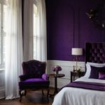
Rich Navy Blue
Navy blue curtains create stunning contrast against Evergreen Fog walls, bringing out the depth and complexity of both colors.
This classic color combination feels both timeless and current, working beautifully in traditional, nautical, or modern decorating schemes.
The deep blue tones complement the gray undertones in Evergreen Fog while adding richness and sophistication to your space.
You’ll love how navy curtains make your room feel more intimate and cozy, especially in larger spaces that might otherwise feel too open or cold.
Choose navy shades that lean slightly toward the blue side rather than purple-navy tones, which can feel too bold against the subtle green-gray walls.
Midnight blue, sailor navy, and deep indigo are excellent choices that provide beautiful contrast without overwhelming your space.
The weight and texture of your navy curtains significantly impact the overall mood of your room.
Heavy velvet or thick cotton navy curtains create a luxurious, formal atmosphere perfect for dining rooms or master bedrooms.
Lighter-weight navy linens or cotton blends maintain the sophisticated color combination while feeling more casual and relaxed.
Navy curtains work particularly well when you incorporate other blue accents throughout your room, such as throw pillows, artwork, or decorative accessories.
This creates a cohesive color scheme that feels intentional and professionally designed rather than random or chaotic.
The beauty of navy and Evergreen Fog together lies in their natural harmony – both colors have depth and sophistication that complement each other without competing for attention.
You can enhance this combination with metallic accents in brass, gold, or copper tones that warm up the cooler color palette.
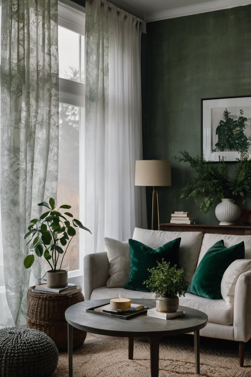
Soft Sage Green
Sage green curtains create a monochromatic color scheme with Evergreen Fog walls that feels incredibly calming and nature-inspired.
This tone-on-tone approach works beautifully when you want to create a serene, spa-like atmosphere in your home.
The subtle variation between your wall color and curtain color adds visual interest without creating harsh contrast or overwhelming patterns.
You’ll find that sage green curtains work especially well in bedrooms, bathrooms, or any space where relaxation and tranquility are your primary goals.
Choose sage green shades that are either slightly lighter or slightly darker than your Evergreen Fog walls to create gentle contrast and prevent the colors from blending together completely.
Silvery sage, dusty sage, and herb green are beautiful options that complement the complex undertones in Evergreen Fog.
Mix smooth fabrics with textured ones, matte finishes with subtle sheens, and different weights of materials throughout your space.

Find Your Room’s Color Palette
Tap a vibe — get a curated 5-color palette with hex codes you can copy ✨
💭 I Wrote a Book About My Biggest Decorating Mistakes!
When I decorated my first home, I thought I knew what I was doing. Spoiler: I didn’t. 😅
💸 I bought a sofa way too big for my living room. Paint colors that looked amazing in the store but terrible on my walls.
Sage green curtains in natural linen or cotton add organic texture that enhances the earthy, botanical feeling of this color combination.
Silk or satin sage curtains bring elegance and luxury while maintaining the calming, sophisticated atmosphere.
This monochromatic green palette provides the perfect backdrop for natural wood furniture, wicker accessories, and botanical artwork or plants.
The result is a cohesive, peaceful environment that feels like a retreat from the busy outside world.
You can add interest and prevent monotony by incorporating different shades of green throughout your room, creating a layered, nuanced color palette that feels both sophisticated and natural.
Charcoal Gray
Charcoal gray curtains bring out the gray undertones in Evergreen Fog walls while creating a sophisticated, modern color palette.
This combination works beautifully in contemporary spaces where you want to emphasize clean lines and minimalist elegance.
The darker gray curtains provide striking contrast against the lighter Evergreen Fog walls without introducing competing colors that might clash or feel chaotic.
You’ll love how charcoal gray curtains make your space feel more dramatic and sophisticated, especially when paired with modern furniture and sleek accessories.
Choose charcoal shades that lean toward true gray rather than blue-gray or purple-gray tones, which might not harmonize as well with the green elements in your wall color.
Slate gray, gunmetal, and deep pewter are excellent choices that maintain the sophisticated, neutral palette while adding visual weight and importance to your windows.
The texture and material of your charcoal curtains can dramatically change the mood and style of your room.
Smooth, sleek fabrics like silk or high-quality polyester create a modern, formal appearance perfect for dining rooms or home offices.
Textured charcoal curtains in linen, wool, or cotton blends add warmth and comfort while maintaining the sophisticated color combination.
Charcoal gray curtains work exceptionally well when you want to create a cozy, intimate atmosphere in larger rooms or spaces with high ceilings.
The darker color helps ground the space and makes it feel more proportioned and comfortable.
This color combination provides an excellent neutral backdrop for colorful artwork, bright throw pillows, or statement furniture pieces that you want to highlight.
The sophisticated gray and green palette won’t compete with your decorative accessories, allowing you to change your room’s personality easily by swapping out accent pieces.
Psst… Check This Out
What Color Curtains Goes With Peach Walls? Top Color Combinations Take Me There →Warm Blush Pink
Blush pink curtains create an unexpectedly beautiful and sophisticated combination with Evergreen Fog walls.
This pairing taps into the complementary color relationship between pink and green, creating visual harmony that feels both fresh and timeless.
The soft, muted pink tones add warmth and femininity to the cool green-gray walls without overwhelming the sophisticated, calming atmosphere.
You’ll find that blush pink curtains work particularly well in bedrooms, nurseries, or any space where you want to create a romantic, cozy feeling.
Choose blush pink shades that lean toward the peachy or coral side rather than purple-pink tones, which might clash with the green undertones in your wall color.
Dusty rose, soft coral, and warm pink are beautiful options that complement Evergreen Fog while adding gentle color and visual interest.
Too bright or cool-toned pink can look garish against Evergreen Fog, while the right warm, muted pink creates elegant contrast.
Blush pink curtains in flowing, romantic fabrics like silk, chiffon, or soft cotton create a dreamy, feminine atmosphere.
More structured fabrics like linen or cotton blends maintain the sophisticated color combination while feeling more tailored and contemporary.
This unexpected color pairing provides opportunities to incorporate other warm tones throughout your room, such as gold or brass hardware, warm wood tones, and cream or ivory accents.
The result is a sophisticated, layered color palette that feels both current and timeless, perfect for creating spaces that are both beautiful and livable.
You can enhance this combination with natural textures like woven baskets, wooden furniture, and soft throw blankets that bridge the gap between the pink and green tones.
What’s Your Decor Personality?
5 questions · 30 seconds · Instant style match 🏡
Pure Black
Black curtains create dramatic, high-contrast elegance against Evergreen Fog walls that feels both modern and timeless.
This bold combination works beautifully in spaces where you want to make a strong design statement while maintaining sophisticated style.
The deep black fabric brings out all the subtle color variations in Evergreen Fog, making your walls appear more complex and interesting.
You’ll love how black curtains instantly elevate the drama and importance of your windows while creating a striking focal point in your room.
Choose true black rather than charcoal or dark gray for the most impactful contrast against your Evergreen Fog walls.
The stark difference between the light walls and dark curtains creates visual tension that makes both colors appear more vibrant and significant.
Black curtains work exceptionally well for light control and privacy, making them perfect for bedrooms, media rooms, or any space where you need to block outside light completely.
The practical benefits combine beautifully with the sophisticated aesthetic impact of this high-contrast color combination.
Different textures and materials in black curtains can dramatically change the mood and style of your space.
Glossy black silk or satin curtains create formal elegance perfect for dining rooms or sophisticated living spaces.
Matte black cotton, linen, or wool curtains feel more casual and contemporary while maintaining the dramatic visual impact.
Black curtains provide an excellent backdrop for colorful artwork, bright accessories, or metallic accents that you want to highlight against the neutral wall color.
This combination creates a sophisticated canvas that allows you to experiment with different decorative elements without overwhelming your space.
The timeless appeal of black and green together ensures that this color combination will remain stylish and relevant regardless of changing design trends.
Dusty Blue
Dusty blue curtains complement Evergreen Fog walls by creating a cool, calming color palette that feels both sophisticated and relaxing.
This combination works beautifully in spaces where you want to emphasize tranquility and serenity, such as bedrooms, bathrooms, or reading nooks.
The muted blue tones harmonize with the gray undertones in Evergreen Fog while adding gentle color variation that prevents your space from feeling too monochromatic.
You’ll find that dusty blue curtains make your room feel more spacious and airy while maintaining the sophisticated, grown-up atmosphere that makes Evergreen Fog so popular.
Choose dusty blue shades that lean toward gray-blue rather than bright or navy blue tones, which might create too much contrast against your subtle wall color.
Powder blue, slate blue, and gray-blue are excellent choices that maintain the calm, sophisticated feeling while adding visual interest.
The soft, muted quality of dusty blue curtains works particularly well when you want to create a bedroom that promotes good sleep and relaxation.
This color combination naturally lends itself to layered bedding in complementary blues, grays, and whites that enhance the peaceful atmosphere.
Dusty blue curtains in natural fabrics like linen or cotton add texture and organic appeal that complements the nature-inspired feeling of Evergreen Fog walls.
Silkier fabrics in dusty blue create more formal elegance while maintaining the cool, calming color palette.
This combination provides an excellent foundation for incorporating natural wood tones, white or cream accents, and metallic elements in silver or pewter finishes.
The result is a sophisticated, layered color scheme that feels both current and timeless, perfect for creating spaces that promote rest and relaxation.
You can enhance this palette with soft textures like throw blankets, area rugs, and decorative pillows that bridge the blue and green tones while adding comfort and visual warmth.
💭 Ever wondered what your room would actually look like rearranged?
I built a free tool that lets you drag furniture around a 2D floor plan. No signup, no catch.
See the Room Planner →This or That?
Pick your fave — see what other readers chose! 👀
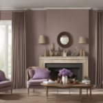
Warm Taupe
Taupe curtains offer a sophisticated neutral option that complements the complex undertones in Evergreen Fog walls without competing for attention.
The warm brown-gray tones in taupe harmonize beautifully with both the green and gray elements in your wall color, creating a cohesive, earthy palette.
This combination feels naturally elegant and works well in both traditional and contemporary decorating styles where sophistication and comfort are equally important.
You’ll love how taupe curtains provide enough contrast to define your windows while maintaining the calm, understated atmosphere that makes Evergreen Fog such a popular choice.
Choose taupe shades that lean toward the warmer brown side rather than cool gray-taupe tones, which might feel too stark against the organic feeling of Evergreen Fog.
Mushroom taupe, warm greige, and sandy taupe are beautiful options that add gentle warmth while maintaining the sophisticated neutral palette.
The versatility of taupe curtains makes them an excellent choice when you want to create a timeless backdrop that won’t date quickly or limit your decorating options.
This neutral combination allows you to easily change your room’s personality by switching out colorful accessories, artwork, or furniture without replacing your window treatments.
Taupe curtains in textured fabrics like linen, wool, or cotton blends add visual interest and organic appeal that enhances the natural, calming feeling of Evergreen Fog walls.
Smoother fabrics in taupe create more formal elegance while maintaining the sophisticated, understated color combination.
This neutral palette provides the perfect foundation for incorporating natural wood furniture, metallic accents in brass or bronze, and colorful accessories that you can change seasonally.
The result is a flexible, sophisticated color scheme that feels both current and classic, perfect for creating spaces that are both beautiful and highly livable.
You can layer different shades of taupe and beige throughout your room to create depth and visual interest while maintaining the calm, cohesive atmosphere.
Deep Burgundy
Burgundy curtains create a rich, luxurious combination with Evergreen Fog walls that feels both dramatic and sophisticated.
This deep red-wine color brings warmth and elegance to the cool green-gray walls while creating striking visual contrast that makes both colors appear more vibrant.
The combination works beautifully in formal spaces like dining rooms, libraries, or master bedrooms where you want to create an atmosphere of luxury and refinement.
You’ll find that burgundy curtains make your space feel more intimate and cozy, especially during evening hours when artificial lighting enhances the rich, jewel-tone color.
Choose burgundy shades that lean toward the wine or claret side rather than bright red or purple-burgundy tones, which might feel too bold or overwhelming against the subtle wall color.
Deep wine, dark cherry, and rich claret are excellent choices that provide dramatic contrast while maintaining sophisticated elegance.
The weight and texture of burgundy curtains significantly impact the overall mood and formality of your space.
Heavy velvet or brocade burgundy curtains create opulent, traditional elegance perfect for formal dining or entertaining areas.
Lighter-weight burgundy fabrics in cotton or linen blends maintain the rich color impact while feeling more approachable and contemporary.
Burgundy curtains work exceptionally well when you incorporate other warm tones throughout your room, such as gold or brass hardware, warm wood furniture, and cream or ivory accents.
This creates a layered, sophisticated color palette that feels intentional and professionally designed.
The richness of burgundy against Evergreen Fog provides an excellent backdrop for artwork, mirrors, or decorative accessories in gold, copper, or warm metallic finishes.
This combination creates a sense of luxury and sophistication that makes your space feel special and important, perfect for rooms where you entertain guests or want to create a dramatic impact.
💭 I Wrote a Book About My Biggest Decorating Mistakes!
When I decorated my first home, I thought I knew what I was doing. Spoiler: I didn’t. 😅
💸 I bought a sofa way too big for my living room. Paint colors that looked amazing in the store but terrible on my walls.
Soft Lavender
Lavender curtains create an unexpectedly beautiful and calming combination with Evergreen Fog walls that feels both sophisticated and serene.
The soft purple tones complement the green elements in your wall color through their position as neighboring colors on the color wheel, creating natural harmony.
This gentle combination works particularly well in bedrooms, bathrooms, or any space where relaxation and tranquility are your primary decorating goals.
You’ll love how lavender curtains add subtle color interest without overwhelming the sophisticated, muted atmosphere that makes Evergreen Fog so appealing.
Choose lavender shades that lean toward the gray-purple side rather than bright or pink-purple tones, which might create too much contrast against your subtle wall color.
Dusty lavender, gray-purple, and muted lilac are beautiful options that maintain the calm, sophisticated feeling while adding gentle color variation.
Soft, romantic fabrics in lavender like silk, cotton, or linen create dreamy elegance that enhances the peaceful, spa-like atmosphere of this color combination.
Lavender curtains work beautifully when you want to create a feminine space that still feels sophisticated and adult, avoiding the overly sweet or juvenile feeling that brighter purples might create.
This combination provides opportunities to incorporate other soft, muted colors throughout your room, such as cream, soft gray, and dusty pink accents that enhance the gentle, romantic atmosphere.
The result is a sophisticated, layered color palette that promotes relaxation and creates a peaceful retreat from daily stress and activity.
You can enhance this palette with natural textures, soft lighting, and botanical elements that bridge the purple and green tones while creating a cohesive, calming environment.
Quick Design Dilemma
Cast your vote — see what other readers think! 🤔
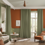
Chocolate Brown
Chocolate brown curtains create a rich, grounding combination with Evergreen Fog walls that feels both sophisticated and cozy.
The warm brown tones complement the gray undertones in your wall color while adding depth and richness that makes your space feel more substantial and important.
This combination works beautifully in living rooms, home offices, or any space where you want to create an atmosphere of warmth and sophisticated comfort.
You’ll find that chocolate brown curtains make your room feel more intimate and inviting while maintaining the elegant, grown-up atmosphere that makes Evergreen Fog such a popular wall color choice.
Choose chocolate brown shades that are rich and warm rather than cool or gray-brown tones, which might not provide enough contrast against your wall color.
Dark chocolate, espresso brown, and rich cocoa are excellent choices that add warmth and visual weight while complementing the sophisticated neutral palette.
The texture and material of your chocolate brown curtains can dramatically influence the overall style and mood of your space.
Smooth, luxurious fabrics like velvet or silk in chocolate brown create formal elegance perfect for sophisticated living or dining areas.
Textured brown curtains in linen, cotton, or wool blends add casual comfort while maintaining the rich, warm color impact.
Chocolate brown curtains work exceptionally well when you incorporate other warm, natural tones throughout your room, such as cream, gold, and natural wood finishes.
This creates a layered, sophisticated color palette that feels both current and timeless, perfect for creating spaces that are both beautiful and comfortable.
The richness of chocolate brown against Evergreen Fog provides an excellent backdrop for colorful artwork, metallic accents, or decorative accessories that you want to highlight.
This combination creates a sense of stability and sophistication that makes your space feel grounded and substantial, perfect for rooms where you spend significant time relaxing or working.
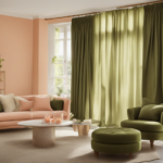
Soft Coral
Coral curtains bring warmth and energy to Evergreen Fog walls through the complementary relationship between coral’s orange-pink tones and the green elements in your wall color.
This unexpected combination creates visual harmony that feels both fresh and sophisticated, perfect for spaces where you want to add personality without overwhelming the calm atmosphere.
The soft coral tones add warmth and life to the cool green-gray walls while maintaining the sophisticated, grown-up feeling that makes Evergreen Fog so appealing.
You’ll love how coral curtains make your space feel more welcoming and energetic while still promoting the relaxation and tranquility that this wall color naturally provides.
Choose coral shades that lean toward the peach or salmon side rather than bright orange-coral tones, which might feel too bold or overwhelming against the subtle wall color.
Dusty coral, soft peach, and muted salmon are beautiful options that provide gentle warmth and color interest while maintaining sophisticated elegance.
Coral curtains in natural fabrics like linen or cotton add organic texture that enhances the nature-inspired feeling of your wall color while introducing warm, life-affirming color.
This combination works particularly well when you incorporate other warm, natural tones throughout your room, such as cream, warm wood, and metallic accents in gold or copper finishes.
The result is a sophisticated, layered color palette that feels both current and timeless, perfect for creating spaces that are both calming and energizing.
Coral curtains provide opportunities to bring in natural elements like plants, woven textures, and organic shapes that bridge the coral and green tones while creating a cohesive, welcoming environment.
You can enhance this palette with soft textures and natural materials that support the warm, organic feeling while maintaining the sophisticated atmosphere that makes this combination so appealing.