olor drenching — the art of painting an entire room, surfaces and all, in one single shade — felt terrifying before I tried it.
If you have been scrolling past those gorgeous, enveloping rooms online and thinking “I could never,” I’m here to sit down with you, pour us both something warm, and walk you through exactly how this works.
What Color Drenching Actually Is (and Why It’s Not What You Think)


Color drenching is not just painting four walls the same color.
That part is important.
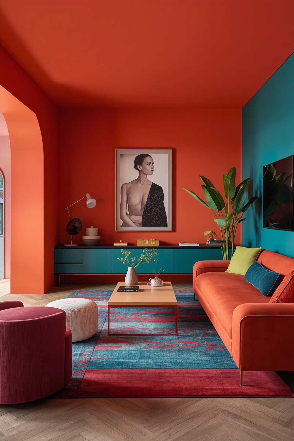
It means you take one single paint color and you apply it to everything — walls, ceiling, trim, baseboards, window frames, even built-in shelving if you have it.
The whole room becomes one continuous, immersive experience.
It’s sort of like wrapping yourself in a really beautiful blanket.
The color doesn’t just sit on the walls.
It surrounds you.
And that’s where the magic comes from.
A lot of people think it will feel dark or suffocating, and I totally get that hesitation.
But the opposite tends to happen — the room actually feels more spacious and intentional because your eye isn’t bouncing between competing white trim and colored walls.
There’s a calm to it.
A settledness.
When I first read about this technique, I thought it was some ultra-modern design fad.
But it’s honestly been around for centuries in European interiors — think rich, jewel-toned drawing rooms in old English manor houses.
It has just finally made its way into everyday American homes, and I am so glad it did.
Tap to Explore These Beauties
See my ideas in action 👇 Tap any image to explore full details.
The Room Where I Tried It First (and Almost Chickened Out)

My home office was the room that started it all for me.
It was small — kind of awkwardly shaped — and no matter what I did, it just felt like a forgotten little corner of my house.
I had tried a gallery wall.
Floating shelves.
A cute rug.
Nothing made it feel intentional.
Then I decided to drench it in a dusty, muted terracotta.
Every wall.
The ceiling.
Even the chunky white baseboards got the same treatment.

And when I stepped back and looked at it?
I actually teared up a little.
It felt like a room for the first time.
Warm and cozy and somehow both intimate and sophisticated.
I remember sitting at my desk the first morning after it dried, with my coffee, just sort of… glowing.
That sounds dramatic, I know.
But color has such a powerful effect on how a space feels, and until you experience it firsthand, it’s really hard to explain.
The office went from a room I avoided to my absolute favorite place in the house.
That was the moment I became a full convert.
Why It Works — The Emotional Reason Nobody Talks About

Here’s something I don’t think gets said enough in design content.
Color drenching works emotionally before it works aesthetically.
When every surface in a room is the same color, your brain stops doing that subconscious checklist — “okay, walls, ceiling, trim, floor” — and just… relaxes.
There’s nothing competing for your attention.
You just land in the space.
It’s the same reason a hotel room with beautifully coordinated linens feels more luxurious than one with mismatched pieces, even when everything is technically the same quality.
Cohesion reads as calm.
And calm reads as luxury.
I also think there’s something deeply intentional about color drenching that signals confidence.
It says: “I made a choice here.
I committed.”
And that commitment makes a room feel designed rather than just decorated.
When I have friends over and they walk into my drenched dining room, they always pause.
Not because it’s loud.
But because it feels complete.
Like the room has a personality.
And honestly, that’s what I’m always chasing in my home — rooms that feel like they have their own soul.
How to Choose Your Drench Color (My Personal Method)

This is where most people get stuck, and I totally understand why.
Choosing one color to commit to on every single surface feels a lot more high-stakes than just picking a wall color.
My advice?
Start with a feeling, not a shade.
Ask yourself: how do I want to feel in this room?
Energized and creative?
Go warm — terracotta, spiced rust, golden ochre.
Calm and introspective?
Try muted sage, dusty blue, or a soft forest green.
Cozy and romantic?
Deep plum, rich burgundy, or a warm chocolate brown.
Once you have the feeling locked in, then go find your shade.
I always, always, always order samples before committing.
Paint a large swatch — like, at least a foot by foot — and look at it at different times of day.
Morning light tells a completely different story than afternoon sun.
And evening lamplight?
That’s when the real magic (or a potential disaster) reveals itself.
One more tip from me: slightly muted, slightly dusty tones tend to work better for drenching than super bright, saturated ones.
Rich and moody almost always wins.

Find Your Room’s Color Palette
Tap a vibe — get a curated 5-color palette with hex codes you can copy ✨
💭 I Wrote a Book About My Biggest Decorating Mistakes!
When I decorated my first home, I thought I knew what I was doing. Spoiler: I didn’t. 😅
💸 I bought a sofa way too big for my living room. Paint colors that looked amazing in the store but terrible on my walls.
Don’t Skip the Ceiling — Seriously, Don’t

I know.
The ceiling feels scary.
But skipping it is the single biggest mistake people make when attempting color drenching.
The ceiling is why it works.
When you leave the ceiling white and drench only the walls, you’re creating a hard visual stop at the top of the room.
Your eye hits that white and bounces back down.
The immersive quality — the whole cozy, enveloping feeling — disappears.
When I painted my office ceiling that same terracotta?
The room dropped.
Not in a claustrophobic way.
✦ You Might Love This
Anyone Ignoring These Mood Lighting Living Room Hacks Regrets It Keep Reading →In a nestled way.
Like the room was giving me a hug.
I’ve heard people say they’re worried a colored ceiling will make a room feel lower.
And yes, technically, a dark ceiling does draw the eye downward a little.
But here’s the thing — when it’s the same color as the walls, it reads as part of the whole.
The absence of contrast is what makes it feel airy rather than crushing.
Trust me on this one.
Paint the ceiling.
You can thank me later.
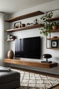
The Trim and Baseboard Secret That Changes Everything

This is genuinely my favorite little detail to share, because most people don’t think about it.
Trim and baseboards.
Paint them.
Same color.
No exceptions.
When you leave your trim bright white against a drenched wall, it creates an outline around everything.
Your eye reads every line and edge.
The room feels choppy.
But when that trim disappears into the wall color?
The whole room becomes one smooth, seamless experience.
It sounds almost too simple to make a difference.
But it makes an enormous difference.
I was painting my home office and I tested it — I left one window frame white while I finished the other trim in terracotta.
Standing back and looking at both?
The white-framed window looked like an interruption.
The terracotta-framed window looked like it belonged there.
Like it had always been that color.
Even door frames and the door itself, if it swings into the room, benefit from the same treatment.
And hardware?
Try to pull your hardware into the mood too — brushed gold or matte black depending on your palette.
That little move ties the whole room together in a way that just feels so polished.
What’s Your Decor Personality?
5 questions · 30 seconds · Instant style match 🏡
Small Rooms Are Actually Made for This

I know what you might be thinking.
“Madison, my room is tiny.
Won’t this make it feel smaller?”
Counterintuitive as it sounds?
No.
Small rooms are honestly ideal candidates for color drenching.
Here’s the thing — in a small room, the contrast between white trim and colored walls creates a busy visual experience.
Your eye is constantly bouncing between light and dark, edge and surface.
That busyness makes a room feel more cramped, not less.
When you drench a small room in one cohesive color, all those visual interruptions disappear.
The eye can’t measure the room as easily.
And when the eye can’t measure, the room feels more expansive.
It’s a little bit of a visual trick, and I love it so much.
When I tackled my cramped little powder room — which is barely bigger than a closet — I drenched it in the deepest, most luscious midnight navy.
Everyone told me not to.
And every single person who walks in now comments on how cool and surprisingly spacious it feels.
Small rooms deserve big color energy.
Don’t let anyone tell you otherwise.
Furniture and Decor — What Actually Works With It

Once your room is drenched, the furniture conversation gets really interesting.
My general rule?
Go for contrast in texture, not necessarily in color.
What I mean is — you don’t have to buy all new furniture.
But the feel of what you bring in matters more now.
Natural materials absolutely shine inside a color-drenched room.
Warm rattan, chunky linen, raw wood, aged leather — these textures create depth against a single-color backdrop in a way that feels so rich and layered.
Metallic accents work beautifully too.
A brushed brass lamp against a deep green wall?
I’m obsessed with that combination.
If you want to introduce pattern, keep it subtle and tonal.
A pillow that’s two shades lighter than your wall color, for example, feels intentional rather than jarring.
And plants.
Oh, plants.
Greenery inside a drenched room — especially against a warm or jewel-toned backdrop — looks painterly.
Like you live inside a piece of art.
I keep a big, leafy pothos on my office bookshelf, and against that terracotta, it looks like something out of a magazine spread.
Don’t overthink the furniture.
Just lean into texture and let the color do its thing.
Texture Is Your Best Friend in a Drenched Room

Here’s a design truth I wish someone had told me before I started this whole color drenching journey.
When everything is one color, texture becomes the new pattern.
And that is actually a beautiful thing.
In a traditionally decorated room, your eye moves around via color contrast.
In a drenched room, it moves via texture.
So the more interesting textures you layer in, the richer and more dynamic the space feels.
Think about a bouclé sofa in a warm cream against a dusty rose wall.
The fluffiness of the fabric creates shadow and depth — your eye has something to explore even though the palette is restrained.
I added a chunky, hand-woven throw to my office chair, a jute basket in the corner, and a linen roman shade on the window.
All of them were slightly different from each other.
All of them were within the warm, earthy family of my terracotta.
The result?
A room that looks editorial but feels genuinely cozy and livable.
Rough and smooth.
Matt and sheen.
Soft and structured.
That interplay of textures is what keeps a drenched room from feeling flat or monotonous.
It’s the secret sauce, honestly.
This or That?
Pick your fave — see what other readers chose! 👀
Lighting Changes Everything — Here’s What I Noticed

Before I drenched my first room, I didn’t fully appreciate how dramatically lighting affects paint color.
Now?
It’s basically the first thing I think about.
Natural light is your biggest variable.
A north-facing room gets cooler, bluer light — which can make warm tones look slightly muted and cool tones look absolutely dreamy.
A south-facing room gets warm, golden light — which makes warm tones glow and can make cool tones feel a little washed out.
Knowing which direction your room faces can seriously change which color you choose.
And then there’s artificial lighting.
Overhead recessed lighting tends to flatten color a little.
💭 I Wrote a Book About My Biggest Decorating Mistakes!
When I decorated my first home, I thought I knew what I was doing. Spoiler: I didn’t. 😅
💸 I bought a sofa way too big for my living room. Paint colors that looked amazing in the store but terrible on my walls.
But warm, low-wattage lamps?
They make a drenched room feel magical.
In my office, I have a small terracotta-shaded table lamp in the corner, and at dusk, when I flip it on?
The whole room goes golden.
It genuinely looks like candlelight.
I’m not exaggerating when I say I sometimes just sit in there in the evening and don’t even turn on my laptop.
It’s just that good.
Swap your bright white LED bulbs for warm-toned ones — 2700K is my personal sweet spot — and watch your drenched room transform.
Quick Design Dilemma
Cast your vote — see what other readers think! 🤔
My Favorite Color Combinations for Drenching Right Now

Okay, this is the section where I let you peek into my personal design notebook.
These are the combos I am absolutely loving right now — combinations that feel sophisticated, warm, and genuinely livable.
Dusty sage green + warm brass hardware + natural linen.
This one is so soft and dreamy.
It works in a bedroom, a living room, a home office — basically anywhere.
Deep terracotta + matte black hardware + aged leather.
This is the combination in my own office, and I will never stop talking about how much I love it.
It feels warm and creative and just a little bit bold.
Warm mushroom/greige + brushed gold + creamy bouclé.
This one feels like luxury without trying too hard.
Psst… Check This Out
Accent Walls In Living Room Setups That Bring Warmth And Character Take Me There →Great for a living room or a primary bedroom.
Midnight navy + polished nickel + crisp white textiles.
Dramatic in the best way.
Perfect for a powder room or a moody home library.
Soft dusty rose + antique brass + velvet.
Romantic and feminine and just warm enough to not feel cold.
This one would be stunning in a reading nook or a small sitting room.
Pick the one that matches the feeling you’re after and start pulling samples.
You might surprise yourself with how much you love it.
Mistakes I Made So You Don’t Have To

I would be a terrible friend if I didn’t tell you about the things that went sideways for me.
First mistake: I didn’t do enough sample swatches before committing.
I ordered one small paint chip, fell in love with it in the store lighting, and bought two gallons.
The color on my wall looked completely different — much warmer and almost orange-ish — and I had to repaint.
Order sample pots.
Paint big swatches.
Live with them for a few days.
Second mistake: I skipped priming over a previously dark wall.
I tried to drench a room that had been painted charcoal gray, and even with two coats of my new color, the old color bled through in patches.
Primer saves you from a nightmare.
Third mistake: I didn’t account for my furniture undertones.
My sofa had very cool, almost gray undertones, and when I put it against my warm terracotta wall?
It looked awkward.
Pulled it out, added a warm throw, and the problem mostly solved itself — but I wish I’d thought about it sooner.
And fourth: I rushed the second coat.
If you don’t let the first coat fully dry, the finish gets streaky and weird.
Patience, friend.
Good things take a little time.