

I spent three years painting my living room beige.
Different beiges, sure, but still — beige.
And every single time I’d finish, I’d stand there with my coffee and feel absolutely nothing.
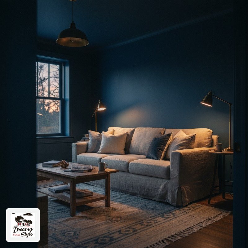
Then I saw a photo of a living room painted floor-to-ceiling in this deep inky blue, and something clicked.
Like, oh.
THAT’S what I’ve been missing.
Color drenching — where you commit hard to one color and take it everywhere, walls, ceiling, trim, sometimes even the furniture — is the decorating move that genuinely changed how I think about rooms.
These 13 living rooms are the ones I go back to when I need proof that bold is better.
Midnight Navy From Floor to Ceiling (Yes, Even the Trim)
The first time I tried dark paint I stopped at the trim.
Left it white.
Immediately regretted it because the whole effect was just… a dark wall with a white frame.
It fought itself.
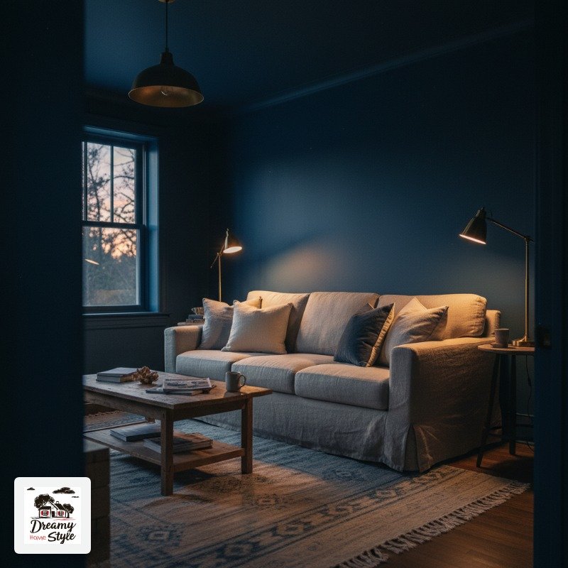
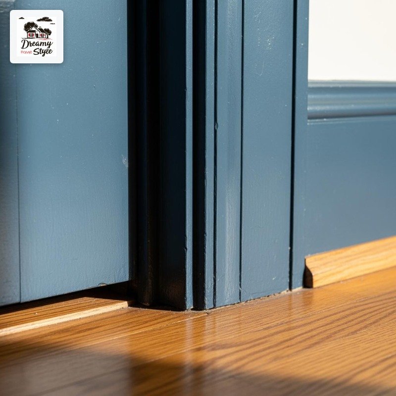
True color drenching means you paint the trim too.
The baseboards, the door casings, all of it.
When you do that with a color like navy, the room stops feeling like a box and starts feeling like somewhere.
Navy specifically has this thing where it reads differently at 8am versus 9pm.
Morning light softens it into something almost dusty.
Evening light makes it feel like you’re inside a very chic ship cabin.
I’m obsessed with that duality.
Pair it with brass hardware and natural linen and you won’t miss the white trim for a single second.
Honestly, you’ll wonder why you ever had it.
Dusty Terracotta That Feels Like Southern Italy
This is the color I’d choose if I were decorating a vacation rental in Tuscany and wanted every guest to immediately forget their problems.
Terracotta.
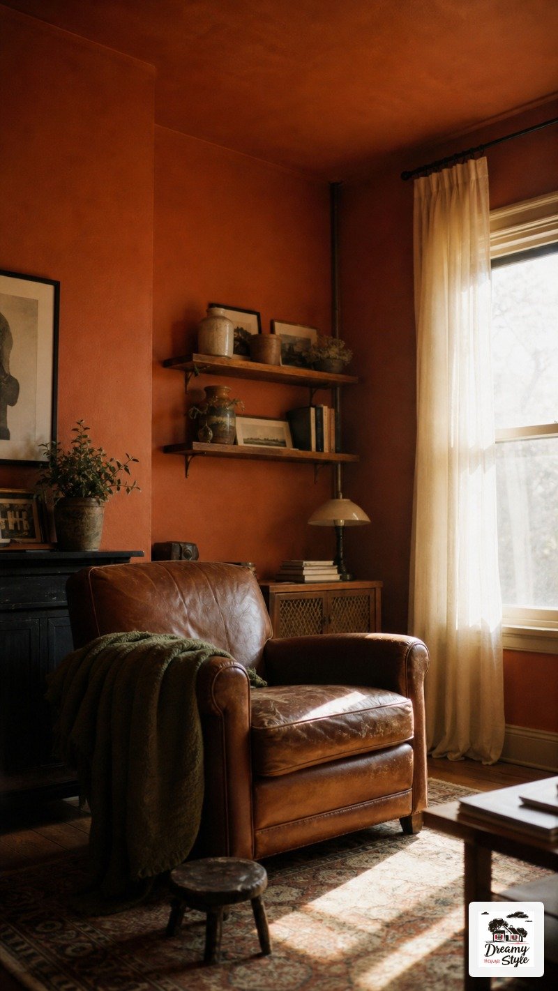
The dusty, muted version, not the orange-orange one.
The reason it works so well as a drench color is that it’s warm without being loud.
It sort of wraps around you.
Biscuit walked into my friend’s terracotta living room and immediately fell asleep on the rug.
That’s a vibe endorsement.
It pairs shockingly well with deep olive green throws and worn leather.
And if you add cream-colored bookshelves loaded with paperbacks and a few dried grasses?
You’ve accidentally created something that feels very expensive.

One thing I’ll say: terracotta can shift orange under harsh light, so test your swatch in the afternoon.
I’ve seen it go sideways fast in rooms with big west-facing windows (I learned this the expensive way).
Forest Green That Makes You Forget There’s a City Outside
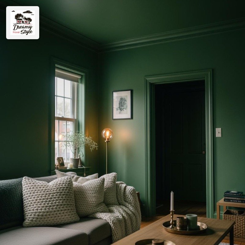
Forest green is having a moment and I don’t care how trendy that sounds because it deserves every second of it.
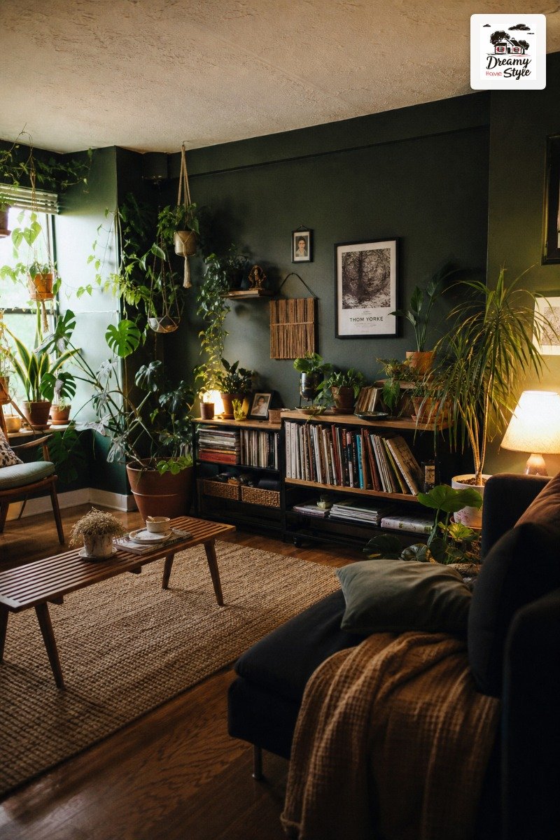
When you drench an entire living room in a deep, slightly muted forest green, something genuinely strange happens — the room feels bigger.
I know that contradicts everything we were all told about dark colors shrinking spaces.
But it’s true.
The walls sort of dissolve when there’s no contrast stopping your eye.
I’d go with a flat or matte finish here.
Eggshell gets weird on dark greens in my experience.
Too much sheen and it starts looking like a doctor’s waiting room from the nineties.
Bring in natural wood tones, some chunky cream knit pillows, and a floor lamp with a warm bulb (not cool white, please, I’m begging).
That’s the whole recipe.
Deep Plum for the Person Who’s Done Playing It Safe
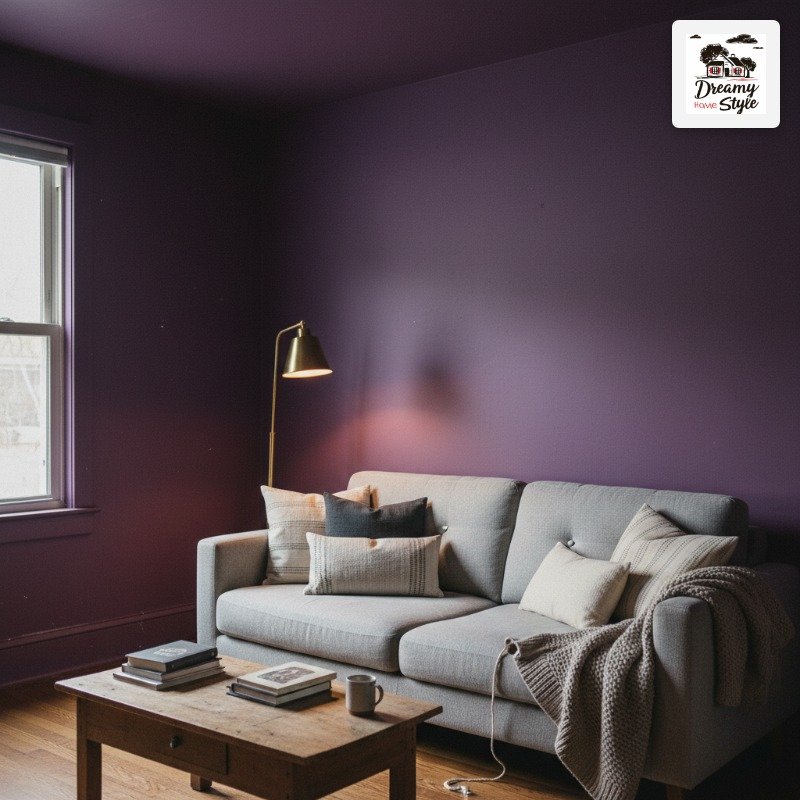
Deep plum is not for everyone.
I’m going to say that upfront because I respect you.
But if it IS for you, it will ruin every other color choice you’ve ever made.
My neighbor Deb painted her living room this rich, almost blackened plum and I literally stood in her doorway for a full minute just… looking.
It felt like stepping into a jewel box.
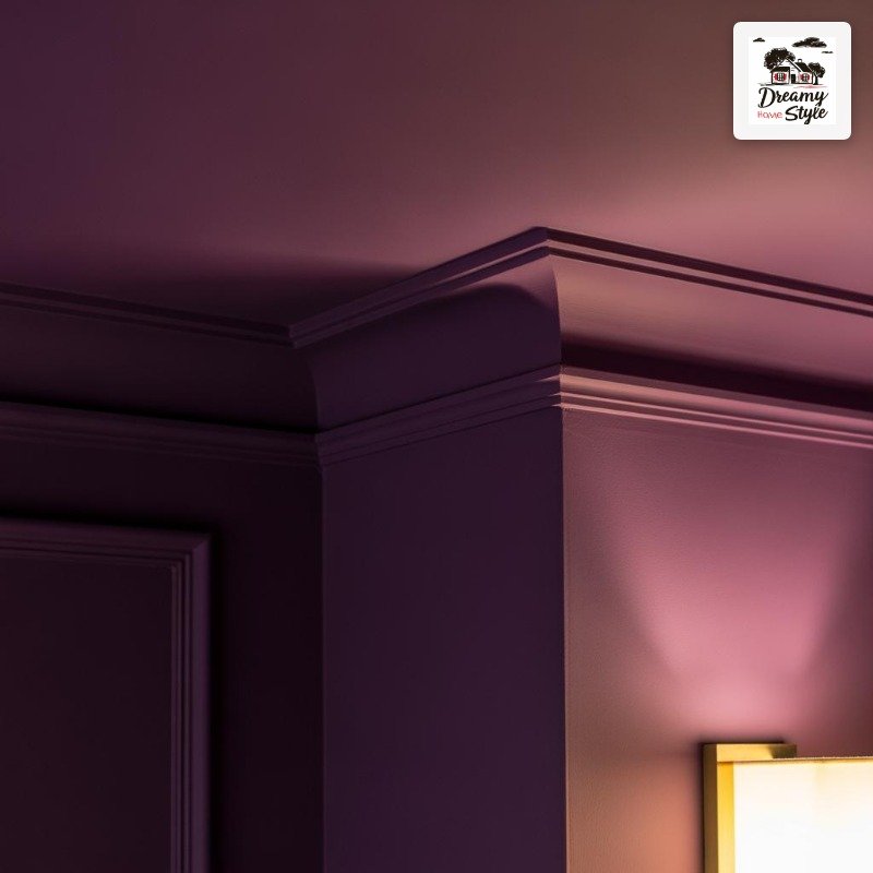
The trick she used was keeping everything else super neutral.
Off-white chunky rug.
Simple brass floor lamp she got at HomeGoods for $40.
The plum did all the talking so nothing else needed to.
Ceiling included, obviously.
That’s non-negotiable with plum.
Without it on the ceiling it just looks like an accent wall that got carried away.
Warm Rust That Glows Like Firelight
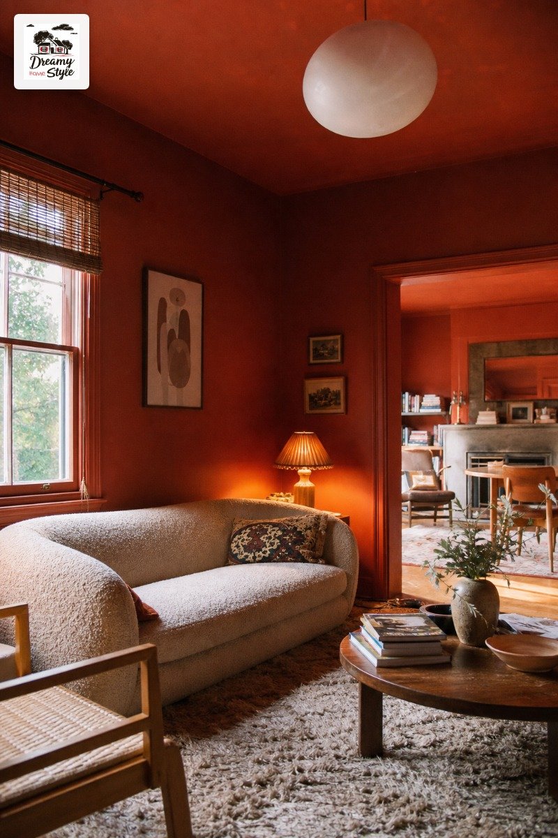
Rust is terracotta’s more dramatic sister.
More red, more intensity, a little more commitment.
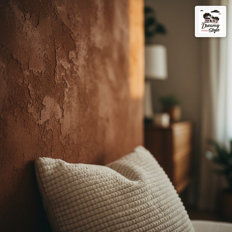
A rust-drenched living room in the evening looks like it’s literally glowing.
I painted a test swatch of a rust color called ‘Adobe Clay’ (it was a Benjamin Moore sample, like $4) on my wall and at 7pm with my lamp on, I stood there with my coffee and had a small moment.
This color asks for textured fabrics.
Boucle, linen, something tactile.
Smooth fabrics next to rust feel a bit cold and it fights the warmth you’re going for.
Also, real talk: rust can read brown in low light.
So if you’re a person who lives in a dim apartment, test it hard before you commit to a full room.
Gorgeous in the right light, muddy in the wrong one.
Soft Sage That Feels Like a Greenhouse
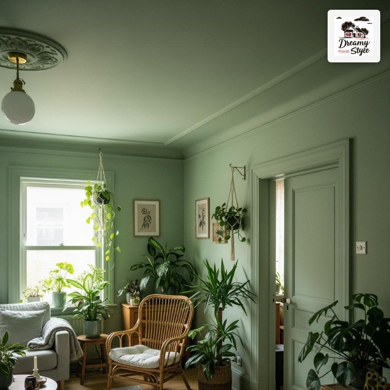
Okay, sage is not what most people picture when you say color drenching.
It’s quiet.
It’s gentle.
But a full sage drench — walls, ceiling, trim — is one of the most genuinely calming things I’ve ever walked into.
My friend’s house has a sage living room with literally thirty plants in it.
It sounds like too much.
It is not too much.
It feels like standing inside a very peaceful forest.
The key thing with sage is you have to go full drench or it reads as just… a green room.
The magic happens when the ceiling matches and the trim matches and suddenly the color becomes the architecture.
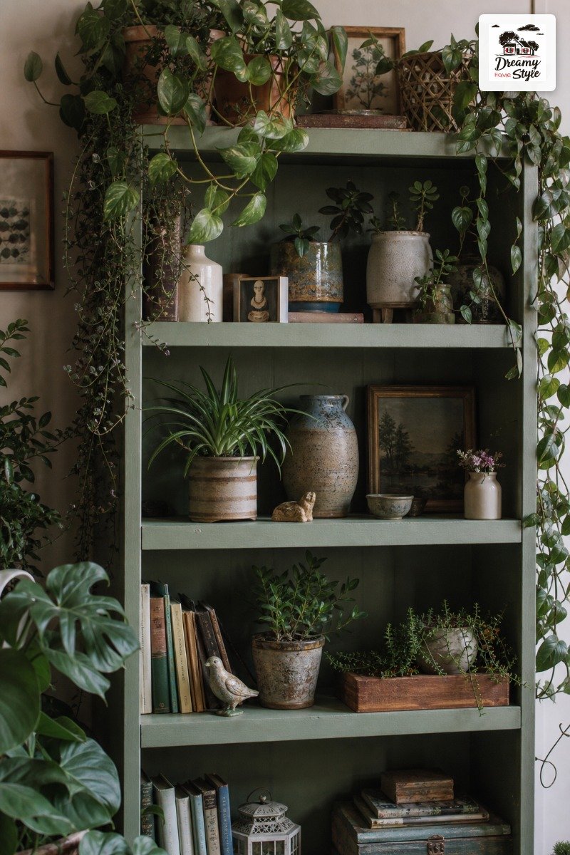
Rattan furniture works beautifully here.
So does unpainted wood.
Anything that references nature sort of sings against sage.
Moody Black That’s Actually Cozy, Not Dramatic
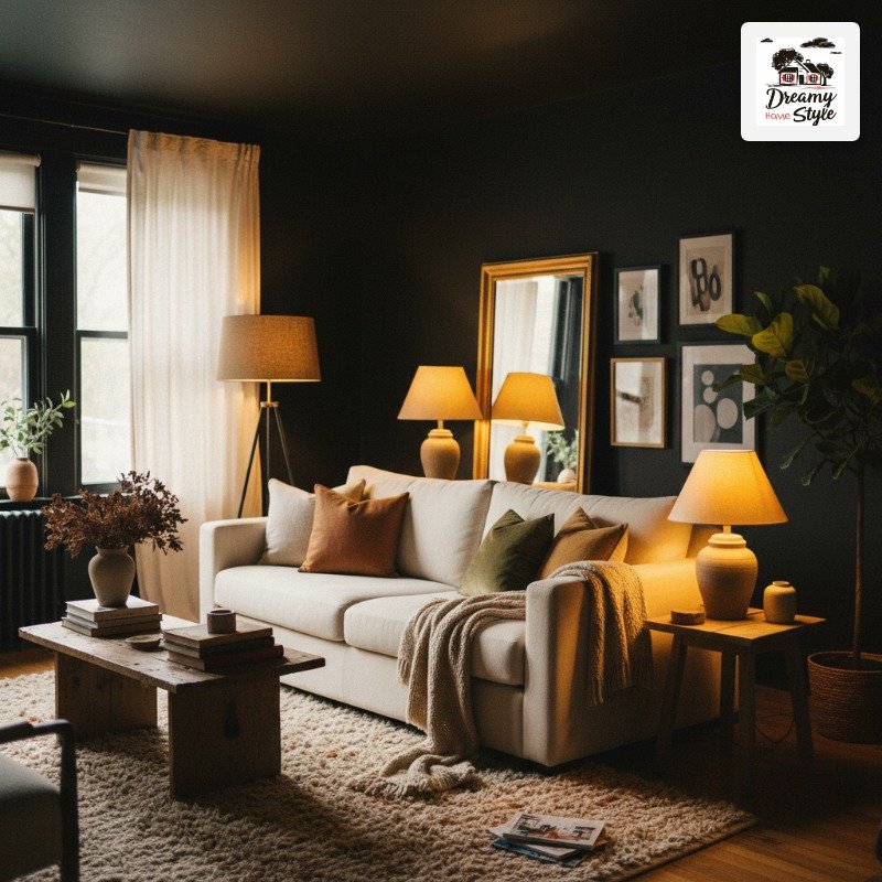
Every person I’ve told about a black living room has said ‘but won’t it feel depressing?’ No.
It won’t.
Stop.
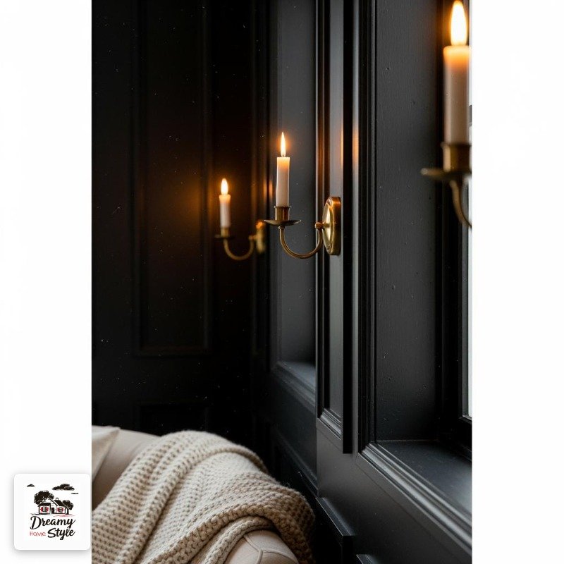
A warm-toned black (something with brown or green undertones, NOT a blue-black) in a living room feels like a hug.
It sounds unhinged but it’s true.
The room just settles around you.
The lighting situation has to be right though.
A floor lamp, a table lamp, maybe a sconce.
Overhead lighting in a black room is genuinely criminal (I already feel strongly about overhead lighting in general but this is a whole other level).
Warm wood floors, textured white or cream cushions, a big mirror to bounce the light — that’s the move.
And honestly, Biscuit’s fur shows up way less on dark furniture so there’s a practical benefit too.
Buttery Lemon Yellow That’s Not as Scary as It Sounds
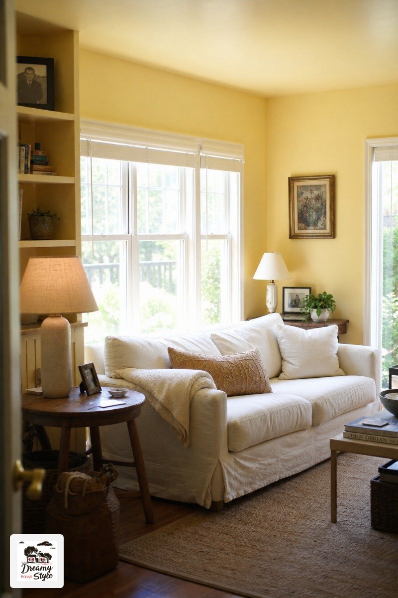
Yellow has a reputation.
Mostly bad.
And honestly, if you go too bright it deserves that reputation — I once saw a living room the color of a school bus and I still think about it.
But a soft, slightly greyed lemon yellow?
Drenched floor to ceiling?
It feels like standing inside a sunbeam.
In the best possible way.
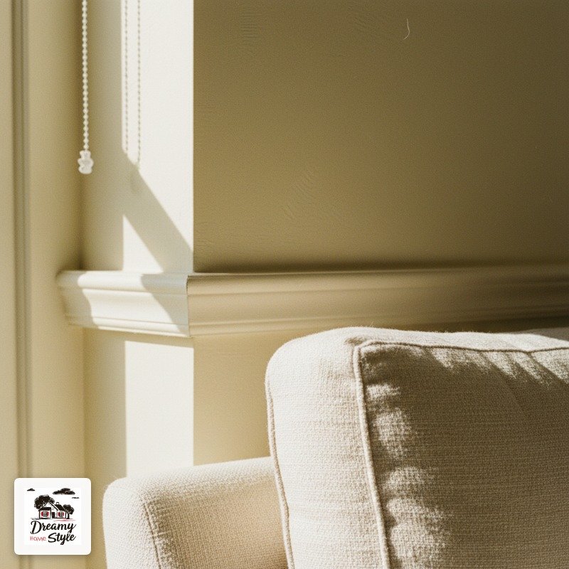
The gray undertone is what saves it from tipping into kindergarten territory.
Look for something described as ‘straw’ or ‘aged lemon’ rather than anything with ‘sunshine’ or ‘bright’ in the name.
Those are warning words.
This color is particularly magic in rooms that get good morning light.
It amplifies the warmth in a way that makes you actually want to get out of bed and go sit in there.
Dusty Mauve for Something That Feels Vintage and Dreamy
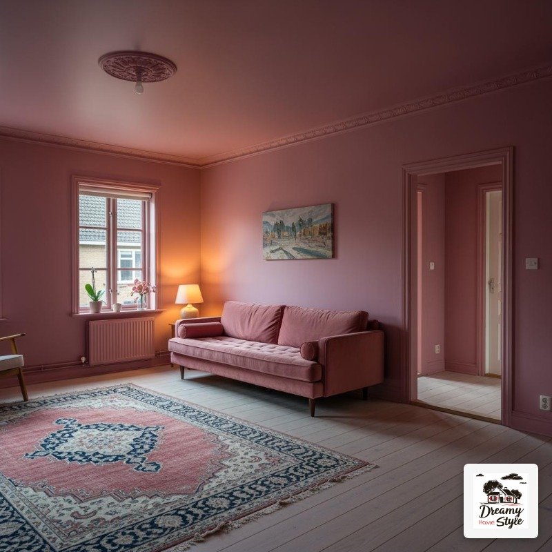
Mauve got written off in the eighties and it’s been slowly making its way back and I for one am delighted.
A dusty, desaturated mauve living room has this quality that’s hard to describe — it’s sort of nostalgic and also completely current at the same time.
Like a really well-preserved old photograph.
It’s softer than plum but still has that lavender-pink depth that makes it feel intentional, not just ‘I liked the pink chip at the hardware store.’ There’s sophistication there.
Velvet in dusty rose or deep wine looks incredible against it.
And if you do a vintage Persian rug on a light wood floor, the whole room starts to look like somewhere a very fashionable novelist lives.
I’m into it.
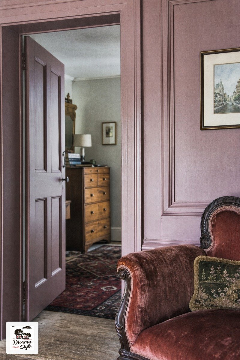
Rich Chocolate Brown That Belongs in a Parisian Apartment
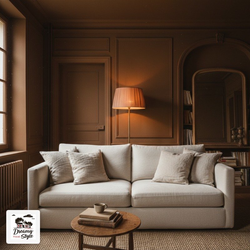
Chocolate brown gets ignored.
It shouldn’t.
A deep, warm chocolate brown on every surface in a living room feels like the visual equivalent of a really good espresso.
Grounding.
Rich.
Completely unapologetic.
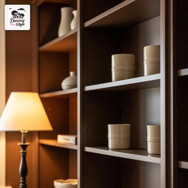
The thing that makes it work is contrast in texture, not color.
You want cream boucle, matte black hardware, natural linen — things that stand out against the brown through feel rather than hue.
Otherwise it can look flat.
I’ve noticed this color ages really well with wear too.
A tiny scuff on a chocolate trim just looks like patina.
Whereas a white trim with a scuff just looks like damage.
Low-maintenance chic.
That’s my brand.
Eucalyptus Blue-Green That Feels Like a Coastal Cabin
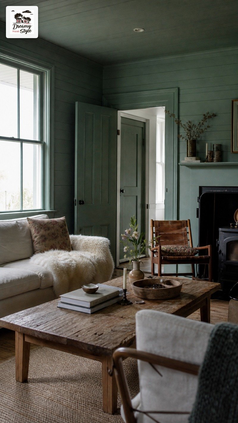
This is not seafoam.
This is not mint.
Eucalyptus is its own thing — a bit grey, a bit blue, a bit green, and somehow all three at once.
Drenched in eucalyptus, a living room gets this quality where it feels both coastal and woodsy.
Like a cabin that also happens to have a water view.
It’s a very specific fantasy and I’m fully in it.
Natural wood furniture is practically required here.
Unfinished oak, raw walnut, anything with grain that shows.
It anchors the color so it doesn’t float away into ‘spa bathroom’ territory.
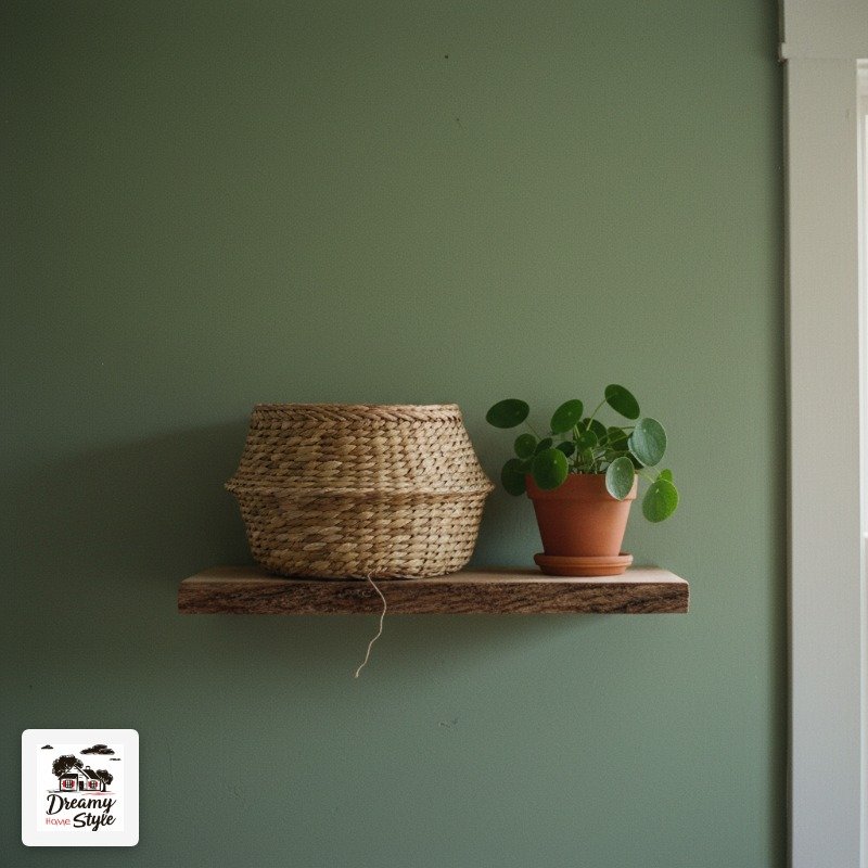
Soft white sheepskin throws and woven baskets round it out.
And if you can get some good afternoon light in there, the blue-green shifts and changes throughout the day in a way that’s genuinely nice to live with.
Ink Black-Blue That Makes Every Lamp Look Like Candlelight
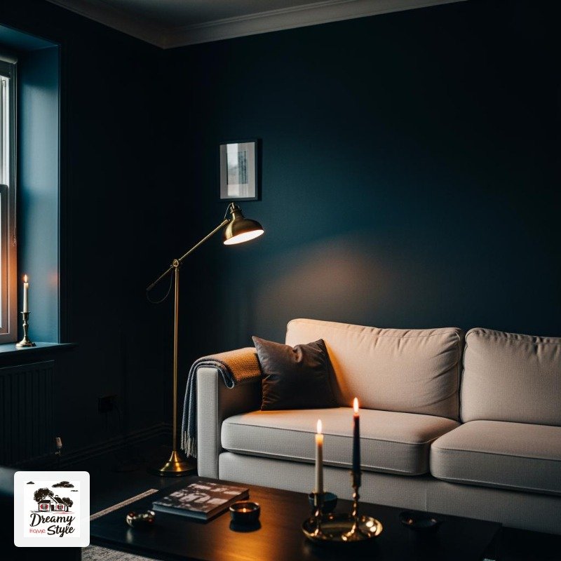
There’s a color sitting right between navy and black — not quite either — and it might be the most atmospheric living room color I’ve ever seen in real life.
It’s the kind of color that makes you light candles even when you have electric lights.
It just asks for it.
Everything warm glows against it.
My only caution is ceiling height.
In a room with low ceilings it can feel genuinely heavy, like the ceiling is pressing down.
But in a space with any kind of height — even just standard eight-foot — it’s breathtaking.
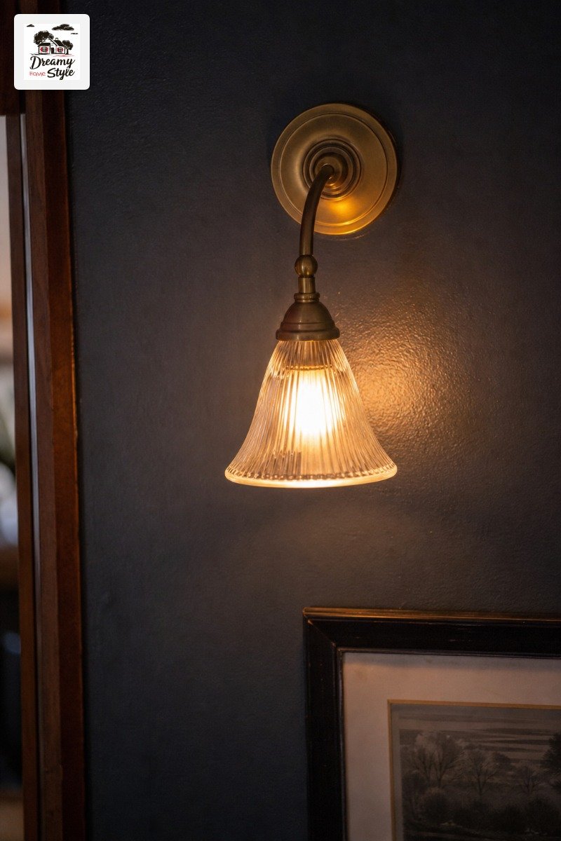
Soft warm metallics look phenomenal here.
Aged gold, antique brass, even bronze.
Not silver, not chrome — those go cold and clinical.
Warm metals only.
Sienna Spice for the Room That Should Feel Like a Souk
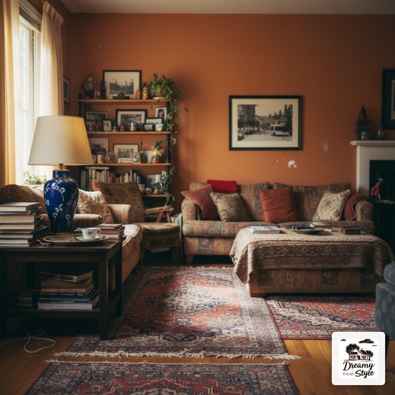
Last one and it’s a bold one.
Sienna — the warm, slightly brownish-orange that shows up in Moroccan tiles and old paintings and that one sunset every October.
A sienna-drenched living room is genuinely transportive.
There’s no other word for it.
It’s warm and earthy and has this depth that changes completely depending on what light hits it.
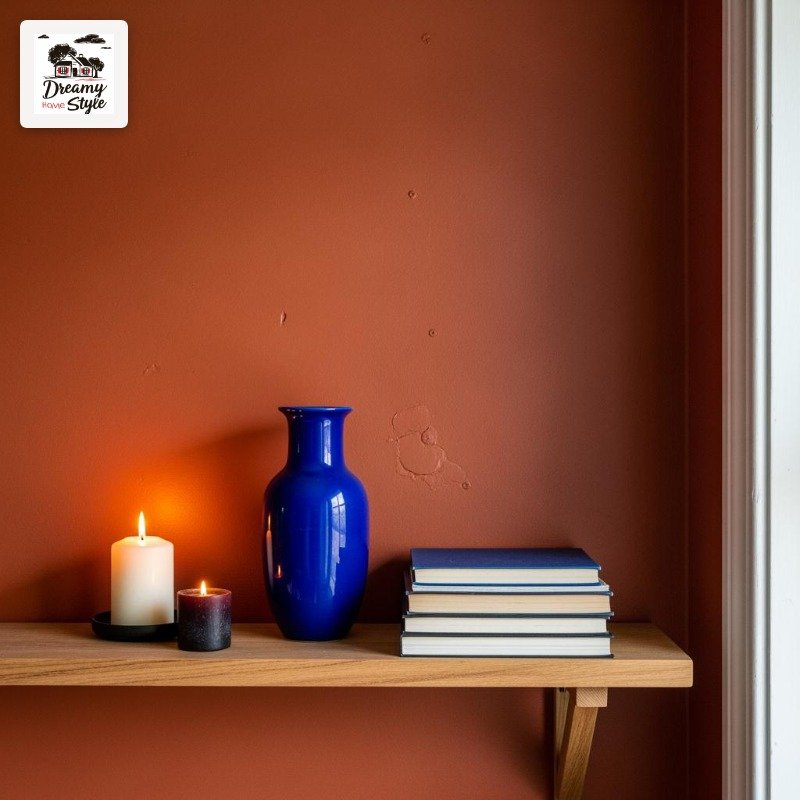
Layer it with deep teal or cobalt accents — throw pillows, a painted vase, even a rug with those tones — and the whole room starts to feel rich in a way that has nothing to do with how much you spent.
I picked up a cobalt blue ceramic lamp at a thrift store for $8 and it looked like I planned the whole thing.
This isn’t a color for minimalists.
It wants stuff.
Layered rugs, stacked books, a few plants, some candles.
It’s the living room that’s okay being a little maximalist.

