hink of your curtains as the frame around a beautiful painting – they can make your purple bedding the star of the show or totally ruin the look.
The secret is understanding which colors work together and which ones fight against each other.
Some colors will make your purple bedding look more vibrant and exciting, while others will create a calm and peaceful feeling.
You might want drama and boldness, or you might prefer something soft and relaxing.
Get ready to turn your bedroom into a space you absolutely love spending time in.
White Curtains: Clean and Classic


White curtains are the perfect choice when you want your purple bedding to be the main attraction in your room.
This timeless combination creates a fresh, clean look that never goes out of style.
White acts like a blank canvas, allowing every shade of purple to pop and shine without any competition.
Whether your bedding is deep eggplant purple or soft lilac, white curtains will make the color look more vibrant and beautiful.
The contrast between white and purple creates visual interest without being overwhelming or too busy.
This combination works especially well in smaller bedrooms because white curtains help make the space feel bigger and brighter.
You can choose from many different white shades – pure bright white, creamy off-white, or warm ivory.
Each type of white will give your room a slightly different feeling, so pick the one that matches your style best.
Pure white creates a modern, crisp look that feels fresh and energetic.
Cream or ivory whites add warmth and coziness, making your bedroom feel more comfortable and inviting.
White curtains also give you lots of flexibility if you ever want to change your bedding colors later.
They work with almost any color, so you won’t need to buy new curtains if you decide to switch things up.
For the best look, choose white curtains in a fabric that matches the mood of your room – light and airy cotton for a casual feel, or rich silk for something more fancy.
Tap to Explore These Beauties
See my ideas in action 👇 Tap any image to explore full details.
Gray Curtains: Modern and Sophisticated
Gray curtains bring a modern, grown-up feeling to bedrooms with purple bedding.
This color combination feels current and stylish, like something you’d see in a fancy hotel or magazine.
Gray is a neutral color that doesn’t fight with purple but instead makes it look more elegant and refined.
Light gray curtains create a soft, dreamy atmosphere that’s perfect for relaxing and sleeping.
These pale gray shades work especially well with lighter purples like lavender or lilac.
The combination feels gentle and calming, creating a peaceful space where you can unwind after a long day.
Medium gray curtains offer the perfect balance between light and dark, working beautifully with almost any shade of purple.
This middle-ground gray is versatile and sophisticated, giving your room a polished look without being too dramatic.
Dark gray or charcoal curtains create a bold, dramatic effect that makes purple bedding look rich and luxurious.
This combination works best with deeper purple shades and creates a cozy, intimate feeling in your bedroom.
Gray curtains also hide dirt and dust better than lighter colors, making them practical for busy households.
You can find gray curtains in many different textures and fabrics, from smooth cotton to rich velvet.
The texture you choose will change how fancy or casual your room feels, so pick something that matches your personal style.
Cream Curtains: Warm and Cozy
Cream curtains add warmth and coziness to bedrooms with purple bedding, creating a space that feels like a comfortable hug.
Unlike stark white, cream has yellow undertones that make everything feel softer and more inviting.
This warm neutral color works beautifully with all shades of purple, from deep royal purple to soft lavender.
Cream curtains help create a bedroom that feels peaceful and relaxing, perfect for getting a good night’s sleep.
The combination of cream and purple has a vintage, romantic feeling that many people love.
It reminds you of old-fashioned bedrooms in pretty country houses or cozy bed-and-breakfast inns.
Cream is also a forgiving color that doesn’t show every little speck of dust or dirt like pure white does.
This makes cream curtains a smart choice for families with kids or pets who might not keep things perfectly clean.
The warm tones in cream curtains help balance the cool tones often found in purple bedding.
This creates a room that feels comfortable and welcoming rather than cold or unfriendly.
Cream works especially well if your bedroom gets lots of natural light, as the warm color helps soften harsh sunlight.
You can pair cream curtains with matching cream throw pillows or blankets to tie the whole room together.
For extra coziness, choose cream curtains in a soft fabric like cotton or linen that feels comfortable to touch.
✦ You Might Love This
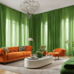
9+ Best Curtain Colors for Orange Sofas : Spicing Up Your Space Keep Reading →Silver Curtains: Glamorous and Shiny
Silver curtains bring Hollywood glamour and sparkle to bedrooms with purple bedding.
This metallic color creates a luxurious, fancy feeling that makes your bedroom feel like a movie star’s suite.
Silver reflects light beautifully, making your room brighter and more spacious-looking.
The cool tones in silver complement the cool tones often found in purple, creating a harmonious color scheme.
Silver curtains work especially well with deep, rich purples like plum or eggplant.
The combination feels regal and sophisticated, like something you’d find in a fancy palace or high-end hotel.
Metallic silver curtains catch and reflect light throughout the day, creating interesting patterns and sparkles on your walls.

Find Your Room’s Color Palette
Tap a vibe — get a curated 5-color palette with hex codes you can copy ✨
💭 I Wrote a Book About My Biggest Decorating Mistakes!
When I decorated my first home, I thought I knew what I was doing. Spoiler: I didn’t. 😅
💸 I bought a sofa way too big for my living room. Paint colors that looked amazing in the store but terrible on my walls.
This adds visual interest and movement to your room, making it feel alive and dynamic.
Silver is also a neutral color, which means it won’t clash with other colors you might want to add to your room later.
You can easily add gold accents, colorful artwork, or bright throw pillows without worrying about color conflicts.
For the most glamorous look, choose silver curtains with a slight sheen or shimmer.
Satin or silk silver curtains create the most dramatic effect, while matte silver feels more subtle and understated.
Silver curtains also work well in modern or contemporary bedrooms where clean lines and sleek finishes are important.
Navy Blue Curtains: Bold and Dramatic
Navy blue curtains create a bold, dramatic look when paired with purple bedding.
This deep, rich blue acts as a strong contrast to purple, making both colors look more vibrant and interesting.
Navy blue is often called a neutral because it works with so many other colors, but it’s much more exciting than beige or gray.
The combination of navy and purple feels sophisticated and confident, perfect for someone who isn’t afraid to make a statement.
Navy blue curtains work especially well with lighter purple shades like lavender or periwinkle.
The dark curtains provide a strong backdrop that makes the softer purple bedding really stand out.
This color combination also works in reverse – if you have very dark purple bedding, navy curtains still create beautiful contrast.
Navy blue has a classic, timeless feeling that won’t look outdated in a few years.
It’s the kind of color choice that always looks put-together and intentional.
Navy curtains also have practical benefits – they block light well, helping you sleep better in the morning.
The dark color hides stains and dirt better than lighter curtains, making them ideal for busy households.
You can add other navy blue accents around your room, like throw pillows or a cozy blanket, to tie everything together.
For the richest look, choose navy curtains in a substantial fabric like cotton or linen that hangs beautifully.
Beige Curtains: Neutral and Calming
Beige curtains offer a safe, neutral choice that works beautifully with purple bedding.
This warm, earthy color creates a calming atmosphere that feels comfortable and relaxing.
Beige is like the quiet friend who gets along with everyone – it never causes problems or creates clashes.
The warm undertones in beige help balance the cool tones often found in purple, creating a harmonious room.
Beige curtains work with every shade of purple, from the palest lavender to the deepest eggplant.
This versatility makes beige a smart choice if you like to change your bedding colors seasonally.
The combination of beige and purple feels natural and organic, like colors you might find in a beautiful garden.
Beige curtains also help create a sense of continuity if your bedroom connects to other rooms with neutral colors.
This neutral color won’t compete with purple bedding for attention, allowing your bed to be the focal point.
Beige is also a practical choice because it doesn’t show dust, pet hair, or small stains as easily as lighter colors.
You can find beige curtains in many different shades, from pale sand to rich mushroom brown.
Choose the beige shade that best matches the other colors in your room for the most pulled-together look.
Beige curtains in natural fabrics like cotton or linen add texture and warmth to your bedroom.
What’s Your Decor Personality?
5 questions · 30 seconds · Instant style match 🏡
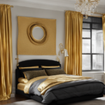
Gold Curtains: Rich and Luxurious
Gold curtains bring warmth, richness, and luxury to bedrooms with purple bedding.
This combination creates a regal, royal feeling that makes your bedroom feel like a palace.
Gold and purple have been paired together for centuries in royal decorations and expensive fabrics.
The warm tones in gold create a beautiful contrast with the cool tones in most purple shades.
Gold curtains work especially well with deeper purple shades like plum, wine, or eggplant.
The rich colors together create a cozy, intimate atmosphere perfect for a master bedroom.
Metallic gold curtains reflect light beautifully, adding sparkle and glamour to your space.
Even on cloudy days, gold curtains help keep your room feeling bright and cheerful.
Gold is also a color that makes people feel happy and energetic, adding positive vibes to your bedroom.
You don’t need a lot of gold to make an impact – even gold curtains with subtle metallic threads can transform your room.
For a more understated look, choose curtains in a muted gold or champagne color.
These softer golds still provide warmth and richness without being too flashy or overwhelming.
Gold curtains pair beautifully with other warm metals like brass or copper in your light fixtures and hardware.
Pink Curtains: Soft and Romantic
Pink curtains create a soft, romantic atmosphere when paired with purple bedding.
These two colors are neighbors on the color wheel, which means they naturally look beautiful together.
The combination feels feminine and dreamy, perfect for creating a peaceful retreat in your bedroom.
Light pink curtains work especially well with deeper purple bedding, creating a lovely contrast.
The soft pink helps tone down intense purple shades, making the room feel more balanced and comfortable.
This color combination reminds many people of beautiful flowers like roses and violets.
Pink curtains add warmth to purple bedding that might otherwise feel cool or distant.
The warm undertones in pink help create a cozy, welcoming atmosphere in your bedroom.
You can choose from many different pink shades, from barely-there blush to rich rose.
Pale pink curtains create a subtle, sophisticated look that feels grown-up and elegant.
Deeper pink shades make more of a statement and work well if you love bold, confident colors.
Pink and purple together create a color scheme that feels both calming and energizing.
This combination works well for people who want their bedroom to feel cheerful and uplifting.
Pink curtains also reflect flattering light that makes everyone look good in the room.

Green Curtains: Fresh and Natural
Green curtains bring a fresh, natural feeling to bedrooms with purple bedding.
This unexpected color combination creates visual interest and makes your room feel unique and creative.
Green and purple are opposite each other on the color wheel, which means they create beautiful contrast.
Sage green curtains offer a soft, muted option that feels calming and peaceful.
This gray-green color works especially well with lighter purple shades like lavender or periwinkle.
The combination feels like a peaceful garden where you can relax and unwind.
Forest green curtains create a bold, dramatic look that works beautifully with rich purple bedding.
This deep green feels grounded and stable, creating a cozy atmosphere in your bedroom.
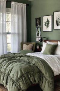
The combination of forest green and purple feels luxurious and sophisticated.
Mint green curtains add a fresh, energizing feeling to bedrooms with purple bedding.
This light, cheerful green works well with both light and dark purple shades.
The combination feels young and fun, perfect for kids’ rooms or guest bedrooms.
Green curtains also connect your bedroom to nature, which can help you feel more relaxed and peaceful.
Choose green curtains in natural fabrics like cotton or linen to enhance the natural, organic feeling.
This or That?
Pick your fave — see what other readers chose! 👀
Black Curtains: Bold and Dramatic
Black curtains make a strong, dramatic statement when paired with purple bedding.
This high-contrast combination creates a bold, confident look that isn’t for everyone but can be absolutely stunning.
Black curtains make any shade of purple look more vibrant and intense by providing the ultimate contrast.
This combination works especially well in larger bedrooms where the dark curtains won’t make the space feel cramped.
Black curtains are incredibly practical because they block out light completely, helping you sleep better.
They also hide every type of stain, dust, or pet hair, making them perfect for busy households.
The combination of black and purple feels gothic and mysterious, creating a unique atmosphere.
💭 I Wrote a Book About My Biggest Decorating Mistakes!
When I decorated my first home, I thought I knew what I was doing. Spoiler: I didn’t. 😅
💸 I bought a sofa way too big for my living room. Paint colors that looked amazing in the store but terrible on my walls.
This color scheme works well for people who love drama and want their bedroom to make a statement.
Black curtains also provide a sophisticated backdrop for colorful artwork or decorative accents.
You can add touches of other colors through pillows, throws, or wall art without worrying about clashing.
For a softer look, choose black curtains with subtle texture or pattern rather than solid black.
Black curtains with a slight sheen or subtle pattern feel less harsh while still providing drama.
This combination works best when balanced with plenty of light-colored accents and good lighting.
Brown Curtains: Earthy and Warm
Brown curtains add an earthy, grounded feeling to bedrooms with purple bedding.
This natural color combination feels comfortable and relaxing, like a cozy cabin in the woods.
Brown is a warm neutral that works well with both light and dark purple shades.
Light brown or tan curtains create a soft, natural look that feels casual and comfortable.
This combination works well in bedrooms that connect to outdoor spaces or have lots of natural light.
Medium brown curtains offer richness and warmth without being too dark or overwhelming.
This chocolate brown shade works especially well with deeper purple bedding colors.
The combination feels luxurious and sophisticated, like expensive leather and velvet.
Dark brown curtains create a cozy, intimate atmosphere perfect for a master bedroom.
Brown curtains in rich fabrics like velvet or heavy cotton add texture and visual interest to your room.
The natural color helps your bedroom feel connected to the outdoors, which can be very relaxing.
Brown is also a practical color choice because it doesn’t show dirt or stains easily.
You can add other brown accents throughout your room, like wooden furniture or woven baskets, to create a cohesive look.
Quick Design Dilemma
Cast your vote — see what other readers think! 🤔
Teal Curtains: Vibrant and Unique
Teal curtains create a vibrant, unique look when paired with purple bedding.
This blue-green color offers something completely different from typical neutral curtain choices.
Teal and purple together create a jewel-tone color scheme that feels rich and luxurious.
The combination reminds many people of beautiful peacock feathers or precious gemstones.
Light teal curtains work beautifully with darker purple bedding, creating lovely contrast.
The cool blue-green helps balance warm undertones that might be in your purple bedding.
Deep teal curtains make a bold statement and work well with both light and dark purple shades.
This rich color combination feels confident and creative, perfect for someone who loves unique style.
Teal curtains help create a bedroom that feels like a relaxing spa or tropical retreat.
The blue-green color is naturally calming and helps promote good sleep and relaxation.
Teal also works well with metallic accents like gold or silver, giving you lots of decorating options.
You can add teal throw pillows or artwork to tie the curtain color throughout your room.
This color combination works especially well in bedrooms with good natural light that shows off the rich colors.
Psst… Check This Out
Sick Curtain Colors That Will Totally Match Your Black & Brown Furniture Take Me There →Burgundy Curtains: Rich and Sophisticated
Burgundy curtains create a rich, sophisticated atmosphere when paired with purple bedding.
This deep red color works beautifully with purple because both colors share similar undertones.
The combination feels luxurious and elegant, like something you’d find in an expensive hotel or mansion.
Burgundy and purple together create a monochromatic color scheme that feels harmonious and planned.
This rich color combination works especially well in formal bedrooms or master suites.
Burgundy curtains add warmth to purple bedding that might otherwise feel cool or distant.
The deep, rich colors together create a cozy, intimate feeling perfect for relaxation.
This combination also works well in bedrooms with traditional or classic decorating styles.
Burgundy curtains in luxurious fabrics like velvet or silk enhance the elegant feeling.
The rich colors hide imperfections and create a forgiving environment that always looks put-together.
You can add other burgundy accents like throw pillows or artwork to strengthen the color connection.
This color combination works best in rooms with good lighting to show off the beautiful rich tones.
Burgundy and purple together create a timeless look that won’t go out of style quickly.