I’ve been stressin’ over re-do’in my bedroom lately.
Been rockin’ this super cozy blue comforter for years but it’s time for an update.
I wanted to switch up the curtains but had no clue which shades would vibe with my comforter.
There are just too many options to choose from, ya know?
As I was cruisin’ Pinterest late one night lookin’ for inspo, I came across an interesting fact: did you know blue is one of the most popular colors for bedrooms because it promotes relaxation and calmness?
Who woulda thought!
That got me thinkin’ – maybe I should stick with shades that complement the chill vibe my comforter gives off.
After lots of research, here are the top fly colors that will look fresh as heck with your baby blues comforter:
1. Gray

Gray is a classic neutral that goes with everything.
Look for shades like charcoal, which is a dark gray with slight hints of blue – it will match seamlessly with navy comforters.
Dove gray is also a great option, as its soft, light hue will brighten up the space without overwhelming the blue.
Light gray is an airy, soft choice that will make the comforter really pop without distracting the eye too much.
Pair any of these shades with silver, bronze or gold hardware on the curtains for an elevated look.
Charcoal curtains with silver rings and tiebacks would be totally boss in a room with robin’s egg blue bedding.
The gray adds depth and sophistication while allowing the blue to shine through as the focal point.
You really can’t go wrong with a neutral gray – it’s a timeless choice that will match any decor changes down the line.
Go gray if you want a polished, pulled-together look without much hassle.
2. White

You can never go wrong with white.
Crisp, bright white is truly a blank canvas that will make any color pop, especially tints of blue.
Opt for a pure, untinted white if you want all eyes to be on that baby blues comforter.
Consider a linen or cotton weave in an off-white for a softer, lived-in aesthetic.
The subtle texture will add visual interest without distracting from the comforter hue.
For breezy, beachy vibes, try white curtains with navy piping or ruffles.
The subtle navy trim coordinates without being matchy-matchy.
White curtains are also a low-effort choice that can be dressed up or down with different bedding throughout the seasons.
They’ll make any room feel bright, airy and put together with very little effort on your part.
You truly can’t lose going white when pairing with blues.
3. Light Green

A pale mint or sage green is super on-trend right now.
Mint is a light, refreshing hue perfect for complementing navy or sky blue bedding.
It adds a spa-like oasis vibe without being too matchy-matchy.
Sage is a warm, earthy option that pairs beautifully with robin’s egg or periwinkle tones.
The soft yellow-green undertones in sage play nicely off cooler shades of blue.
Both mint and sage work well in crisp cotton to mimic the feel of fresh linen curtains.
You could also go bolder with light green velvet or faux fur panels for a glam twist.
Consider lining the panels or swag valance with a complementary color, like blush pink.
This adds visual interest while letting the green play complement to the main blue comforter.
Light green curtains define a relaxed, fresh vibe perfect for chillaxin’ in your bedroom space.
Go light green if you want an on-trend pop of color without sacrificing serenity.
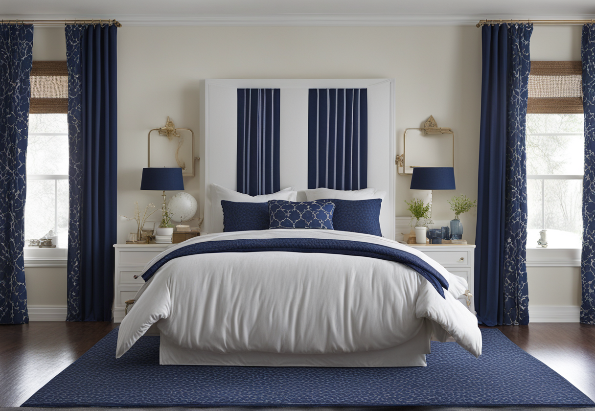
4. Navy

Navy truly is blue’s cooler cousin.
While darker than other blue shades, navy creates harmony instead of harsh contrast.
It adds drama and depth without overwhelming a room the way black might.
Navy curtains pair especially well with robin’s egg, sky or denim blue bedding.
The darker, richer navy acts as a complement that binds the colors together cohesively.
Try navy Roman shades for a tailored, pulled-together aesthetic.
Or go bolder with patterned curtains in a navy toile, stripe or dots.
The print provides visual interest while maintaining an orderly, put-together vibe.
Navy is always a chic, polished choice whether you’re going for preppy, coastal or minimal decor.
It seamlessly matches any style while adding visual unity between bedding and window treatment colors.
Go navy if you want drama without sacrificing relaxed comfort vibes in your bedroom space.
5. Yellow

Yes, hear me out on this one!
A soft buttercream or lemon yellow truly pairs better with blue than you might think.
It’s a sunshine pop of color that makes darker, richer blues absolutely sing.
The yellow acts as a visual anchor without overwhelming the space like a bolder orange might.
For paneled sheers, try a polka dot or gingham print in pale yellow.
The subtle pattern interrupts without distracting from the gorgeous blue bedding you’ve got going on.
You could also do solid yellow with a wide cream or white piping along the edges and seams.
This balances out the brightness and turns up the content farmhouse charm.
Or go all out glam with gathered silk curtains in porcelain yellow.
Pair with mercury glass pendants above for major hotel vibes in your own bedroom.
Pale yellow truly livens up a dark blue sanctuary without upstaging the star of the show – your comfy coordination.
Go yellow if you’re feeling bold but don’t want an overpowering pop of color competing with your blue bedding.
6. Purple

Similar to yellow, purple pairs beautifully with various shades of blue.
On the lavender-lilac-periwinkle end of the spectrum, purple acts as a complement instead of a contrast.
Choose dusty lavender if your comforter is a rich midnight or navy hue that screams luxury.
The lighter lavender serves to soften and neutralize without overwhelming the darkness.
Lilac blends effortlessly with robin’s or duck egg blue for a balanced, tranquil vibe.
Periwinkle, which has strong blue undertones itself, truly harmonizes with light blues.
Consider periwinkle Roman shades with pintucked pleats for a romantic, feminine look.
Or go whimsical with paneled curtains in a floral print mixing lilacs, bluebells and buttercups.
The pastel blooms cheerfully counterbalance a bold blue without competing for attention.
Soft purple is an on-trend, soothing complement to various shades of your favorite color – blue!
Go purple if you want an fresh pop of antique rose tones to offset the richness or brightness of your blue bedding.
7. Pink
Like yellow and purple, pink pairs unexpectedly well with different shades of blue.
For curtains, stick to blush or rose gold tints that are light, soft and feminine.
Visualize blush pink curtains with a scattering of tiny navy polka dots.
The dots add fun whimsy and tie the colors together in perfect harmony.
Rose gold is a warm neutral with pink undertones that looks glam paired with royal or cobalt blue.
Try rose gold hardware like tie-backs or curtains rods for boudoir vibes.
Or go all out with ruched silk charmeuse in delicate rose – it’s just the right pop against navy.
The pink serves as a soft, feminine accent without screaming for attention the way hot pink might.
It plays perfectly to highlight the beauty of your blue bedding without competing for the spotlight.
Consider a scalloped or lace pink valance atop your blue curtains for extra softness and charm.
The sweet pink trim elevates a cozy, romantic mood perfect for winding down in your oasis.
Go bold yet delicate with blush or rose if you want to accentuate the femininity and calmness of your blue bedding through subtle means.
Pink balances richness or brightness for a sophisticated take on classic color-blocking.
8. Beige
Nothing says calming vibes quite like various tones of beige.
An oat or sand colored curtain adds warmth while maintaining visual unity with your blue comforter.
It’s an earthy backdrop that allows for the eye to focus on decorative details.
Beige is also forgiving – it masks any stains or dirt better than darker shades might.
Go for a linen weave if you want that relaxed, lived-in luxury feel.
Or try lightweight velvet if you prefer a slightly more glamorous look.
The velvet adds texture while maintaining the calming essence of beige.
Consider sprucing up plain beige curtains with decorative tiebacks or a swag valance.
An antique brass valance would be stunning against a polished oat or sand shade of beige.
This neutral serves as the perfect complement to let your blue bedding shine in a calming, balanced way.
Opt for beige if you want an easy, unified backdrop that lets other design elements stand out as focal points.
9. Tan
Tan is beige’s cooler, richer cousin with more depth and depth.
Like beige, it adds warmth without overwhelming darker tones of blue.
A chocolatey tan curtain plays up the coziness of your comforter in a subtle way.
Look for tan in a smooth silk if you want a luxurious, high-end vibe on a budget.
For relaxed cottage charm, canvas weaves or homespun fabrics in tan hit the spot.
The subtle texture enhances that lived-in feel you’re going for without being overly matchy.
Add cream or white polka dots to tan curtains for a farmhouse twist.
Or adorn plain tan with jute tiebacks and trimmed valance for coastal cottage vibes.
Tan effortlessly enhances the comfort factor of your blue bedding through its welcoming warmth.
Opt for tan if you want an earthier, cozier alternative to beige that plays up your bedding’s chill vibes.
10. Orange
Yes, hear me out again on orange!
A pale peach or apricot shade acts as an unexpected yet lovely accent to various blues.
It livens up the space in a gentle, soft-focus way instead of being an attention-stealing “in your face” pop.
Picture diaphanous peach organza panels that let light filtering while maintaining privacy.
The lightweight sheer material enhances the airiness without overwhelming your blue bedding palette.
You could also do tailored bamboo shades in a muted apricot tone.
The warm wood grain complements while the color acts as a cheerful counterpoint to cool blues.
A blush orange shade brings a youthful glow to a navy or grayish blue bedroom.
It’s the perfect pick-me-up for brighter winter months spent lounging with your cozy bedding.
Go light orange if you dare to veer slightly unconventional with an unexpected pop of warmth against your blue bedding.
11. Red
Don’t underestimate how nicely red can pair with blue, either!
Used right, it complements instead of competes in a yin-yang balance of warm and cool tones.
For curtains, opt for softer Merlot or burgundy on the red spectrum.
These shades of red wine bring to mind relaxing indoor-outdoor living than harsh primary colors.
Consider Merlot velvet if you’re after boudoir vibes perfect for romance.
Or try slim Roman shades in burgundy faux leather for modern farmhouse appeal.
The red frames your view while doubling as a decorative focal point.
For those who dare to push boundaries, deep cherry or cranberry can also work against navy or indigo.
In the right context, red defines luxury and sets a perfect nighttime mood to unwind in your blue sanctuary.
Go red if you’re bold enough to make a statement through wine-pairing your bedding and window treatments.
12. Brown
Earthy browns like espresso or cognac work amazingly with various blues.
They embody rustic-chic vibes through natural, warm tones that feel indulgent.
Cognac velvet drapes with frothy raw silk tiebacks exude refined cabin coziness.
Or try brushed wood blinds in deep espresso for a shot of rugged luxury.
The brown frames and grounds your view in cozy retreat essence.
Distressed leather or faux suede in caramel or milk chocolate also bring indoor-outdoor appeal.
They embrace casualness while complementing royal or cobalt blues elegantly.
From prairie modern to mountain lodge, browns define relaxed sophistication when paired with your favorite hue of blue.
Choose brown if you’re after rustic-luxe vibes that highlight comfort above all else.
13. Gold
Metallic gold adds the perfect hint of luxury.
Look for it in matte, satin or rose gold finishes depending on your style preference.
Satin gold drapes with tucks and gathers exude old Hollywood glamour for a night in.
For contemporary edge, try sculptural vertical gold shades that make a statement.
Or go the layered look with rose gold hardware on white linen behind sheer matte gold panels.
The multiple textures create visual interest balancing the richness of your blue bedding.
Don’t be afraid to layer gold sheer over patterned blue curtains, either!
The colors play off each beautifully while exuding only the highest-end hotel vibes.
Add luxury through gold if you want bedroom decor worthy of design magazines and pampering yourself at the same time.
14. Black
Black is truly the little black dress of decor – it goes with everything including various blues.
For curtains, look to charcoal or gray-black shades that darken without stark harshness.
Try sleek blackout panels in a matte gray charcoal for moodiness with practical function.
Or lined velvet with subtle sheen in deep charcoal to make a statement.
The rich darkness frames your bedding beautifully while allowing other design elements to pop.
Black can also serve as a backdrop for patterned blue and white toile curtains layered behind.
The dark grounding provides context to appreciate the lighter hues.
Pair charcoal or black with rose gold, bronze or gunmetal accents for a lavish modern ambiance.
Go for black if you dare to set an ultra luxe, cinematic tone through rich contrast with your blue bedding.
15. Teal
Teal truly lets your blue comforter shine its brightest.
As a neighbor to blue on the color wheel, it reflects and highlights the hue instead of clashing.
Pair teal curtains with sky or robin’s egg blue for a cohesive aquatic dreamscape.
The teal acts as a complement that brings out subtle nuances in your favorite comforter shade.
Opt for silk teal with ripple pleats or soft ruching for a relaxed, breezy sentiment.
Or consider patterned linen in a botanical motif mixing teal foliage with white blooms.
The natural print feels light and airy while echoing the comforter hue you love.
Teal can also function beautifully as a bedroom accent, like a valance or swag topping blue curtains.
The pop of color enhances your bed as a focal point without competing for attention.
Truly, teal lets that baby blue sing through gentle reflection and accentuation of its best qualities.
Choose teal if you want window treatments that highlight rather than distract from your comforter’s gorgeous shade.
16. Light wood tones
Shades like whitewashed oak, bleached sandalwood and natural maple warmly complement navy blue.
Their pale, soft tones balance out cooler colors instead of clashing in contrast.
Wide horizontal slats in washed sandalwood impart casual texture.
Or go polished with layered sheer in oiled maple and linen behind wood blinds.
The warm grainy framing enhances the coziness of your space.
For beachy essence, try rattan or sea grass roll-up shades in natural tones.
Their breezy texture lets soft light stream in to appreciate the blue bedding.
No matter the style, light wood instills a relaxed, cabin vibe when paired with your favorite tone of navy.
Opt for soft wood tones if you want your decor balanced between crispness and indulgent comfort.
17. Denim
What’s cooler than window treatments in indigo threadbare denim?
Distressed or faded denim echoes your favorite jeans for a casual-luxe bedroom.
The subtle fading flatters both pale and rich shades of blue equally well.
Or try indigo linen roller shades with sand-washed texture for coastal charm.
The blue tones work seamlessly together to define a breezy aesthetic.
Button-tufted denim would also make a statement above drapes in a complementary hue.
The material frames your space casually while allowing your bedding to shine through as the focal point.
Denim is a carefree choice to pair your bedding hue in a way that feels simultaneously put-together and relaxing.
Choose denim if you want a casually luxe look and feel inspired by your favorite off-duty wardrobe staple.
Hope this major list of fly options gives you major inspo for re-vampin’ your bedroom vibes, homie!
Hit me up if you need any other decor deets.
18. Aqua
Aqua is truly a twin to many shades of blue that it pairs with flawlessly.
As a relative to both blue and green on the color wheel, it blends magestically with variations of the hue.
Bright, crisp aqua curtains make a statement while letting a royal or navy comforter really shine through.
The color pop also enhances the feeling of calm without distracting harshly like neon tones might.
Soft aqua sheers layered behind white wood shutters impart coastal essence indoors.
Complete the seaside vibe with jute tiebacks, a natural blind, or aquatic art above the bed.
Aqua acts as a cheerful accent to perk up a bedroom sanctuary dedicated to relaxation.
19. Bonus: Mauve
Mauve enters the purple family but leans pinker, making it gentle and bridging.
The soft mauve shade brings out subtle rose notes in robin’s egg or pastel blue.
Visualize ruched voile curtains in mauve draped casually from a wood slat ceiling.
Their ethereal texture contributes to a bohemian romance vibe perfect for unwinding.
You could also try a mauve chevron print linen behind white panel curtains.
The blend of patterns adds visual interest while maintaining a relaxed pastoral mood.
Mauve offers a gracious complement to light blue with vintage-inspired femininity.
20. Neutrals
While beige and gray top the neutral pairings, don’t sleep on others that flatter blue equally well.
Consider pale silver for modern edge or ecru for a soft, breezy sentiment that lets navy or royal blue pop.
Coastal mist brings a breezier yet sophisticated essence for beach house-esque style.
And stone highlights sophistication while grounding royal or periwinkle blue tones elegantly.
Tones like these make blue sing through balance rather than bold complementation alone.
Neutral curtains allow your blue bedding color to shine through as the calming, relaxing focal point.
The Flyest Colors to Complement Your Baby Blues Comfy
| RANK | WHY IT WORKS | |
|---|---|---|
| Gray | 8.9 | Timeless neutral that adds sophistication without distracting from the blue |
| White | 8.8 | Makes any room feel bright, fresh and lets the blue pop as focal point |
| Light Green | 7.9 | On-trend pop of color that adds a calming, spa-like vibe without clashing |
| Navy | 7.8 | Deep, rich tone that creates visual unity and drama without overwhelming |
| Yellow | 7.7 | Sunshiney accent that brings out nuances in darker blues without distracting |
| Purple | 7.6 | Complements both light and dark blues with soothing, antique rose tones |
| Pink | 7.5 | Soft, feminine pop that highlights beauty of blue without demanding attention |
| Beige | 7.4 | Calming neutral that lets other elements stand out while unifying the space |
| Tan | 7.3 | Earthier version of beige that plays up blue’s cozy vibes with subtle warmth |
| Orange | 7.2 | Unexpected yet lovely accent color that brightens without overwhelming |
| Red | 7.1 | Complements blue through balance of warm and cool tones rather than contrast |
| Brown | 7.0 | Earthy tones define cozy retreat vibes when paired with various blues |
| Gold | 6.9 | Adds luxury and glamour while playing complement rather than contrast |
| Black | 6.8 | Grounds space elegantly while letting other hues like patterns pop |
| Teal | 6.7 | Highlights nuances in blue without competing as a reflection of the hue |
| Light Wood | 6.6 | Balances crispness of blue with warmth and relaxed cabin vibes |
| Denim | 6.5 | References favorite jeans casually while complementing various blues |
| Aqua | 6.4 | Relative enhances feeling of calm through cheerful pop without clash |
| Mauve | 6.3 | Soft, vintage-inspired pink tone brings out rose in light blue elegantly |
| Silver | 6.2 | Brightens modern edge while maintaining calm through balancing blue |
| Ecru | 6.1 | Soft, breezy neutral lets navy or royal blue tones pop visually |
| Coastal Mist | 6.0 | Refined essence through balance of crispness and relaxation with blue |


