When decorating a small room, every design choice matters.
The color of your carpet can dramatically affect how spacious a room appears.
Selecting the right carpet color is like having a secret weapon in your home design arsenal.
It can visually push walls outward, raise ceilings, and make cramped spaces feel open and airy.
The psychology of color plays a huge role in how we perceive space.
Some carpet colors seem to recede and expand, while others advance and close in.
Understanding this visual magic can completely transform your room without moving a single wall:
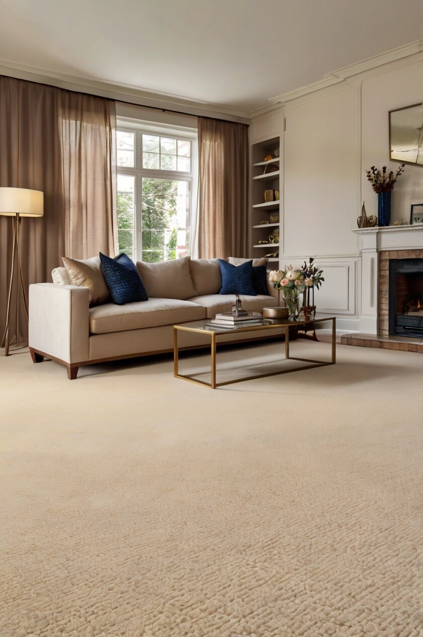
1. Light Beige Creates Depth and Openness

Light beige is a classic choice for making rooms appear larger than they actually are.
This neutral tone reflects natural light beautifully, brightening up the entire space.
When light bounces off beige carpeting, it creates an airy feeling that instantly expands visual space.
Beige works particularly well because it blends seamlessly with walls and furniture.
This creates a continuous flow throughout the room without visual interruptions.
The fewer visual breaks in a space, the larger it will appear to the human eye.
Designers often recommend beige for smaller rooms precisely because of this space-enhancing quality.
The warm undertones in beige carpeting add a cozy feel without the closing-in effect of darker colors.
You can pair beige carpets with slightly darker beige walls for a sophisticated monochromatic look.
This technique creates depth while maintaining the spacious feeling.
Beige carpets also provide an excellent neutral backdrop for furniture and decorations.
This allows your eye to travel around the room freely rather than stopping at stark color changes.
The versatility of beige means it works in any room of your home.
From living rooms to bedrooms, this carpet color choice will make spaces feel open and inviting.
Many homeowners choose beige carpeting when preparing to sell their homes because it makes rooms photograph larger.
The subtle texture variations available in beige carpets can add interest without overwhelming the space.
Consider a low-pile beige carpet for the best space-enhancing effect.
Shorter carpet fibers create less visual weight and contribute to a more spacious appearance.
Remember that beige doesn’t have to be boring – look for options with subtle patterns or gentle variations in tone.
These small details add character without compromising the space-expanding properties of this versatile carpet color.
2. Crisp White Opens Up Any Room

White carpet creates an immediate sense of openness in any room.
This brightest of all carpet colors reflects the maximum amount of light possible.
The reflective quality literally pushes visual boundaries outward, making walls appear farther away than they actually are.
White floors create a blank canvas that doesn’t visually stop the eye at any point.
This continuous visual flow makes ceilings appear higher and rooms feel more expansive.
Designers often recommend white carpeting for basement rooms or spaces with limited natural light.
In these challenging spaces, white carpet can transform a dark cavern into a bright, welcoming area.
White carpets pair beautifully with any wall color, allowing for design flexibility.
However, they create the largest visual impact when paired with white or very light walls.
This creates what designers call a “white box effect” – where boundaries seem to disappear.
The psychological impact of white spaces cannot be overstated when it comes to perceived size.
Our brains associate whiteness with open areas and freedom, unconsciously registering more space.
White carpeting works especially well in bedrooms and living rooms where relaxation is important.
The expansive feeling creates a sense of calm that other colors may not provide.
When selecting white carpet, consider options with subtle texture or pattern.
These details add interest without diminishing the space-enhancing properties.
Many people worry about keeping white carpet clean, but modern stain-resistant technologies make maintenance easier than ever.
Scotchgard and similar treatments provide practical protection against everyday spills and dirt.
White carpeting pairs beautifully with colorful furniture and art, allowing your decorative pieces to stand out.
This focused attention on design elements rather than flooring helps create a larger visual field.
For the most dramatic space-expanding effect, choose a white carpet with a slight sheen or luster.
This subtle reflective quality multiplies light even further, maximizing the space-enhancing benefits of this powerful carpet color.
3. Soft Gray Creates Sophisticated Spaciousness

Gray carpet has become increasingly popular for good reason – it makes rooms look significantly larger.
This versatile neutral creates a sophisticated foundation that visually expands floor space.
Light gray carpets in particular have all the space-enhancing benefits of beige but with a more modern edge.
The cool undertones in gray carpet create depth without the heaviness of darker colors.
This depth perception trick makes walls appear to recede, opening up the room substantially.
Gray carpeting works wonderfully in rooms with limited natural light where white might look flat.
It provides enough contrast to be interesting while still maintaining space-enhancing properties.
Designers often recommend gray carpet for connecting spaces like hallways and staircases.
The continuous flow of gray flooring from room to room creates visual unity that makes your entire home feel larger.
Gray carpets pair beautifully with almost any wall color from white to bold hues.
This versatility makes gray an excellent choice when you want to experiment with colorful walls without shrinking the space.
The subtlety of gray allows furniture and decor to stand out naturally.
This creates focal points away from the floor, expanding your visual perception of the room.
When choosing gray carpet, consider the undertones carefully for maximum impact.
Grays with blue undertones create a cooler, more expansive feel than those with warm brown undertones.
Lighter gray shades will naturally create more spaciousness than charcoal or deeper grays.
For small spaces like bedrooms or home offices, a pale silver-gray can work wonders.
This specific shade reflects light nearly as well as white but with more sophistication and practicality.
Gray carpeting also hides dirt and footprints better than beige or white options.
This practical benefit means you won’t need visible transition rugs that can visually chop up your space.
Consider a gray carpet with subtle patterns like small diamonds or lines.
These details draw the eye forward across the room, creating an illusion of greater distance and space.
4. Pale Blue Adds Depth Like the Sky

Pale blue carpet creates an immediate sense of expansiveness similar to looking up at a clear sky.
This color psychologically registers as endless space in our minds.
The light-reflecting qualities of pale blue carpet brighten rooms naturally.
This increased brightness automatically makes spaces feel larger and more open.
Blue tones recede visually, which means walls appear to push outward when paired with blue carpeting.
This optical illusion is especially powerful in smaller rooms like bedrooms or home offices.
Pale blue works particularly well in rooms with natural light, as it enhances the outdoor connection.
This indoor-outdoor flow further expands the perceived boundaries of your space.
Designers often recommend pale blue carpet for basement rooms or spaces that feel closed-in.
The airy quality of blue counteracts the heaviness often associated with below-ground spaces.
Pale blue carpet pairs beautifully with white or cream walls to maximize the spacious effect.
This combination mimics sky and clouds, triggering associations with open, unlimited space.
When selecting blue carpet, choose softer tones like powder blue or pale aqua.
These gentle shades expand space more effectively than vibrant or dark blues.
Blue carpeting creates a calm atmosphere that enhances the feeling of roominess.
Our brains associate tranquility with space, making this psychological connection work in your favor.
Many homeowners find that pale blue carpet makes bedrooms feel like retreats rather than just sleeping spaces.
The expansive quality adds a luxurious feel even to modest-sized rooms.
Consider blue carpet with subtle variations in tone or gentle patterns.
These details add interest without compromising the space-enhancing properties of blue.
For maximum effect, pair blue carpet with minimal furniture pieces in light colors.
This design approach maximizes floor visibility, making the blue carpet’s space-expanding properties most effective.
Remember that lighting can dramatically affect how blue carpet performs in expanding space.
Natural white light brings out blue’s expansive qualities best, while yellow lighting may diminish its effect.
5. Cream Creates Warmth Without Weight

Cream carpet offers the perfect balance between cozy warmth and visual spaciousness.
This versatile color reflects light beautifully, instantly making rooms appear larger.
The slight warmth in cream differentiates it from stark white, adding dimension without heaviness.
This subtle depth creates visual interest while maintaining excellent space-enhancing properties.
Designers often recommend cream carpet for rooms that need to feel both spacious and inviting.
This balance makes cream perfect for smaller living rooms where both comfort and space are priorities.
Cream carpeting creates a continuous floor plane that doesn’t stop the eye.
This visual flow makes walls appear farther away and ceilings seem higher.
When paired with cream or slightly darker walls, this carpet color creates a sophisticated monochromatic look.
Monochromatic color schemes are known for their space-expanding properties.
Cream carpet works particularly well in rooms with limited natural light.
The warm undertones prevent the space from feeling cold or institutional while still maximizing perceived size.
For small bedrooms, cream carpet can transform the space into a luxurious retreat.
The expansive quality adds a high-end feel even in modest-sized spaces.
Cream carpeting provides an excellent neutral base for any design style.
This versatility means your furniture and decor remain the focus rather than visual boundaries.
When selecting cream carpet, look for options with subtle texture variations.
These details add interest without compromising the space-enhancing properties.
Cream works especially well in open-concept homes where continuous flooring expands the entire space.
The seamless transition from room to room creates an uninterrupted visual plane.
Many homeowners appreciate that cream carpet hides dust better than pure white options.
This practical benefit means your space-enhancing carpet will maintain its expansive look between cleanings.
Consider cream carpet with a slight luster or sheen for maximum light reflection.
This subtle reflective quality enhances the space-expanding properties even further.
For the most spacious effect, pair cream carpet with furniture that sits on visible legs.
This allows more carpet to show, maximizing the expansive visual effect.
6. Silver Gray Adds Modern Spaciousness

Silver gray carpet creates an immediate contemporary feel while visually expanding your space.
This elegant color reflects light differently than other grays, with a subtle metallic quality.
The reflective properties of silver gray push visual boundaries outward, making rooms feel larger.
This carpet color works particularly well in modern and minimalist design schemes.
Silver gray creates a sophisticated foundation that doesn’t dominate the visual field.
This subtlety allows your eye to travel throughout the space without stopping at the floor.
Designers often recommend silver gray carpet for smaller apartments and condos.
The contemporary feel pairs perfectly with urban living while maximizing limited square footage.
Silver gray carpeting creates a perfect neutral backdrop for colorful furniture and art.
This allows decorative elements to become focal points that draw attention away from room size.
When paired with white walls, silver gray flooring creates dramatic spaciousness.
The slight contrast between walls and floor adds interest without dividing the space visually.
Silver gray works equally well in spaces with abundant natural light or limited windows.
In bright rooms, it reflects light beautifully; in darker rooms, it adds brightness without looking dirty.
For home offices or other small functional spaces, silver gray creates a professional backdrop.
This color choice makes tight workspaces feel more open and conducive to productivity.
Silver gray carpet pairs beautifully with both warm and cool accent colors.
This versatility allows for seasonal decor changes without affecting the space-enhancing properties.
When selecting silver gray carpet, look for options with subtle variations or patterns.
These details add visual interest without compromising the space-expanding effect.
Many homeowners appreciate that silver gray carpet hides footprints and daily dirt.
This practical benefit maintains the clean, spacious look between deep cleanings.
Consider silver gray carpet with flecks of lighter gray or white mixed in.
These variations create dimension and movement that further enhance spatial perception.
For maximum effect, pair silver gray carpet with furniture in similar tones but different textures.
This creates a harmonious look that expands the visual field rather than chopping it into sections.
7. Taupe Blends Neutrals for Expanded Space

Taupe carpet creates an immediate sense of sophisticated spaciousness in any room.
This versatile color sits between beige and gray, offering the best space-enhancing properties of both.
The complex undertones in taupe add depth without darkness, keeping spaces feeling open.
This subtle complexity makes taupe more interesting than basic beige while maintaining excellent light reflection.
Designers often recommend taupe for spaces where pure white or cream might feel too stark.
It provides warmth and character while still visually expanding the room.
Taupe carpet pairs beautifully with almost any wall color from white to bold accent walls.
This versatility allows for design flexibility without compromising the space-enhancing effect.
When creating a space-expanding color scheme, taupe carpet with slightly lighter walls works wonderfully.
This subtle contrast adds interest without creating hard visual boundaries.
Taupe carpeting creates an excellent foundation for both traditional and contemporary furniture styles.
This adaptability makes it perfect for evolving design preferences in long-term homes.
For smaller living areas, taupe carpet unifies the space without calling attention to its limitations.
The subtle color creates a continuous visual plane that expands the room’s perceived dimensions.
Taupe works particularly well in rooms with limited natural light.
It brightens the space more effectively than darker neutrals without showing dirt like lighter options.
When selecting taupe carpet, consider the specific undertones for maximum effect.
Taupe with pinker undertones adds warmth; taupe with greener undertones creates a cooler, more expansive feel.
Many homeowners appreciate taupe’s practical nature for high-traffic areas.
It hides minor soiling while maintaining its space-enhancing light-reflective properties.
Taupe carpet creates a particularly effective backdrop for wooden furniture.
The contrasting textures draw the eye around the room, expanding the visual field.
Consider taupe carpet with subtle striation or gentle patterning.
These details add visual interest without interrupting the expansive flow of the flooring.
For maximum space-enhancing effect, pair taupe carpet with lighting that highlights its complex undertones.
The right lighting brings out taupe’s depth and dimension, further enhancing its space-expanding properties.
8. Ice Blue Creates Cool Expansiveness

Ice blue carpet immediately opens up a room with its cool, receding properties.
This pale, slightly silvery blue tone reflects light brilliantly, brightening every corner.
The color psychologically registers as expansive space, similar to looking at a winter sky.
This association creates an immediate sense of openness and breathing room.
Designers often recommend ice blue carpet for small bedrooms and children’s rooms.
The color creates a serene backdrop that makes compact spaces feel airy and open.
Ice blue carpeting works particularly well with white or very light gray walls.
This combination mimics clouds and sky, creating the ultimate space-expanding color scheme.
The cooling properties of ice blue make it excellent for rooms that feel cramped or stuffy.
The psychological effect of this color actually makes the air feel fresher and more abundant.
When selecting ice blue carpet, choose versions with subtle silver or gray undertones.
These complex undertones add sophistication while maintaining the space-enhancing properties.
Ice blue carpet creates a perfect backdrop for both warm and cool accent colors.
This versatility allows for seasonal decor changes without compromising the expansive feel.
Many homeowners find that ice blue carpet makes small guest rooms feel more welcoming.
The expansive quality prevents overnight guests from feeling confined in compact quarters.
For home offices or craft rooms, ice blue carpet creates a productive atmosphere.
The spacious feeling reduces stress and enhances creativity in limited square footage.
Consider ice blue carpet with subtle patterns like tiny diamonds or faint lines.
These details add interest without interrupting the continuous expansive flow.
Ice blue carpeting pairs beautifully with natural wood tones in furniture and trim.
This combination creates a balanced feel of warmth and spaciousness.
When lighting ice blue carpet, use bulbs with a cooler temperature rather than yellow-toned lighting.
Cool-toned lighting enhances the space-expanding properties of this carpet color.
For maximum effect, pair ice blue carpet with minimalist furniture featuring clean lines.
This design approach maximizes the visible carpet area, enhancing its spacious effect.
Remember that ice blue carpet can make north-facing rooms feel cooler.
Balance this effect with warm-toned accessories if you want to maintain comfort while maximizing space.
9. Pale Green Creates Nature-Inspired Openness

Pale green carpet instantly connects indoor spaces with the expansiveness of nature.
This subtle color recalls open meadows and vast landscapes, triggering associations with unlimited space.
The light-reflective qualities of pale green brighten rooms naturally without stark whiteness.
This gentle brightness automatically makes spaces feel larger and more inviting.
Designers often recommend pale green carpet for rooms that feel confined or lack natural light.
The nature-inspired color creates a sense of outdoor connection even in interior spaces.
Pale green carpet pairs beautifully with white, cream, or light gray walls.
These combinations maintain visual flow while adding subtle interest and depth.
The psychological impact of green spaces on perceived openness is well-documented.
Our brains associate green with open, natural environments rather than confined spaces.
When selecting pale green carpet, choose soft sage tones or very light mint greens.
These subtle natural shades expand space more effectively than bright or yellowish greens.
Pale green carpeting creates a particularly effective foundation for plant-filled rooms.
The complementary backdrop enhances the biophilic design elements that further expand the space.
For small bedrooms, pale green carpet transforms the space into a tranquil retreat.
The expanded feeling reduces stress and enhances relaxation in compact quarters.
Many homeowners find that pale green carpet makes home offices feel more productive.
The nature-inspired spaciousness reduces confinement stress during long working hours.
Consider pale green carpet with subtle texture variations rather than distinct patterns.
These natural-looking variations mimic outdoor spaces while maintaining visual continuity.
Pale green works particularly well in connecting spaces like hallways or stairs.
The continuous flow from room to room creates visual unity that makes your entire home feel larger.
When lighting pale green carpet, use full-spectrum bulbs that mimic natural daylight.
This lighting enhances the outdoor connection and maximizes the space-expanding properties.
For maximum effect, pair pale green carpet with furniture in natural materials like wood or rattan.
This coherent nature-inspired design further enhances the expansive quality of the space.
Remember that pale green carpet can show dirt in high-traffic areas.
Consider slightly darker sage tones for entries and hallways while keeping bedrooms and living spaces in the palest greens.
10. Pale Lavender Adds Unique Spatial Depth

Pale lavender carpet creates an unexpected but effective space-expanding foundation.
This subtle purple tone has naturally receding visual properties, pushing walls outward.
The light-reflective qualities of pale lavender brighten rooms with a soft, diffused glow.
This gentle illumination makes spaces feel larger and more open than they actually are.
Designers increasingly recommend pale lavender carpet for creating unique, spacious interiors.
This unexpected choice offers space-enhancing benefits while adding personality beyond basic neutrals.
Pale lavender carpet pairs beautifully with white, light gray, or cream walls.
These combinations maintain visual flow while the subtle color adds sophisticated interest.
The cooling properties of lavender make it excellent for rooms that feel confined or stuffy.
The psychological effect actually makes the air feel fresher and more abundant in the space.
When selecting pale lavender carpet, choose options with gray undertones rather than pink ones.
These cooler variations create more visual depth and spaciousness than warmer purple tones.
Pale lavender carpeting works particularly well in bedrooms and meditation spaces.
The color naturally enhances relaxation while making compact areas feel like retreats.
Many homeowners find that pale lavender carpet makes powder rooms or small bathrooms feel larger.
The unexpected color choice draws attention away from limited square footage.
Consider pale lavender carpet with subtle silver threads or flecks woven throughout.
These reflective elements enhance light distribution, further expanding the perceived space.
Pale lavender works surprisingly well with many decorative styles from traditional to modern.
This versatility allows your furniture and art to remain the focus rather than the room’s dimensions.
For maximum space-enhancing effect, pair pale lavender carpet with lighting that has cool undertones.
Warm yellow lighting can diminish lavender’s space-expanding properties.
Many design professionals note that pale lavender carpet creates particularly effective results in spaces with limited windows.
The light-reflective purple tone brightens dark corners more effectively than many neutral options.
Remember that pale lavender carpet makes a subtle statement while expanding your space.
This dual benefit makes it perfect for homeowners who want distinctive interiors that still feel open and airy.
For those concerned about resale value, pale lavender is easily neutralized with furniture and decor choices.
The space-enhancing benefits remain even when the color is downplayed with neutral furnishings.
11. Light Pearl Gray Creates Elegant Expansion
Light pearl gray carpet immediately adds sophisticated spaciousness to any room.
This elegant color contains subtle iridescent undertones that reflect light in unique ways.
The multi-dimensional quality of pearl gray creates depth without darkness, expanding visual boundaries.
This complex color shifts throughout the day with changing light, keeping spaces feeling dynamic and open.
Designers often recommend pearl gray carpet for formal living areas and master bedrooms.
The subtle luxury of this color enhances spaciousness while adding upscale appeal.
Pearl gray carpet pairs beautifully with both cool and warm wall colors.
This versatility allows for design flexibility without compromising the space-enhancing effects.
The reflective properties of pearl gray push visual boundaries outward in all directions.
This expansion effect makes walls appear farther apart and ceilings look higher.
When selecting pearl gray carpet, look for options with silver or ivory undertones.
These light-reflective variations maximize the space-expanding properties of this sophisticated color.
Pearl gray carpeting creates a particularly effective foundation for rooms with architectural interest.
The subtle flooring allows unique architectural features to stand out without competing for attention.
For smaller formal dining rooms, pearl gray carpet transforms the space into a luxurious entertaining area.
The expansive quality adds a high-end feel even in modest-sized spaces.
Many homeowners find that pearl gray carpet makes entryways feel more welcoming and spacious.
The elegant color creates a sophisticated first impression while visually expanding the entry area.
Consider pearl gray carpet with subtle patterns like tiny diamonds or gentle swirls.
These details add interest without interrupting the continuous expansive flow.
Pearl gray works particularly well in spaces with crystal or glass light fixtures.
The reflective surfaces play off each other, multiplying light throughout the room.
For maximum space-enhancing effect, pair pearl gray carpet with furniture that features metallic accents.
These reflective elements create cohesion while further expanding the visual field.
Many interior designers note that pearl gray carpet creates an excellent backdrop for artwork.
The neutral yet sophisticated base allows art to become focal points that draw attention away from room dimensions.
Remember that lighting dramatically affects how pearl gray performs in expanding space.
Use a mix of lighting sources to highlight the multi-dimensional qualities that make this carpet color so effective.
12. Ivory Expands with Timeless Elegance
Ivory carpet immediately creates a sense of expansive luxury in any room.
This classic color reflects light beautifully without the stark brightness of pure white.
The subtle warmth in ivory adds depth and dimension while maintaining excellent space-enhancing properties.
This complex color reads as spacious while feeling more livable than clinical white carpeting.
Designers have recommended ivory carpet for decades because of its timeless space-expanding properties.
The enduring popularity speaks to how effectively this color opens up interior spaces.
Ivory carpet pairs beautifully with virtually any wall color from white to bold accent walls.
This versatility allows for design flexibility without compromising the space-enhancing effects.
The light-reflective properties of ivory make rooms appear larger and airier instantly.
This brightening effect works particularly well in spaces with limited natural light.
When selecting ivory carpet, look for options with subtle texture variations.
These details add interest and prevent the carpet from looking flat while maintaining spaciousness.
Ivory carpeting creates a particularly elegant foundation for traditional or transitional design styles.
The classic color enhances architectural features while expanding the perceived space.
For formal living rooms, ivory carpet transforms the space into a sophisticated entertainment area.
The expansive quality adds a high-end feel even in modest-sized rooms.
Many homeowners find that ivory carpet makes master bedrooms feel like luxury hotel suites.
The space-enhancing color creates a retreat-like atmosphere regardless of actual square footage.
Consider ivory carpet with subtle patterns like tone-on-tone damask or gentle stripes.
These details add visual interest without interrupting the continuous expansive flow.
Ivory works particularly well when used throughout connecting spaces in a home.
The continuous flooring creates visual unity that makes your entire house feel larger.
For maximum space-enhancing effect, pair ivory carpet with furniture that sits on visible legs.
This allows more carpet to show through, maximizing the expansive visual effect.
Many interior designers recommend ivory carpet for homes that will eventually be sold.
The universally appealing color photographs well and makes spaces look larger in listings.
Remember that ivory carpet does require more maintenance than darker options.
Consider stain-resistant treatments to maintain the space-enhancing appearance over time.
13. Sand Beige Creates Natural Expansiveness
Sand beige carpet instantly connects indoor spaces with the vast expanses of beaches and deserts.
This nature-inspired color triggers psychological associations with unlimited horizons and open spaces.
The warm undertones in sand beige add inviting depth while maintaining excellent light-reflective properties.
This balance creates spaces that feel both open and welcoming simultaneously.
Designers often recommend sand beige carpet for family rooms and casual living spaces.
The practical color hides minor soiling while still visually expanding the room.
Sand beige carpet pairs beautifully with white, cream, or pale blue walls.
These combinations evoke sky and sand, reinforcing the connection to expansive natural landscapes.
The light-reflective qualities of sand beige brighten rooms naturally without stark brightness.
This gentle illumination makes spaces feel larger without feeling institutional.
When selecting sand beige carpet, look for options with subtle variations in tone.
These natural-looking variations mimic actual sand, enhancing both authenticity and perceived space.
Sand beige carpeting creates a particularly effective foundation for coastal or natural design schemes.
The earth-inspired color enhances biophilic elements that further connect to expansive outdoor spaces.
For smaller family rooms, sand beige carpet transforms the space into a comfortable gathering area.
The expanded feeling creates a relaxed atmosphere regardless of actual square footage.
Many homeowners find that sand beige carpet makes basements feel less subterranean.
The connection to earth tones paradoxically makes below-ground spaces feel more open and airy.
Consider sand beige carpet with subtle flecks of cream or gold woven throughout.
These reflective elements enhance light distribution, further expanding the perceived space.
Sand beige works particularly well when paired with natural materials like wood, rattan, or stone.
This coherent nature-inspired design further enhances the expansive quality of the space.
For maximum space-enhancing effect, pair sand beige carpet with furniture in similar tones but different textures.
This creates a harmonious look that expands the visual field rather than chopping it into sections.
Many interior designers note that sand beige carpet creates outstanding results in open-concept homes.
The continuous flooring unites different functional areas while maximizing perceived space throughout.
Remember that sand beige carpet offers both practical benefits and space-enhancing properties.
This dual advantage makes it one of the most popular carpet colors for families seeking spacious-feeling homes.


