I still remember the day I bought my gray bed frame.
It was a splurge after my promotion, and I was so excited about this neutral, sophisticated centerpiece for my bedroom.
But then came the paralyzing indecision.
Standing in the bedding aisle, I felt completely overwhelmed by options.
Should I go bold with color?
Stick with more gray?
Pattern or solid?
Three shopping trips and countless online browsing sessions later, I finally figured out what worked—and what definitely didn’t.
Since then, I’ve become somewhat obsessed with gray bed styling possibilities, collecting ideas from interior design magazines, friends’ homes, and my own experiments.
1. Crisp White Linens for a Classic Look

Nothing pairs more beautifully with a gray bed than pristine white bedding.
This combination creates a hotel-like aesthetic that feels both luxurious and timeless.
The stark contrast between the solid gray frame and white linens creates a striking visual impact without trying too hard.
Look for high-quality Egyptian or Pima cotton with a thread count of at least 400 for that luxury feel against your skin.
To prevent the look from feeling too sterile, consider adding texture through a waffle-weave blanket or linen duvet cover.
White bedding works with any shade of gray, from charcoal to light silver, making it arguably the most versatile option.
For extra dimension, layer different shades of white and cream rather than sticking to a single tone.
Consider adding a subtle detail like a thin border or minimal embroidery on pillowcases for visual interest without sacrificing the clean aesthetic.
When going with white, quality matters more than ever—yellow-tinged or dingy whites will immediately downgrade the entire look of your bedroom.
This pairing works in every season—it feels crisp and cool in summer, and with the addition of textured throws, can feel cozy and inviting in winter.
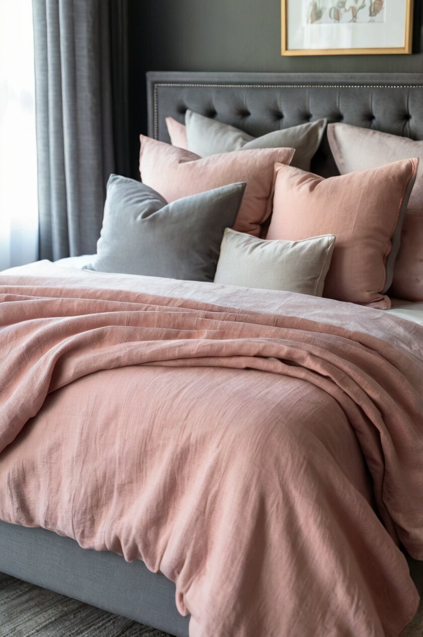
2. Blush Pink for Soft Sophistication

Blush pink has emerged as a modern neutral that pairs exquisitely with gray beds.
This color combination strikes the perfect balance between masculine and feminine energy in the bedroom.
The softness of blush against the solidity of gray creates a sophisticated palette that feels both contemporary and timeless.
For maximum impact, choose a blush with slightly peachy undertones rather than one that leans too purple.
Layer different textures of the same color—perhaps a silk pillowcase, linen duvet, and knit throw—to create visual interest without complicating the color scheme.
This combination works particularly well in bedrooms with natural light, as the sunlight enhances the warmth of the blush tones.
Accessorize with small touches of brass or gold for a truly luxurious feel that complements both the gray and blush.
If full blush bedding feels too committed, start with just a few blush pillows or a throw blanket against white bedding to test the waters.
The key to making this combination sophisticated rather than juvenile is choosing muted, dusty versions of pink rather than bright or bubble-gum varieties.
This color pairing creates a naturally calming environment, making it perfect for creating a restful bedroom retreat.
3. Navy Blue for Bold Contrast

Navy blue against a gray bed frame creates a bold, sophisticated statement that feels both masculine and timeless.
The deep richness of navy provides a striking contrast while still maintaining a cohesive, neutral color story.
This color combination evokes the feeling of a luxury boutique hotel or high-end men’s club.
Navy works particularly well with medium to light gray beds, where the contrast is most pronounced.
Consider incorporating different shades of blue—from navy to indigo to royal—for a tonal approach that adds depth without introducing new colors.
For maximum impact, choose navy bedding with subtle texture like a jacquard pattern or ribbed cotton that catches the light differently from various angles.
Navy and gray pair beautifully with natural wood elements, so consider incorporating wooden side tables or picture frames to warm up the space.
Add crisp white accents through pillowcases or sheet cuffs to break up the intensity and add a fresh dimension to the palette.
This combination works year-round but feels especially cozy during fall and winter months.
Navy bedding hides minor stains and wear better than lighter options, making it practical for everyday use.
4. Earthy Greens for a Natural Retreat

Sage, olive, or emerald green bedding transforms a gray bed frame into a nature-inspired sanctuary.
The combination of green and gray mimics natural elements like stone and foliage, creating an inherently soothing environment.
Green tones work with the cool undertones of gray to establish a cohesive color story with subtle variation.
Lighter sages and mints pair beautifully with lighter gray beds, while deeper emeralds and forest greens complement darker charcoal frames.
Consider incorporating botanical patterns through sheets or pillowcases to enhance the natural theme without overwhelming the space.
Green bedding benefits from natural textile choices like linen or cotton that reinforce the organic aesthetic you’re creating.
Adding wooden accents through bedside tables or picture frames will enhance the earthy quality of this color combination.
The gray-green combination allows for seasonal adaptation—lighter accessories in summer and richer, darker elements in winter.
This nature-inspired palette has been shown to reduce stress and promote better sleep quality, making it functional as well as beautiful.
For a contemporary twist, look for green textiles with subtle metallic threads or details that will catch the light and add dimension.
5. Charcoal and Black for Monochromatic Drama

Creating a monochromatic palette with various shades of gray bedding on a gray bed frame delivers sophisticated, high-design impact.
This approach creates a layered look that’s rich in texture and subtle variation without relying on contrasting colors.
The key to successful monochromatic styling is incorporating at least three different shades of gray—typically light, medium, and dark.
Add visual interest through different textures—perhaps a quilted duvet, knitted throw, and silk pillowcases—all in varying gray tones.
This approach works best when you include true black accents through pillows or a throw to anchor the palette and provide definition.
For added dimension, look for bedding with subtle patterns like pinstripes, herringbone, or geometric designs in similar gray shades.
This monochromatic approach provides the perfect backdrop for a statement art piece above the bed that can introduce a small pop of color.
Gray-on-gray styling works beautifully in modern, minimalist spaces or industrial-inspired bedrooms with exposed elements.
The sophisticated simplicity of this approach makes it perfect for guest rooms or master bedrooms where you want a serene, uncluttered feel.
For warmth, incorporate gray textiles with the faintest undertones of brown, which will prevent the space from feeling too cold or sterile.
6. Yellow Accents for Unexpected Energy
Introducing mustard, amber, or sunshine yellow bedding transforms a gray bed into a vibrant, energizing space.
This unexpected color combination feels both contemporary and timeless, drawing inspiration from trending color palettes in modern design.
Yellow and gray create a visual balance between cool and warm tones that feels inherently harmonious.
For a subtle approach, consider white bedding with strategic yellow accents through pillows, throws, or a folded duvet at the foot of the bed.
This combination works particularly well in bedrooms that don’t receive abundant natural light, as the yellow brings warmth and brightness to the space.
Choose mustard or amber tones rather than bright lemon yellow for a more sophisticated, adult interpretation of this cheerful color.
The gray bed frame helps ground the yellow elements, preventing them from feeling too overwhelming or childish.
This color combination creates a naturally uplifting environment that can help combat seasonal mood changes, especially during darker winter months.
For a cohesive look, incorporate small touches of yellow in other bedroom accessories like a vase, picture frame, or lampshade.
The gray-yellow palette transitions beautifully between seasons with slight adjustments—lighter yellows for spring/summer and deeper mustards for fall/winter.
7. Lavender and Purple for Subtle Luxury
Lavender, lilac, or deeper purple bedding creates an unexpectedly rich pairing with a gray bed frame.
This combination feels both regal and soothing, perfect for creating a bedroom sanctuary that feels special.
The cool undertones in both purple and gray create a naturally cohesive color story that feels intentional and designed.
For a subtle approach, choose barely-there lavender that reads almost as a neutral in certain lights.
For drama, opt for deeper eggplant or amethyst that creates striking contrast against a light gray bed frame.
The purple-gray combination has historical roots in royal and luxury contexts, bringing an inherent sophistication to your bedroom.
This pairing works beautifully with silver accents through picture frames, lamps, or decorative objects.
Consider incorporating small floral patterns that include both purple and gray tones for a coordinated, thoughtful approach.
The psychology of purple suggests creativity and tranquility, making this an excellent choice for artists or those seeking better sleep quality.
To keep the look mature and sophisticated, avoid bright purples in favor of dusty, muted versions with gray undertones.
8. Patterns and Prints for Visual Interest
Introducing patterned bedding is one of the most effective ways to enhance a solid gray bed frame.
Geometric patterns like herringbone, chevron, or simple stripes create visual movement without overwhelming the space.
Floral patterns can soften the modern lines of a gray bed frame, creating an interesting juxtaposition of styles.
When choosing patterned bedding, keep the background color neutral (white, cream, or light gray) with the pattern providing the pop of color.
For a cohesive look, select patterns that incorporate gray as one of the colors to tie back to the bed frame.
Mixing patterns can create a designer look when done thoughtfully—try combining a large-scale pattern on the duvet with a smaller, complementary pattern on sheets or pillowcases.
Abstract patterns work particularly well with modern gray bed frames, reinforcing a contemporary aesthetic.
Consider the scale of patterns carefully—oversized patterns make a bold statement while tiny, repetitive patterns create texture from a distance.
Limit yourself to a maximum of three different patterns in the same color family to avoid a chaotic look.
If you’re pattern-shy, start with just one patterned element—perhaps just the pillowcases or a throw—against solid bedding in a complementary color.
9. Textured Neutrals for Subtle Sophistication
Incorporating highly textured bedding in neutral tones creates depth and interest without introducing competing colors.
Think chunky knit throws, waffle-weave blankets, ribbed duvet covers, or linen with its natural slubbed texture.
The combination of visual texture against the solid structure of a gray bed frame creates a rich sensory experience.
Layer different neutral tones—cream, beige, taupe, and white—for a dimensional look that remains cohesive.
This approach works particularly well in minimalist or Scandinavian-inspired bedrooms where simplicity is key.
Natural fibers like cotton, linen, wool, and cashmere not only provide beautiful texture but also different tactile experiences.
The subtle color variation in textured neutrals catches light differently throughout the day, creating an ever-changing look.
This styling approach allows the architectural elements of your gray bed frame to take center stage rather than competing with bold colors.
For winter months, incorporate faux fur or sherpa elements for maximum coziness against the cool tones of the gray frame.
This textural neutral approach is particularly effective in small bedrooms where too much color or pattern might feel overwhelming.
10. Teal and Turquoise for Mediterranean Vibes
Teal, aqua, or turquoise bedding creates a refreshing contrast against a gray bed frame.
This color combination evokes coastal and Mediterranean influences, bringing a vacation-like ambiance to your bedroom.
The cool blue-green tones complement the coolness of gray while adding vibrancy and energy.
For a sophisticated take, choose jewel-toned teal rather than bright turquoise which can feel casual or juvenile.
This pairing works exceptionally well in bedrooms with abundant natural light, where the colors will show their true depth.
Consider incorporating subtle geometric patterns that include both teal and gray for a coordinated, intentional look.
The gray bed frame helps ground the potentially overwhelming intensity of teal, creating perfect balance.
Add natural elements like woven baskets, driftwood, or plants to enhance the organic, coastal feel of this color combination.
This pairing transitions beautifully between seasons—feeling cool and refreshing in summer and rich and cozy in winter with the addition of extra textures.
For a cohesive look, pull the teal color through your room with small accessories like picture frames, vases, or lampshades.
11. Burnt Orange and Rust for Warm Sophistication
Burnt orange, terra cotta, or rust bedding creates a surprisingly harmonious pairing with cool gray bed frames.
This combination feels earthy yet sophisticated, drawing inspiration from mid-century modern color palettes.
The warmth of orange tones creates perfect balance against the coolness of gray, resulting in a space that feels both energizing and grounded.
This color pairing works particularly well in bedrooms with warm wood elements or natural materials like leather and rattan.
The orange-gray combination has roots in desert and southwestern aesthetics, bringing a subtle earthy quality to contemporary spaces.
For maximum impact, choose rich, saturated orange tones with brown undertones rather than bright citrus variations.
This pairing allows for beautiful seasonal adaptations—lighter oranges in summer and deeper rusts in fall and winter.
Consider incorporating small patterns that include both gray and orange for pillows or accent pieces.
Add metallic accents in brass or copper to enhance the warmth and sophistication of this color scheme.
This combination creates a naturally cozy environment that feels particularly inviting during colder months.
12. Black and White for Graphic Impact
Black and white bedding creates a striking, high-contrast look against a gray bed frame.
This timeless combination feels both modern and classic, working in virtually any style of bedroom.
The neutral gray acts as a perfect mediator between the stark contrast of black and white.
Consider incorporating black and white patterns like stripes, windowpane checks, or bold geometrics for maximum graphic impact.
This approach allows the architectural details of your gray bed frame to become part of the intentional color story.
For a designer look, mix patterns of different scales—perhaps a large-scale pattern on the duvet with a smaller pattern on pillows.
This combination creates a naturally photogenic bedroom that looks straight out of a design magazine.
Add one small accent color through a throw pillow or blanket to break up the monochromatic palette if desired.
This approach works beautifully in contemporary, minimalist, or industrial-style bedrooms.
For a softer version of this look, substitute cream for stark white while maintaining the black accents.
13. Rich Jewel Tones for Luxurious Drama
Deep emerald, sapphire, ruby, or amethyst bedding creates a luxurious, opulent look against a gray bed frame.
This approach feels particularly appropriate for master bedrooms where you want to create a special sanctuary.
The neutral gray allows the richness of jewel tones to shine without competing or creating visual chaos.
For maximum impact, choose saturated, deep versions of these colors rather than bright or pastel variations.
Consider velvet or silk fabrics to enhance the luxurious quality of these rich colors.
This combination creates a naturally cozy, cocoon-like environment perfect for colder months.
Add metallic accents in gold, brass, or copper to enhance the regal quality of this color combination.
To prevent overwhelming the space, limit yourself to one dominant jewel tone with perhaps one complementary jewel tone in a smaller dose.
This approach creates a bedroom with distinctive personality that feels intentionally designed rather than randomly assembled.
Gray’s neutrality provides the perfect balance to the intensity of jewel tones, creating a sophisticated space that feels both bold and restrained.


