I remember walking into my friend’s newly purchased home for the first time last year.
She had been so excited to show me around, proudly pointing out all the decorating she’d done herself.
As an interior designer, I immediately noticed several design missteps – the furniture pushed against walls creating a cavernous middle space, the mismatched lighting creating harsh shadows, and artwork hung way too high on walls.
I smiled and complimented her enthusiasm, but my mind was already redesigning the space.
It wasn’t until she specifically asked for my professional opinion that I gently offered suggestions.
That moment reminded me how differently designers see spaces compared to most homeowners.
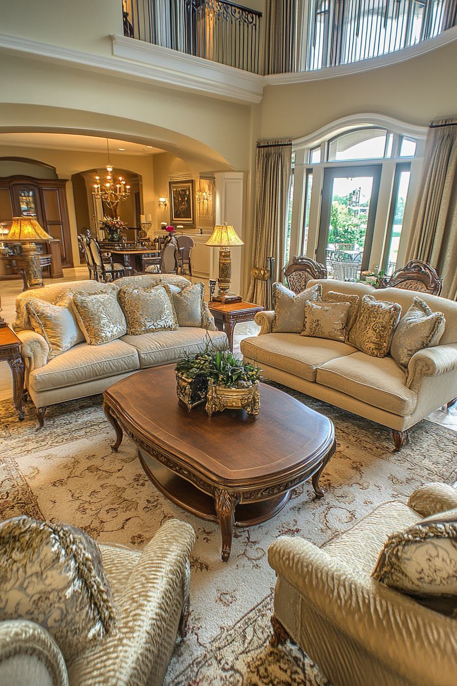
1. Improper Furniture Scaling

Nothing screams “amateur decorator” louder than furniture that’s completely wrong for your space.
Oversized sectionals crammed into tiny living rooms make movement difficult and spaces feel claustrophobic.
Conversely, dainty furniture floating in vast rooms creates a disconnected, unwelcoming atmosphere that feels unfinished.
Professional designers immediately notice when your coffee table is too small for your sofa arrangement or when your dining chairs are dwarfed by your table.
The ideal scale maintains a harmonious relationship between pieces, allowing proper traffic flow while creating visual balance.
A properly scaled room feels intentional rather than accidental, with furniture that complements the architecture rather than fighting against it.
Consider measuring your space before purchasing pieces and using painter’s tape to outline furniture footprints on the floor to visualize the arrangement.
2. Poor Lighting Decisions

Walking into a home with lighting issues is like entering a cave with occasional flashlight beams – immediately uncomfortable and visually confusing.
Most homes rely exclusively on ceiling fixtures that cast unflattering shadows and create harsh overhead light that flattens spaces.
Designers immediately notice when lighting exists at only one height level instead of the ideal three: ambient (general illumination), task (functional lighting for specific activities), and accent (highlighting architectural features or art).
Your lighting choices reveal whether you understand that proper illumination shapes perception, creates mood, and defines function in every room.
Mismatched color temperatures – mixing cool LED bulbs with warm incandescent fixtures – create a disjointed feel that subtly disturbs visual harmony.
Professional designers notice when light fixtures are improperly sized for spaces, like tiny pendants floating above massive islands or overwhelming chandeliers in modest dining areas.
Effective lighting design requires understanding how light interacts with surface materials, colors, and textures throughout the day and evening.
Dimmers are a non-negotiable element for designers because they provide flexibility for different activities and times of day.
The absence of thoughtful lighting at various heights – floor lamps, table lamps, sconces – immediately indicates an incomplete design approach.
3. Wall Art Hanging Mistakes

Nothing makes designers internally cringe faster than improperly hung artwork – it’s like seeing a beautiful frame worn as a hat instead of displayed on a wall.
The most common mistake I notice is the “too high syndrome” – artwork floating awkwardly close to ceilings instead of at eye level.
Professional designers immediately spot when pictures are hung without consideration for scale, creating tiny frames lost on vast walls or oversized pieces dominating small spaces.
Gallery walls assembled without a cohesive plan reveal a haphazard approach that lacks the intentionality good design requires.
The ideal height for hanging art centers around 57-60 inches from the floor to the middle of the piece – approximately average eye level.
When hanging art above furniture, designers look for proper relationships – ideally, the artwork should be no more than 2/3 the width of the furniture below it and hung 8-10 inches above.
Mismatched or poorly chosen frames can undermine even beautiful artwork, creating visual discord that disrupts the overall design harmony.
The absence of art altogether suggests an unfinished space that hasn’t been thoughtfully considered beyond functional furniture placement.
Professional designers notice when art has no relationship to the room’s color palette, style, or emotional intention – creating disconnected visual experiences.
4. Rug Sizing Blunders

Walking into a room with an undersized rug is like seeing someone wearing shoes two sizes too small – immediately noticeable and slightly uncomfortable to witness.
The infamous “postage stamp” rug floating in the middle of a room without touching any furniture is perhaps the most common mistake designers instantly recognize.
Professional standards dictate that at minimum, front legs of seating should rest on the rug to create a cohesive conversation area rather than disconnected furniture islands.
Rugs define zones within spaces, and improper sizing fails to establish these important visual and functional boundaries.
Designers immediately notice when dining room rugs aren’t large enough to accommodate chairs when pulled out – creating both practical and visual problems.
The ideal living room rug extends 12-18 inches beyond furniture on all sides, creating a generous frame for your seating arrangement.
In bedrooms, designers look for rugs that extend at least 24 inches beyond the sides and foot of the bed, allowing for a soft landing when getting up in the morning.
Improper rug placement can make rooms appear smaller, disconnect design elements, and disrupt the visual flow between spaces.
The relationship between rug pattern scale and room size reveals design awareness – oversized patterns can overwhelm small spaces while tiny patterns get lost in larger rooms.
Layering rugs without purpose or placing rugs at awkward angles often appears as forced attempts at stylistic expression rather than thoughtful design decisions.
5. Poorly Executed Window Treatments

One glance at improperly hung curtains immediately reveals a lack of design understanding to professional eyes.
The most obvious mistake is curtain rods installed just above window frames rather than extended toward the ceiling to create height and visual expansion.
Designers instantly notice curtains that barely reach the windowsill or hover awkwardly above the floor instead of properly kissing or puddling on the ground.
Window treatments that fail to extend beyond window frames when open block natural light and make windows appear smaller than they actually are.
Professional designers look for properly weighted fabrics that hang with intention rather than flimsy materials that lack presence and proper drape.
The relationship between window treatment style and overall room design shows whether there’s a cohesive vision or disconnected decorating decisions.
Using the same generic window treatments throughout every room indicates missed opportunities to enhance specific room functions and styles.
Designers notice when window treatments lack proper lining, creating uneven light filtration and potential UV damage to flooring and furniture.
The hardware selected for hanging curtains – from finials to brackets to tie-backs – reveals attention to detail and design consistency (or lack thereof).
6. Furniture Placement Problems

The moment designers enter a room, they immediately assess traffic flow patterns and furniture arrangement logic – noticing when pieces obstruct natural pathways.
The notorious “furniture against the wall” syndrome creates cavernous central spaces that feel unwelcoming and fail to foster conversation or connection.
Professional designers instantly recognize when seating arrangements lack focal points or conversational groupings that support human interaction.
Furniture placed without consideration for sight lines – blocking views to other rooms, windows, or TVs – reveals a lack of practical space planning.
The relationship between furniture pieces matters tremendously – coffee tables too far from sofas, side tables misaligned with seating, dining chairs crammed too closely together.
Designers observe whether furniture serves the room’s actual function or simply adheres to conventional expectations (like formal dining rooms that would better serve as home offices).
The absence of negative space – areas intentionally left empty – creates visual clutter and prevents the eye from appreciating design elements.
Professional designers notice when furniture doesn’t account for human behavior patterns, like inadequate surfaces near entry points for mail and keys or insufficient lighting near reading areas.
Furniture arrangements that ignore architectural features – fireplaces, built-ins, windows – miss opportunities to enhance and highlight a home’s inherent character.
7. Neglected Transitional Spaces
Entryways, hallways and stairwells frequently reveal whether homeowners understand that every square foot deserves design attention – not just primary living areas.
Designers immediately notice barren entryways lacking functional elements like designated places for keys, mail, shoes, and outerwear.
The absence of personality in transition spaces suggests a utilitarian rather than holistic approach to home design.
Professional designers recognize that these connective areas establish important first impressions and set expectations for what follows.
Hallways without artwork, lighting, or purpose beyond passage represent missed opportunities to create visual journeys between destinations.
Designers notice when stairwells lack proper lighting – both for safety and aesthetic enhancement of architectural elements.
Transitional spaces offer perfect opportunities for bold design statements that might overwhelm larger areas – through wallpaper, dramatic lighting, or concentrated art displays.
The neglect of these areas often indicates budget prioritization issues rather than intentional minimalism – revealing underlying design approach limitations.
Professional designers observe whether these spaces maintain consistent design language with adjacent rooms or exist as disconnected afterthoughts.
8. Misunderstood Color Application
Walking into spaces with jarring color combinations or monotonous palettes immediately signals color confidence issues to design professionals.
Designers instantly notice when accent walls appear as random paint decisions rather than thoughtful highlighting of architectural features or focal points.
The relationship between wall colors, flooring tones, furniture finishes, and fabric selections reveals whether there’s a cohesive color strategy or disconnected choices.
Professional designers observe whether colors enhance or fight against a home’s natural light conditions – particularly important in north-facing versus south-facing rooms.
The infamous “builder beige” throughout entire homes indicates missed opportunities to define spaces and create emotional responses through color psychology.
Designers notice when color transitions between rooms lack logical flow – creating abrupt visual experiences when moving throughout the home.
The balance between neutrals and accent colors often reveals amateur approaches – either everything beige or chaotic rainbow effects without restraint.
Professional designers recognize when trending colors appear without consideration for the home’s architecture, geographical location, or the inhabitants’ personal color affinities.
Color application extends beyond wall paint to how hues repeat and relate throughout furnishings, accessories, and architectural elements – creating visual rhythm or dissonance.
9. Ignored Vertical Space
Designers immediately scan walls and vertical planes to assess whether homeowners understand that good design extends beyond floor layouts to include the full volume of rooms.
The most common oversight is barren upper wall areas that create top-heavy emptiness while visual elements cluster at lower levels.
Professional designers notice when artwork, shelving, and architectural details fail to draw the eye upward, missing opportunities to create visual interest throughout the space.
The relationship between ceiling treatments, wall applications, and floor coverings reveals whether there’s three-dimensional thinking or merely flat surface decoration.
Designers observe whether tall walls in two-story spaces have been addressed appropriately or left as intimidating blank canvases.
The strategic use of vertical elements – bookcases, floor-to-ceiling drapery, tall plants, architectural moldings – indicates spatial awareness beyond furniture arrangement.
Professional designers recognize when kitchen cabinets stop short of ceilings, creating dust-collecting gaps and missed storage opportunities that break vertical flow.
The treatment of staircases as vertical design elements rather than merely functional transitions reveals sophisticated spatial understanding.
10. Disregarded Proportions and Scale
Walking into rooms with wildly mismatched proportions immediately triggers designer alarm bells – like tiny accessories lost on massive surfaces or oversized elements crowding modest spaces.
Designers instantly assess whether furniture, lighting, art, rugs, and accessories maintain appropriate scale relationships to each other and to the room itself.
The balance between visual weight and negative space reveals intuitive understanding of composition principles or their absence.
Professional designers notice when accessories appear as random collections rather than curated groupings with intentional proportional relationships.
The scale of pattern selections – from tiny prints to bold graphics – demonstrates awareness of how pattern size affects spatial perception.
Designers observe whether architectural details like crown molding, baseboards, and door casings maintain appropriate proportions for ceiling heights and overall room dimensions.
The sizing of lighting fixtures relative to tables, rooms, and ceiling heights frequently reveals amateur versus professional approaches to scale.
Professional designers recognize when kitchen islands, bathroom vanities, or built-in elements have disproportionate relationships to surrounding spaces.
The careful balance of horizontal and vertical elements creates visual harmony that might not be consciously identified but is subconsciously experienced as “rightness.”
11. Neglected Texture Diversity
One quick scan of a room reveals to designers whether homeowners understand that texture diversity creates visual interest beyond color and pattern.
The most common oversight is texture monotony – rooms consisting entirely of smooth, hard surfaces without tactile contrast to create depth and dimension.
Professional designers immediately notice when spaces lack layering through varied textural elements – rough, smooth, shiny, matte, nubby, sleek, natural, and manufactured surfaces.
The absence of natural elements – wood, stone, plants, textiles – creates sterile environments that lack the organic variation that makes spaces feel alive and inviting.
Designers observe whether texture choices support or contradict intended room functions – like cold, slick surfaces in spaces meant for relaxation.
The strategic use of texture to highlight focal points or define zones indicates sophisticated design understanding beyond decorative afterthoughts.
Professional designers recognize when texture choices fail to consider acoustic properties – creating echoing, uncomfortable sound environments in hard-surfaced rooms.
The balance of textural elements through upholstery, window treatments, floor coverings, wall finishes, and accessories reveals intentional design depth or one-dimensional thinking.
12. Attachment to Matching Sets
Walking into rooms with perfectly matching furniture suites immediately signals to designers a missed opportunity for creating spaces with character and personality.
Designers instantly recognize the “showroom effect” – entire rooms purchased from single collections that create uniform height, finish, and style without visual interest.
The absence of collected, curated elements suggests prioritizing convenience over creating spaces that tell personal stories and evolve over time.
Professional designers notice when every piece of furniture matches perfectly – all woods the same tone, all metals identical finishes – creating flat, predictable environments.
The relationship between different furniture styles, eras, and materials reveals design confidence when thoughtfully mixed or design timidity when rigidly matched.
Designers observe whether accessories appear as thoughtfully collected items or coordinated sets purchased simultaneously – lacking the depth that comes from meaningful acquisition.
The balance between cohesion and variety distinguishes sophisticated design approaches from formulaic solutions that prioritize “matching” over “coordinating.”
Professional designers recognize that interests in specific periods or styles can be honored without slavish dedication to matching every element in a space.
13. Obvious Decorating Formulas
Designers immediately recognize cookie-cutter approaches that follow rigid decorating formulas without consideration for a home’s unique architecture or the inhabitants’ authentic lifestyles.
The infamous “accent wall + matching throw pillows + coordinating rug” recipe appears repeatedly in homes that prioritize formulaic solutions over personalized design thinking.
Professional designers notice when spaces feel like three-dimensional Pinterest boards – assemblages of trending elements without cohesive vision or personal meaning.
The relationship between decor and actual lifestyle reveals whether spaces truly support inhabitants’ daily patterns or merely project idealized versions of home life.
Designers observe whether furniture arrangements follow conventional expectations or thoughtfully adapt to family activities, traffic patterns, and functional priorities.
The presence of design clichés – words stenciled on walls, mass-produced “inspiration” signs, predictable holiday decorations – indicates reliance on external validation rather than personal expression.
Professional designers recognize when homes become time capsules of specific trends rather than evolving expressions of the inhabitants’ developing tastes and experiences.
The balance between trend awareness and timeless design principles separates thoughtful curation from fashion-focused decorating that quickly appears dated.
Flooring

One of the very first things interior designers notice is your flooring.
They look down to analyze what type of flooring you have chosen and assess its condition.
Is it hardwood, tile, concrete, laminate?
Engineered or solid hardwood?
Carpeted or bare floors?
Stained concrete or polished concrete?
Designers also look for how the flooring flows from room to room.
Having cohesive flooring materials and colors throughout promotes an orderly, put-together look.
On the other hand, clashing materials or a hodgepodge of different flooring types in each room reads as chaotic.
Pay attention to the state of your floors too.
Scratches, stains, worn areas, and damage are red flags.
Interior designers will consider whether refinishing or replacing floors is needed to give the home a fresh, polished look.
They also take note of whether area rugs are needed to warm up bare floors or help define seating arrangements.
Furniture Layouts

How furniture is arranged and positioned is another one of the first things interior designers analyze.
They pay attention to the layout and floor plan – how items are placed in relation to one another and the flow between rooms.
In the living room, they’ll notice if the primary sofa faces the focal point of the room and if the additional seating relates well to the coffee table and fireplace.
For the kitchen, they assess if the table connects to the kitchen work triangle properly.
In bedrooms, they look at whether the bed feels balanced between nightstands and other furnishings.
Interior designers consider the furniture layout in terms of functionality and spaciousness.
Too much furniture crammed into a room makes it feel cluttered.
On the flip side, sparse furnishings with too much empty space can feel cold.
The ideal layout has purposeful, complementary positioning and enough room to move around comfortably.
Window Treatments


Interior designers also take note of window treatments – or lack thereof – right off the bat.
Uncovered windows can look unfinished and bare.
On the other hand, heavy drapes in a room with ample natural light give a formal, stuffy feel.
They analyze what types of shades, blinds, curtains, or shutters you have.
Assessing factors like privacy, light control, and bringing in natural light are top of mind.
Do the window treatments fit the architectural style and interior design of the home?
Traditional homes tend to have more ornate treatments like gathered drapes, while modern spaces look best with sleek roller shades.
Making adjustments to window treatments is an easy upgrade interior designers often recommend.
It can make a noticeable impact on the ambiance and put-together look of a room.
Lighting Sources

Lighting is a key focus area interior designers examine right away.
They look up to see what types of lighting you have – overhead, lamps, sconces, chandeliers, etc.
The variety, placement, and brightness of lighting fixtures throughout a home influence the overall ambiance.
Too little lighting casts dark shadows, making rooms feel gloomy and cave-like.
Bright ceiling lights alone create glare and a sterile, office-like environment.
A thoughtful mix of natural light, general ambient lighting, and task lighting is ideal.
Interior designers consider if and where supplemental lighting fixtures could highlight decor, brighten up darker corners, or create cozy mood lighting.
They envision how adjustments can make spaces more lively, functional, and visually appealing through lighting design.
Furniture Style & Condition


Interior designers also pay close attention to the furnishings in a home.
What immediately stands out to them are the styles and finishes present.
A cohesive style makes a space feel pulled together and luxurious.
Mismatched furniture styles can read as disjointed or haphazard.
Designers look for whether the furnishings properly fit the size of the rooms too.
Overly bulky, oversized furniture crowds spaces quickly.
Petite accent chairs in an expansive living room with tall ceilings make the room feel empty rather than grand.
Worn, dated, or damaged furniture is another red flag interior designers notice.
Aged wood finishes, torn upholstery, and chipped tables signal a need for replacement pieces.
Just a few new, on-trend statement pieces mixed into a room can refresh the look instantly.
Artwork
The artwork present in a home is another area interior designers hone in on immediately.
Specifically, they look at the arrangement, scale, and frames chosen.
A gallery wall makes a big visual impact when unified by color schemes, frame styles, or subject matter.
Yet many gallery walls appear randomly cobbled together without cohesion.
Over or under-sized art visibly throws off balance in a space.
A collection of similar small prints packed together can get lost in a large room with high ceilings.
Meanwhile, one small painting floating alone on a massive empty wall shows awkward negative space.
Cheap poster prints in basic frames make areas feel like a dorm room rather than an upscale space.
Interior designers suggest framing prints or choosing a few key statement pieces as focal points in lieu of cluttered, mismatched collages.
Accessorizing

Accessories bring visual interest into spaces when selected thoughtfully.
Interior designers immediately spot sparse, bare surfaces that look unfinished or overlooked.
Yet overloading surfaces and spaces with tchotchkes comes across as messy and distracting.
Interior designers look for accessorizing opportunities to inject colors, textures, and personality.
This includes layering in pillows and throws onto sofas or beds.
Sculptural items on bookshelves, vases with floral arrangements, trays with candles or coffee table books creatively fill empty surfaces.
Scent Impression


Believe it or not, interior designers notice how your home smells too!
They pick up on ambient scents wafting through the home when first walking in.
Pleasant subtle aromas like cinnamon-apple or fresh laundry smell clean and welcoming.
Strong odors come across negatively though.
Pet smells, old sports equipment, takeout food, and stale air make poor first impressions on designers.
It signals a lack of fresh airflow and circulated air.
They make note to suggest air purifiers, opening windows more regularly, and using fresh flowers or essential oils to elevate the scent.
First whiffs of your home’s scent stick with interior designers as they evaluate what ambient aromas would boost the atmosphere.
It’s an often overlooked yet impactful detail.
Entryways & Foyers

Interior designers especially focus on the entryway and foyer of homes, as this sets the visual tone upon arrival.
A beautiful front door, stylish lighting fixtures, wall art, a console table vignette, and decorative mirrors make impressive statements in foyers.
Or does your entryway lack much style or presence?
Cluttered layers of outerwear, loose shoes, and accessories scattered about a foyer reads as disorganized, interior designers note.
Necessary items like umbrellas should have a dedicated storage spot to keep areas tidy.
Clean lines and minimal layers near the front door maintain an orderly appearance.
Additionally, interior designers look to see if the style of the entryway cohesively flows with adjacent rooms.
All spaces transition smoothly when wall colors, flooring, lighting, and decor continue in a complementary way.
Color Schemes

The color palette present throughout a home sticks out immediately to interior designers too.
They notice not just the main wall colors, but how accent colors play off one another as well.
A cohesive scheme with two or three colors threaded throughout rooms makes the design feel intentional.
Yet clashing colors can feel jarring and chaotic as you move from room to room.
Dated, bold wallpaper prints scream for an update.
And even all-white spaces feel flat and uninspired without contrasting hues in textiles and decor.
Interior designers look to inject more personality and visual interest through an updated color palette.
Storage Solutions

Interior designers also assess the storage solutions in place throughout a home – including how well concealed and organized they are.
Mismatched bins and containers piled up on counters makes areas feel cluttered.
Yet custom built-in cabinetry and shelving offers seamless unified storage.
Interior designers seek to maximize underutilized nooks and corners with clever storage spots as well.
Repurposing an awkward angled space beneath a stairwell with cabinets streamlines odds and ends.
Storage ottomans, wall-mounted racks, and cabinet inserts optimize room for tucking away items.
Multi-functional furniture conceals clutter while serving dual purposes.
Quality of Materials

High-quality materials make spaces feel polished, elegant, and luxurious.
Whereas lower-grade finishes, textures, and fabrics signal opportunities for upgrades.
Designers look at countertops, cabinets, flooring, furniture, and decorative metals with a discerning eye.
Quartz countertops with pronounced veining versus budget laminate counters make vastly different style impressions.
Custom cabinetry with sturdy hardwood doors and soft-close hinges differs from stock cabinetry.
Likewise, nubby low-pile carpet reads as inferior to plush wool fibers underfoot.
A scratchy cotton sofa screams for a buttery leather upgrade.
And brass plated fixtures that are already tarnishing can be swapped for solid brass hardware and lighting.
Interior designers crave richness in the materials incorporated throughout a space.
The quality comes through visually and sensorily when using wood grains with beautiful figuring, smooth natural stone, sumptuous textiles, and real metals.
High-end durable materials withstand wear-and-tear gracefully as well.
Architectural Features

Finally, interior designers pay close attention to any special architectural features within a space.
This includes the home’s overall architectural style, along with unique built-ins, open floor plans, fireplaces, ceiling moldings and beams.
Interior designers look to highlight these special features through decor choices.
For example, a massive stone fireplace could display an oversized artwork above.
Or custom millwork and paneling could be painted a dramatic, contrasting color.
Objects placed on mantles and shelves draw eyes to the beautiful details.
Flooring, furniture placement, work triangles, window treatments, lighting, art and accessories, scents, storage, colors, and architectural details all reveal opportunities for elevating the space.
Gaining awareness of what catches a designer’s eye right away helps maximize positive first impressions.


