remember walking into a friend’s kitchen for the first time and being absolutely blown away by how stunning her dark wood cabinets looked.
The secret?
The perfect paint color on the walls that made those cabinets pop like never before.
If you’re like me and love the rich, classic look of dark wood cabinets but struggle to find the right paint color to complement them, you’re in luck.

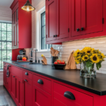
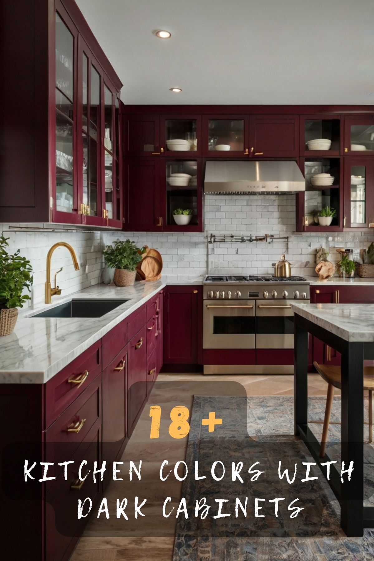
Bordeaux Wine Red

Bordeaux red creates an absolutely stunning combination with dark wood cabinets that feels both elegant and cozy.
This deep, rich red has purple undertones that complement the warm tones in most dark woods perfectly.
When you paint your walls this sophisticated color, your kitchen instantly feels like a high-end restaurant or wine cellar.
The dark wood cabinets become even more dramatic against this bold backdrop.
Your guests will be amazed at how rich and luxurious everything looks together.
Bordeaux works especially well if your cabinets have cherry or mahogany tones because the colors share similar warm undertones.
You don’t have to worry about this color being too bright or overwhelming because it’s deep and moody.
The combination creates a space that feels intimate and perfect for entertaining.
This color choice makes your kitchen feel like the heart of your home where people naturally want to gather.
You can add gold or brass hardware to make the whole look even more elegant.
White or cream countertops look amazing against both the red walls and dark cabinets.
The contrast between the three colors creates visual interest without being too busy.
If you’re worried about the room feeling too dark, you can use this color on just one accent wall.
Even a single bordeaux wall behind your stove or sink will make a huge impact.
The key is to make sure you have good lighting to show off how beautiful this color combination really is.
Pendant lights or under-cabinet lighting will help the red walls glow and make your dark cabinets look even richer.
Tap to Explore These Beauties
See my ideas in action 👇 Tap any image to explore full details.
Deep Pink Blush

Deep pink might sound scary for a kitchen, but this sophisticated blush shade is absolutely gorgeous with dark wood cabinets.
This isn’t the bright hot pink you might be thinking of – it’s a muted, dusty pink that feels grown-up and elegant.
The warm undertones in this color bring out the natural beauty in dark wood while adding a soft, feminine touch.
Your kitchen will feel welcoming and unique without being too bold or overwhelming.
This color works amazingly well if you want your space to feel warm and inviting rather than formal.
Deep pink blush is perfect for creating a farmhouse or cottage-style kitchen that still feels modern.
The combination of dark wood and soft pink creates beautiful contrast that’s not too dramatic.
You’ll love how this color makes your kitchen feel like a cozy retreat where you actually want to spend time.
This shade works especially well with espresso or dark walnut cabinets because the contrast is striking but harmonious.
You can pair this wall color with white or light gray countertops for a fresh, clean look.
Brass or gold hardware on your cabinets will tie everything together beautifully.
The pink walls will make your dark cabinets look even more rich and expensive.
If you’re nervous about using pink in your kitchen, start with just one accent wall to see how you like it.
You can always paint the rest of the walls the same color later if you love the look.
This color is perfect if you want your kitchen to feel different from every other kitchen in your neighborhood.
Your friends will be impressed by how sophisticated and unique your space looks.

Navy Blue

Navy blue is one of the most timeless and elegant colors you can choose for walls with dark wood cabinets.
This classic color creates a sophisticated look that never goes out of style.
The deep blue provides beautiful contrast against dark wood while still feeling harmonious and balanced.
Your kitchen will look like it belongs in a luxury home or high-end magazine.
Navy blue works with almost any style, from traditional to modern to farmhouse.
This color makes dark wood cabinets look even more rich and beautiful.
The combination feels both cozy and elegant at the same time.
You can’t go wrong with this classic pairing that interior designers love.
Navy blue is especially stunning with cherry or mahogany cabinets because the colors complement each other perfectly.
The blue walls will make your wood cabinets look warm and inviting.
You can add white or light gray countertops to brighten up the space and create beautiful contrast.
Silver or brushed nickel hardware looks amazing with this color combination.
The navy walls provide the perfect backdrop for displaying white dishes or colorful accessories.
If you want to add some warmth, consider brass or gold accents like light fixtures or cabinet pulls.
This color choice works well in both large and small kitchens because it doesn’t overwhelm the space.
Navy blue actually makes rooms feel larger and more open than you might expect.
The key is to have good lighting to prevent the space from feeling too dark.
Under-cabinet lighting and pendant lights will help show off how beautiful this color combination really is.
✦ You Might Love This
These Trendy Color Combinations Will Make Your Brown Cabinets Pop! Keep Reading →Cloud White – This very soft, almost grayed neutral works perfectly to brighten up dark cabinets without feeling too stark. It’s elegant and calming

Cloud White is the perfect pale neutral to pair with dark cabinets.
As the name suggests, cloud white is extremely light and bright.
This helps open up the space and make dark cabinets feel less overwhelming.
The white reflects light well and bounces it around the kitchen.
The tone of cloud white is clean and refined, leaning more cool than warm.
This makes it feel sophisticated and high-end.
It’s a crisp neutral that looks polished with darker wood.
Because cloud white is so pale, it allows the grain and character of wood cabinets to really pop.
The contrast between light and dark makes cabinetry details like knots and mineral streaks stand out.

💭 I Wrote a Book About My Biggest Decorating Mistakes!
When I decorated my first home, I thought I knew what I was doing. Spoiler: I didn’t. 😅
💸 I bought a sofa way too big for my living room. Paint colors that looked amazing in the store but terrible on my walls.
White is easy to pair with most colors, from bold blues or greens to soft blushes and taupes.
It provides a solid backdrop to build upon.
Cabinets anchor the space while walls can take on personality.
White maintains its appearance extremely well as it doesn’t show scuffs or stains as easily as darker colors.
It has enduring curb appeal and won’t feel dated over time.
In my experience, cloud white is the top choice for lightening up dark cabinetry in a subtle, elegant way.
The contrast is striking yet balanced—making for a sleek, sophisticated look.
It truly lets the beauty of the wood shine through.
Dove Gray – For those wanting something a touch warmer than true white, dove gray is ideal. It has a subtle softness that doesn’t overwhelm the cabinets

Dove gray is a soft, sophisticated color that creates a beautiful, calming atmosphere with dark wood cabinets.
This gentle gray has warm undertones that prevent it from feeling cold or sterile.
The combination of gray walls and dark wood creates a modern, elegant look that feels both cozy and sophisticated.
Your kitchen will look like it belongs in a high-end design magazine.
Dove gray is perfect if you want something more interesting than white but not as bold as a bright color.
This color makes dark wood cabinets look even more rich and beautiful.
The subtle contrast creates visual interest without being overwhelming or dramatic.
Your guests will love how calm and peaceful your kitchen feels.
Dove gray works especially well with espresso or dark walnut cabinets because the combination feels balanced and harmonious.
This color choice is perfect for creating a spa-like atmosphere in your kitchen.
You can add white or light countertops to brighten up the space and create beautiful contrast.
Stainless steel appliances look amazing with this color combination.
The gray walls provide a perfect neutral backdrop for any style of decor.
You can add colorful accessories or keep everything neutral – both look great.
This color is trending in interior design because it’s both modern and timeless.
Dove gray will never look dated or go out of style like some trendy colors might.
The combination works well in both large and small kitchens because it doesn’t overwhelm the space.
Good lighting will help show off how sophisticated and beautiful this color pairing really is.
Find Your Room’s Color Palette
Tap a vibe — get a curated 5-color palette with hex codes you can copy ✨
Rice Milk – As the name suggests, this pale beige is creamy and comfortable. It allows the cabinets to still stand out while keeping the space feeling light

Rice milk is a warm, creamy off-white that creates a cozy, inviting atmosphere with dark wood cabinets.
This color has subtle beige undertones that make it feel warmer than pure white.
The soft, neutral walls make dark wood cabinets look rich and beautiful without creating too much contrast.
Your kitchen will feel like a warm hug – comfortable and welcoming.
Rice milk is perfect if you want the brightness of white but with more warmth and personality.
This color makes your space feel larger and more open while still being cozy.
The combination creates a timeless look that will never go out of style.
Your family and friends will love spending time in this inviting space.
Rice milk works beautifully with any type of dark wood cabinet, from cherry to walnut to espresso.
The warm undertones in this color complement the natural warmth of wood perfectly.
You can add any color accents you want because this neutral base goes with everything.
Colorful artwork, plants, or accessories will look amazing against these soft walls.
This color choice is perfect for creating a farmhouse or cottage-style kitchen.
Rice milk also works well in modern kitchens where you want warmth without being too bold.
The color reflects light beautifully, making your kitchen feel bright and airy.
This is an especially good choice if you have limited natural light in your kitchen.
You can pair rice milk walls with white or cream countertops for a soft, cohesive look.
The result is a kitchen that feels both elegant and comfortable.
Pale Oak – A muted wood-toned color, pale oak combines warmth with lightness. It works beautifully with natural materials like stone

Even though it’s lighter, Pale Oak has brownish yellow undertones similar to most wood tones.
This helps it blend cohesively versus stark contrast.
The wood-like hue creates an organic, relaxed atmosphere.
It feels pulled from nature unlike sterile whites which can be too clinical.
Pale Oak reads as light gray in some lights but takes on warmth in others.
This dimensional quality prevents it from being flat.
While light, the woody element gives it more character than white.
Pale Oak feels polished and pairs well in both modern farmhouse and traditional designs.
Its near-taupe depth highlights grooves and detail in wood cabinetry versus flattening features out.
Grain pops beautifully.
As a painted wood tone, Pale Oak holds up well over time taking on a fade that adds personality versus looking shabby.
Pale Oak makes the most of dark wood’s natural charms through flattering, compatible undertones.
It’s a relaxed pairing that feels pulled together and built to last.
The similarity in hue creates a seamless space.
Ochre – A buttery yellow is an optimistic choice. Ochre is versatile and cheery without being high-impact

As a buttery yellow shade, Ochre feels vibrant, happy and energetic where darker cabinets could feel heavy.
It brightens the space.
The color literally seems to bounce sunlight around and glow from within.
It makes even gloomy kitchens feel sunlit.
Ochre is understated enough to blend with most styles yet vibrant enough to be the center of attention without dominating.
Its mellow yellow depth stands out beautifully against espresso or walnut stained wood, bringing out details through luminosity.
Timeless Appeal: Yellow is a perennial favorite that suits every generation.
Ochre marries modern edges with vintage warmth in one sweep.
Unlike some colors, Ochre feels as happy in dreary months as bright.
It combats winter blues every day with its sheer optimism.
Ochre is an uplifting choice for those wanting to energize darker cabinets without bold color scream.
Its mellow yet solar glow works magic.
The pairing is fresh and bright.
Blush – Think barely-there pink. Blush is delicate and romantic, great for those wanting a hidden pop of color

Blush adds just a hint of soft feminine color without being too loud or overwhelming.
It’s the perfect subtle pop.
Even though it’s a very light and pale pink, it helps brighten up dark cabinets in a way that neutral tones don’t.
The soft pink undertones create a romantic, welcoming atmosphere that fits well with common kitchen design styles like farmhouse.
The light contrast allows cabinetry details like wood grain to really shine through without distracting from the artwork of the wood.
As a very pale shade, blush acts as a nice neutral backdrop for introducing colors, patterns, backsplashes down the line.
Pastel pink is a perennial favorite that never goes out of style.
Blush adds softness without dateable trends.
Blush pairs beautifully for those wanting to subtly feminize or add springtime cheer to a space dominated by rich browns.
The juxtaposition is both pretty and cultivated.
Sage Green

Sage green is a soft, muted green that creates a peaceful, spa-like atmosphere with dark wood cabinets.
This color has gray undertones that make it feel sophisticated and modern.
The combination of sage walls and dark wood creates a natural, earthy look that’s both calming and elegant.
Your kitchen will feel like a serene retreat where you can relax and unwind.
Sage green is perfect if you love the idea of green but want something subtle and sophisticated.
This color makes dark wood cabinets look warm and inviting rather than heavy.
The soft contrast creates visual interest without being overwhelming.
Your guests will comment on how peaceful and beautiful your kitchen feels.
Sage green works especially well with walnut or cherry cabinets because the colors share warm undertones.
This color choice is trending in interior design because it brings nature indoors.
You can add white or light stone countertops to brighten up the space.
Natural wood accessories and plants will enhance the organic feeling of this color combination.
The sage walls provide a perfect backdrop for white dishes and natural textures.
This color works well in kitchens with lots of natural light because it enhances the connection to nature.
Sage green is also calming enough to use in breakfast nooks or dining areas.
The color creates a cohesive flow throughout your kitchen and eating spaces.
If you’re nervous about using green, sage is a safe choice because it’s so soft and neutral.
This color will make your kitchen feel like a peaceful oasis in your home.
What’s Your Decor Personality?
5 questions · 30 seconds · Instant style match 🏡
💭 I Wrote a Book About My Biggest Decorating Mistakes!
When I decorated my first home, I thought I knew what I was doing. Spoiler: I didn’t. 😅
💸 I bought a sofa way too big for my living room. Paint colors that looked amazing in the store but terrible on my walls.
Putty – An approachable taupe that adds visual interest. Putty looks especially nice with brass or gold accents

Putty is a neutral taupe shade that works with many styles from modern farmhouse to traditional.
It allows the cabinets to take center stage.
Although it’s a medium grayed tone, putty has brownish undertones that make it feel cozy instead of cold like true grays can.
The tonal contrast with dark cabinets emphasizes the attractive grain patterns and natural variations in the wood.
Putty feels very polished and sophisticated.
It dresses up richer wood tones without overwhelming them.
Unlike stark whites, putty’s dimension won’t date it over time as dirt and scuffs blend in naturally.
Its neutral canvas provides a perfect backdrop to layer in brass, copper or gold open shelving, hardware and fixtures.
Putty is the ideal companion color for dark stained wood as it flatters without competing.
The balanced pairing is both warm and dignified.
Hazy Grape – Wine colors liven up dark cabinets while still feeling elegant

Wine colors are seen as refined and elegant.
Hazy Grape has those qualities while still feeling soft and livable.
Unlike neutral colors, the subtle purple hue adds another layer of depth and artistic flair to the space.
It’s eye-catching.
Even though it’s a dark color, the blue-purple undertones help create a moody yet lively atmosphere that neutral colors can lack.
The tonal contrast emphasizes texture and natural irregularities beautifully in the cabinets without overwhelming them.
Timeless Appeal – Wine colors are perennially stylish.
Hazy Grape feels romantic and composed, flattering the cabinets for years to come.
Its deep base allows room to add layered patterns, metallic accents, or artwork without everything blending together too much.
Hazy Grape pairs gorgeously with natural materials like wood for a dramatic yet cultivated look.
The marriage of purple and chocolate is both sumptuous and modern.
The pairing feels fashionable and elegant.
Fog – Light gray is a chic alternative to white. Fog has character and pairs well with mixed metals
As a very pale, light gray, Fog takes the edge off stark black or brown cabinets in a soothing way.
Gray is a quintessential modern neutral.
Fog feels ultra sleek and polished when paired with the richness of wood.
The subtle contrast allows pleasing wood grains and knots to stand out instead of disappearing into the background.
As an adaptable neutral, Fog is the perfect canvas for changing decorative accents seasonally without repainting.
Its light color masks fingerprints and everyday smudges that build over time on darker walls.
Fog will age gracefully as natural light causes it to take on subtle variations – avoiding a flat look long-term.
Fog is the perfect contemporary backdrop for feature cabinets, creating an elegant synergy between light and dark.
The high-end pairing feels fresh and tailored.
Sand – On the warmer side of neutrals, sand is sandy beige perfection for a comfortable, organic vibe
As a very light neutral beige, Sand gently lightens and warms dark stains without high contrast.
Its golden undertones almost glow to bounce light around the space and seem sun-drenched.
Beiges are perennially popular for their versatility.
Sand feels both classic and modern.
The subtle gap emphasizes the natural character of wood through interesting knots and swirls.
Unlike stark whites, Sand gracefully mellows and takes on an inviting vintage patina as it ages.
Its mild palette allows room to feature cabinetry.
Plus, it pairs with any style from industrial to lodge.
Sand is as elegant with espresso as it is with ebony.
The natural synergy it creates flatters furnishings for years.
I see it as the ideal choice for those seeking a sophisticated yet soothing neutral backdrop.
This or That?
Pick your fave — see what other readers chose! 👀
Cornflower – Pale blue is classic for a reason. Cornflower fits right in without dominating
Unlike neutral shades, Cornflower offers a pop of calming color that complements wood tones beautifully.
Even as a pastel, the blue undertones help lift darker spaces in an understated way that feels fresh.
The pale hue leans warm and takes the edge off stark cabinetry without overwhelming hardwood character.
The subtle contrast allows attractive grains and characters of the wood to really stand out in the spotlight.
Perennial favorites like pale blue are dependable styles that maintain their charm over decades.
Its soft base invites woven baskets, floral accents, or blue and white patterns for country-chic warmth.
Cornflower suits everything from lodge to coastal grandma aesthetics.
It dresses rich tones up or down.
Cornflower pairs luxuriously with walnut or mahogany trim for a polished look that’s light, feminine but enduringly stylish through trends.
The union is both classy and calm.
While neutral palettes are always versatile, bolder hues like blush, emerald or sapphire can also highlight textural details through tonal contrast in a visual interesting way.
And pale shades like fog, dove or dove tend to soften darkness without overwhelming.
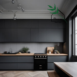
Charcoal Gray
Charcoal gray creates a dramatic, modern look with dark wood cabinets that’s absolutely stunning.
This deep gray provides beautiful contrast while still feeling sophisticated and elegant.
The combination creates a bold, contemporary kitchen that looks like it belongs in a luxury home.
Your space will feel dramatic and sophisticated without being overwhelming.
Charcoal gray is perfect if you love the idea of dark walls but want something more versatile than black.
This color makes dark wood cabinets look even more rich and expensive.
The monochromatic scheme creates depth and visual interest.
Your kitchen will look like a high-end restaurant or modern showroom.
Charcoal gray works especially well with espresso or very dark walnut cabinets.
The similar tones create a cohesive, sophisticated look that’s very on-trend.
💭 I Wrote a Book About My Biggest Decorating Mistakes!
When I decorated my first home, I thought I knew what I was doing. Spoiler: I didn’t. 😅
💸 I bought a sofa way too big for my living room. Paint colors that looked amazing in the store but terrible on my walls.
You can add white or light countertops to break up the darkness and create contrast.
Stainless steel appliances look amazing with this color combination.
The dark walls make colorful accessories or artwork really pop.
This color choice is perfect for creating a masculine or industrial-style kitchen.
Charcoal gray also works well in modern or contemporary home designs.
The combination feels both cozy and sophisticated at the same time.
Make sure you have excellent lighting to prevent the space from feeling too dark.
Under-cabinet lights and pendant fixtures will help show off how beautiful this dramatic combination really is.
Cream
Cream is a warm, rich off-white that creates a classic, elegant look with dark wood cabinets.
This color has yellow undertones that make it feel warmer and more inviting than pure white.
The combination of cream walls and dark wood creates a timeless, traditional look that never goes out of style.
Your kitchen will feel like a beautiful, classic American home.
Cream is perfect if you want the brightness of white but with more warmth and character.
This color makes dark wood cabinets look rich and beautiful while keeping the space feeling light.
The soft contrast creates a comfortable, welcoming atmosphere.
Your family will love gathering in this warm, inviting space.
Cream works beautifully with any type of dark wood cabinet, especially cherry and mahogany.
The warm undertones in both the paint and wood complement each other perfectly.
You can add traditional accessories like copper pots or wooden bowls to enhance the classic look.
This color choice works well with both granite and marble countertops.
Cream walls provide a perfect backdrop for displaying your favorite dishes or artwork.
The color reflects light beautifully, making your kitchen feel larger and more open.
This is an especially good choice for traditional or farmhouse-style homes.
Cream also works well if you’re planning to sell your home because it appeals to most buyers.
The combination of cream walls and dark cabinets feels both elegant and comfortable.
You can update your accessories over time while keeping this classic foundation.
Soft Yellow
Soft yellow brings sunshine and warmth to kitchens with dark wood cabinets.
This gentle, buttery yellow has cream undertones that keep it from being too bright or overwhelming.
The combination creates a cheerful, welcoming space that makes everyone smile.
Your kitchen will feel like a sunny morning even on cloudy days.
Soft yellow is perfect if you want to add personality and warmth to your space.
This color makes dark wood cabinets look rich and beautiful while adding brightness.
The warm contrast creates a cozy, inviting atmosphere that’s perfect for families.
Your guests will love how happy and welcoming your kitchen feels.
Soft yellow works especially well with cherry or mahogany cabinets because the colors share warm undertones.
This color choice is perfect for creating a farmhouse or cottage-style kitchen.
You can add white countertops to keep the space feeling fresh and clean.
Natural wood accessories and plants will enhance the warm, organic feeling.
The yellow walls make your dark cabinets look even more rich and expensive.
This color works well in kitchens with limited natural light because it adds brightness.
Soft yellow is also perfect for breakfast nooks or casual dining areas.
The color creates a cheerful start to every day in your kitchen.
If you’re worried about yellow being too bold, this soft version is very livable.
The combination of soft yellow walls and dark cabinets feels both energizing and comforting.
Psst… Check This Out
Zen Minimalist Kitchen Inspiration That Feels Calm And Stylishp Take Me There →Quick Design Dilemma
Cast your vote — see what other readers think! 🤔
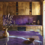
Lavender
Lavender creates a unique, sophisticated look with dark wood cabinets that’s both calming and elegant.
This soft purple has gray undertones that make it feel modern and sophisticated.
The combination of lavender walls and dark wood creates an unexpected but beautiful contrast.
Your kitchen will feel like a peaceful retreat with a touch of luxury.
Lavender is perfect if you want something unique that nobody else in your neighborhood will have.
This color makes dark wood cabinets look warm and inviting while adding personality.
The soft contrast creates visual interest without being too dramatic.
Your guests will be impressed by how sophisticated and unique your kitchen looks.
Lavender works especially well with walnut or espresso cabinets because the cool and warm tones balance beautifully.
This color choice is trending in interior design because it’s both calming and stylish.
You can add white or light gray countertops to keep the space feeling fresh.
Silver or brushed nickel hardware will complement the cool undertones in the lavender.
The color walls provide a perfect backdrop for white dishes and modern accessories.
Lavender works well in kitchens with good natural light because it enhances the soft, peaceful feeling.
This color is also perfect for open floor plans where the kitchen flows into living spaces.
The calming lavender creates a cohesive, relaxing atmosphere throughout.
If you’re nervous about using purple, lavender is a safe choice because it’s so soft and neutral.
This color combination will make your kitchen feel like a sophisticated spa.
Warm Beige
Warm beige is a rich, neutral color that creates a cozy, sophisticated atmosphere with dark wood cabinets.
This color has brown undertones that complement wood beautifully.
The combination of beige walls and dark wood creates an elegant, timeless look.
Your kitchen will feel warm and welcoming while still looking sophisticated.
Warm beige is perfect if you want a neutral color that’s more interesting than white.
This color makes dark wood cabinets look even more rich and beautiful.
The similar warm tones create a harmonious, cohesive look.
Your space will feel like a luxury hotel or high-end restaurant.
Warm beige works especially well with cherry or mahogany cabinets because the colors share warm undertones.
This color choice is perfect for traditional or transitional kitchen styles.
You can add cream or white countertops to brighten up the space.
Natural stone or wood accessories will enhance the warm, organic feeling.
The beige walls make your dark cabinets the star of the show.
This color works well in both large and small kitchens because it doesn’t overwhelm.
Warm beige is also a safe choice if you’re planning to sell your home.
The neutral color appeals to most buyers while still feeling warm and inviting.
You can add any color accents you want because beige goes with everything.
The combination of warm beige walls and dark cabinets will never go out of style.
Teal
Teal creates a bold, modern look with dark wood cabinets that’s absolutely stunning.
This blue-green color has enough depth to complement dark wood without competing with it.
The combination creates a sophisticated, contemporary kitchen with lots of personality.
Your space will feel like a designer showroom that’s both elegant and unique.
Teal is perfect if you want to make a statement but still keep things sophisticated.
This color makes dark wood cabinets look even more rich and dramatic.
The contrast between the cool teal and warm wood creates beautiful visual interest.
Your guests will be amazed by how stylish and modern your kitchen looks.
Teal works especially well with espresso or dark walnut cabinets because the contrast is striking.
This color choice is very on-trend in interior design right now.
You can add white or light countertops to balance the bold wall color.
Brass or gold hardware will warm up the cool teal and tie everything together.
The teal walls make colorful accessories really pop against the dramatic backdrop.
This color works well in kitchens with lots of natural light because it shows off the richness.
Teal is also perfect for modern or contemporary home styles.
The combination feels both bold and sophisticated at the same time.
Make sure you have good lighting to show off how beautiful this color combination really is.
The result is a kitchen that feels both trendy and timeless.
Off-White
Off-white is a soft, neutral color that creates a clean, elegant look with dark wood cabinets.
This color has subtle gray undertones that keep it from being too stark or cold.
The combination of off-white walls and dark wood creates a classic, sophisticated look.
Your kitchen will feel bright and airy while still being warm and welcoming.
Off-white is perfect if you want the cleanliness of white but with more warmth.
This color makes dark wood cabinets look rich and beautiful while keeping the space feeling light.
The gentle contrast creates a timeless look that will never go out of style.
Your family will love spending time in this clean, comfortable space.
Off-white works beautifully with any type of dark wood cabinet.
The neutral color lets the natural beauty of the wood be the star.
You can add any color accents you want because off-white goes with everything.
This color choice works well with both modern and traditional kitchen styles.
Off-white walls provide a perfect backdrop for displaying artwork or colorful accessories.
The color reflects light beautifully, making your kitchen feel larger and more open.
This is an especially good choice if your kitchen has limited natural light.
Off-white is also a safe choice if you’re planning to sell your home.
The combination of off-white walls and dark cabinets appeals to almost all buyers.
You can update your decor over time while keeping this versatile foundation.
💭 I Wrote a Book About My Biggest Decorating Mistakes!
When I decorated my first home, I thought I knew what I was doing. Spoiler: I didn’t. 😅
💸 I bought a sofa way too big for my living room. Paint colors that looked amazing in the store but terrible on my walls.