Are you staring at your Agreeable Gray walls wondering what furniture colors will look best?
This perfect blend of gray and beige (sometimes called “greige”) creates a warm, welcoming backdrop that works in almost any room.
The right furniture color can make your Agreeable Gray walls shine, while the wrong choice might leave your room feeling flat or mismatched.
That’s why understanding which furniture colors work best with Agreeable Gray is so important for creating a space you’ll love.
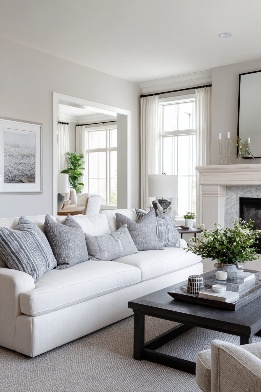
1. Crisp White Furniture

White furniture creates a clean, bright contrast against Agreeable Gray walls that instantly makes any room feel fresh and modern.
When you choose white furniture, you’re setting up a classic pairing that will never go out of style.
Think of white as Agreeable Gray’s perfect partner – they enhance each other without competing.
The subtle warmth in Agreeable Gray helps prevent the white from feeling too stark or clinical.
Instead, the combination creates a soft, welcoming atmosphere that works in any room of your home.
White sofas, beds, or dining tables stand out beautifully against the gray backdrop, creating a visual anchor in your space.
This contrast helps define your furniture pieces and makes them appear more crisp and intentional.
For a living room, consider a plush white sectional that pops against your Agreeable Gray walls.
In the bedroom, a white bed frame creates a serene retreat that feels both clean and cozy.
White dining furniture in an Agreeable Gray dining room creates an elegant, timeless look that’s perfect for both everyday meals and special occasions.
One of the biggest benefits of white furniture with Agreeable Gray is the flexibility it gives you with accessories and accent pieces.
With this neutral foundation, you can easily add pops of color through pillows, throws, artwork, or rugs.
You can change these accents seasonally or when you want a fresh look, all without having to replace your furniture.
To keep white furniture from feeling too flat, look for pieces with interesting textures or details.
A white sofa with button tufting, a dresser with carved details, or dining chairs with unique shapes all add visual interest.
For a more casual vibe, consider off-white or cream furniture that still provides contrast but feels a bit softer and more relaxed.
Remember that white furniture does require some extra maintenance to keep it looking its best.
Performance fabrics and slipcovers can be great options for families with kids or pets.
The beauty of this combination is that it works with any style – from modern farmhouse to contemporary, traditional to coastal.
💭 I Wrote a Book About My BIGGEST Decorating Mistakes!
When I decorated my first home, I thought I knew what I was doing. Spoiler alert: I DIDN’T. 😅
💸 I bought a sofa that was WAY TOO BIG for my living room. I chose paint colors that looked amazing in the store but terrible on my walls. I spent THOUSANDS on pieces that didn’t work together. Sound familiar?
“Things I Wish I Knew Before I Decorated My First Home” is your shortcut to avoiding ALL my costly mistakes. ✨ Inside, you’ll find practical, NO-NONSENSE advice that will save you time, money, and a whole lot of decorating regret. 🏡
🎯 Grab Your Copy Now!2. Rich Navy Blue Furniture
Navy blue furniture creates a sophisticated, dramatic statement when paired with Agreeable Gray walls.
This deep, rich color brings a sense of elegance and depth to any room in your home.
When you place navy blue furniture against Agreeable Gray walls, you create a striking contrast that still feels harmonious.
The warmth in Agreeable Gray softens navy’s intensity, resulting in a balanced, inviting space.
Navy blue is often considered a “new neutral” because it pairs beautifully with so many other colors.
This versatility makes it an excellent investment for your home that will stand the test of time.
In your living room, a navy blue sofa becomes an instant focal point that grounds the space.
The deep color adds a sense of coziness while still maintaining a polished, pulled-together look.
Navy blue accent chairs can create conversation areas that feel intentional and designed.
For your bedroom, navy blue upholstered headboards or bed frames create a restful retreat that feels both on-trend and timeless.
Navy blue dressers or nightstands offer a more subtle way to incorporate this rich color if you’re not ready for larger navy pieces.
In dining spaces, navy blue dining chairs around a light wood or white table create a beautiful contrast that makes mealtimes feel special.
A navy blue buffet or sideboard provides both elegant storage and a touch of color that enhances your Agreeable Gray walls.
When decorating with navy blue furniture, consider metallic accents like brass or gold to add warmth and dimension.
These metallics pop beautifully against both the navy furniture and Agreeable Gray walls.
For a cohesive look, pull in navy blue through smaller accessories like throw pillows, artwork, or rugs throughout your space.
This creates visual flow from room to room without overwhelming your home with dark furniture.
Navy blue furniture works with many different design styles, from traditional to modern coastal to transitional.
The key is choosing pieces that reflect your personal style while complementing your Agreeable Gray walls.
To keep navy from feeling too heavy, balance it with lighter elements like white side tables, natural wood tones, or light-colored textiles.
This creates a balanced space that feels intentional and designed rather than dark or overwhelming.
Design Your Dream Room in Minutes! – By Madison
🏡 Start Creating FREE →3. Natural Wood Tones
Natural wood furniture brings warmth and organic texture to rooms painted in Agreeable Gray.
This pairing creates a grounded, timeless look that never goes out of style.
When you choose natural wood furniture, you’re adding character and depth that beautifully complements the subtle warmth in Agreeable Gray.
The key is finding wood tones that enhance rather than clash with your gray walls.
Medium wood tones like oak, maple, and cherry create a particularly harmonious look with Agreeable Gray.
These woods have warm undertones that echo the beige notes hidden within this popular greige paint color.
Lighter woods like ash, pine, or birch can brighten up a room while still providing that natural element that makes spaces feel lived-in and welcoming.
These lighter woods are especially effective in rooms that don’t get much natural light.
Walnut and mahogany furniture bring richness and sophistication to Agreeable Gray rooms.
These darker woods create beautiful contrast without the starkness that can sometimes come with black furniture.
Mixed wood tones can work beautifully in an Agreeable Gray room, creating a collected-over-time look that feels authentic and personal.
Don’t feel locked into matching all your wood furniture perfectly.
In living rooms, wooden coffee tables, end tables, or entertainment centers add warmth while maintaining a neutral palette.
Look for pieces with interesting grain patterns or unique shapes to add visual interest.
For dining spaces, a wooden table surrounded by coordinating or contrasting chairs creates an inviting gathering place.
Consider a wooden table with different chair styles for an eclectic, designer look.
In bedrooms, wooden bed frames, dressers, and nightstands create a serene retreat that feels connected to nature.
The combination of Agreeable Gray walls and natural wood furniture creates a peaceful backdrop for rest.
Home offices benefit from wooden desks and bookshelves that make the space feel established and professional.
The warmth of wood helps counteract the sometimes-sterile feeling of workspace environments.
To enhance this pairing, consider adding elements like woven baskets, natural fiber rugs, or plants.
These accessories reinforce the organic quality that makes wood furniture so appealing.
The beauty of pairing natural wood with Agreeable Gray is that it works with nearly every design style.
From mid-century modern to farmhouse, Scandinavian to traditional, this combination provides a versatile foundation.
💭 I Wrote a Book About My BIGGEST Decorating Mistakes!
When I decorated my first home, I thought I knew what I was doing. Spoiler alert: I DIDN’T. 😅
💸 I bought a sofa that was WAY TOO BIG for my living room. I chose paint colors that looked amazing in the store but terrible on my walls. I spent THOUSANDS on pieces that didn’t work together. Sound familiar?
“Things I Wish I Knew Before I Decorated My First Home” is your shortcut to avoiding ALL my costly mistakes. ✨ Inside, you’ll find practical, NO-NONSENSE advice that will save you time, money, and a whole lot of decorating regret. 🏡
🎯 Grab Your Copy Now!4. Soft Gray Furniture
Choosing gray furniture to pair with Agreeable Gray walls creates a sophisticated, monochromatic look that feels both modern and timeless.
This tone-on-tone approach brings a sense of calm and cohesion to any room in your home.
When you select gray furniture that’s a few shades darker or lighter than your walls, you create subtle depth without high contrast.
This layered look has become a designer favorite for creating serene, pulled-together spaces.
The key to making this combination work is varying the shades and textures of gray throughout your room.
Too much of the exact same gray can feel flat, while thoughtfully varied grays create dimension.
Light gray furniture like a pale silver sofa or light charcoal chairs creates a soft, airy feeling against Agreeable Gray walls.
This lighter approach works especially well in smaller spaces or rooms with limited natural light.
Medium gray furniture offers just enough contrast to stand out against your walls while maintaining the cohesive, monochromatic theme.
These middle tones are versatile and hide everyday wear and tear better than very light grays.
Darker charcoal gray furniture makes a stronger statement while still keeping within the gray family.
These deeper tones add weight and grounding to a room, helping to anchor larger spaces.
Textured gray fabrics like tweed, bouclé, velvet, or linen prevent your monochromatic scheme from feeling flat or boring.
The varied textures catch light differently, creating visual interest within your color palette.
For living rooms, consider a gray sectional or sofa with varied gray pillows in different textures.
Add a gray area rug in a slightly different shade to define the space while maintaining the color story.
In bedrooms, gray upholstered headboards or bed frames create a serene retreat perfect for relaxation.
Layering different gray tones in bedding adds depth while maintaining the calm, monochromatic feel.
Dining rooms benefit from gray upholstered chairs that hide everyday marks while still looking sophisticated.
A gray buffet or sideboard provides elegant storage that blends seamlessly with your Agreeable Gray walls.
To prevent a gray-on-gray scheme from feeling too cool or flat, incorporate warm metallic accents like brass, gold, or copper.
These warm metals add shine and warmth that beautifully complement both your furniture and walls.
Adding natural elements like wood, stone, or plants helps bring life and organic texture to your gray-on-gray palette.
Even small touches like wooden picture frames or a live plant can make a significant difference.
The beauty of this monochromatic approach is its flexibility – you can easily add seasonal pops of color through accessories whenever you want a change.
Your gray foundation will work with virtually any accent color you choose.
Design Your Dream Room in Minutes! – By Madison
🏡 Start Creating FREE →5. Black Furniture
Black furniture creates a bold, dramatic contrast against Agreeable Gray walls that instantly elevates your space.
This high-contrast pairing brings sophistication and definition to any room in your home.
When you choose black furniture, you’re making a confident design statement that never goes out of style.
Black has been a staple in interior design across decades and design movements for good reason.
The subtle warmth in Agreeable Gray helps soften black’s intensity, resulting in a balanced look that feels intentional rather than harsh.
This is why this particular combination works so well in so many homes.
In living rooms, a black sofa creates an anchor piece that grounds the space while allowing other elements to shine.
Black coffee tables or entertainment centers provide structure and visual weight that helps define your layout.
For dining spaces, black dining tables paired with black or contrasting chairs create an elegant setting for meals.
A black buffet or china cabinet offers both beautiful storage and a strong visual presence.
In bedrooms, black bed frames – whether sleek modern platform styles or traditional poster beds – create a focal point that feels both grounding and sophisticated.
Black dressers and nightstands add continuity while providing practical storage.
Home offices benefit from black desks or bookshelves that create a distinguished, professional atmosphere.
The contrast between black furniture and Agreeable Gray walls helps you focus and feels purposefully designed.
To keep black furniture from feeling too heavy, balance it with lighter elements throughout your space.
Light-colored textiles, artwork with white space, or glass accessories can provide necessary visual relief.
The beauty of black furniture is its versatility – it works with virtually any accent color you might want to incorporate.
This flexibility makes it a practical choice as your color preferences evolve over time.
For a softer take on this high-contrast look, consider off-black or very dark charcoal furniture.
These slightly muted options provide similar drama with a bit less severity than pure black.
Black furniture can work with many different design styles, from modern to traditional, industrial to farmhouse chic.
The key is choosing black pieces that reflect your personal style while complementing your Agreeable Gray walls.
To prevent a black-and-gray scheme from feeling too cool, incorporate warm elements like brass hardware, wooden accents, or textiles in warm hues.
These touches help create balance and keep your space feeling inviting rather than stark.
Remember that black furniture shows dust more readily than other colors, so regular maintenance helps keep it looking its best.
Microfiber cloths are your friend when it comes to keeping black furniture dust-free and beautiful.
💭 I Wrote a Book About My BIGGEST Decorating Mistakes!
When I decorated my first home, I thought I knew what I was doing. Spoiler alert: I DIDN’T. 😅
💸 I bought a sofa that was WAY TOO BIG for my living room. I chose paint colors that looked amazing in the store but terrible on my walls. I spent THOUSANDS on pieces that didn’t work together. Sound familiar?
“Things I Wish I Knew Before I Decorated My First Home” is your shortcut to avoiding ALL my costly mistakes. ✨ Inside, you’ll find practical, NO-NONSENSE advice that will save you time, money, and a whole lot of decorating regret. 🏡
🎯 Grab Your Copy Now!6. Emerald Green Furniture
Emerald green furniture paired with Agreeable Gray walls creates a fresh, sophisticated space that feels both timeless and on-trend.
This rich jewel tone brings vibrant energy while still feeling grounded and livable.
When you introduce emerald green furniture into your Agreeable Gray rooms, you’re creating a designer-worthy color combination that guests will remember.
The contrast is striking yet harmonious, as Agreeable Gray’s subtle warmth complements green beautifully.
Green has strong connections to nature, bringing the outdoors in and creating spaces that feel alive and rejuvenating.
This natural association makes emerald green furniture feel inherently welcoming and comfortable.
In living rooms, an emerald green sofa becomes an instant conversation piece that anchors your design.
The rich color provides a perfect backdrop for neutral throw pillows or can be enhanced with complementary jewel tones.
Emerald green accent chairs offer a less committed way to incorporate this beautiful color if you’re hesitant about larger pieces.
Even one green chair can transform an otherwise neutral room into something special.
For bedrooms, consider an emerald green upholstered headboard or bed frame that creates a luxurious focal point.
This rich color creates a cocooning effect that makes your bedroom feel like a special retreat.
In dining spaces, emerald green upholstered dining chairs around a wood or white table create a dynamic eating area.
This combination feels fresh and interesting while still being livable for everyday use.
Home offices or libraries benefit from emerald green desks, bookshelves, or filing cabinets that make work spaces feel more inspiring.
This color is known to promote creativity and focus – perfect for productive work environments.
To keep emerald green furniture from overwhelming your space, balance it with plenty of neutrals and natural elements.
White, cream, light wood, and brass accents all pair beautifully with emerald green and Agreeable Gray.
The key to making emerald green furniture work is embracing it as a dominant color in your design rather than trying to downplay it.
Let your green pieces shine by keeping surrounding elements more understated.
For a cohesive look, echo small touches of emerald green in accessories throughout your space.
Items like throw pillows, artwork, or vases can help distribute the color and create visual flow.
Emerald green works with many different design styles, from glam to traditional to mid-century modern.
The key is choosing green pieces that reflect your personal style while complementing your Agreeable Gray walls.
Remember that lighting affects how emerald green appears – in natural daylight it may look more vibrant, while evening lamp light might deepen the tone.
Consider how your room’s lighting will interact with this rich color before making your purchase.
7. Blush Pink Furniture
Blush pink furniture creates an unexpectedly beautiful partnership with Agreeable Gray walls, offering a soft, sophisticated pairing that feels both current and timeless.
This delicate pink brings warmth and femininity without being overly sweet or childish.
When you choose blush pink furniture to complement your Agreeable Gray walls, you’re creating a designer-worthy color scheme that feels fresh and intentional.
The subtle warmth in Agreeable Gray harmonizes perfectly with blush’s gentle hue.
Despite being a color rather than a neutral, blush pink has earned a reputation as a “new neutral” in the design world.
Its versatility and understated elegance allow it to work with many different styles and color schemes.
In living rooms, a blush pink sofa or loveseat becomes a sophisticated focal point that softens the space.
This unexpected choice brings personality to your room while still maintaining an elevated aesthetic.
Blush pink accent chairs offer a more subtle way to incorporate this beautiful color if you’re not ready to commit to larger pieces.
Even one pink chair can transform an otherwise neutral room into something special and personal.
For bedrooms, blush pink upholstered headboards or bed frames create a soothing sanctuary that feels both current and comforting.
The combination of gray walls and pink furniture creates a perfectly balanced retreat for rest.
Dining spaces benefit from blush pink upholstered chairs that add a touch of unexpected color to mealtime.
These can be paired with wood, white, or even black tables for different design effects.
Home offices or reading nooks become more inviting with a blush pink desk chair or accent chair.
This soft color creates a welcoming environment that makes work or relaxation more enjoyable.
To keep blush pink from feeling too feminine (if that’s not your goal), balance it with more structured, angular furniture pieces.
Clean lines and minimal ornamentation help maintain a contemporary rather than overly romantic feel.
Blush pink pairs beautifully with metallic accents like brass, gold, or chrome.
These shiny elements add dimension and elegance that enhances both the pink furniture and Agreeable Gray walls.
For a cohesive look, consider incorporating small touches of blush pink throughout your space in artwork, pillows, or decorative objects.
This helps distribute the color and creates visual flow from room to room.
Textural elements are important when working with blush pink furniture – consider velvet, bouclé, or textured linen upholstery.
These tactile surfaces add depth and interest to this subtle color choice.
The beauty of blush pink is its chameleon-like quality – it can read as nearly neutral in some lights and more distinctly pink in others.
This variability adds dimension and interest to your Agreeable Gray rooms throughout the day.
This sophisticated pairing works with many design styles, from mid-century modern to transitional to contemporary glam.
The key is choosing pieces that reflect your personal style while complementing your Agreeable Gray walls.
💭 I Wrote a Book About My BIGGEST Decorating Mistakes!
When I decorated my first home, I thought I knew what I was doing. Spoiler alert: I DIDN’T. 😅
💸 I bought a sofa that was WAY TOO BIG for my living room. I chose paint colors that looked amazing in the store but terrible on my walls. I spent THOUSANDS on pieces that didn’t work together. Sound familiar?
“Things I Wish I Knew Before I Decorated My First Home” is your shortcut to avoiding ALL my costly mistakes. ✨ Inside, you’ll find practical, NO-NONSENSE advice that will save you time, money, and a whole lot of decorating regret. 🏡
🎯 Grab Your Copy Now!8. Charcoal or Dark Gray Furniture
Charcoal or dark gray furniture creates a sophisticated depth when paired with lighter Agreeable Gray walls.
This tone-on-tone approach offers elegant contrast while maintaining a cohesive, harmonious feel.
When you choose darker gray furniture, you’re creating visual weight and anchoring in your space without the starkness that can sometimes come with black.
The result is rich and grounding while still feeling connected to your wall color.
The subtle variation between your Agreeable Gray walls and darker gray furniture creates dimension that makes rooms feel thoughtfully designed.
This layered approach to color is a technique often used by professional interior designers.
In living rooms, a charcoal sectional or sofa provides a commanding presence that helps define the space.
Dark gray upholstery hides everyday wear and tear better than lighter colors, making it practical for busy households.
For bedrooms, a charcoal upholstered headboard or bed frame creates a cocooning effect that feels both dramatic and comfortable.
This darker tone promotes restfulness while adding visual interest to your sleeping space.
Dining rooms benefit from dark gray upholstered chairs that hide inevitable mealtime marks while still looking sophisticated.
A charcoal buffet or sideboard provides elegant storage that stands out beautifully against lighter walls.
Home offices gain a sense of professionalism and focus with charcoal desks or bookcases.
These darker pieces create definition and structure in working environments.
To prevent this combination from feeling too somber, incorporate lighter elements through accessories, artwork, or accent furniture.
Light-colored pillows, throws, or area rugs help balance the visual weight of dark gray furniture.
Textural variation is especially important when working within a gray palette.
Consider velvet, tweed, bouclé or other textured upholstery to add dimensional interest to your darker gray pieces.
For a more dramatic look, choose dark gray furniture with black undertones that create stronger contrast with your walls.
For a softer approach, select grays with subtle purple or blue undertones that add richness without harshness.
Metallic accents like silver, chrome, or brass add necessary sparkle that keeps gray-on-gray schemes from feeling flat.
These shiny elements reflect light and add dimension to your space.
The beauty of this pairing is its sophistication – dark gray furniture with Agreeable Gray walls creates rooms that feel curated and intentional.
This combination works equally well in traditional or contemporary settings.
To maintain visual flow in open floor plans, use dark gray as a recurring element throughout connected spaces.
This creates cohesion while still allowing each area to have its own distinct feel.
Remember that lighting affects how gray appears – what looks like a medium gray in store lighting might appear darker in your home.
Always test fabric swatches in your actual space before committing to larger furniture pieces.
9. Light Blue Furniture
Light blue furniture creates a refreshing, airy contrast against Agreeable Gray walls that feels both calming and uplifting.
This color combination evokes clear skies and coastal vibes without being overly themed.
When you choose light blue furniture to pair with Agreeable Gray, you’re creating a palette that feels inherently serene and welcoming.
The cool tones in light blue balance beautifully with the warm undertones in Agreeable Gray.
In living rooms, a light blue sofa or sectional becomes a breath of fresh air that brightens the entire space.
This unexpected choice adds personality while still maintaining a sophisticated, livable feel.
Light blue accent chairs offer a more subtle way to incorporate this beautiful color if you’re not ready for larger pieces.
Even one blue chair can transform an otherwise neutral room into something special and memorable.
For bedrooms, light blue upholstered headboards or bed frames create a tranquil sanctuary perfect for rest and relaxation.
This color has been shown to promote calmness and better sleep – an added benefit beyond its aesthetic appeal.
Dining spaces benefit from light blue upholstered chairs that add a touch of unexpected color to mealtime gatherings.
These can be paired with wood, white, or even gray tables for different design effects.
Home offices become more inspiring with light blue desks or bookshelves that break away from typical work space neutrals.
This refreshing color can help maintain focus while adding a touch of personality to functional spaces.
To enhance this color combination, consider incorporating natural elements like jute rugs, wooden accents, or plants.
These organic touches help ground the lightness of blue furniture while adding warmth and texture.
Light blue works well with many accent colors if you want to add more dimension to your space.
Consider coral, yellow, deeper blues, or even emerald green as complementary accent colors.
For a cohesive look, echo small touches of light blue in accessories throughout your space in artwork, pillows, or decorative objects.
This helps distribute the color and creates visual flow from room to room.
Textural elements are important when working with light blue furniture – consider linen, velvet, or textured weaves.
These tactile surfaces add depth and interest to this ethereal color choice.
The beauty of light blue furniture is its versatility – it works equally well in traditional, coastal, farmhouse, or contemporary settings.
The key is choosing blue pieces that reflect your personal style while complementing your Agreeable Gray walls.
This color combination creates spaces that feel fresh year-round but are especially appealing in warmer months.
The cool blue tones create a visual sense of coolness that’s perfect for spring and summer.
Remember that light blue can vary greatly – from barely-there powder blue to more saturated sky blue.
Consider how much color impact you want when selecting your particular shade of light blue furniture.
💭 I Wrote a Book About My BIGGEST Decorating Mistakes!
When I decorated my first home, I thought I knew what I was doing. Spoiler alert: I DIDN’T. 😅
💸 I bought a sofa that was WAY TOO BIG for my living room. I chose paint colors that looked amazing in the store but terrible on my walls. I spent THOUSANDS on pieces that didn’t work together. Sound familiar?
“Things I Wish I Knew Before I Decorated My First Home” is your shortcut to avoiding ALL my costly mistakes. ✨ Inside, you’ll find practical, NO-NONSENSE advice that will save you time, money, and a whole lot of decorating regret. 🏡
🎯 Grab Your Copy Now!10. Camel or Tan Leather Furniture
Camel or tan leather furniture paired with Agreeable Gray walls creates a rich, timeless look that feels both sophisticated and approachable.
This combination brings warmth and texture to your space in a way that few other pairings can match.
When you select camel or tan leather pieces to complement your Agreeable Gray walls, you’re creating a designer-worthy palette that never goes out of style.
The warm undertones in both elements harmonize beautifully together.
Leather’s natural variations in color and texture add depth and character to rooms that might otherwise feel flat with just painted walls.
This material brings an organic quality that makes spaces feel lived-in and welcoming.
In living rooms, a camel leather sofa becomes an investment piece that actually looks better with age and use.
The patina that develops over time adds character and tells the story of your family’s life in the space.
Tan leather accent chairs offer a less committed way to incorporate this beautiful material if you’re not ready for a full sofa.
Even one leather chair can transform an otherwise simple room into something special.
For family rooms, leather’s durability makes it ideal for withstanding everyday life with kids and pets.
Unlike fabric upholstery, most leather can be easily wiped clean when spills occur.
In home offices or libraries, camel leather desk chairs bring warmth and executive-level sophistication to work spaces.
This classic look never feels trendy or temporary – it’s always appropriate and impressive.
Bedrooms can incorporate leather through headboards, benches at the foot of beds, or even side chairs in a reading nook.
These touches add warmth and texture that create balance in sleeping spaces.
To enhance this pairing, consider incorporating natural wood tones, woven textiles, and plants.
These elements reinforce the organic quality that makes leather furniture so appealing.
The beauty of camel or tan leather is its versatility – it works equally well in masculine, feminine, or gender-neutral designs.
This adaptability makes it perfect for shared spaces where different tastes need to be accommodated.
For a cohesive look, consider incorporating small touches of leather throughout your space in items like picture frames, trays, or even lampshades.
These details help distribute the material and create visual flow.
To keep leather furniture looking its best with Agreeable Gray walls, position pieces away from direct sunlight when possible.
This prevents uneven fading that can affect the beauty of your leather over time.
The color combination of camel leather and Agreeable Gray works with many different design styles.
From mid-century modern to rustic farmhouse, traditional to contemporary – this pairing adapts beautifully.
Remember that leather comes in many different finishes from glossy to matte, distressed to smooth.
Consider which look best complements your overall design style when selecting your leather furniture.
While quality leather furniture represents an investment, its longevity and timeless appeal make it cost-effective over the years.
Unlike trendy pieces that may need replacement, well-made leather furniture often becomes an heirloom.
11. Gold or Brass Accent Furniture
Gold or brass accent furniture creates a luxurious, warm contrast against Agreeable Gray walls that instantly elevates your space.
This metallic touch brings a sense of sophistication without overwhelming your neutral foundation.
When you incorporate gold or brass furniture pieces, you’re adding a reflective quality that catches light and adds dimension to rooms.
This luminosity creates visual interest that makes spaces feel more dynamic and designed.
The warm undertones in both Agreeable Gray and gold/brass create a harmonious partnership that feels intentional and cohesive.
This color combination has become a designer favorite for creating elegant, current interiors.
In living rooms, brass coffee tables or side tables add a touch of glamour that elevates the entire space.
These metallic surfaces reflect light from windows and lamps, helping to brighten your room.
For bedrooms, gold-framed beds create a stunning focal point that feels both luxurious and timeless.
Brass nightstands or dressers with metallic hardware add consistent touches of warmth throughout the room.
Dining spaces shine with brass-based tables or gold-framed chairs that make everyday meals feel more special.
A brass bar cart or serving table adds both function and beauty to entertaining areas.
Home offices gain sophistication with brass desk lamps, gold-framed chairs, or metallic accessories.
These touches transform utilitarian work spaces into inspiring environments that feel curated and personal.
To prevent metallic overload, use gold or brass furniture as accents rather than dominant elements in your space.
A few well-placed pieces make more impact than filling a room with multiple metallic items.
The beauty of gold and brass is their ability to work with many different design styles.
From traditional to glam, mid-century modern to contemporary – these warm metals adapt beautifully.
For a cohesive look, echo your metallic furniture through smaller accessories like picture frames, vases, or light fixtures.
These details help distribute the gold or brass throughout your space for balanced design.
When selecting gold or brass pieces, consider whether you prefer bright, polished finishes or more subdued, brushed metals.
Both work beautifully with Agreeable Gray, but create slightly different effects in your space.
Polished brass and gold add more drama and formality, while brushed or antiqued finishes feel more relaxed and casual.
Choose the finish that best matches your overall design style and lifestyle.
To keep this combination feeling current rather than dated, look for clean-lined metallic furniture with contemporary silhouettes.
The simplicity of modern forms helps metallic finishes feel fresh rather than reminiscent of earlier decades.
The beauty of gold or brass furniture with Agreeable Gray is the versatility it provides for other decorative elements.
This neutral-plus-metallic foundation works with virtually any accent colors you might want to incorporate.
Remember that metallic furniture makes a statement, so allow these special pieces to shine by keeping surrounding elements more understated.
Let your gold or brass furniture be the jewelry of your room – special accents that elevate everything around them.
💭 I Wrote a Book About My BIGGEST Decorating Mistakes!
When I decorated my first home, I thought I knew what I was doing. Spoiler alert: I DIDN’T. 😅
💸 I bought a sofa that was WAY TOO BIG for my living room. I chose paint colors that looked amazing in the store but terrible on my walls. I spent THOUSANDS on pieces that didn’t work together. Sound familiar?
“Things I Wish I Knew Before I Decorated My First Home” is your shortcut to avoiding ALL my costly mistakes. ✨ Inside, you’ll find practical, NO-NONSENSE advice that will save you time, money, and a whole lot of decorating regret. 🏡
🎯 Grab Your Copy Now!12. Dusty Rose or Mauve Furniture
Dusty rose or mauve furniture creates an unexpectedly sophisticated pairing with Agreeable Gray walls that feels both current and timeless.
These muted, complex pinks bring subtle warmth without the sweetness of brighter pinks or the intensity of red.
When you choose dusty rose or mauve pieces to complement your Agreeable Gray walls, you’re creating a designer-worthy color combination that feels intentional and refined.
The subtle warmth in both elements harmonizes beautifully together.
These understated pinks have emerged as “new neutrals” in the design world, offering more personality than beige while remaining incredibly versatile.
They provide warmth and interest without overwhelming your space.
In living rooms, a dusty rose sofa or sectional becomes a sophisticated focal point that adds dimension to your neutral walls.
This unexpected choice brings subtle color while still maintaining an elevated, adult aesthetic.
Mauve accent chairs offer a less committed way to incorporate this beautiful color if you’re not ready for larger pieces.
Even one chair in this complex pink can transform an otherwise neutral room into something special.
For bedrooms, dusty rose upholstered headboards or bed frames create a soothing sanctuary that feels both current and timeless.
The combination of gray walls and subtle pink furniture creates a perfectly balanced retreat for rest.
Dining spaces benefit from mauve upholstered chairs that add a touch of unexpected color to mealtime gatherings.
These can be paired with wood, white, or gray tables for different design effects.
Home offices or reading nooks become more inviting with a dusty rose desk chair or accent chair.
This soft color creates a welcoming environment that makes work or relaxation more enjoyable.
To enhance this color combination, consider incorporating natural wood tones, crisp whites, or metallic accents.
These elements add contrast and dimension that highlight the beauty of both your walls and furniture.
For a cohesive look, echo small touches of dusty rose or mauve throughout your space in artwork, pillows, or decorative objects.
This helps distribute the color and creates visual flow from room to room.
Textural elements are important when working with these subtle pinks – consider velvet, bouclé, or textured linen upholstery.
These tactile surfaces add depth and interest to these nuanced color choices.
The beauty of dusty rose and mauve is their versatility – they work equally well in traditional, transitional, or contemporary settings.
The key is choosing pieces that reflect your personal style while complementing your Agreeable Gray walls.
To prevent this combination from feeling too feminine (if that’s not your goal), balance it with more structured, angular furniture pieces.
Clean lines and minimal ornamentation help maintain a contemporary rather than overly romantic feel.
Remember that dusty rose and mauve can vary greatly in their undertones – some lean more toward purple, others more toward brown.
Consider which specific shade best complements the particular lighting in your space and the exact tone of your Agreeable Gray walls.
This sophisticated pairing creates spaces that feel curated and thoughtful without being overly trendy or theme-driven.
It’s a subtle approach to color that rewards closer inspection and creates depth in your home.
13. Teal or Peacock Blue Furniture
Teal or peacock blue furniture creates a bold, jewel-toned statement against Agreeable Gray walls that feels both dramatic and sophisticated.
This rich, complex blue-green brings energy and personality to your space without overwhelming it.
When you choose teal or peacock blue pieces to complement your Agreeable Gray walls, you’re creating a designer-worthy color combination that feels current yet timeless.
The neutral backdrop lets these vibrant furniture pieces truly shine.
These deeper blue-greens have become increasingly popular in interior design for their versatility and ability to work as “statement neutrals.”
They pair beautifully with many other colors while still providing visual interest on their own.
In living rooms, a teal sofa or sectional becomes an instant focal point that anchors your design scheme.
This bold choice shows confidence and personality while still maintaining a sophisticated aesthetic.
