So you walk into your room and see your beautiful white furniture sitting there looking… well, kind of plain.
You love your white dresser, bed, and desk, but something feels missing.
The room looks clean but maybe too clean, like a hospital room instead of your cozy space.
Here’s the secret that interior designers don’t want you to know: the right wall color can turn your boring white furniture into the star of your room.
The wrong wall color makes your furniture disappear into the background.
Some colors make white furniture look expensive and fancy.
Others create a fun and playful vibe that makes you smile every time you walk in.
Ready to transform your space from boring to amazing?
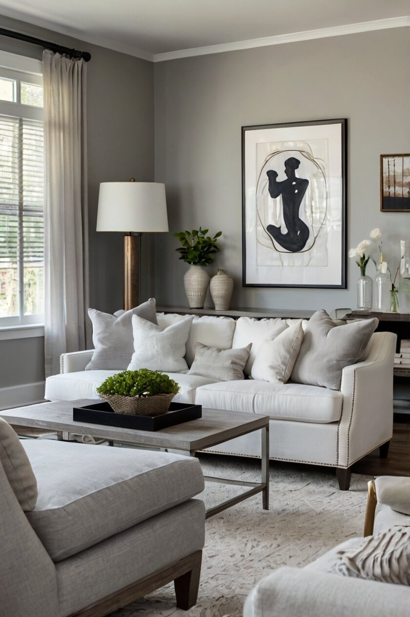
Soft Gray Walls


Gray might sound boring, but it’s actually one of the best friends your white furniture will ever have.
Soft gray walls create a gentle backdrop that makes white furniture look crisp and clean without being too harsh.
Think of gray as the perfect supporting actor that never tries to steal the show.
When you paint your walls a soft gray, your white furniture stands out beautifully without shouting for attention.
The cool thing about gray is that it works in any room, whether it’s your bedroom, living room, or even your bathroom.
Light gray walls make your white furniture look more expensive and sophisticated.
You can choose from warm grays that have a tiny bit of beige mixed in, or cool grays that lean toward blue.
Warm grays make your room feel cozy and welcoming, like a big hug when you walk in.
Cool grays create a modern, fresh feeling that’s perfect if you like clean, simple designs.
Gray walls also make it easy to add colorful decorations later.
You can throw in bright pillows, colorful artwork, or fun accessories without worrying about them clashing with your walls.
The gray acts like a neutral base that lets other colors shine.
Another bonus is that gray walls hide dirt and scuff marks better than pure white walls.
This makes gray a smart choice for busy rooms or if you have pets that might bump into walls.
Your white furniture will look fresh and new against gray walls for years to come.
Navy Blue Walls
Navy blue walls might seem scary at first, but they create one of the most stunning looks with white furniture.
Imagine walking into a room that feels like a cozy seaside cottage or a fancy yacht club.
That’s the magic navy blue walls can create with your white furniture.
The deep, rich blue makes white furniture pop like stars against a midnight sky.
Navy blue is not just any blue – it’s a sophisticated color that makes everything look more expensive.
When you pair navy walls with white furniture, you get a classic combination that never goes out of style.
This color combo works especially well in bedrooms because navy blue helps you feel calm and relaxed.
Navy blue walls make your white bed frame look like it belongs in a luxury hotel.
The contrast between the dark walls and light furniture creates visual interest that makes people say “wow” when they see your room.
You can make the look even better by adding white curtains, which will seem to glow against the navy background.
Navy blue also works great with different lighting.
During the day, natural light makes the blue look rich and vibrant.
At night, warm lamp light makes the navy feel cozy and intimate.
If you’re worried about the room feeling too dark, remember that your white furniture will reflect light and brighten up the space.
You can also add mirrors with white frames to bounce even more light around the room.
The best part about navy blue walls is that they make your room feel bigger and more important, like you’re living in a magazine.
Sage Green Walls
Sage green is like bringing a peaceful garden inside your home.
This soft, muted green color creates the perfect calm background for your white furniture.
Sage green walls make your room feel fresh and natural, like you’re surrounded by gentle plants and trees.
When you combine sage green walls with white furniture, you get a look that feels both modern and timeless.
The green adds life and energy to your space without being too bright or overwhelming.
White furniture against sage green walls looks clean and pure, like fresh snow on grass.
This color combination is perfect if you want your room to feel like a relaxing spa.
Sage green has a calming effect that helps you feel peaceful and happy.
Unlike bright greens that might hurt your eyes, sage green is gentle and soothing.
Your white dresser, bed, or desk will stand out beautifully against these soft green walls.
The great thing about sage green is that it works with both warm and cool decorating styles.
You can add wooden accents for a natural, cozy feel.
Or you can include metallic decorations for a more modern, sleek look.
Sage green walls also make it easy to bring in other natural colors like cream, beige, or soft brown.
Plants look amazing against sage green walls, and your white furniture helps create a fresh, garden-like feeling.
This color choice is perfect if you spend a lot of time in your room and want it to feel like a peaceful retreat.
Your white furniture will look sophisticated and elegant against the gentle green background.
Warm Beige Walls
Warm beige walls are like wrapping your room in a cozy blanket.
This color creates a comfortable, welcoming feeling that makes your white furniture look soft and inviting.
Beige might seem plain, but it’s actually a super smart choice that makes everything else in your room look better.
When you paint your walls warm beige, your white furniture gets a gentle, creamy glow.
The beige background makes white pieces look less stark and more comfortable.
Think of beige as the color of warm sand at the beach or creamy hot chocolate.
This wall color makes your room feel bigger and brighter without being too bright.
Warm beige walls work great in any room, but they’re especially nice in bedrooms and living rooms.
The color makes you feel relaxed and happy, like you’re in a cozy cabin or a fancy coffee shop.
Your white furniture will look more expensive against beige walls because the warm color adds richness to the whole room.
Beige walls also make it super easy to decorate with almost any color.
You can add bright red pillows, deep blue artwork, or green plants without worrying about color clashes.
The beige acts like a neutral stage that lets your decorations be the stars.
Another great thing about warm beige is that it looks good in all kinds of lighting.
Morning sunlight makes beige walls glow warmly.
Evening lamp light makes the beige feel cozy and intimate.
Your white furniture will always look perfect against this versatile background color.
Soft Pink Walls
Soft pink walls might make you think of little girls’ rooms, but modern soft pink is actually super stylish and grown-up.
This gentle color creates a warm, happy feeling that makes your white furniture look fresh and beautiful.
Soft pink is not bright or overwhelming – it’s more like the color of a sunset or rose petals.
When you pair soft pink walls with white furniture, you get a dreamy, romantic look that feels both cozy and elegant.
The pink adds warmth to your room without being too bold or attention-grabbing.
Your white bed, dresser, or desk will look crisp and clean against the gentle pink background.
Soft pink walls make your room feel like a peaceful retreat where you can relax and feel happy.
This color works especially well in bedrooms because it creates a calming, restful atmosphere.
The great thing about soft pink is that it’s not just for one decorating style.
You can make it modern by adding black accents and sleek decorations.
Or you can make it romantic by including gold accents and soft textures.
Soft pink walls also look amazing with natural light streaming through windows.
The pink seems to glow and makes your whole room feel warm and inviting.
Your white furniture will stand out beautifully without the contrast being too harsh.
Evening lighting makes soft pink walls feel cozy and dreamy.
You can add white curtains that will seem to float against the pink background.
This color combination creates a space that feels special and personal, like your own private sanctuary.
Charcoal Gray Walls
Charcoal gray walls create a bold, dramatic look that makes your white furniture the absolute star of the room.
This dark, sophisticated color is like having a fancy theater backdrop for your furniture.
Charcoal gray is much darker than regular gray, almost like the color of storm clouds or expensive suits.
When you paint your walls charcoal gray, your white furniture practically glows against the dark background.
The contrast is stunning and makes everything look more expensive and important.
Charcoal gray walls work great in modern homes where you want a sleek, stylish look.
Your white bed frame or dresser will look like it’s floating against the dark walls.
This color combination creates a cozy feeling without being too bright or overwhelming.
Charcoal gray makes your room feel intimate and sophisticated, like a fancy hotel or upscale restaurant.
The dark walls also make colorful decorations pop beautifully.
You can add bright artwork, colorful pillows, or metallic accents that will stand out amazingly.
Charcoal gray walls are perfect if you want your room to feel grown-up and stylish.
The dark color hides imperfections better than light colors, so your walls always look perfect.
Your white furniture will create bright spots that draw attention and make the room feel balanced.
This color choice is bold but not overwhelming because the white furniture softens the dramatic effect.
Charcoal gray walls also work well with different types of lighting.
Bright lights make the contrast between walls and furniture even more striking.
Dim lighting makes the room feel cozy and intimate, like your own private hideaway.
Cream Walls
Cream walls are like the perfect middle ground between white and beige.
This warm, soft color creates a gentle background that makes your white furniture look elegant and sophisticated.
Cream is warmer than white but not as bold as beige, making it perfect for any room in your home.
When you paint your walls cream, your white furniture gets a subtle glow that makes everything look more expensive.
The cream background prevents your white pieces from looking too stark or cold.
Think of cream as the color of vanilla ice cream or fresh butter.
This wall color makes your room feel bigger and brighter while still being cozy and welcoming.
Cream walls work especially well in rooms that don’t get a lot of natural light.
The warm undertones in cream help make dark rooms feel brighter and more cheerful.
Your white furniture will stand out beautifully without the contrast being too harsh or overwhelming.
Cream walls are super versatile and work with almost any decorating style.
You can go traditional with wooden accents and classic patterns.
Or you can go modern with clean lines and minimal decorations.
The cream background makes it easy to change your room’s style by just switching out accessories.
Another great thing about cream walls is that they make your room feel calm and peaceful.
This color doesn’t fight for attention, so your white furniture and decorations can be the stars.
Your room will feel like a serene, elegant space where you can relax and feel comfortable.
Dusty Blue Walls
Dusty blue is like bringing a piece of the sky into your room.
This soft, muted blue creates a calm, peaceful feeling that makes your white furniture look fresh and beautiful.
Dusty blue is not bright or overwhelming – it’s more like the color of faded denim or morning mist.
When you combine dusty blue walls with white furniture, you get a look that feels both modern and timeless.
The blue adds a cool, refreshing feeling to your space without being too bold.
Your white bed, dresser, or desk will look crisp and clean against the gentle blue background.
Dusty blue walls make your room feel like a peaceful retreat by the ocean.
This color works great in bedrooms because it helps you feel calm and relaxed.
The soft blue color is perfect if you want your room to feel bigger and more open.
Your white furniture will stand out beautifully while still blending nicely with the overall color scheme.
Dusty blue walls also work well with different types of decorations.
You can add white and cream accents for a soft, dreamy look.
Or you can include wooden decorations for a more natural, coastal feeling.
The blue background makes metallic accents like silver or gold look especially elegant.
Natural light makes dusty blue walls look fresh and airy during the day.
Evening lighting makes the blue feel cozy and intimate.
Your white furniture will always look perfect against this versatile, calming background color.
This combination creates a space that feels like your own personal sanctuary.
Lavender Walls
Lavender walls bring a touch of magic and calm to any room with white furniture.
This gentle purple color is like surrounding yourself with peaceful flowers and sweet dreams.
Lavender is much softer than regular purple – it’s more like the color of actual lavender plants or a sunset sky.
When you paint your walls lavender, your white furniture looks elegant and dreamy against the soft purple background.
The lavender adds a unique, special feeling to your room that makes it different from everyone else’s.
Your white bed frame or dresser will stand out beautifully while still feeling like part of a cohesive, peaceful design.
Lavender walls work especially well in bedrooms because purple is known to help people feel calm and sleep better.
This color makes your room feel like a fairy tale or a beautiful garden.
The soft purple background makes your white furniture look more delicate and elegant.
Lavender walls also work great with natural light streaming through windows.
The purple seems to glow and makes your whole room feel magical and special.
You can make the look even better by adding white curtains or light-colored decorations.
Evening lighting makes lavender walls feel cozy and dreamy, perfect for relaxing after a long day.
This color choice is perfect if you want your room to feel unique and personal.
Your white furniture will create bright, clean spots that balance the gentle purple color.
Lavender walls also make it easy to add other soft colors like pink, cream, or light yellow.
The result is a room that feels like your own private paradise.
Terracotta Walls
Terracotta walls bring warmth and earthiness to your space, making white furniture look fresh and striking.
This rich, orangish-brown color is like bringing the beauty of desert sunsets and clay pottery into your room.
Terracotta is a bold choice that creates a cozy, welcoming feeling while still being sophisticated and stylish.
When you pair terracotta walls with white furniture, you get a stunning contrast that makes both colors look amazing.
The warm, earthy background makes your white pieces pop like bright flowers in a garden.
Your white bed, dresser, or desk will look crisp and modern against the rich terracotta walls.
This color combination works especially well if you like southwestern or bohemian decorating styles.
Terracotta walls make your room feel like a cozy adobe house or a stylish desert retreat.
The warm color creates an inviting atmosphere that makes people want to stay and relax.
Your white furniture provides cool, clean balance to the warm wall color.
Terracotta walls also work beautifully with natural materials like wood, rope, and plants.
You can add wooden accents that complement the earthy wall color.
Green plants look amazing against terracotta walls, and your white furniture helps create a fresh, natural feeling.
Natural light makes terracotta walls glow warmly during the day.
Evening lighting makes the terracotta feel intimate and cozy, like sitting around a campfire.
This color choice is perfect if you want your room to feel unique, warm, and full of personality.
Your white furniture will always stand out beautifully against this rich, earthy background.
Forest Green Walls
Forest green walls create a rich, dramatic backdrop that makes white furniture look absolutely stunning.
This deep, luxurious green is like bringing the beauty of a peaceful forest into your home.
Forest green is much darker than regular green – it’s more like the color of pine trees or expensive emeralds.
When you paint your walls forest green, your white furniture stands out like bright stars against a rich, natural background.
The deep green creates a cozy, intimate feeling that makes your room feel like a sophisticated retreat.
Your white bed frame, dresser, or desk will look elegant and important against the dramatic green walls.
Forest green walls work great in bedrooms and living rooms where you want to feel relaxed and surrounded by nature.
This color makes your room feel bigger and more luxurious, like you’re living in a fancy cabin or upscale lodge.
The contrast between the dark walls and light furniture creates visual interest that makes people notice your room.
You can make the look even better by adding plants, which will blend beautifully with the forest green background.
Your white furniture will help reflect light and keep the room from feeling too dark.
Forest green walls also work well with different metals like gold, brass, or copper.
These warm metallic accents look amazing against the rich green background.
Natural light makes forest green walls look fresh and vibrant during the day.
Evening lighting makes the green feel cozy and intimate, perfect for reading or relaxing.
This color choice is perfect if you want your room to feel sophisticated, natural, and uniquely beautiful.
Your white furniture will always look crisp and elegant against this rich, dramatic background.
Blush Walls
Blush walls are like wrapping your room in the gentlest, most beautiful sunrise.
This super soft pink color is much more subtle than regular pink – it’s more like the color inside a seashell or a cloud at sunset.
Blush creates a warm, happy feeling that makes your white furniture look fresh and elegant.
When you paint your walls blush, your white pieces get a gentle, rosy glow that makes everything look more expensive.
The soft pink background prevents your white furniture from looking too cold or stark.
Your white bed, dresser, or desk will stand out beautifully while still feeling part of a cohesive, peaceful design.
Blush walls work especially well in bedrooms because the color helps you feel calm and content.
This gentle pink makes your room feel like a peaceful retreat where you can relax and be happy.
The soft color is perfect if you want your room to feel feminine and sophisticated without being too bold.
Blush walls also work great with natural light coming through windows.
The pink seems to glow softly and makes your whole room feel warm and inviting.
Evening lighting makes blush walls feel cozy and dreamy, perfect for winding down after a busy day.
You can add white curtains that will seem to float against the gentle pink background.
Your white furniture will create bright, clean spots that balance the soft wall color perfectly.
This color combination is great if you want your room to feel special and personal.
Blush walls also make it easy to add other soft colors like cream, gold, or light gray.
The result is a room that feels like your own beautiful, peaceful sanctuary.
Warm White Walls
Warm white walls might seem like the obvious choice, but they’re actually a smart and sophisticated option for white furniture.
This isn’t the stark, cold white you might be thinking of – warm white has tiny hints of cream or yellow that make it feel cozy and welcoming.
When you paint your walls warm white, your white furniture blends beautifully while still standing out in subtle ways.
The key is that warm white walls create different textures and depths that make your room interesting.
Your white bed frame might have cool undertones while your warm white walls have yellow undertones, creating a beautiful, layered look.
Warm white walls make your room feel bigger, brighter, and more open than any other color.
This is perfect if you have a small room or a space that doesn’t get much natural light.
The warm undertones prevent your room from feeling like a cold, sterile hospital.
Instead, you get a fresh, clean look that still feels comfortable and livable.
Your white furniture will stand out through different textures, materials, and finishes rather than through color contrast.
Warm white walls also make it super easy to change your room’s style by just switching decorations.
You can add bright, colorful accents that will pop against the neutral background.
Or you can keep everything soft and neutral for a calm, peaceful feeling.
Natural light makes warm white walls glow beautifully during the day.
Evening lighting makes the warm undertones more obvious, creating a cozy, intimate atmosphere.
This color choice is perfect if you want a timeless look that will never go out of style.
Your white furniture will always look perfect against warm white walls, no matter how you decorate the rest of your room.


