
Stepping into a room with cream walls feels like being wrapped in a warm embrace of timeless elegance.
Unlike stark white, cream brings a subtle warmth that transforms ordinary spaces into inviting sanctuaries.
You might be wondering how to enhance this neutral backdrop with the perfect furniture selections.
The beauty of cream walls lies in their chameleon-like ability to complement virtually any furniture color you choose.
With the right furniture pairings, you’ll create spaces that feel simultaneously fresh and timeless, modern and classic:
Navy Blue: Timeless Elegance Meets Modern Sophistication
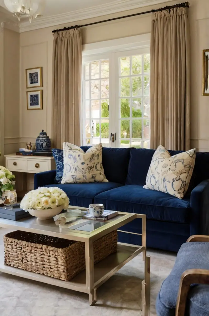
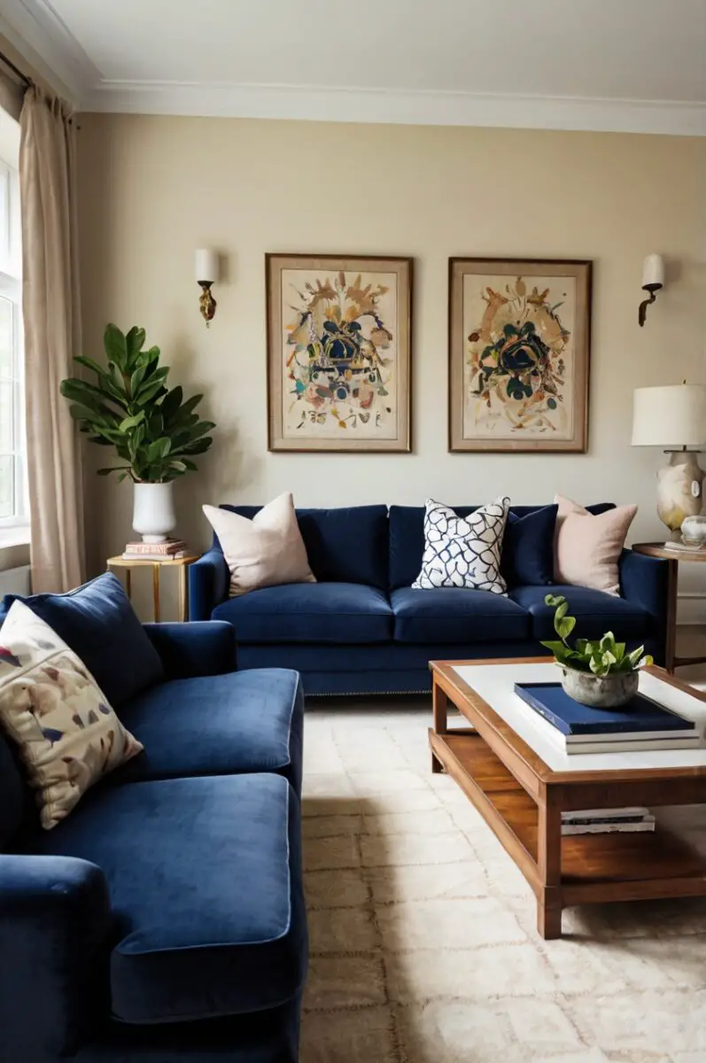
Navy blue furniture against cream walls creates a pairing that exudes both classic charm and contemporary appeal.
The deep, rich tone of navy provides a striking contrast that makes your cream walls appear even more luminous and warm.
You’ll find this combination particularly effective in formal living rooms or studies where a sense of refined elegance is desired.
Think of navy as the sophisticated cousin in the blue family—it carries all the calming properties of blue but with an added layer of maturity and restraint.
When selecting navy furniture for your cream-walled space, consider pieces with clean lines and minimal ornamentation for a modern look.
Alternatively, choose tufted or rolled-arm designs if you’re aiming for a more traditional or transitional aesthetic.
The versatility of this color combination allows you to easily shift the overall feel through your choice of accessories.
You can warm up this pairing with brass or gold accents, which will highlight the underlying warmth in your cream walls.
For a cooler, more contemporary approach, incorporate chrome or nickel finishes along with glass elements.
Textural variety becomes especially important with this color scheme to prevent the contrast from feeling too stark or two-dimensional.
Consider incorporating natural materials like jute, rattan, or light woods to add organic warmth to the navy-cream dynamic.
Pattern plays well within this color scheme—think navy and cream striped pillows, geometric area rugs, or botanical prints that include both hues.
In terms of wood tones, medium to light finishes often work best with this color combination, preventing the overall look from becoming too heavy.
You’ll want to pay special attention to lighting with this pairing, as navy can absorb significant light in a room.
Ample natural light or strategically placed lamps will ensure your navy pieces remain vibrant rather than reading as black in dimmer conditions.
For those hesitant to commit to large navy furniture pieces, consider starting with smaller accents like an ottoman or accent chair.
The navy-cream combination works equally well in traditional, transitional, coastal, and contemporary design schemes.
This color pairing maintains its appeal throughout the seasons, never feeling too heavy in summer or too light in winter.
With thoughtful execution, your navy and cream combination will create spaces that feel simultaneously fresh and timelessly elegant.
Madison’s Current Obsessions
13 Gorgeous Alternatives to Pottery Barn That Won't Break the BankEmerald Green: Luxurious Drama for Statement Spaces
Emerald green furniture creates a luxurious and unexpected counterpoint to the subtle warmth of cream walls.
This rich jewel tone instantly elevates any room, bringing both sophistication and a touch of drama to your space.
You’ll notice how emerald pieces seem to come alive against cream backgrounds, creating a dynamic visual tension that draws the eye.
Think of emerald as nature’s perfect accent—bringing the refreshing essence of the outdoors into your carefully curated interior.
When incorporating emerald furniture into cream-walled rooms, consider the visual weight of your pieces.
A velvet emerald sofa becomes an instant focal point, while smaller accents like emerald side chairs allow you to experiment with this bold color more cautiously.
The key to successfully working with this color combination lies in balancing the intensity of emerald with complementary neutrals.
Consider introducing natural wood tones, particularly medium to dark finishes, to ground the vibrancy of your emerald pieces.
Gold or brass accents pair exceptionally well with this color scheme, highlighting the inherent luxury of emerald while warming up the cream backdrop.
For a more contemporary approach, black metal accents create striking definition that emphasizes the modern potential of this classic color.
Textural variety becomes especially important with such a bold color choice—consider incorporating natural fibers, different fabric weaves, and mixed materials.
Pattern can work wonderfully within this color scheme, but exercise restraint to prevent visual competition with your statement emerald pieces.
In terms of additional accent colors, soft pinks, blues, or even muted purples can complement the emerald-cream foundation without overwhelming it.
Lighting plays a crucial role with emerald furniture—ensure your space receives ample natural or artificial light to showcase the true depth of this magnificent color.
You’ll find that emerald furniture looks different throughout the day as light changes, revealing new dimensions of this complex hue.
This color combination works particularly well in spaces designed for gathering and conversation—living rooms, dining rooms, or sophisticated home bars.
For those concerned about emerald being too bold, consider restricting it to occasional pieces rather than larger upholstered items.
The emerald-cream pairing transcends design styles, working equally well in traditional, mid-century modern, or even eclectic spaces.
With thoughtful implementation, your emerald furniture will transform cream-walled rooms into sophisticated sanctuaries that feel both refreshing and timelessly elegant.
Design Your Dream Room in Minutes! By DreamyHomeStyle
🏡 Start Creating FREE →Madison’s Current Obsessions
Love Urban Outfitters? Try These 11+ Home Decor Brands InsteadCharcoal Gray: Sophisticated Neutrality with Edge
Charcoal gray furniture presents a sophisticated alternative to traditional black, offering substantial visual weight without the starkness.
Against cream walls, charcoal creates a refined neutral palette that feels both contemporary and endlessly versatile.
You’ll appreciate how this combination provides a perfect foundation for introducing accent colors according to seasonal preferences or changing design trends.
Think of charcoal as the sophisticated neutral that bridges the gap between dramatic black and softer mid-tone grays.
When selecting charcoal pieces for cream-walled spaces, consider varying the textures to prevent the scheme from feeling flat or one-dimensional.
A charcoal sofa in a nubbly bouclé fabric creates a different effect than one in sleek leather or plush velvet—each texture altering how the color interacts with your cream walls.
The beauty of this pairing lies in its chameleon-like ability to shift from casual to formal depending on your styling choices.
For a more relaxed environment, incorporate natural materials like wood, rattan, or jute to warm up the charcoal-cream foundation.
To create a more sophisticated atmosphere, introduce glass, metal, and polished surfaces alongside your charcoal furniture.
Accent colors work exceptionally well with this neutral base—consider mustard yellow, terracotta, or teal for controlled pops of personality.
Metallics play beautifully against this combination, with gold and brass warming the space while silver and chrome emphasize its contemporary potential.
Pattern becomes particularly important with neutral pairings—incorporate geometric designs, subtle stripes, or organic motifs to add visual interest.
You’ll find that artwork stands out beautifully against cream walls when anchored by charcoal furniture, allowing your art collection to shine.
The charcoal-cream combination works well in virtually any room of your home, from formal living spaces to casual family rooms or even bedrooms.
Consider varying the intensity of your charcoal pieces—some darker, some lighter—to create depth and dimension throughout your space.
This color pairing responds beautifully to layered lighting, with ambient, task, and accent lighting each revealing different aspects of the charcoal’s complexity.
For those concerned about too much darkness, balance larger charcoal pieces with lighter elements in cream, white, or natural materials.
The versatility of this combination extends to design styles as well, working equally effectively in minimalist, industrial, transitional, or even traditional settings.
With thoughtful execution, your charcoal and cream pairing will create spaces that feel simultaneously grounded and light, dramatic and welcoming.
Madison’s Current Obsessions
West Elm Alternatives: 7+ Brands That Match Their Style and QualityWarm Cognac: Rich Leather Tones for Timeless Appeal
Cognac leather furniture against cream walls creates a pairing that epitomizes timeless sophistication with an inviting warmth.
This rich, amber-toned brown develops a beautiful patina over time, adding character and depth to your cream-walled spaces.
You’ll find that cognac leather pieces bring an inherent sense of quality and permanence to any room they inhabit.
Think of cognac as the perfect middle ground between statement-making and enduring—bold enough to command attention but classic enough to transcend trends.
When incorporating cognac furniture into cream spaces, consider how the material itself contributes to the overall effect.
Leather cognac pieces offer a different aesthetic than cognac-colored fabrics—the leather bringing additional texture and an organic quality to the combination.
This color pairing works exceptionally well in spaces designed for comfort and longevity—living rooms, studies, or family gathering areas.
To maximize the impact of this combination, incorporate varying wood tones that complement rather than match your cognac furniture exactly.
Natural fibers like jute, sisal, or wool in neutral tones help ground this color scheme while adding necessary textural contrast.
For accent colors, consider deep blues, forest greens, or even aubergine to complement the warmth of your cognac pieces.
Black metal accents can add contemporary edge to this otherwise traditional color combination, preventing it from feeling too conservative.
Alternatively, brass or gold metallics enhance the inherent warmth of both the cognac furniture and cream walls.
Pattern works beautifully within this color scheme—consider kilim pillows, vintage-inspired rugs, or botanical prints that incorporate cognac tones.
You’ll find that this combination adapts well to different lighting conditions, with cognac furniture appearing richer and more dimensional as light changes throughout the day.
The cognac-cream pairing translates effectively across design styles from mid-century modern to rustic farmhouse to refined traditional.
Consider incorporating both hard and soft cognac elements—perhaps a leather sofa alongside fabric accent chairs in similar tones.
This color combination provides excellent versatility for seasonal decorating, working equally well with summer linens as with winter velvets.
For spaces that might otherwise feel too neutral, cognac furniture provides warming depth without the heaviness of darker brown or black pieces.
With thoughtful implementation, your cognac furniture will transform cream-walled rooms into sophisticated, welcoming spaces that feel simultaneously fresh and familiar.
Madison’s Current Obsessions
Transform Your Gray Space: 13 Furniture Color Ideas That Pop Against Gray Walls and CarpetBlush Pink: Subtle Sophistication with Feminine Charm
Blush pink furniture creates an unexpectedly sophisticated pairing with cream walls, offering subtle color that reads almost as a neutral.
This delicate hue brings warmth and softness to any space without overwhelming the calm foundation established by your cream backdrop.
You’ll notice how this combination creates rooms that feel both fresh and timeless, with a gentle feminine energy that remains decidedly grown-up.
Think of blush as the understated color choice that makes a confident design statement through its very restraint.
When selecting blush furniture for cream-walled spaces, consider the undertones in both your wall color and your furniture pieces.
Blush tones that lean slightly peach will enhance the warmth in cream walls, while cooler blush tones with more lavender undertones create a more contrasting effect.
This color combination excels in spaces designed for relaxation and comfort—bedrooms, sitting rooms, or intimate conversation areas.
To prevent this pairing from feeling too sweet or juvenile, incorporate elements with visual weight and structural lines.
Black metal accents work surprisingly well with this color scheme, providing necessary contrast and architectural interest.
Similarly, darker wood tones help ground the ethereal quality of the blush-cream combination, creating welcome tension between light and dark elements.
Gold or brass metallics enhance the inherent warmth and sophistication of this color pairing, adding subtle glamour without ostentation.
Textural variety becomes especially important with such a gentle color palette—consider bouclé, linen, velvet, and other tactile fabrics to create depth.
For those concerned about too much pink, consider restricting blush to occasional chairs or accent pieces rather than larger upholstered items.
Pattern can work beautifully within this color scheme—subtle geometrics, abstract botanical prints, or tone-on-tone designs add interest without competing.
You’ll find that this combination provides an excellent foundation for both minimalist and more decorated approaches to interior design.
The blush-cream pairing adapts well to different design styles, from modern Scandinavian to traditional French to contemporary eclectic.
Consider incorporating natural elements like marble, alabaster, or light-toned woods to enhance the inherent elegance of this color combination.
For accent colors, sage green, light blue, or even hints of burgundy can complement this foundation without disrupting its delicate harmony.
With thoughtful execution, your blush and cream spaces will feel simultaneously fresh and sophisticated, youthful and timeless.
Madison’s Current Obsessions
Gray Bed Styling: 9+ Furniture Color Ideas for a Designer LookDeep Burgundy: Rich Contrast for Statement Spaces
Deep burgundy furniture creates dramatic tension against cream walls, offering rich color depth without the harshness of pure black.
This sophisticated red-brown hue brings inherent warmth and a sense of established elegance to any space it inhabits.
You’ll find that burgundy pieces appear especially luxurious against cream backdrops, creating rooms that feel both bold and surprisingly inviting.
Think of burgundy as the perfect choice when you desire richness and character without overwhelming your serene cream foundation.
When incorporating burgundy furniture into cream-walled spaces, consider the visual weight of your pieces and balance accordingly.
A burgundy sofa becomes an instant focal point, while burgundy accent chairs or ottomans allow you to experiment with this bold color more cautiously.
This color combination particularly excels in formal dining rooms, libraries, or living spaces designed for evening entertaining.
To maximize the sophisticated potential of this pairing, incorporate brass or gold accents that highlight the underlying warmth in both burgundy and cream.
For a more contemporary approach, black metal elements provide structural contrast that enhances the modern potential of this classic color scheme.
Wood tones should be carefully considered with this combination—medium to dark finishes generally work best, preventing visual competition.
Textural variety becomes especially important with such a rich hue—consider incorporating velvet, leather, wool, and other tactile materials.
Pattern can work wonderfully within this color scheme—subtle damasks, herringbone textures, or geometric designs add dimension without overwhelming.
For additional accent colors, consider deep teal, navy, or even touches of olive green to complement the burgundy-cream foundation.
You’ll notice that this color combination shifts dramatically with changing light—appearing more vibrant during daylight hours and increasingly intimate in evening settings.
The burgundy-cream pairing works effectively across design styles from traditional and Victorian to transitional and even contemporary approaches.
For those concerned about burgundy feeling too heavy, consider restricting it to occasional pieces or balancing with lighter-toned accessories.
Natural materials like marble or stone with warm undertones enhance the sophisticated nature of this color combination.
In spaces with limited natural light, ensure adequate artificial lighting to prevent burgundy furniture from appearing too dark or heavy.
With thoughtful implementation, your burgundy furniture will transform cream-walled rooms into rich, sophisticated spaces that exude confidence and character.
Madison’s Current Obsessions
Upgrade Your Home: 8+ Four Hands Alternatives for Every StyleSoft Sage: Natural Serenity for Relaxed Spaces
Soft sage furniture creates a naturally harmonious partnership with cream walls, offering subtle color that enhances rather than competes.
This muted green brings an organic, earthy quality to interiors while maintaining the serene atmosphere established by your cream backdrop.
You’ll find that this combination creates spaces that feel inherently calming, with a connection to nature that promotes relaxation and wellbeing.
Think of sage as the sophisticated nature-inspired neutral—more interesting than beige but still restrained enough for everyday living.
When selecting sage furniture for cream-walled rooms, consider variations in tone and intensity to create visual interest within your color scheme.
Lighter sage pieces almost blend with cream walls, creating subtle distinction, while deeper sage establishes more noticeable but still gentle contrast.
This color combination works exceptionally well in spaces designed for relaxation—bedrooms, reading nooks, or casual living areas.
To enhance the organic quality of this pairing, incorporate natural materials like light woods, rattan, jute, or stone elements.
White or cream accents maintain the airy quality of this color scheme, while black elements provide welcome definition and prevent it from feeling too ethereal.
For metallic accents, consider brushed nickel or pewter rather than yellow-toned metals, which can compete with the cool undertones of sage.
Textural variety becomes especially important with such subtle color differences—incorporate nubby linens, soft wools, and other tactile fabrics.
Pattern works beautifully within this color scheme—botanical prints, subtle stripes, or organic motifs enhance the nature-inspired foundation.
For additional accent colors, consider soft terracotta, muted blues, or gentle lavender tones that complement without disrupting the calm palette.
You’ll appreciate how this combination creates spaces that feel simultaneously fresh and grounded, contemporary and timeless.
The sage-cream pairing adapts well across design styles from coastal casual to Scandinavian minimalism to updated traditional.
Consider incorporating both hard and soft sage elements—perhaps upholstered furniture alongside painted wood pieces in complementary sage tones.
This color scheme responds beautifully to natural light, with sage furniture appearing more vibrant in bright conditions and more muted in softer light.
For those concerned about too much green, consider restricting sage to occasional pieces or balancing with neutral accessories.
With thoughtful execution, your sage and cream rooms will create sanctuaries of calm that feel both refreshing and enduringly comfortable.
Madison’s Current Obsessions
How to Pair Furniture Colors With Accessible Beige for a Cozy HomeMidnight Black: Bold Contrast for Dramatic Impact
Midnight black furniture creates maximum contrast against cream walls, establishing a bold dynamic that feels both dramatic and surprisingly sophisticated.
This striking combination offers timeless appeal that transcends trends, creating spaces with undeniable visual impact and definition.
You’ll find that black furniture pieces gain new prominence against cream backgrounds, their silhouettes and details becoming more pronounced and architectural.
Think of black as the confident punctuation mark in your design scheme—creating deliberate emphasis and structure within your cream-walled canvas.
When incorporating black furniture into cream spaces, consider the balance of visual weight to prevent the darker elements from overwhelming the room.
A black sofa or bed frame makes a strong statement, while smaller black pieces like side tables or accent chairs allow for more subtle implementation.
This color pairing works particularly well in spaces where you desire contrast and definition—formal living rooms, dining rooms, or sophisticated bedrooms.
To prevent this high-contrast combination from feeling too stark, incorporate transitional elements in mid-tones like woods, metals, or textiles.
Warming metallics like brass or gold can soften the black-cream dynamic, adding necessary dimension and preventing a flat, two-toned effect.
Texture becomes critically important with this pairing—consider black leather, velvet, bouclé, or other tactile materials that add depth to the dark elements.
Pattern plays an important role in successfully executing this combination—consider incorporating designs that include both black and cream to bridge the contrast.
For additional accent colors, virtually any hue can complement this neutral foundation—from rich jewel tones to softer pastels depending on your desired mood.
You’ll notice that this combination creates excellent backdrops for artwork and decorative objects, allowing them to stand out with gallery-like prominence.
The black-cream pairing translates effectively across design styles from modern minimalist to glamorous Art Deco to updated traditional.
Consider varying the intensity of your black pieces—some pure black, some softer charcoal—to create depth and prevent harshness.
This color combination responds dramatically to lighting, so ensure your space receives adequate illumination to prevent black furniture from appearing as dark voids.
For those concerned about too much darkness, balance larger black pieces with lighter elements including cream-colored textiles and accessories.
Natural materials like wood, marble, or plant elements provide welcome organic relief within this bold color scheme.
With thoughtful implementation, your black and cream rooms will create sophisticated, editorial-worthy spaces with timeless graphic appeal.
Madison’s Current Obsessions
Make Your Black Furniture Shine: The Best Wall Colors to ChooseCerulean Blue: Refreshing Energy for Bright Spaces
Cerulean blue furniture introduces refreshing vibrancy against cream walls, creating spaces that feel simultaneously energizing and welcoming.
This clear, sky-inspired blue brings an inherent cheerfulness to interiors without veering into childish territory.
You’ll find that cerulean pieces appear especially vivid against cream backdrops, creating rooms that feel both uplifting and surprisingly sophisticated.
Think of cerulean as the perfect balance between statement-making color and everyday livability—bold enough to notice but easy enough to live with long-term.
When incorporating cerulean furniture into cream-walled spaces, consider the mood you wish to create in each specific room.
A cerulean sofa makes a confident color statement in living areas, while blue occasional chairs or ottomans allow for more measured color introduction.
This combination works particularly well in spaces that benefit from its inherent freshness—sunrooms, breakfast nooks, or casual living areas.
To enhance the coastal potential of this pairing, incorporate natural materials like light woods, rattan, or sisal that reference beachside environments.
For a more contemporary approach, combine your cerulean and cream foundation with glass, chrome, or white elements for a clean, modern aesthetic.
Wood tones should be carefully considered with this combination—lighter finishes generally complement the fresh, airy quality of cerulean blue.
Textural variety becomes especially important with such a distinct color—consider incorporating linen, cotton, and other natural fabrics with visible weaves.
Pattern works beautifully within this color scheme—stripes, geometric prints, or nautical motifs enhance the inherent freshness of cerulean blue.
For additional accent colors, consider coral, soft yellow, or even touches of green to complement the cerulean-cream foundation.
You’ll appreciate how this combination creates spaces that feel simultaneously invigorating and calming—energetic but not overwhelming.
The cerulean-cream pairing adapts effectively across design styles from coastal casual to contemporary to updated traditional approaches.
Consider incorporating varying intensities of blue—some brighter cerulean, some deeper navy—to create depth and visual interest throughout your space.
This color combination responds beautifully to natural light, with cerulean appearing more vibrant in bright conditions and increasingly complex in softer light.
For those concerned about too much blue, consider restricting cerulean to occasional pieces or balancing with neutral accessories.
With thoughtful implementation, your cerulean and cream rooms will create cheerful, inviting spaces that feel both fresh and timelessly appealing.
Madison’s Current Obsessions
Revere Pewter Wall Pairings: 13 Furniture Colors That Create Stunning SpacesWarm Walnut: Natural Richness for Inviting Spaces
Warm walnut furniture creates a naturally harmonious partnership with cream walls, offering rich wood tones that enhance the inherent warmth of your neutral backdrop.
This classic pairing brings timeless appeal to any space, creating rooms that feel simultaneously sophisticated and inherently inviting.
You’ll find that walnut’s distinctive grain patterns and dimensional color variations gain new prominence against the subtle canvas of cream walls.
Think of walnut as nature’s perfect neutral—organic, versatile, and able to complement virtually any design style you might choose.
When incorporating walnut furniture into cream-walled spaces, consider mixing wood pieces with upholstered elements to create textural variety.
A walnut dining table or bed frame serves as an anchor piece, while smaller walnut elements like side tables or shelving units extend the theme thoughtfully.
This color combination works exceptionally well in spaces designed for gathering—dining rooms, living areas, or comfortable family rooms.
To enhance the natural quality of this pairing, incorporate additional organic materials like leather, stone, or plant elements.
For metallic accents, brass or bronze complements the warm undertones in walnut while adding subtle gleam without competing.
Textiles in cream or complementary neutrals help soften the substantial quality of walnut furniture, creating balance between hard and soft elements.
Pattern can work beautifully within this color scheme—consider incorporating subtle geometrics, abstracts, or nature-inspired designs in complementary colors.
For additional accent colors, consider deep blues, forest greens, or rich burgundies that enhance rather than compete with walnut’s natural depth.
You’ll appreciate how this combination creates spaces that feel grounded yet still light, substantial without heaviness.
The walnut-cream pairing transcends design trends, working equally well in mid-century modern, craftsman, contemporary, or traditional settings.
Consider incorporating both solid walnut pieces and those that combine walnut with other materials for added dimension and interest.
This color scheme responds beautifully to layered lighting, with accent lights particularly effective at highlighting walnut’s rich grain patterns.
For those concerned about too much brown, balance larger walnut pieces with lighter textiles and accessories in cream or complementary neutrals.
Natural light enhances this combination, bringing out the subtle variations in both the cream walls and the dimensional tones within walnut furniture.
With thoughtful execution, your walnut and cream rooms will create timeless, welcoming environments that feel simultaneously fresh and established.
Madison’s Current Obsessions
The Perfect Furniture Colors for Your Blue Walls : 11+ Top PicksMustard Yellow: Unexpected Warmth with Modern Edge
Mustard yellow furniture creates a surprisingly sophisticated pairing with cream walls, offering warm color that feels both bold and surprisingly livable.
This rich, earthy yellow brings immediate warmth and energy to spaces while maintaining a grown-up aesthetic that avoids feeling childish or overly bright.
You’ll find that mustard pieces provide welcome visual punctuation against cream backdrops, creating rooms with distinctive character and subtle vintage appeal.
Think of mustard as the perfect balance between statement-making and timeless—bold enough to notice but grounded enough to endure beyond passing trends.
When incorporating mustard furniture into cream spaces, consider the visual weight and placement of your yellow pieces for maximum impact.
A mustard sofa creates an immediate focal point, while mustard accent chairs or ottomans allow for more measured introduction of this distinctive color.
This combination works particularly well in spaces where you desire warmth and energy—living rooms, home offices, or creative spaces.
To enhance the sophisticated potential of this pairing, incorporate mid-century inspired elements that reference the era when mustard yellow first gained popularity.
For a more contemporary approach, combine your mustard and cream foundation with clean-lined furniture and minimal accessorizing.
Wood tones should be carefully considered with this combination—walnut or other medium-toned woods generally complement mustard’s warm undertones.
Textural variety becomes especially important with such a distinct color—consider incorporating velvet, bouclé, or wool for added dimension.
Pattern works beautifully within this color scheme—geometric prints, abstract designs, or even subtle florals can incorporate mustard yellow effectively.
For additional accent colors, consider deep teal, navy blue, or olive green to complement the mustard-cream foundation with sophisticated contrast.
You’ll notice that this color combination shifts subtly throughout the day as light changes, appearing more vibrant in daylight and increasingly rich in evening settings.
The mustard-cream pairing adapts effectively across design styles from mid-century modern to contemporary to eclectic approaches.
Consider incorporating both hard and soft mustard elements—perhaps upholstered furniture alongside ceramic or metal accessories in complementary yellow tones.
This color combination responds beautifully to both natural and artificial light, with mustard maintaining its distinctive character in various lighting conditions.
For those concerned about too much yellow, consider restricting mustard to occasional pieces or balancing with neutral accessories.
With thoughtful implementation, your mustard and cream rooms will create spaces that feel simultaneously energizing and sophisticated, distinctive and timelessly appealing.
Madison’s Current Obsessions
Transform Your Space with Perfect Furniture Colors for Espresso FloorsTeal Blue-Green: Jewel-Toned Sophistication
Teal furniture creates a rich, multi-dimensional contrast against cream walls, offering sophisticated color depth that bridges the gap between blue and green.
This complex jewel tone brings an inherent sense of luxury and depth to any space without the darkness of navy or the intensity of emerald.
You’ll find that teal pieces appear particularly luminous against cream backdrops, creating rooms that feel both distinctive and surprisingly versatile.
Think of teal as the perfect statement color for those who appreciate nuance—revealing different facets of blue or green depending on surrounding elements and lighting.
When incorporating teal furniture into cream-walled spaces, consider the undertones in your specific shade—some teals lean more blue while others favor green.
A teal sofa establishes immediate character in living areas, while teal occasional chairs or storage pieces allow for more measured color introduction.
This combination works particularly well in spaces designed for both relaxation and sophistication—master bedrooms, formal living rooms, or home libraries.
To enhance the luxurious quality of this pairing, incorporate plush textures like velvet or rich brocades that showcase teal’s depth and dimension.
For a more contemporary approach, combine your teal and cream foundation with geometric patterns and mixed metallics for an updated look.
Wood tones should be carefully considered with this combination—lighter woods create airier spaces while darker finishes enhance teal’s inherent richness.
Textural variety becomes especially important with such a complex color—incorporate multiple fabric types and finishes to create visual interest.
Pattern works beautifully within this color scheme—abstract designs, nature-inspired prints, or even subtle geometrics can incorporate teal effectively.
For additional accent colors, consider coral, mustard yellow, or even amethyst to complement the teal-cream foundation with thoughtful color relationships.
You’ll appreciate how this combination creates spaces that feel simultaneously fresh and established, colorful without being overwhelming.
The teal-cream pairing adapts effectively across design styles from transitional to contemporary to even traditional approaches.
Consider incorporating varying intensities of teal—some deeper, some brighter—to create depth and visual rhythm throughout your space.
This color combination responds beautifully to both natural and artificial light, with teal revealing different aspects of its complex nature as lighting changes.
For those concerned about too much color intensity, consider restricting teal to occasional pieces or balancing with neutral accessories.
