Wood paneling can give your home a classic, warm feeling that many love.
The right carpet choice can completely change how your wood-paneled room looks and feels.
Too similar colors can make your room feel flat, while colors that clash might create an uncomfortable space.
Finding that perfect balance is the secret to creating a room you’ll love:
Love This Post? You’ll Love My Book!
I wasted THOUSANDS on decorating mistakes you can EASILY AVOID. ✨ My book shares every lesson I learned the hard way—so you can create a home you LOVE without the costly trial and error. 🏡
Get the Book Now1. Warm Beige for Traditional Appeal
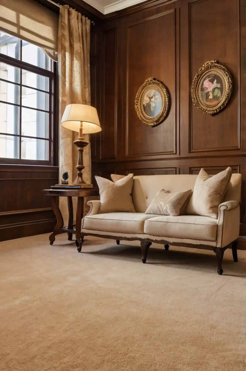
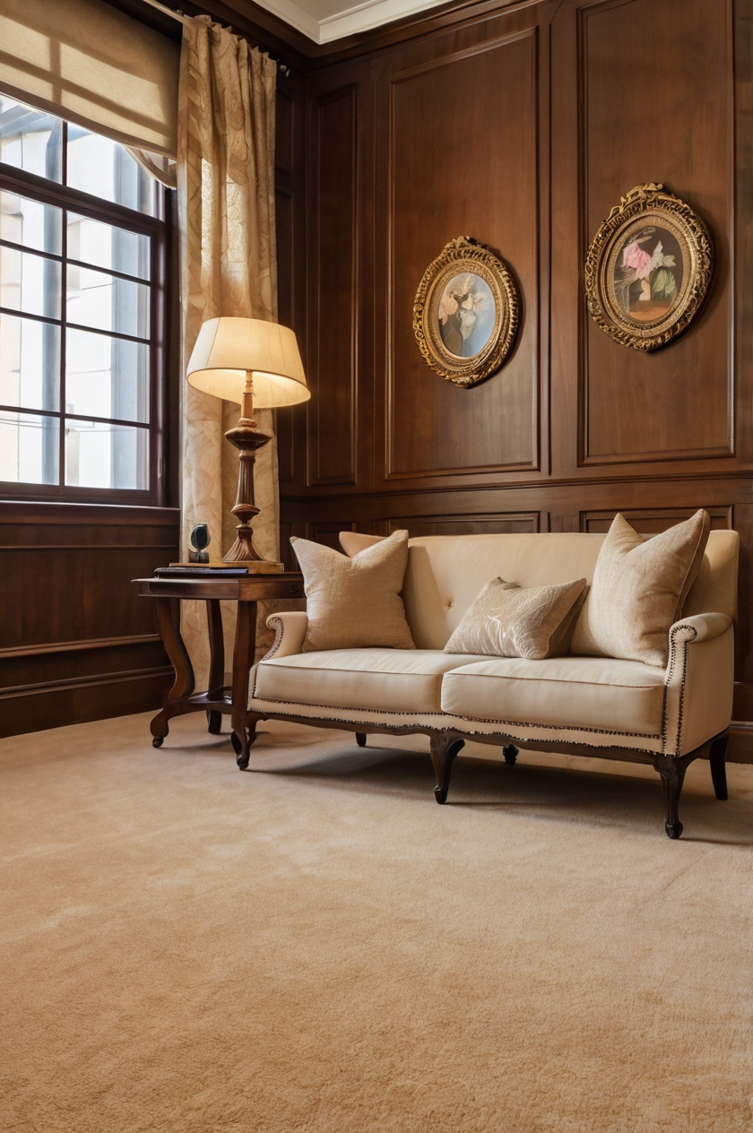
Warm beige carpet creates a harmonious, cozy atmosphere when paired with wood paneling of almost any shade.
This neutral option provides a soft foundation that allows your wood features to remain the star of the show.
Beige carpets with subtle gold or yellow undertones particularly complement the natural warmth found in most wood paneling.
Colors like “Sandalwood,” “Champagne,” or “Biscuit” offer that perfect warm beige tone that feels both timeless and inviting.
When selecting a warm beige carpet, look for options with a plush texture to add dimension to your wood-paneled room.
The combination of textured carpet and wood paneling creates a multi-layered sensory experience that feels rich and welcoming.
Designers often recommend this pairing for living rooms and family spaces where comfort is a priority.
The warm beige complements both dark walnut paneling and lighter oak or pine varieties.
For darker wood paneling, a slightly lighter beige helps brighten the overall feel of the room.
With medium-toned wood paneling, choose a beige that’s either slightly lighter or darker than the wood for subtle contrast.
This classic combination works particularly well in spaces with traditional or transitional design styles.
The timelessness of both wood paneling and beige carpet ensures your room won’t quickly feel dated or trendy.
Warm beige carpets are also practical choices for high-traffic areas as they help disguise minor soil and wear better than very light or very dark options.
This color family also provides excellent versatility when selecting furniture and accessories.
Almost any accent color pairs beautifully with the wood-and-beige foundation, allowing you to update your look seasonally with different pillows, throws, and decorative items.
💭 I Wrote a Book About My BIGGEST Decorating Mistakes!
When I decorated my first home, I thought I knew what I was doing. Spoiler alert: I DIDN’T. 😅
💸 I bought a sofa that was WAY TOO BIG for my living room. I chose paint colors that looked amazing in the store but terrible on my walls. I spent THOUSANDS on pieces that didn’t work together. Sound familiar?
“Things I Wish I Knew Before I Decorated My First Home” is your shortcut to avoiding ALL my costly mistakes. ✨ Inside, you’ll find practical, NO-NONSENSE advice that will save you time, money, and a whole lot of decorating regret. 🏡
🎯 Grab Your Copy Now!2. Soft Gray for Modern Contrast
Soft gray carpet brings an immediate contemporary update to rooms with wood paneling.
This color choice creates a beautiful contrast that feels fresh and current while still respecting the warmth of the wood.
The cool undertones in gray carpet help balance the warm tones typically found in wood paneling, creating a pleasing visual harmony.
Gray shades like “Silver Mist,” “Dove,” or “Pewter” offer enough contrast without overwhelming the natural beauty of the wood.
When paired with darker wood paneling, light to medium gray carpet helps brighten the space considerably.
For rooms with lighter wood paneling like pine or ash, a medium to charcoal gray creates an elegant, grounding effect.
Gray carpet transforms wood-paneled rooms from potentially dated to deliberately designed spaces with architectural interest.
Designers frequently recommend this combination for creating a transitional look that bridges traditional and contemporary styles.
The neutral nature of gray means it works with virtually any accent colors you might want to introduce through furniture and accessories.
For a cohesive look, choose gray carpets with warm undertones when pairing with very warm-toned wood paneling.
Conversely, grays with cooler undertones create more dramatic contrast that feels especially modern and intentional.
Textured gray carpets, like those with subtle patterns or berber styles, add another dimension of visual interest to wood-paneled rooms.
This combination works particularly well in home offices, dens, and bedrooms where a calming, sophisticated atmosphere is desired.
Gray carpet also provides excellent versatility as your style preferences evolve over time.
Unlike some color choices that may feel trendy, gray has established itself as a new neutral that continues to feel relevant year after year.
Design Your Dream Room in Minutes! – By Madison
🏡 Start Creating FREE →3. Cream or Off-White for Brightness
Cream or off-white carpet instantly brightens any wood-paneled room, creating an airy, open feeling.
This light neutral option provides maximum contrast with medium to dark wood paneling, helping to visually expand the space.
Colors like “Ivory,” “Alabaster,” or “Vanilla” offer that perfect off-white shade that feels clean without being stark.
Unlike pure white, which can feel too clinical, cream carpets retain a subtle warmth that complements the natural tones in wood paneling.
This light carpet color choice is particularly effective in rooms with limited natural light where the wood paneling might otherwise make the space feel enclosed.
For rooms with dark walnut or mahogany paneling, cream carpet creates a dramatic yet elegant contrast.
When paired with lighter wood like pine or cedar, cream carpet creates a soft, cohesive look perfect for casual, relaxed spaces.
Designers often recommend this combination for smaller rooms where visual expansion is a priority.
The light carpet reflects more light throughout the space, counterbalancing the light-absorbing quality of wood paneling.
For a contemporary take on this pairing, look for cream carpets with subtle texture or a low-pile modern look.
In traditional spaces, plush cream carpeting adds a touch of luxury that elevates the rustic qualities of wood paneling.
One practical consideration: cream carpet requires more regular cleaning in high-traffic areas, so consider it for bedrooms, formal living rooms, or other lower-traffic spaces.
This color combination creates an excellent neutral backdrop for colorful furniture and accessories to stand out.
Cream carpet also allows architectural details in your wood paneling to become more noticeable and appreciated.
The timeless nature of both wood and off-white ensures this combination will remain stylish for years to come.
Love This Post? You’ll Love My Book!
I wasted THOUSANDS on decorating mistakes you can EASILY AVOID. ✨ My book shares every lesson I learned the hard way—so you can create a home you LOVE without the costly trial and error. 🏡
Get the Book Now4. Navy Blue for Bold Sophistication
Navy blue carpet creates a striking foundation that pairs surprisingly well with wood paneling of almost any tone.
This rich color choice adds instant sophistication and depth to wood-paneled rooms.
Navy works particularly well with lighter wood paneling like pine, oak, or ash, creating beautiful contrast without feeling harsh.
With darker wood paneling, navy carpet creates a cozy, enveloping feeling perfect for dens, libraries, or media rooms.
Colors like “Midnight,” “Maritime,” or “Deep Indigo” offer that perfect navy tone that feels both classic and current.
Unlike brighter blues that might feel trendy, navy has established itself as a neutral that stands the test of time.
The deep blue tones in navy carpet help highlight and enhance the natural grain patterns visible in wood paneling.
Interior designers often pair navy carpet with wood paneling in spaces where they want to create a sense of tradition with a twist.
This combination works exceptionally well in home offices, studies, and formal living areas where a distinguished atmosphere is desired.
For a cohesive design, echo the navy in small accents elsewhere in the room through artwork, throw pillows, or decorative objects.
The rich depth of navy helps disguise soil and wear, making it a practical choice for many household situations.
When selecting navy carpet for wood-paneled rooms, consider options with subtle texture to add dimension and prevent the dark color from feeling flat.
This color combination creates a perfect backdrop for metallic accents like brass or gold, which pop beautifully against both the wood and navy.
For rooms with high ceilings, navy carpet helps create visual weight and makes soaring spaces feel more intimate and grounded.
This sophisticated pairing allows you to embrace the vintage charm of wood paneling while ensuring the space feels intentionally designed rather than dated.
💭 I Wrote a Book About My BIGGEST Decorating Mistakes!
When I decorated my first home, I thought I knew what I was doing. Spoiler alert: I DIDN’T. 😅
💸 I bought a sofa that was WAY TOO BIG for my living room. I chose paint colors that looked amazing in the store but terrible on my walls. I spent THOUSANDS on pieces that didn’t work together. Sound familiar?
“Things I Wish I Knew Before I Decorated My First Home” is your shortcut to avoiding ALL my costly mistakes. ✨ Inside, you’ll find practical, NO-NONSENSE advice that will save you time, money, and a whole lot of decorating regret. 🏡
🎯 Grab Your Copy Now!5. Sage Green for Natural Harmony
Sage green carpet creates a natural partnership with wood paneling that feels both fresh and timeless.
This subtle green hue draws inspiration from the outdoors, complementing the natural origins of wood paneling.
The muted quality of sage green means it pairs beautifully with all wood tones from light pine to rich walnut.
Colors like “Eucalyptus,” “Dried Herb,” or “Laurel” capture that perfect sage tone that feels organic and soothing.
With lighter wood paneling, sage carpet adds just enough color to create interest while maintaining a serene atmosphere.
When paired with medium to dark wood paneling, sage carpet lightens the visual weight of the room while honoring the natural theme.
Interior designers frequently choose this combination for creating spaces that feel connected to nature and promote relaxation.
The green undertones echo the living essence of wood, creating a biophilic design that many find inherently calming.
This color pairing works exceptionally well in bedrooms, sunrooms, or any space where you want to create a peaceful retreat.
Sage green carpet provides enough color to be interesting but remains neutral enough to work with changing decor and accessories.
For a contemporary take on this combination, look for sage carpets with low pile and minimal texture.
In more traditional spaces, a plush sage carpet adds comfort underfoot while maintaining the natural aesthetic.
This color choice allows both the carpet and wood paneling to shine without either element overpowering the other.
Sage green also has remarkable staying power in interior design, avoiding the fate of trendy colors that quickly feel dated.
The subtle color variation in sage carpet helps disguise minor soiling, making it a practical choice for many households.
6. Warm Taupe for Elegant Neutrality
Warm taupe carpet creates a sophisticated neutral foundation that beautifully complements wood paneling.
This complex color blends gray and brown tones, creating a perfect bridge between cool and warm elements in your space.
Taupe shades like “Mushroom,” “Driftwood,” or “Stone” offer that perfect balance that works with virtually any wood tone.
The chameleon-like quality of taupe makes it one of the most versatile carpet colors for wood-paneled rooms.
With darker wood paneling, lighter taupe carpet helps brighten the space while maintaining a cohesive color story.
When paired with lighter wood like pine or ash, deeper taupe creates subtle contrast that adds dimension to the room.
Interior designers often choose this combination for spaces that need to feel simultaneously current and timeless.
The sophisticated neutrality of taupe allows architectural details in your wood paneling to stand out rather than compete with floor color.
This color pairing works exceptionally well in living rooms, dining rooms, and other spaces where elegance is a priority.
Taupe carpet provides an excellent backdrop for both cool and warm accent colors, offering maximum decorating flexibility.
For a luxurious effect, consider taupe carpet with subtle patterns or a plush, high-pile texture.
In more casual spaces, a berber or loop-style taupe carpet adds interesting texture while maintaining the neutral palette.
This color combination creates a perfect foundation for introducing various metals, woods, and textures in your furniture and accessories.
Taupe carpet has remarkable staying power in interior design, avoiding the cycle of quickly changing color trends.
The complex color mixture in taupe helps it disguise minor soil and wear, making it practical for busy households.
Love This Post? You’ll Love My Book!
I wasted THOUSANDS on decorating mistakes you can EASILY AVOID. ✨ My book shares every lesson I learned the hard way—so you can create a home you LOVE without the costly trial and error. 🏡
Get the Book Now7. Rich Burgundy for Traditional Warmth
Rich burgundy carpet creates a luxurious foundation that pairs beautifully with wood paneling, especially in formal or traditional spaces.
This deep, wine-inspired color adds warmth and sophistication to rooms with wood features.
Burgundy shades like “Merlot,” “Cranberry,” or “Garnet” offer that perfect depth of color that feels both classic and cozy.
With lighter wood paneling, burgundy carpet creates dramatic contrast that feels intentional and designed.
When paired with darker wood tones, burgundy carpet creates a rich, enveloping atmosphere perfect for libraries, dining rooms, or formal living areas.
This color combination has historical precedent in many traditional design styles, making it perfect for heritage homes or classic aesthetics.
Interior designers often recommend this pairing for creating spaces with a sense of history and permanence.
The rich red undertones in burgundy carpet actually complement the warm undertones typically found in wood paneling.
This color choice works particularly well in rooms where you entertain guests or want to create a sense of occasion.
Burgundy carpet has the added advantage of hiding minor stains and wear, making it practical despite its formal appearance.
For maximum impact, choose burgundy carpet with plush texture that adds another dimension of luxury to the space.
This color combination creates a perfect backdrop for antique furniture pieces and traditional accessories.
In large rooms with high ceilings, burgundy carpet helps create a sense of intimacy and warmth that might otherwise be lacking.
The timeless nature of both wood paneling and burgundy ensures this combination will remain stylish for decades.
For a slightly updated take on this classic pairing, choose burgundy carpets with subtle patterns or textural interest.
8. Light Blue for Airy Contrast
Light blue carpet creates a refreshing counterpoint to wood paneling that feels both unexpected and completely harmonious.
This subtle color choice adds a breath of fresh air to wood-paneled rooms that might otherwise feel heavy or dated.
Blue shades like “Sky,” “Powder,” or “Mist” offer that perfect light blue tone that feels both calming and uplifting.
With darker wood paneling, light blue carpet dramatically brightens the space, creating beautiful contrast.
When paired with medium-toned wood paneling, light blue adds just enough color distinction to create visual interest without overwhelming.
This combination works particularly well in bedrooms, nurseries, or any space where a serene atmosphere is desired.
Interior designers often choose this pairing to create a transitional look that respects the wood’s traditional character while adding contemporary freshness.
The cool undertones in light blue balance the warmth of wood paneling, creating a pleasing temperature balance in the room’s color scheme.
Light blue carpet allows the rich, warm tones of the wood paneling to stand out and become a true feature rather than something to downplay.
For coastal or beach-inspired homes, this combination feels especially appropriate and creates a sense of place.
When selecting light blue carpet, look for options with gray undertones for a sophisticated take that avoids feeling too juvenile.
This color pairing creates a perfect backdrop for either modern or traditional furniture, offering remarkable versatility.
In smaller spaces with wood paneling, light blue carpet helps create a sense of expanded space and airiness.
For a cohesive design, echo small touches of the wood tone in accessories or furniture pieces throughout the room.
This combination allows you to embrace the character of wood paneling while ensuring the space feels fresh and current.
9. Charcoal for Contemporary Edge
Charcoal carpet brings an immediate contemporary update to any wood-paneled space.
This deeply saturated neutral creates dramatic contrast with wood paneling of any shade.
Charcoal tones like “Onyx,” “Graphite,” or “Shadow” provide that perfect deep gray that feels both modern and grounding.
With lighter wood paneling like pine or ash, charcoal carpet creates a stunning contrast that feels deliberately designed.
When paired with darker wood paneling, charcoal creates a moody, sophisticated atmosphere perfect for media rooms or personal retreats.
Interior designers often recommend this combination for spaces where you want to acknowledge the traditional aspect of wood paneling while ensuring the overall look feels current.
The depth of charcoal carpet helps highlight the natural grain patterns and variations in wood paneling.
This color pairing works particularly well in home offices, entertainment spaces, or areas where a more masculine energy is desired.
Charcoal carpet has the practical advantage of hiding soil and stains exceptionally well, making it ideal for high-traffic areas.
For maximum impact, look for charcoal carpets with subtle texture or visual interest rather than a completely flat appearance.
This combination creates an excellent backdrop for introducing colorful accessories that pop against the neutral foundation.
In larger rooms, the visual weight of charcoal carpet helps create a sense of coziness and intimacy.
The contemporary feel of this pairing helps wood paneling look intentional rather than outdated.
For a cohesive design, consider incorporating small black or dark gray accents elsewhere in the room.
This carpet choice allows you to embrace the architectural character of wood paneling while creating a space that feels perfectly aligned with current design trends.
Love This Post? You’ll Love My Book!
I wasted THOUSANDS on decorating mistakes you can EASILY AVOID. ✨ My book shares every lesson I learned the hard way—so you can create a home you LOVE without the costly trial and error. 🏡
Get the Book Now10. Warm Terra Cotta for Southwestern Flair
Warm terra cotta carpet creates a rich, earthy foundation that pairs beautifully with wood paneling for a distinctive southwestern-inspired look.
This orange-brown color choice enhances the natural warmth of wood while adding character and visual interest.
Terra cotta shades like “Adobe,” “Clay,” or “Sunset” offer that perfect warm tone that feels both bold and grounded in nature.
With lighter wood paneling, terra cotta carpet creates moderate contrast while maintaining a cohesive, warm color palette.
When paired with darker wood paneling, terra cotta brings brightness and energy to the space without feeling disconnected from the natural theme.
Interior designers often recommend this combination for creating spaces with a distinctive personality and sense of place.
The earthy quality of terra cotta carpet complements the natural origin of wood paneling, creating a space that feels connected to the outdoors.
This color pairing works particularly well in sunrooms, family rooms, or spaces where you want to create a gathering place with warmth and character.
Terra cotta carpet has the practical advantage of disguising minor soil in high-traffic areas due to its medium tone and warm undertones.
For a cohesive design, echo small touches of terra cotta in accessories, artwork, or textiles elsewhere in the room.
This combination creates a perfect backdrop for incorporating plants, natural fibers, and organic textures.
In rooms with abundant natural light, terra cotta carpet takes on a glowing quality that enhances its warmth throughout the day.
The distinctive color choice transforms wood paneling from a potential design challenge to an intentional style statement.
For maximum impact, look for terra cotta carpets with some texture or subtle pattern that adds visual dimension.
This unexpected yet harmonious pairing allows you to create a space with character that stands apart from more common neutral choices.
11. Soft Lavender for Unexpected Elegance
Soft lavender carpet creates an unexpected yet remarkably elegant pairing with wood paneling.
This subtle purple hue adds a touch of refinement and uniqueness to rooms with wood features.
Lavender shades like “Wisteria,” “Lilac Mist,” or “Heather” offer that perfect delicate purple tone that feels sophisticated rather than juvenile.
With darker wood paneling, soft lavender creates beautiful contrast while adding brightness to the space.
When paired with lighter wood tones, lavender creates a soft, dreamy quality perfect for bedrooms or reading nooks.
Interior designers sometimes recommend this combination for spaces where you want to create a distinctive look that feels both timeless and unique.
The cool undertones in lavender balance the warmth of wood paneling, creating an interesting temperature contrast in the color scheme.
This color pairing works particularly well in bedrooms, dressing rooms, or spaces where a touch of gentle luxury is desired.
Soft lavender carpet allows the rich character of wood paneling to remain prominent while adding an unexpected color dimension.
For a cohesive design, incorporate small touches of purple in accessories, artwork, or textiles throughout the room.
This combination works beautifully with both silver and gold metallic accents, offering decorating versatility.
In spaces with good natural light, lavender carpet takes on different qualities throughout the day, creating visual interest.
The subtle color choice helps wood paneling look deliberately designed rather than dated or overwhelming.
For maximum sophistication, choose lavender carpets with gray undertones rather than very pink variations.
This elegant pairing allows you to embrace the architectural character of wood paneling while creating a space that feels personal and distinctive.
12. Olive Green for Natural Sophistication
Olive green carpet creates a rich, natural foundation that pairs beautifully with wood paneling of virtually any tone.
This sophisticated green hue enhances the organic quality of wood while adding depth and character.
Olive shades like “Moss,” “Cypress,” or “Avocado” offer that perfect green-brown balance that feels both natural and designed.
With lighter wood paneling, olive carpet creates subtle contrast while maintaining a cohesive, nature-inspired palette.
When paired with darker wood tones, olive green adds dimension and prevents the space from feeling too heavy.
Interior designers often choose this combination for spaces where they want to create an elevated take on natural elements.
The green-brown balance in olive carpet perfectly complements the organic qualities of wood paneling.
This color pairing works exceptionally well in living rooms, studies, or spaces where you want to create a distinguished yet comfortable atmosphere.
Olive carpet has the practical advantage of disguising minor soil in high-traffic areas due to its medium tone and complex color mixture.
For a cohesive design, incorporate natural materials like leather, stone, or woven textiles throughout the space.
This combination creates an excellent backdrop for brass, bronze, or copper accents, which pop beautifully against both the wood and olive green.
In spaces with abundant natural light, olive carpet creates a grounding effect that balances the brightness.
The sophisticated color choice transforms wood paneling into a deliberate design feature rather than something to minimize.
For maximum impact, look for olive carpets with subtle variations in tone or gentle texture that adds dimension.
This harmonious pairing allows you to create a space that feels both timeless and current, respecting tradition while feeling fresh.
Love This Post? You’ll Love My Book!
I wasted THOUSANDS on decorating mistakes you can EASILY AVOID. ✨ My book shares every lesson I learned the hard way—so you can create a home you LOVE without the costly trial and error. 🏡
Get the Book Now13. Soft Coral for Refreshing Warmth
Soft coral carpet creates a refreshing yet warm foundation that pairs surprisingly well with wood paneling.
This subtle pink-orange hue adds unexpected brightness and personality to wood-paneled rooms.
Coral shades like “Blooming,” “Sunset,” or “Terracotta Rose” offer that perfect blush tone that feels both energizing and welcoming.
With darker wood paneling, soft coral creates beautiful contrast that brightens the space considerably.
When paired with lighter wood tones like pine or ash, coral adds just enough color distinction to create visual interest.
Interior designers sometimes recommend this combination for spaces where you want to create a distinctive, joyful atmosphere.
The warm undertones in coral carpet enhance and complement the natural warmth typically found in wood paneling.
This color pairing works particularly well in dining rooms, living spaces, or areas where you entertain and want to create an uplifting mood.
Soft coral has the added advantage of casting a flattering, warm glow that makes people and furnishings look their best.
For a cohesive design, echo small touches of coral in accessories, artwork, or textiles throughout the room.
This combination creates a perfect backdrop for incorporating plants, which stand out beautifully against both the wood and coral tones.
In rooms with limited natural light, coral carpet adds brightness and warmth that might otherwise be lacking.
The unexpected color choice transforms wood paneling from potentially dated to deliberately designed and distinctive.
For maximum sophistication, choose coral carpets with subtle dusty undertones rather than very bright or neon variations.
This joyful yet refined pairing allows you to embrace the character of wood paneling while ensuring the space feels fresh and personal.
