Butter yellow isn’t just a color—it’s a mood elevator that brings sunshine indoors regardless of what’s happening outside your windows.
This cheerful yet sophisticated hue creates living spaces that feel simultaneously cozy and refreshing.
Butter Yellow & Navy Blue: Classic Contrast With Coastal Vibes
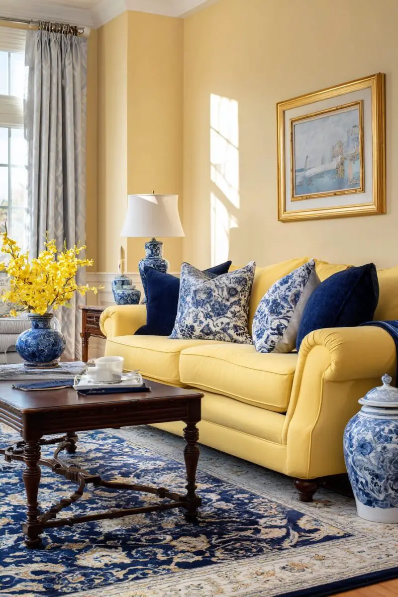
Nothing makes butter yellow pop quite like the deep, rich contrast of navy blue, creating a color combination that’s simultaneously bold and timeless.
This dynamic duo channels coastal vibes without being too literal, offering sophistication that works year-round.
Navy blue serves as a grounding anchor that prevents the yellow from feeling too overwhelming or childish.
The key to nailing this look is in the balance—think butter yellow walls with navy furniture, or the reverse with navy walls and butter yellow accent pieces.
Add brass or gold metallic accents to enhance the luxurious feel while complementing the warmth of the yellow.
White trim and ceiling help keep the space feeling open and prevent these strong colors from making your room feel smaller.
For texture, incorporate natural elements like jute rugs or woven baskets that play nicely with both colors.
Pattern mixing works wonderfully with this combination—try navy and white stripes alongside yellow floral prints for unexpected visual interest.
This color scheme adapts beautifully across design styles, from traditional to contemporary, making it incredibly versatile.
In a traditional space, opt for deeper butter tones with classic navy pieces featuring elegant silhouettes.
For modern interpretations, choose a brighter butter yellow with sleek navy furniture featuring clean lines.
Accent pillows in varied patterns that incorporate both colors help tie the scheme together effortlessly.
Don’t forget the power of art—pieces that combine these colors create cohesion while adding personality.
Window treatments present another opportunity to introduce either color—consider navy curtains with yellow walls or butter yellow drapes against navy paint.
This combination works particularly well in living rooms that receive ample natural light, as it enhances the sunny quality of the yellow while preventing the navy from feeling too dark.
For a seasonal update, swap accessories between summer (more yellow) and winter (more navy) to adjust the room’s feel throughout the year.
The beauty of this pairing lies in its timelessness—it never goes out of style, making it a worthy investment.
If you’re color-shy, start small with butter yellow and navy blue accessories against a neutral backdrop before committing to larger elements.
Remember that different shades of butter yellow—from pale creamy tones to deeper golden hues—create different effects when paired with navy.
This high-contrast combination photographs beautifully, making your living room instantly social media-worthy.
Butter Yellow & Sage Green: Nature’s Perfect Harmony
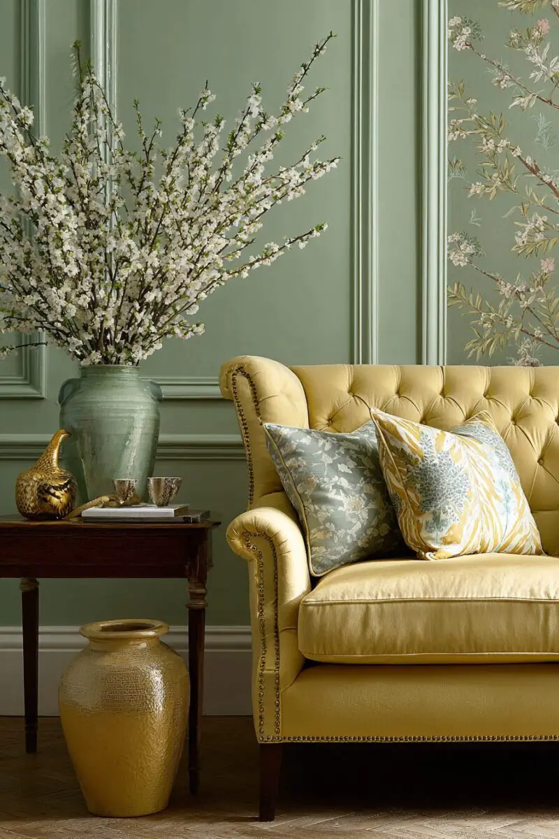
Imagine bringing the gentle balance of a spring garden indoors with the soothing combination of butter yellow and sage green.
This nature-inspired palette creates a space that feels organically peaceful yet visually interesting, perfect for creating a sanctuary away from the chaos of daily life.
The soft undertones of sage green complement butter yellow perfectly, creating a color story that feels as though it was plucked directly from nature.
Unlike more dramatic color combinations, this pairing creates a subtle, sophisticated look that won’t overwhelm your senses when you’re trying to relax.
The earthy quality of sage provides a wonderful grounding effect for the more uplifting, sunny quality of butter yellow.
This combination works beautifully in living rooms with plenty of natural light, as sunlight enhances the natural variations in both colors throughout the day.
Alternatively, sage walls with butter yellow accent pieces create a more subtle, enveloping environment that showcases your yellow accessories beautifully.
Natural materials like wood, rattan, and linen enhance this color scheme, emphasizing its connection to the outdoors.
Light to medium wood tones work especially well, adding warmth without competing with either color.
Botanical prints and patterns that incorporate both hues help reinforce the nature-inspired theme while adding visual texture.
This color combination accommodates various design styles, from farmhouse to mid-century modern, depending on how you implement it.
For a more contemporary look, keep the lines clean and incorporate geometric patterns that feature both colors.
In traditional spaces, opt for classic furniture silhouettes and more muted versions of both the yellow and green.
The versatility of this palette allows for easy seasonal transitions—add deeper greens in winter and brighter yellows in summer.
Indoor plants become not just accessories but key design elements in this scheme, their natural greens playing beautifully against butter yellow backdrops.
Textural elements become particularly important with this subtle color combination—think nubby linens, soft velvets, and natural fiber rugs.
The beauty of this pairing is its longevity—these nature-inspired colors have a timeless quality that transcends passing trends.
This combination has been proven to reduce stress and promote wellbeing, making it perfect for creating a truly restorative living space.
Design Your Dream Room in Minutes!
🏡 Start Creating FREE →Butter Yellow & Coral: Vibrant Energy for Statement Spaces
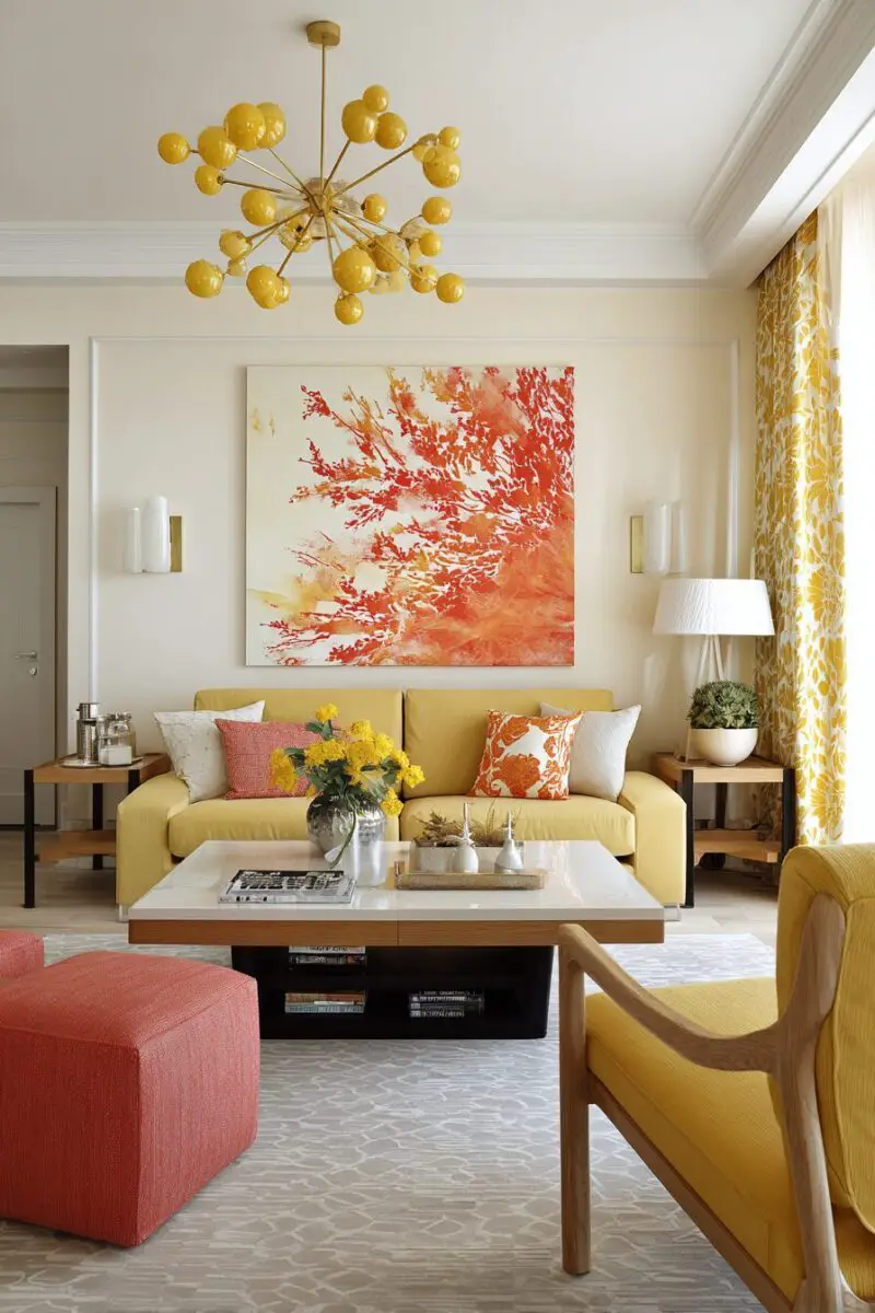
This unexpected color combination packs a punch of personality that instantly energizes your living space with the warmth of a perfect sunset.
Butter yellow and coral together create a bold, joyful atmosphere that feels both contemporary and timeless, perfect for homeowners who aren’t afraid of color.
The warmth these colors share makes them natural companions, while their different intensities create visual interest that draws the eye around the room.
This vibrant pairing works surprisingly well in both modern and traditional spaces, depending on how you balance and implement the colors.
For a more subtle approach, consider butter yellow walls with coral accents through pillows, artwork, and smaller decorative pieces.
More color-confident decorators might opt for a coral sofa against butter yellow walls for a statement that’s impossible to ignore.
The key to preventing this combination from feeling overwhelming is balancing it with plenty of neutral elements—think white trim, natural wood tones, and cream-colored rugs.
Metallics like gold and brass enhance the warmth of both colors, adding a touch of glamour to this already eye-catching scheme.
Patterns that incorporate both colors—like floral prints or geometric designs—help tie the space together cohesively.
This color combination particularly shines in spaces that need an energy boost, like north-facing rooms or areas that don’t receive abundant natural light.
The psychological impact of this pairing is notable—both colors evoke feelings of optimism, creativity, and sociability, making it perfect for entertaining spaces.
Textural contrast becomes important with such vibrant colors—mix smooth surfaces with rougher textures to add depth to the visual experience.
This combination works beautifully with bohemian and eclectic decorating styles, where the mixing of bright colors is already an established aesthetic.
Don’t forget the ceiling—a wash of the palest butter yellow overhead can warm up the entire space while complementing coral elements below.
For a seasonal approach, lean heavier on the coral in summer months and emphasize the butter yellow during fall and winter.
Lighting plays a crucial role with these colors—warm-toned bulbs enhance their natural warmth, while cooler lighting can change how they’re perceived.
Area rugs present another opportunity to introduce either color in a meaningful way that anchors furniture groupings.
This combination translates beautifully to outdoor living spaces as well, creating a seamless transition between indoor and outdoor areas.
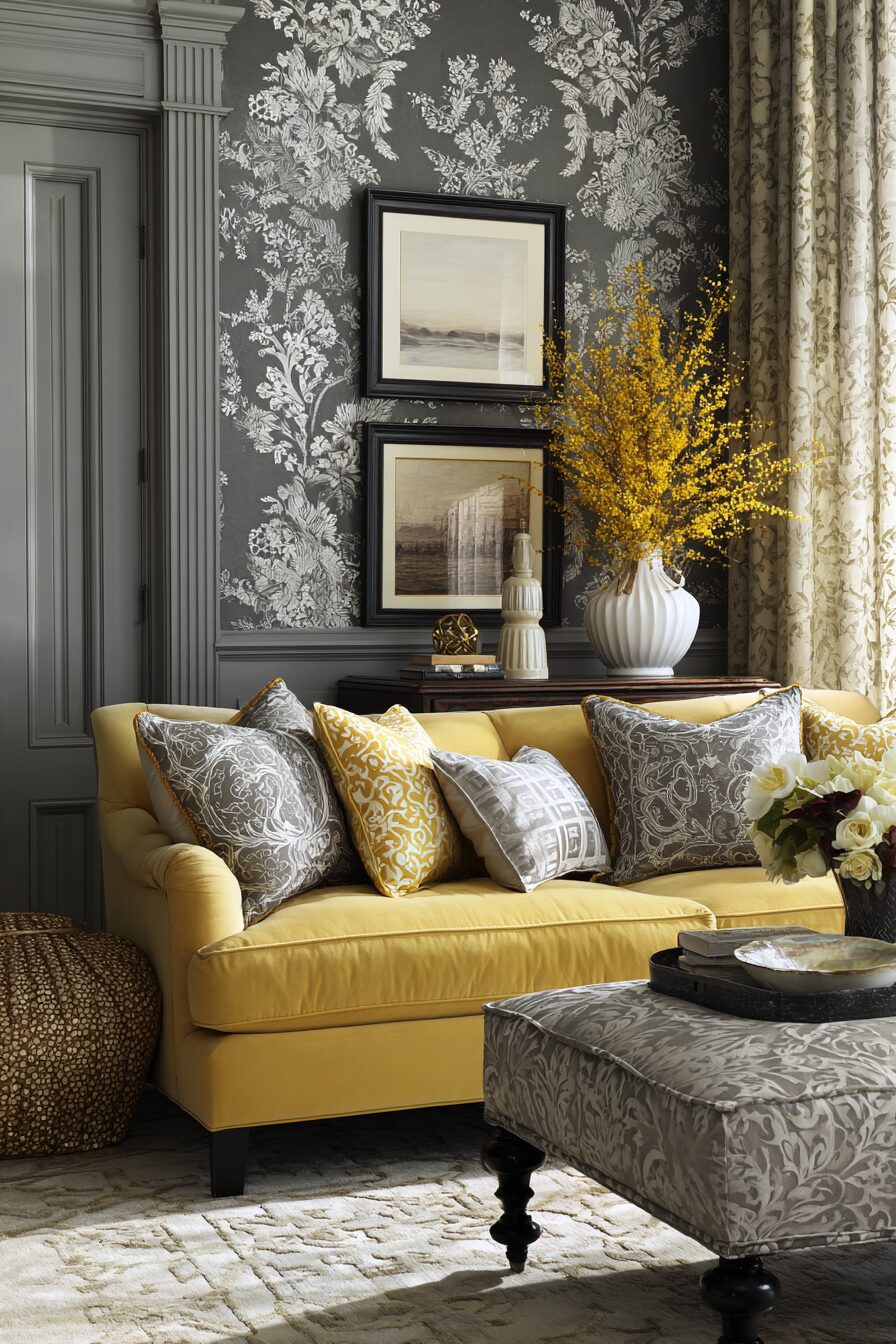
Butter Yellow & Gray: Sophisticated Balance for Modern Spaces
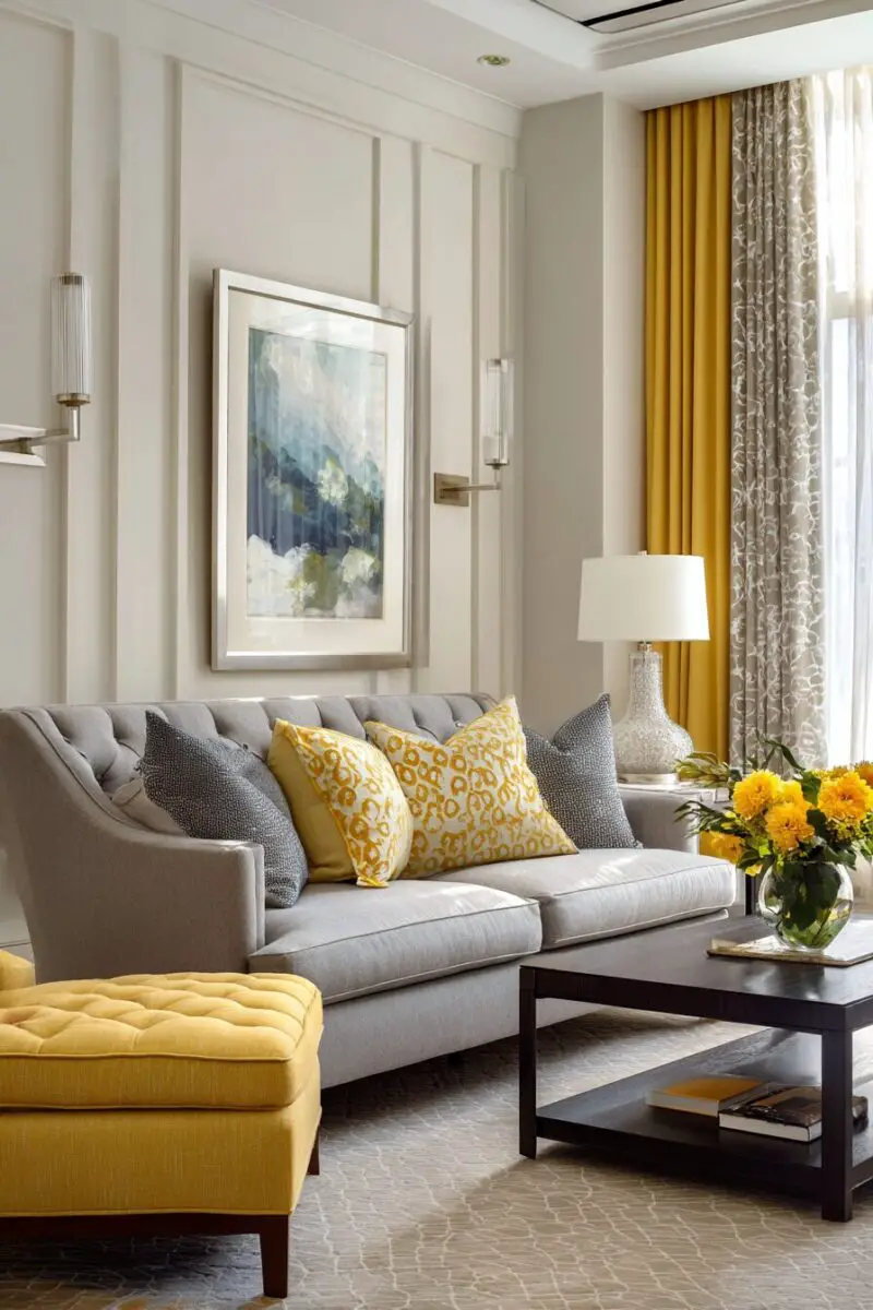

The pairing of butter yellow with gray creates an instantly sophisticated atmosphere that feels both contemporary and timeless.
This combination offers the perfect balance between warm and cool tones, creating a living space that feels both inviting and elegantly restrained.
The neutrality of gray allows butter yellow to shine without competing, making this an ideal choice for those who want color without overwhelming their space.
This color scheme adapts beautifully to changing design trends, giving you flexibility to update accessories without repainting or replacing major furniture pieces.
For a dramatic statement, deep charcoal gray furniture against butter yellow walls creates a high-contrast look that feels decidedly modern.
Alternatively, butter yellow accent pieces against pale gray walls offer a more subtle approach that’s equally effective in creating visual interest.
The sophistication of this pairing makes it particularly well-suited to contemporary and transitional design styles.
Introduce varied textures to prevent this combination from feeling flat—think fuzzy throw pillows, smooth ceramics, and nubby woven blankets.
Metallics serve as perfect accents with this color scheme—silver and chrome enhance the modernity, while gold and brass warm up the overall feel.
This color combination works beautifully in spaces that receive varying amounts of light, as the contrast remains effective regardless of lighting conditions.
The versatility of this pairing allows it to serve as a foundation for seasonal color additions—add burgundy in fall, emerald in winter, or navy in summer.
For open-concept spaces, this combination helps define the living area while complementing adjacent rooms painted in coordinating neutrals.
Wood tones play an important role—medium woods add warmth, while lighter woods enhance the contemporary feel of this color scheme.
This combination looks particularly elegant when carried through in large-scale art pieces that incorporate both colors.
The sophistication of this pairing makes it ideal for formal living rooms while still maintaining an approachable, livable quality.
For small spaces, lighter grays keep the room feeling open while butter yellow adds warmth without closing in the space.
This color combination allows for beautiful layering effects—different shades of gray can create depth while butter yellow provides consistent warmth throughout.
Butter Yellow & White: Fresh, Timeless Simplicity
Nothing says “clean and fresh” quite like butter yellow paired with crisp white, creating a living room that feels perpetually sun-drenched.
This classic combination never goes out of style, offering a timeless foundation that can evolve with your changing tastes over the years.
The beauty of this pairing lies in its versatility—it works equally well in farmhouse, traditional, contemporary, and even minimalist spaces.
White acts as the perfect canvas for butter yellow to shine, allowing you to use as much or as little of the sunny hue as suits your comfort level.
For a bold statement, consider butter yellow walls with white trim, ceiling, and major furniture pieces for a look that’s cheerful without being overwhelming.
If you prefer a more subtle approach, keep walls white and introduce butter yellow through furniture, curtains, and accent pieces for pops of sunshine.
This combination is particularly effective in smaller living rooms, as the brightness of both colors helps the space feel larger and more open.
Texture becomes especially important with this simple color scheme—incorporate natural fibers, interesting weaves, and varied materials to add visual depth.
Wood tones can be introduced as a third element, with both light natural woods and darker stained varieties working beautifully alongside butter yellow and white.
This color combination creates an excellent backdrop for seasonal decorating, allowing you to add accent colors that reflect the time of year.
Pattern mixing works especially well within this palette—stripes, florals, and geometrics in butter yellow and white create visual interest while maintaining cohesion.
The simplicity of this combination makes it particularly well-suited to showcasing art and special collections, which stand out beautifully against these colors.
For architectural interest, consider shiplap, beadboard, or wainscoting in white with butter yellow walls above for dimensional contrast.
This color scheme has tremendous psychological benefits, creating spaces that feel optimistic, clean, and calming simultaneously.
In rooms with abundant natural light, these colors will shift throughout the day, creating subtle variations that keep the space feeling dynamic.
For added interest, introduce black or navy blue as accent colors in small doses through picture frames, lamp bases, or decorative objects.
The timeless quality of this pairing means your investment in butter yellow and white furniture or paint will never feel dated or trendy.
TRENDING NOW
17+ Colorful Eclectic Living Room Makeover SecretsButter Yellow & Teal: Bold Statement for the Color Confident
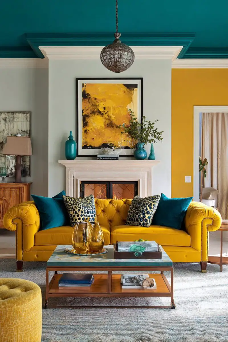
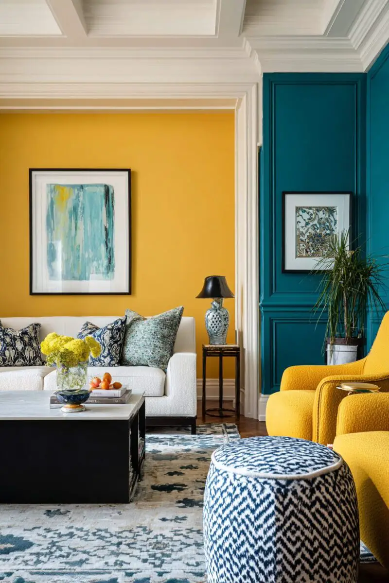
This dynamic color combination instantly creates a living space that feels both invigorating and sophisticated, perfect for those who embrace color with confidence.
The contrast between warm butter yellow and cool teal creates visual electricity that energizes your living room while maintaining an elegant balance.
This pairing draws inspiration from nature—think fields of buttercups against a clear summer sky—yet feels thoroughly contemporary in interior applications.
For maximum impact, consider teal furniture against butter yellow walls, creating a bold statement that still feels intentional rather than chaotic.
The versatility of this combination allows it to work across different design styles, from mid-century modern to bohemian to contemporary.
Balance is key with these strong colors—aim for approximately 70% of one color and 30% of the other for a harmonious relationship.
White or cream acts as an essential third element, providing visual breaks between these bold hues through trim, ceilings, or large accessories.
Wood tones help ground this vibrant combination—medium woods with warm undertones complement both colors particularly well.
Pattern becomes an excellent vehicle for incorporating both colors—look for geometric prints, ikat patterns, or abstract designs that feature both hues.
This color combination works surprisingly well in both abundantly bright spaces and rooms with limited natural light, though the effect will be different in each.
Metallics serve as perfect accents—gold enhances the warmth of the yellow, while chrome or silver complements the coolness of the teal.
For a cohesive look, incorporate various shades of both colors throughout the space—from pale buttery tones to deep golden yellows, light aquas to rich teals.
This bold combination particularly shines when used in contemporary furniture with clean lines that let the colors take center stage.
The psychological effect of this pairing creates spaces that feel both creative and calming—the yellow energizes while the teal provides balance.
This combination makes a wonderful backdrop for art that picks up either or both colors, creating a curated look that feels intentional.
Don’t forget the power of texture with strong colors—velvet, linen, and other tactile fabrics add another dimension to the visual experience.
This pairing works beautifully for creating focal points—a teal fireplace wall against butter yellow, for instance, draws the eye immediately.
The unexpectedness of this combination makes it perfect for those who want their living spaces to reflect their personality rather than following safer trends.
Butter Yellow & Chocolate Brown: Warm, Cozy Sophistication
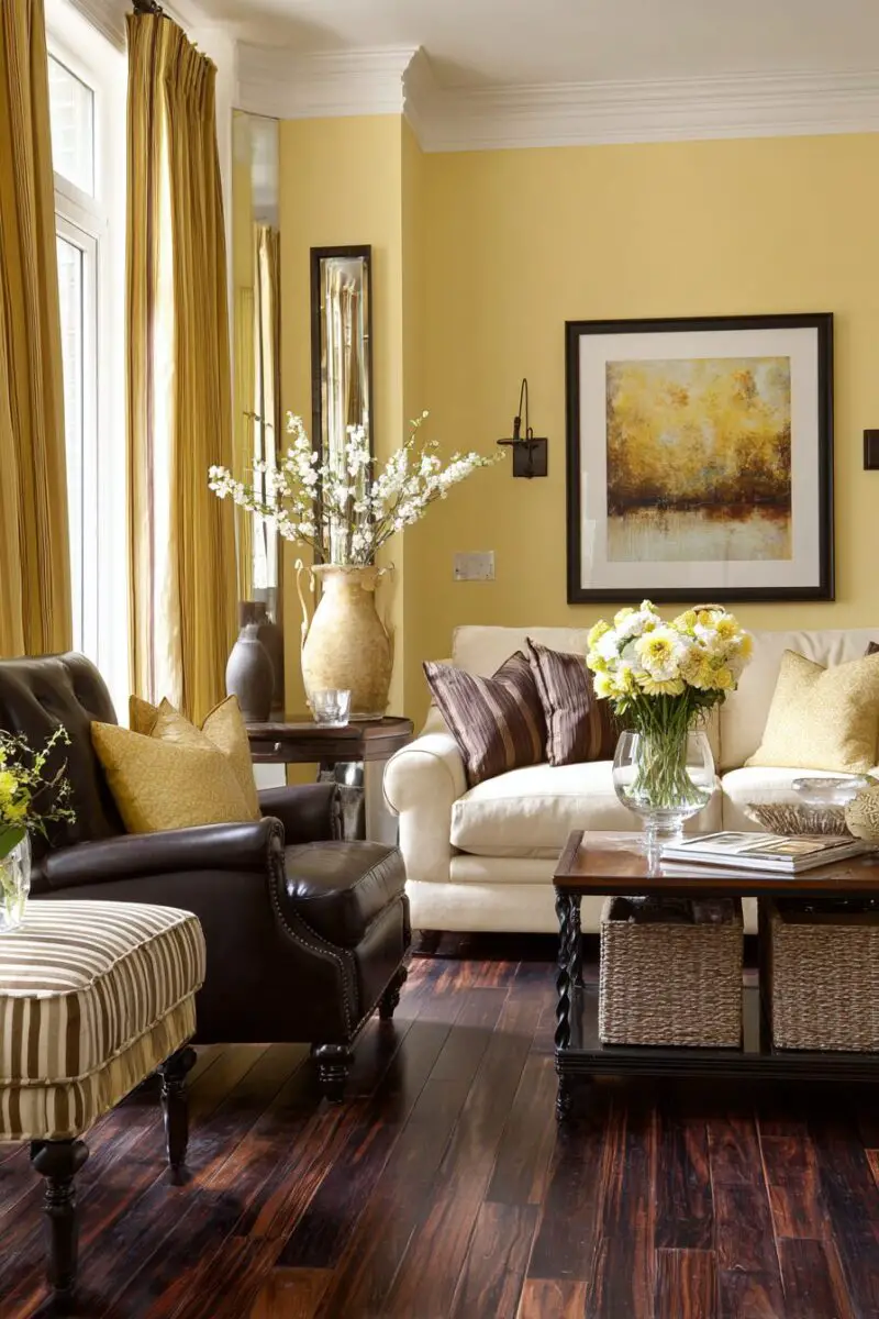
This rich, grounding combination creates an instantly cozy atmosphere that feels both sophisticated and incredibly welcoming.
The warmth of chocolate brown complements butter yellow perfectly, creating depth and dimension that feels natural and timeless.
This pairing works especially well in living rooms that serve as gathering spaces for family and friends, as it creates an environment that encourages relaxation and conversation.
Consider butter yellow walls with chocolate brown furniture for a balanced approach that feels both bold and approachable.
The richness of this combination makes it particularly well-suited to traditional and transitional design styles, though it can work in contemporary spaces with the right application.
Natural materials shine with this color scheme—leather, wood, rattan, and other organic elements enhance the warmth inherent in both colors.
Texture plays a crucial role in preventing this warm combination from feeling flat—incorporate varied textiles like velvet, linen, wool, and sisal for dimensional interest.
This color pairing creates a wonderful foundation for introducing other warm accent colors like burnt orange, deep red, or forest green in small doses.
For a seasonal approach, this combination transitions beautifully from summer to fall, allowing you to add cooler accents in warmer months and lean into its coziness during autumn and winter.
The grounding quality of chocolate brown makes it an excellent choice for larger furniture pieces, while butter yellow works beautifully for walls or significant accent pieces.
This combination works particularly well in rooms with abundant natural light, as it prevents the space from feeling too dark while maintaining warmth.
For rooms with limited natural light, consider using butter yellow more predominantly with chocolate brown as an accent to prevent the space from feeling too heavy.
The timelessness of this pairing means your investment in quality pieces in either color will serve you well for many years, regardless of changing trends.
This combination creates excellent backdrops for displaying collections, as both colors complement most art and decorative objects beautifully.
The contrast between these colors creates visual interest without relying on stark differences, resulting in spaces that feel harmonious rather than jarring.
Gold or brass accents enhance the warmth of this combination, adding a touch of elegance that elevates the overall look.
This color scheme transitions seamlessly to adjacent spaces like dining rooms or entryways, creating a cohesive flow throughout your home.
For those concerned about rooms feeling too dark, remember that butter yellow reflects light beautifully, balancing the depth of chocolate brown perfectly.
Butter Yellow & Lavender: Unexpected Charm with Subtle Elegance
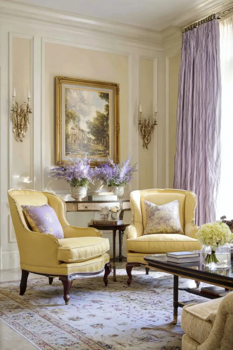
This unconventional color combination creates a living space that feels both fresh and sophisticated, with a distinctly unique personality.
The subtle contrast between warm butter yellow and cool lavender creates a surprisingly harmonious palette that feels both innovative and timeless.
This pairing works remarkably well in transitional spaces, bridging the gap between traditional charm and contemporary freshness.
This combination brings a distinctly spring-like quality to your living room, evoking blooming flowers and fresh beginnings regardless of the season outside.
For a balanced approach, consider butter yellow walls with lavender furniture, or the reverse with lavender as the backdrop for butter yellow accent pieces.
White or cream serves as an essential third element, providing breathing room between these distinctive colors through trim, ceilings, or larger furniture pieces.
The femininity often associated with lavender is beautifully balanced by the gender-neutral quality of butter yellow, creating spaces that appeal to everyone.
This combination works particularly well in spaces that receive morning light, as the changing daylight enhances the subtle undertones in both colors.
Silver or chrome accents complement the coolness of lavender, while gold or brass enhances the warmth of butter yellow—consider incorporating both for balance.
Textural elements become particularly important with this unique combination—think silk, velvet, linen, and other materials with distinct tactile qualities.
Pattern offers an excellent way to incorporate both colors cohesively—floral designs that feature butter yellow and lavender create natural harmony.
This color scheme adapts beautifully to different design styles, from shabby chic to modern, depending on the furniture silhouettes and accessories you choose.
The unexpected nature of this combination makes it perfect for those who want their living spaces to feel uniquely theirs rather than following common color recipes.
This pairing has surprising versatility across seasons—it feels fresh in spring and summer but can be warmed up with deeper accents for fall and winter.
The psychological effect of these colors creates spaces that feel both energizing and calming simultaneously—perfect for living rooms that serve multiple purposes.
This color pairing creates an excellent backdrop for art featuring either or both colors, allowing your wall decor to tie seamlessly into the overall design.
The subtlety of this combination means it works well in open-concept spaces, creating definition without jarring transitions to adjacent areas.
Butter Yellow & Black: Dramatic Contrast with Timeless Appeal

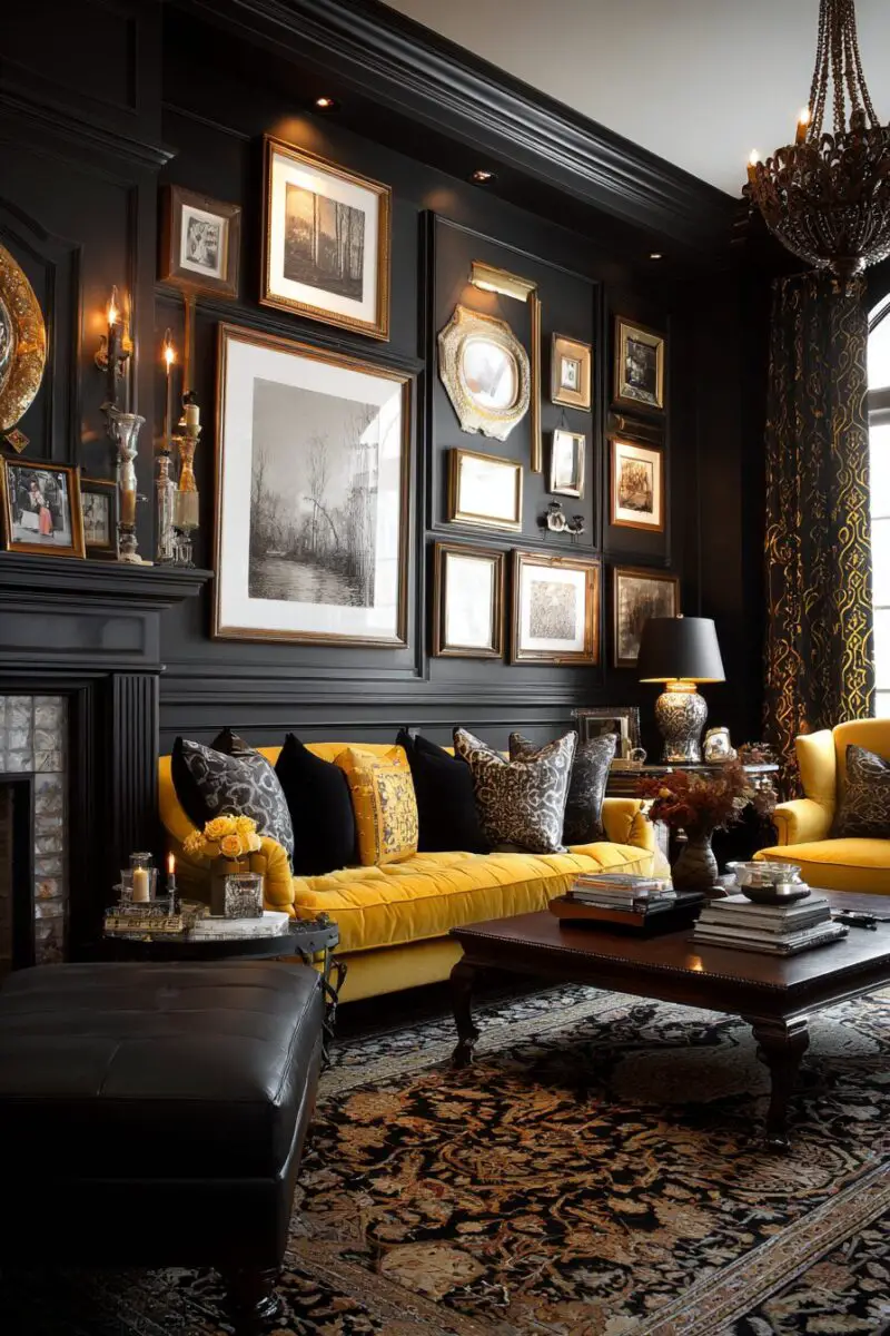
This high-contrast combination instantly creates a sophisticated, dramatic living space that commands attention while remaining surprisingly livable.
The stark contrast between sunny butter yellow and bold black creates visual drama that feels both contemporary and classically elegant.
This pairing works particularly well for those who appreciate color but still want their space to feel polished and architecturally defined.
Alternatively, black walls with butter yellow furniture and accessories create a strikingly modern look that still feels warm and inviting.
The beauty of this combination lies in its simplicity—these two colors need little else to create a complete, designed look.
White serves as a natural third element, providing visual breaks that prevent the contrast from becoming overwhelming.
This color scheme adapts beautifully across design styles—from Art Deco to modern to traditional—depending on your furniture choices and accessories.
The formality of black adds sophistication to the playfulness of butter yellow, creating balanced spaces that feel both serious and cheerful.
The dramatic nature of this pairing makes it particularly well-suited to formal living rooms or spaces where you entertain guests.
This combination creates excellent backdrops for artwork and collectibles, which stand out beautifully against either color.
Metallic accents add another dimension to this strong pairing—gold enhances the warmth while silver adds modern coolness.
Texture becomes especially important with such high contrast—incorporate varied materials like velvet, leather, wool, and linen to add depth.
This color scheme works wonderfully in spaces with architectural interest, as black beautifully outlines interesting features against butter yellow backgrounds.
The timelessness of this combination means your investment in either color will remain stylish regardless of changing trends.
This combination allows for beautiful layering—incorporate different shades of butter yellow from pale cream to deeper gold for sophisticated dimension.
For those concerned about too much black feeling heavy, remember that butter yellow reflects light beautifully, maintaining brightness even with significant black elements.
The graphic quality of this pairing creates spaces that photograph particularly well, making your living room instantly social media-worthy.
Butter Yellow & Dusty Rose: Soft Sophistication with Vintage Charm
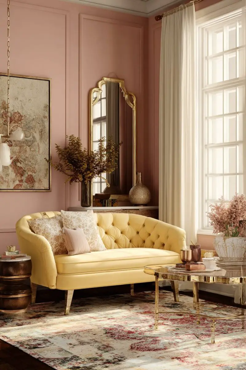
This delicate color combination creates living spaces that feel romantically nostalgic yet surprisingly contemporary, with a softness that’s instantly welcoming.
The subtle warmth shared by butter yellow and dusty rose makes them natural companions, creating a palette that feels harmonious rather than contrasting.
This pairing brings a distinctly feminine energy to your living room without feeling overly precious or saccharine.
The vintage quality of this combination makes it particularly well-suited to spaces with traditional architecture or antique furniture pieces.
Despite its nostalgic associations, this color scheme can feel thoroughly modern when paired with contemporary furniture featuring clean lines and minimal ornamentation.
Cream or ivory serves as an essential third element, providing breathing room between these colors through trim, ceiling, or larger furniture pieces.
The soft nature of this combination makes it ideal for creating living spaces that feel like sanctuaries—perfect for unwinding after hectic days.
This color pairing works beautifully with natural materials like linen, cotton, and light woods, enhancing its organic, effortless quality.
This combination transitions seamlessly through seasons—it feels fresh in spring, cooling in summer, warm in fall, and cozy in winter.
Gold or brass accents enhance the warmth inherent in both colors, adding a touch of elegance that elevates the overall look.
For those concerned about too much pink feeling overly feminine, butter yellow provides the perfect balance, adding warmth without gender associations.
This color scheme adapts beautifully to different design styles—from shabby chic to transitional to mid-century—depending on your furniture and accessories.
The subtlety of this combination makes it particularly well-suited to spaces where you want to create a sense of calm and restoration.
This pairing creates an excellent backdrop for vintage art, botanical prints, or landscape paintings, which tie in beautifully with both colors.
The timeless quality of this combination means your investment in either color will serve you well regardless of changing trends.
This color pairing photographs beautifully in both natural and artificial light, creating spaces that feel consistently inviting throughout the day and evening.
Butter yellow offers unlimited potential for creating living rooms that feel personally yours while remaining stylishly current.
The key to success lies in balancing your chosen colors throughout the space and incorporating varied textures and patterns to add depth and interest.
Now it’s your turn to bring a little sunshine indoors—which butter yellow combination speaks to your style?
