When you’re stuck with blue carpet, picking wall colors might seem tricky at first.
But actually, blue is more neutral than you might think!
Do you want something calm and peaceful?
Or maybe bright and energetic?
Or perhaps elegant and sophisticated?
Your blue carpet can work with all these different moods when paired with the right paint color.
With mypaint color ideas, you’ll be able to work with your carpet instead of against it:
1. Crisp White


White walls are a total game-changer when you have blue carpet.
They make any room feel bigger, brighter, and super clean-looking.
White is like a blank canvas that lets your blue carpet be the star of the show.
When you go with white walls, you’re creating this awesome contrast that makes the blue pop in a really good way.
Think about how the sky looks against fluffy white clouds – that’s the kind of fresh feeling you’ll get!
You don’t have to worry about white being boring either.
There are actually tons of different whites to choose from, from super bright whites to softer, warmer cream-whites.
Pure whites like Benjamin Moore’s “Simply White” give a modern, clean look that works especially well with navy or royal blue carpets.
If your blue carpet is more on the light side, try a softer white like “White Dove” that has just a tiny hint of warmth to it.
The great thing about white walls is they go with literally any furniture or decorations you want to add.
You can change up your room style whenever you want without having to repaint!
Another cool trick is to use white on the walls but add some blue accents in your decorations that match or complement your carpet.
This ties everything together in a way that looks totally intentional.
White walls also reflect more light, which helps brighten up the whole room.
This is super helpful if your blue carpet makes the room feel a little dark.
Don’t forget about your trim and ceiling – painting these white (even a slightly different shade of white than your walls) creates a clean, finished look.
For a more interesting twist, you could do white walls with one accent wall in a color that complements your blue carpet.
This gives you that clean white look but with a little extra personality!
Tap to Explore These Beauties
See my ideas in action 👇 Tap any image to explore full details.
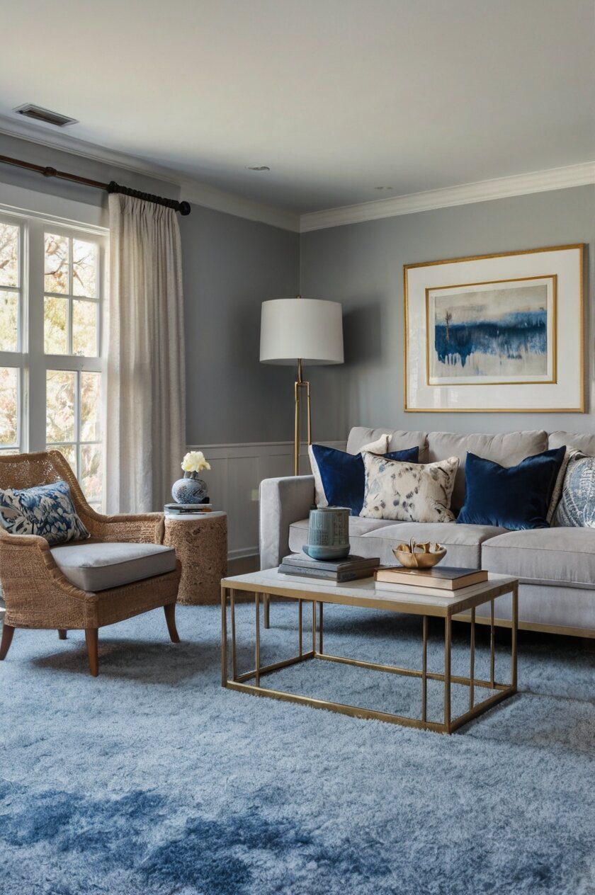
2. Soft Gray


Soft gray is an awesome choice when you’ve got blue carpet in your home.
It’s like the cool friend who gets along with everyone – totally chill and easy to work with.
Gray and blue are natural friends because they both have cool undertones that complement each other perfectly.
When you choose a soft gray for your walls, you’re creating this sophisticated, modern vibe without trying too hard.
The gentle contrast between gray walls and blue carpet creates depth without being overwhelming.
It’s like they’re having a quiet conversation instead of shouting at each other.
Light grays like Sherwin Williams’ “Repose Gray” or Benjamin Moore’s “Gray Owl” work especially well with medium to dark blue carpets.
These colors create a soothing atmosphere that feels both contemporary and timeless.
If your blue carpet is on the lighter side, you might want to go with a slightly darker gray to create more contrast.
The great thing about gray is that it can lean warm or cool depending on its undertones.
For blue carpet, grays with slight blue or purple undertones (cool grays) often work best because they enhance the blue rather than fighting with it.
Avoid grays with strong yellow or green undertones, as these might clash with your blue carpet.
Gray walls give you so much flexibility with your furniture and accessories too.
You can add pops of bright color for energy or stick with a monochromatic palette for a more zen feel.
Consider using different shades of gray throughout the room for a layered, designer look that adds visual interest.
Maybe a slightly darker gray for an accent wall, or lighter gray for trim.
Gray also makes a perfect backdrop for artwork and photos, letting them stand out without competing with them.
If you’re worried about your room feeling too cold with both blue carpet and gray walls, warm it up with wooden furniture, yellow or orange accents, or warm lighting.
Soft textiles like fluffy pillows or throws can also add coziness to balance the cool color scheme.
Gray has been popular for years, and there’s a reason – it’s versatile and creates a perfect neutral backdrop for any style from modern to traditional.

3. Navy Blue
Going with navy blue walls when you already have blue carpet might sound like too much blue, but it can actually look super stylish!
This is all about the monochromatic approach – using different shades of the same color to create depth and interest.
When you paint your walls navy blue with a blue carpet, you’re creating this cozy, wrapped-in-color feeling that’s surprisingly sophisticated.
Think of it as creating your own personal blue cocoon – perfect for bedrooms or dens where you want that cozy, intimate feeling.
Navy walls work especially well if your carpet is a lighter blue, creating a beautiful contrast that feels intentional and designed.
The dark walls with lighter floor creates this reverse effect that’s unexpected and eye-catching.
If your carpet is already navy, you can still go this route by choosing a navy with different undertones – maybe one that’s slightly more purplish or greenish than your carpet.
The key is making sure they’re different enough to create contrast, but similar enough to feel coordinated.
Navy blue walls create an amazing backdrop for gold or brass accents, which will really pop against the dark color.
Picture gold picture frames, lamps, or decorative objects standing out beautifully against that deep blue background.
White furniture or accessories also look incredibly crisp and clean against navy walls – think white curtains, shelving, or furniture for a nautical-inspired look.
Navy has this amazing ability to make a room feel both classic and current at the same time.
It’s been used in interior design for centuries, but still feels fresh and modern.
For smaller rooms, navy walls with blue carpet can actually make the space feel bigger because the boundaries of the room seem to disappear.
It’s like the walls are receding, creating the illusion of more space.
If you’re worried about the room feeling too dark, balance it with plenty of good lighting and mirrors to bounce light around.
Consider adding some lighter blue or white accents to break up all that navy and create visual breathing room.
Navy blue walls work with almost any decorating style – from traditional to ultra-modern.
This versatility makes navy a safe bet if you like to change up your decorations but don’t want to repaint often.
4. Pale Yellow
Pale yellow walls create this amazing sunny contrast with blue carpet that’s instantly cheerful and welcoming.
This color combo is inspired by nature – think blue skies and sunshine, which is why it feels so right to our eyes.
When you choose a soft yellow like Benjamin Moore’s “Hawthorne Yellow” or Sherwin Williams’ “Butter Up,” you’re bringing warmth and light into your space.
The yellow walls and blue carpet complement each other perfectly because they’re complementary colors on the color wheel, which means they make each other pop in the best way.
This color pairing works in any room but is especially nice in kitchens, breakfast nooks, or children’s rooms where that cheerful energy is welcome.
Even on cloudy days, your room will feel sunny and bright with this color combination.
If your carpet is a darker blue, a pale yellow will lighten the whole space and keep it from feeling too heavy or dark.
For lighter blue carpets, the yellow adds just enough warmth to keep the space from feeling too cool or sterile.
The best yellow for your blue carpet depends on the exact shade of blue – warmer blues work well with buttery yellows, while cooler blues pair nicely with yellows that have a slight greenish undertone.
Yellow is known to stimulate conversation and happiness, making it perfect for living rooms or dining areas where you entertain.
When decorating a yellow and blue room, consider bringing in natural elements like plants or wooden furniture to enhance that outdoor-inspired feel.
White trim looks crisp and clean against pale yellow walls, creating a finished, polished look that frames the space beautifully.
If you’re worried about yellow being too bright, remember that pale, buttery yellows are much more subtle than bright lemon yellows.
These softer yellows act almost like neutrals but with added warmth and personality.
You can easily incorporate other accent colors with this palette – greens, oranges, or even pops of red work well in a blue and yellow room.
For a more sophisticated take on this combo, look for yellows with a hint of gold or amber in them rather than pure primary yellow.
This creates a more elegant feel while still maintaining that cheerful contrast with the blue carpet.
Find Your Room's Color Palette
Tap a vibe — get a curated 5-color palette with hex codes you can copy ✨

💭 I Wrote a Book About My Biggest Decorating Mistakes!
When I decorated my first home, I thought I knew what I was doing. Spoiler: I didn't. 😅
💸 I bought a sofa way too big for my living room. Paint colors that looked amazing in the store but terrible on my walls.
5. Sage Green
Sage green walls create this amazing, nature-inspired harmony with blue carpet that feels both fresh and calming.
This color combination reminds you of peaceful outdoor scenes – like a meadow meeting the sky or forest trees against a blue lake.
When you choose sage green for your walls, you’re bringing in this organic, earthy element that balances beautifully with the blue below.
The soft, grayish undertones in sage green make it an incredibly versatile color that plays well with almost any shade of blue carpet.
It’s like sage green was designed to be the perfect partner for blue – not competing, just complementing.
Darker blue carpets look particularly striking with sage green, creating a rich, natural color palette that feels sophisticated yet relaxed.
For lighter blue carpets, sage adds just enough contrast and warmth to create visual interest without overwhelming the space.
The blue-green combination creates this peaceful, tranquil atmosphere that’s perfect for bedrooms, home offices, or any space where you want to feel calm and centered.
Sage green has enough gray in it to act almost like a neutral, meaning it won’t clash with your existing furniture or decorations.
This makes it a safe choice if you’re nervous about adding color to your walls.
Natural materials like wood, stone, and rattan look especially beautiful against sage green walls and blue carpet, enhancing that connection to nature.
Consider adding houseplants to really lean into the natural vibe this color combination creates.
The subtle warmth in sage green helps balance the coolness of blue carpet, creating a more comfortable, inviting space that doesn’t feel too cold.
Lighting plays a big role in how sage green looks – in bright natural light it appears fresher and more vibrant, while in evening light it becomes more muted and cozy.
This color has staying power too – unlike trendy colors that quickly look dated, sage green has a timeless quality that will look good for years to come.
For a more dramatic look, consider a slightly darker sage for an accent wall, with lighter sage on the remaining walls.
White trim and ceiling will keep the space feeling open and airy despite the colored walls and carpet.
Sage green works with nearly any decorating style from farmhouse to modern to traditional, making it an incredibly versatile choice for your blue-carpeted room.
6. Warm Beige
Warm beige walls create this perfect balance with blue carpet – like sandy beaches meeting ocean waves.
This natural color pairing feels both classic and comforting, giving your room a timeless quality that won’t go out of style.
When you choose a warm beige like Benjamin Moore’s “Manchester Tan” or Sherwin Williams’ “Accessible Beige,” you’re adding this subtle warmth that softens the coolness of blue.
The contrast between warm and cool creates visual interest while still feeling harmonious and easy on the eyes.
Beige isn’t boring – it’s actually one of the most versatile backdrop colors you can choose, working with virtually any decorating style or accent color.
The best beiges for blue carpet have slightly warm undertones – look for hints of yellow or pink rather than gray to create that warming effect.
This combo works especially well in living rooms and bedrooms where you want a comfortable, inviting atmosphere without too much color drama.
If your blue carpet is bold or bright, beige walls help tone things down and create a more balanced, sophisticated space.
For darker blue carpets, beige creates a lightening effect that keeps the room from feeling too heavy or cave-like.
The neutral quality of beige means you can change your accessories and accent colors seasonally without needing to repaint.
Think of beige as the supporting actor that makes the star (your blue carpet) look even better without stealing the spotlight.
Beige walls provide the perfect backdrop for artwork, allowing your favorite pieces to stand out beautifully against the neutral background.
To prevent a beige and blue room from looking too plain, add plenty of texture through pillows, throws, curtains, and other soft furnishings.
Natural wood tones work beautifully with this color combination, bringing in additional warmth and organic elements.
Lighting fixtures in gold or brass can add a touch of glamour to this otherwise understated color scheme.
For a more layered look, consider using a slightly darker beige for an accent wall or incorporating beige patterned wallpaper on one wall.
The combination of beige walls and blue carpet creates this subtle coastal vibe that feels relaxed but still put-together.
If you’re selling your home, this neutral-but-interesting color combination appeals to a wide range of potential buyers while still having more personality than plain white.
What's Your Decor Personality?
5 questions · 30 seconds · Instant style match 🏡
7. Light Lavender
Light lavender walls create this dreamy, unexpected harmony with blue carpet that’s both sophisticated and unique.
This color combination has a cool, twilight quality that feels magical without being over-the-top or childish.
When you choose a subtle lavender like Benjamin Moore’s “Organdy” or Sherwin Williams’ “Breathtaking,” you’re bringing in this gentle purple tone that shares blue undertones with your carpet.
The result is a color connection that feels intentional and cohesive, yet still provides enough contrast to be interesting.
Lavender might not be your first thought for wall color, but that’s exactly what makes it special when paired with blue carpet.
The unexpected combination shows design confidence and creates a space that feels truly custom.
This pairing works especially well in bedrooms where the soothing qualities of both blue and lavender create the perfect restful environment.
For darker blue carpets, light lavender walls help brighten the space while maintaining that cool, serene color family.
If your blue carpet has purple undertones already, a light lavender wall color will enhance and complement those tones beautifully.
Silver or chrome accents look particularly striking against lavender walls and blue carpet, adding a modern, slightly glamorous touch.
The great thing about light lavender is that it’s subtle enough to act almost like a neutral while still adding character and softness to your space.
This color combination works with both traditional and contemporary furniture styles, making it versatile for different design preferences.
To keep lavender walls from feeling too “young,” balance them with sophisticated accessories and furniture in more neutral tones.
Natural light changes how lavender appears throughout the day – morning light brings out its blue undertones, while evening light often emphasizes the warmer pink aspects.
Consider white trim to create a clean frame for your lavender walls, helping to define the space and add architectural interest.
For a more dramatic look, pair light lavender walls with dark blue carpet, creating a striking contrast that still feels harmonious because of the shared color family.
Adding plants brings a nice organic element to balance the cool-toned lavender and blue palette.
This color combination lends itself well to a variety of accent colors – silver, gold, pink, deeper purples, or even yellow can all work beautifully as accent colors.
8. Soft Coral
Soft coral walls create this amazing warm-cool contrast with blue carpet that’s unexpected and totally eye-catching.
This color combination feels modern and energetic while still being livable and not too intense for everyday spaces.
When you choose a soft coral like Benjamin Moore’s “Coral Gables” or Sherwin Williams’ “Coral Reef” (but lightened to about 50%), you’re bringing in this perfect complement to blue.
On the color wheel, coral (a pinkish-orange) sits opposite blue, making them complementary colors that naturally enhance each other’s vibrancy.
The warmth of coral balances the coolness of blue carpet in a way that creates perfect color harmony and makes the whole room feel more balanced.
This pairing works especially well in spaces where you want energy and creativity – home offices, craft rooms, or children’s bedrooms.
For darker blue carpets, soft coral walls add light and warmth that prevents the space from feeling too cool or cave-like.
If your blue carpet is more of a light sky blue, coral brings just enough contrast to create visual interest without being overwhelming.
The great thing about coral is that it’s flattering to most skin tones, casting a warm, healthy glow that makes people look and feel their best.
This matters because we want our homes to make us feel good when we’re in them!
White trim and accents look particularly crisp against coral walls, creating clean lines that help define the space.
Natural wood tones also pair beautifully with this color combination, adding another layer of warmth and texture.
For a more sophisticated take on this playful color combo, look for corals with a bit more pink and less orange, and keep them soft rather than bright.
This coral-blue combination works well with many decorating styles, from bohemian to modern to coastal with a twist.
To balance the vibrancy of this color pairing, incorporate plenty of neutrals through furniture and larger pieces, using coral mainly on the walls.
The contrast between coral walls and blue carpet creates a defined floor and wall separation that gives the room structure and intentionality.
Coral is actually more versatile than you might think – it can read as playful and energetic or sophisticated and unexpected depending on how you style the rest of the room.
If you’re nervous about going full coral on all walls, try it on just one accent wall to see how you like the effect with your blue carpet.
9. Mint Green
Mint green walls create this refreshing, spa-like atmosphere when paired with blue carpet that instantly makes a room feel clean and calm.
This color combination reminds you of cool ocean waters meeting fresh greenery – a natural pairing that feels both energizing and relaxing at the same time.
When you choose a soft mint green like Benjamin Moore’s “Fresh Mint” or Sherwin Williams’ “Mint Condition,” you’re bringing in this light, airy color that complements blue perfectly.
The shared cool undertones mean these colors naturally get along, while being different enough to create interest.
Mint and blue sit next to each other on the color wheel, creating what designers call an “analogous” color scheme that’s naturally harmonious to our eyes.
This pairing works especially well in bathrooms and bedrooms where that clean, refreshing feeling is most welcome.
For darker blue carpets, mint walls add brightness and prevent the space from feeling too heavy or dramatic.
If your carpet is a lighter blue, mint green creates a subtle color shift that’s interesting without being jarring.
The youthful quality of mint makes it perfect for kids’ rooms or playrooms, but it can also look surprisingly sophisticated in adult spaces when paired with the right accessories.
White woodwork and trim look especially crisp against mint walls, creating a clean, finished look that enhances the fresh feeling.
To keep this color combination from feeling too “sweet” or juvenile, balance it with some darker accents or natural wood tones.
Plants look absolutely amazing against mint green walls, enhancing that natural, organic feeling and adding depth to the color scheme.
This color pairing works with many different metals – silver for a more modern look, brass for warmth, or black for contrast.
Mint has been popular in design for decades, from vintage 1950s kitchens to today’s modern spaces, showing its staying power as a versatile color choice.
If your blue carpet has greenish undertones already, mint walls will enhance and complement those tones beautifully.
For a more subtle approach, consider a very pale mint that almost reads as a neutral with just a hint of green.
The combination of mint walls and blue carpet creates this clean, slightly retro vibe that feels both nostalgic and fresh at the same time.
This color pairing is perfect for spaces where you want to feel alert but not overwhelmed – home offices, craft rooms, or anywhere you need to focus.
This or That?
Pick your fave — see what other readers chose! 👀
10. Warm Taupe
Warm taupe walls create this perfect neutral backdrop for blue carpet that feels sophisticated and grounded.
This color combination strikes that ideal balance between warm and cool tones, creating a space that feels both cozy and refreshing.
When you choose a rich taupe like Benjamin Moore’s “Weimaraner” or Sherwin Williams’ “Mega Greige,” you’re adding this complex neutral that’s more interesting than beige but still versatile.
The grayish-brown quality of taupe works with blue carpet because it contains both warm and cool undertones, helping to bridge different elements in your room.
Think of taupe as the perfect mediator between your cool blue carpet and warmer elements like wood furniture or brass accents.
This pairing works especially well in living rooms and dining rooms where you want a sophisticated, mature atmosphere without bold colors.
For lighter blue carpets, taupe walls add weight and substance that grounds the space and keeps it from feeling too airy or insubstantial.
If your carpet is a darker blue, taupe creates enough contrast to define the space while still maintaining a cohesive, harmonious feel.
The earthy quality of taupe brings a natural element to the room that balances the sometimes synthetic feeling of carpet.
Taupe walls provide the perfect backdrop for artwork and decorative objects, allowing them to stand out while still having more personality than plain white.
This color combination works with virtually any decorating style from traditional to modern to transitional, making it incredibly versatile.
If you’re selling your home, taupe walls with blue carpet create an appealing neutral palette that helps buyers imagine their own furniture in the space.
The combination of taupe and blue creates this subtle depth that makes rooms feel more intentionally designed rather than just randomly put together.
Unlike trendy colors that quickly look dated, taupe has staying power as a classic neutral that won’t need repainting every few years.
To prevent a taupe and blue room from looking too bland, incorporate plenty of texture through textiles, natural materials, and layered accessories.
Lighting fixtures in warm metals like brass or copper add a beautiful warmth against the taupe walls and complement the coolness of the blue carpet.
This color combination creates a perfect backdrop for both cool and warm accent colors, giving you tremendous flexibility with your decorating.
For a more dramatic look, consider a slightly darker taupe for an accent wall, with lighter taupe on the remaining walls.
💭 I Wrote a Book About My Biggest Decorating Mistakes!
When I decorated my first home, I thought I knew what I was doing. Spoiler: I didn't. 😅
💸 I bought a sofa way too big for my living room. Paint colors that looked amazing in the store but terrible on my walls.
11. Pale Pink
Pale pink walls create this unexpectedly beautiful contrast with blue carpet that feels both fresh and sophisticated.
This color combination has a modern, slightly Nordic feel that’s becoming increasingly popular in contemporary interior design.
When you choose a very soft pink like Benjamin Moore’s “Pink Bliss” or Sherwin Williams’ “Intimate White,” you’re bringing in this subtle warmth that beautifully balances the coolness of blue.
The key is keeping the pink very pale and muted – almost a blush tone rather than anything too saturated or bubble-gum like.
This pairing works especially well in bedrooms, home offices, or anywhere you want a space that feels both calming and uplifting.
For darker blue carpets, pale pink walls lighten the space and create a beautiful contrast that feels intentional and designed.
If your blue carpet is on the lighter side, pale pink creates a subtle color shift that’s interesting without being overwhelming.
The great thing about pale pink is that it acts almost like a neutral but with just enough color to add character and warmth to your space.
Contrary to what you might think, pale pink isn’t necessarily feminine – when paired with blue and the right accessories, it can create a balanced space that appeals to everyone.
Gold or brass accents look absolutely stunning against pale pink walls and blue carpet, adding a touch of glamour to this subtle color scheme.
Natural wood tones also pair beautifully with this color combination, adding warmth and organic texture.
White trim looks crisp and clean against pale pink walls, helping to define the space and add architectural interest.
This color combination works with many different decorating styles, from minimalist to mid-century modern to traditional with a twist.
If you’re worried about the space feeling too sweet or feminine, balance the pink with darker blue accents, black photo frames, or more structured furniture.
The contrast between cool blue carpet and warm pink walls creates visual interest and depth that makes the space feel thoughtfully designed.
This is a color combination that photographs beautifully for social media, if that’s something you care about!
For a more sophisticated take on this combo, look for pinks with just a hint of peach or beige in them, rather than very cool or purplish pinks.
Pale pink reflects light beautifully, giving the room a subtle glow that’s flattering and warm without being obviously colored.
Quick Design Dilemma
Cast your vote — see what other readers think! 🤔
12. Light Cream
Light cream walls create this timeless, versatile backdrop for blue carpet that works in literally any room of your house.
This color combination feels classic and clean while still having more warmth and dimension than stark white.
When you choose a soft cream like Benjamin Moore’s “Swiss Coffee” or Sherwin Williams’ “Alabaster,” you’re bringing in this subtle warmth that softens the coolness of blue carpet.
The slight yellow undertones in cream complement blue perfectly, as these colors sit opposite each other on the color wheel.
Think about how beautiful blue and cream look in nature – like blue sky against cream clouds or blue flowers with cream centers.
This pairing works especially well in living rooms, dining rooms, and bedrooms where you want a versatile backdrop that goes with everything.
For darker blue carpets, cream walls help brighten the space and keep it from feeling too heavy or cave-like.
If your carpet is a lighter blue, cream creates just enough contrast to define the space while still maintaining a soft, cohesive look.
The wonderful thing about cream is that it works with both cool and warm accents, so you can use any other colors you like in the room.
Cream walls provide the perfect canvas for changing your decor seasonally or as your tastes evolve, without needing to repaint.
Wood furniture of any tone – from light maple to dark walnut – looks beautiful against cream walls and blue carpet.
This color combination creates a slightly coastal feel that can be enhanced with nautical accessories or downplayed for a more neutral look.
If you’re selling your home, cream walls with blue carpet have broad appeal to potential buyers while still feeling more welcoming than stark white.
Unlike pure white, cream doesn’t show dirt and scuffs as easily, making it more practical for busy households with kids or pets.
The subtle warmth of cream helps make a room with blue carpet feel more inviting and less sterile than it might with cooler white walls.
For a more layered look, consider using slightly different shades of cream on trim, walls, and ceiling to create subtle depth.
This color combination works with virtually any decorating style from traditional to modern to farmhouse, making it incredibly versatile.
If you’re worried about cream being too plain, you can add interest through textured wallpaper in cream tones or through architectural details like wainscoting or crown molding.
13. Pale Aqua
Pale aqua walls create this flowing, harmonious connection with blue carpet that feels like you’re surrounded by water and sky.
This tone-on-tone approach uses different shades within the same color family to create a space that feels cohesive yet interesting.
When you choose a soft aqua like Benjamin Moore’s “Ocean Air” or Sherwin Williams’ “Tidewater,” you’re bringing in this watery blue-green that naturally complements your blue carpet.
The slight green undertone in aqua creates just enough distinction from your blue carpet while still maintaining a connected color story.
This pairing works especially well in bedrooms, bathrooms, or any space where you want a serene, spa-like atmosphere.
For darker blue carpets, pale aqua walls add light and brightness that balances the deeper floor color beautifully.
If your carpet is a lighter blue, aqua walls create this subtle color shift that adds dimension without contrast – like different depths of ocean water.
The monochromatic quality of this combination (staying within blues and blue-greens) creates a peaceful, harmonious space that naturally reduces stress.
White woodwork and trim look especially crisp against pale aqua walls, helping to define the space and add architectural interest.
This color combination has a slightly coastal or beachy feel that can be enhanced or minimized depending on your accessories and furniture choices.
Natural materials like light woods, jute, and rattan pair beautifully with this color scheme, adding warmth and texture to balance the cool tones.
Silver or chrome accents reflect the cool tones of this color palette, enhancing the fresh, watery feeling of the space.
If you’re worried about too much blue, balance the space with plenty of white or natural wood elements to create visual breaks.
The pale aqua and blue combination creates a backdrop that works beautifully with many accent colors – coral, navy, yellow, or white all pop nicely against this palette.
This color pairing works in both modern and traditional spaces, depending on your furniture and how you accessorize the room.
For a more dramatic take on this theme, consider a slightly deeper aqua on one accent wall with the paler shade on remaining walls.
The blue-green quality of aqua is known to be psychologically calming and is associated with clear thinking, making it perfect for home offices or study spaces.
Morning light enhances the blue tones in aqua, while evening light often brings out more of the green, giving your room subtle color changes throughout the day.