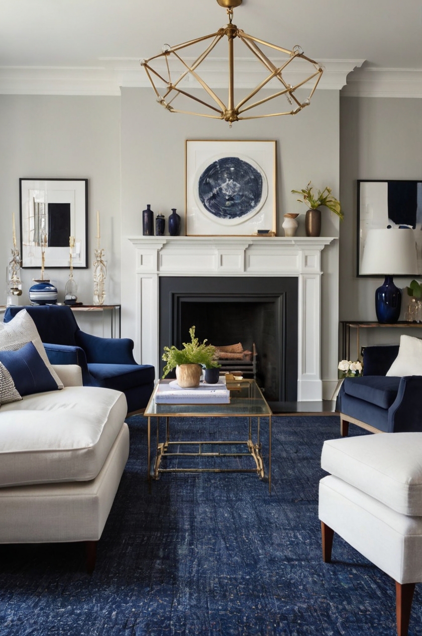
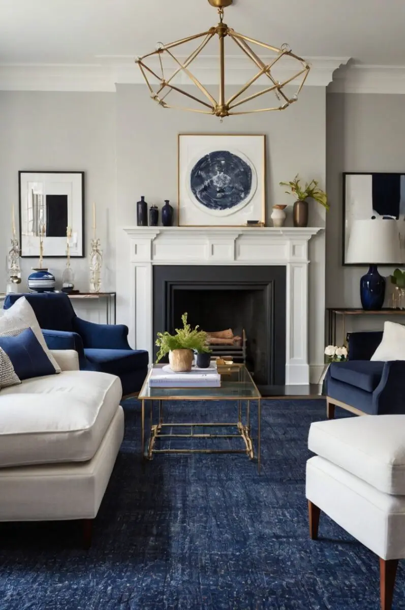
Are you staring at your navy carpet wondering what paint colors will make your room shine?
Navy carpet grounds your space with rich, classic color that exudes sophistication and timelessness.
Good news!
Your navy carpet is actually incredibly versatile and works beautifully with many different paint colors.
Design Your Dream Room in Minutes! – By Madison
🏡 Start Creating FREE →1. Crisp White
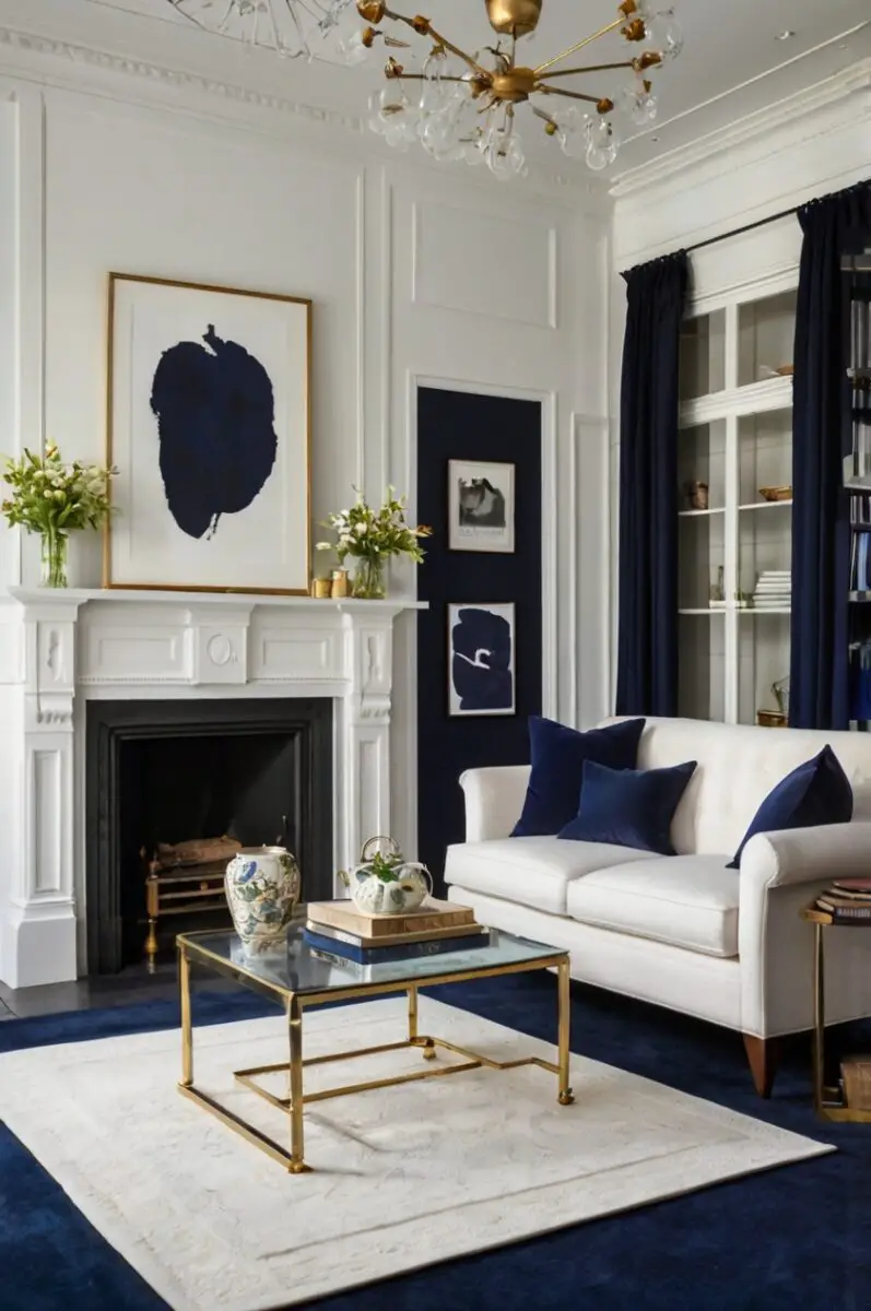
White walls create a classic, fresh contrast with navy carpet that never goes out of style.
This high-contrast pairing gives your space a clean, tailored look reminiscent of nautical themes without being overly themed.
When you choose white with navy carpet, you’re creating a versatile backdrop that allows your furniture and accessories to take center stage.
Benjamin Moore’s “Simply White” or Sherwin-Williams’ “Extra White” offer clean, bright options without harsh undertones.
For a slightly softer look, consider off-whites with subtle warm undertones like Benjamin Moore’s “White Dove” which adds just enough warmth to keep the space from feeling cold.
The beauty of this combination lies in its timelessness and versatility.
Your navy carpet becomes a strong foundation while white walls expand the space visually, making smaller rooms appear larger and brighter.
This pairing works especially well in rooms with limited natural light, helping to bounce what light is available around the space.
In bedrooms, this color scheme creates a calm, restful environment that can be easily accessorized with different accent colors as your tastes change over time.
For living spaces, white walls with navy carpet provide an elegant backdrop for both modern and traditional furniture styles.
When decorating with this combination, consider adding texture through natural wood elements, woven textiles, or metallic accents to prevent the high-contrast look from feeling flat.
Gold or brass accessories particularly shine against this color palette, adding warmth and sophistication.
Remember that white walls show marks more readily, so choosing a quality paint with good washability is important, especially in high-traffic areas or homes with children and pets.
💭 I Wrote a Book About My BIGGEST Decorating Mistakes!
When I decorated my first home, I thought I knew what I was doing. Spoiler alert: I DIDN’T. 😅
💸 I bought a sofa that was WAY TOO BIG for my living room. I chose paint colors that looked amazing in the store but terrible on my walls. I spent THOUSANDS on pieces that didn’t work together. Sound familiar?
“Things I Wish I Knew Before I Decorated My First Home” is your shortcut to avoiding ALL my costly mistakes. ✨ Inside, you’ll find practical, NO-NONSENSE advice that will save you time, money, and a whole lot of decorating regret. 🏡
2. Soft Gray
Soft gray paint creates an elegant, sophisticated harmony with navy carpet that feels both contemporary and timeless.
This understated combination works in nearly any room of your home, offering a refined neutral palette that never feels boring.
When you select a soft gray like Benjamin Moore’s “Stonington Gray” or Sherwin-Williams’ “Repose Gray,” you’re choosing a versatile canvas that complements the deep richness of navy beautifully.
Gray and navy share cool undertones that naturally complement each other, creating a cohesive look that feels intentional and designed.
For a particularly harmonious effect, choose grays with the slightest blue undertone to echo the navy carpet’s hue in a subtle way.
This color combination excels in creating spaces that feel calming and sophisticated without being stark or cold.
The soft gray walls provide enough contrast to define the space while still maintaining a serene, unified feeling throughout the room.
In home offices or studies, this pairing creates a focused, productive environment without being distracting.
Bedrooms benefit from the restful quality of this color combination, promoting relaxation and good sleep.
To add warmth to this cool-toned palette, incorporate natural wood tones through furniture pieces or accessories.
Consider adding texture through textiles like chunky knit throws, velvet pillows, or natural fiber rugs layered over portions of the navy carpet.
Metallic accents in silver, chrome, or brushed nickel enhance the sophisticated feel of this color scheme, adding subtle shine and interest.
For a more dramatic effect, incorporate black accents through picture frames, lamp bases, or furniture to create a tailored, defined look.
This color combination also provides a perfect backdrop for artwork, allowing colorful pieces to stand out beautifully against the neutral walls.
When selecting gray paint, be sure to test samples at different times of day, as gray can shift dramatically in appearance depending on lighting conditions.
Design Your Dream Room in Minutes! – By Madison
🏡 Start Creating FREE →3. Warm Beige
Warm beige paint creates a cozy, inviting atmosphere that softens the cool tones of navy carpet beautifully.
This timeless combination brings balance to your space, with the warmth of beige walls offsetting the coolness of navy flooring.
When you choose a beige like Benjamin Moore’s “Manchester Tan” or Sherwin-Williams’ “Accessible Beige,” you’re creating a versatile foundation that works with virtually any decorating style.
The key to this successful pairing lies in selecting beiges with yellow or pink undertones rather than gray undertones, which brings necessary warmth to contrast with the cool navy carpet.
This color combination excels in living rooms and family spaces where comfort and relaxation are priorities.
The visual warmth of beige walls makes spaces feel instantly more welcoming and lived-in, even when newly painted.
In bedrooms, this pairing creates a cocoon-like effect that promotes rest and relaxation, perfect for winding down at the end of a busy day.
Beige walls provide an excellent backdrop for both traditional and contemporary furnishings, allowing your decorating style to evolve without needing to repaint.
Natural materials like wood, leather, and woven textiles look particularly rich against this color combination, enhancing the organic, grounded feeling of the space.
For accent colors, consider rust, terracotta, or olive green elements through pillows, artwork, or accessories to complement this warm-cool balance.
Gold, brass or bronze metallic elements add sophisticated shine that enhances the warmth of beige while creating pleasing contrast with the navy carpet.
In rooms with limited natural light, this combination helps create a sense of brightness without the starkness that can come with white walls.
For a layered, collected-over-time look, incorporate vintage pieces and natural textures against this neutral backdrop.
Remember that proper lighting is particularly important with beige walls – install warm-toned light bulbs (2700K-3000K) to enhance the cozy quality of this color rather than cool-toned bulbs that might make beige appear dingy.
💭 I Wrote a Book About My BIGGEST Decorating Mistakes!
When I decorated my first home, I thought I knew what I was doing. Spoiler alert: I DIDN’T. 😅
💸 I bought a sofa that was WAY TOO BIG for my living room. I chose paint colors that looked amazing in the store but terrible on my walls. I spent THOUSANDS on pieces that didn’t work together. Sound familiar?
“Things I Wish I Knew Before I Decorated My First Home” is your shortcut to avoiding ALL my costly mistakes. ✨ Inside, you’ll find practical, NO-NONSENSE advice that will save you time, money, and a whole lot of decorating regret. 🏡
4. Pale Blue
Pale blue paint creates a serene, cohesive look with navy carpet that feels natural and harmonious.
This tone-on-tone approach pairs different shades from the same color family for a sophisticated, intentional design statement.
When you select a pale blue like Benjamin Moore’s “Breath of Fresh Air” or Sherwin-Williams’ “Rainwashed,” you’re creating a subtle color story that feels both calming and refined.
This monochromatic approach works because it embraces color psychology – blues generally promote feelings of tranquility, focus, and relaxation.
The contrast between the deep navy carpet and lighter blue walls creates visual interest without jarring color transitions that might feel disruptive.
In bedrooms, this combination particularly shines, creating a sleep-promoting sanctuary that feels like a retreat from the outside world.
Home offices benefit from blue’s focus-enhancing properties, making this combination practical as well as beautiful.
For bathrooms or powder rooms, this pairing creates a spa-like atmosphere that feels clean and refreshing.
To prevent this look from feeling flat, incorporate varying textures through fabrics, wall treatments, or accessories – think grasscloth wallpaper, velvet pillows, or woven window treatments.
Natural wood tones warm this cool palette beautifully, especially medium to light woods like oak, maple, or ash.
White trim and ceiling help define the space and provide crisp contrast that keeps the blue-on-blue from feeling too soft or undefined.
For accent colors, consider introducing small doses of complementary colors like coral, peach, or mustard yellow through accessories for vibrant contrast points.
Silver, chrome, or glass accessories enhance the cool sophistication of this color scheme, adding reflective surfaces that play with light.
When selecting your pale blue, observe how it looks throughout the day in your specific space, as blues can shift dramatically depending on lighting conditions.
This combination works particularly well in rooms with abundant natural light, which helps showcase the subtle variations between the deep navy carpet and lighter blue walls.
5. Sage Green
Sage green paint creates a natural, tranquil partnership with navy carpet that feels both fresh and grounded.
This combination draws inspiration from nature, where deep blues and soft greens exist harmoniously in landscapes from forests to oceans.
When you choose a sage green like Benjamin Moore’s “October Mist” or Sherwin-Williams’ “Sea Salt,” you’re bringing the restorative quality of nature indoors.
The magic of this pairing lies in color theory – blue and green sit adjacent on the color wheel, making them naturally complementary without creating stark contrast.
Sage green’s gray undertones help it bridge the gap between neutral and color, offering subtle interest while still functioning practically as a background hue.
This combination excels in creating spaces that feel connected to the natural world, promoting relaxation and reducing stress.
Living rooms painted sage green with navy carpet feel instantly more peaceful and welcoming to guests.
Bedrooms benefit from this nature-inspired palette, enhancing sleep quality through its calming visual effect.
To enhance this organic palette, incorporate natural materials like wood, stone, rattan, or linen through furniture and accessories.
Plant life thrives visually against sage green walls and navy carpet, adding literal life to this nature-inspired color scheme.
For accent colors, consider adding earth tones like terracotta, clay, or warm browns through textiles and decorative objects.
Metallic finishes in brushed brass or bronze add subtle warmth that enhances without overwhelming this subtle color combination.
Textures play an important role in preventing this combination from feeling flat – consider grasscloth wallpaper, nubby textiles, or ceramic accessories with interesting glazes.
This color pairing adapts well to various decorating styles from bohemian to traditional, mid-century to contemporary farmhouse.
In rooms with plentiful natural light, sage green walls take on a luminous quality that changes subtly throughout the day, adding visual interest.
For rooms with limited natural light, choose sage greens with slightly warmer undertones to prevent the space from feeling too cool or cave-like.
💭 I Wrote a Book About My BIGGEST Decorating Mistakes!
When I decorated my first home, I thought I knew what I was doing. Spoiler alert: I DIDN’T. 😅
💸 I bought a sofa that was WAY TOO BIG for my living room. I chose paint colors that looked amazing in the store but terrible on my walls. I spent THOUSANDS on pieces that didn’t work together. Sound familiar?
“Things I Wish I Knew Before I Decorated My First Home” is your shortcut to avoiding ALL my costly mistakes. ✨ Inside, you’ll find practical, NO-NONSENSE advice that will save you time, money, and a whole lot of decorating regret. 🏡
Design Your Dream Room in Minutes! – By Madison
🏡 Start Creating FREE →6. Warm Terracotta
Warm terracotta paint creates a bold, rich contrast with navy carpet that feels both energizing and grounded.
This pairing draws on color theory principles, as orange (terracotta) and blue (navy) are complementary colors that naturally enhance each other’s vibrancy.
When you select a terracotta like Benjamin Moore’s “Persimmon” or Sherwin-Williams’ “Pottery,” you’re making a confident design statement that feels both timeless and on-trend.
This combination has historical precedent in various cultures from Mediterranean to Southwestern design, giving it an established pedigree while feeling fresh in contemporary contexts.
The warmth of terracotta walls balances beautifully with the coolness of navy carpet, creating a yin-yang effect that feels complete and harmonious.
In living and dining spaces, this combination creates an energetic, sociable atmosphere perfect for gathering and entertaining.
Home offices benefit from terracotta’s energizing quality paired with navy’s focus-promoting properties – a perfect balance for productivity.
This color pairing creates rooms with definite character and mood rather than playing it safe with expected neutrals.
Natural materials like wood, leather, and clay complement this earth-and-sky inspired palette beautifully.
For a globally-inspired look, incorporate textiles with patterns from various cultural traditions – ikat, block prints, or geometric motifs work particularly well.
Metallic accents in brass or copper enhance the warmth of terracotta while creating pleasing contrast with the navy carpet.
Plants add a necessary element of freshness to this rich color combination, with both trailing vines and structural varieties working well.
While this combination makes a statement, it’s surprisingly versatile as both terracotta and navy have stood the test of time across many design eras.
For balance, incorporate some neutral elements through furniture or larger textiles to provide visual rest amid this colorful pairing.
This combination works particularly well in spaces where you want to create a definite mood – consider it for dining rooms, libraries, or conversation areas.
If painting all walls terracotta feels too bold, consider using it on a single accent wall with neutral colors elsewhere for a more moderate approach to this dynamic color combination.
7. Butter Yellow
Butter yellow paint creates a cheerful, sunny contrast with navy carpet that brightens and energizes your space.
This unexpected pairing combines warmth and coolness in a balanced way that feels both classic and fresh.
When you choose a butter yellow like Benjamin Moore’s “Hawthorne Yellow” or Sherwin-Williams’ “Decisive Yellow,” you’re creating a space that radiates optimism and welcome.
Color psychology shows yellow promotes happiness and mental stimulation, while navy provides grounding stability – making this combination emotionally balanced.
The contrast between these colors creates visual interest without being jarring, as both hues share a certain richness and depth.
In kitchens and breakfast nooks, this color combination shines particularly bright, creating energizing spaces for morning routines.
Living rooms with this color scheme feel hospitable and conversation-promoting, perfect for family gatherings or entertaining friends.
Children’s rooms benefit from this combination’s playful yet sophisticated quality that can grow with them from toddlerhood through teens.
White trim and accessories create crisp definition that enhances both the yellow walls and navy carpet, adding architectural interest.
Natural wood tones in medium to dark finishes complement this palette beautifully, adding organic warmth and texture.
For accent colors, consider navy’s complementary color, orange, in small doses through accessories or artwork to create vibrant focal points.
This combination works well with various decorating styles from traditional to contemporary, country to coastal, making it versatile for most homes.
In rooms with northern exposure or limited natural light, butter yellow walls compensate beautifully, creating the illusion of sunshine even on cloudy days.
To prevent this combination from feeling too primary or childlike, choose butter yellows with subtle undertones of gold rather than clear, bright yellows.
Pattern plays well against this bold color combination – consider striped, floral, or geometric prints in coordinating colors for pillows, window treatments, or area rugs.
In spaces where you spend morning time, this combination can actually help energize your day, starting with a color palette that promotes alertness and positivity.
💭 I Wrote a Book About My BIGGEST Decorating Mistakes!
When I decorated my first home, I thought I knew what I was doing. Spoiler alert: I DIDN’T. 😅
💸 I bought a sofa that was WAY TOO BIG for my living room. I chose paint colors that looked amazing in the store but terrible on my walls. I spent THOUSANDS on pieces that didn’t work together. Sound familiar?
“Things I Wish I Knew Before I Decorated My First Home” is your shortcut to avoiding ALL my costly mistakes. ✨ Inside, you’ll find practical, NO-NONSENSE advice that will save you time, money, and a whole lot of decorating regret. 🏡
8. Soft Lavender
Soft lavender paint creates an unexpected yet harmonious pairing with navy carpet that feels both refined and unique.
This combination balances coolness with a touch of warmth, as lavender contains both blue and red undertones that complement navy’s depth.
When you select a soft lavender like Benjamin Moore’s “Violet Mist” or Sherwin-Williams’ “Sensitive Tint,” you’re creating a sophisticated space that feels both calming and slightly daring.
This color pairing has historical precedent in both Victorian design and Art Deco periods, giving it a timeless quality despite feeling fresh and current.
The subtle relationship between these colors – both containing blue elements but in different concentrations – creates a cohesive look with just enough contrast.
In bedrooms, this combination excels at creating restful spaces that feel more interesting than standard neutrals while still promoting relaxation.
Home offices gain a creative edge with this color combination, as purple tones are associated with imagination and insight.
Formal living rooms or sitting areas take on an elegant, slightly feminine quality that feels collected and intentional rather than trendy.
Silver, chrome, or crystal accessories enhance the sophisticated quality of this color scheme, adding reflective elements that play with light.
For contrast, incorporate natural elements like wood or woven materials to ground this somewhat ethereal color combination.
White trim creates necessary definition for this subtle pairing, helping both colors maintain their distinct qualities rather than blending indistinctly.
This combination pairs beautifully with floral patterns that incorporate both navy and lavender tones, creating a cohesive design language throughout the space.
For accent colors, consider soft greens, blush pinks, or pewter grays through accessories to create a layered, sophisticated palette.
This color combination responds dramatically to different lighting conditions, so install dimmer switches to control the mood from energizing to relaxing.
In rooms with abundant natural light, soft lavender takes on a luminous quality that changes subtly throughout the day, adding visual interest.
While bold, this combination has staying power beyond mere trends, as these colors have complemented each other in design for centuries.
Design Your Dream Room in Minutes! – By Madison
🏡 Start Creating FREE →9. Light Coral
Light coral paint creates a warm, unexpected contrast with navy carpet that feels fresh, energetic and thoroughly modern.
This combination plays with color theory in an exciting way, as coral (a red-orange tone) sits opposite blue on the color wheel, creating maximum visual impact.
When you choose a light coral like Benjamin Moore’s “Coral Gables” or Sherwin-Williams’ “Sociable,” you’re making a confident design statement that balances feminine and masculine energies.
This bold pairing creates spaces with definite personality and mood rather than fading into the background like more expected neutrals.
The warmth of coral walls beautifully balances the coolness of navy carpet, creating rooms that feel complete and thoughtfully designed.
In living spaces, this combination creates an energetic, sociable atmosphere perfect for entertaining and conversation.
Dining rooms particularly shine with this color scheme, as coral tones are known to stimulate appetite and encourage lively discussion.
Home offices benefit from coral’s energizing properties balanced with navy’s focus-enhancing qualities – a productive combination indeed.
White trim and ceiling help define and brighten this rich color combination, preventing it from feeling overwhelming in smaller spaces.
Natural wood tones in light to medium finishes provide necessary grounding elements that complement this vibrant color pairing.
For accent colors, consider teal, emerald green, or mustard yellow in small doses through accessories or artwork for additional visual interest.
Metallic elements in gold or brass enhance the warmth of coral while creating beautiful contrast with the navy carpet.
This combination works surprisingly well with various patterns from geometric to floral, allowing for playful textile choices.
While bold, this pairing has historical precedent in both tropical and coastal design traditions, giving it longevity beyond current trends.
In north-facing rooms or spaces with limited natural light, coral walls compensate beautifully, adding warmth and brightness.
To make this combination more subtle, consider a coral with significant white content for a softer, more pastel effect that still maintains the color relationship.
💭 I Wrote a Book About My BIGGEST Decorating Mistakes!
When I decorated my first home, I thought I knew what I was doing. Spoiler alert: I DIDN’T. 😅
💸 I bought a sofa that was WAY TOO BIG for my living room. I chose paint colors that looked amazing in the store but terrible on my walls. I spent THOUSANDS on pieces that didn’t work together. Sound familiar?
“Things I Wish I Knew Before I Decorated My First Home” is your shortcut to avoiding ALL my costly mistakes. ✨ Inside, you’ll find practical, NO-NONSENSE advice that will save you time, money, and a whole lot of decorating regret. 🏡
10. Muted Teal
Muted teal paint creates a sophisticated, analogous color scheme with navy carpet that feels rich and cohesive.
This combination plays with different shades in the blue-green spectrum, creating depth and interest while maintaining color harmony.
When you select a muted teal like Benjamin Moore’s “Aegean Teal” or Sherwin-Williams’ “Riverway,” you’re creating a layered color story that feels intentional and designed.
The relationship between these colors – both containing blue but with teal incorporating green elements – creates a nuanced palette that feels naturally harmonious.
This color combination excels in creating spaces with depth and character without relying on stark contrasts or obvious color pairings.
In living rooms, this combination creates a sophisticated, enveloping atmosphere perfect for both relaxation and entertaining.
Home libraries or reading nooks benefit from this thoughtful color pairing, creating focused spaces that encourage concentration and comfort.
Primary bathrooms transform into spa-like retreats with this water-inspired color palette that feels naturally restorative.
Natural materials like wood, stone, and woven textures enhance this color combination, adding organic elements that complement these nature-inspired hues.
Metallic accents in brushed brass or bronze add warmth and sophistication that prevents this cool-leaning palette from feeling cold.
White or cream elements through trim, accessories, or textiles create necessary contrast points that help define the space.
For accent colors, consider introducing small amounts of rust, terracotta, or amber to warm and balance this cool-toned combination.
This color pairing adapts beautifully to various design styles from coastal to contemporary, traditional to transitional.
Artwork and textiles in complementary rust or coral tones stand out beautifully against this blue-green backdrop.
Layering different patterns that incorporate both navy and teal creates visual richness without introducing new colors to the palette.
Plants thrive visually against this nature-inspired color scheme, adding literal life and freshness to these water-and-earth tones.
11. Charcoal Gray
Charcoal gray paint creates a sophisticated, moody partnership with navy carpet that feels deeply modern and intentional.
This combination plays with depth and tone rather than contrast, creating spaces with considerable visual weight and presence.
When you choose a charcoal gray like Benjamin Moore’s “Wrought Iron” or Sherwin-Williams’ “Iron Ore,” you’re making a bold choice that signals design confidence.
The relationship between these dark hues creates a layered look that feels particularly current in today’s design landscape, where depth and richness are highly valued.
This color combination excels in creating intimate spaces that feel cocooning and enveloping – perfect for rooms where you gather in the evening.
Media rooms particularly benefit from this dark color scheme, as it reduces light reflection and creates an immersive viewing experience.
Home offices gain a serious, professional quality with this combination, creating spaces that promote focus and concentration.
Primary bedrooms transform into sophisticated retreats with this pairing, particularly effective for those who appreciate a dramatic, hotel-inspired aesthetic.
To prevent this dark combination from feeling overwhelming, incorporate adequate lighting with multiple sources at different heights.
Contras

