Oak wood has this warm, golden tone that can either clash horribly with the wrong colors or create magic with the right ones.
The good news is that oak is actually one of the most flexible woods when it comes to matching colors.
You can go bold and dramatic, or keep things soft and classic.
The key is understanding what makes oak special and how different colors play with its natural beauty.
Some oak pieces lean more toward yellow undertones, while others have reddish or brown hints.
This means you have tons of options that can work beautifully:
Classic White Chairs


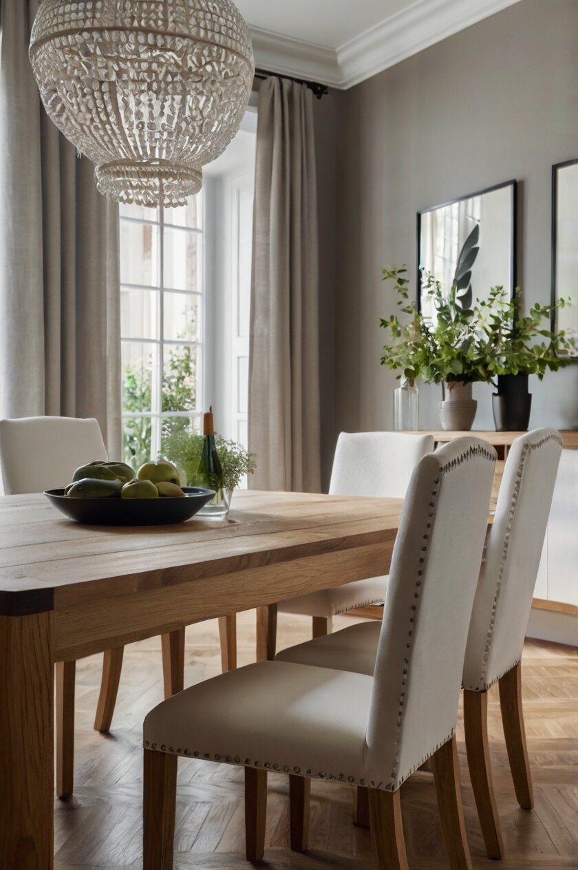
White chairs paired with an oak table create one of the most timeless and elegant combinations you can choose.
This pairing works because white acts as a perfect neutral that lets the natural beauty of your oak table take center stage.
The contrast between the warm, golden tones of oak and the crisp, clean look of white creates visual interest without being overwhelming.
White chairs make your dining room feel larger and brighter, which is especially helpful if you have a smaller space or limited natural light.
The light color reflects more light around the room, creating an airy and open atmosphere that many people love.
This combination works with almost any decorating style, from farmhouse to modern to traditional.
You can choose from many different shades of white, including pure white, cream, ivory, or off-white.
Each shade will give you a slightly different feel, so consider the other colors in your room when making your choice.
Pure white creates the strongest contrast and most dramatic look, while cream or ivory feels softer and more relaxed.
White chairs are also practical because they’re easy to clean and maintain, especially if you choose chairs with wipeable surfaces.
They won’t show dust as much as darker colors, and they always look fresh and clean.
If you’re worried about white getting dirty, look for chairs with removable covers that you can wash, or choose white leather or vinyl that wipes clean easily.
This color combination never goes out of style, so you won’t have to worry about your dining room looking dated in a few years.
Rich Navy Blue Chairs
Navy blue chairs create a sophisticated and striking look when paired with your oak table.
This deep, rich color provides a beautiful contrast against the Warm Wood Tones while still feeling classic and timeless.
Navy blue is considered a neutral in the design world, which means it works well with many other colors and won’t clash with your existing decor.
The combination of navy and oak gives your dining room a refined, almost nautical feel without being too themed or overwhelming.
Navy blue chairs work especially well if your oak table has cooler undertones or if you want to balance out very warm, yellow-toned oak.
The cool blue helps tone down any excessive warmth and creates a more balanced color palette in your space.
This color choice works beautifully in both traditional and modern settings, making it a versatile option for any home style.
Navy blue chairs can be formal enough for special occasions but still comfortable and welcoming for everyday family meals.
You can find navy chairs in many different materials, from upholstered fabric to painted wood to leather.
Each material will give you a different texture and feel, so think about how you want your dining room to look and feel.
Fabric chairs feel cozy and comfortable, while leather chairs look more formal and sophisticated.
Navy blue also pairs wonderfully with white accents, so if you have white walls, trim, or other furniture, this color will tie everything together beautifully.
The combination creates a classic, preppy look that many people find appealing and comfortable.
Warm Gray Chairs
Gray chairs offer a modern and sophisticated look that complements oak tables beautifully.
The key is choosing the right shade of gray – you want warm grays that have brown or beige undertones rather than cool grays with blue undertones.
Warm grays work because they share some of the same undertones as oak wood, creating a harmonious and cohesive look.
This combination feels contemporary and fresh while still being timeless enough to work for years to come.
Gray is an excellent choice if you want something more interesting than white but not as bold as a bright color.
It provides a subtle contrast that lets your oak table shine while adding visual interest to your dining room.
Warm gray chairs work especially well in modern or transitional decorating styles, but they can also work in more traditional settings.
The color is sophisticated enough for formal dining but relaxed enough for everyday use.
Gray chairs are also very practical because they don’t show dirt and wear as much as lighter colors.
This makes them a great choice for families with children or for people who entertain frequently.
You can find gray chairs in many different shades, from light dove gray to deeper charcoal tones.
Lighter grays feel more casual and airy, while darker grays feel more formal and dramatic.
Consider the amount of natural light in your dining room when choosing your shade – darker grays work better in bright rooms, while lighter grays are better for rooms with less natural light.
Gray also works well with accent colors, so you can add pops of color through accessories like pillows, artwork, or table settings.
Deep Forest Green Chairs
Forest green chairs create a rich, natural look that pairs beautifully with the warm tones of oak wood.
This color combination brings an earthy, organic feel to your dining room that many people find very appealing and calming.
Green is a natural complement to brown wood tones because both colors are found together in nature.
Think about how green leaves look against brown tree trunks – it’s a combination that always looks right and harmonious.
Deep forest green chairs work especially well if you want your dining room to feel cozy and intimate.
The dark color creates a sense of warmth and enclosure that makes the space feel like a comfortable retreat.
This color choice works beautifully in traditional, rustic, or even bohemian decorating styles.
Forest green chairs can make your dining room feel like a sophisticated English country home or a cozy cabin retreat.
The color is rich enough to feel formal for special occasions but natural enough to be comfortable for everyday meals.
Green chairs also work well with other natural materials and colors, so you can easily incorporate elements like plants, natural fibers, or stone accents.
If your oak table has reddish undertones, forest green chairs will create a beautiful complementary color scheme.
Red and green are opposite on the color wheel, which means they create a pleasing contrast when used together.
You can find forest green chairs in many different materials and styles, from upholstered dining chairs to painted wood chairs.
The color looks especially beautiful in rich fabrics like velvet or leather, which add to the luxurious feel of the combination.
Soft Cream Chairs
Cream chairs offer a gentle, warm alternative to pure white that creates a softer, more relaxed look with your oak table.
This color combination feels cozy and inviting while still being light and airy enough to make your dining room feel spacious.
Cream shares some of the warm undertones found in oak wood, which creates a harmonious and cohesive color palette.
The result is a dining room that feels pulled together and thoughtfully designed rather than random or mismatched.
Cream chairs work especially well if your oak table has yellow or golden undertones because the colors complement each other naturally.
This combination creates a warm, sunny feeling that many people find very appealing and comfortable.
Cream is more forgiving than pure white when it comes to showing dirt and wear, making it a practical choice for families.
It’s also less stark than white, which some people find more welcoming and comfortable for everyday dining.
This color combination works beautifully in farmhouse, cottage, or shabby chic decorating styles.
It creates a relaxed, casual feeling that’s perfect for family meals and informal entertaining.
Cream chairs can be found in many different materials, from painted wood to upholstered fabric to wicker.
Each material will give you a different texture and feel, so consider what matches your personal style and the overall look of your home.
You can also add interest by choosing cream chairs with different textures or patterns, like woven fabric or carved wood details.
The neutral color provides a perfect backdrop for colorful accessories like bright placemats, colorful flowers, or patterned table runners.
Bold Black Chairs
Black chairs create a dramatic and sophisticated look when paired with an oak table.
This high-contrast combination is bold and striking, making a strong design statement in your dining room.
The contrast between the warm, light wood and the deep black creates visual interest and drama that many people find very appealing.
Black chairs work especially well if you want your dining room to feel formal and elegant.
This combination has a timeless, classic feel that works in both traditional and modern settings.
Black is considered a neutral color in design, which means it works well with many other colors and won’t clash with your existing decor.
The combination of black and oak creates a sophisticated color palette that feels intentional and well-designed.
Black chairs are also very practical because they don’t show dirt, wear, or stains as much as lighter colors.
This makes them an excellent choice for families with children or for people who entertain frequently.
You can find black chairs in many different styles and materials, from sleek modern designs to more traditional or rustic styles.
The color works well with both glossy and matte finishes, so you can choose the look that best fits your personal style.
Black chairs also provide a great foundation for adding color through accessories like bright cushions, colorful table settings, or vibrant artwork.
The neutral black won’t compete with these accent colors, allowing you to change your decor seasonally or whenever you want a fresh look.
This combination works especially well in rooms with plenty of natural light, where the contrast won’t make the space feel too dark or heavy.
Burgundy Wine Chairs
Burgundy chairs bring a rich, luxurious feel to your dining room when paired with an oak table.
This deep red color creates a warm and inviting atmosphere that’s perfect for intimate dinners and special occasions.
Burgundy and oak work beautifully together because both colors share warm undertones that create a harmonious and cohesive look.
The combination feels sophisticated and elegant while still being warm and welcoming.
This color choice works especially well if your oak table has reddish undertones, as the colors will complement each other naturally.
Burgundy chairs create a sense of richness and luxury that makes your dining room feel special and formal.
The deep color adds depth and interest to your space without being overwhelming or too bold.
This combination works beautifully in traditional, formal, or even romantic decorating styles.
Burgundy chairs can make your dining room feel like an elegant restaurant or a sophisticated wine cellar.
The color is associated with fine wine and luxury, which adds to the upscale feeling of your space.
Burgundy chairs work well with other rich colors like gold, cream, or deep green, allowing you to create a layered and sophisticated color palette.
You can find burgundy chairs in many different materials, from rich velvet upholstery to leather to painted wood.
Each material will give you a different texture and level of formality, so consider what matches your personal style.
The color is also practical because it hides stains and wear better than lighter colors, making it a good choice for frequently used dining rooms.
Burgundy chairs create a timeless look that won’t go out of style, making them a smart long-term investment for your home.
Charcoal Gray Chairs
Charcoal gray chairs offer a modern and sophisticated alternative to black that still provides strong contrast with your oak table.
This deep gray color creates a contemporary look that works well in both modern and traditional settings.
Charcoal gray is less harsh than black but still provides enough contrast to create visual interest and drama in your dining room.
The color works especially well if you want a modern look but find pure black too stark or overwhelming.
Charcoal gray chairs create a sophisticated and refined atmosphere that’s perfect for both everyday dining and special occasions.
The color is neutral enough to work with many different accent colors and decorating styles.
This combination feels current and fresh while still being timeless enough to work for years to come.
Charcoal gray chairs are also very practical because they don’t show dirt, dust, or wear as much as lighter colors.
This makes them an excellent choice for busy families or people who entertain frequently.
The color works well with both matte and glossy finishes, giving you flexibility in choosing the exact look you want.
Charcoal gray chairs pair beautifully with white accents, creating a classic and sophisticated color palette.
You can also add warmth to the combination by incorporating natural materials like wood, stone, or plants.
The neutral gray provides a perfect backdrop for colorful accessories, allowing you to change your decor seasonally or whenever you want a new look.
This color combination works especially well in contemporary homes but can also work in more traditional settings when paired with the right accessories and styling.
Sage Green Chairs
Sage green chairs create a calming and natural look when paired with your oak dining table.
This soft, muted green color brings a peaceful, organic feeling to your dining room that many people find very relaxing and appealing.
Sage green works beautifully with oak because both colors are inspired by nature and share some similar undertones.
The combination creates a harmonious and soothing atmosphere that’s perfect for long, leisurely meals with family and friends.
This color choice works especially well if you want your dining room to feel like a peaceful retreat from the busy world outside.
Sage green chairs add color and interest without being overwhelming or too bold.
The muted tone is sophisticated and elegant while still being soft and welcoming.
This combination works beautifully in farmhouse, cottage, or bohemian decorating styles.
Sage green chairs can make your dining room feel like a garden room or a peaceful countryside retreat.
The color pairs well with other natural materials like linen, wood, and stone, allowing you to create a cohesive natural look.
Sage green also works well with white, cream, and other neutral colors, giving you flexibility in your decorating choices.
You can find sage green chairs in many different styles and materials, from upholstered fabric chairs to painted wood chairs.
The color looks especially beautiful in natural fabrics like linen or cotton, which add to the organic feel of the combination.
Sage green is also a practical choice because it’s a medium tone that doesn’t show dirt or wear as much as very light or very dark colors.
This makes it a good choice for families with children or for people who use their dining room frequently.
Caramel Brown Chairs
Caramel brown chairs create a warm, monochromatic look when paired with your oak table that feels cozy and inviting.
This combination uses different shades of brown to create depth and interest while maintaining a harmonious and cohesive color palette.
The key is choosing a caramel brown that’s different enough from your oak table to create some contrast but similar enough to feel intentional and coordinated.
This monochromatic approach creates a sophisticated and elegant look that feels very pulled together and well-designed.
Caramel brown chairs work especially well if you want your dining room to feel warm and cozy.
The combination of warm wood tones creates an intimate atmosphere that’s perfect for family meals and casual entertaining.
This color choice works beautifully in rustic, traditional, or casual decorating styles.
Caramel brown chairs can make your dining room feel like a comfortable cabin or a cozy farmhouse kitchen.
The warm brown color is also very versatile and works well with many different accent colors.
You can add interest by incorporating different textures and materials, like leather, fabric, or woven elements.
The neutral brown color won’t compete with colorful accessories, allowing you to change your decor seasonally or whenever you want a fresh look.
Caramel brown chairs are also practical because they don’t show dirt, scratches, or wear as much as lighter colors.
This makes them an excellent choice for families with children or for people who use their dining room frequently.
The color is timeless and classic, so you won’t have to worry about your dining room looking dated in a few years.
This combination creates a warm and welcoming atmosphere that makes everyone feel comfortable and at home.
Dusty Blue Chairs
Dusty blue chairs bring a soft, romantic feel to your dining room when paired with an oak table.
This muted blue color creates a gentle contrast with the warm wood tones while maintaining a sophisticated and elegant look.
Dusty blue is less bold than navy blue but more interesting than gray, making it a perfect middle ground for people who want color without being too dramatic.
The combination of dusty blue and oak creates a timeless and classic look that works in many different decorating styles.
This color choice works especially well if you want your dining room to feel serene and peaceful.
The soft blue color has a calming effect that makes the space feel like a relaxing retreat.
Dusty blue chairs work beautifully in farmhouse, cottage, or shabby chic decorating styles.
The color can make your dining room feel like a charming French countryside home or a peaceful seaside cottage.
Dusty blue also pairs well with other soft colors like cream, white, and soft pink, allowing you to create a layered and sophisticated color palette.
You can find dusty blue chairs in many different materials and styles, from upholstered fabric chairs to painted wood chairs.
The color looks especially beautiful in soft fabrics like linen or cotton, which add to the romantic feel of the combination.
Dusty blue is also a practical choice because it’s a medium tone that doesn’t show dirt or wear as much as very light colors.
This makes it a good choice for families or for people who entertain frequently.
The color is also timeless and won’t go out of style, making it a smart long-term investment for your home.
This combination creates a soft and welcoming atmosphere that makes everyone feel comfortable and relaxed.
Mustard Yellow Chairs
Mustard yellow chairs create a bold and cheerful look when paired with your oak dining table.
This warm, golden color complements the natural tones in oak wood beautifully, creating a sunny and inviting atmosphere in your dining room.
Mustard yellow is a sophisticated alternative to bright yellow that feels more mature and elegant while still adding plenty of personality and warmth.
The combination of mustard yellow and oak creates a rich, warm color palette that feels both classic and contemporary.
This color choice works especially well if you want your dining room to feel energetic and welcoming.
The warm yellow color creates a cheerful atmosphere that’s perfect for family meals and casual entertaining.
Mustard yellow chairs work beautifully in bohemian, eclectic, or modern farmhouse decorating styles.
The color can make your dining room feel like a sunny California kitchen or a cozy European bistro.
Mustard yellow also pairs well with other warm colors like cream, brown, and orange, allowing you to create a layered and sophisticated color palette.
You can also balance the warmth by incorporating cooler colors like navy blue or forest green in your accessories and decor.
Mustard yellow chairs are available in many different materials and styles, from upholstered fabric chairs to painted wood chairs.
The color looks especially beautiful in rich fabrics like velvet or corduroy, which add texture and depth to the combination.
Mustard yellow is also a practical choice because it’s a medium tone that doesn’t show dirt or stains as much as very light colors.
This makes it a good choice for families with children or for people who use their dining room frequently.
The color adds personality and character to your space while still being sophisticated enough for formal dining occasions.
Terracotta Orange Chairs
Terracotta orange chairs bring warmth and earthiness to your dining room when paired with an oak table.
This rich, clay-inspired color creates a beautiful complement to the natural wood tones while adding a touch of Mediterranean or southwestern flair.
Terracotta orange works especially well with oak because both colors share warm, earthy undertones that create a harmonious and natural-feeling combination.
The result is a dining room that feels warm, inviting, and connected to nature.
This color choice works especially well if you want your dining room to feel cozy and intimate.
The warm orange color creates a sense of comfort and hospitality that makes everyone feel welcome.
Terracotta orange chairs work beautifully in rustic, southwestern, or bohemian decorating styles.
The color can make your dining room feel like a charming Italian villa or a cozy adobe home in the desert.
Terracotta orange also pairs well with other earth tones like cream, brown, and sage green, allowing you to create a natural and organic color palette.
You can also add contrast by incorporating cooler colors like navy blue or charcoal gray in your accessories and decor.
Terracotta orange chairs are available in many different materials and styles, from upholstered fabric chairs to painted wood chairs.
The color looks especially beautiful in natural materials like clay, ceramic, or woven fabrics, which add to the earthy feel of the combination.
Terracotta orange is also a practical choice because it’s a medium tone that doesn’t show dirt or wear as much as very light colors.
This makes it a good choice for families or for people who entertain frequently.
The color adds warmth and personality to your space while creating a unique and memorable dining experience for your family and guests.


