The perfect carpet doesn’t just cover your floor – it completes your room’s story and ties your entire design together.
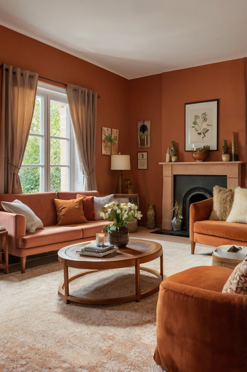
When you have terracotta walls, your carpet choice can either enhance the natural warmth or provide a beautiful contrast that makes both elements shine.
The right pairing creates balance, while the wrong one might make your space feel overwhelming or disjointed.
With so many carpet options available, how do you know which colors will work best with your terracotta walls?
Let’s have a look at my favorites here:
Creamy Ivory for Timeless Elegance


When you pair creamy ivory carpet with terracotta walls, you create a classic combination that never goes out of style.
The soft, neutral tone of ivory creates breathing room in your space, preventing the warm terracotta from feeling overwhelming.
This pairing works particularly well in rooms that receive limited natural light, as the light-colored carpet helps brighten the space.
Ivory brings out the warmth in terracotta walls without competing for attention.
When you select an ivory carpet, look for ones with subtle warm undertones rather than stark white, as this creates a more harmonious transition with the earthy terracotta.
The neutral backdrop of ivory carpet allows you to introduce accent colors through furniture and accessories with ease.
In living rooms, this combination creates an inviting atmosphere that feels both sophisticated and comfortable.
Bedrooms benefit from this pairing too, as the ivory carpet contributes to a serene, restful environment against the terracotta backdrop.
Texture plays an important role when working with ivory carpet – consider options like a plush shag or a subtle pattern to add visual interest without introducing new colors.
For families with children or pets, stain-resistant ivory carpet treatments have made this light color more practical than ever before.
The contrast between terracotta and ivory creates a beautiful play of warm and light, reminiscent of Mediterranean design aesthetics.
This color combination allows your architectural features and artwork to stand out beautifully against the balanced backdrop.
Ivory carpet also reflects more light around the room, making your space feel larger and more open.
When decorating with this combination, consider natural wood furniture to complement the earthy quality of both the walls and floor.
For a finished look, add accent pillows or curtains that incorporate both terracotta and ivory tones to tie the room together.
The versatility of ivory carpet means you can easily update your décor without needing to replace your flooring.
Sage Green for Natural Harmony
Sage green carpet creates a perfect natural complement to terracotta walls because these colors exist together in nature.
The cool, muted green provides a refreshing contrast to the warm terracotta, creating visual balance in your space.
This combination evokes the feeling of being outdoors, with terracotta representing sun-baked earth and sage representing natural foliage.
When you choose sage green carpet, you’re creating a grounding effect that makes rooms feel peaceful and connected to nature.
The subtle quality of sage green allows it to function almost like a neutral while still adding color to your design scheme.
In living spaces, this combination creates an environment that feels both energizing and calming at the same time.
Sage green carpet works especially well in rooms that get plenty of natural light, as sunlight enhances both colors beautifully.
For a cohesive look, consider decorating with plants that echo the green carpet and terracotta planters that pick up the wall color.
The green and terracotta combination works well with both modern and traditional furniture styles, making it versatile for different design preferences.
In bedrooms, this color pairing creates a tranquil retreat that promotes relaxation and good sleep.
When selecting your sage green carpet, look for options with a bit of gray or blue undertone to keep the look sophisticated rather than too vibrant.
This combination provides an excellent backdrop for natural materials like wood, rattan, and linen, enhancing the organic feel of your space.
For a more dramatic effect, choose a deeper sage; for a lighter touch, opt for a pale sage with more gray undertones.
The terracotta and sage green pairing creates a perfect foundation for southwestern, rustic, or earth-inspired design themes.
Accent colors that work beautifully with this combination include cream, rust, and warm brown tones.
This color scheme allows you to bring in metallic accents in either warm copper or cool silver – both look striking against the earthy background.
Warm Beige for Subtle Sophistication
Warm beige carpet creates a harmonious flow with terracotta walls, allowing the rich wall color to be the star of the show.
This neutral pairing gives your room a cohesive look without feeling matchy-matchy or overwhelming.
When you choose beige carpet, you’re selecting a practical option that hides daily dirt while still keeping the space feeling light.
The warm undertones in beige connect beautifully with terracotta, creating a seamless transition from walls to floor.
This combination works particularly well in open floor plans where you want a consistent, flowing feel throughout connected spaces.
Beige carpet provides a versatile foundation that allows you to change accent colors and accessories as trends or seasons change.
For smaller rooms, this pairing helps maintain an airy feel while still embracing the rich warmth of terracotta.
When selecting your beige carpet, look for options with subtle gold or pink undertones that will complement the terracotta walls.
This color combination creates a perfect backdrop for both traditional and contemporary furniture styles.
In home offices or study spaces, this warm, neutral pairing promotes focus without being distracting.
The timeless quality of beige means your carpet investment will stay relevant even if you decide to repaint other rooms in your home.
Texture becomes particularly important with beige carpet – consider options with subtle patterns or varied pile heights to add visual interest.
For a luxurious feel, look for beige carpets with a slight sheen that will catch the light and add dimension to your space.
This color combination works beautifully with natural wood tones, making it easy to incorporate various furniture pieces.
When accessorizing rooms with this pairing, consider textiles and art that feature both colors to create a cohesive design story.
The versatility of this combination makes it appropriate for any room in your home, from formal living areas to casual family spaces.
Navy Blue for Bold Contrast
Navy blue carpet creates a stunning contrast with terracotta walls that instantly adds drama and sophistication to your space.
This unexpected pairing works because blue and orange (terracotta being in the orange family) are complementary colors that naturally enhance each other.
When you choose navy carpet, you’re making a confident design statement that shows your understanding of color theory.
The deep, cool tone of navy grounds the warm vibrancy of terracotta, creating perfect balance in your room.
This combination works particularly well in spaces where you want to create a memorable impression, like dining rooms or home libraries.
Navy carpet hides stains and wear beautifully, making it practical for high-traffic areas in your home.
The richness of both colors creates a cozy atmosphere that feels especially inviting in evening light.
When decorating with this bold combination, keep other elements relatively simple to let the color play between walls and carpet shine.
In bedrooms, this pairing creates a cocoon-like effect that feels both protective and luxurious.
Navy blue carpet provides an excellent foundation for bringing in metallic accents, particularly gold or brass, which pop beautifully against both colors.
For a more traditional look, choose navy carpet with a subtle pattern; for contemporary spaces, solid navy creates a more dramatic effect.
This color combination works well in rooms of all sizes, but particularly shines in spaces with good natural light.
When accessorizing rooms with navy carpet and terracotta walls, consider adding elements in cream or white to provide visual relief.
This pairing creates excellent backdrops for artwork, allowing paintings and photographs to stand out beautifully.
The formal quality of navy adds sophistication to the earthy, casual nature of terracotta, creating interesting tension in your design.
For rooms with architectural features you want to highlight, this high-contrast pairing helps draw attention to those details.
Chocolate Brown for Rich Depth
Chocolate brown carpet paired with terracotta walls creates a rich, earthy environment that feels grounded and welcoming.
This combination works beautifully because both colors come from the same earthy palette, creating a harmonious tonal connection.
When you choose chocolate brown carpet, you’re creating a foundation that feels solid and substantial in your space.
The depth of chocolate brown provides a beautiful contrast to terracotta without creating stark opposition.
This pairing works particularly well in living rooms and family spaces where you want to create a cozy, inviting atmosphere.
Brown carpet is exceptionally practical, hiding dirt and wear while still looking rich and intentional.
The combination of these warm hues creates a perfect backdrop for leather furniture, wooden elements, and natural textures.
In spaces with high ceilings, this grounding color combination helps make the room feel more intimate and enveloping.
When selecting brown carpet, consider options with slight variations in tone or subtle patterns to add visual interest to your space.
This color pairing provides a perfect foundation for global-inspired décor, from Moroccan to southwestern design elements.
For a lighter effect, choose medium brown carpet with golden undertones that pick up similar notes in your terracotta walls.
In home theaters or TV rooms, this combination creates a cozy environment while the dark carpet helps reduce glare on screens.
The warmth of both colors creates a space that feels especially inviting during colder months or in rooms with northern exposure.
When accessorizing this room, consider adding contrasting elements in turquoise, deep green, or cobalt blue for visual interest.
This color combination works well with both antique furniture and contemporary pieces, making it versatile for different design styles.
The richness of chocolate brown helps anchor the sometimes vibrant quality of terracotta, creating beautiful balance in your space.
Soft Gray for Modern Contrast
Soft gray carpet creates a contemporary counterpoint to terracotta walls, bringing modern sensibility to this traditional color.
The cool undertones of gray provide a refreshing visual break from the warmth of terracotta, creating dynamic tension in your space.
When you choose gray carpet, you’re adding a neutral that doesn’t compete with your terracotta walls but still holds its own presence.
This combination works particularly well in transitional design schemes that blend traditional elements with modern touches.
Light to medium gray carpets help brighten rooms with terracotta walls, preventing the space from feeling too dark or heavy.
Gray’s reputation as a “new neutral” means this pairing feels fresh and current while still honoring the timeless quality of terracotta.
In home offices or creative spaces, this combination creates an environment that feels both stimulating and balanced.
When selecting gray carpet, consider options with warm undertones that will connect more harmoniously with the terracotta walls.
This color pairing provides an excellent backdrop for both colorful accessories and monochromatic design schemes.
For homes with an open floor plan, gray carpet creates a subtle transition from spaces with terracotta walls to areas with different wall colors.
This combination works especially well in bedrooms, where the coolness of gray promotes restfulness while terracotta adds warmth.
When decorating with this pairing, consider adding elements in black and white to enhance the contemporary feel.
For a cohesive look, choose artwork and textiles that incorporate both gray and terracotta tones.
The versatility of gray means you can easily introduce seasonal color changes through accessories without clashing with your walls or carpet.
This combination creates an excellent backdrop for statement furniture pieces in bold colors or interesting shapes.
For rooms with architectural interest, this balanced color pairing allows those features to stand out without competition.
Burnt Orange for Monochromatic Drama
Burnt orange carpet paired with terracotta walls creates a bold, monochromatic look that makes a confident design statement.
This tone-on-tone approach creates depth and dimension through subtle variations of the same color family.
When you choose this combination, you’re embracing color psychology that suggests orange tones promote conversation, enthusiasm, and creativity.
The layered effect of similar tones adds sophistication and intentionality to your space – this is clearly not an accidental color scheme.
This pairing works particularly well in dining rooms, where the warm, appetizing colors create an environment that enhances mealtime experiences.
In spaces with architectural interest, this monochromatic approach allows the eye to appreciate shapes and details without color distraction.
The warm glow created by this combination makes it especially appealing in rooms with northern exposure or limited natural light.
When working with this bold pairing, consider varying textures to add visual interest – perhaps a plush carpet against matte walls.
This color scheme provides an excellent foundation for global-inspired décor, particularly designs drawing from Morocco, Mexico, or the American Southwest.
For balance, incorporate neutral furniture pieces in cream, beige, or wood tones to provide visual breaks from the orange intensity.
This combination creates drama even in smaller spaces, making it perfect for powder rooms or entryways where you want to make an impression.
When accessorizing rooms with this pairing, consider adding contrasting elements in teal, navy, or emerald green for visual pop.
The cohesive look of this approach creates a perfect backdrop for displaying art collections or statement pieces.
In homes with open floor plans, this distinctive combination helps define specific areas while maintaining overall flow.
For a more subtle effect, choose burnt orange carpet with a pattern that includes neutral tones to soften the monochromatic impact.
This color pairing creates an especially cozy environment in spaces meant for gathering and conversation.
Pale Yellow for Sunny Optimism
Pale yellow carpet creates a cheerful companion to terracotta walls, brightening your space with subtle sunny energy.
This combination feels natural and harmonious because both colors appear together in nature – think sunshine on clay.
When you choose pale yellow carpet, you’re adding a gentle warmth that enhances the earthy quality of terracotta walls.
The light reflective quality of yellow carpet helps illuminate rooms with limited natural light, making spaces feel more open and airy.
This pairing works particularly well in breakfast nooks, kitchens, and morning rooms where the cheerful energy sets a positive tone.
For children’s rooms or playspaces, this warm, optimistic combination creates an environment that feels both energizing and comforting.
The subtle contrast between these colors allows architectural details and furniture pieces to stand out beautifully.
When selecting yellow carpet, look for soft, buttery tones rather than bright lemon shades for a more sophisticated pairing with terracotta.
This color combination creates a perfect backdrop for both modern and vintage furniture styles.
In home offices or creative spaces, this energizing pairing promotes productivity and positive thinking.
For a cohesive look, consider decorating with accessories that incorporate both colors, like artisan pottery or textiles.
This warm color scheme works beautifully with natural materials like rattan, wicker, and various wood tones.
The yellow and terracotta combination evokes Mediterranean or Tuscan design aesthetics, perfect for creating a vacation-inspired feel at home.
In spaces with high ceilings, this warm combination helps make the room feel more intimate and welcoming.
When working with this pairing, white trim and moldings provide beautiful definition and prevent the colors from feeling too intense.
For a seasonal update, this combination transitions beautifully from summer to fall with simple accessory changes.
Taupe for Understated Elegance
Taupe carpet creates a sophisticated neutral backdrop that allows terracotta walls to shine without competition.
This versatile color exists between beige and gray, offering warmth while maintaining a contemporary edge.
When you choose taupe carpet, you’re selecting a chameleon-like neutral that adapts beautifully to changing light throughout the day.
The subtle gray undertones in taupe help temper the warmth of terracotta, creating perfect balance in your space.
This pairing works particularly well in formal living areas or dining rooms where you want an atmosphere of understated elegance.
Taupe carpet provides a practical option that hides everyday soil while still maintaining a light, airy quality in your room.
The sophisticated nature of this combination creates a perfect backdrop for introducing textural elements like velvet, linen, or leather.
In bedrooms, this pairing creates a serene environment that feels both grounded and peaceful.
When selecting taupe carpet, samples viewed in your actual space are essential, as this color can read differently depending on your lighting.
This combination provides an excellent foundation for both traditional and contemporary furniture styles.
For a cohesive design, consider adding accessories in deeper terracotta tones and lighter taupe shades to create a layered effect.
The subtlety of this pairing allows artwork and statement furniture pieces to stand out as focal points in your space.
Taupe carpet with terracotta walls works beautifully with metallic accents in either warm or cool tones, offering design flexibility.
In home offices or study spaces, this balanced combination creates an environment that promotes focus without distraction.
For rooms with architectural interest, this pairing provides a sophisticated backdrop that doesn’t compete with detailed moldings or unique features.
The timeless quality of both colors means this combination will remain relevant even as design trends come and go.
Turquoise for Vibrant Energy
Turquoise carpet creates a stunning color statement with terracotta walls that instantly transports you to the American Southwest or Mediterranean coast.
This bold pairing works because blue-green tones are complementary to the orange-red family of terracotta, creating natural color harmony.
When you choose turquoise carpet, you’re making a confident design choice that shows personality and color knowledge.
The cool vibrance of turquoise provides refreshing contrast to the warm earthiness of terracotta, creating perfect balance in your space.
This combination works particularly well in spaces meant for entertaining, where the energetic color play stimulates conversation and creates memorable impressions.
In vacation homes or rooms designed for relaxation, this pairing evokes resort-like feelings and vacation memories.
The intensity of both colors means this combination works best in well-lit spaces that can handle the color strength.
When decorating with this bold pairing, consider adding neutral elements in cream or white to provide visual breathing room.
This color combination creates a perfect backdrop for Southwestern, Mexican, or Mediterranean-inspired décor.
For a more subtle approach, consider turquoise carpet with a pattern that incorporates neutral tones to soften the impact.
In bathrooms or dressing areas, this energetic pairing creates a space that feels both refreshing and warm.
The vibrant quality of this combination makes it ideal for spaces where you want to create a specific mood or transportive experience.
When accessorizing rooms with this pairing, metallic elements in copper or bronze enhance the rich quality of both colors.
This combination works beautifully with natural elements like wood and stone, creating interesting tension between vibrant color and organic materials.
For homes with an open floor plan, this distinctive pairing helps define specific areas while creating visual interest throughout the space.
The boldness of this combination makes it particularly suited to spaces where you want to make a design statement.
Cream for Soft Sophistication
Cream carpet creates a soft, sophisticated companion to terracotta walls, allowing the rich wall color to be featured without overwhelming the space.
This pairing works beautifully because the warm undertones in cream connect harmoniously with terracotta while providing visual contrast.
When you choose cream carpet, you’re creating an airy foundation that helps prevent terracotta walls from feeling too heavy or intense.
The lightness of cream helps bounce light around the room, making spaces feel larger and more open.
This combination works particularly well in bedrooms, where the warmth of terracotta promotes coziness while cream keeps the space feeling serene.
In formal living rooms, this pairing creates an elegant atmosphere that feels both welcoming and refined.
Cream carpet provides a neutral backdrop that allows you to introduce accent colors through furniture and accessories with ease.
When selecting cream carpet, look for options with stain resistance, particularly in high-traffic areas or homes with children and pets.
This color combination creates a perfect foundation for both traditional and transitional design styles.
For a cohesive look, consider adding textiles and accessories that incorporate both cream and terracotta tones.
The classic nature of this pairing means it works well with various wood tones and metal finishes, offering decorating flexibility.
In home offices or study spaces, this warm yet light combination creates an environment that promotes focus without feeling sterile.
The softness of cream carpet creates beautiful contrast to the earthy texture and depth of terracotta walls.
When accessorizing rooms with this pairing, consider adding elements in sage green, navy, or chocolate brown for visual interest.
This combination allows architectural details and trim work to stand out beautifully, especially when painted in crisp white.
The timeless quality of both colors ensures your space will feel current even as other design trends come and go.
Deep Purple for Royal Ambiance
Deep purple carpet paired with terracotta walls creates a rich, unexpected combination that adds drama and personality to your space.
This pairing works because purple and terracotta share red undertones, creating a connected yet contrasting relationship.
When you choose deep purple carpet, you’re making a statement that shows confidence and creativity in your design choices.
The cool deepness of purple provides beautiful balance to the warm earthiness of terracotta, creating visual tension that keeps your eye moving.
This combination works particularly well in spaces meant for evening entertainment, as the rich colors become even more dramatic in lamplight.
In home theaters or media rooms, this pairing creates an atmosphere of luxury and escape from the ordinary.
The intensity of both colors means this combination benefits from rooms with adequate space and good lighting.
When decorating with this bold pairing, consider adding metallic accents in gold or brass to enhance the regal quality.
This color combination creates a perfect backdrop for art collections, particularly pieces that incorporate similar jewel tones.
For a more subtle approach, choose purple carpet with a pattern that incorporates neutral elements to soften the impact.
In bedrooms, this rich color combination creates a cocoon-like effect that feels luxurious and comforting.
The unexpected nature of this pairing makes it ideal for spaces where you want to create a unique, memorable impression.
When accessorizing rooms with these colors, consider adding elements in cream or light gray to provide visual relief from the intensity.
This combination works beautifully with dark wood furniture, creating a sophisticated, traditional atmosphere.
For homes with an open floor plan, this distinctive pairing helps define specific areas while creating visual interest throughout the space.
The boldness of this combination makes it particularly suited to spaces where you want your design choices to spark conversation.
Olive Green for Mediterranean Charm
Olive green carpet creates a natural companion to terracotta walls, evoking the landscapes of Tuscany and the Mediterranean coast.
This combination works beautifully because both colors appear together in nature, creating an organic, harmonious feeling.
When you choose olive carpet, you’re bringing in a sophisticated green that has enough gray undertones to function almost like a neutral.
The muted quality of olive provides subtle contrast to terracotta without creating sharp visual boundaries in your space.
This pairing works particularly well in dining rooms, where both colors create an environment that enhances food and conversation.
In living spaces with a global or traveled aesthetic, this combination provides perfect backdrop for collected treasures and artifacts.
Olive carpet provides a practical option that hides dirt while still adding color and character to your space.
When selecting olive carpet, look for options with varied tones to add depth and interest to your floors.
This color combination creates an excellent foundation for introducing natural materials like wood, stone, and linen.
For homes with indoor-outdoor flow, this nature-inspired pairing helps connect interior spaces with garden views and outdoor living areas.
The timeless quality of both colors ensures your space will remain relevant even as design trends change.
In home offices or libraries, this grounding combination creates an environment that promotes focus and thoughtfulness.
When accessorizing rooms with this pairing, consider adding elements in cream, rust, or burnished gold for visual interest.
This combination works beautifully with both antique furniture pieces and clean-lined contemporary designs.
For a cohesive design, consider decorating with botanical prints or landscape art that incorporates both olive and terracotta tones.
The warmth and depth of this pairing makes it appropriate for any room where you want to create a cozy, collected atmosphere.


