Brown carpet presents both challenges and opportunities when decorating your home.
While many of you feel limited by this flooring choice, the right paint color can completely transform the space.
With brown carpet as your foundation, you have more color flexibility than you might think.
Brown carpet can range from light tan to deep chocolate, each shade opening up different decorating possibilities.
Your paint color choice can make your carpet appear intentional and stylish rather than outdated or limiting:
My following paint color ideas will help you see your brown carpet in a new light:
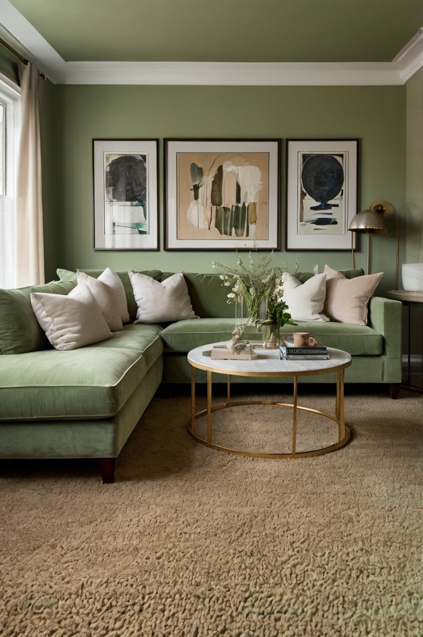
1. Soft Sage Green: A Natural Companion


Sage green creates a serene, nature-inspired palette when paired with brown carpet.
This combination mimics the outdoors, bringing a fresh, organic feeling to your space.
The earthy undertones in sage green naturally complement the warmth of brown, creating a balanced look.
When selecting a sage green paint, look for muted versions with gray undertones for the most sophisticated result.
Benjamin Moore’s “Sage Wisdom” or Sherwin Williams’ “Clary Sage” offer beautiful options that pair well with most brown carpet tones.
For lighter tan carpets, you can choose a slightly more vibrant sage shade to create contrast.
With darker brown carpets, a lighter sage will prevent the room from feeling too heavy.
This color combination works exceptionally well in living rooms and bedrooms where you want to create a calming atmosphere.
The natural vibe of sage and brown together helps reduce stress and promotes relaxation.
To enhance this color scheme, incorporate natural elements like wooden furniture, woven baskets, or potted plants.
Metal accents in brass or copper will add warmth and dimension to this earthy palette.
Sage green walls also provide a versatile backdrop for artwork, allowing your personal style to shine.
This color combination transitions beautifully through different seasons without feeling dated.
During warmer months, add lighter accents like cream or beige for a fresh look.
In winter, incorporate deeper greens and burgundy for a cozy, seasonal update.
Lighting plays an important role with this color combination – sage looks different throughout the day as natural light changes.
North-facing rooms may need a slightly warmer sage to prevent the space from feeling too cool.
2. Creamy Off-White: Bright and Timeless

Off-white paint creates a classic, bright backdrop that allows your brown carpet to appear intentional rather than dated.
This neutral choice expands your space visually and provides maximum flexibility for decorating.
The warmth in cream tones complements the warm undertones typically found in brown carpet.
When choosing an off-white, look for shades with subtle yellow or beige undertones to enhance harmony with your carpet.
Popular options include Benjamin Moore’s “Swiss Coffee” or Sherwin Williams’ “Alabaster” for their soft, warm qualities.
Avoid stark whites with blue undertones, as they can create a jarring contrast with warm brown.
This color combination creates a clean, fresh canvas that makes furniture and accessories the focal point.
The contrast between light walls and darker flooring adds architectural interest to your space.
In smaller rooms, this light-dark combination helps define the space without making it feel cramped.
Off-white walls reflect more light, counterbalancing the light-absorbing nature of brown carpet.
This is especially valuable in rooms with limited natural light or north-facing exposures.
The versatility of off-white means you can easily change accent colors seasonally or as trends evolve.
For a contemporary look, add black accents and sleek furniture against the off-white and brown backdrop.
For a more traditional style, incorporate rich woods and classic furniture shapes that complement both colors.
This combination works well in any room but is especially effective in dining rooms and home offices.
The neutral background creates a distraction-free environment that feels open and inviting.
To prevent this pairing from appearing bland, incorporate texture through window treatments, artwork, and textiles.
Consider adding an area rug with pattern over your brown carpet to create layered interest in living areas.
Warm-toned bulbs enhance the creaminess of off-white and complement the warmth of brown carpet.
3. Sky Blue: Fresh and Unexpected


Sky blue creates a striking yet harmonious contrast with brown carpet that feels fresh and unexpected.
This combination pairs the warmth of earth with the coolness of sky, creating a balanced and inviting space.
The contrast between cool blue walls and warm brown floor adds visual interest and depth to your room.
Look for mid-tone sky blues with a hint of gray to keep the look sophisticated rather than childlike.
Benjamin Moore’s “Blue Sky” or Sherwin Williams’ “Atmospheric” offer perfect starting points for this color pairing.
This combination works because blue and brown are complementary colors that enhance each other’s strengths.
The cool blue walls visually recede, making your space feel larger and more open.
Brown carpet grounds the room, providing warmth and a natural element to balance the airy blue.
This color scheme works particularly well in bedrooms, creating a calming sanctuary reminiscent of nature.
In living spaces, this combination feels fresh and contemporary while remaining livable and timeless.
To enhance this pairing, incorporate natural wood tones in furniture that bridge the wall and floor colors.
White trim and ceilings will provide crisp definition and prevent the blue from becoming overwhelming.
Metallic accents in silver or chrome add sparkle that complements the coolness of the blue walls.
This color combination allows for versatile accent color options, from coral and orange to greens and yellows.
For a cohesive look, select artwork that incorporates both blue and brown tones.
Lighting is crucial with blue walls – ensure your room has adequate illumination to prevent the space from feeling dark.
South-facing rooms with plenty of natural light showcase this combination beautifully throughout the day.
In north-facing rooms, choose a slightly warmer blue to prevent the space from feeling too cold.
This color pairing transitions well between seasons with simple accessory changes.
For summer, add white and light green accents; for winter, incorporate deeper blues and chocolates.
The unexpected nature of this combination makes it perfect for homeowners who want to express creativity while maintaining broad appeal.
4. Warm Taupe: Sophisticated Monochrome
Taupe creates a sophisticated monochromatic look when paired with brown carpet, delivering subtle elegance to any room.
This color combination creates a layered, textural space without stark contrasts or competing elements.
The beauty of taupe lies in its versatility – it can lean more gray or more beige depending on your carpet’s undertones.
For warmer brown carpets, choose taupe with beige undertones like Benjamin Moore’s “Pale Oak” or Sherwin Williams’ “Accessible Beige.”
For cooler brown carpets, select taupe with gray undertones like Benjamin Moore’s “Revere Pewter” or Sherwin Williams’ “Agreeable Gray.”
This tonal approach creates a cohesive backdrop that makes furniture and accessories stand out.
The subtle contrast between wall and carpet adds dimension without creating visual choppiness.
Monochromatic doesn’t mean boring – the variations in tone and texture create visual interest and depth.
This color scheme works exceptionally well in open floor plans, helping connect different areas seamlessly.
In smaller spaces, the continuity between wall and floor colors creates an expansive feeling.
Taupe’s neutrality means it pairs beautifully with nearly any accent color you might choose.
For a contemporary look, add black and white elements against this neutral backdrop.
For a warmer atmosphere, incorporate rust, terracotta, or burnt orange accents.
Taupe walls reflect light differently throughout the day, creating subtle mood changes from morning to evening.
This color combination works particularly well in transitional spaces like hallways and entryways.
The sophistication of taupe makes it ideal for formal dining rooms paired with brown carpet.
To enhance this monochromatic scheme, incorporate varied textures in furnishings and window treatments.
Consider adding mirrors to reflect light and create visual expansion within this neutral palette.
Wood tones add natural warmth and complement both taupe walls and brown carpet beautifully.
This combination provides excellent flexibility when selling your home, appealing to a wide range of potential buyers.
The timeless nature of taupe means you won’t need to repaint as trends change over the years.
5. Soft Butter Yellow: Warm and Cheerful
Butter yellow brings unexpected cheerfulness to rooms with brown carpet, creating a warm, welcoming atmosphere.
This color combination feels sunny and optimistic without being overpowering or childish.
The yellow-brown pairing has historical roots in traditional design, making it feel both fresh and timeless.
When choosing a butter yellow, look for softened versions with a touch of beige to maintain sophistication.
Benjamin Moore’s “Philadelphia Cream” or Sherwin Williams’ “Humble Gold” offer refined yellow options that complement brown beautifully.
This combination works because both colors share warm undertones that create harmony and flow.
Yellow walls counteract any darkness from brown carpet, instantly brightening the entire space.
The contrast creates a pleasing visual foundation that highlights furniture and decorative elements.
This pairing works particularly well in rooms that lack natural light or north-facing spaces.
Morning rooms, breakfast nooks, and kitchens shine with this cheerful, energizing combination.
Brown carpet grounds the brightness of yellow, preventing the space from feeling too stimulating.
White trim creates crisp definition that enhances both the yellow walls and brown carpet.
For a contemporary twist, add black accents through picture frames, lighting fixtures, or furniture.
Natural wood tones bridge the wall and floor colors, creating a cohesive, layered look.
This color scheme transitions beautifully through seasons with simple accessory changes.
For spring and summer, add green plants and blue accents to enhance freshness.
For fall and winter, incorporate deeper golds and burgundy for a rich, seasonal atmosphere.
This combination creates a backdrop that works with various design styles from farmhouse to mid-century modern.
The warmth of this pairing makes it ideal for spaces where you entertain and gather with friends and family.
Yellow is psychologically associated with optimism and energy, making it perfect for home offices with brown carpet.
To prevent yellow from appearing too intense, test several samples in your space before committing.
6. Slate Blue-Gray: Elegant and Balanced
Slate blue-gray creates a sophisticated, contemporary look when paired with brown carpet, offering elegance with edge.
This rich, complex color contains both warm and cool undertones that harmonize beautifully with brown’s warmth.
The slight color contrast creates visual interest without jarring transitions between wall and floor.
Look for slate blues with gray undertones like Benjamin Moore’s “Brewster Gray” or Sherwin Williams’ “Serious Gray.”
These complex colors shift subtly throughout the day, creating a dynamic backdrop for your space.
The blue-gray family pairs particularly well with chocolate brown carpets, creating rich dimension.
With lighter tan carpets, deeper slate blue-grays create dramatic contrast that feels intentional and designed.
This color combination has an inherent sophistication that elevates the perceived value of your space.
In living rooms, this pairing creates a formal yet comfortable atmosphere perfect for entertaining.
In bedrooms, the cool undertones promote relaxation while the depth creates intimacy.
This combination works in both traditional and contemporary settings, depending on your furnishings.
For a traditional look, add mahogany furniture and classic patterns against this timeless backdrop.
For contemporary spaces, incorporate clean-lined furniture and metallic accents for an updated feel.
The versatility of slate blue-gray means it complements many accent colors from mustard yellow to burgundy.
Consider adding texture through velvet, linen, or wool to enhance the richness of this color pairing.
Natural light dramatically affects how slate blue-gray appears, so test samples at different times of day.
In south-facing rooms, these colors appear more vibrant; in north-facing rooms, they appear cooler and deeper.
This color combination creates a perfect backdrop for artwork and collectibles to shine.
The balance between warm and cool elements creates a sense of completeness in your interior design.
To enhance this pairing, incorporate elements that contain both colors, like artwork or patterned textiles.
White trim provides crisp contrast that frames both the walls and flooring beautifully.
7. Soft Coral: Warm and Unexpected
Soft coral creates an unexpected yet harmonious partnership with brown carpet, bringing warmth and character to any room.
This color combination feels fresh and current while maintaining timeless appeal.
The warmth in both colors creates a cozy, inviting atmosphere perfect for gathering spaces.
When selecting coral, choose muted versions with peachy undertones rather than bright, saturated options.
Benjamin Moore’s “Coral Gables” or Sherwin Williams’ “Subdued Sienna” offer sophisticated options that pair beautifully with brown.
This combination works particularly well with medium to dark brown carpets, creating rich visual interest.
The contrast between wall and floor feels intentional and designed rather than accidental.
Coral brings a touch of playfulness to rooms that might otherwise feel too serious with brown carpet.
This pairing works exceptionally well in dining rooms, creating an atmosphere that stimulates conversation.
In bedrooms, this combination feels both energizing and soothing, perfect for creating a personal sanctuary.
Coral contains both warm red and cool pink undertones, making it surprisingly versatile with different browns.
The slight contrast between warm walls and floor creates subtle dimension that adds depth to your space.
This combination provides excellent flexibility for accent colors, from navy blue to emerald green.
For a contemporary look, add black and white elements to ground the warmth of coral and brown.
For a more bohemian vibe, incorporate natural textures and global-inspired patterns.
This pairing transitions beautifully between seasons with simple accessory changes.
White trim provides crisp definition that enhances both the coral walls and brown carpet.
Natural wood tones in furniture create a bridge between the wall and floor colors.
This combination reflects current design trends toward warmer, more personalized interiors.
The unexpected nature of this pairing shows design confidence and creates memorable spaces.
In spaces with limited natural light, coral walls counteract darkness and add a warm glow.
For an even more cohesive look, incorporate textiles that contain both coral and brown tones.
8. Deep Navy: Bold and Sophisticated
Navy blue creates dramatic contrast with brown carpet, delivering a bold, confident look with timeless appeal.
This powerful combination blends traditional elements with contemporary edge.
The deep blue walls provide a striking backdrop that makes furniture and art stand out beautifully.
When selecting navy, look for deep blues with subtle gray undertones to maintain sophistication.
Benjamin Moore’s “Hale Navy” or Sherwin Williams’ “Naval” offer perfect starting points for this dramatic pairing.
This combination works because navy contains subtle warm undertones that harmonize with brown’s warmth.
The contrast creates architectural interest, defining the space without the need for additional elements.
Brown carpet grounds the boldness of navy, preventing the space from feeling overwhelming.
This pairing works particularly well in home offices, libraries, and dining rooms where drama is welcome.
In bedrooms, navy creates a cocooning effect that promotes deep, restful sleep.
White trim and ceilings provide essential contrast that prevents the space from feeling too dark.
Consider adding mirrors and metallic accents to reflect light within this rich color scheme.
Brass and gold accessories pop dramatically against navy walls and complement brown carpet beautifully.
This combination allows you to incorporate various wood tones, from light oak to dark walnut.
For a classic nautical twist, add red accents to this navy and brown foundation.
For a more contemporary look, incorporate emerald green or mustard yellow accessories.
This color scheme transitions well between seasons with simple accent changes.
The formality of this combination makes it ideal for entertaining spaces and formal living rooms.
In smaller spaces, navy creates intimacy without making the room feel cramped.
Adequate lighting is essential with this dramatic combination – layer ambient, task, and accent lighting.
This pairing works well with various design styles from traditional to transitional to contemporary.
The timeless nature of navy means you won’t need to repaint as trends evolve.
9. Soft Lavender: Unexpected and Refined
Soft lavender creates an unexpected yet sophisticated pairing with brown carpet, bringing subtle elegance to any room.
This unique combination feels fresh and current while maintaining broad appeal.
The cool undertones in lavender balance the warmth of brown, creating a harmonious contrast.
Choose muted lavenders with gray undertones like Benjamin Moore’s “Organdy” or Sherwin Williams’ “Vesper Violet.”
These sophisticated purples avoid feeling juvenile while adding character and personality to your space.
This combination works because lavender contains both warm red and cool blue undertones that complement brown.
The subtle contrast creates visual interest without overwhelming the senses.
Brown carpet grounds the ethereal quality of lavender, creating balance and preventing the space from feeling too feminine.
This pairing works particularly well in bedrooms, creating a soothing sanctuary that promotes relaxation.
In home offices, this combination stimulates creativity while maintaining a sense of calm.
White trim provides essential definition that enhances both the lavender walls and brown carpet.
Natural wood tones in furniture help bridge the wall and floor colors beautifully.
This color scheme provides excellent flexibility for accent colors from silver gray to deep plum.
For a contemporary look, add black and white elements to ground the softness of lavender.
For a more romantic feel, incorporate vintage elements and curved furniture pieces.
This combination creates a perfect backdrop for silver and chrome accents to shine.
Lighting greatly impacts how lavender appears – incandescent bulbs enhance warmth while LEDs emphasize coolness.
Consider testing several lavender samples in your space before committing, as they shift dramatically with lighting.
This pairing transitions beautifully between seasons with simple accessory changes.
In south-facing rooms, lavender will appear more vibrant; in north-facing rooms, it will appear cooler and more gray.
The unexpected nature of this combination showcases personal style and creates memorable spaces.
This color scheme works with various design styles from traditional to transitional to contemporary.
10. Warm Terracotta: Rich Earth Tones
Terracotta creates a rich, earthy palette when paired with brown carpet, delivering Mediterranean warmth to any space.
This combination feels grounded, natural and timeless with roots in traditional design.
The warm red-orange undertones in terracotta complement the warmth in brown, creating a cohesive look.
Choose softened terracottas with brown undertones rather than bright orange versions for sophisticated results.
Benjamin Moore’s “Audubon Russet” or Sherwin Williams’ “Copper Mountain” offer perfect starting points for this earthy pairing.
This combination works because both colors share earth-based pigments that naturally harmonize.
The slight variation in tone creates subtle dimension without jarring contrast.
Brown carpet grounds the richness of terracotta walls, preventing the space from feeling too intense.
This pairing works particularly well in living rooms, dining rooms, and kitchens where warmth is welcome.
In cooler climates, this color combination creates a visual warmth that counteracts gray weather.
These colors hold their own in large spaces with high ceilings, creating intimacy without feeling closed in.
White trim provides crisp contrast that enhances both the terracotta walls and brown carpet.
Natural materials like wood, leather, and stone complement this organic color scheme beautifully.
For a global-inspired look, add textiles with geometric patterns and deep jewel tones.
For a more contemporary approach, incorporate clean-lined furniture and minimal accessories.
This combination provides a beautiful backdrop for plants and botanical elements to shine.
The warmth of this pairing creates an inviting atmosphere for gathering and entertaining.
Metal accents in bronze, copper, and gold enhance the richness of this color scheme.
Consider adding area rugs with pattern over brown carpet to create layered interest in living areas.
This combination transitions beautifully to outdoor spaces, creating flow between interior and exterior.
The timeless nature of these earth tones means your space won’t feel dated as trends change.
This color pairing works with various architectural styles from Spanish and Mediterranean to Craftsman.
11. Mossy Olive Green: Natural and Timeless
Mossy olive green creates a natural, timeless partnership with brown carpet, bringing outdoors-inspired harmony to your home.
This color combination feels organic and grounded with a connection to the natural world.
The yellow-green undertones in olive complement the warm undertones typically found in brown carpet.
Choose muted olives with gray undertones like Benjamin Moore’s “Dried Moss” or Sherwin Williams’ “Oakmoss” for sophisticated results.
This combination works because both colors occur together frequently in nature, creating an instinctive harmony.
The subtle contrast between wall and floor adds dimension without creating jarring transitions.
Brown carpet grounds the complexity of olive green, creating balance and cohesion.
This pairing works particularly well in living rooms, studies, and transitional spaces where calm is desired.
In south-facing rooms, this combination feels warm and inviting throughout the day.
In north-facing rooms, the warmth in both colors counteracts cooler natural light.
White trim provides crisp definition that enhances both the olive walls and brown carpet.
Natural wood tones in varying shades complement this organic color scheme beautifully.
This combination provides excellent flexibility for accent colors from deep burgundy to mustard yellow.
For a traditional look, add leather furniture and classic patterns against this timeless backdrop.
For a more contemporary feel, incorporate clean-lined furniture and minimal accessories.
This color scheme provides a perfect backdrop for brass and bronze metal accents to shine.
Plants and botanical elements feel right at home against olive walls and brown carpet.
Consider adding textural elements like woven baskets, natural fibers, and stone accessories.
This combination transitions beautifully between seasons with simple accessory changes.
The timeless nature of these colors means your space will feel current despite changing trends.
This color pairing works with various architectural styles from Craftsman to traditional to modern farmhouse.
The psychological benefits include reduced stress and increased connection to nature while indoors.
12. Pale Blush Pink: Subtle and Current
Pale blush pink creates an unexpected yet harmonious pairing with brown carpet, bringing subtle warmth and current style.
This combination feels fresh and sophisticated without being overtly feminine.
The warm undertones in blush complement the warmth in brown, creating a cohesive color story.
Choose muted blushes with beige undertones like Benjamin Moore’s “First Light” or Sherwin Williams’ “Romance” for refined results.
These sophisticated pinks avoid feeling juvenile while adding character and softness to your space.
This combination works because blush contains subtle warm undertones that echo those in brown carpet.
The slight contrast between wall and floor creates visual interest without jarring transitions.
Brown carpet grounds the delicacy of blush, creating balance and preventing the space from feeling too ethereal.
This pairing works particularly well in bedrooms, creating a soothing sanctuary that promotes relaxation.
In home offices, this combination promotes creativity while maintaining a sense of calm.
White trim provides essential definition that enhances both the blush walls and brown carpet.
Natural wood tones in furniture help bridge the wall and floor colors beautifully.
This color scheme provides excellent flexibility for accent colors from navy blue to emerald green.
For a contemporary look, add black and white elements to ground the softness of blush.
For a more glamorous feel, incorporate gold, brass, and mirrored accessories.
This combination creates a perfect backdrop for copper and rose gold accents to shine.
Lighting dramatically impacts how blush pink appears – test samples at different times of day before committing.
In north-facing rooms, choose blushes with slightly warmer undertones to prevent the color from appearing gray.
This pairing transitions beautifully between seasons with simple accessory changes.
The subtle nature of blush means it functions almost as a neutral, providing versatility similar to beige or gray.
This color scheme works with various design styles from mid-century modern to contemporary to transitional.
The current popularity of blush tones makes this combination feel fresh while the brown carpet adds timeless grounding.
13. Rich Chocolate Brown: Monochromatic Luxury
Chocolate brown walls create a bold, enveloping monochromatic look when paired with brown carpet, delivering dramatic luxury.
This rich, saturated approach makes a confident design statement that feels intentional and sophisticated.
The tonal variations between wall and floor create subtle dimension and layered depth.
Choose a wall color slightly lighter or darker than your carpet for the most successful monochromatic look.
Benjamin Moore’s “Wenge” or Sherwin Williams’ “Turkish Coffee” offer perfect starting points for this dramatic approach.
This combination works when you embrace the boldness of all-brown, creating a cocooning effect that feels intentional.
The monochromatic approach makes architectural features and furniture silhouettes the focal point.
White ceilings and trim provide essential contrast that prevents the space from feeling too dark or heavy.
This pairing works particularly well in home theaters, libraries, and formal dining rooms where drama is welcome.
In bedrooms, this combination creates an intimate cocoon that promotes deep, restful sleep.
Adequate lighting is essential with this bold combination – layer ambient, task, and accent lighting generously.
Consider adding mirrors and reflective surfaces to bounce light throughout the space.
This color scheme provides a dramatic backdrop for artwork and collectibles to shine.
For a contemporary look, add white, cream, and black accents against this rich backdrop.
For a more traditional approach, incorporate burgundy, navy, and forest green accessories.
Metal accents in brass and gold provide essential gleam that enhances the richness of brown.
Texture becomes extremely important in monochromatic schemes – incorporate velvet, leather, and woven elements.
This approach requires design confidence but delivers undeniable sophistication when executed well.
Consider adding area rugs with subtle pattern over brown carpet to create layered interest in living areas.
This combination transitions beautifully to outdoor spaces with rich landscaping and natural materials.
The dramatic nature of this pairing creates memorable spaces that make a lasting impression.
This approach works well with various architectural styles from Tudor to contemporary to traditional.


