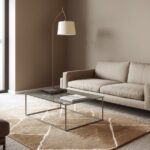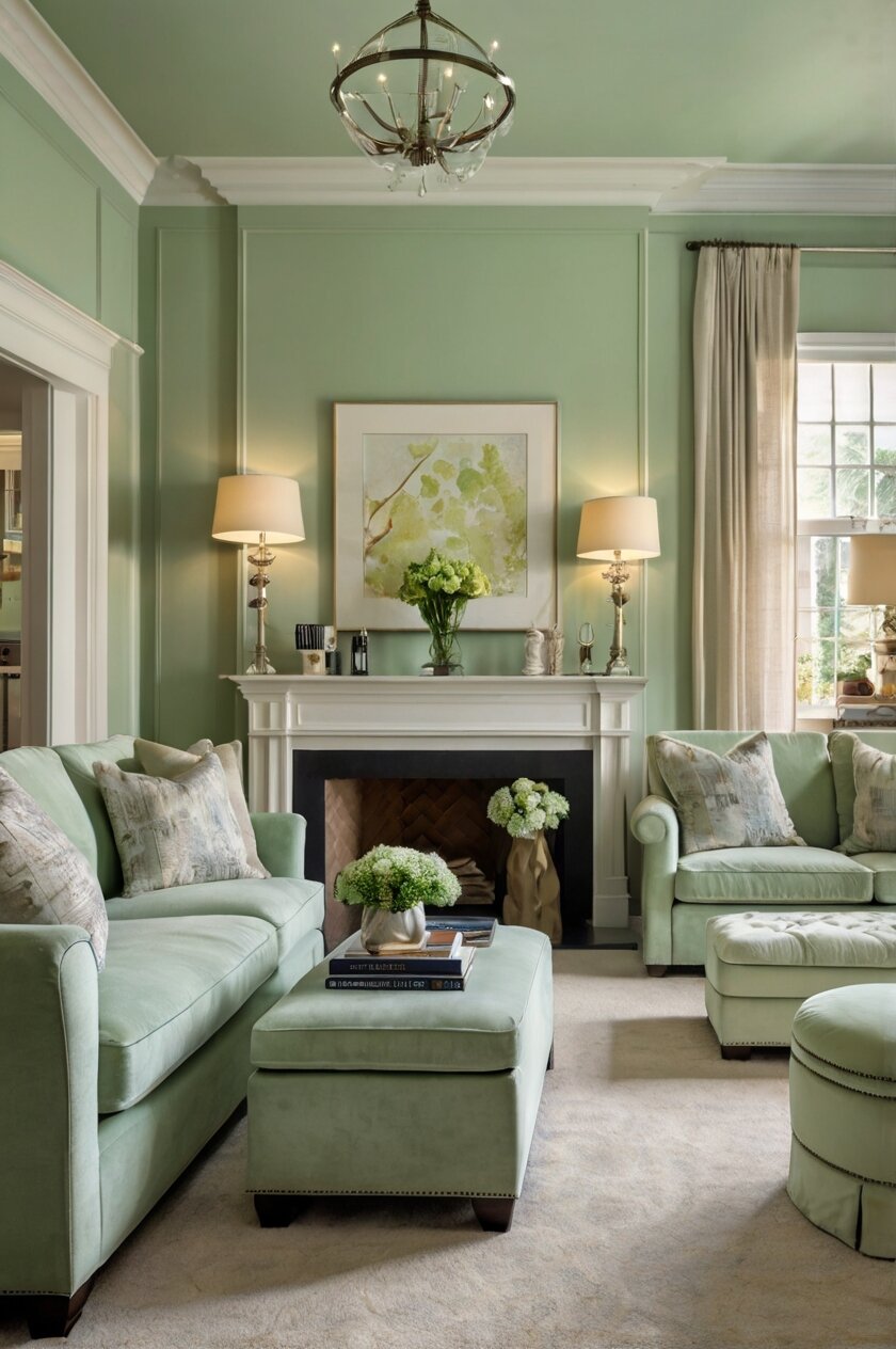
Pale green walls create a fresh, calming atmosphere in any room, but choosing the right carpet to complement them can be tricky.
Some carpet choices will make your room feel cozy and warm, while others will keep it light and airy.
Your carpet choice can completely transform how people experience your pale green room:
Design Your Dream Room in Minutes! – By Madison
🏡 Start Creating FREE →Creamy White Carpet: Fresh and Timeless


A creamy white carpet creates a clean, airy feeling when paired with pale green walls.
This combination reminds you of fresh spring mornings and brings a timeless elegance to any room.
White isn’t just one color – you can choose from warm ivory tones or cooler snow whites depending on your pale green shade.
Warmer ivory carpets work beautifully with pale greens that have yellow undertones.
Cooler white carpets pair perfectly with mint-leaning pale greens.
This pairing works especially well in smaller spaces since the light colors make rooms feel bigger and more open.
Your furniture choices can really shine against this neutral backdrop.
Dark wood furniture creates a beautiful contrast against the light walls and carpet.
Colorful accent pieces will stand out dramatically against this light background.
Maintaining a white carpet requires some extra care, but new stain-resistant options make this much easier than in the past.
You might consider area rugs in high-traffic zones to protect your white carpet from excessive wear.
For a coastal-inspired look, add blue accessories to your pale green and white room.
Natural elements like wood or rattan furniture bring warmth to balance the coolness of this color scheme.
If you’re worried about the space feeling too sterile, incorporate different textures through pillows, throws, and curtains.
A plush, high-pile white carpet adds luxury and comfort underfoot.
Flat-weave white carpets offer a more modern, minimalist look when paired with pale green walls.
This combination works in virtually any room of your house, from bedrooms to living areas.
White carpets can make your pale green walls appear more vibrant by creating contrast.
The timeless nature of this pairing means you won’t need to redecorate when design trends change.
Soft Beige Carpet: Warm and Versatile
Beige carpet creates a warm, grounded feeling when combined with pale green walls.
This neutral pairing offers endless possibilities for decorating in any style you prefer.
The earthy quality of beige perfectly balances the fresh, natural feel of pale green.
Together, they create a room that feels connected to nature without being overly themed.
Beige isn’t boring – it ranges from light sand tones to deeper taupes, giving you flexibility.
Choose lighter beige for a brighter room or deeper beige for a cozier, intimate space.
This combination works well in living rooms where you want a comfortable, welcoming atmosphere.
Your guests will feel instantly at ease in a space with this soothing color palette.
Beige carpets hide everyday dirt better than white while still maintaining a light, airy feel.
The practical nature of this pairing makes it perfect for busy family homes.
For a contemporary look, choose a beige carpet with subtle patterns or interesting textures.
Adding metallic accents like gold or copper can elevate this neutral combination.
Beige carpets with flecks of other colors can add depth and interest to your pale green room.
Consider beige carpets with hints of green to create a subtle, cohesive look.
This combination provides a perfect backdrop for almost any accent color you might choose.
Red or burgundy accessories pop dramatically against this neutral foundation.
Blue accents create a nature-inspired palette reminiscent of earth, sky, and plants.
Wooden furniture of any shade works beautifully with this wall-to-carpet combination.
For a classic look, pair this color scheme with traditional furniture styles and antiques.
For a more modern approach, add geometric patterns and clean-lined furniture.
This versatile pairing works equally well in bedrooms, creating a restful atmosphere.
Soft Gray Carpet: Modern and Sophisticated
Gray carpet creates a contemporary, sophisticated look when paired with pale green walls.
This combination feels modern without being cold or impersonal.
The gray grounds the lightness of pale green, creating a balanced, harmonious space.
Cool gray carpets work well with pale greens that have blue undertones.
Warmer gray carpets complement pale greens with yellow undertones.
This pairing creates a perfect backdrop for bold accent colors if you want to add pops of brightness.
Purple or plum accessories look especially striking against this color combination.
Yellow accents bring sunshine and energy to this cool, calming palette.
Gray carpets range from light silver to deep charcoal, allowing you to control the contrast level.
Light gray creates a subtle, airy feel while dark gray makes a stronger statement.
The neutrality of gray means you can easily change your accent colors without replacing flooring.
This versatility makes gray carpet a smart investment for your home.
Gray carpets with subtle patterns add visual interest without overwhelming the space.
Consider carpets with low-contrast patterns in various shades of gray for added dimension.
This combination works beautifully in home offices, creating a focused, professional environment.
Your productivity may improve in a space with these calming, balanced colors.
Gray carpet hides dirt and stains better than lighter options while still looking clean and fresh.
This practicality makes it perfect for high-traffic areas like hallways and family rooms.
For a luxurious feel, choose a plush, high-pile gray carpet to contrast with the walls.
Berber or loop-style gray carpets offer a more casual, textured appearance.
This color combination works well in both sunny rooms and spaces with limited natural light.
The reflective quality of pale green helps brighten spaces even with darker gray flooring.

💭 I Wrote a Book About My BIGGEST Decorating Mistakes!
When I decorated my first home, I thought I knew what I was doing. Spoiler alert: I DIDN’T. 😅
💸 I bought a sofa that was WAY TOO BIG for my living room. I chose paint colors that looked amazing in the store but terrible on my walls. I spent THOUSANDS on pieces that didn’t work together. Sound familiar?
“Things I Wish I Knew Before I Decorated My First Home” is your shortcut to avoiding ALL my costly mistakes. ✨ Inside, you’ll find practical, NO-NONSENSE advice that will save you time, money, and a whole lot of decorating regret. 🏡
Design Your Dream Room in Minutes! – By Madison
🏡 Start Creating FREE →Navy Blue Carpet: Bold and Classic
Navy blue carpet creates a dramatic foundation when paired with pale green walls.
This combination offers a fresh take on classic blue and green color pairings.
The depth of navy grounds the lightness of pale green, creating beautiful contrast.
This color scheme references nature – think ocean waters beneath pale green leaves.
Navy carpet makes a bold statement while still feeling timeless and classic.
This pairing creates a perfect backdrop for white furniture and accessories to pop.
Gold or brass accents look particularly luxurious against this color combination.
The richness of navy adds a sense of elegance and sophistication to any room.
Your pale green walls will appear even fresher and more vibrant against dark blue carpet.
This high-contrast pairing works especially well in larger rooms that can handle visual weight.
Consider navy carpets with subtle patterns or textures to add dimension.
Tone-on-tone navy patterns keep the look interesting without being busy.
This combination creates a perfect setting for coastal or nautical decor themes.
You could also take this pairing in a more traditional direction with classic furniture styles.
Navy carpets hide stains and wear better than most colors, making them practical for busy households.
This durability makes them a smart choice for family rooms and children’s spaces.
The formal quality of navy blue works well in dining rooms with pale green walls.
Your guests will be impressed by this sophisticated yet unexpected color combination.
For a more subtle approach, consider navy area rugs over neutral carpeting.
This gives you the impact of the navy-green pairing without committing to dark carpeting throughout.
White trim and crown molding really pop against both the pale green walls and navy carpet.
This combination works in any season and doesn’t feel tied to specific holiday or seasonal decor.
Pale Blue Carpet: Cool and Calming
Pale blue carpet creates a soothing, spa-like atmosphere when paired with pale green walls.
This combination reminds you of tranquil outdoor scenes – soft skies above gentle meadows.
The cool tones work together to create a space that feels peaceful and relaxing.
This color pairing works beautifully in bedrooms where a calming environment is important.
Your stress levels may actually decrease in a room with these gentle, nature-inspired colors.
Pale blue and green together create a fresh, clean feeling that’s perfect for bathrooms too.
This combination feels timeless while still having more personality than all-neutral spaces.
White furniture and accessories enhance the clean, airy feeling of this color scheme.
Natural wood accents add necessary warmth to balance the coolness of blue and green.
Consider pale blue carpets with subtle patterns for added visual interest.
Tone-on-tone blue patterns maintain the serene feeling while adding dimension.
This pairing creates a perfect backdrop for coastal or beach-themed decor.
Your seaside-inspired accessories will feel right at home with these colors.
For a more formal look, add silver or crystal accents to this cool color palette.
This combination works especially well in rooms with plenty of natural light.
Your pale blue carpet will look different throughout the day as lighting changes.
Morning light brings out the freshness while evening light adds a peaceful glow.
This color pairing works well in children’s rooms, creating a calm yet cheerful environment.
You can easily add brighter accent colors if you want to increase the energy level.
Orange or coral accessories create a beautiful complementary contrast with this blue-green scheme.
Yellow accents bring sunshine and warmth to balance these cool tones.
This combination creates a gender-neutral palette that works for anyone’s personal space.
Chocolate Brown Carpet: Rich and Grounding
Chocolate brown carpet creates a rich, earthy foundation when paired with pale green walls.
This combination mimics what you see in nature – think forest floors beneath leafy canopies.
The darkness of brown grounds the lightness of pale green, creating beautiful balance.
This pairing feels both sophisticated and comfortable at the same time.
Your pale green walls will pop dramatically against the rich brown carpet.
This high-contrast look works especially well in living rooms and family spaces.
Brown carpet brings warmth to a room, making the space feel cozy and inviting.
This combination creates a perfect backdrop for both modern and traditional furniture styles.
Cream or white accessories stand out beautifully against this color scheme.
Metallic accents like gold or copper add luxurious highlights to this earthy palette.
The practical nature of dark brown carpet makes it ideal for high-traffic areas.
Your busy household will appreciate how well it hides dirt and everyday wear.
This combination creates a perfect setting for showcasing houseplants and natural elements.
Your green plants will echo the wall color while standing out against the brown floor.
Consider brown carpets with subtle patterns or textures for added interest.
Berber carpets in brown tones offer practical durability with visual texture.
This pairing works well in home libraries or studies, creating a scholarly atmosphere.
Your books and collectibles will stand out beautifully against this color backdrop.
For a more contemporary look, choose a brown carpet with modern patterns or flecks.
This updates the traditional brown carpet concept for today’s homes.
The richness of chocolate brown adds a sense of luxury to any space.
Your room will feel more expensive and curated with this sophisticated color combination.
Taupe Carpet: Subtle and Sophisticated
Taupe carpet creates a sophisticated, versatile foundation when paired with pale green walls.
This understated combination works in nearly any style of home, from traditional to contemporary.
The complex nature of taupe – not quite gray, not quite brown – adds depth to your space.
This pairing feels elegant without being stuffy or formal.
Your room will have a designer quality that looks thoughtfully planned.
Taupe carpets combine the best aspects of both brown and gray options.
This versatility makes them perfect for open floor plans where rooms flow together.
The subtle contrast between taupe and pale green creates a gentle, soothing atmosphere.
This palette works beautifully in bedrooms where you want a restful environment.
Your sleep quality might even improve in a room with these calming, natural colors.
Taupe carpets with varying pile heights add textural interest while maintaining color cohesion.
Consider taupe carpets with subtle patterns for added visual dimension.
This combination creates a perfect backdrop for vibrant accent colors if desired.
Purple or wine-colored accessories look particularly rich against this neutral palette.
Coral or salmon accents bring warmth and energy to this subtle color scheme.
The neutral quality of taupe means you can easily change accent colors seasonally.
This flexibility makes decorating for different holidays or seasons much simpler.
Taupe carpets hide dirt better than lighter options while still keeping spaces bright.
This practicality makes them excellent for family homes and busy areas.
Your furniture in almost any wood tone will work with this wall-and-carpet combination.
Both light and dark wood finishes complement this balanced neutral palette.
This color pairing works especially well in dining rooms, creating an elegant atmosphere for entertaining.
Design Your Dream Room in Minutes! – By Madison
🏡 Start Creating FREE →Sage Green Carpet: Monochromatic Magic
Sage green carpet creates a serene, cohesive look when paired with pale green walls.
This tone-on-tone approach feels modern and intentional, like something from a design magazine.
The monochromatic palette creates a peaceful backdrop for your life and activities.
This subtle color scheme allows your furniture and accessories to stand out.
Your artwork will pop beautifully against this unified green backdrop.
Different shades of green add depth without creating stark contrasts.
This approach feels sophisticated and shows confidence in your design choices.
Green-on-green creates a connection to nature that many find calming and restorative.
This combination works beautifully in bedrooms where restful sleep is important.
Your mind may actually relax more easily in a room with harmonious colors.
Consider sage carpets with subtle patterns to add interest while maintaining the monochromatic look.
Texture becomes especially important in monochromatic spaces to prevent flatness.
This combination creates a perfect setting for houseplants, which will blend seamlessly with the decor.
Your botanical collection will look like an intentional part of the room’s design.
White or cream furniture creates beautiful contrast against this green backdrop.
Natural wood tones bring necessary warmth to balance the coolness of green.
This pairing works well in home offices, creating a focused environment that connects to nature.
Your productivity may improve in a space that feels calming yet energizing.
The consistency of green throughout the space creates a feeling of harmony and balance.
This visual consistency can make smaller rooms feel larger and more open.
For a more dramatic look, choose a sage carpet that’s noticeably darker than your pale green walls.
For a more subtle effect, select a sage that’s very close in value to your wall color.
Ivory Carpet: Light and Elegant
Ivory carpet creates an elegant, spacious feeling when paired with pale green walls.
This combination brightens any room while still offering more warmth than stark white.
The creamy quality of ivory adds a touch of luxury to your space.
This pairing works beautifully in formal living rooms and adult bedrooms.
Your room will feel larger and more open with this light floor-to-wall combination.
Ivory’s slight warmth prevents the space from feeling cold or sterile.
This color scheme creates a perfect backdrop for both modern and antique furniture.
Your favorite pieces will stand out beautifully against this neutral palette.
The classic nature of this pairing means it won’t go out of style quickly.
This timelessness makes it a good investment for long-term home decorating.
Consider ivory carpets with subtle patterns or varying textures for added interest.
Tone-on-tone patterns maintain the light feeling while adding sophistication.
This combination creates a perfect setting for showcasing colorful artwork or collections.
Your decorative objects will pop dramatically against this light background.
For a glamorous look, add mirrors and crystal accents to reflect light throughout the space.
This maximizes the brightness that this color combination naturally creates.
The formal quality of ivory works well in dining rooms with pale green walls.
Your entertaining spaces will feel special and designed for memorable gatherings.
Stain-resistant treatments make ivory carpets more practical than in the past.
This protection helps maintain the pristine look even in busy households.
The softness of these colors creates a gentle transition between rooms in open floor plans.
This visual flow helps your home feel cohesive and thoughtfully designed.
You can easily add seasonal colors through accessories without changing your base palette.
💭 I Wrote a Book About My BIGGEST Decorating Mistakes!
When I decorated my first home, I thought I knew what I was doing. Spoiler alert: I DIDN’T. 😅
💸 I bought a sofa that was WAY TOO BIG for my living room. I chose paint colors that looked amazing in the store but terrible on my walls. I spent THOUSANDS on pieces that didn’t work together. Sound familiar?
“Things I Wish I Knew Before I Decorated My First Home” is your shortcut to avoiding ALL my costly mistakes. ✨ Inside, you’ll find practical, NO-NONSENSE advice that will save you time, money, and a whole lot of decorating regret. 🏡
Lavender Carpet: Unexpected and Fresh
Lavender carpet creates an unexpected, fresh combination when paired with pale green walls.
This color pairing references nature – think lavender plants against green garden foliage.
The complementary nature of purple and green creates visual energy and interest.
This combination feels sophisticated yet playful at the same time.
Your room will stand out as unique and personally curated rather than following typical design rules.
Light lavender carpets keep the space feeling open and airy.
Deeper purple carpets create more drama and visual weight.
This pairing works beautifully in bedrooms, creating a romantic, dreamy atmosphere.
Your personal space will feel special and removed from everyday concerns.
Consider lavender carpets with subtle patterns to add dimension while maintaining the color impact.
Tone-on-tone lavender patterns add sophistication without competing with the wall color.
This combination creates a perfect setting for silver or white furniture and accessories.
Your metallic accents will shine against this pastel background.
For a vintage look, incorporate antique furniture and floral patterns with this color scheme.
For a more modern approach, add geometric patterns and clean-lined furniture.
The unexpected nature of this pairing makes it perfect for creative spaces like art studios or craft rooms.
Your creative thinking may be enhanced by a color combination that breaks conventional rules.
This palette works well in children’s rooms but can grow with them into teen years.
You won’t need to completely redecorate as your child’s tastes mature.
The softness of these colors creates a calming environment despite their contrasting nature.
This balance makes the combination work in spaces where relaxation is important.
Gold accents add warmth and luxury to this cool-toned color scheme.
Light Gray Carpet: Clean and Contemporary
Light gray carpet creates a clean, contemporary look when paired with pale green walls.
This modern combination feels fresh and updated without being trendy or temporary.
The neutrality of light gray provides the perfect backdrop for the gentle color of pale green.
This combination works beautifully in minimal, contemporary spaces.
Your room will feel open, airy and thoughtfully designed with this pairing.
Light gray offers a softer alternative to white while still keeping spaces bright.
This practicality makes it perfect for busy households and high-traffic areas.
The subtle contrast between these colors creates a serene, peaceful atmosphere.
This calming quality makes it ideal for bedrooms and relaxation spaces.
Your stress levels may noticeably decrease in a room with this gentle color palette.
Consider light gray carpets with subtle patterns or textures for added interest.
Low-contrast patterns maintain the clean look while adding visual dimension.
This combination creates a perfect backdrop for colorful furniture or bold art pieces.
Your statement pieces will stand out beautifully against this neutral foundation.
For a Scandinavian-inspired look, add natural wood elements and minimal accessories.
This creates the clean, nature-connected feel that Nordic design is known for.
Light gray and pale green work well in home offices, creating a focused yet calming environment.
Your productivity may improve in a space that feels both professional and peaceful.
This pairing allows colorful technology and office supplies to stand out without clashing.
This makes it perfect for modern work-from-home spaces filled with devices.
The contemporary nature of this combination works especially well in newly built homes.
Your new construction will feel current and designed with modern aesthetics in mind.
Design Your Dream Room in Minutes! – By Madison
🏡 Start Creating FREE →Pale Yellow Carpet: Sunny and Cheerful
Pale yellow carpet creates a sunny, cheerful atmosphere when paired with pale green walls.
This combination brings to mind spring gardens and cheerful daffodils among green leaves.
The warmth of yellow balances the coolness of green, creating perfect harmony.
This pairing feels naturally happy and uplifting in any space.
Your mood might actually improve in a room with these cheerful, optimistic colors.
Pale yellow ranges from buttery cream to soft lemon tones, giving you flexibility.
Choose yellows with the same undertones as your pale green for the most cohesive look.
This combination works beautifully in kitchens and breakfast nooks, enhancing morning light.
Your family gathering spaces will feel naturally welcoming with this bright palette.
Consider yellow carpets with subtle patterns or textures to add dimension while maintaining brightness.
Tone-on-tone yellow patterns add interest without overwhelming the space.
This combination creates a perfect setting for white furniture and natural wood accents.
Your wooden elements will stand out beautifully against this pastel background.
For a cottage-inspired look, add floral patterns and vintage accessories to this color scheme.
For a more modern approach, keep accessories minimal and add geometric patterns.
The cheerful nature of this pairing makes it perfect for playrooms and children’s spaces.
Your children’s creativity may be enhanced by these bright, happy colors.
This palette works well in south-facing rooms that receive plenty of natural sunlight.
Your room will glow with warmth throughout the day with these light-reflecting colors.
The freshness of this combination makes it perfect for spring and summer months.
You can add deeper accents in fall and winter if you want a seasonal change.
This pairing creates spaces that feel naturally clean and well-maintained.
Deep Green Carpet: Bold and Immersive
Deep green carpet creates a bold, immersive look when paired with pale green walls.
This monochromatic approach feels intentional and designer-inspired rather than accidental.
The contrast between light and dark greens creates visual interest and depth.
This combination references the varying shades of green found in nature.
Your room will feel like a cohesive retreat surrounded by different tones of the same color.
Deep green grounds the space while pale green walls keep it from feeling dark or heavy.
This balance creates rooms that feel both cozy and spacious at the same time.
Consider deep green carpets with subtle patterns or textures to add even more dimension.
Tone-on-tone patterns in dark green add sophistication while maintaining color cohesion.
This combination creates a perfect setting for brass or gold accents to shine.
Your metallic elements will pop beautifully against the green background.
For a library or study, this color scheme creates a classic, scholarly atmosphere.
Your book collection will look striking against this rich green backdrop.
White or cream furniture creates dramatic contrast against deep green carpet.
Natural wood tones in medium to dark finishes complement this green palette beautifully.
This pairing works well in dining rooms, creating an elegant, nature-inspired setting for meals.
Your entertaining spaces will feel special and intentionally designed.
The richness of deep green carpet adds a sense of luxury to any room.
This combination works especially well in rooms used primarily in the evening.
Your space will feel cozy and enveloping under artificial lighting with these colors.
Consider this combination for media rooms where a darker floor won’t show stains from snacks.
This practical aspect makes it perfect for rooms where you entertain and relax.