hen you have aqua walls, you’re already embracing a refreshing, tranquil color that brings the essence of water and sky into your home.
But the journey doesn’t end with your wall color choice – the carpet you select can either enhance that seaside vibe or create an entirely different mood altogether.
Think of your carpet as the foundation that grounds your aqua walls, creating a complete color story in your room.
You might be surprised to discover how different carpet colors can completely change the feel of your aqua walls – making them appear more vibrant, more sophisticated, or more soothing.

Crisp White Carpet


When you pair aqua walls with crisp white carpet, you create a fresh, airy space that feels like a breath of ocean breeze.
White carpet acts as a blank canvas that allows your aqua walls to take center stage in the room’s design.
This combination instantly brightens any space, making it feel larger and more open than it actually is.
The contrast between the cool aqua and pure white creates a clean, modern aesthetic that works beautifully in bedrooms, living rooms, and home offices.
You’ll find that morning light takes on a magical quality in this space, with the aqua walls casting subtle blue-green reflections onto the white flooring.
White carpet also provides versatility when it comes to your other design elements and furniture choices.
With this neutral base, you can introduce accent colors through pillows, artwork, and accessories without creating a space that feels too busy or overwhelming.
For families with children or pets, consider stain-resistant white carpet options that offer the same aesthetic appeal with added durability.
White carpet with aqua walls creates a coastal-inspired look that can be enhanced with natural materials like rattan, jute, and light woods.
You might consider adding texture through these elements to balance the smoothness of the wall and carpet combination.
When selecting the exact shade of white, consider warmer whites (with subtle cream undertones) if your aqua leans toward green, or cooler whites if your aqua has more blue in its composition.
Lighting plays a crucial role in this pairing – under warm lighting, the white carpet may take on a slightly golden hue, while cool lighting will emphasize the crispness of the white.
The ultimate advantage of white carpet with aqua walls is the timeless quality of this combination – it never goes out of style and provides a perfect backdrop for changing tastes in décor over the years.
Tap to Explore These Beauties
See my ideas in action 👇 Tap any image to explore full details.
Sandy Beige Carpet
When you select sandy beige carpet to accompany your aqua walls, you instantly create a beach-inspired retreat in your home.
This natural pairing mimics the shoreline where the ocean meets the sand, bringing a slice of coastal paradise indoors.
Beige carpet grounds the ethereal quality of aqua walls, adding warmth and creating a balanced, harmonious look.
The neutral tone of beige provides a subtle contrast that doesn’t compete with the aqua but rather complements it perfectly.
You’ll notice that sandy beige carpeting makes a room feel cozy and inviting, perfect for spaces where comfort is key, like bedrooms or family rooms.
This combination works especially well in rooms that receive plenty of natural light, as the sunlight enhances the beach-like quality of the color scheme.
Beige carpet offers practical benefits too, as it hides minor dirt and wear better than lighter options like white, making it family-friendly while still maintaining an elegant appearance.
When choosing the exact shade of beige, consider the undertones in your aqua walls – cooler aqua pairs beautifully with beiges that have subtle gray undertones, while warmer aqua walls harmonize with beiges that lean toward golden or taupe.
You might find that this color combination allows you to introduce natural elements easily – wicker furniture, driftwood accents, and seagrass decorative pieces all enhance the coastal aesthetic.
The sandy beige carpet creates a visual anchor in the room, allowing your eyes to rest after taking in the refreshing aqua walls.
For a cohesive look, consider incorporating small touches of beige in your wall décor or window treatments to tie the room together.
Texture plays an important role in this pairing – a beige carpet with subtle variations or a low pile with slight texture can mimic the look of sand even more effectively.
This color combination transitions beautifully through seasons, feeling cool and refreshing in summer months while retaining enough warmth for winter comfort.
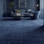
Navy Blue Carpet
When you choose navy blue carpet to pair with aqua walls, you create a dramatic depth that mirrors the various shades of the ocean itself.
This bold combination makes a sophisticated statement that works exceptionally well in formal living rooms, dining rooms, or home libraries.
Navy blue adds a sense of luxury and timelessness to your space, grounding the lighter, more playful aqua with its rich, authoritative presence.
The contrast between these colors creates visual interest while still maintaining a cohesive water-inspired color palette.
You might be surprised by how this pairing can make a room feel both energetic and serene at the same time – the aqua keeps things light while the navy adds a calming weight.
This carpet choice works particularly well in rooms that receive ample natural light, as it absorbs some brightness while allowing the aqua walls to reflect light throughout the space.
When selecting accessories for this color scheme, consider introducing metallic elements in gold or brass, which will pop beautifully against both the aqua and navy.
Navy carpet offers practical benefits too – it’s excellent at hiding stains and showing less wear over time compared to lighter options.
You’ll find that navy carpet with aqua walls creates a perfect backdrop for white furniture, creating a crisp, clean aesthetic reminiscent of yacht interiors or upscale coastal homes.
For those who love the ocean but want a more sophisticated take on beach décor, this pairing delivers the perfect balance without becoming too themed or literal.
The psychological effect of this combination tends to be focusing and calming, making it excellent for spaces where concentration is important, like home offices or study areas.
When selecting the specific shade of navy, consider slightly muted navy tones rather than the brightest blue-navy to ensure the carpet doesn’t overwhelm the more delicate aqua walls.
This color combination transitions beautifully from day to night – in daylight, the contrast is vibrant and energizing, while evening light turns the space into a cozy, intimate setting.
Soft Gray Carpet
When you pair aqua walls with soft gray carpet, you create a contemporary space that feels both sophisticated and serene.
Gray acts as a neutral foundation that allows your aqua walls to shine without competition or clash.
This combination brings to mind misty coastlines where sky meets sea, creating a naturally harmonious color story in your home.
The versatility of gray makes it an excellent choice for open floor plans where your aqua-walled room flows into other spaces.
You’ll find that soft gray carpet has a chameleon-like quality, sometimes appearing almost silver or sometimes taking on subtle blue undertones that echo your aqua walls.
This pairing works exceptionally well in bedrooms, creating a restful atmosphere that promotes relaxation and good sleep.
Gray carpet provides a modern alternative to beige, giving your space an updated look while still providing a neutral base for your furnishings and décor.

Find Your Room’s Color Palette
Tap a vibe — get a curated 5-color palette with hex codes you can copy ✨
💭 I Wrote a Book About My Biggest Decorating Mistakes!
When I decorated my first home, I thought I knew what I was doing. Spoiler: I didn’t. 😅
💸 I bought a sofa way too big for my living room. Paint colors that looked amazing in the store but terrible on my walls.
When selecting the exact shade of gray, consider the undertones in your aqua walls – warmer aqua tones pair beautifully with greiges (gray-beige blends), while cooler aqua walls harmonize with pure gray or those with slight blue undertones.
You might discover that this combination creates an excellent backdrop for both colorful accessories and natural elements like plants, which pop vividly against the subdued palette.
Gray carpet offers practical benefits for busy households, as it shows less dirt and wear than very light carpets while still maintaining a lighter, airier feel than dark options.
This color pairing works well with many design styles, from minimalist and Scandinavian to transitional and contemporary coastal themes.
For added interest, consider a gray carpet with subtle patterns or texture, which adds dimension without competing with your aqua walls.
Lighting dramatically affects this combination – natural daylight emphasizes the freshness of the pairing, while warm evening lighting brings out cozier aspects of both colors.
Coral or Salmon Carpet
When you select coral or salmon carpet to accompany your aqua walls, you create a bold, energetic space inspired by tropical seaside destinations.
This warm-cool color combination perfectly balances opposites on the color wheel, creating visual excitement that draws the eye and stimulates conversation.
Coral carpet adds a unexpected warmth that contrasts beautifully with the cool, refreshing quality of aqua walls.
The pairing evokes images of vibrant coral reefs beneath turquoise waters, bringing a touch of natural wonder into your interior space.
You’ll find this combination particularly effective in social spaces like living rooms or dining areas where you want to encourage energy and interaction.
This bold pairing makes a confident design statement that shows your willingness to embrace color and create truly unique spaces.
Coral carpet with aqua walls creates an excellent backdrop for neutral furniture, allowing the floor and walls to be the stars of your design story.

When selecting the exact shade of coral, consider the intensity of your aqua walls – brighter aqua can handle vibrant coral, while more muted aqua walls may pair better with softer salmon tones.
You might be surprised by how this combination can make a space feel simultaneously invigorating and welcoming – perfect for areas where you entertain guests.
For a cohesive look, consider incorporating small touches of coral in your wall décor or window treatments to create visual connections throughout the room.
This color scheme transitions beautifully through seasons – feeling fresh in spring and summer while providing welcome warmth during fall and winter months.
Lighting dramatically influences this pairing – natural light emphasizes the contrast between the colors, while evening lighting brings out the richness and depth of the coral tones.
With this distinctive carpet choice, your space will become memorable and photo-worthy, perfect for sharing on social media or impressing visitors with your design confidence.
Chocolate Brown Carpet
When you pair aqua walls with chocolate brown carpet, you create a rich contrast that feels both grounding and unexpected.
This combination brings to mind the natural pairing of earth and water, creating a balanced space that feels connected to the natural world.
Chocolate brown adds substantial visual weight to anchor the lighter, ethereal quality of aqua walls.
The warmth of brown carpet softens the coolness of aqua, making rooms feel more intimate and welcoming, particularly in larger spaces that might otherwise feel too open.
You’ll find this pairing particularly effective in living rooms, studies, or rooms where you want to create a sense of stability and permanence.
This combination works exceptionally well with wooden furniture, creating a cohesive look that celebrates natural materials and colors.
Brown carpet offers practical benefits for active households, as it masterfully hides dirt and stains while still providing a rich, luxurious appearance.
When selecting the exact shade of chocolate brown, look for options with subtle reddish undertones that will complement the blue-green quality of your aqua walls.
You might be surprised by how this unexpected pairing creates a sophisticated space that feels curated rather than following obvious design formulas.
For added interest, consider accessories in metallic copper or bronze, which bridge the warm-cool divide between the brown carpet and aqua walls.
This color combination creates an excellent backdrop for houseplants, allowing their green foliage to pop against both the walls and floor.
Lighting plays a crucial role with this pairing – natural light keeps the combination fresh, while warm evening lighting enhances the cozy qualities of the brown carpet.
The psychological effect of this pairing tends to be stabilizing and comforting, making it excellent for spaces where you want to promote relaxation and conversation.
What’s Your Decor Personality?
5 questions · 30 seconds · Instant style match 🏡
Pale Yellow Carpet
When you choose pale yellow carpet to complement your aqua walls, you create a cheerful, sunshine-filled space that feels perpetually bright and optimistic.
This combination brings to mind sunny skies over tropical waters, infusing your room with a vacation-like atmosphere year-round.
Pale yellow adds a gentle warmth that balances the cooler tones of aqua, creating a harmonious space that feels both refreshing and welcoming.
The subtle contrast between these colors creates visual interest without overwhelming the senses, making it perfect for spaces where you want to promote happiness and creativity.
You’ll find this pairing works beautifully in sunrooms, children’s rooms, or creative spaces like craft rooms or home offices where positive energy enhances productivity.
This color combination naturally brightens dark or north-facing rooms that receive limited natural light, making spaces feel sunnier even on cloudy days.
Pale yellow carpet creates a soft glow effect, as it reflects light upward and subtly illuminates the aqua walls from below.
When selecting the exact shade of yellow, consider soft buttery tones or pale lemon hues rather than bright canary yellows, which might compete too strongly with the aqua walls.
You might discover that this combination allows you to incorporate natural elements easily – wicker furniture, light woods, and botanical elements all enhance the fresh, nature-inspired palette.
For a cohesive design, consider introducing small yellow accents in your wall décor or textiles that connect back to the carpet color.
This cheerful pairing creates spaces that photograph beautifully in natural light, making them perfect for sharing on social media platforms like Pinterest or Instagram.
Psychologically, this color combination tends to elevate mood and energy levels, making it ideal for spaces where you want to counteract stress or seasonal affective disorder.
The yellow-aqua pairing transitions beautifully through seasons – feeling appropriately fresh in spring and summer while providing welcome warmth during fall and winter months.
Mint Green Carpet
When you select mint green carpet to pair with aqua walls, you create a harmonious, analogous color scheme that feels naturally cohesive and soothing.
This tone-on-tone approach creates a serene atmosphere using colors that sit near each other on the color wheel, resulting in a space that feels thoughtfully designed rather than randomly assembled.
Mint green adds a subtle variation that complements aqua walls without matching them exactly, creating visual interest through gentle contrast.
The combination evokes images of shallow coastal waters where varied blues and greens blend together, bringing a piece of natural serenity into your home.
You’ll find this pairing creates a space that feels expanded and open, as the similar tones blur the boundaries between floor and walls.
This carpet choice works particularly well in bedrooms or meditation spaces where creating a calming environment is the primary goal.
Mint green carpet with aqua walls creates a perfect backdrop for either white furniture (for a fresh, clean look) or natural wooden pieces (for added warmth and texture).
💭 Ever wondered what your room would actually look like rearranged?
I built a free tool that lets you drag furniture around a 2D floor plan. No signup, no catch.
See the Room Planner →When selecting the exact shade of mint, consider options with subtle gray undertones rather than yellow-based mints to maintain the cool, refreshing quality of the space.
You might be surprised by how this seemingly simple color combination creates depth through the subtle variations between the mint and aqua tones.
For added visual interest, consider incorporating textural elements in your furnishings and décor – woven textiles, ceramic pieces, and glass accents all enhance this palette.
This color scheme transitions beautifully from day to night – in daylight, the distinction between the mint and aqua is more apparent, while evening light blends them into a cohesive wash of cool color.
Lighting plays a crucial role in this pairing – natural light highlights the subtle differences between the mint and aqua, while artificial lighting can be chosen to either emphasize or minimize the contrast.
With this carpet choice, you create a tranquil environment that promotes relaxation and mindfulness, perfect for today’s busy lifestyle where home serves as a sanctuary.
This or That?
Pick your fave — see what other readers chose! 👀
Lavender or Light Purple Carpet
When you pair aqua walls with lavender or light purple carpet, you create an unexpected yet harmonious combination that feels both fresh and sophisticated.
This pairing brings to mind fields of lavender growing near coastal waters, capturing a dreamy landscape in your interior space.
Lavender carpet adds a soft, romantic quality that complements the serene nature of aqua while introducing a new color family that creates pleasant contrast.
The cool undertones shared by both colors create cohesion, while the different hue families provide enough contrast to keep the space visually interesting.
You’ll find this combination works beautifully in bedrooms, particularly for older children, teens, or adults who appreciate subtle color play and non-traditional design choices.
This pairing has a slightly magical quality that encourages imagination and creativity, making it excellent for spaces dedicated to artistic pursuits or relaxation.
Lavender carpet with aqua walls creates a perfect setting for silver or mercury glass accessories, which enhance the dreamy quality of this color scheme.
When selecting the exact shade of lavender, consider softer, grayed versions rather than bright purples, which might compete too strongly with your aqua walls.
You might discover that this combination creates spaces that feel simultaneously peaceful and unique, avoiding both the blandness of neutral-only rooms and the potential chaos of high-contrast spaces.
For a cohesive design, consider incorporating small touches of lavender in your wall décor or window treatments to create visual connections between the floor and the rest of the room.
This color scheme works well with many design styles, from contemporary to vintage-inspired spaces, offering flexibility as your taste evolves over time.
Lighting dramatically affects this pairing – natural daylight emphasizes the freshness and clarity of both colors, while evening lighting brings out their more mysterious, dreamy qualities.
The psychological effect of this combination tends to be calming yet uplifting, promoting both relaxation and positive energy in the space.
Silver or Platinum Gray Carpet
When you choose silver or platinum gray carpet to accompany your aqua walls, you create a sophisticated, contemporary space with a subtle metallic undertone that adds luxury.
This combination brings to mind the shimmering surface of water catching sunlight, translating that natural beauty into an elegant interior design scheme.
Silver carpet adds a modern edge to the more organic quality of aqua, creating a balanced space that feels both natural and curated.
The reflective quality of silver or platinum gray introduces a subtle luminosity that enhances the light in your room without the brightness of white carpet.
You’ll find this pairing works exceptionally well in formal living spaces, dining rooms, or master bedrooms where you want to create an elevated, refined atmosphere.
This carpet choice offers the versatility of gray with an added dimension of subtle shine that creates visual interest as light changes throughout the day.
Silver carpet with aqua walls creates a beautiful backdrop for both modern furniture with clean lines and more traditional pieces that benefit from a contemporary foundation.
When selecting the exact shade, look for silver grays with blue undertones rather than beige undertones to complement the cool nature of your aqua walls.
You might be surprised by how this seemingly simple combination creates a space that feels luxurious without being ostentatious or trend-dependent.
For added sophistication, consider incorporating actual metallic accents in silver, chrome, or stainless steel to reinforce the subtle shimmer of the carpet.
This color scheme transitions beautifully from day to night – in daylight, the aqua walls take precedence, while evening lighting often highlights the subtle gleam of the silver carpet.
Lighting plays a crucial role with this pairing – directional lighting can enhance the metallic quality of the carpet, creating interesting reflections and shadows throughout the space.
With this carpet choice, your space achieves a timeless elegance that nods to contemporary design while avoiding fleeting trends that quickly become dated.
💭 I Wrote a Book About My Biggest Decorating Mistakes!
When I decorated my first home, I thought I knew what I was doing. Spoiler: I didn’t. 😅
💸 I bought a sofa way too big for my living room. Paint colors that looked amazing in the store but terrible on my walls.
Charcoal Gray Carpet
When you select charcoal gray carpet to pair with aqua walls, you create a bold contrast that feels both modern and sophisticated.
This combination brings to mind stormy seas, capturing the dramatic power of nature in your interior space.
Charcoal gray adds substantial visual weight that anchors the lighter, more ethereal quality of aqua walls.
The stark contrast between these colors creates a dynamic tension that makes both elements more impactful than they would be on their own.
You’ll find this pairing particularly effective in spaces where you want to make a strong design statement, such as living rooms, home offices, or creative studios.
This carpet choice offers excellent practicality for busy households, as it masterfully conceals dirt and stains while still providing a refined, intentional appearance.
Charcoal carpet with aqua walls creates a perfect backdrop for bright accent colors like coral, yellow, or lime green, which pop vividly against this high-contrast foundation.
When selecting the exact shade of charcoal, consider options with subtle blue undertones rather than brown undertones to complement the cool nature of your aqua walls.
You might discover that this combination makes furniture and décor pieces stand out more prominently, as they’re set against a clearly defined background of contrasting colors.
For a cohesive look, consider incorporating small touches of charcoal in your wall décor or window treatments to create visual connections throughout the room.
This color scheme works particularly well with modern and industrial design styles, where strong contrast and bold choices are celebrated.
Lighting dramatically influences this pairing – natural light softens the contrast, while directional artificial lighting can be used to emphasize the distinction between the dark floor and lighter walls.
The psychological effect of this pairing tends to be focusing and energizing, making it excellent for spaces where concentration and productivity are important.
✦ You Might Love This
11+ Designer-Approved Carpet Colors That Complement White Walls Keep Reading →Quick Design Dilemma
Cast your vote — see what other readers think! 🤔
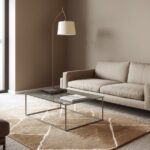
Taupe Carpet
When you pair aqua walls with taupe carpet, you create a sophisticated balance between cool and warm tones that feels both refined and relaxing.
This combination brings to mind sandy shores meeting clear blue waters, translating natural harmony into interior design.
Taupe adds a neutral warmth that softens the cooler aqua walls without competing for attention, creating a perfect foundation for various design elements.
The subtle contrast between these colors creates visual interest while maintaining an overall sense of cohesion and calm.
You’ll find this pairing works beautifully in transitional spaces that bridge traditional and contemporary design, offering flexibility as your style preferences evolve.
This carpet choice provides practical benefits for everyday living, as the mid-tone color hides minor dirt and wear while still appearing lighter than dark carpets.
Taupe carpet with aqua walls creates an excellent backdrop for furniture in almost any wood tone, from light oak to dark walnut, making it versatile for existing pieces.
Psst… Check This Out
Picking the Perfect Carpet Color for Your Burgundy Walls: Let's Get Cozy! Take Me There →When selecting the exact shade of taupe, consider options with subtle gray undertones rather than pink undertones to complement the cool nature of your aqua walls.
You might be surprised by how this seemingly simple combination creates a sophisticated space that feels intentionally designed rather than following obvious formulas.
For added interest, consider taupe carpet with subtle patterns or texture, which adds dimension without competing with your aqua walls.
This color scheme transitions beautifully from season to season – feeling cool and fresh in summer while providing welcome warmth during winter months.
Lighting plays a crucial role in this pairing – natural daylight emphasizes the contrast between the colors, while warm evening lighting brings out the cozy qualities of the taupe.
With this carpet choice, your space achieves a timeless quality that won’t quickly date, allowing you to update accessories and furniture without needing to replace flooring.
Multi-colored Pattern Carpet with Aqua Accents
When you choose a multi-colored patterned carpet that incorporates aqua accents to complement your aqua walls, you create a cohesive, designer-inspired space with visual depth and interest.
This strategic choice brings the wall color down to the floor in small doses, creating intentional color connections throughout the room.
Patterned carpet adds complexity and sophistication to your space while helping to hide stains and wear in high-traffic areas.
The variety of colors in the pattern provides flexibility for introducing additional hues through furniture and accessories without creating a disjointed look.
You’ll find this pairing works exceptionally well in family rooms, playrooms, or spaces where you want to create visual energy while maintaining a cohesive color story.
This carpet choice allows you to incorporate several complementary colors that might otherwise be difficult to introduce in large doses throughout the room.
Multi-colored patterned carpet with aqua accents creates a perfect foundation for eclectic design styles that embrace variety while maintaining harmony.
When selecting the pattern, look for designs where aqua is present but not dominant – the pattern should complement your walls rather than competing with them.
You might discover that this combination makes decorating easier, as the pattern often suggests additional accent colors you can incorporate throughout the space.
For a balanced design, consider pulling one or two secondary colors from the carpet pattern to use in larger decorative elements like throw pillows or window treatments.
This color approach works particularly well in spaces that need to accommodate existing furniture in various colors, as the multi-colored carpet helps tie disparate elements together.
Lighting affects this pairing in complex ways – different colors in the pattern may become more or less prominent depending on the type and direction of light in the room.
With this carpet choice, your space achieves a collected-over-time feeling that appears thoughtfully curated rather than purchased all at once from a single collection.