hite tables are timeless and elegant, but they can sometimes feel a bit plain without the right accessories.
Placemats are the perfect solution because they add color, texture, and personality without permanent commitment.
You can change them according to seasons, holidays, or just your mood!
The right placemat color can create a specific atmosphere – from calm and sophisticated to bright and energetic.
Think about the feeling you want to create when people sit at your table.
Are you going for cozy family dinners or elegant entertainment?
Your placemat choice can help set that tone.
Now, I’ll show you my favorite placemat color ideas that work beautifully with white tables:
💭 Ever wondered what your room would actually look like rearranged?
I built a free tool that lets you drag furniture around a 2D floor plan. No signup, no catch.
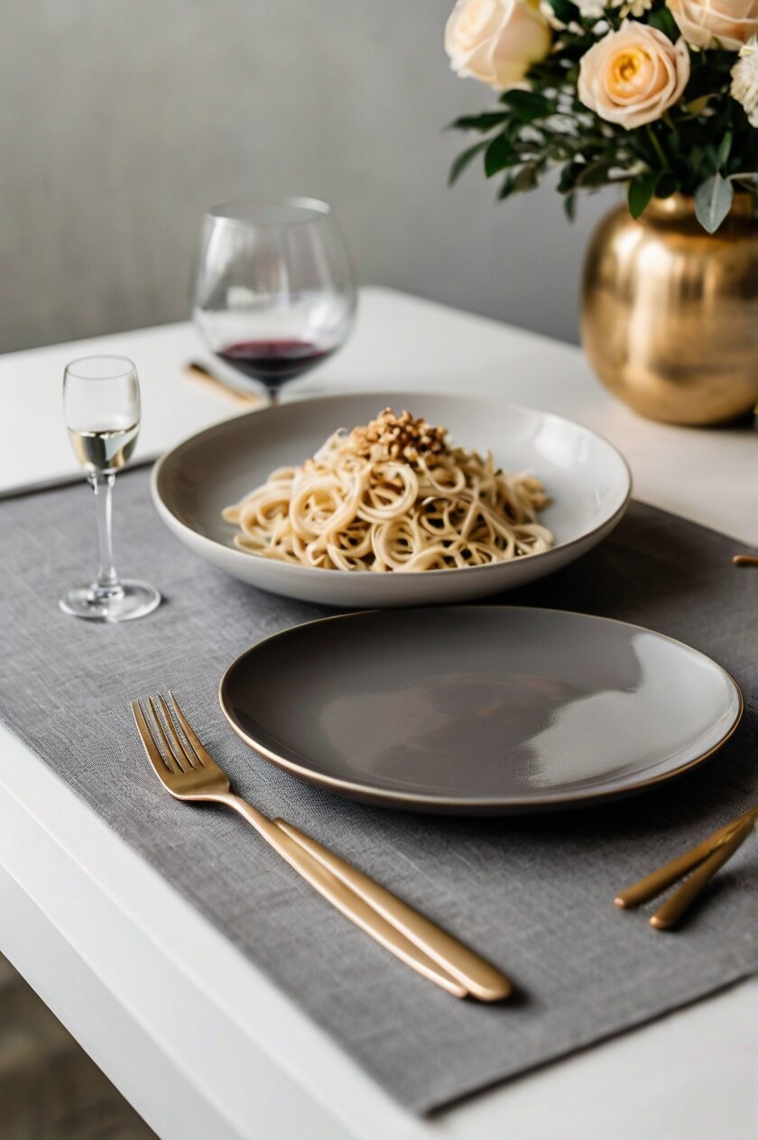
See the Room Planner →Soft Gray: Understated Sophistication


Soft gray placemats bring understated elegance to your white table.
This versatile neutral creates a subtle yet sophisticated foundation for any table setting.
When you choose soft gray, you’re selecting a color that effortlessly bridges traditional and contemporary styles.
Gray placemats work like a gentle shadow on your white table, adding dimension without competing for attention.
This color choice allows your food presentation and table accessories to take center stage.
The psychological effect of gray includes feelings of balance, calmness, and refinement – perfect for creating a peaceful dining atmosphere.
Soft gray placemats serve as an excellent foundation for building colorful table settings through napkins, centerpieces, and dishware.
This neutral option works beautifully year-round and can easily shift between seasons with simple accessory changes.
Consider textured gray placemats, like linen or woven materials, to add subtle visual interest to your white table.
The combination of soft gray and white creates a clean, modern aesthetic that fits perfectly in contemporary homes.
This color pairing also works wonderfully in traditional settings when you incorporate silver elements or classic patterns.
Gray placemats provide a perfect backdrop for vibrant food presentations, allowing the colors of your culinary creations to stand out brilliantly.
For special occasions, gray placemats can be dressed up with metallic accents – silver for a cool, elegant look or gold for warmth and luxury.
This versatile color pairs well with nearly any accent color you might want to introduce through napkins or centerpieces.
Soft gray placemats help create a cohesive look if your dining area already incorporates gray elements in flooring, walls, or furniture.
This color choice works particularly well for minimalist or Scandinavian-inspired dining spaces where clean lines and subtle colors are valued.
The soft contrast between gray placemats and a white table creates visual interest without creating a stark, high-contrast look.
Tap to Explore These Beauties
See my ideas in action 👇 Tap any image to explore full details.
Navy Blue: Timeless Elegance for Your White Table


Navy blue placemats bring a touch of sophistication to your white table.
This deep, rich color creates a striking contrast that feels both classic and modern at the same time.
Navy is often associated with trust, confidence, and stability – perfect feelings to bring to your dining experience.
When you choose navy blue placemats, you’re selecting a versatile option that works year-round.
This color pairs beautifully with gold or brass accessories if you want to create an upscale look.
Think about adding gold-rimmed glasses or brass candlesticks to complement the navy placemats.
The combination of navy against white creates a crisp, clean aesthetic that works in virtually any dining space.
Navy placemats can help ground your table setting, providing a solid foundation for the rest of your dinnerware.
You might consider pairing them with white plates to continue the contrast theme, or introduce cream dishes for a softer look.
For material, consider navy linen for a textured, casual elegance.
Alternatively, navy vinyl placemats offer easy cleaning for everyday family meals.
This color works exceptionally well for coastal-inspired decor, creating that nautical feel without being too theme-heavy.
If you enjoy entertaining during holidays, navy placemats can easily transition from summer gatherings to winter festivities.
In summer, pair them with coral or light blue accents for a fresh feel.
During winter holidays, add silver or white decorative elements for a sophisticated seasonal table.
Navy placemats also create a perfect backdrop for colorful food presentations, making your culinary creations stand out beautifully.
The psychological effect of navy blue can make your dining space feel more peaceful and orderly.
This could subtly enhance conversations and create a more relaxed dining atmosphere.
Remember that lighting plays a role in how navy appears – under warm lighting, these placemats will feel cozier, while cool lighting emphasizes their crispness.
Emerald Green: Nature-Inspired Luxury
Emerald green placemats bring a touch of natural luxury to your white table.
This rich jewel tone instantly adds depth and character to your dining space.
When you place emerald green against a white background, you create a refreshing contrast that feels both energizing and grounding.
This color choice works particularly well if you want to bring elements of nature indoors.
Green represents growth, harmony, and renewal – perfect sentiments to incorporate into your mealtime experience.
The psychological benefits of green include stress reduction and a sense of balance, making it ideal for creating peaceful dining moments.
Emerald green placemats pair beautifully with gold or brass accessories for a look that feels both natural and glamorous.
Consider how this color can complement your existing dinnerware – white plates will pop against the green background, while gold-rimmed dishes will enhance the luxurious feel.
For a cohesive look, you might incorporate small touches of green elsewhere in your dining space, like in artwork or a centerpiece.
This color choice works wonderfully year-round but feels especially appropriate during spring and holiday seasons.
The texture of your emerald placemats matters too – consider linen for casual elegance or a more structured material with a slight sheen for formal occasions.
Emerald green works with many design styles, from traditional to contemporary, making it a versatile choice for most homes.
If you’re concerned about introducing such a bold color, start with just a few emerald placemats as accents among more neutral options.
This color creates a wonderful backdrop for food photography if you enjoy sharing your culinary creations on social media.
The contrast between the white table and emerald placemats creates a defined dining space that feels intentional and designed.
For seasonal variety, you can pair emerald placemats with different napkin colors – think coral in summer or deep red during holiday seasons.
The rich tone of emerald green creates an atmosphere of abundance and prosperity – perfect for gatherings where you want guests to feel special.
Ready to Master the Kallax?
Transform your IKEA cube storage into custom furniture. Get my complete guide with 100+ projects, material lists, and pro tips.
“The IKEA Kallax Bible: 100+ Ways to Transform Cube Storage”
Burnt Orange: Warm and Inviting Atmosphere
Burnt orange placemats bring immediate warmth and energy to your white table.
This rich, earthy hue creates a welcoming atmosphere that makes everyone want to linger at the table longer.
When you choose burnt orange, you’re selecting a color that bridges the gap between vibrant and sophisticated.
This shade works particularly well during autumn months, but can easily become a year-round staple in your home.
The combination of burnt orange against white creates a clean, modern contrast that feels intentional and designed.
This color choice adds instant personality to your dining space without overwhelming it.
Burnt orange has strong connections to harvest traditions and abundance, making it perfect for thanksgiving and fall gatherings.
However, don’t limit this versatile color to just one season – it pairs beautifully with turquoise or teal accents in summer for a global-inspired look.
The psychological impact of orange includes stimulating conversation and appetite – perfect qualities for a dining table setting.
When selecting burnt orange placemats, consider different materials for different effects – linen creates casual elegance while a glossy finish adds contemporary flair.
This color complements many different dish colors, including white, cream, turquoise, and even patterns with orange accents.
For a cohesive look, you might add small touches of burnt orange elsewhere in your dining space through artwork, flowers, or decorative objects.
Because burnt orange is a warm color, it can make large dining spaces feel more intimate and cozy.
This shade works well with many design styles, from mid-century modern to southwestern to contemporary farmhouse.
The richness of burnt orange creates a perfect backdrop for food presentation, especially dishes with green elements like salads or herbs.
If you’re nervous about committing to such a distinct color, try starting with burnt orange as an accent, perhaps alternating with neutral placemats.
This color choice pairs beautifully with natural elements like wood, stone, and plants, helping to create a grounded, organic dining experience.
Find Your Room’s Color Palette
Tap a vibe — get a curated 5-color palette with hex codes you can copy ✨
Bold Red: Dramatic Impact and Energy
Bold red placemats create instant drama and energy on your white table.
This powerful color choice makes a confident statement that transforms your dining space immediately.
When you select red placemats, you’re choosing a color associated with passion, vitality, and celebration.
The contrast between vibrant red and clean white creates a striking visual impact that feels both classic and contemporary.
Red is known to stimulate appetite and conversation, making it a perfect choice for entertaining and family gatherings.
This color choice works particularly well for holiday settings but can make a beautiful statement year-round.
Consider different shades of red to create different effects – cherry red for vibrant energy or burgundy for sophisticated richness.
Red placemats pair beautifully with gold accessories for a luxurious look or with rustic elements for a more casual, homey feel.
This bold color choice makes even the simplest white dishes look intentional and designed as part of a cohesive table setting.
For balance, consider pairing red placemats with neutral napkins, or embrace the boldness with complementary red accessories.
The psychological impact of red includes creating feelings of excitement and warmth – perfect for creating memorable dining experiences.
This color choice can make large dining tables feel more intimate and connected, drawing people together visually.
Red placemats work particularly well in dining spaces that already have neutral backgrounds, as they add a perfect pop of color.
For a sophisticated look, pair red placemats with crystal glassware and silver accessories against your white table.
This color combination has strong cultural associations with celebration in many traditions, making it perfect for special occasions.
When using red placemats, consider the lighting in your dining area – warm lighting will enhance the coziness, while bright light emphasizes its vibrancy.
Bold red placemats can help define individual place settings on a large white table, creating visual organization and structure.
Sunny Yellow: Cheerful and Uplifting Vibes
Sunny yellow placemats instantly brighten your white table with cheerful energy.
This happy color choice creates an atmosphere of optimism and warmth that’s perfect for morning breakfasts or casual gatherings.
When you choose yellow placemats, you’re selecting a color that represents sunshine, joy, and positive energy.
The contrast between bright yellow and crisp white creates a fresh, clean look that feels welcoming and inviting.
Yellow is known to stimulate mental activity and conversation, making it perfect for lively family meals or brunch with friends.
This color choice works especially well during spring and summer months but can bring welcome brightness during darker seasons too.
Consider different shades of yellow for different effects – buttery pale yellow for subtle warmth or bright lemon yellow for maximum energy.
Yellow placemats pair beautifully with blue accessories for a classic, fresh combination or with green elements for a nature-inspired table.
This cheerful color makes white dishware pop while creating a perfect backdrop for colorful food presentations.
For balance, consider pairing yellow placemats with neutral napkins, or embrace the brightness with complementary yellow accessories.
The psychological impact of yellow includes promoting feelings of happiness and creativity – perfect for creating memorable dining experiences.
This color choice can make dining spaces feel more open, airy and spacious due to its light-reflecting qualities.
Yellow placemats work particularly well in dining spaces that might lack natural light, as they bring a sunshine-like quality indoors.
For a sophisticated take, pair mustard yellow placemats with black accents against your white table for dramatic contrast.
This color combination has strong associations with hospitality and warmth in many cultures, making guests feel welcome.
When using yellow placemats, consider incorporating some natural elements like fresh flowers or greenery to enhance the fresh, vibrant feel.
Sunny yellow placemats create a perfect foundation for spring and summer entertaining, especially for brunches or outdoor dining brought inside.
Ready to Master the Kallax?
Transform your IKEA cube storage into custom furniture. Get my complete guide with 100+ projects, material lists, and pro tips.
“The IKEA Kallax Bible: 100+ Ways to Transform Cube Storage”
What’s Your Decor Personality?
5 questions · 30 seconds · Instant style match 🏡
Turquoise: Refreshing Coastal Charm
Turquoise placemats bring instant coastal charm to your white table.
This refreshing blue-green hue creates a sense of tranquility with a hint of exotic flair.
When you choose turquoise placemats, you’re selecting a color that evokes water, sky, and tropical destinations.
The contrast between vibrant turquoise and clean white creates a fresh, crisp look that feels both relaxing and invigorating.
Turquoise is known to promote feelings of calmness and clarity, making it perfect for creating peaceful mealtime environments.
This color choice works beautifully year-round but feels especially appropriate during spring and summer months.
Consider different shades of turquoise for different effects – lighter aqua for subtle freshness or deeper teal for more dramatic impact.
Turquoise placemats pair wonderfully with coral or orange accents for a complementary color scheme that feels balanced and dynamic.
This refreshing color makes white dishes stand out while adding a perfect pop of personality to your dining space.
For a cohesive look, consider incorporating small touches of turquoise elsewhere in your dining area through artwork or decorative objects.
The psychological impact of turquoise includes promoting communication and self-expression – perfect qualities for dinner conversation.
This color choice can make dining spaces feel more open and breezy, creating a vacation-like atmosphere even for everyday meals.
Turquoise placemats work particularly well in homes with minimal color elsewhere, as they add interest without overwhelming the space.
For a sophisticated take, pair turquoise placemats with silver or white accessories for a clean, modern aesthetic on your white table.
This color has strong associations with water elements, making it perfect if you enjoy a coastal or Mediterranean-inspired style.
When using turquoise placemats, consider introducing natural textures like rattan, jute, or light wood to enhance the organic, coastal feel.
This vibrant color creates a perfect backdrop for food presentation, especially dishes with warm colors like oranges, yellows, and reds.
Rich Purple: Regal and Creative Expression
Rich purple placemats bring a touch of luxury and creativity to your white table.
This regal hue adds depth and sophistication that transforms ordinary meals into special occasions.
When you choose purple placemats, you’re selecting a color historically associated with royalty, imagination, and artistic expression.
The contrast between deep purple and bright white creates a dramatic visual impact that feels both elegant and unexpected.
Purple is known to stimulate creativity and imagination, making it perfect for dinner parties where conversation is key.
This color choice works particularly well for evening entertaining or special celebrations where you want to create a memorable atmosphere.
Consider different shades of purple for different effects – eggplant for sophisticated drama or lavender for softer, romantic charm.
Purple placemats pair beautifully with silver accessories for a cool, elegant look or with gold elements for warmth and opulence.
This bold color choice makes white dinnerware look crisp and intentional while creating a perfect backdrop for creative food presentation.
For balance, consider pairing purple placemats with neutral napkins, or embrace the richness with complementary purple accessories.
The psychological impact of purple includes promoting feelings of luxury and quality – perfect for elevating everyday dining experiences.
This color choice can make dining spaces feel more intimate and special, creating a sense of occasion even for regular meals.
Purple placemats work particularly well in dining spaces with neutral backgrounds, as they add a perfect statement of personality.
For a sophisticated look, pair purple placemats with crystal glassware and white flowers against your white table.
This color has strong cultural associations with creativity and wisdom in many traditions, making it perfect for stimulating dinner conversations.
When using purple placemats, consider the lighting in your dining area – candlelight especially enhances the richness and depth of purple.
Rich purple placemats create a perfect foundation for holiday entertaining beyond the traditional colors, offering an elegant alternative.

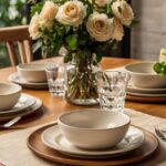
Natural Jute: Organic Texture and Warmth
Natural jute placemats bring organic texture and earthy charm to your white table.
This natural fiber option adds warmth and visual interest through its distinctive woven pattern.
When you choose jute placemats, you’re selecting a material that bridges rustic and sophisticated styles with ease.
The contrast between textured jute and smooth white creates a pleasing visual and tactile experience for your dining space.
Jute is known for its sustainability and eco-friendly qualities, making it perfect for environmentally conscious homes.
This material choice works beautifully year-round and complements nearly any season or holiday decoration scheme.
Consider different weave patterns for different effects – tight weaves for a more refined look or looser, chunkier weaves for casual charm.
Jute placemats pair wonderfully with both casual ceramic dishes and fine china, making them incredibly versatile for any occasion.
This natural option adds dimension and interest to your white table without introducing strong color that might compete with food or centerpieces.
Ready to Master the Kallax?
Transform your IKEA cube storage into custom furniture. Get my complete guide with 100+ projects, material lists, and pro tips.
“The IKEA Kallax Bible: 100+ Ways to Transform Cube Storage”
For added interest, look for jute placemats with subtle variations in color or incorporated metallic threads for a touch of elegance.
The psychological impact of natural materials includes promoting feelings of groundedness and connection to nature – perfect for mindful dining experiences.
This material choice can warm up modern, minimalist dining spaces that might otherwise feel too stark or clinical.
Jute placemats work particularly well in farmhouse, coastal, bohemian, or nature-inspired dining rooms.
For a sophisticated take, pair jute placemats with linen napkins and simple glassware for an elegant yet approachable table setting.
This material has strong associations with casual comfort, making guests feel at ease and welcome at your table.
When using jute placemats, consider the practicality factor – they add wonderful texture but may not be ideal for messy meals or young children.
Natural jute creates a perfect foundation for seasonal decorating – adding simple elements like fresh greenery, pinecones, or seashells can change the entire look.
This or That?
Pick your fave — see what other readers chose! 👀
Black: Modern Sophistication and Contrast
Black placemats create dramatic sophistication on your white table.
This bold choice offers the highest possible contrast for a look that’s decidedly modern and intentional.
When you choose black placemats, you’re selecting a color that represents elegance, power, and timeless style.
The stark contrast between deep black and bright white creates a graphic visual impact that feels both contemporary and classic.
Black is known for its slimming, defining quality – it helps create clear visual boundaries for each place setting.
This color choice works beautifully year-round and can be dressed up or down for any occasion from casual to formal.
Consider different materials for different effects – matte black linen for subtle sophistication or glossy black for dramatic modern appeal.
Black placemats pair wonderfully with any accent color you might want to introduce through napkins, flowers, or dishware.
This strong neutral makes colorful dishes pop dramatically while allowing white dishes to create a striking monochromatic statement.
For a classic look, pair black placemats with white napkins and silver accessories for timeless elegance on your white table.
The psychological impact of black includes promoting feelings of sophistication and focus – perfect for important dinner conversations.
This color choice can make dining spaces feel more intimate and defined, especially in open-concept homes.
Black placemats work particularly well in contemporary, minimalist, or industrial-inspired dining spaces.
For a softer approach, look for black placemats with subtle texture or pattern to add visual interest without additional color.
This color has strong associations with formal dining in many cultures, making it perfect for special occasions and entertaining.
When using black placemats, consider balancing with natural elements like wood or plants to keep the look from feeling too stark.
Black placemats create a perfect backdrop for food photography, allowing the colors and textures of your culinary creations to stand out brilliantly.
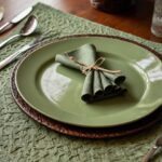
Sage Green: Calming Natural Harmony
Sage green placemats bring gentle, natural tranquility to your white table.
This soft, muted green creates a sense of harmony and balance that’s perfect for everyday dining.
When you choose sage green placemats, you’re selecting a color connected to nature, healing, and restfulness.
The subtle contrast between sage green and white creates a soothing visual effect that feels both fresh and grounding.
Sage green is known for its calming properties, making it ideal for creating peaceful mealtime environments.
This color choice works beautifully year-round and complements nearly any decorating style from farmhouse to modern.
Consider different textures for different effects – linen sage placemats for casual elegance or a smoother finish for contemporary appeal.
Sage green placemats pair wonderfully with natural elements like wood, stone, and fresh or dried herbs for a cohesive earthy aesthetic.
This gentle color creates a perfect backdrop for both white dishes and more colorful tableware without competing for attention.
For a harmonious look, consider incorporating small touches of sage elsewhere in your dining space through plants or decorative accents.
The psychological impact of sage green includes promoting feelings of wellness and natural balance – perfect for mindful eating experiences.
This color choice can make dining spaces feel more connected to the outdoors, especially valuable in urban environments.
Sage green placemats work particularly well in spaces with other natural elements, creating a cohesive, organic dining experience.
For a sophisticated take, pair sage placemats with cream napkins and brass or gold accessories for a subtle yet elegant table setting.
This color has strong associations with herb gardens and natural healing in many traditions, subtly enhancing the dining experience.
When using sage green placemats, consider seasonal adjustments – pair with brighter colors in spring and summer or deeper tones in fall and winter.
This versatile color creates a perfect foundation for both everyday meals and special occasions without feeling too casual or too formal.
Quick Design Dilemma
Cast your vote — see what other readers think! 🤔
Mixed Patterns: Playful and Eclectic Style
Mixed pattern placemats bring playful personality to your white table.
This creative approach allows you to express your unique style while maintaining a cohesive look.
When you choose mixed patterns, you’re creating a table setting that feels curated, collected, and full of character.
The backdrop of a white table serves as the perfect clean canvas for exploring pattern mixing without overwhelming the space.
Mixed patterns add visual interest and conversation starters to your dining experience – perfect for entertaining.
This approach works beautifully year-round and can be tailored to any season or celebration through thoughtful pattern selection.
Consider starting with a unifying color scheme – perhaps blue and white patterns or various patterns in shades of green – for a cohesive look.
Mixed pattern placemats pair wonderfully with solid color dishes that pick up one of the colors from your placemat patterns.
This creative choice allows you to incorporate various colors and styles while the white table helps unify the overall aesthetic.
For balance, consider using solid color napkins that coordinate with one of the colors in your pattern mix.
The psychological impact of thoughtfully mixed patterns includes promoting feelings of creativity and playfulness – perfect for memorable dining.
This approach can make dining spaces feel more personalized and unique, reflecting your individual taste and style.
Mixed pattern placemats work particularly well in eclectic, bohemian, or maximalist dining spaces where variety is celebrated.
For a more controlled look, choose patterns with varying scales – perhaps combining large floral prints with small geometric patterns.
This styling approach has strong associations with collected, traveled, and curated homes where items tell a story.
When using mixed pattern placemats, consider rotating them seasonally or for different occasions to keep your table settings fresh and interesting.
The combination of patterns against your white table creates visual excitement that can make even the simplest meals feel special and intentional.
Ready to Master the Kallax?
Transform your IKEA cube storage into custom furniture. Get my complete guide with 100+ projects, material lists, and pro tips.
“The IKEA Kallax Bible: 100+ Ways to Transform Cube Storage”
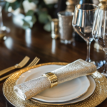
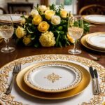
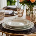
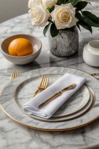
Metallic Gold or Silver: Luxurious Special Occasion Shine
Metallic gold or silver placemats bring instant luxury to your white table.
This glamorous choice elevates any meal into a special occasion with its reflective shine.
When you choose metallic placemats, you’re selecting a look that represents celebration, opulence, and festivity.
The contrast between gleaming metallics and a crisp white table creates a sophisticated backdrop for memorable dining experiences.
Metallic placemats are known for adding warmth (gold) or cool elegance (silver) to your table setting.
This style choice works beautifully for holidays, anniversaries, birthdays, or any time you want to create a celebratory atmosphere.
Consider different metallic finishes for different effects – brushed metals for subtle elegance or high-shine for dramatic impact.
Metallic placemats pair wonderfully with crystal or glass elements, creating beautiful reflections and light play across your table.
This luxurious option makes even simple white dishes look expensive and intentional while creating a perfect backdrop for formal dinnerware.
For balance, consider pairing metallic placemats with simple, solid-colored napkins to let the placemats remain the focal point.
The psychological impact of metallics includes promoting feelings of abundance and special occasion – perfect for creating memorable moments.
This choice can transform everyday dining spaces into glamorous entertainment areas for special gatherings.
Metallic placemats work particularly well in dining spaces with good lighting that can enhance their reflective qualities.
For a sophisticated look, match your metallic placemats to other metal elements in your dining space for a cohesive design.
This style has strong associations with celebration in many cultures, making it perfect for marking important occasions.
When using metallic placemats, consider practical aspects – they make a statement but may show fingerprints more readily than other materials.
The combination of metallics against your white table creates a blank canvas where food presentations can truly shine as the colorful focal point.