remember back when I first got my walnut dining room table, I was stumped on what colors to pair it with.
Walnut is such a gorgeous rich brown, but I didn’t want the whole room to feel dark and dreary.
It took me forever to decide on the perfect shades.
Through a lot of trial and error, I realized neutral tones like grays and taupes look amazing with walnut without being too dull.
Bold colors can also work if used sparingly as accents.
💭 Ever wondered what your room would actually look like rearranged?
I built a free tool that lets you drag furniture around a 2D floor plan. No signup, no catch.
See the Room Planner →Gray
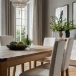
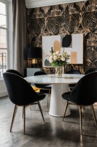
Gray is hands down one of the best colors to pair with walnut.
There’s a reason it’s such a classic – gray pairs beautifully without being too bold.
With walnut, grays create a polished, put-together vibe.
The main thing that makes gray a prime choice is its neutrality.
It doesn’t dominate or fight with the rich brown tones of walnut.
Rather, gray acts as a nice backdrop that allows the woodgrain to really sing.
The walnut provides warmth while gray adds just the right amount of sophistication.
Lighter grays like mist or dove work great for an airy, light-filled feel.
Dark charcoal gray creates major drama.
But I think medium gray shades like storm cloud or iron are the most versatile.
They lean toward the cooler side without being too blue-ish.
Gray looks bomb on everything from walls to accent chairs to bedding.
I especially love a gray area rug under a walnut table – it pulls the space together in a genteel way.
Pairing gray with the natural beauty of wood is like artwork, if you ask me.
The versatility is also awesome.
Gray works in both traditional and modern styles.
It’s a hue that will never go out of style either.
In summary – gray plus walnut is a match made in decor heaven!
You really can’t go wrong with this dynamic duo.

Tap to Explore These Beauties
See my ideas in action 👇 Tap any image to explore full details.
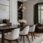
Taupe
If you want a color that harmonizes with walnut without being boring, taupe is the way to go.
Also known as “dull pink,” taupe has undeniable sophistication.
What makes taupe such a stellar pairing is its neutral sepia tones.
It bridges the gap between gray and brown perfectly.
Taupe echoes the warm, rich notes in walnut without overpowering the wood’s natural beauty.
I love using taupe in soft furnishings like drapes, pillows, or a throw blanket draped over the back of a chair.
The subtle texture and color creates a polished ambiance.
Textiles in taupe also hide dirt and dust really well, if you know what I mean.
Walls painted taupe produce a cocooning yet breathable backdrop for decorating.
The color comes across as light and airy even in a small space.
And a plush taupe area rug grounds the whole look with sophistication.
The best part is taupe is a chameleon – it fits in anywhere from traditional to modern farmhouse styles.
All in all, taupe takes walnut to the next level without trying too hard.
It’s the perfect understated pairing if you’re going for refined taste, dude.

Green
Walnut and green is a match made in interior design heaven.
The two colors have an innate yin-yang thing going on that just works.
Dark, moody greens like forest or emerald emphasize the richness of walnut by contrast.
Lighter mint or sage tones brighten things up without overwhelming the wood’s warmth.
Together they evoke peaceful vibes of nature.
Green has an amazing ability to make spaces feel relaxed and grounded.
When paired with walnut’s classic charm, a touch of green brings a refreshed modern edge.
Whether you go modern farmhouse or mid-century minimal – green is your new BFF.
I love green in pillows, art, or small accents around a walnut table.
Even just a few leaves in a low arrangement makes a statement.
Green plants also compliment walnut cabinets or built-ins like nobody’s business.
The versatility across shades is *chef’s kiss*.
Olive and pine pair best for traditional while mint and emerald sing for modern.
No matter what though, walnut + green = a color combination that really ties the room together, if you know what I mean.
Long story short – play up walnut’s warmth by adding a dose of nature’s favorite hue.
Green is the eco-friendly accessory your space has been missing!

Blue
When it comes to walnut, navy blue is a no-brainer accent color.
The rich wood combined with a deep, saturated blue creates major curb appeal.
The deep tones of navy tap into walnut’s luxurious aesthetic.
Together they scream vintage glam and old-world aristocracy.
Think antique furnishings paired with velvet drapes – simply opulent.
Lighter blues like robin’s egg or periwinkle also vibe well if you prefer a fresher coastal vibe.
Their sky-like hues brighten walnut’s coziness in a chic way.
Blue works great as an accent through art, décor, or even just a few statement pieces.
Too much can be overwhelming so take the less is more approach.
Pair printed pillow shams or a gallery wall for high impact without going overboard.
The richness of walnut grounds airy blues beautifully.
Together they achieve balance between sophistication and vibrancy.
Best of all, blue-toned accents pair with everything from traditional to modern styles.
In summary – walnut was clearly meant to be with its blue-blooded bestie.
Whether you go dark or light, navy or sky, the combination is sure to tie your space together with elegant polish.


💭 I Wrote a Book About My Biggest Decorating Mistakes!
When I decorated my first home, I thought I knew what I was doing. Spoiler: I didn’t. 😅
💸 I bought a sofa way too big for my living room. Paint colors that looked amazing in the store but terrible on my walls.
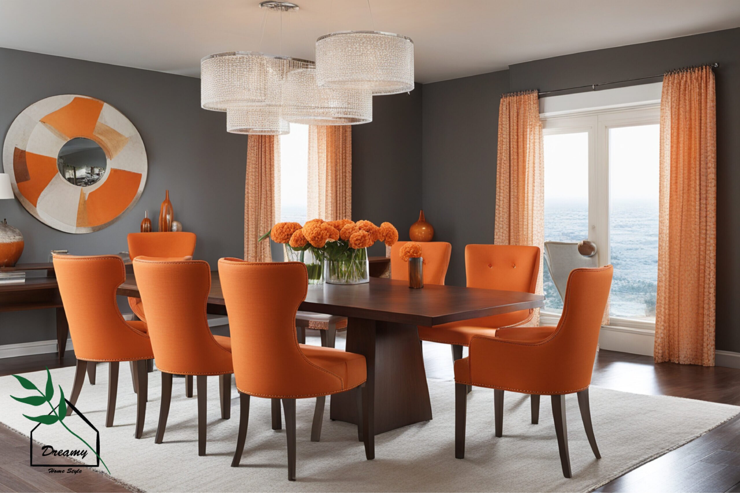
Orange
I know orange might seem like an unexpected choice for walnut at first.
But hear me out – a pop of terra cotta or burnt sienna is a total fashionista move!
Orange adds a subtle yet spirited warmth that really makes a statement.
While still letting walnut’s natural character shine through.
Think of it like an beautiful bronze tan – radiant without trying too hard.
The key is using orange sparingly as an accent.
Go for throw pillows, a framed photo print, or a decorative bowl.
Vibrant bursts of color make walnut feel lively and inviting.
Terra cotta and burnt sienna shades ground the look with their earthy tones.
They tap into walnut’s cozy essence in the best way.
Psst… Check This Out
Gray Table Dilemma? Here Are 7+ Chair Colors That Work Every Time Take Me There →
Come fall, these shades feel festive without screaming pumpkin spice latte either.
Plus the color combo works all year long.
Orange looks chic against a snowy backdrop just as much as summery florals.
It’s the type of pairing that brings joy no matter the season, you know?
In short – don’t be afraid to be bold with walnut!
Orange adds dimension as a secondary accent few other hues can.
Break the norms for design that feels totally original.

Find Your Room’s Color Palette
Tap a vibe — get a curated 5-color palette with hex codes you can copy ✨
Yellow
Yellow gets a bad rap but when used correctly, it’s a furnishing MVP.
Against walnut’s deep undertones, a touch of sunshine yellow is anything but dull.
Lighter shades like lemon or butter bring brightness without being aggressive.
Their vintage charm has major cottage core clout.
Meanwhile goldenrod and mustard provide lively contrast.
Accessories like pillows, vases, or artwork let you tap into yellow’s vivacious personality.
Try pairing vintage botanical prints with walnut’s classicism for a balanced look.
The color combo feels fresh and playful.

Walnut gives yellow just the right grounded presence it needs to feel polished instead of cartoonish.
Plus yellow doesn’t fade to the background like lighter tones.
It enhances walnut’s strengths while highlighting its joyous side too.
Talk about a well-rounded pairing!
So don’t be afraid to get a little yolky with your walnut accents.
Let sunshine into your space and watch the warm vibes flow.
A splash of yellow is the seasoning that takes the woodgrain to a whole new level.
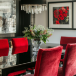
Red
Red gets a bad rap for being too intense, but against walnut’s deep brown undertones, it’s downright lavish.
Used tastefully, red adds drama and passion to a space.
Think burgundy, cordovan, or terracotta – vibrant shades that evoke warmth and richness.
Their texture plays nicely with walnut’s natural characteristics.
Using red is all about balance.
Try cushion accents, a sculptural vase, or framed artwork.
Small doses create visual harmony, letting each element shine.
The colors invite intimacy.
Their luxurious depths set a mood whether you’re entertaining guests or curled up with a glass of wine at the end of a day.
Plus red has range – everything from modern farmhouse to vintage glam.
It pairs equally well in provincial or sleek settings when styled correctly.
In summary – don’t underestimate red and walnut’s magnetism.
With restraint and flair, they become living art, elevating any space with passion and polish.
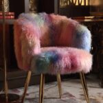
Pink
Most people wouldn’t think to pair pink with walnut but hear me out – when done right it’s absolutely gorgeous.
Used sparingly as an accent, pink brings a romantic touch.
Softer blush or rose shades have an heirloom quality that feels feminine without being over-the-top.
Their vintage tones play nicely off walnut’s heritage vibes.
Pink in textiles is especially lovely.
Try draping an antique linen scarf over chair backs or using blush pillows and throws.
The color adds sweetness to the space.
Walnut anchors pink’s delicacy so it never reads childish or twee.
The wood gives pink an air of sophistication and old world glamour.
And pink isn’t just for traditional settings.
Pastel hues pair beautifully with mid-century modern silhouettes too for a breath of romance.
So go ahead – don’t be afraid to embrace your inner girly-girl and mix in a touch of pink with your walnut accents.
The rich wood keeps things grown-up while blush adds softly feminine flair.
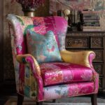
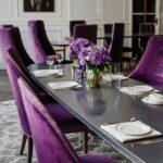
Purple
Purple may seem like an unconventional choice but it adds such drama to walnut.
Used sparingly as an accent, it livens up the space.
Eggplant and plum tones have an opulence that makes a statement without overwhelming the wood.
Their lively hues pop against walnut’s neutral backdrop.
Think cushions, framed art, or a sculptural vase – let purple elements come to the forefront for high impact.
The color evokes feelings of luxury and richness.
Walnut offers the perfect soil for purple’s vibrancy to take root without going over-the-top.
Its neutrality tempers purple’s intensity in a beautiful balance.
Plus purple’s range is wide – it pairs with everything from vintage glam to sleek modern.
Just adapt the shades to your aesthetic and watch it thrive.
Long story short – don’t be afraid to let your inner eccentric shine by mixing in moody, vivacious purple.
It livens walnut in the most luxurious way possible.
What’s Your Decor Personality?
5 questions · 30 seconds · Instant style match 🏡
Brown
Brown may seem like an obvious choice but it’s actually very versatile when paired with walnut.
Used strategically, different shades of brown create beautiful harmony.
darker tones like espresso or chocolate accentuate walnut’s melanin richness.
Their cocooning vibe evokes warmth and luxury.
Meanwhile tan, caramel and sand-toned browns lighten things up for an earthy yet airy ambiance.
Their tones flatter walnut beautifully.
Textiles are a great way to incorporate brown.
Try a plush area rug, throw pillows or even an upholstered chair to pull the look together.
💭 I Wrote a Book About My Biggest Decorating Mistakes!
When I decorated my first home, I thought I knew what I was doing. Spoiler: I didn’t. 😅
💸 I bought a sofa way too big for my living room. Paint colors that looked amazing in the store but terrible on my walls.
Walnut’s depth anchors various brown shades so they feel balanced instead of boring.
The contrasts bring out each other’s best attributes.
Plus brown is endlessly versatile – it mixes with everything from lodge decor to modern minimalism.
A touch of cafè au lait here, mocha there – perfection!
So don’t be afraid to repeat that luscious brown.
Strategic layering with walnut yields cohesion and serenity in spades.
Black
Black exudes timeless glamour when juxtaposed with walnut’s natural allure.
It creates a high-contrast palette that demands attention.
While walnut emanates warmth, black brings edgy sophistication.
Their yin-yang dynamic keeps looks fresh and moody.
Black accents like a decorative lamp, bookends or artwork let walnut take center stage.
But their bold backdrop elevates the setting to new heights.
The deep tones also conjure an air of elegance and drama.
Use them together for a vibe that feels perfectly tailored yet welcoming too.
Plus, black mixes effortlessly with any style – glam traditional, jet-set mid century or ultra modern.
It melds style signatures seamlessly.
In short, go bold by embracing the richness of walnut against black’s edgy charm.
Their contrast makes a high-impact yet timelessly luxurious statement.
White
White accentuates walnut’s beauty without overwhelming it.
Used as an airy backdrop, white lets the woodgrain shine in focus.
Crisp walls, linen drapes or a sleek sofa contrast walnut’s inherent warmth for visual balance.
Their brightness feels light and refreshing.
White also shows the nuances in walnut’s coloring.
Its blank canvas aesthetic emphasizes knots, grains and undertones we may overlook otherwise.
There’s a classic yet modern ease to the pairing too.
White lends an airy backdrop to pair walnut with everything from traditional to contemporary style.
And white is forever timeless.
Perfect for withstanding trends and adapting spaces, just like heirloom walnut will.
Their longevity as partners solidifies a look that feels meant-to-be.
So when accentuating your walnut centerpieces, consider letting white take the supporting role.
Its simplicity magnifies the beauty in every curve and detail.
This or That?
Pick your fave — see what other readers chose! 👀
Beige
Neutral beige is the chameleon color that seamlessly complements walnut’s sophistication.
As a secondary tone, it enhances without distracting.
Shades like cream, taupe and sand allow walnut to shine while adding warmth.
Their muted earthiness feels peaceful and relaxing.
Use beige in soft furnishings like curtains, pillows or an area rug.
Its soft blending quality ties disparate elements together in style.
And it conceals dirt!
Beige stays looking pristine far longer than stark whites.
Perfect for high-traffic homes with walnut furniture.
Plus its versatility is key – beige meshes with rustic farmhouse, vintage glam and modern minimalist aesthetics alike.
A chameleon for all décor personalities.
In the end, beige lets walnut take the lead while providing a subtly luxe, soothing backdrop.
A true harmonious partner that elevates the room’s ambiance.
So whether muted taupe or soft putty, beige picks up walnut’s subtle notes without competing.
The perfect neutral ally.
Gold
Gold adds opulence and glamour when paired with walnut’s luxury tones.
Where walnut feels rich and earthy, gold brings shine and prestige.
Use gold accents like a mirrored tray, brass picture frames or gold finish décor to amplify walnut’s sophistication.
The metallic hue feels prestigious.
Shades like brushed gold, bronze and champagne flatter walnut uniquely.
Their warmth complements without overwhelming the woodgrain.
The color combo feels sumptuous and glamorous.
Perfect for both traditional furniture in a manor home or modern accents in a penthouse.
Plus, both elements withstand the test of time.
Their classicism will never go out of style, maintaining value and beauty for generations.
So bring on the glitz!
Walnut and gold pair like nobility to exude decadent riches without trying too hard.
The perfect prestige pair.
Silver
While gold adds opulence, silver lends sleek modern edge.
It creates a high-contrast palette with walnut’s depth for dramatic effect.
Use metallic silver accents to juxtapose walnut’s organic texture.
Try a sculptural tray, pendant light, or serving pieces for visual zing.
The yin-yang of walnut’s warmth and silver’s coolness steals the show.
Their tension sparks visual interest.
Plus silver mixes easily with multiple styles like glam traditional, art deco revival or contemporary minimalism.
A chameleon partner for walnut.
When going monochrome, walnut offers the ideal canvas to let silver elements pop.
It’s a high-design statement pairing.
So don’t be afraid to splash out with a dash of silver luxe alongside your favorite wooden furnishings.
The dynamic contrast livens up any space with high fashion finish.
Rust
Rust adds warm texture when paired with walnut’s richness.
Where walnut feels inherently classic, rust brings rugged charm.
Terracotta, sienna and burnt orange tones infuse intimate spaces with personality.
Their tones pair effortlessly with walnut’s depths.
Incorporate rust in accent pieces like a copper tray, warm throw or distressed planter.
Their antiquated patina feels perfectly at home.
The earthy yin-yang creates a cozy yet sophisticated ambiance.
Rustic rust counterbalances walnut’s prestige for balanced appeal.
And rust acts as a style chameleon.
It pairs with lodge decor, modern farmhouse or vintage glam with ease.
So don’t be afraid to remix your walnut staples with a dash of rustic spirit.
Their complementary personalities elevate the room to refined yet relaxed new heights.
Quick Design Dilemma
Cast your vote — see what other readers think! 🤔
💭 I Wrote a Book About My Biggest Decorating Mistakes!
When I decorated my first home, I thought I knew what I was doing. Spoiler: I didn’t. 😅
💸 I bought a sofa way too big for my living room. Paint colors that looked amazing in the store but terrible on my walls.
Teal
Teal adds a refreshing twist to walnut’s warm undertones.
Where walnut feels rich, teal brings a breezy dose of sea air.
Shades like sky, sea and mint teals pair beautifully against walnut’s depth.
Their tonal harmony feels perfectly balanced.
Try teal accents like a sculptural vase, pillows or artwork.
Their cooling pop injects liveliness without clashing.
The color combo feels globally inspired – think antique maps, tropical inspired prints or nautical motifs.
Perfect for any style.
And teal has range – it looks right at home in everything from beachy cottages to modern farmhouse interiors.
So unleash your inner world traveler and sprinkle in a hint of coastal breeze with teal and walnut.
Their tonalities marry seamlessly for diverse global flair.
Mint
Fresh mint colors add a light, cheerful accent to walnut’s richness.
Where walnut is dark and substantial, mint feels airy and uplifting.
Pale mint, seafoam and mint chocolate chip shades pair beautifully against walnut’s depth.
Their tonal harmony feels bright yet balanced.
Try mint accents like a sculptural candy dish, pillows or small artwork.
Their cooling pop lifts spirits without clashing.
The color combo has a spa-like feeling – think zen-inspired motifs, light herbs and natural prints.
Perfect for any style.
And mint translates to everything from modern farmhouse to tropical decor.
It’s a refreshing complement to walnut.
Embrace your inner wellness guru and let a hint of mint lift the senses alongside walnut’s natural allure.
Their balanced tones marry refreshment and richness.
Salmon
Salmon adds a warm, organic accent to walnut’s solid base.
Where walnut is grounded, salmon feels lively and uplifting.
Shades like coral, peach and apricot salmon pull out hidden pink and orange undertones in the woodgrain.
Their harmonizing tones bring out the best in each other.
Try salmon accessories like a bohemian pillow, art print or planter.
The pop of color enlivens without overwhelming the setting.
The pair feels coastal yet grounded – perfect for beach cottages, mountain cabins or casually elegant farmhouse fare.
Salmon also uplifts walnut in modern contexts.
Think Moroccan or Turkish inspired accents for global eclecticism.
So unleash your inner bohemian and let hints of rosy salmon energize walnut’s understated luster.
Their balanced union blends coastal charm with natural sophistication.
There you have it dudes, my top 19 favorite colors to pair with a walnut table.
As you can see, most of them are neutral earth tones.
But don’t be afraid to throw in some more vibrant hues as accent colors.
The most important thing is finding a palette that suits your style.
Happy decorating!