
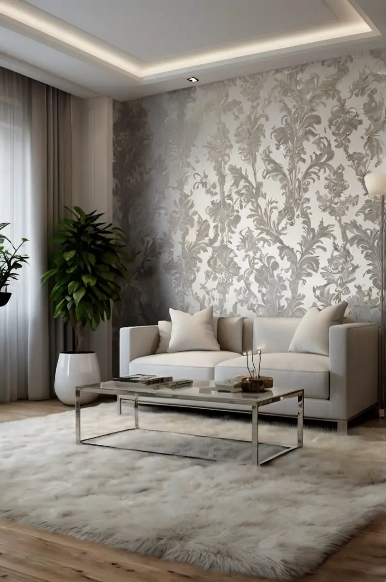
Silver wallpaper brings a modern, luxurious feel to any room, creating a backdrop that’s both elegant and versatile.
The perfect carpet doesn’t just cover your floor – it completes your entire design vision and ties your space together.
When silver walls meet the right carpet color, the result can be breathtaking, turning an ordinary room into a designer showcase:
The right pairing will depend on your personal style, the amount of natural light in your room, and the mood you want to create:
1. Classic White Carpet
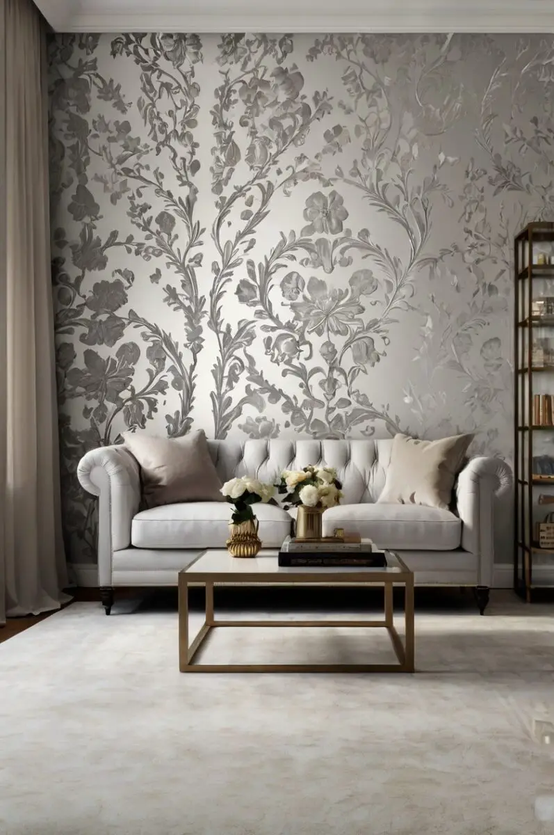
White carpet creates a clean, bright foundation that allows your silver wallpaper to truly shine.
This pairing gives your room a fresh, airy feel that works wonderfully in both traditional and contemporary spaces.
When you choose white carpet with silver walls, you’re creating a sophisticated monochromatic look that designers love for its timeless appeal.
The combination feels luxurious and high-end, similar to what you might see in upscale hotels or designer showrooms.
Your silver wallpaper will appear even more luminous against the crisp white background, especially when natural light hits the space.
This color combination works particularly well in smaller rooms, as the light colors create an illusion of more space.
White carpet also has the advantage of being extremely versatile if you decide to change your accessories or accent pieces in the future.
For practical considerations, look for white carpets with stain-resistant treatments if you have children or pets.
Consider different textures of white carpet to add visual interest – options range from plush deep pile to more practical Berber styles.
A white carpet with subtle silver flecks or a very light pattern can create a cohesive connection with your silver wallpaper.
This pairing works beautifully in bedrooms, creating a calm, serene atmosphere that promotes relaxation.
In living spaces, white carpet with silver walls creates a bright, welcoming environment that can be warmed up with wooden furniture and colorful accessories.
Remember that lighting plays a crucial role in this combination – warm lighting will soften the coolness of the silver and white for a more inviting feel.
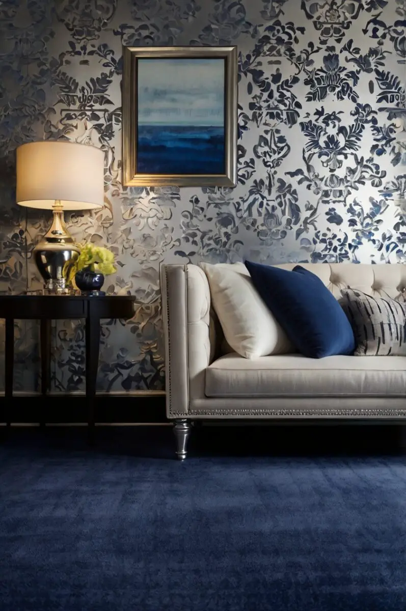
2. Soft Gray Carpet
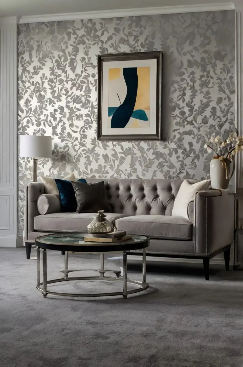
Soft gray carpet creates a seamless, sophisticated look when paired with silver wallpaper.
This tone-on-tone approach feels cohesive and elegant, giving your room a designer-worthy appearance.
When you select a gray carpet that’s a few shades darker than your silver wallpaper, you create depth without harsh contrast.
The subtle difference in shades creates a layered look that adds dimension to your space.
Gray carpet comes in many undertones – some lean cool with blue hints, while others have warmer beige or taupe undertones.
For silver wallpaper with cool blue undertones, choose a gray carpet with similar cool properties for harmony.
If your silver wallpaper has warmer champagne undertones, a gray carpet with beige or taupe influences will create a cohesive look.
Medium gray carpet is particularly forgiving for everyday life, hiding footprints and minor stains better than very light or dark options.
The gray and silver combination works wonderfully in home offices, living rooms, and bedrooms – anywhere you want a calming, sophisticated atmosphere.
You can add interest to this monochromatic scheme with different textures – consider a plush, deep-pile gray carpet against sleek silver walls.
This pairing allows your furniture and accessories to stand out as focal points against the unified background.
Gray carpet with subtle patterns or flecks can add visual interest while maintaining the cohesive color palette.
For a more dramatic look, consider a charcoal gray carpet that creates stronger contrast while still staying within the silver family.
Design Your Dream Room in Minutes!
🏡 Start Creating FREE →3. Navy Blue Carpet
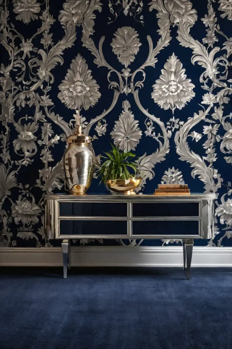
Navy blue carpet creates a bold, striking contrast against silver wallpaper that immediately gives your room a designer edge.
This powerful combination balances cool tones with rich depth, creating a space that feels both sophisticated and dramatic.
When you choose navy carpet with silver walls, you’re creating a color story that feels both timeless and thoroughly modern.
The deep, inky blue grounds the space while allowing the luminous quality of silver to stand out even more dramatically.
Navy carpet brings a sense of calm and stability to rooms with silver wallpaper, which can sometimes feel cold or overly reflective on their own.
This color combination works particularly well in formal living rooms, dining rooms, or home offices where you want to create an impression.
The contrast between light walls and dark floors creates architectural interest even in simply furnished spaces.
Navy is considered a “new neutral” in interior design, meaning it pairs beautifully with almost any accent color you might want to introduce.
Your silver wallpaper will appear more luminous and reflective when contrasted against the deep, light-absorbing quality of navy carpet.
For smaller rooms, this combination can create a cozy, intimate feeling that wraps around you like a warm embrace.
In larger spaces, navy carpet helps define areas and prevents the room from feeling too vast or impersonal.
This pairing works with many design styles – from traditional to transitional to contemporary – depending on your furniture and accessories.
Consider the specific pattern of your silver wallpaper – more ornate patterns pair beautifully with solid navy, while simpler silver wallpaper can handle textured or subtly patterned navy carpet.
4. Blush Pink Carpet
Blush pink carpet creates a soft, feminine counterpoint to the cool metallic shine of silver wallpaper.
This unexpected combination brings warmth and subtle color to your space while maintaining an elegant, sophisticated feel.
When you pair blush pink carpet with silver walls, you’re creating a balance between cool and warm tones that feels both current and timeless.
The gentle pink softens the potentially cold or industrial feel that silver can sometimes create on its own.
This color combination has become increasingly popular in design circles for its ability to look both fresh and classic simultaneously.
Blush pink is considered a “new neutral” that pairs beautifully with metallic finishes, giving you versatility when selecting accessories.
Your silver wallpaper will appear more luminous against the soft contrast of blush, especially in spaces with good natural light.
This pairing works wonderfully in bedrooms, creating a romantic yet sophisticated atmosphere that promotes relaxation.
In living spaces or home offices, blush carpet with silver walls creates a welcoming environment that feels both professional and personal.
The combination particularly shines in spaces where you want to create a sense of calm elegance with a touch of warmth.
Consider different textures of blush carpet to add visual interest – options range from plush deep pile to more practical low-pile styles.
For a more subtle approach, look for blush carpets with gray undertones that create a beautiful bridge between the pink and silver.
This combination allows for versatile accent colors – navy blue, emerald green, or even matte black accessories pop against this backdrop.
5. Emerald Green Carpet
Emerald green carpet creates a bold, luxurious foundation that transforms silver-wallpapered rooms into dramatic, unforgettable spaces.
This rich jewel tone against metallic silver walls evokes the glamour of Art Deco design while feeling thoroughly modern.
When you choose emerald carpet with silver walls, you’re making a confident design statement that showcases your personal style.
The deep, saturated green grounds the space while allowing the luminous quality of silver to remain the star of the show.
This color combination signals sophistication and a willingness to step beyond safe, expected design choices.
Emerald green has historically been associated with luxury and abundance, adding a sense of richness to your space.
Your silver wallpaper will appear more dimensional and interesting when contrasted against the deep, vibrant emerald floor.
This pairing works particularly well in dining rooms, living rooms, or anywhere you entertain and want to create a memorable impression.
The contrast between cool silver and rich green creates excellent visual tension that makes both colors appear more vibrant.
For a slightly more subtle approach, consider a forest green that’s a touch darker and less saturated than true emerald.
This combination can handle bold accessories – gold accents, deep purples, or even animal prints work beautifully against this backdrop.
In spaces with good natural light, the emerald carpet will show different dimensions throughout the day as light changes.
This pairing works with many design styles – from glamorous Hollywood Regency to contemporary minimalism, depending on your furniture choices.
6. Warm Beige Carpet
Warm beige carpet creates a soft, inviting foundation that beautifully balances the cool, metallic quality of silver wallpaper.
This classic neutral pairing delivers timeless elegance while maintaining a comfortable, livable atmosphere in your space.
When you choose beige carpet with silver walls, you’re creating a sophisticated contrast between warm and cool tones.
The natural warmth of beige grounds the space and prevents silver wallpaper from feeling too cold or sterile.
This combination works in virtually any room of your home, from bedrooms to living spaces to home offices.
Beige carpet comes in countless shades – from pale cream to deeper tan – allowing you to fine-tune the exact level of contrast you want.
Your silver wallpaper will appear more luminous and reflective against the soft, light-absorbing quality of beige carpet.
This pairing is particularly effective in rooms that don’t receive abundant natural light, as the beige adds necessary warmth.
The neutral quality of both colors creates a perfect backdrop for furniture and accessories in virtually any color palette.
For a more cohesive look, choose a beige with subtle gray undertones that creates a bridge between the carpet and wallpaper.
This combination allows architectural features and statement furniture to take center stage against an elegant, unified background.
Beige carpet with interesting texture – like berber, frieze, or cut-and-loop patterns – adds visual interest while maintaining the neutral color scheme.
This pairing works with every design style from traditional to contemporary, making it an excellent choice if you like to update your decor periodically.
7. Deep Purple Carpet
Deep purple carpet creates a regal, dramatic foundation that transforms silver-wallpapered rooms into truly distinctive spaces.
This rich jewel tone against metallic silver delivers unexpected sophistication with a touch of artistic flair.
When you choose deep purple carpet with silver walls, you’re creating a color story that feels both luxurious and creative.
The deep, saturated purple grounds the space while allowing the luminous quality of silver to shine in beautiful contrast.
This combination signals confidence and originality in your design choices, showing a willingness to go beyond expected pairings.
Purple has historical associations with royalty and creativity, bringing these qualities into your living environment.
Your silver wallpaper will appear more dimensional and interesting when contrasted against the rich, complex purple floor.
This pairing works particularly well in creative spaces, home theaters, or anywhere you want to make a bold statement.
The contrast between cool silver and rich purple creates excellent visual tension that makes both colors appear more vibrant.
For a slightly more subtle approach, consider an aubergine or plum that’s deeper and less saturated than a bright purple.
This combination handles accessories in metallics beautifully – silver, gold, or copper accents look stunning against this backdrop.
In spaces with good natural light, the purple carpet will show different dimensions throughout the day as light shifts across it.
This pairing works with contemporary, eclectic, and glamorous design styles, delivering spaces with personality and character.
TRENDING NOW
TOP 17+ Carpet Colors for Your Pink and White Walls8. Charcoal Black Carpet
Charcoal black carpet creates a bold, sophisticated foundation that dramatically contrasts with the luminous quality of silver wallpaper.
This high-contrast pairing delivers serious design impact, creating spaces that feel both modern and timeless.
When you choose black carpet with silver walls, you’re creating a striking color story that photographers and designers have long favored.
The deep, light-absorbing black grounds the space while making your silver wallpaper appear even more reflective and dimensional.
This combination signals confidence and sophistication in your design choices, creating rooms with undeniable presence.
Black carpet has practical advantages too – it’s extremely forgiving with stains and shows less wear than lighter colors.
Your silver wallpaper will pop dramatically against the dark floor, creating almost a gallery-like effect for furniture and art.
This pairing works particularly well in formal living rooms, dining rooms, or anywhere you want to create dramatic impact.
The strong contrast creates architectural interest even in simply furnished spaces with minimal accessories.
For a slightly softer approach, consider a charcoal that’s a very dark gray rather than a true black.
This combination handles colorful accessories beautifully – vibrant pillows, art, or plants really stand out against this neutral backdrop.
In spaces with good natural light, this contrast won’t feel too dark, as the silver reflects and maximizes available light.
This pairing works with many design styles – from ultra-modern to traditional with a twist – depending on your furniture choices.
9. Teal Blue Carpet
Teal blue carpet creates a rich, invigorating foundation that pairs unexpectedly well with the cool shine of silver wallpaper.
This jewel-toned blue-green brings depth and personality while maintaining an elegant balance with metallic walls.
When you choose teal carpet with silver walls, you’re creating a color story that feels both sophisticated and refreshingly different.
The saturated teal grounds the space while adding a touch of color that prevents silver from feeling too cold or clinical.
This combination signals creative confidence in your design choices, showing thoughtful curation rather than playing it safe.
Teal has psychological associations with calm and clarity, making it excellent for spaces where you want to relax or focus.
Your silver wallpaper will appear more dynamic when contrasted against the rich, complex teal floor beneath it.
This pairing works particularly well in home offices, bedrooms, or living spaces where you want color without overwhelming brightness.
The contrast between metallic silver and rich teal creates excellent visual tension that brings energy to your space.
For a slightly different approach, you can move along the teal spectrum toward bluer peacock tones or greener jade shades.
This combination handles wooden furniture beautifully – both light and dark woods look stunning against this color palette.
In spaces with varying light, teal carpet shows fascinating dimension, appearing more blue or more green as lighting changes.
This pairing works with contemporary, transitional, and eclectic design styles, creating spaces with personality and sophistication.
10. Soft Lavender Carpet
Soft lavender carpet creates a gentle, unexpected foundation that pairs beautifully with the cool luminosity of silver wallpaper.
This subtle purple-tinted pastel brings a touch of color while maintaining an airy, sophisticated feel to your space.
When you choose lavender carpet with silver walls, you’re creating a color story that feels both elegant and subtly unique.
The soft lavender adds a touch of personality while allowing the silver wallpaper to remain the dominant feature in the room.
This combination signals refined taste with a creative edge, showing thoughtful design choices without overwhelming the senses.
Lavender has psychological associations with relaxation and creativity, making it excellent for bedrooms or creative spaces.
Your silver wallpaper will appear more luminous against the soft contrast of lavender, especially in spaces with good natural light.
This pairing works wonderfully in bedrooms, creating a dreamy yet sophisticated atmosphere that promotes restful sleep.
The gentle contrast between metallic silver and soft lavender creates a soothing visual experience that feels balanced and harmonious.
For a more subtle approach, look for lavender carpets with gray undertones that create a beautiful bridge between the purple and silver.
This combination allows for versatile accent colors – navy blue, emerald green, or even matte black accessories pop against this backdrop.
In spaces with warm lighting, lavender carpet takes on a cozy, more intimate quality in the evening hours.
This pairing works with many design styles – from romantic traditional to clean contemporary – depending on your furniture and accessories.
11. Rich Burgundy Carpet
Rich burgundy carpet creates a bold, luxurious foundation that pairs dramatically with the cool shine of silver wallpaper.
This deep red-wine tone brings warmth and sophistication while creating striking contrast with metallic walls.
When you choose burgundy carpet with silver walls, you’re creating a color story that feels both opulent and timeless.
The saturated burgundy grounds the space with rich color while allowing the silver wallpaper to maintain its brilliant presence.
This combination signals confidence and sophistication in your design choices, creating rooms with undeniable character.
Burgundy has historical associations with luxury and refinement, bringing these qualities into your contemporary space.
Your silver wallpaper will appear more reflective and dimensional when contrasted against the deep, absorbing quality of burgundy.
This pairing works particularly well in dining rooms, libraries, or formal living spaces where you want to create a sense of richness.
The contrast between cool silver and warm burgundy creates excellent visual tension that brings energy and balance to your space.
For a slightly different approach, you can move along the burgundy spectrum toward deeper wine or lighter cranberry shades.
This combination handles wooden furniture beautifully – both mahogany and lighter woods provide interesting counterpoints.
In spaces with varying light, burgundy carpet shows fascinating dimension, revealing complex undertones as lighting changes.
This pairing works with traditional, transitional, and eclectic design styles, creating spaces with personality and warmth.
12. Pale Sage Green Carpet
Pale sage green carpet creates a soft, natural foundation that pairs beautifully with the cool metallic shine of silver wallpaper.
This subtle green brings an organic, calming influence while maintaining an elegant, sophisticated feel.
When you choose sage green carpet with silver walls, you’re creating a color story inspired by natural elements like mist on foliage.
The gentle sage adds a touch of nature-inspired color while allowing the silver wallpaper to remain the dominant feature.
This combination signals refined taste with an appreciation for subtle beauty, showing thoughtful design choices that feel current yet timeless.
Sage green has psychological associations with tranquility and growth, making it excellent for spaces where you want to feel centered.
Your silver wallpaper will appear more luminous against the soft contrast of sage, especially in spaces with good natural light.
This pairing works wonderfully in bedrooms or living spaces, creating a serene atmosphere that encourages relaxation.
The gentle contrast between metallic silver and soft sage creates a soothing visual experience inspired by natural color harmonies.
For a more subtle approach, look for sage carpets with gray undertones that create a beautiful bridge between the green and silver.
This combination allows for versatile accent colors – navy, rust, or even black accessories provide beautiful counterpoints to this palette.
In different lighting conditions, sage carpet reveals different dimensions, sometimes appearing more gray, sometimes more green.
This pairing works with many design styles – from organic modern to traditional with a twist – depending on your furniture choices.
13. Warm Taupe Carpet
Warm taupe carpet creates a soft, sophisticated foundation that beautifully balances the cool metallic quality of silver wallpaper.
This complex neutral, with its perfect blend of gray and beige tones, delivers understated elegance that works in any space.
When you choose taupe carpet with silver walls, you’re creating a nuanced color story that interior designers often recommend.
The natural warmth of taupe grounds the space while its gray undertones create a harmonious connection with silver wallpaper.
This combination works in virtually any room of your home, from bedrooms to living spaces to formal dining rooms.
Taupe carpet comes in countless variations – some leaning more gray, others more beige – allowing you to fine-tune your exact look.
Your silver wallpaper will appear more dimensional against taupe, which provides contrast without the starkness of darker colors.
This pairing is particularly effective in creating sophisticated spaces that feel curated rather than overly designed.
The neutral quality of both colors creates a perfect backdrop for furniture and accessories in virtually any color palette.
For maximum cohesion, choose a taupe with distinctive gray undertones that creates a seamless flow from walls to floor.
This combination allows architectural features and statement furniture to take center stage against an elegant, unified background.
Taupe carpet with interesting texture – like cut pile, frieze, or pattern – adds visual interest while maintaining the neutral color scheme.
This pairing works with every design style from traditional to contemporary, making it a truly versatile foundation for any home.
